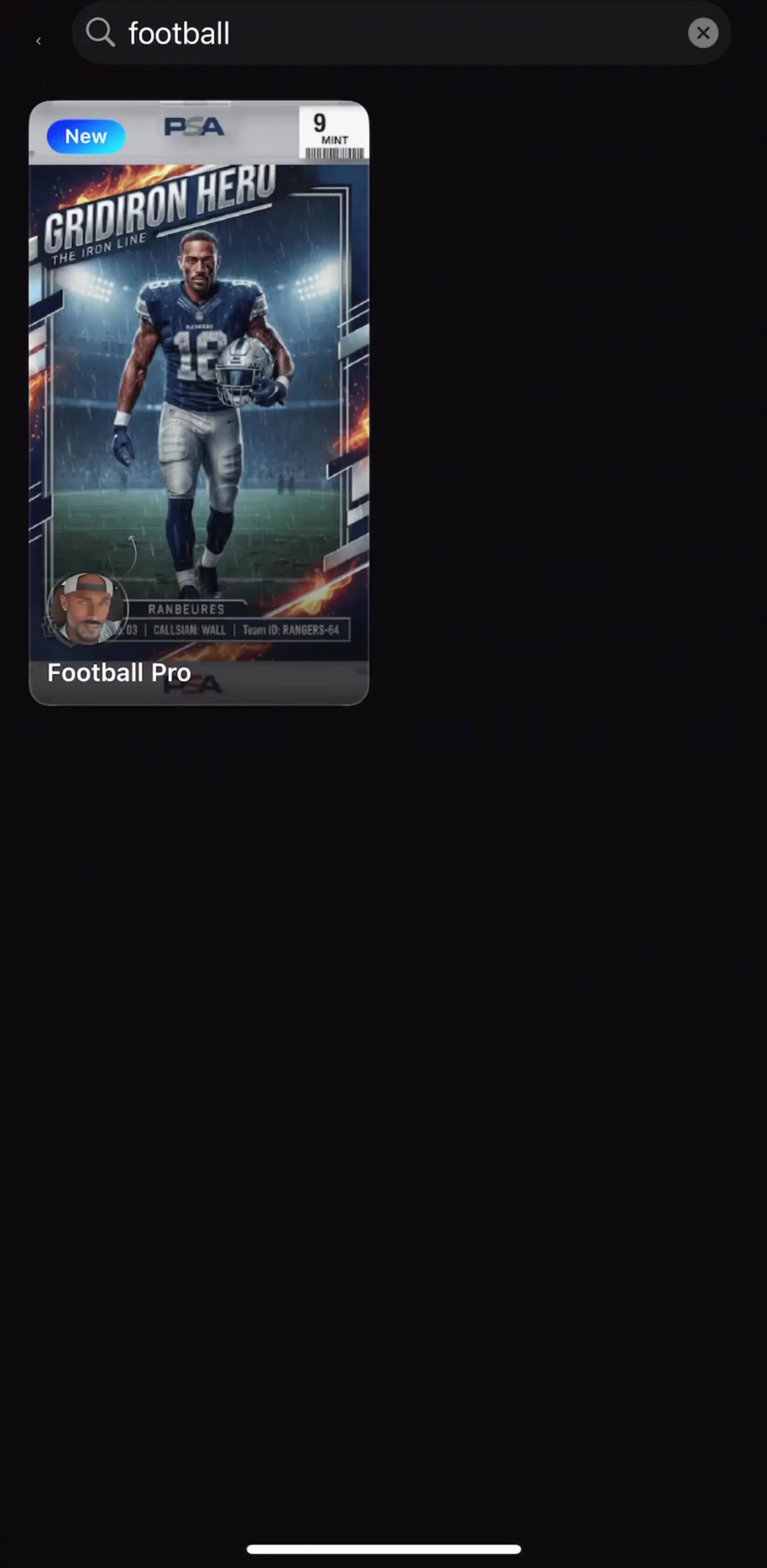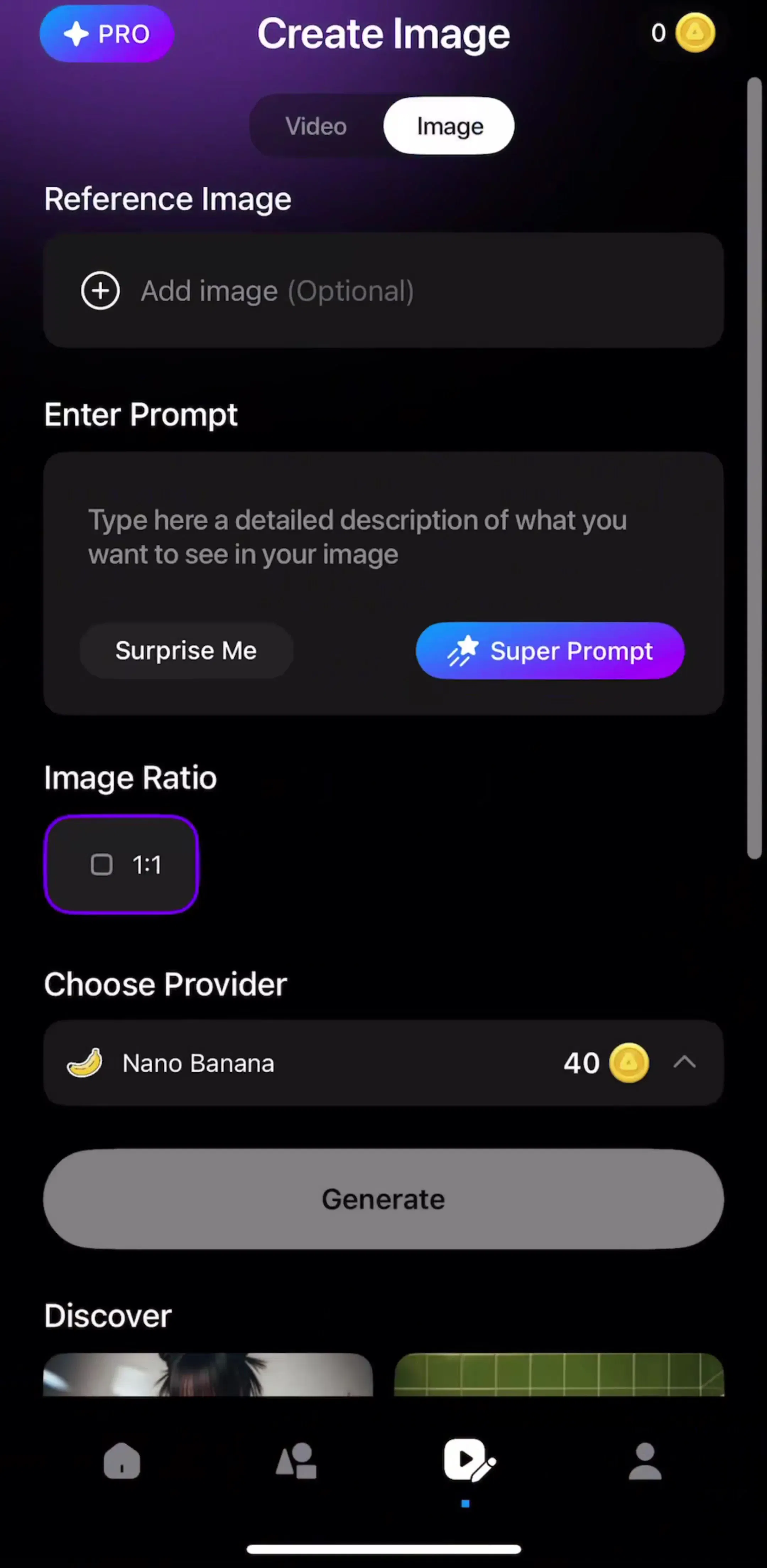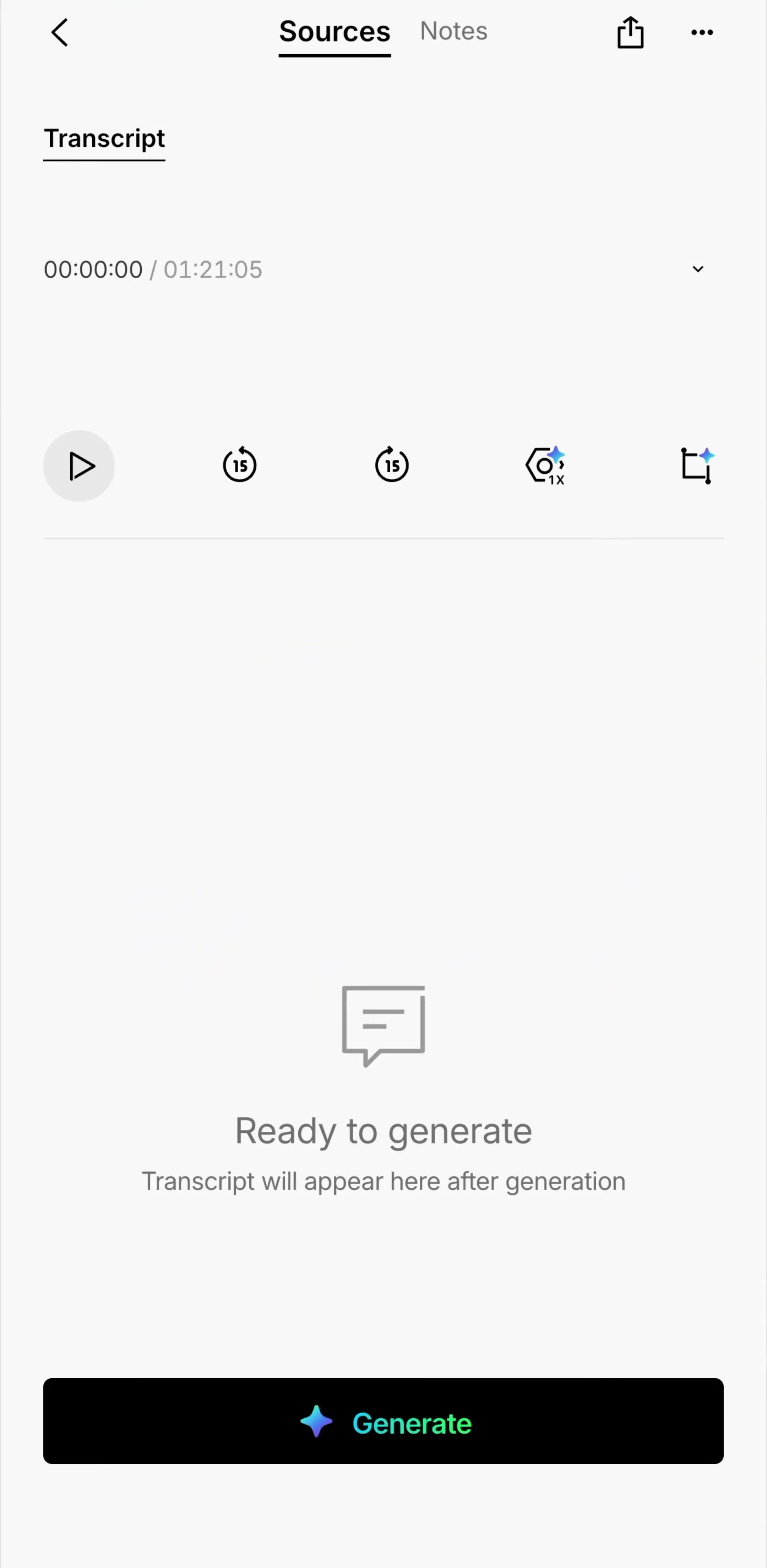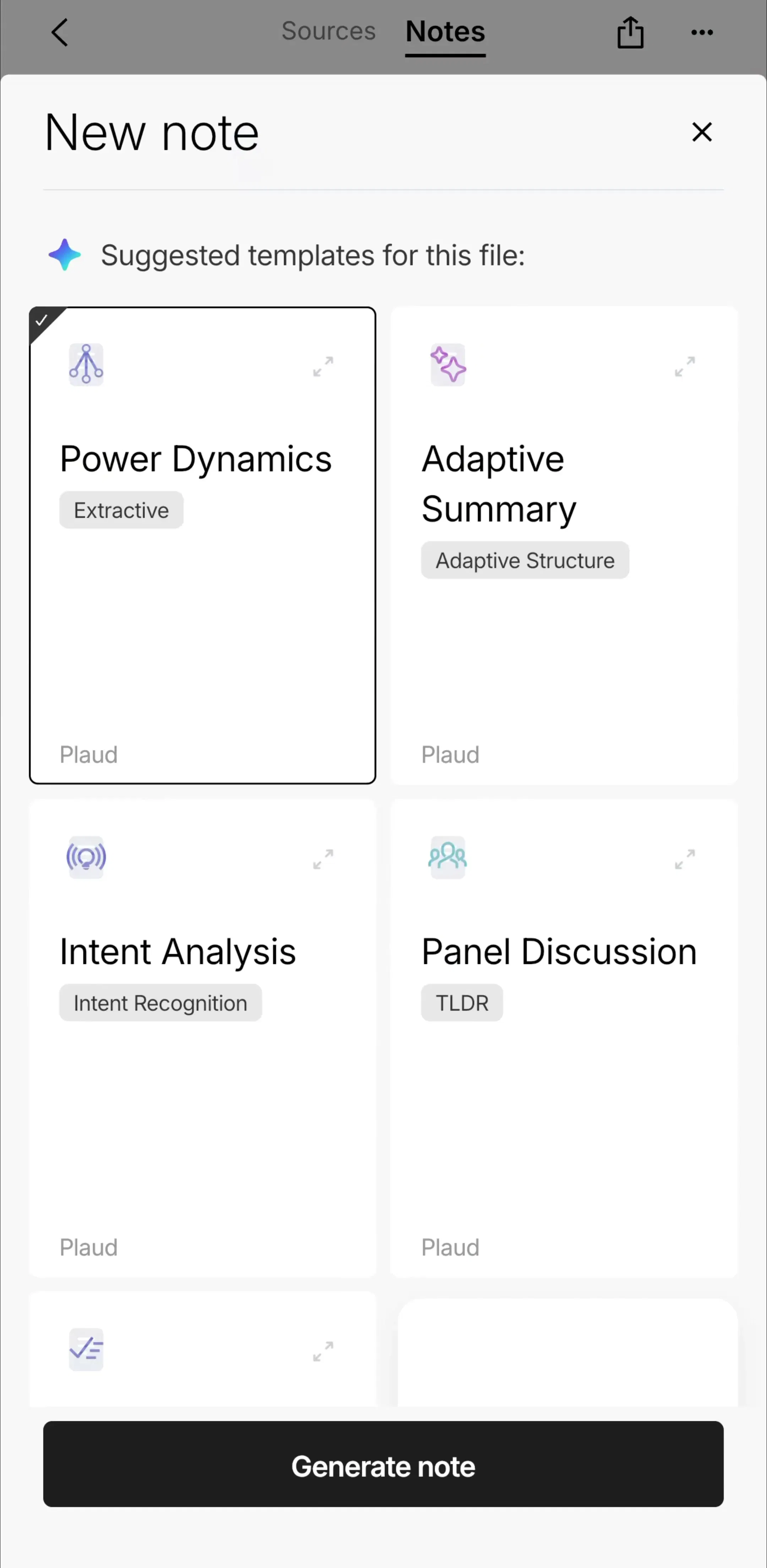
A progress bar looks like the smallest thing on a screen and is usually the only thing on it. By the time one appears, the user has already committed: they tapped generate, or start, or upload, and now they are waiting on a rectangle. Whatever the bar says is the entire product experience for the next few seconds.
That stretch used to be rare. It is not any more. Of the 2,622 revenue-verified iOS apps in our library, 1,049 have a captured content creation section and 591 have an AI tools section, and the shape of those flows is consistent: an input screen, a wait, a result. The wait is not an engineering detail between two screens. It is one of the most frequently seen screens in the App Store, and most teams design it last.
There are only two kinds of progress indicator, and the difference is not visual. A determinate indicator claims to know how much work is left. An indeterminate one claims only that work is happening. Everything else, bars against rings against spinners, is styling on top of that claim.
Which one you are allowed to use is decided by the backend, not by the design. If the server reports bytes transferred or steps completed, you have a determinate signal and should use it. If it returns nothing until it returns everything, you do not, and dressing an indeterminate wait as a filling bar is a promise made on the user’s behalf that something is going to be measured. The moment it stalls, the whole screen loses credibility.
The launch wait. Cold start, before anything is interactive. This one should be as close to invisible as possible and belongs with the launch screen, which we covered in the splash screen post.
The fetch wait. A list or a screen is loading its content. Short, frequent, and almost always better served by a placeholder that holds the layout than by an indicator floating over an empty box.
The transfer wait. Upload, download, export, sync. Genuinely measurable, genuinely long, and the one case where a percentage is the right label.
The generation wait. The app is producing something that did not exist before: a song, a video, a summary, a plan. Unpredictable in duration, often tens of seconds, and now the most commercially important of the four.
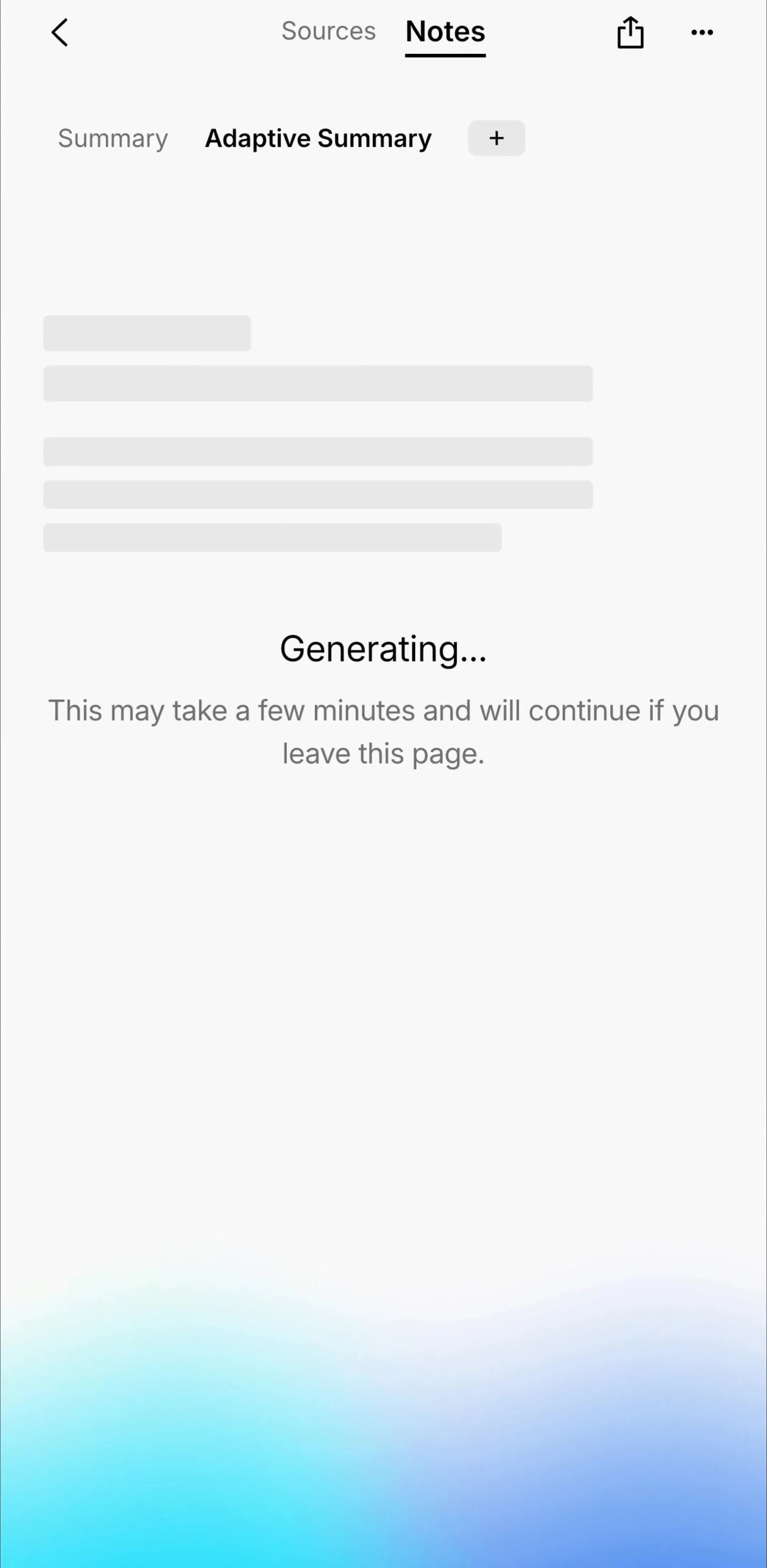
When a wait runs past about ten seconds, an indicator on its own stops being enough. There is nothing to look at, nothing to read, and no way to tell a slow job from a stuck one. The apps that handle this well give the wait a real screen: what is being made, what step it is on, roughly how long, and a way out that does not throw the work away.
Plaud’s summary generation section is a useful reference for the shape, because the wait sits between a recording and a structured result rather than standing alone.
Videa’s media creation flow is the same structure with a longer and less predictable job in the middle, which is the case that most needs naming the step rather than guessing a percentage.
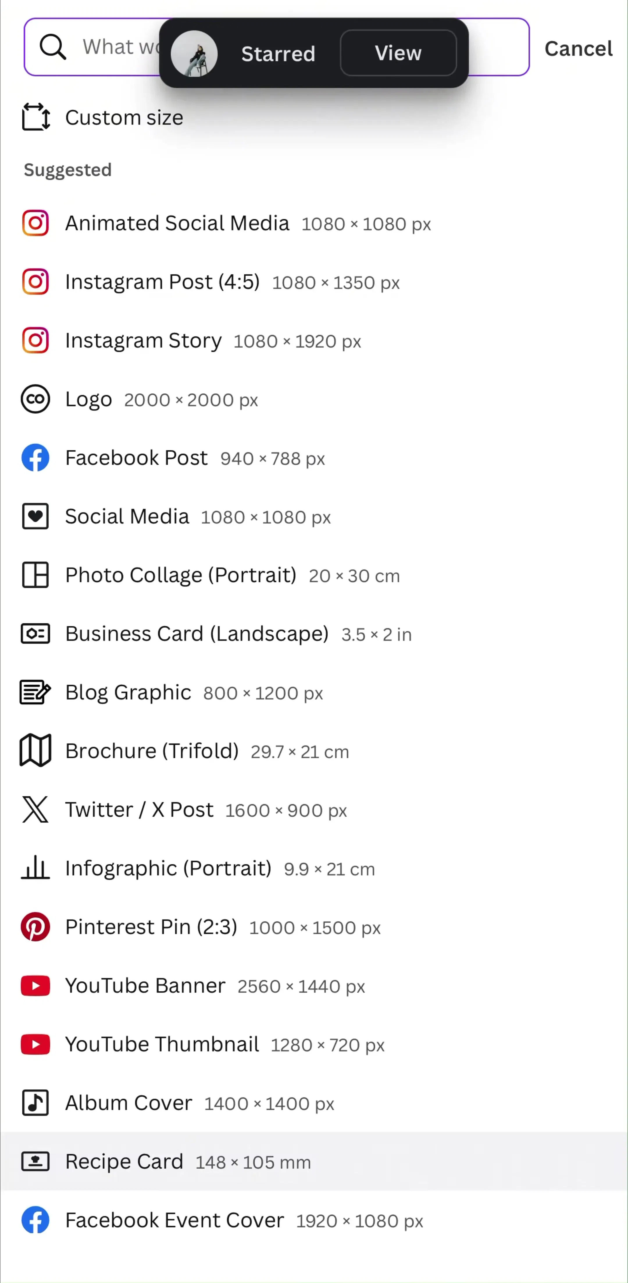
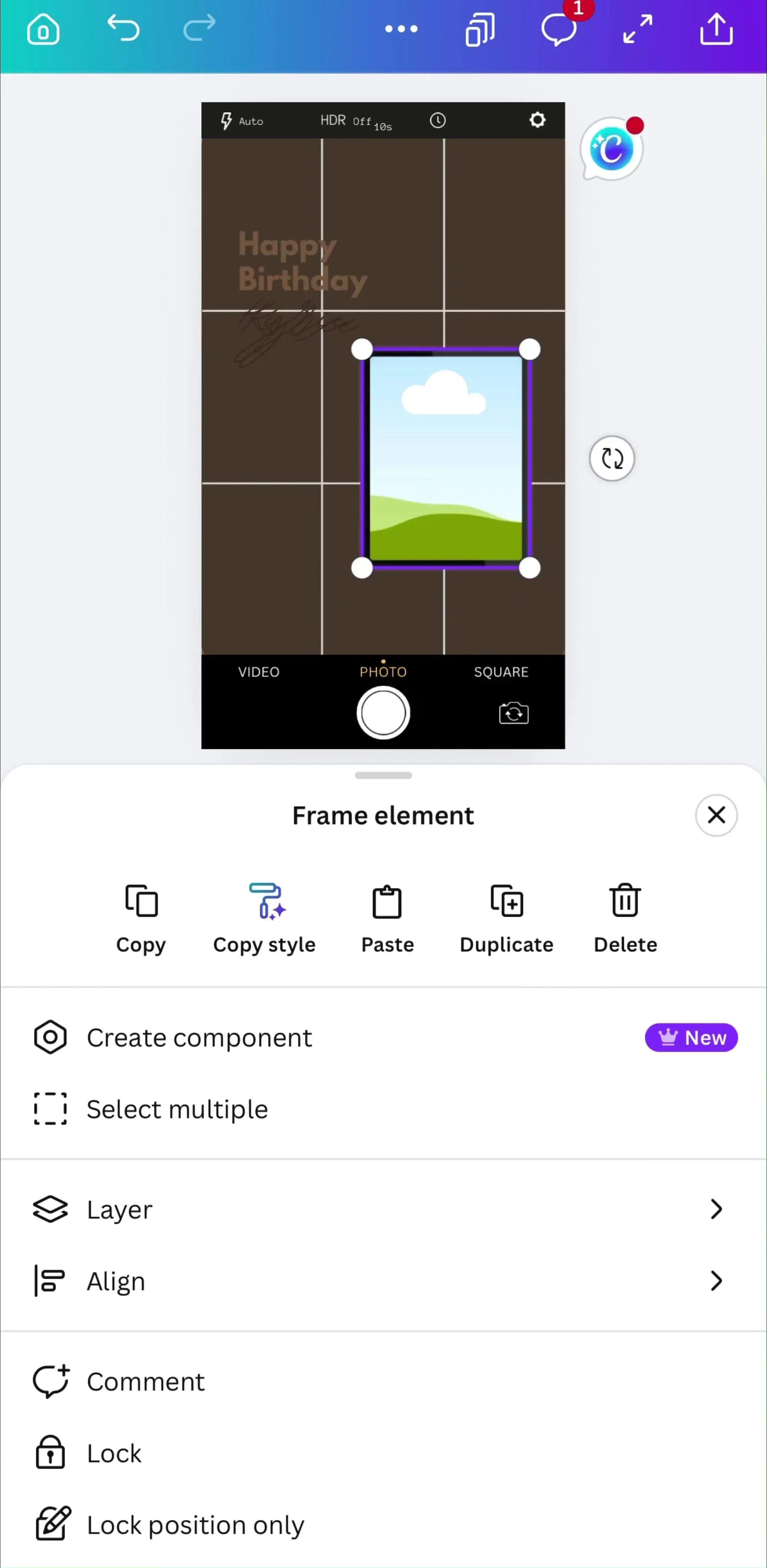
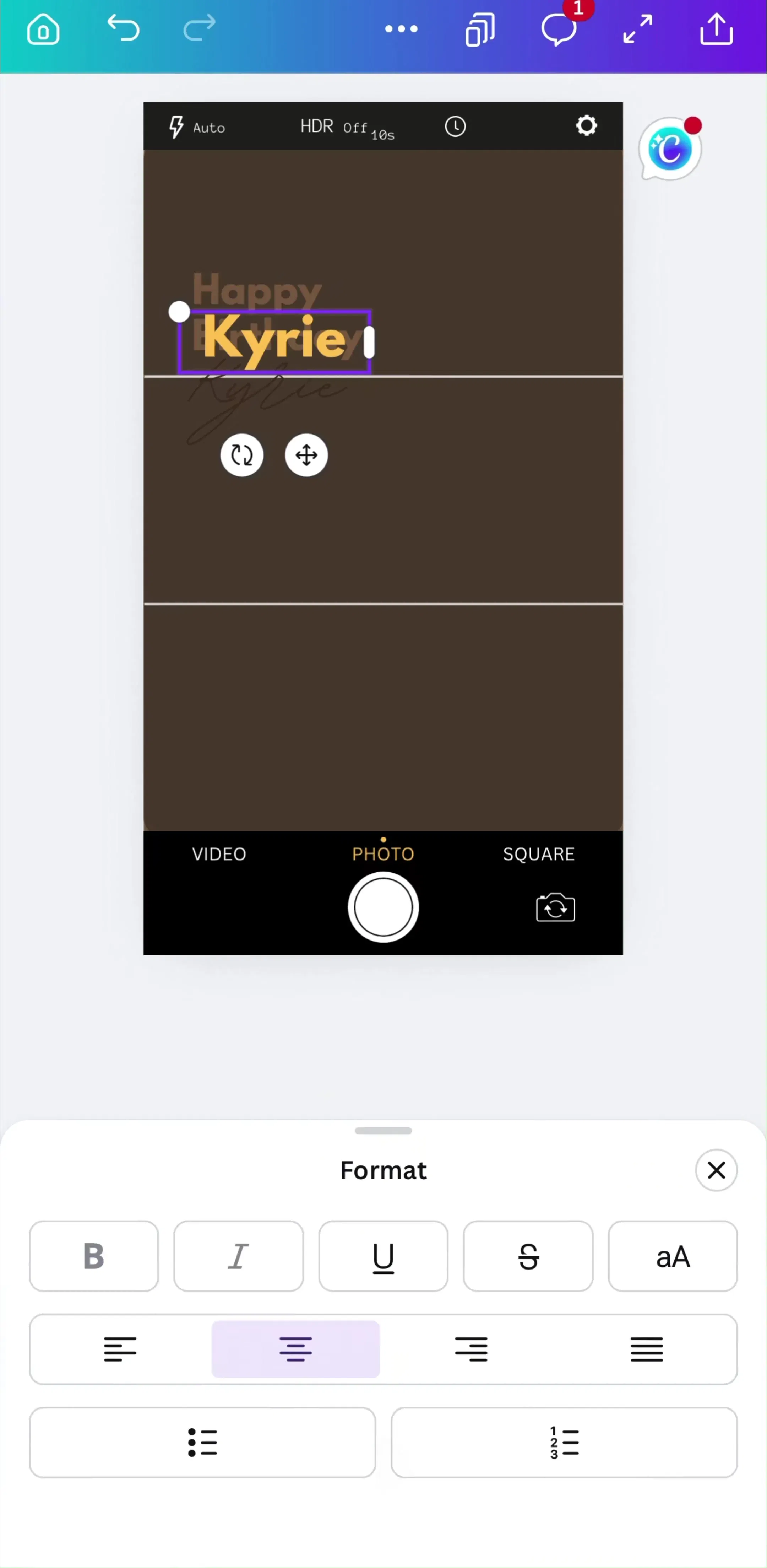
Canva’s story creation section shows the same input-then-result shape inside a full editor rather than a single-purpose generator, which is where the wait has to compete with a screen the user was already working in.
Three things make the difference on this screen. Name the step, because “writing the melody” is information and 47% is not. Keep the input visible or summarised, so the user can see what they asked for. And decide explicitly what happens if they leave: either the job continues and they get told when it lands, or it does not and the screen has to say so before they navigate away.
These three are not interchangeable, and the choice is mostly determined by what is behind the indicator.
A skeleton is right when you know the shape of what is coming: a list of rows, a card grid, a profile header. It holds the layout, so nothing jumps when the content lands, and it implies the content is nearly here. Use it for fetch waits and for the seam at the bottom of a paginated list, which is one of the recommendations in our pagination post.
A spinner is right for short, unmeasurable waits attached to a specific control: a button that submits, a row that saves. Keep it in the control it belongs to rather than covering the screen. A button that becomes a spinner is the standard version, and the button UI post covers the disabled and loading states that go with it.
A determinate bar is right when there is a real quantity: bytes, files, steps, items. If you cannot name the quantity in a sentence, you probably do not have one.
The bar that fills across the top of a long onboarding quiz is not measuring work. It is measuring the user’s own position in a sequence you designed, and it exists to make a twenty step questionnaire feel finite.
That pattern has its own rules, its own failure modes, and its own post: our page indicator post covers dots versus a bar versus a step counter and how many steps a row can carry, and the single select post covers the question screens underneath it. The one rule worth repeating here is that this bar must never move backwards or re-scale mid-flow, because it is the only promise the user has about how long the flow is.
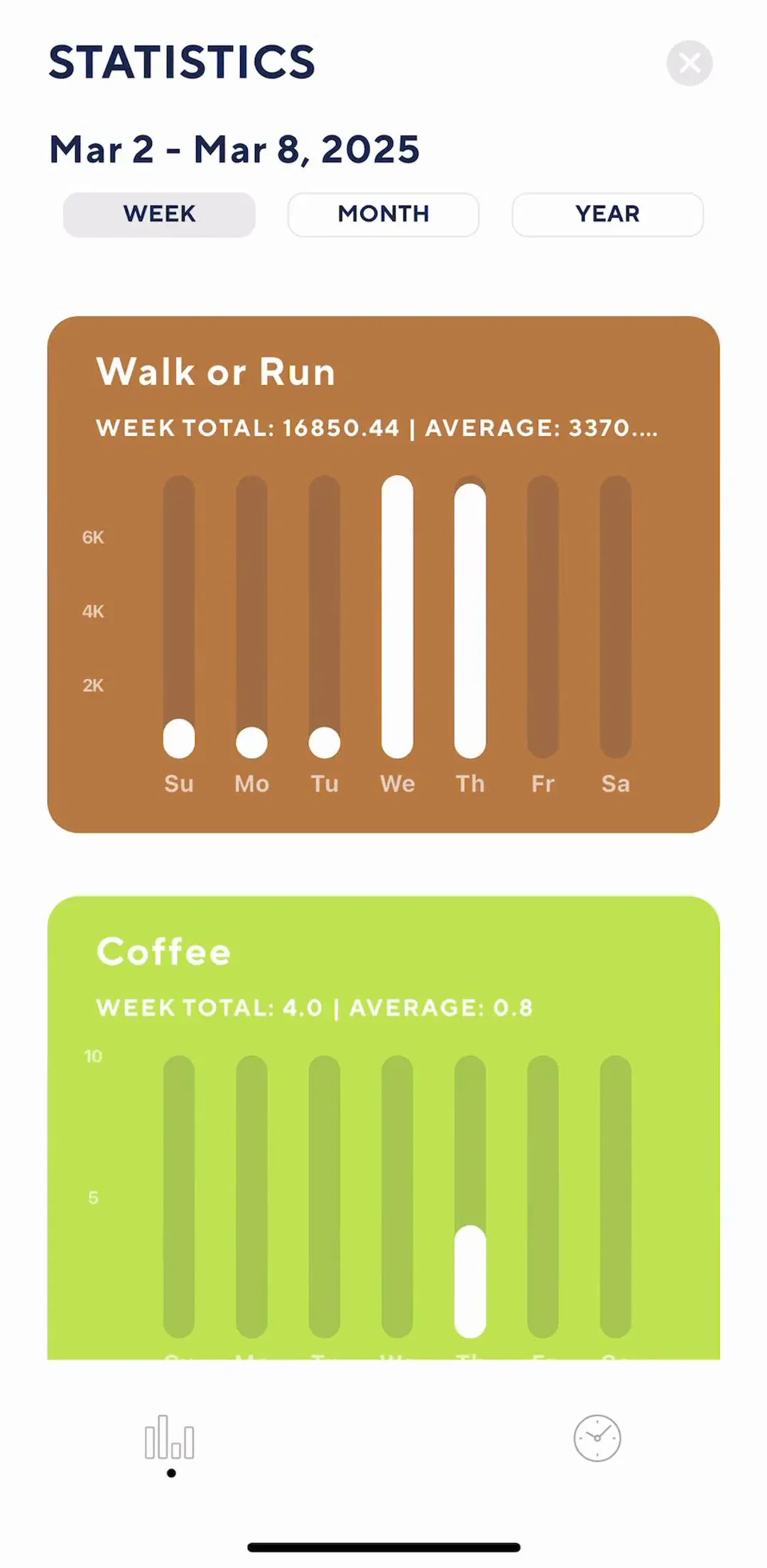
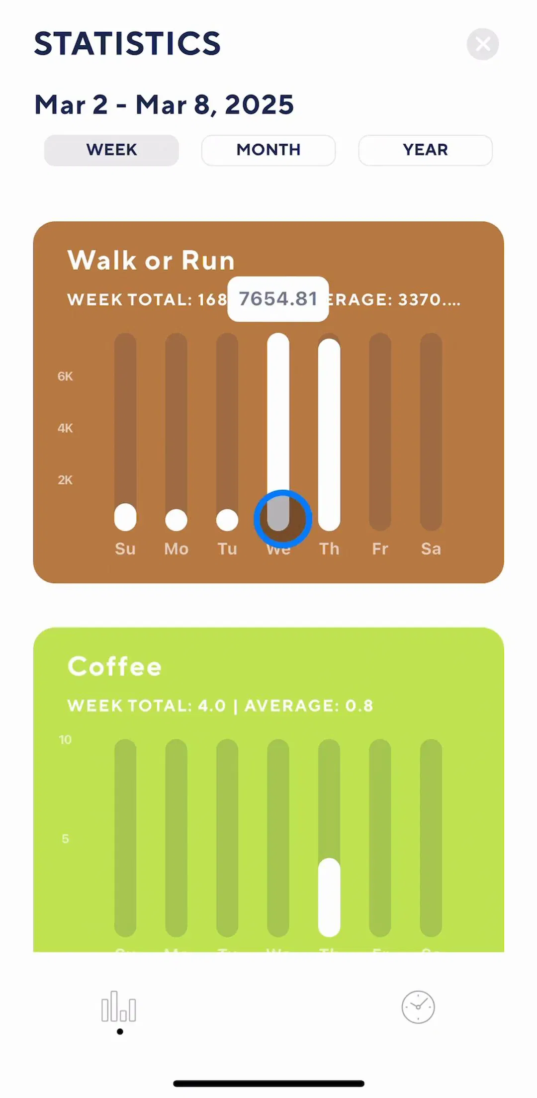
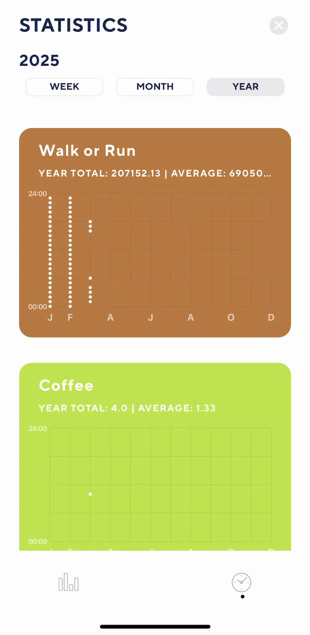
A ring that fills as the user closes in on a step target looks exactly like a loading indicator and means the opposite thing. One reports work the app is doing and is gone in seconds. The other reports something the user did and lives on the screen permanently.
Tally’s statistics section is the persistent kind, where progress is the content rather than an interruption.
Keeping them visually distinct is worth real effort, because a user who reads a goal ring as a loading state will sit and wait for it. We covered the persistent case in detail in the dashboard UI post, where the hero metric and the ring are the screen’s actual subject.
A bar with no words is a shape. Three labelling options, in rough order of usefulness.
The step name. Best when the work has meaningful stages, which is most generation. It converts dead time into an explanation of what you are doing for the money.
The quantity. Best for transfers, where 3 of 12 photos or 14.2 MB of 60 MB is concrete and familiar.
Time remaining. The most useful when it is right and the most damaging when it is wrong. Show it only after the estimate has stabilised, round it generously, and never let it increase: a number that climbs reads as a failure even when the job is healthy.
Percentages alone are the weakest option and the most commonly shipped, because they are the easiest to compute and say the least.
Any wait long enough to need a determinate bar is long enough to need an exit. Cancel should be visible rather than hidden behind a back gesture, and it should say what happens to the work in progress. A cancel that silently discards thirty seconds of generation is a worse outcome than no cancel at all.
Backgrounding is the better answer where the work allows it: let the user leave, finish the job, and tell them. That turns a blocking wait into a notification, which is a trade almost every user takes. The priming and permission side of that is in our notification design post.
Failure is the state teams skip. A bar that reaches the end and shows nothing, or resets to the start, is the worst version. Say what failed, keep the input so the user does not retype it, and offer retry as a real action rather than as an alert the user has to dismiss first.
Attach the indicator to the thing it describes. A bar under a header measures the header; a bar in a row measures the row; a bar filling the screen means the screen is blocked, so only use it when the screen genuinely is. An overlay that dims the whole app for a row-level operation is the most common overreach in this pattern.
Keep the height small enough that the bar reads as a status line rather than a component, and give the track enough contrast against the fill to be legible in both themes, which is one of the specific things that breaks in dark mode. Our dark mode post covers why low-contrast neutrals survive light and fail dark.
For motion, one rule covers most cases: the indicator should never animate faster than the work. A bar that shoots to eighty percent in half a second and then crawls is measuring the animation, not the job.
Before designing the wait, check whether it has to exist. Optimistic updates remove it for anything reversible: show the result, reconcile in the background, and roll back with an explanation if the server disagrees. Prefetching removes it for anything predictable. A local-first write removes it for anything the user typed.
What is left after that is the genuinely slow work, which on a phone in 2026 mostly means generation and transfer. Those two deserve a designed screen. Everything else deserves to be engineered out, and a screen that has had its waits removed is also the screen that needs no empty state for the loading case.
Use a determinate bar only when something real is being counted. Use a skeleton when you know the shape of what is coming, and a spinner only for short waits inside the control that caused them. Give any wait over ten seconds a real screen with the step named, the input visible, and a way out that keeps the work. Never fake the number, never let time remaining climb, and never use the same shape for loading progress and goal progress. Then go back and delete the waits that did not have to be there.
Every screen in the library sits next to the app’s estimated revenue and downloads, so references can be picked by outcome rather than by how the shot looks. Canva (est. $33M/mo), Suno (est. $5.25M/mo), Plaud (est. $4.25M/mo) and Videa (est. $0.2M/mo) are good starting points, because all three put a substantial wait between the user’s input and the result and have had to design it properly. The AI tools flows hold the largest collection of generation waits in the library.
A note on the numbers: revenue figures cited here are third-party monthly estimates from our library, useful for comparing magnitude, not audited financials.
Use a progress bar when you can measure the work, and a spinner when you cannot. A bar that fills in proportion to real progress tells the user how much is left, which is the only thing they want to know. A bar animating against invented progress tells them nothing and costs credibility the moment it stalls at ninety percent. If the duration is unknown and short, a spinner is honest; if it is unknown and long, the screen needs words, not a shape.
Under about one second, show nothing: an indicator that appears and vanishes reads as a flicker. From roughly one to four seconds, an indeterminate indicator in place is enough. Beyond that the user starts wondering whether the app is working, and the screen owes them a determinate measure, a description of the step, or both. Past about ten seconds, add a way to leave without losing the work.
Smoothing is acceptable, invention is not. If the real signal arrives in jumps, animating between the known values is a presentation choice that keeps the bar readable. Running a timer that fills to ninety percent and waits there is a different thing: it makes a promise you did not measure, and users have learned to read a long pause at ninety percent as a failure. When progress genuinely cannot be measured, name the current step instead.
Prefer the step name over the percentage when the steps are meaningful, because the step tells the user what is happening while the number only tells them how long. Percentages work for downloads and uploads, where the quantity is real and familiar. Time remaining is the most useful and the hardest to get right, so show it only once the estimate has settled, and never let it count upward.
No, and treating them the same is a common mistake. A loading bar measures work the app is doing right now and disappears when it finishes. A goal ring measures something the user did and is a permanent part of the screen. They look alike and mean opposite things, so a screen that uses the same shape for both will be misread. Keep loading indicators transient and progress toward goals persistent and clearly labelled.
The mobileappdesign library holds captured flows from 2,622 revenue-verified iOS apps, including 1,049 with a content creation section and 591 with an AI tools section. Because flows are captured in sequence, the wait screen appears between the input that triggered it and the result that followed, which is the context that decides whether the wait was designed well.
Browse captured content creation flows from revenue-verified iOS apps, with the input, the wait and the result in sequence.
Browse creation screens