Search for pagination UI and you get a row of numbered buttons: previous, 1, 2, 3, next. Every design system ships one, every component library has one, and almost no mobile app uses it. Of the 2,622 revenue-verified iOS apps in our library, 1,176 have a captured browse and feed section across 1,417 sections, and the numbered control is essentially absent from them.
That absence is the interesting part. Pagination as a problem did not go away on mobile: lists are longer than ever and the data still arrives in batches. What went away is the control. The work moved into scroll behaviour, into a single button at the end of a list, and into the swipe. So this post is about pagination design as mobile actually practises it, which decision each form encodes, and the handful of places where page numbers still earn their keep.
Numbered pagination is a product of three things the desktop web has and a phone does not. It assumes a pointer precise enough to hit a 24 pixel target in a row of ten. It assumes an address bar, so that page 4 is a place with a URL that can be linked, bookmarked and returned to. And it assumes a footer the user can reach, which on an infinite list is a destination that keeps moving away.
Take those three away and the control loses its reason to exist. A page number on a phone is a small target pointing at a position that is not stable: insert one new item at the top of the feed and everything the user thought was on page 3 is now on page 4. The web papered over that with cursor-based paging behind the same numbered facade. Mobile skipped the facade.
Infinite scroll. The next batch loads as the user approaches the bottom, and the list has no visible seam. This is the default for feeds, rails and anything whose value is browsing rather than finding.
The load more button. The list stops, a button appears, the user decides. One tap costs almost nothing and buys back a stable bottom edge and an explicit choice.
The paged view. Content is cut into full-screen units the user swipes between, with dots or a counter showing position. Onboarding, image galleries and short-form video all work this way.
These are not three styles of the same thing. Each one encodes a different belief about what the user is doing, and picking the wrong one is the usual cause of a feed that feels either exhausting or truncated.
Infinite scroll is right when the content is genuinely browsable, when there is no destination, and when the user leaving the list satisfied after thirty seconds is a success rather than a failure. Social feeds, discovery surfaces and content libraries all qualify. Hevy’s social feed section is the clearest shape of this in the library: a single column the user flicks through with no expectation of reaching an end.
The costs are real and they are all structural. There is no footer, so anything you were planning to put below the list now needs another home. There is no sense of scale, so the user cannot tell whether they have seen ten percent of the library or ninety. There is no natural stopping point, which is a product decision as much as a design one. And scroll position becomes state you are now responsible for, which is section 6.
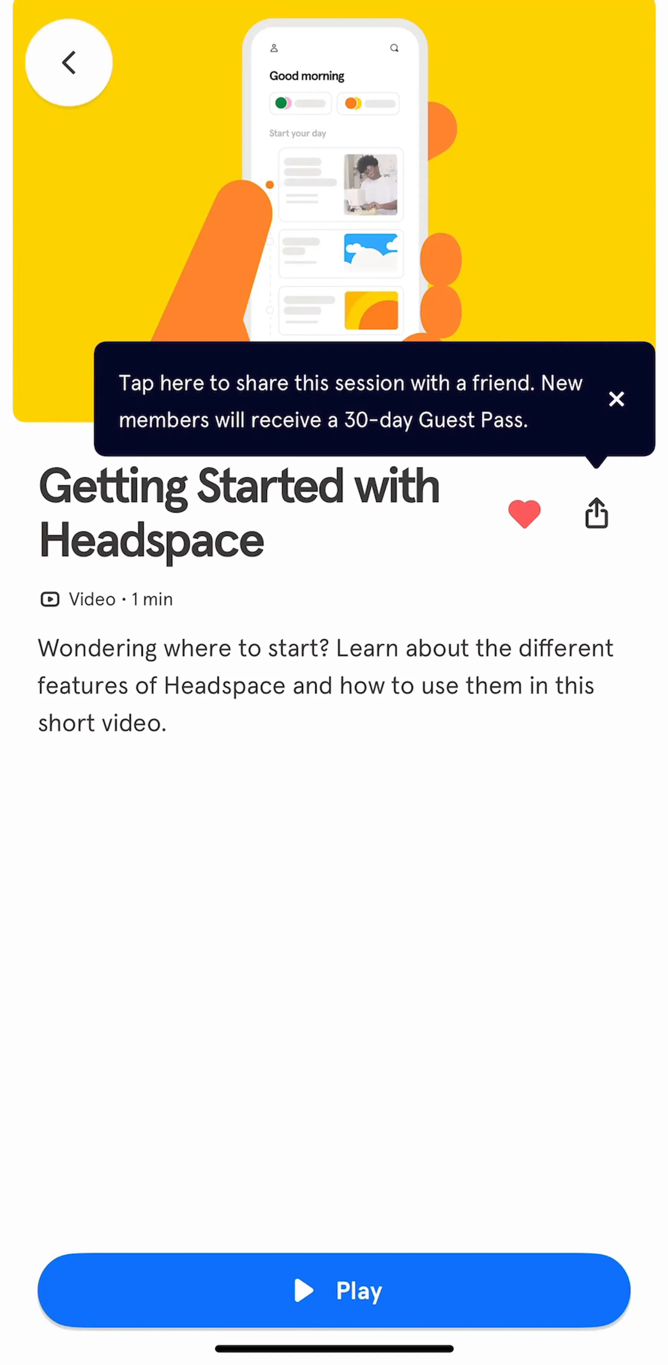
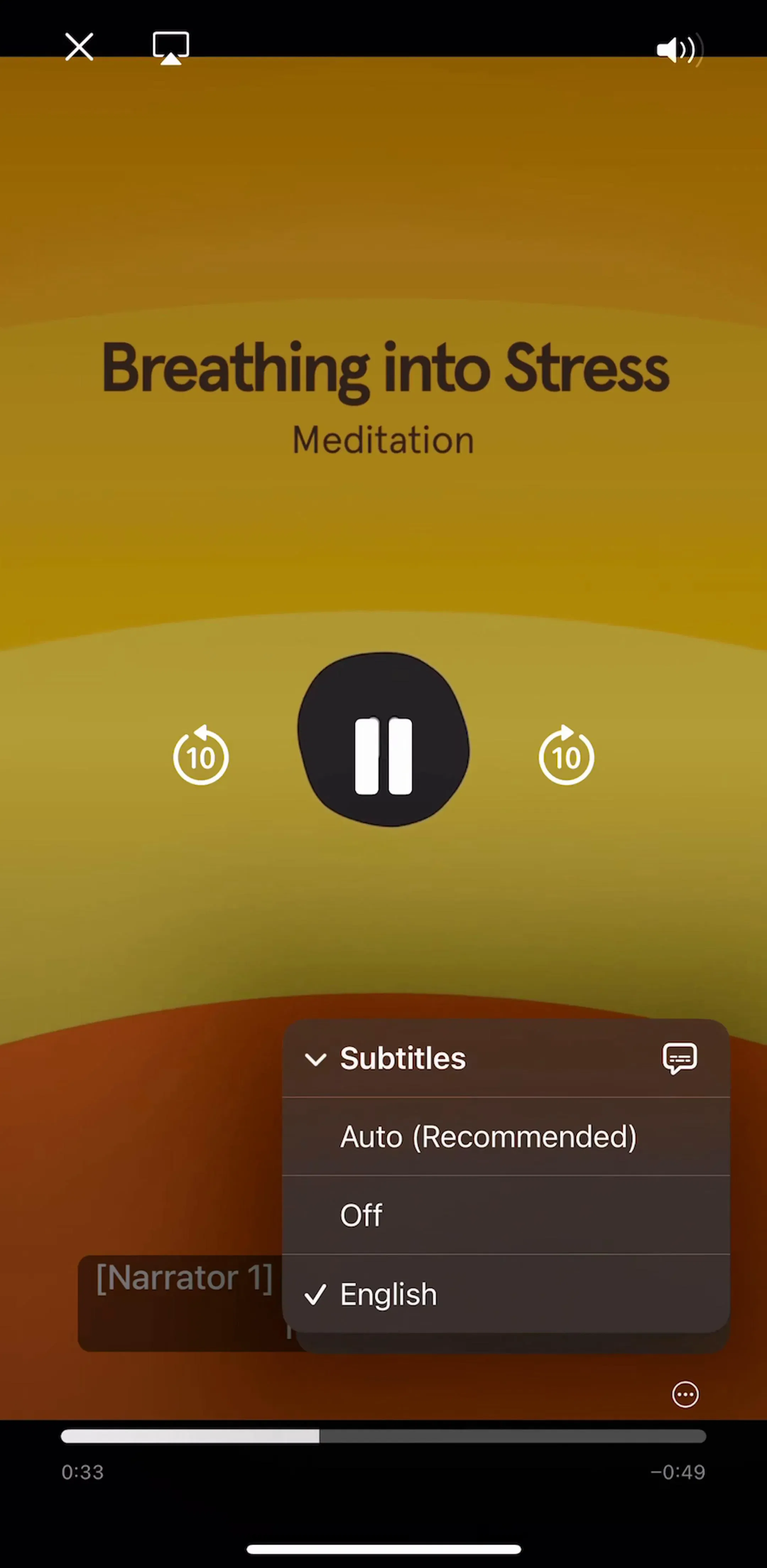
The version that works hardest is the browse surface that mixes sections rather than running one flat list. Headspace’s content browsing section is built from grouped rails, so the vertical scroll is finite and the horizontal rails carry the depth.
A load more button is infinite scroll with the trigger handed back to the user, and it wins in three situations that come up more often than teams expect.
When the list has an end the user cares about, a button lets them see it. When something has to live below the list, such as a related section or a footer action, the button is what makes that reachable. And when each load costs real money, data or battery, an explicit tap is the honest interaction: a generated result, a large media batch or a metered API should not keep loading because a thumb kept moving.
Design it as a full-width, clearly labelled control that shows how many more items are coming when you know, and replaces itself with a progress state while loading rather than disappearing. The rules in our button UI post apply here without change: one primary action, full width, a label that says what happens.
The third form cuts content into screens the user swipes between. This is pagination in the literal sense, and it is the one place the word survives on mobile: the dots under an onboarding carousel are called a page control on iOS.
That belongs to a different post. Our page indicator post covers dots versus a progress bar versus a step counter, how many dots a row can carry, and whether they should be tappable. Everything here is about the other problem: a list that is longer than one load, where the user is scrolling rather than swiping between fixed units.
The practical test is whether the content has a fixed number of units decided by you (paged view) or an open-ended number decided by the data (scroll or load more). Onboarding has five steps. A feed does not have five anything.
The most common pagination failure on mobile is not the loading strategy. It is losing the user’s place. Scroll a feed for forty seconds, tap an item, read it, come back, and the list is at the top with one page loaded. Everything the user built is gone, and the app has made scrolling feel expensive.
This shows up clearly in captured flows, because the library records the sequence rather than a single screen: the feed, the item opened from it, and the screen the user lands on when they return. The fix is to treat the loaded pages and the scroll offset as state belonging to the navigation stack, not to the view. If the list can be rebuilt, it will be, usually on the slowest phone you have.
Reading apps have the same problem in a stricter form, since position is the whole product. NaturalReader’s reading section is a useful reference for what continuous content looks like when the position has to survive everything.
Three numbers decide whether pagination is felt at all.
Page size. Enough to fill the viewport about twice. For a standard row list that is roughly twenty items; for a two-column media grid, closer to thirty. Too few and the user out-scrolls the loader on every flick. Too many and you are paying for content nobody reaches.
The trigger point. Start the next request around one screen height from the bottom, not at the bottom. The whole point of infinite scroll is that the seam is invisible, and a seam is visible the moment the user has to wait at it.
The state at the seam. When a load is genuinely in flight, show it in the list, sized like the rows that are coming rather than as a centred spinner that shifts the layout. We cover the choice between a bar, a spinner and a skeleton in the progress bar post; for a list boundary the answer is nearly always a placeholder row, because it holds the height the new content will take.
An infinite list that quietly stops is indistinguishable from a broken one. When the data runs out, say so: a short end marker, or a section that offers the obvious next move, such as adjusting a filter or following more accounts. The user has reached the end of something, which is worth acknowledging.
The zero case is a different screen altogether. A list with no items is not a pagination problem and should not look like a loading state, which is the argument in our empty state post. A filtered list with no matches is different again, and belongs with the applied filters and the clear control covered in the filter UI post.
Search is where counts matter and where the user does have a destination. Reporting how many results exist is useful information, not decoration, and a result set is the one list where a user might legitimately want to skip ahead.
Even here the answer is rarely a numbered row. It is a count at the top, strong sorting and filtering, and scroll below it, which is the structure described in our search bar post. The count does the work the page numbers used to do: it tells the user how big the thing they are inside actually is.
Books, PDFs and scores have pages that exist outside your app. The page number is a location a reader wants to jump to, quote and return to, so a scrubber, a jump-to control and a page count all earn their place. This is the only mobile context where numbered navigation is the honest answer rather than a web habit, and it is worth noticing that it is also the only one where the pages were not invented by the pagination.
Use infinite scroll for browsable content with no destination. Use a load more button when the list has an end that matters, when something must live below it, or when each load costs something. Use a paged view only when the number of units is fixed and you chose it. Load about two screens at a time, trigger one screen early, hold the height at the seam, say when the list ends, and above all restore the scroll position when the user comes back. Numbered pages belong to documents and result counts, not to feeds.
Every screen in the library sits next to the app’s estimated revenue and downloads, so references can be picked by outcome rather than by how the shot looks. Headspace (est. $2M/mo), Clue (est. $1.25M/mo) and Hevy (est. $0.75M/mo) are good starting points, because all three carry long browsable surfaces without a numbered control anywhere in them. The view and consume flows are the place to look for the other half of the problem, which is what happens after the user taps a row.
A note on the numbers: revenue figures cited here are third-party monthly estimates from our library, useful for comparing magnitude, not audited financials.
Pagination is any technique that splits a long list of content into smaller loads instead of delivering all of it at once. On the web it usually means numbered page links at the bottom of a list. On mobile the same job is done by infinite scroll, a load more button or a swipeable paged view, because the numbered control depends on precise clicking and a visible address bar, and a phone has neither.
Use infinite scroll when the content is browsable and the user has no particular destination, such as a social feed or a recommendations rail. Use a load more button when the list has an end the user cares about, when there is something below the list that needs to stay reachable, or when each load is expensive in data or money. The button costs one tap and buys back control, a stable footer and a natural resting point.
Enough to fill the screen twice over, which for a typical row list is around twenty items and for a media grid is closer to thirty. Load the next batch when the user is roughly one screen height from the bottom, so the new rows are already in place before the scroll reaches them. Loading too few produces a visible stutter on every flick; loading too many wastes data the user never scrolls to.
Because the screen is being rebuilt from the first page instead of restoring the loaded pages and the scroll offset. This is the single most common pagination defect on mobile, and it hurts most in exactly the flow pagination exists to support: scroll a long way, open an item, come back. Persist the loaded pages and the scroll position for the lifetime of the navigation stack, not just the view.
Two cases. Long fixed documents like books and PDFs, where the page is a real location the reader wants to jump to and remember. And result sets where the count itself is the information, such as a search that reports how many matches exist. Outside those, a numbered control on a phone is a row of small targets pointing at positions that change every time the data does.
The mobileappdesign library holds captured flows from 2,622 revenue-verified iOS apps, including 1,176 with a browse and feed section that carries screens across 1,417 captured sections. Flows are captured in sequence, so you can see the feed, the item the user opened from it, and the state they returned to, which is where most pagination decisions actually show.
Browse captured browse and feed flows from revenue-verified iOS apps, in the order a real user walks them.
Browse feed screens