Almost every published guide to filter UI design is written for enterprise tables and ecommerce sidebars, where there is room for a permanent left rail of checkboxes. A phone has no left rail. Filtering there is a sequence of screens, and the design work is deciding which criteria are worth the interruption and what the list looks like once someone comes back. Of the 2,622 revenue-verified iOS apps in our library, 310 ship a search and filter flow. Here is what those flows have in common.
It helps to stop thinking about the filter panel and start thinking about the round trip. There is the entry point, usually a button or a chip row sitting above the results. There is the selection surface, a sheet or a full screen. And there is the return state, the results list carrying evidence of what was applied. Teams tend to spend all their effort on the middle one, which is the surface people spend the least time on.
The return state is where filtering succeeds or fails. If someone lands back on a shorter list with no visible reason why, the app has quietly become confusing, and the usual consequence is not complaint but abandonment.
A horizontal chip row is cheap: it costs one line of vertical space, applies instantly, and keeps the current state permanently visible. It stops working once options need ranges, multiple groups, or mutually dependent choices. The pattern that survives contact with real catalogs is a hybrid, where the two or three filters that carry most of the usage sit in a chip row and a Filters button opens everything else.
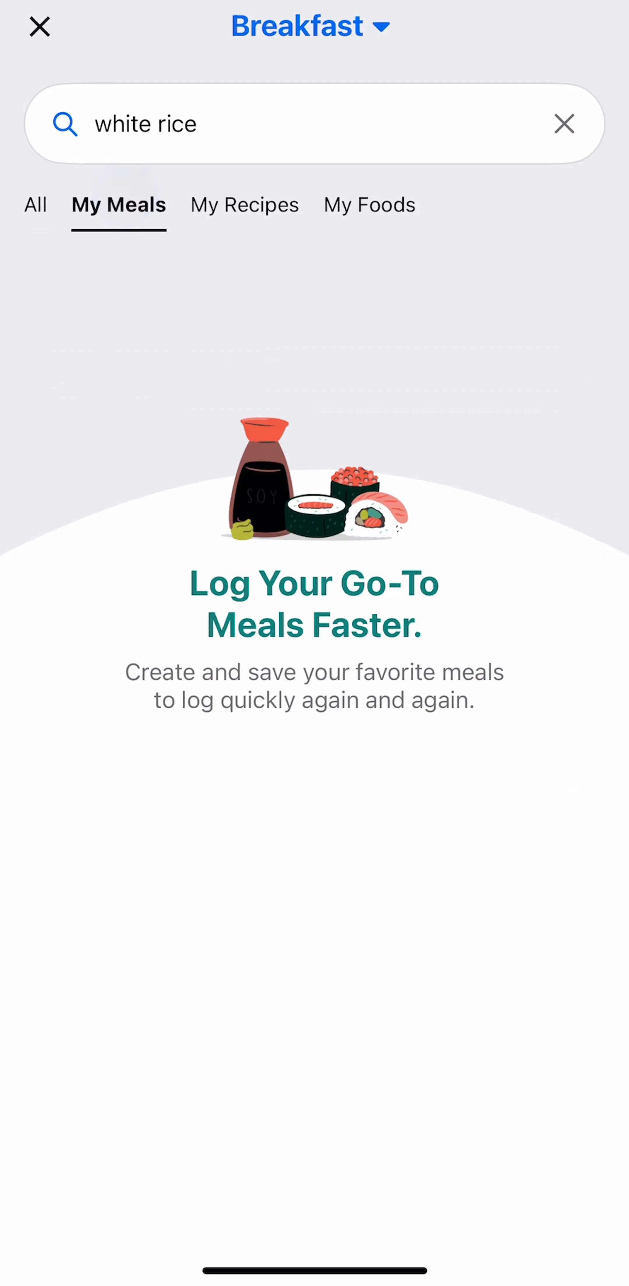
Food logging is a good place to watch this, because the query is high-frequency and the result set is enormous. MyFitnessPal (est. $12M/mo) has to get someone from an open search field to a logged item in a few taps, several times a day.
Sort changes the order of a set. Filter changes the membership of a set. They feel adjacent because they sit next to each other, but burying sort inside a filter sheet means every change of ordering costs an open, a scroll, an apply, and a dismiss. Keep sort as its own control, either beside the filter entry point or pinned at the top of the results list.
A filter sheet that shows how many results the current selection will return removes the main risk of filtering, which is narrowing to zero and having to guess which criterion was too strict. The count also does quiet teaching work: it shows which filters are cheap and which ones are destructive. Where an app cannot compute the count cheaply, the fallback is to make the empty result recoverable rather than to hide the problem.
Discovery products with large geographic catalogs lean on this hard. AllTrails (est. $6M/mo) and komoot (est. $4M/mo) both filter a set where the wrong combination of distance, difficulty, and location can easily produce nothing.
Once someone dismisses the sheet, the filter state lives in their memory unless the interface holds it. Shipped apps solve this three ways, in rough order of how well they work: keeping the applied chips visible above the list, badging the Filters button with a count, and changing the header to describe the current query. The first is best because it also gives each filter its own removal target.
Every filter interface needs a way back to the unfiltered set, and it should not require opening the sheet and undoing each selection. It also should not sit next to Apply, because the cost of a mis-tap is losing a carefully assembled query. The usual resolution is a Clear or Reset control in the sheet header, far from the primary action at the bottom.
Filtering a catalog someone is browsing and filtering content they already own are not the same task. In a personal library the set is small, familiar, and organized by the user, so the useful controls are closer to sorting and grouping than to faceted search. Notes and reading apps make this obvious: Evernote (est. $750k/mo), Litres (est. $250k/mo), and Wattpad (est. $1M/mo) all run filtering over a personal shelf as well as over a public catalog, and the two surfaces look different in each of them. The same split shows up across saved libraries and collections.
A filtered set that returns nothing is not an error, it is a normal outcome of a narrow query, and it deserves a designed screen rather than a blank list. The version that works restates the query, offers to relax the most restrictive criterion, and keeps a one-tap path back to the full set. We covered the general shape of that screen in the empty state breakdown, and the no-results case is the one worth building first, because it is the one users hit most.
Filtering is easy to evaluate badly from single screenshots, because a filter panel out of context always looks reasonable. What you want to see is the sequence: the list before, the sheet, and the list after. Every screen in the library sits in its captured order next to the app’s estimated revenue and downloads, so you can pick references by outcome rather than by taste, and then compare against a catalog-heavy product in a different category to see which decisions are conventions and which are just habits.
A note on the numbers: revenue figures cited here are third-party monthly estimates from our library, useful for comparing magnitude, not audited financials.
Filter UI design is how an interface lets someone narrow a set of results by criteria such as category, price, distance, or date. On mobile it covers three separate surfaces: the control that opens filtering, the screen or sheet where criteria are chosen, and the state shown on the results list once filters are applied.
Chips work when you have a handful of single-choice options that fit in one scrollable row, because they apply instantly and stay visible. A sheet is the right answer once you have multiple filter groups, ranges, or anything that needs an Apply step. Many shipped apps run both: a chip row for the two or three filters people actually use, and a sheet behind a Filters button for everything else.
Sort and filter do different jobs, so combining them into one control forces people to open a sheet to change ordering. Most shipped apps keep sort as its own control next to filters, or place it at the top of the results list, so changing order never costs a round trip through a filter screen.
Instant application suits single controls where the result is visible behind the control, such as a chip row over a live list. An explicit Apply suits full sheets, where someone is setting several criteria at once and re-querying on every tap is both expensive and disorienting. The rule that holds is that the pattern should be consistent within one app.
The mobileappdesign library holds captured flows from 2,622 revenue-verified iOS apps, and 310 of them ship a search and filter flow. Because the screens are captured in sequence, you can see the state before filtering, the filter surface itself, and the filtered result, rather than one isolated shot of a filter panel.
Browse captured search and filter flows from revenue-verified iOS apps, with revenue and download estimates next to every screen.
Browse search and filter screens