Search for recording UI design and the results agree on one screen: a big red circle, a scrolling waveform and a timer counting up. That screen exists in shipping apps, and it is also the least interesting part of them. Across the 2,622 revenue-verified iOS apps in our library, 55 carry a captured audio recording flow, 71 recording sections between them, and 33 of those 55 describe themselves in their App Store name as a note taker, a transcriber or a meeting recorder. The recording is the input. What people open the app for is what comes out of it. This post covers the record button, but mostly it covers the screens around it: the microphone ask, the empty library, the transcript and summary, and deletion.
The category mix makes the shift plain. 25 of the 55 apps are productivity apps and 10 are music apps; the rest are utilities, business and education tools. In the productivity set the product is almost never the audio file. It is a transcript, a summary, a list of action items, or a note that can be searched later.
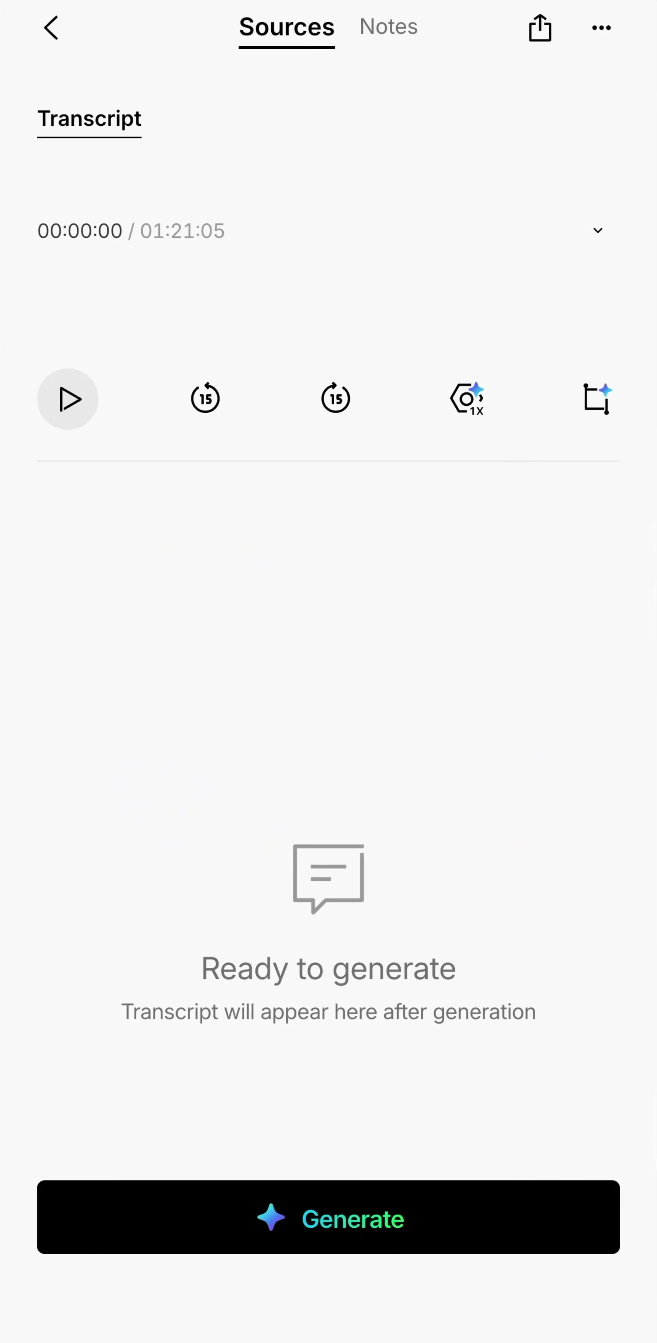
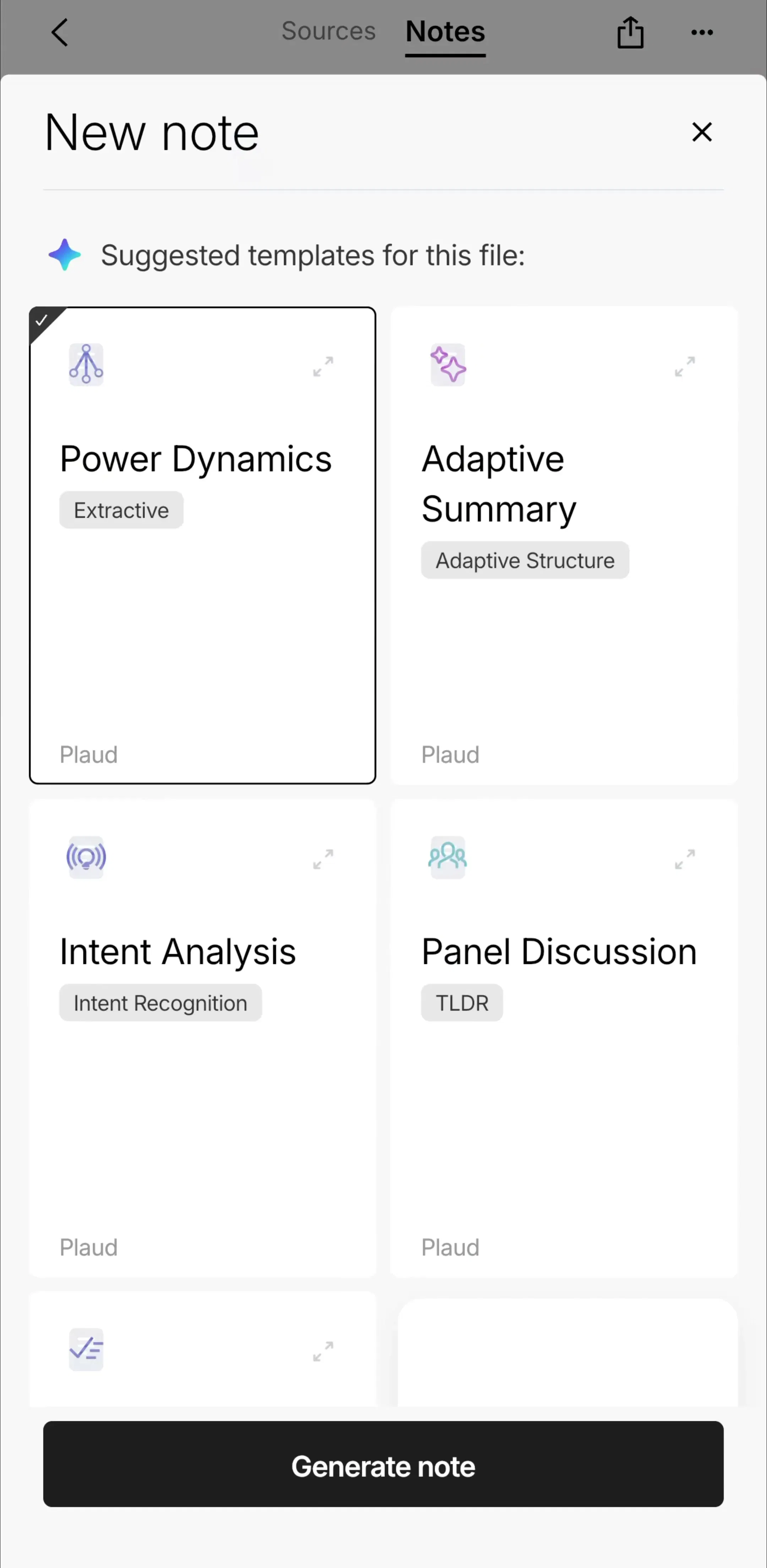
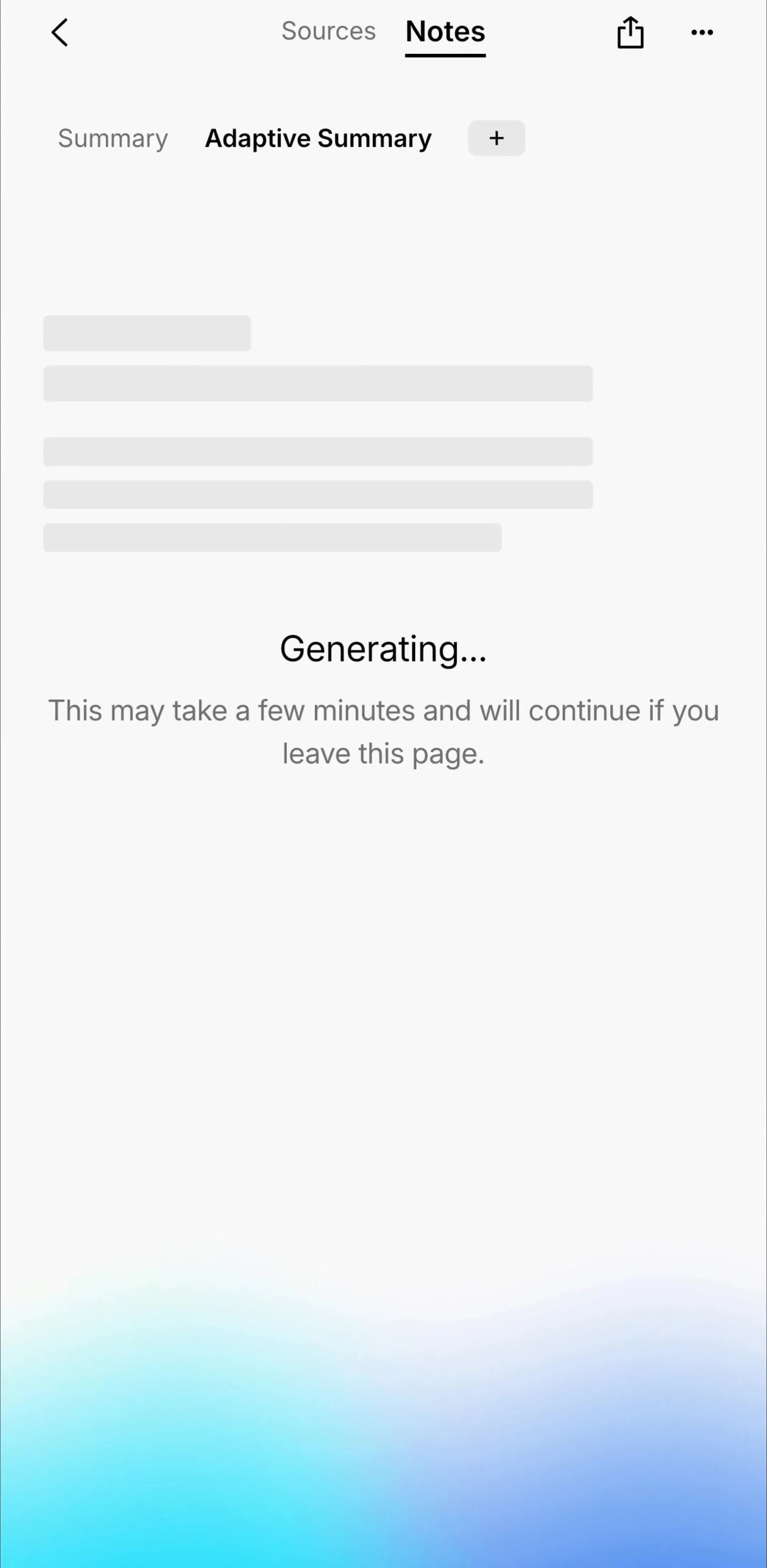
Plaud (est. $4.25M/mo) is the clearest case. Its captured free screens after a recording start with a transcript tab that reads Ready to generate above a single Generate button, then a sheet of suggested note templates for the file, then a generating state that tells the user the work will continue if they leave the page. The strip below begins after the audio already exists, which is where most of the design effort in these apps goes. Revenue figures in this post are third-party estimates, not audited financials.
That changes the brief. If the audio becomes a document, the recording screen should be fast and forgettable, and the screens after it need the care you would give an editor: clear states while processing, a readable transcript, and obvious ways to turn it into something else.
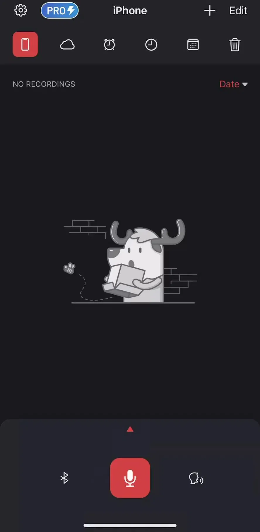
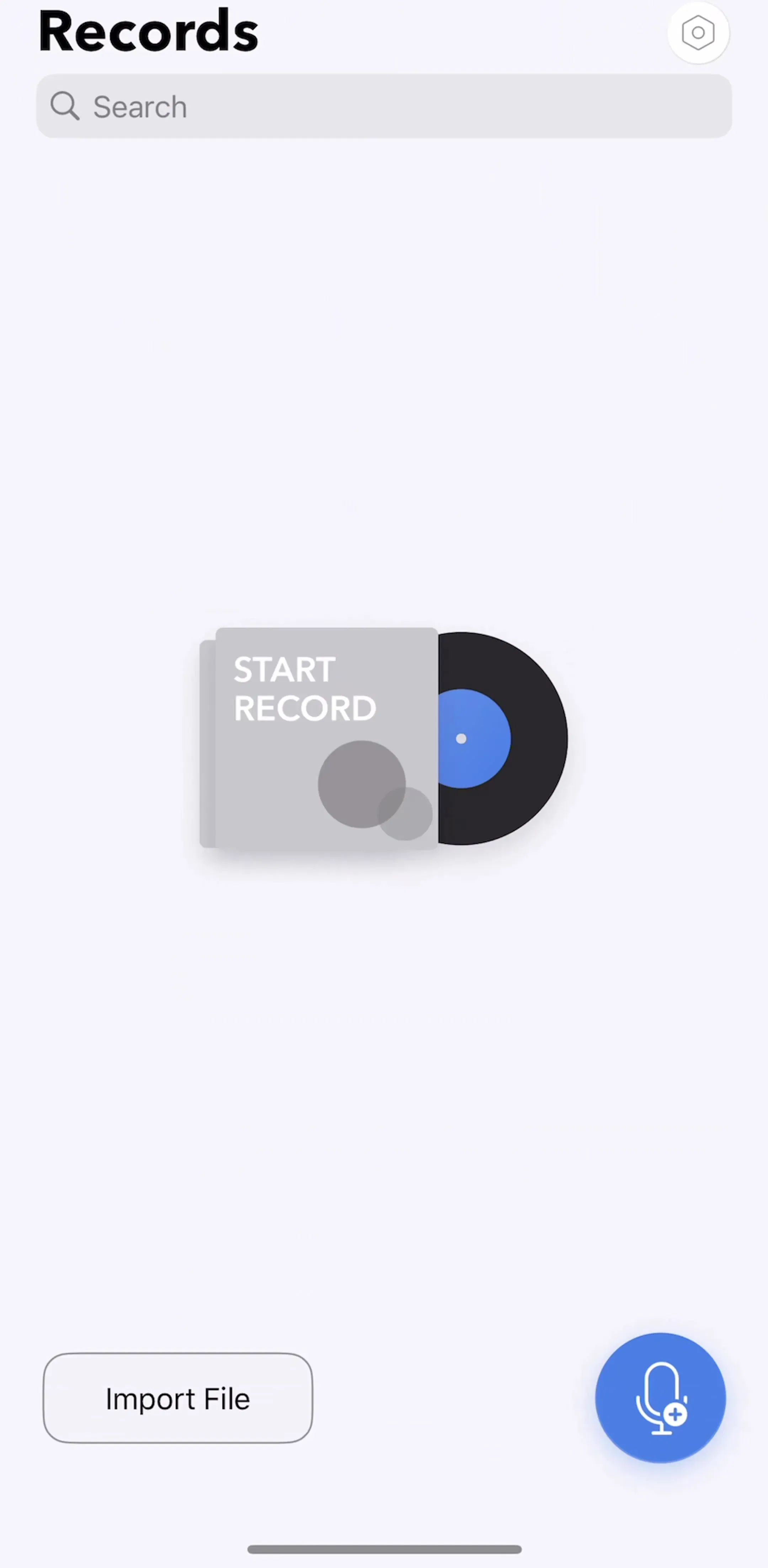
The shipping apps disagree on where the button goes and agree on almost everything else. Voice Recorder & Notes Pro (est. $0.045M/mo) puts a large red microphone button in the middle of a bottom tray, flanked by two smaller controls. iRecord and Otter (est. $1M/mo) put a microphone button in the centre of the tab bar, the slot other apps reserve for a create action. Voice Recorder: Audio Memos (est. $0.25M/mo) uses a floating circular button in the lower right, beside an Import File button.
What they share: the button is the largest target on the screen, it sits in the bottom third, and nothing else competes with it. The general rules from our button UI post apply, with one addition. A record button has to show state. Idle, recording and paused must look different at a glance, because the most expensive mistake in this category is a user who believes they are recording when they are not.
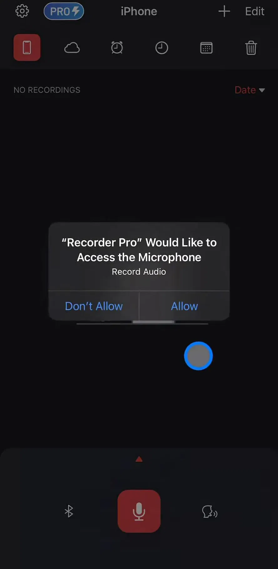
Only one of the 55 apps captures a standalone permissions section. The rest ask inside the recording flow, which is the right place. The strip above shows the system microphone alert appearing over the recording screen itself, and Voice Translate does the same, with a purpose string explaining that the microphone is used for speech recognition.
The purpose string is the one line inside that system alert that you control, and it is easy to waste on two words. Say what happens to the audio: whether it stays on the device, whether it is transcribed on a server, whether it is used for anything else. Then design the denied state. If the user taps Don’t Allow, the record button should not simply do nothing; it should explain that the microphone is off and link to Settings. Our notification design post covers priming screens before a system prompt. For the microphone, a well-timed ask at the first tap usually makes a priming screen unnecessary, because the user has just told you what they want. The captured permission flows are collected on the permissions pattern page.
Before the first recording, the home screen is an empty list, and in this category that empty list is what a new user sees straight after onboarding. The free screens show three answers. Voice Recorder: Audio Memos fills the space with an illustration labelled Start Record and keeps a search field and an Import File button in place. Voice Recorder & Notes Pro shows a No Recordings label over an illustration. Summary (est. $0.9M/mo) says Start your first recording above a single New Summary button, with filter chips already sitting above the list.
The better empty states point at the action and say what the list will hold. The principle from our empty state post holds: replace missing content with the action that creates it. One detail is specific to recording: 16 of the 55 apps also capture an import flow for audio recorded somewhere else, so the empty state is a good place to say that an existing voice memo or meeting file can come in too.
The recording state is where the concept work spends its effort, and most of its conventions are sound. Elapsed time should be the largest text on screen, because it is the question users ask most while recording. A live level meter or waveform proves the microphone is hearing something, which matters more than it looks: a flat line is the fastest way for a user to notice a muted input or the wrong microphone. Pause and stop should be separate controls with different shapes, since confusing them ends a recording that cannot be repeated.
Two states are easy to forget. Recording carries on when the screen locks or the user switches apps, and iOS shows its own microphone indicator while that happens, so the app should show the same truth when the user comes back: still recording, and for how long. And long sessions end in interruptions, a phone call or a full disk, so the app needs a plain message about what was saved when recording stopped on its own.
Once audio exists, these apps become reading tools. iRecord (est. $0.15M/mo) captures a transcript screen with Transcript and AI Summary tabs, timestamps beside each paragraph, a prompt to rate transcript quality and a playback bar pinned to the bottom. Otter starts even earlier: its home screen is an agenda of calendar events with a notetaker toggle on the event and an AI Notetaker button, so the recording is scheduled rather than started by hand.
Three things separate a good post-recording screen from a slow one. First, an honest processing state: transcription and summaries take time, and Plaud’s message that generation continues if the user leaves is worth copying, because it removes the reason to sit and watch a spinner. Second, a link between text and audio, so tapping a line in the transcript plays that moment; the playback controls themselves are covered in our audio player UI post. Third, a way out of the app: a share link, an export or a copy button, since the transcript usually ends up somewhere else. More of these generate-and-review flows sit on the AI tools pattern page.
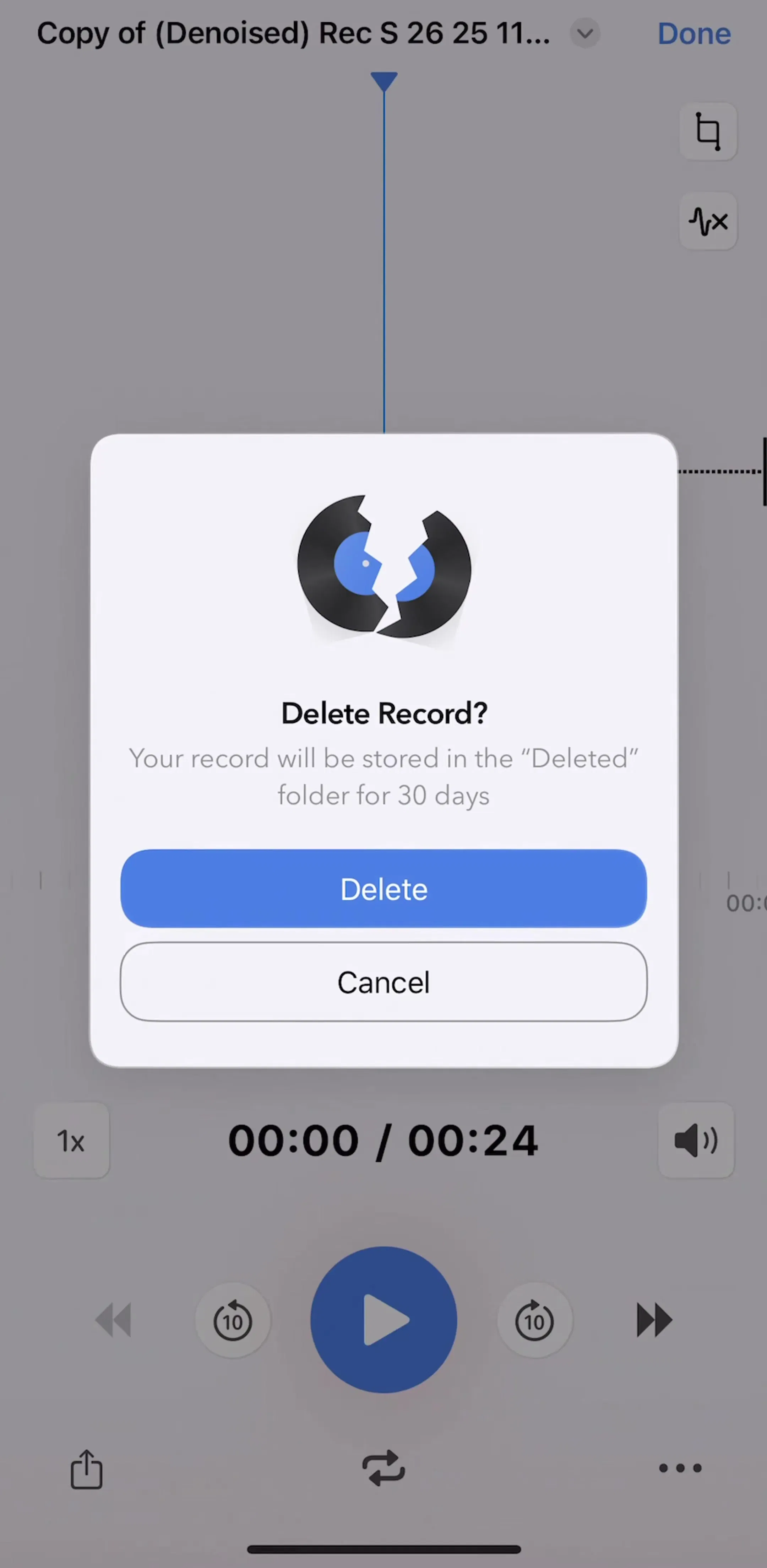
A note can be rewritten; a meeting cannot be held again. That asymmetry shows up in two delete dialogs captured in the library. Voice Recorder: Audio Memos asks Delete Record? and explains that the record will be kept in a Deleted folder for 30 days. iRecord asks Delete Note? and warns that the note and recording will be completely deleted and cannot be retrieved.
Both are honest, and only one is forgiving. For audio, the recoverable delete is the better default: a recently deleted folder costs little storage next to what it protects, and it turns the most destructive action in the app into one that can be undone. If you must delete permanently, say so in the dialog as iRecord does, style the button as destructive, and be careful with bulk selection that makes the loss larger than the user meant. The organising side of the library, folders, sorting and search, is collected on the content management pattern page.
31 of the 55 apps capture a paywall section. The natural place for limits in this category is whatever costs the developer money to run, transcription and AI summaries, rather than the act of pressing record, which keeps the free tier easy to describe and the upgrade easy to justify at the moment it appears. Wispr Flow (est. $0.5M/mo), a voice dictation keyboard, takes a different route in onboarding: its captured screens announce that the user has unlocked two weeks of the Pro plan with no credit card required, which lets people try dictation before any payment decision. The broader patterns are in our paywall design post, and the full set of captured recording flows lives on the capture, scan and record pattern page.
One large record button within easy reach of the thumb, the list of past recordings, and a way to bring in audio recorded elsewhere. Before the first recording that list is empty, so the empty state has to do the work: say what a recording becomes in this app, whether a transcript, a summary or a plain file, and point at the button. Timers, waveforms and level meters belong to the recording state, not the resting screen.
At the bottom of the screen, centred or in the lower right corner, where a thumb reaches it without changing grip. In our library the common placements are a large button in a bottom tray, a microphone button in the middle of the tab bar, and a floating circular button in the lower right. Whichever you pick, it should be the only primary action on the screen and it should look clearly different while a recording is running.
When the user first taps record, not at launch. That is the moment the request makes sense, and it is where shipping apps in our library show the system microphone alert. Write the purpose string yourself and make it specific about what the audio is used for, and design the denied state: if the user declines, the record button should explain how to turn the microphone back on in Settings rather than failing silently.
Most new ones ship it. Of the 55 apps in our library with a captured audio recording flow, 33 describe themselves in their App Store name as a note taker, transcriber or meeting recorder. For those products the transcript and the AI summary are what users pay for, so the screens after the recording deserve more design attention than the recording screen itself.
The mobileappdesign library holds captured flows from 2,622 revenue-verified iOS apps, 55 of them with a dedicated audio recording flow and 301 with a capture, scan or record flow of some kind. Screens are captured in the order a user walks them, so you can see the microphone ask, the first empty library, the recording state and the transcript that follows.
Browse captured recording, scanning and capture flows from revenue-verified iOS apps, from the microphone ask and the first empty library to the transcript that comes after.
Browse recording screens