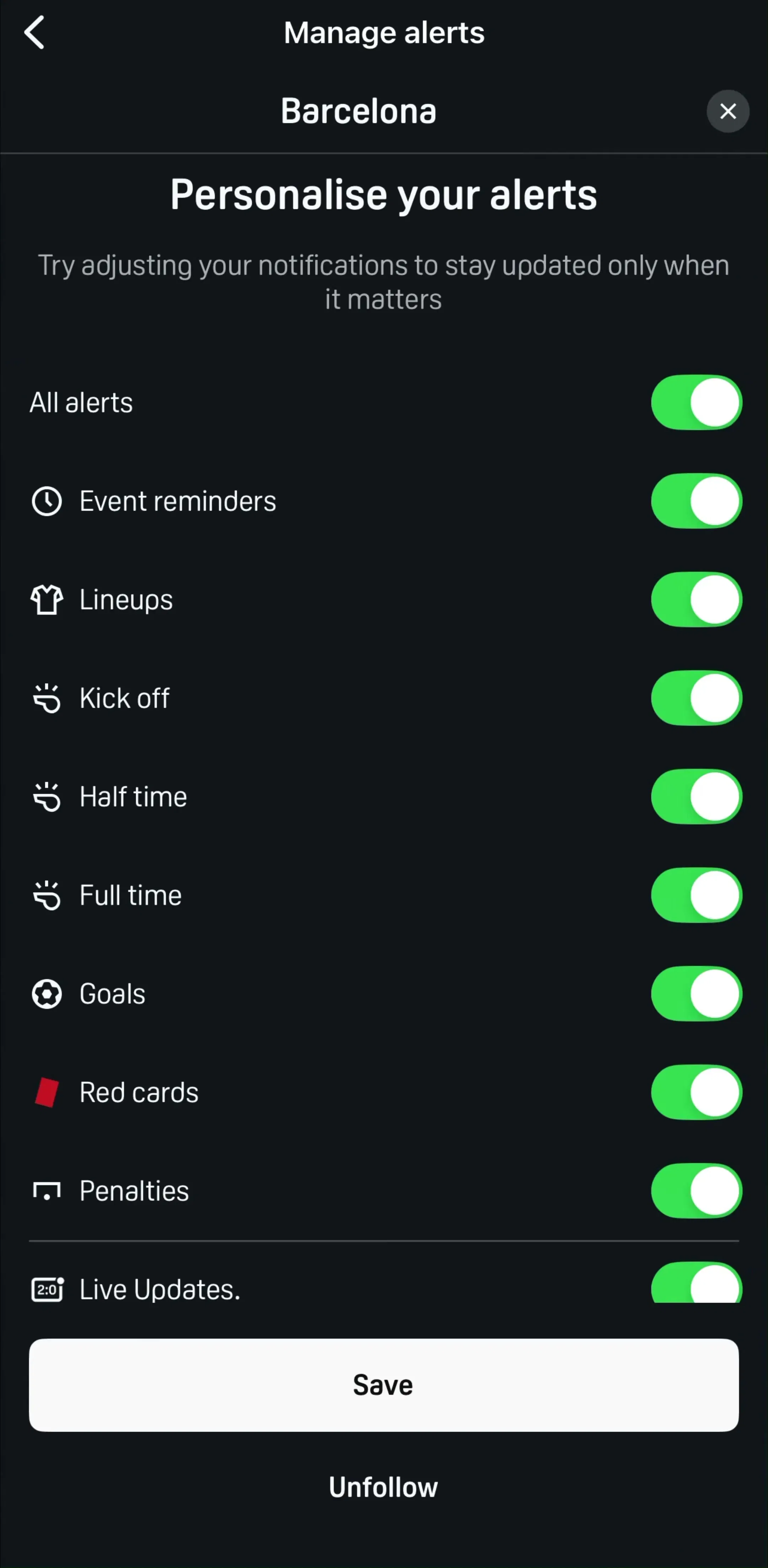
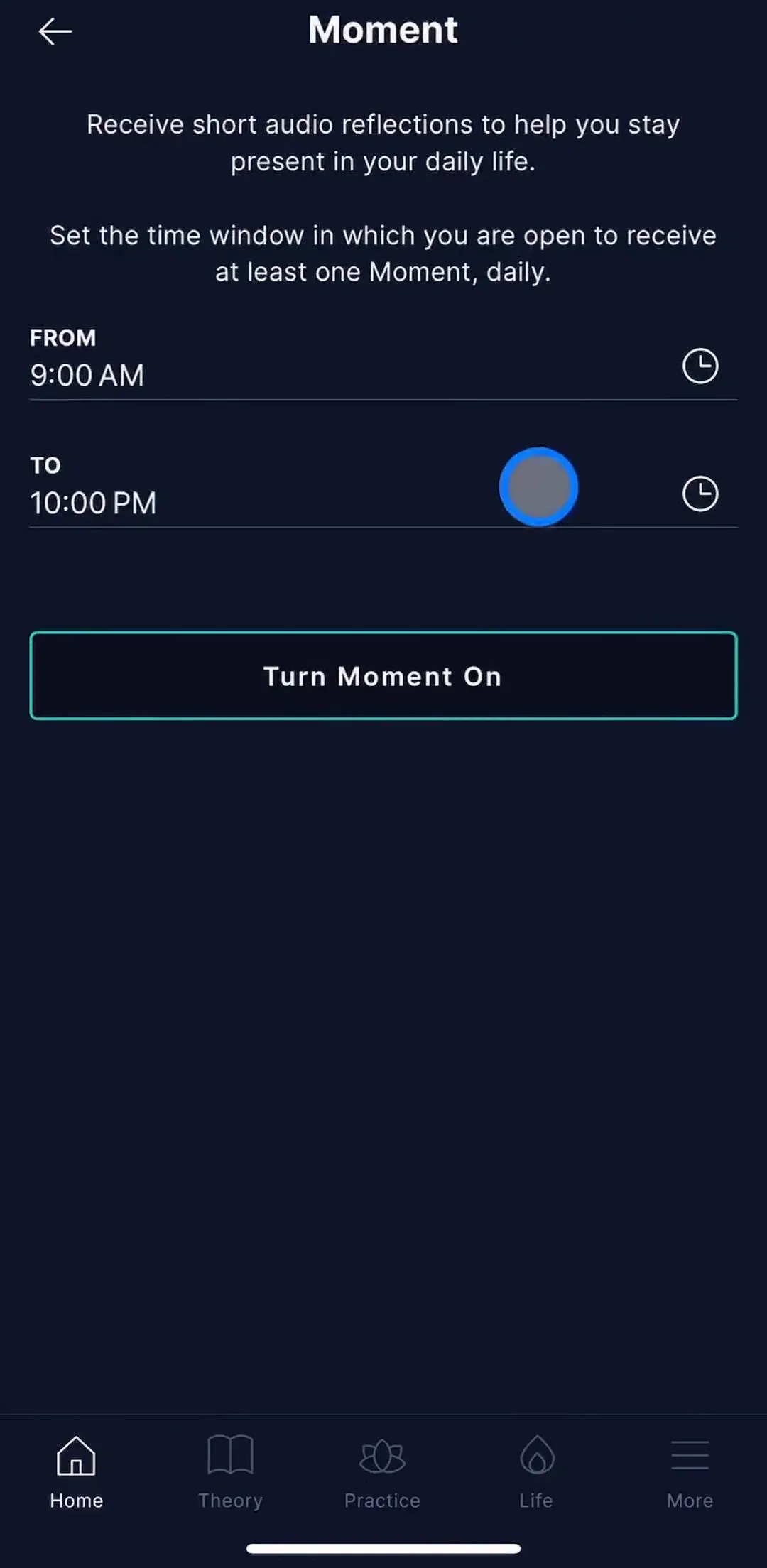
Notification design is three surfaces pretending to be one: the permission ask, the message that arrives on the lock screen, and the controls a user opens when the messages start to annoy them. Teams spend nearly all their effort on the first and almost none on the third. The evidence is in the library: across 2,622 revenue-verified iOS apps, only 29 ship a flow our taxonomy files as dedicated notification management, 176 captured screens in total. That gap is both a quality problem and an unusually cheap place to be better than your competitors.
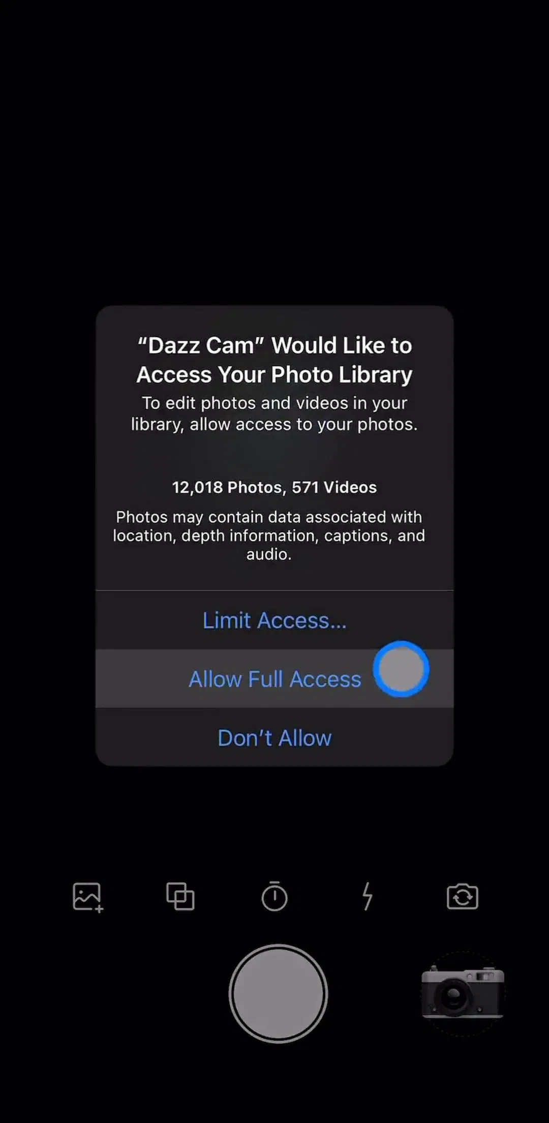
The iOS permission prompt can be shown once. Decline it and the app is done asking; the only remaining path is a deep link into Settings, which almost nobody follows. This single fact drives the whole pattern. Apps that fire the dialog on first launch trade their one ask for a decision made by a user who has no idea what the notifications are for.
The priming screen exists to move that decision into your own interface, where a no costs you nothing permanent. It states what the notifications do in plain terms, shows a positive button, and only then triggers the system dialog. You can see the primer-first shape across our permissions gallery, and it is one of the eight patterns in our onboarding breakdown. Note that our taxonomy files only 48 apps with a standalone permissions flow, because most apps stage the ask inside onboarding rather than as a separate section.
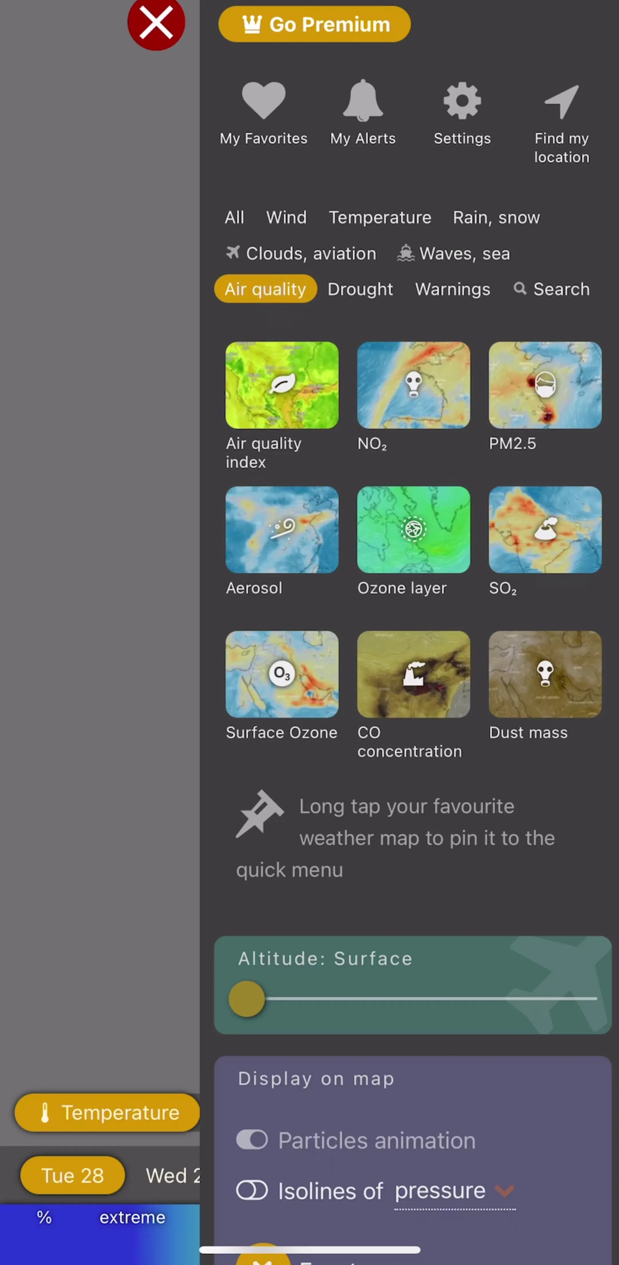
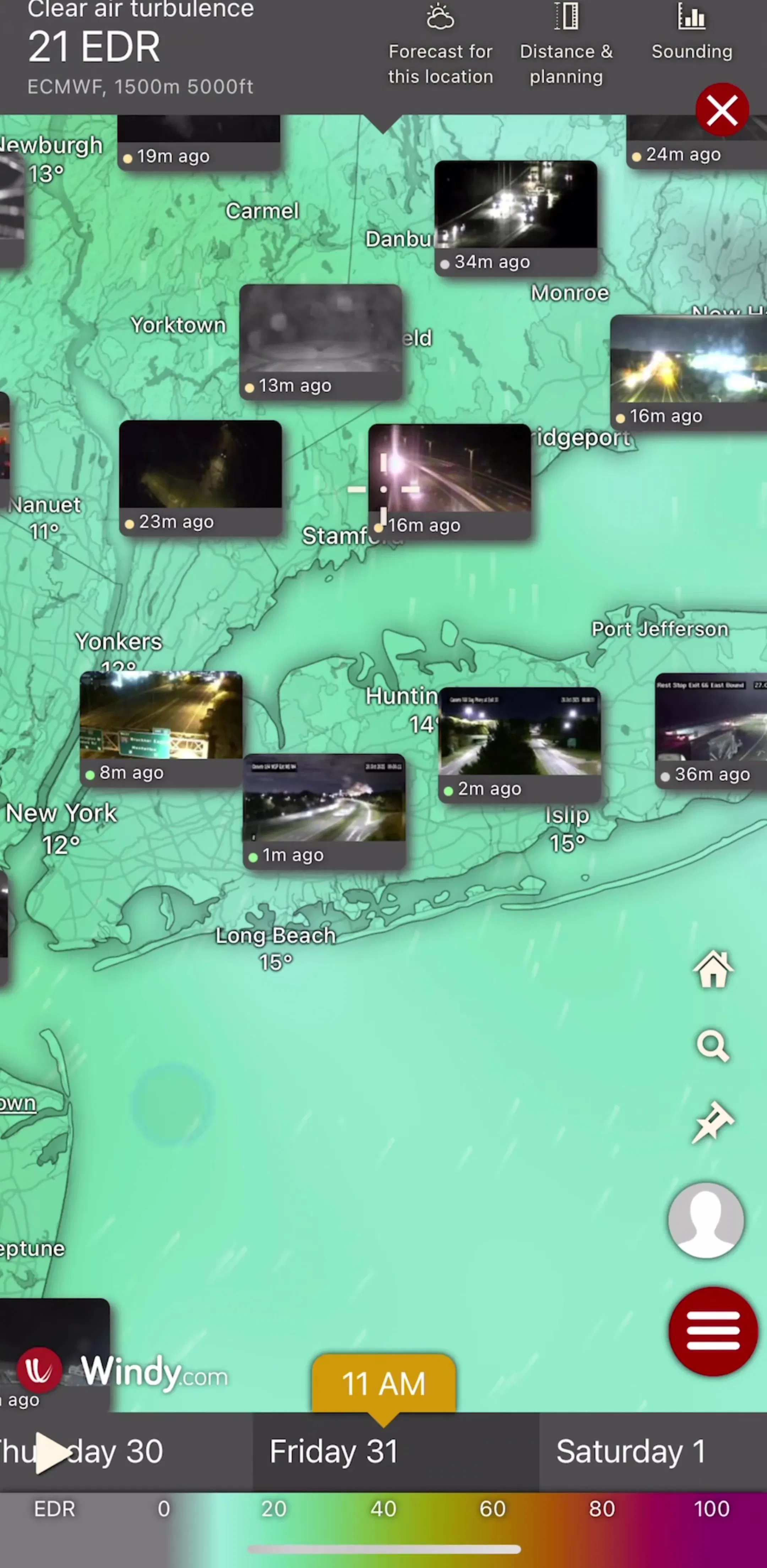
Placement beats copy. The ask converts when it follows a moment that makes the benefit concrete: a tracker set up, an alert configured, a first item saved. Apps whose entire proposition is timely information have the easiest version of this problem, because the notification is the product. Watch Duty (est. $200k/mo) and Windy.com (est. $750k/mo) both sit in that category, where a user who declines alerts has effectively declined the app.
The strongest version of the ask is scoped: notify me about this game, this stock, this fire perimeter, this medication. A user is far more willing to allow notifications for a thing they just chose than for a company. Sports and finance apps get this for free, because the user is subscribing to an event rather than to a brand; DAZN (est. $3M/mo) is a clean example of alerts hanging off a schedule the user assembled.
This is where the 29-app number stings. If your settings screen offers a single toggle, then a user who is tired of your marketing pushes has exactly one available action: turn off everything, including the reminders they actually wanted. Splitting notifications into categories, reminders, activity, social, product news, converts a total opt out into a partial one. It is the single highest-return screen in this whole area and it costs a day.
Habit and practice apps tend to design it properly because their retention depends on it. Waking Up (est. $700k/mo) treats the reminder as part of the practice rather than as an announcement channel, which is the right mental model for anything streak-based.
Where timing is the point, let the user set it. A reminder app that picks 8am for everyone is wrong for most of them. Time pickers, day selectors, and quiet hours belong on the settings screen for any app whose notifications are scheduled rather than event driven. Apps that monitor something on the user’s behalf, like Bark (est. $250k/mo), have the opposite constraint: the alert has to arrive when the event happens, so the design work moves into severity and grouping instead.
A notification is one line of text and a title, seen for about a second on a lock screen. Three rules hold up across the good ones. Lead with the specific thing that happened, not your app name, which iOS already shows. Make the content useful even if the user never taps, since most will not. And name the action if there is one, so the tap has an obvious destination. Vague nudges of the “you have new activity” kind train people to swipe you away, which is the cost that does not show up in any dashboard until it is permanent.
The banner that appears while the app is open, and the inbox behind the bell icon, are not the same thing as push and should not be designed as one. In-app messages are interruptions you fully control, which means they should be rarer and more relevant than push, not the opposite. An inbox that fills with promotional entries is an empty state problem in reverse: users stop opening it, and the one message that mattered goes unread.
A meaningful share of users will say no, and they will still use the app. What happens next is a design decision most teams skip: an inline row in settings that shows notifications are off and offers a deep link into iOS Settings, surfaced again at the moment the feature would have paid off. Blocking a feature outright because permission was denied is the worst of both worlds. Silently doing nothing is nearly as bad.
If you do one thing from this post, build the categories screen. It is small, it is rare among shipped apps, and it converts users who would otherwise mute you permanently into users who keep the notifications that work. Then go look at how apps in your category stage the ask, in full captured flows rather than single screens, because the ask only makes sense in the context of what came before it.
A note on the numbers: revenue figures cited here are third-party monthly estimates from our library, useful for comparing magnitude, not audited financials.
After the user has seen enough of the product to know what the notifications are for, and never as a cold system dialog. The shipped standard is a priming screen that explains the benefit in the app's own design, with the iOS dialog fired only after the user taps the positive button.
On iOS the system dialog is one shot. Once declined, the app cannot ask again and can only deep link the user into Settings. That is why the priming screen matters so much: it protects the single ask you get, and it lets a hesitant user say no to your screen rather than to the system.
Categories rather than one master switch, so a user can keep the notifications they want and drop the rest, plus timing controls where timing is the point, such as reminders and quiet hours. A single on and off toggle turns every annoyance into a total opt out.
Very few. Across 2,622 revenue-verified iOS apps in the mobileappdesign library, only 29 ship a flow our taxonomy classifies as dedicated notification management, totalling 176 captured screens. The permission moment gets design attention; the controls behind it usually do not.
Browse captured permission and notification flows from revenue-verified iOS apps, with revenue and download estimates next to every screen.
Browse notification screens