Empty states are treated as an afterthought and designed like one: a gray icon, a “Nothing here yet” label, and a dead end. But the first-run empty state is often the first real screen a user reaches after onboarding, which makes it one of the most valuable activation surfaces in the whole app. We pulled home, content, and discovery screens from revenue-verified iOS apps in the library and broke the good ones into seven reusable patterns.
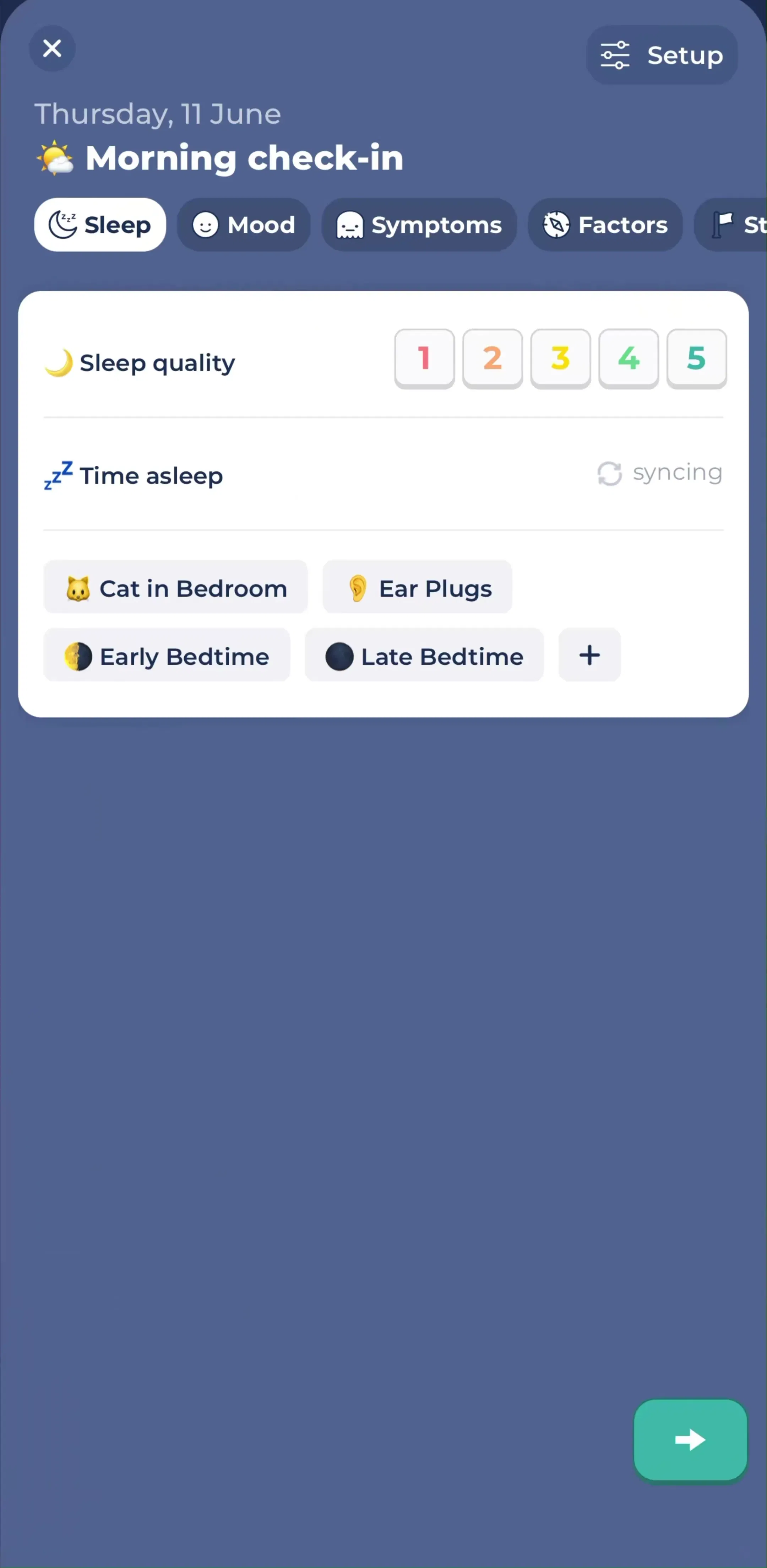
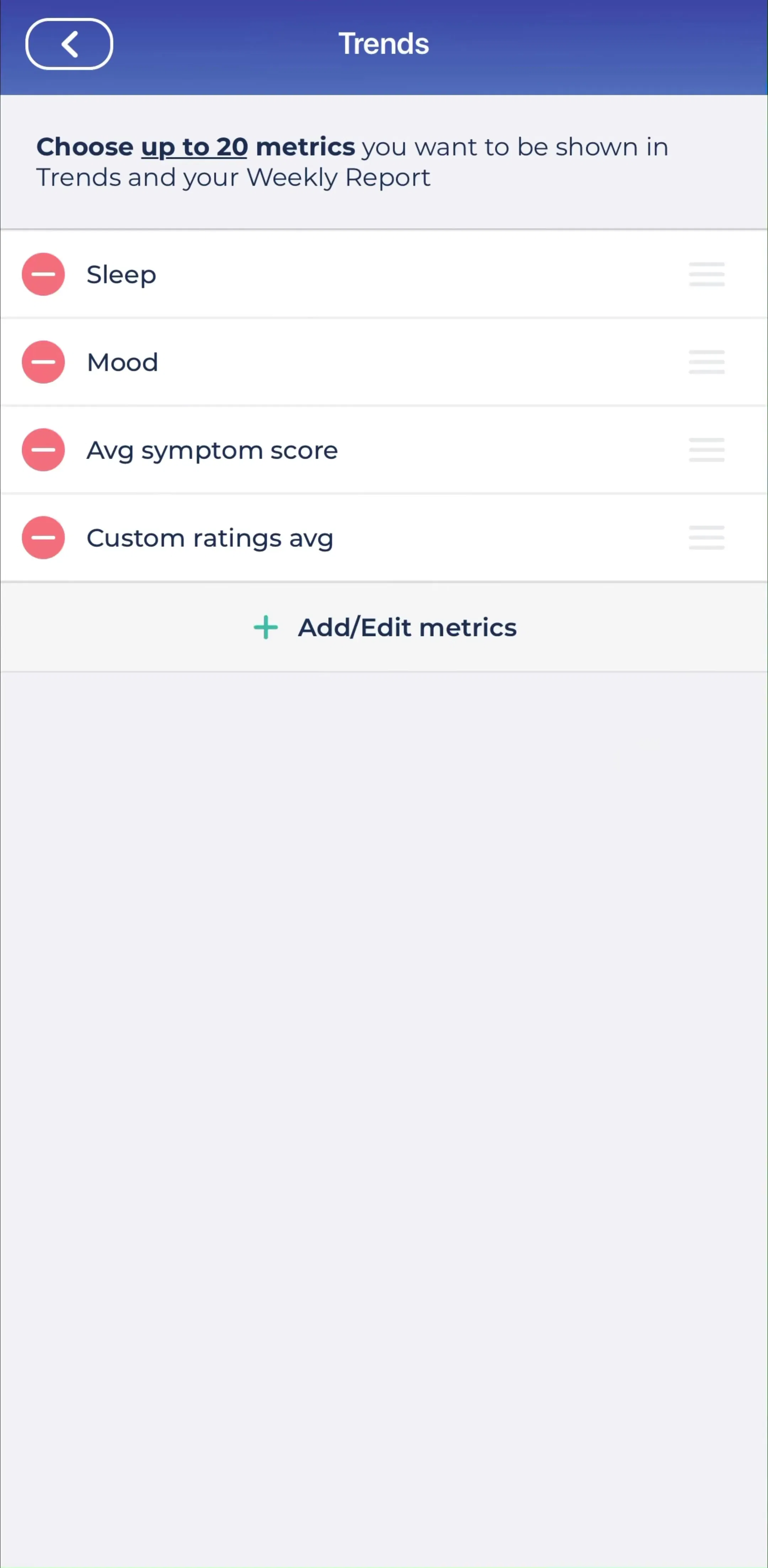
The weakest empty state says “No items.” The strongest tells the user exactly what this screen will hold once they act: “Your logged symptoms will show up here” beats a blank card every time. In a tracker like Bearable, the content areas exist to be filled daily, so the zero state has to teach the loop before the data exists. Study the home and tracking screens in the home gallery and you will see the pattern: describe the future contents, not the current absence.
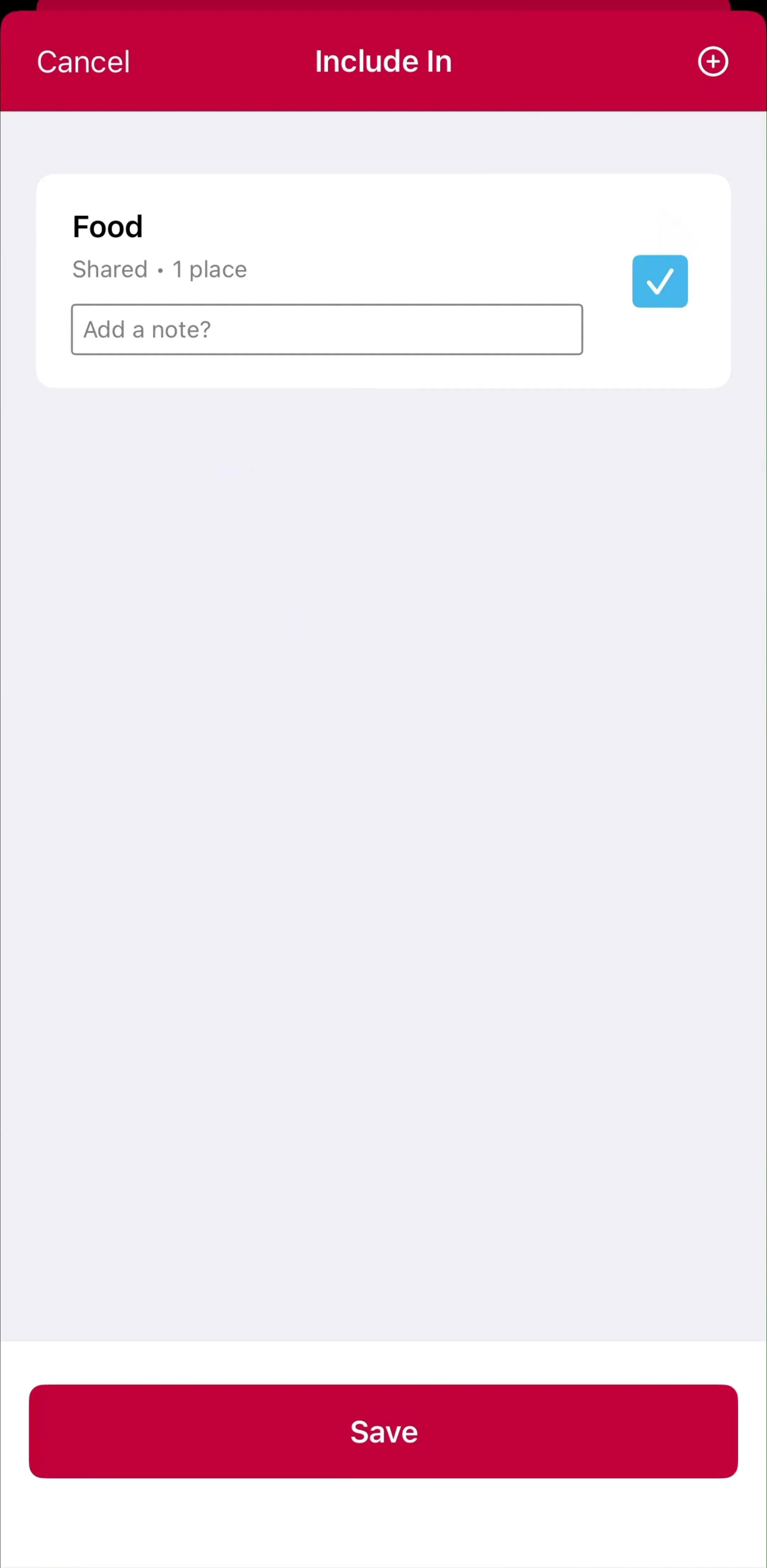
A first-run empty state should offer exactly one obvious next step. Two competing buttons split attention; zero buttons strand the user. The job is to make the first action unmissable, an “Add your first entry” that sits where the content will eventually be. When you browse the content management screens across the library, the apps that activate well almost always resolve their empty list into a single primary call to action.
Instead of an empty container, some apps render a faded or sample version of what a filled screen looks like, so the user can see the payoff before doing the work. A ghosted example entry or a dimmed chart communicates value faster than any illustration. It answers the user’s real question, what will I get if I fill this in, with a picture instead of a promise.
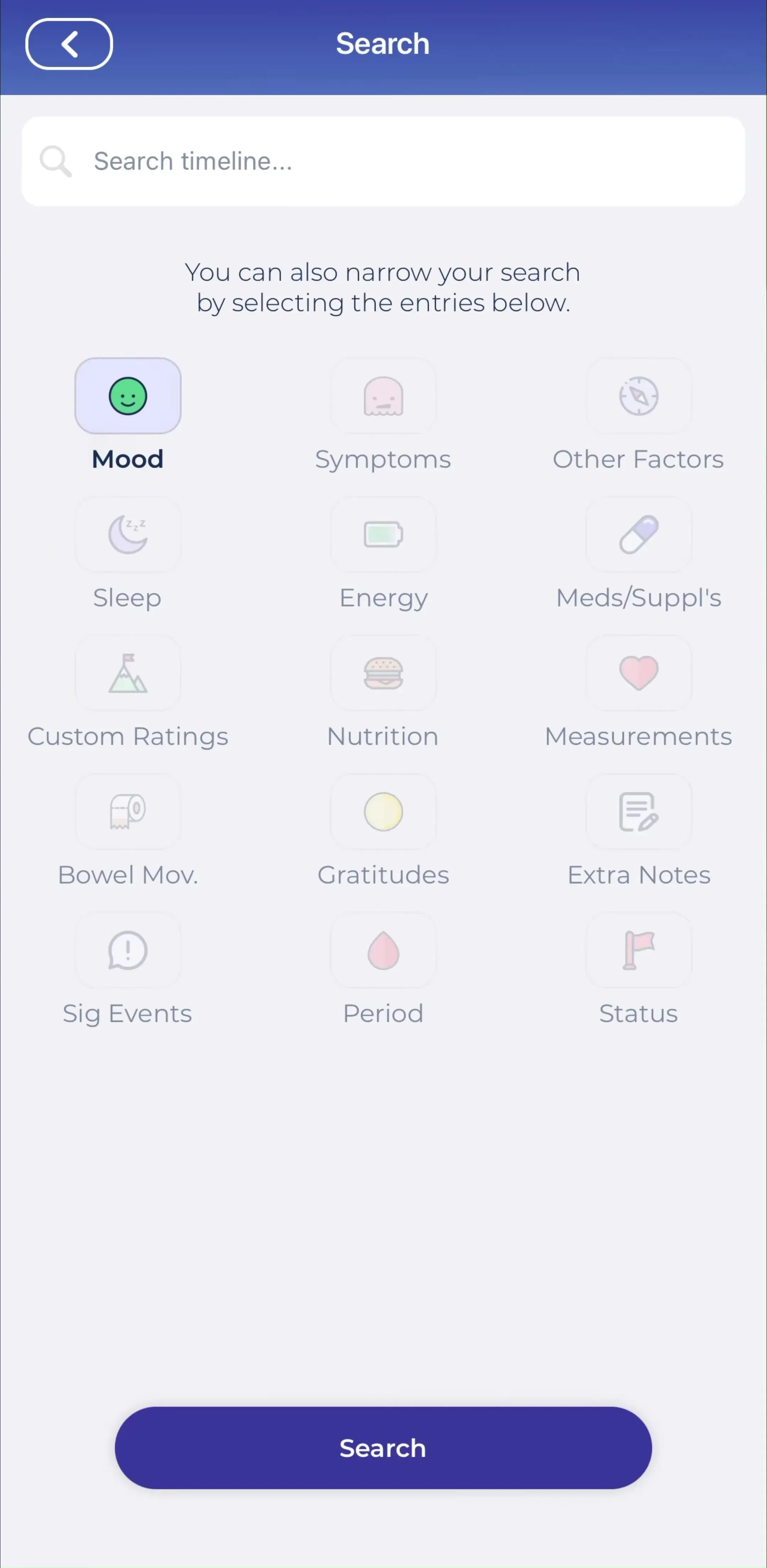
A search or discovery screen with no matches is a different animal from a first-run empty state, and it deserves its own design. The rules: keep the query visible, never blame the user, and always offer an escape such as clearing filters or browsing everything. Apps with rich browse surfaces like Find Me Gluten Free live and die on their discovery flow, and you can compare how apps handle sparse results in the discovery and search gallery.
When a user empties a list on purpose, inbox zero, all tasks done, the empty state should celebrate rather than look broken. A checkmark and a “You’re all caught up” message turns absence into accomplishment. The distinction matters: a first-run zero state motivates action, a cleared state rewards it, and using the same generic blank for both wastes the better moment.
Failed loads and offline states are empty states too, and they are where trust is won or lost. The reliable pattern is a plain description of what went wrong, no jargon, plus a retry control and, where possible, any cached content so the screen is not fully dead. An error state that only says “Something went wrong” with no way forward is the worst blank screen in the app.
Empty states are one of the few places where a little personality reads as care rather than noise. A tracker can be warm, a finance app should stay calm and precise, a game can be playful. The tone should match the rest of the product, which is easiest to judge when you see the empty screen next to the onboarding and home flow it belongs to, exactly how the library presents each app.
Audit every screen in your app that can be empty, then sort each into first-run, cleared, or no-results, because they need different copy and different actions. The empty state is continuous with onboarding, not separate from it; if you have designed your onboarding flow but left the first real screen blank, you have handed the user off at the worst possible moment. Browse how real apps solve it in the library and copy the structure, not the illustration.
A note on the numbers: revenue and download figures across the library are third-party estimates, useful for comparing magnitude, not audited financials.
An empty state is what a screen shows when it has no content to display yet: an inbox with no messages, a tracker with no entries, a search with no results. There are three main kinds, first-use (nothing created yet), user-cleared (everything done or deleted), and error or no-results. Each needs different copy and a different call to action.
The first-run empty state is often the very first real screen a user sees after onboarding, which makes it one of your highest-traffic activation surfaces. A blank list with no guidance stalls the user at the exact moment they should be taking their first action; a well-designed zero state tells them what the screen will hold and gives them one clear way to fill it.
A good empty state does three things: it explains what belongs here, it shows the value of filling it, and it offers one primary action to get started. The best ones avoid sad-looking blank illustrations and instead preview the populated screen or drop a single obvious button. No-results and error states additionally need to preserve the user's input and suggest a next step.
The mobileappdesign library has home, content, and discovery screens from thousands of revenue-verified iOS apps, so you can study how apps handle first-run and no-results states in context, next to the rest of their flow.
Browse home and content screens from thousands of revenue-verified iOS apps and see how they handle first-run and no-results states.
Browse home screens