
Habit tracker UI is one of the most designed screens on Dribbble and one of the most distinctive in the App Store, because tracking is not really a category. It is a mechanic that appears inside fitness apps, learning apps, sleep apps, budgeting apps and pet training apps. Our library holds 2,622 revenue-verified iOS apps and 526 of them carry a tracking and insights flow, which is a much wider sample than the handful of standalone habit apps. Here is what the mechanic looks like when it is built to be used daily rather than screenshotted.
Almost everything in a tracker is in service of a single interaction that happens once or twice a day and takes under two seconds. That is a harsher constraint than it sounds. It means the today screen is the app, the check-in target has to be reachable one-handed, and every screen between launch and that tap is a tax paid daily. Products that open on a dashboard of charts have put their least frequent need in front of their most frequent one.
One tap, large target, immediate visual state change, and no confirmation. The row or tile should change enough that the user can see the result from arm’s length, because the most common failure is a check-in the user is not sure registered, which produces a second tap that undoes it.
Quantity tracking complicates this. If the thing being logged has a number attached, the pattern that survives is a default value on the primary tap with an optional adjustment, rather than opening a numeric entry screen every time. Most days the default is right.
Fitbod (est. $750k/mo) is a good study because logging is high frequency and the app has to hold a lot of structure behind an interaction that has to stay fast.
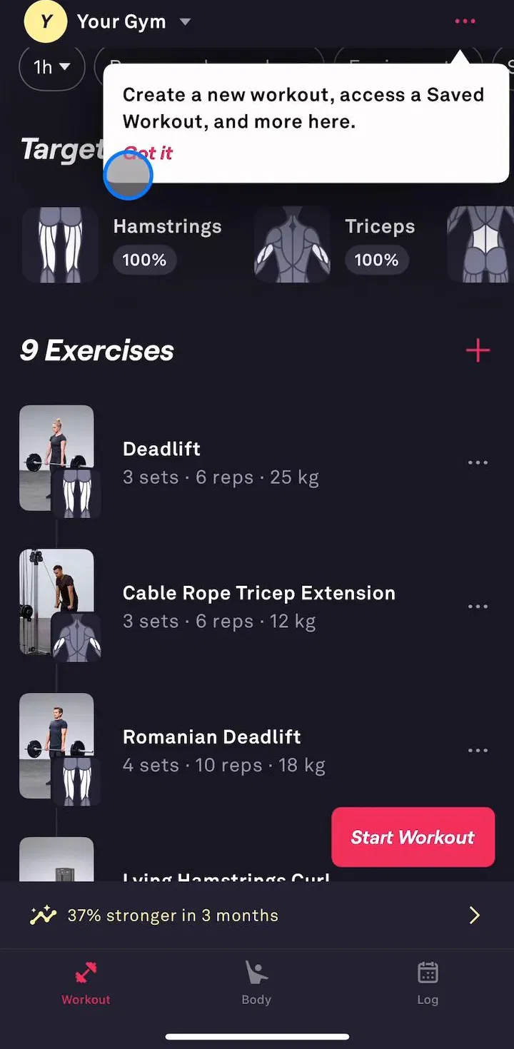
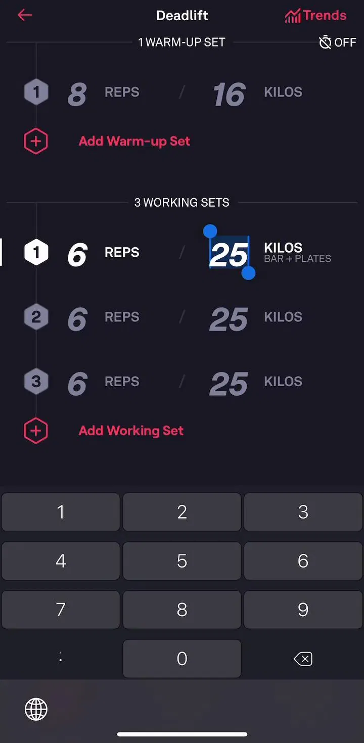
The calendar or dot grid showing the last several weeks is what makes an accumulated run legible. It works because it is dense, glanceable and honest: a month of activity fits on one screen and the pattern of misses is visible without reading anything.
Two details decide whether it is useful. There have to be three distinguishable states rather than two, since not-yet is not the same as missed, and colour alone cannot carry the distinction if the app is to remain readable for colour-blind users. Shape, fill and opacity are doing real work here.
Elevate (est. $750k/mo) and Dogo (est. $85k/mo) both show the mechanic outside the fitness context, which is useful if you have been looking at workout apps for too long.
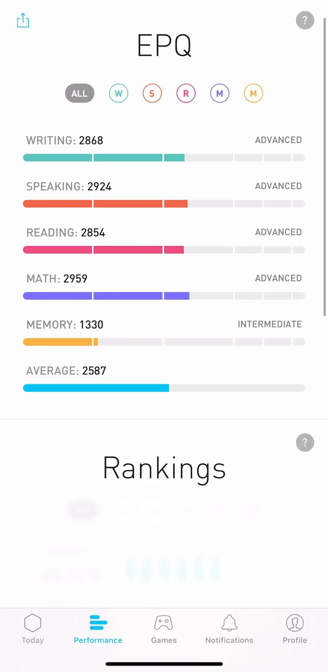
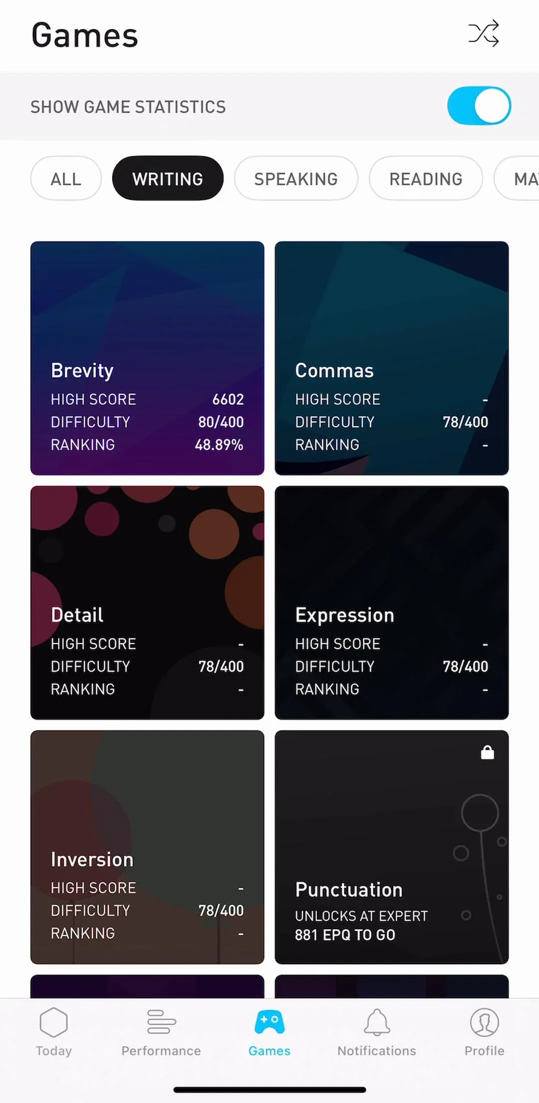
The streak counter works because it makes the cost of stopping visible. It stops working when it becomes the product’s only motivation, because the day it breaks is the day a share of users delete the app rather than restart at zero. That is a design decision, not an inevitability, and shipping apps have converged on a few softeners: a limited number of skip days, a repair action, or a weekly target that tolerates one miss.
The related mistake is inflation. When the streak, a level, a points total, a badge shelf and a leaderboard all sit on one screen, none of them mean much. Pick the one that matches what the product is actually asking the user to do.
The insights screen is where trackers over-build. Users arrive with a specific question, such as whether this month is better than last, and a wall of charts answers it slowly. The structure that works puts a plain-language summary at the top, one primary chart under it, and the raw history below that for the minority who want it.
Chart choice follows the same logic: a run of days is a bar chart because each day is discrete and comparable, and a smooth line over a measured quantity such as weight or sleep duration is a line chart because the trend is the point.
Yuka (est. $750k/mo) and Pillow (est. $150k/mo) are worth comparing, since one is scoring discrete events and the other is summarising a continuous measurement.
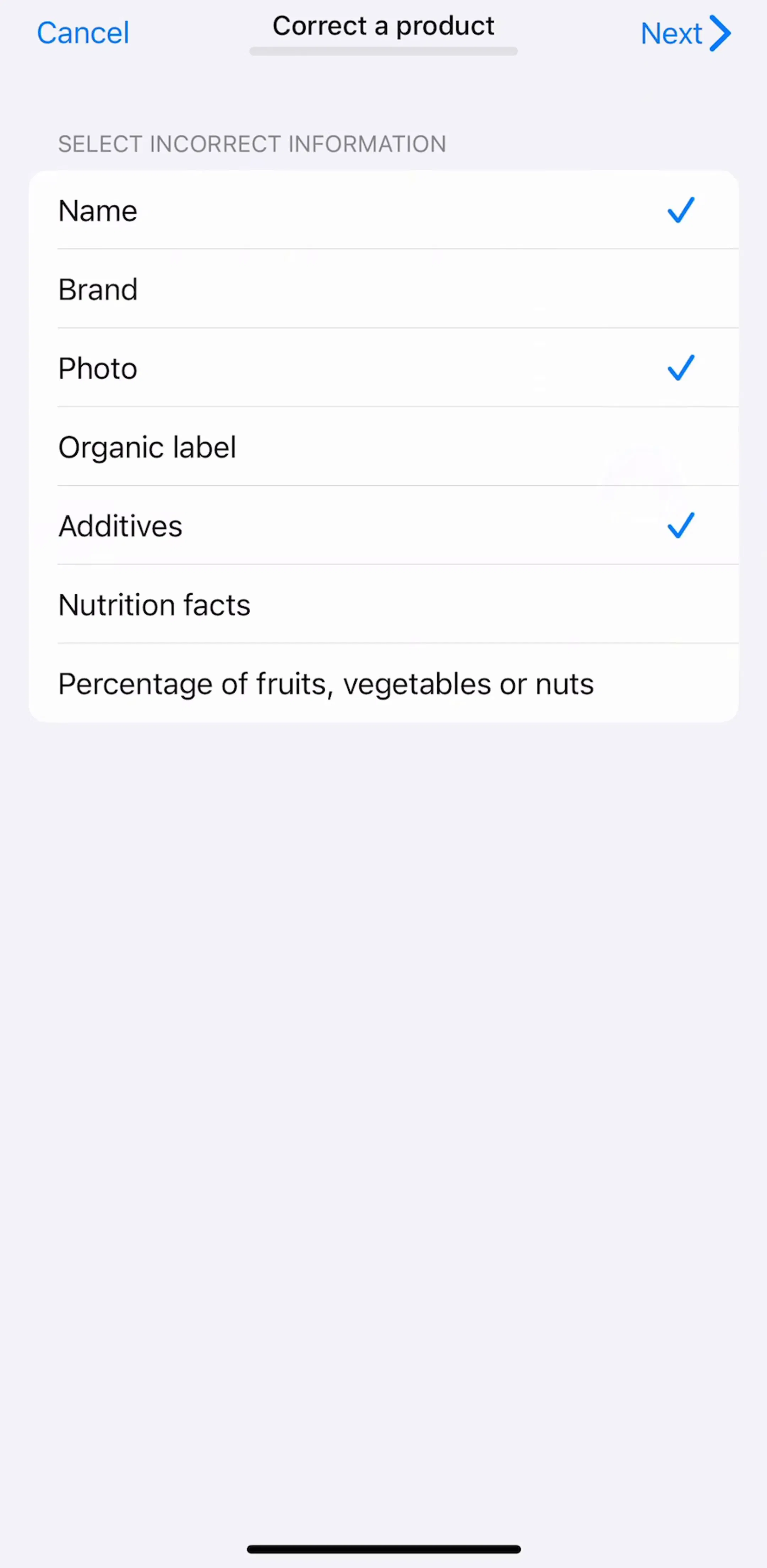
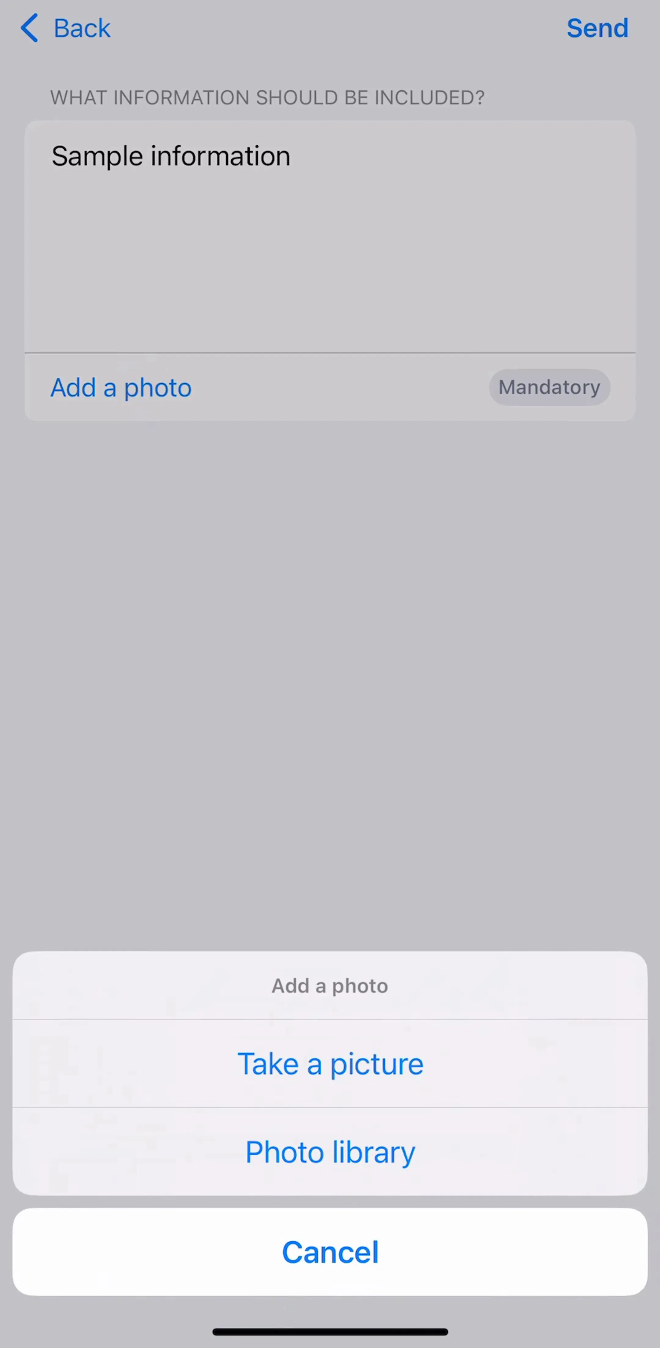
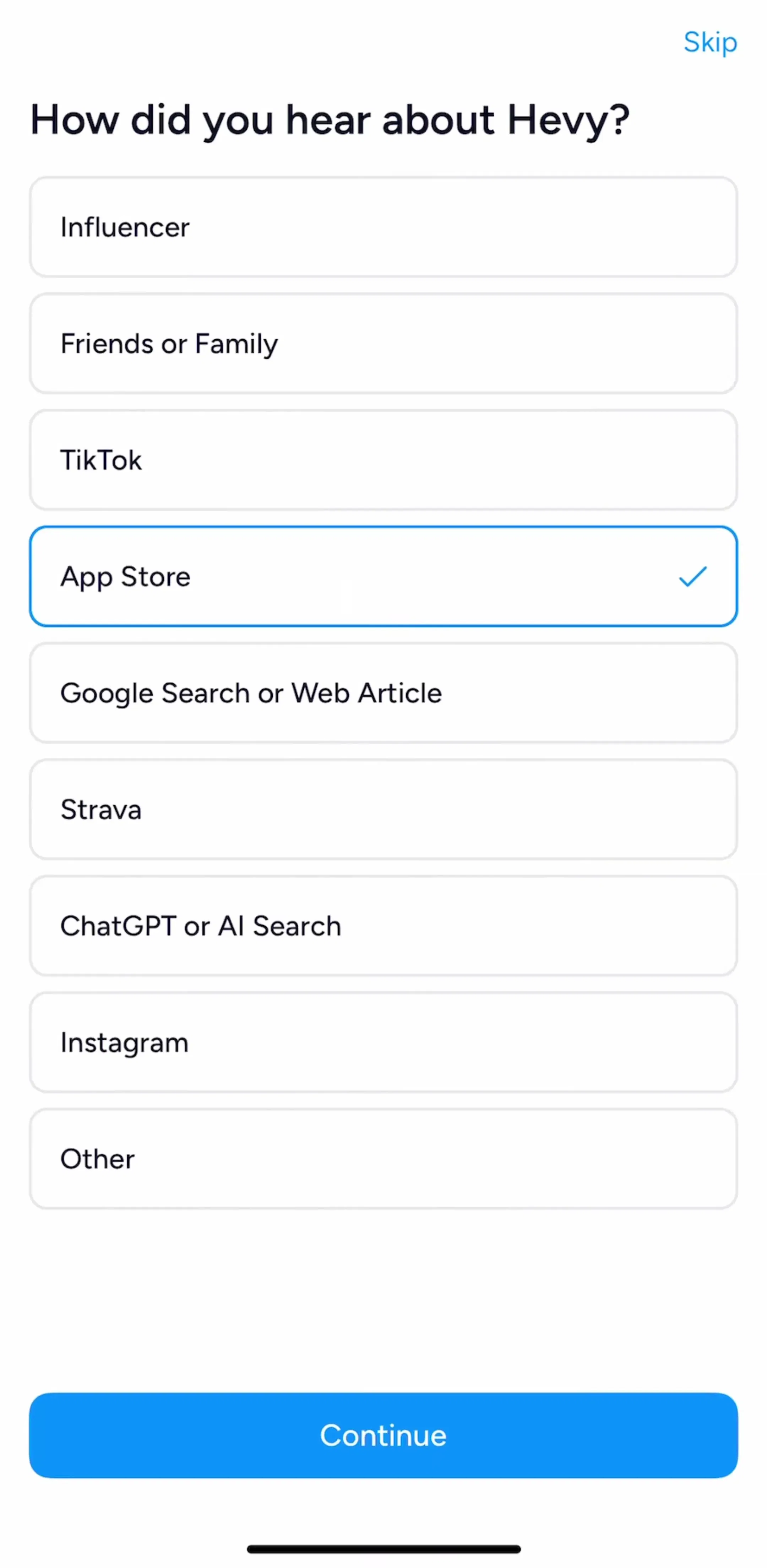
The strongest first runs in this category end with something already being tracked. A tracker with nothing in it is an empty state, and an empty state on first launch is the weakest possible pitch, so the onboarding should carry the user into defining one habit and, ideally, checking it off once.
Suggested presets do most of the work here, because most people arrive wanting a common thing and free-text entry on screen one is a small wall. The general shape of these flows is in the onboarding breakdown and the wider gallery is the onboarding pattern page.
Hevy (est. $750k/mo) is a useful example of a first run that leads into real structure rather than into a settings screen.

A tracker that is not opened records nothing, which makes the daily notification a core component rather than a growth tactic. The version that works is user-scheduled, per-habit if the product supports several, and specific enough to act on. Generic re-engagement copy sent at an arbitrary hour trains people to swipe it away, and a swiped-away reminder is a lost check-in.
The permission and the settings surface behind it are covered in the notification design breakdown.
The common commercial structure in the category is that logging stays free and the accumulated view is where the ask appears: full history beyond a few weeks, multiple habits, detailed insights, or export. That is a reasonable trade, since the value grows with the data, but it creates a specific design risk. If the user hits a wall on the screen that shows their own effort, the ask has to be worded carefully, and locking the history a user has personally generated tends to read worse than locking a new feature.
Where shipping apps across categories place the ask is in the paywall breakdown.
People forget to log, log the wrong day, and abandon habits. All three need to be one or two taps: back-fill a missed day from the history grid, undo a mis-tap, and archive a habit without deleting its record. Products that make retroactive editing hard end up with data the user knows is wrong, and a record the user does not trust stops being motivating.
The list mechanics behind those actions, including swipe targets and what belongs behind a tap, are in the list UI breakdown, and the category context for fitness specifically is in the fitness app UI study.
Test your check-in with one thumb, on the move, on the largest phone you support and the smallest. If it needs aim, it is wrong. Then look at what your product does on day 8 after a missed day 7, because that single moment decides most of the retention in this category. Every screen in the library sits next to the app’s estimated revenue and downloads, so you can pick references by outcome rather than by how the shot looks, and Fable (est. $100k/mo) is worth adding to the set as a tracker for something that is not exercise.
A note on the numbers: revenue figures cited here are third-party monthly estimates from our library, useful for comparing magnitude, not audited financials.
Three carry the product. A today screen where checking something off takes one tap, a progress or history screen that shows the run of past days, and a create or edit screen for defining what is being tracked. A settings screen for reminders is the fourth, and it matters more here than in most categories because the notification is what brings the user back.
A tap, on a target large enough to hit while walking. The check-in is the single most repeated action in the product and it happens in seconds of spare attention, so anything requiring aim, a long press, a confirmation dialog or a second screen loses check-ins. Swipe can exist as a secondary shortcut, never as the only route.
They work as a display of accumulated effort and they backfire as a threat. A long streak makes the cost of stopping visible, which is the useful part. The failure mode is a design where breaking one day resets a large number to zero with no recovery, because a meaningful share of users abandon the app rather than start again. Shipping apps increasingly soften this with skips, freezes, or a weekly target instead of a daily one.
Visibly but neutrally. The history grid needs to distinguish done, missed and not-yet, or it is not a record of anything. What it should not do is style the miss as failure with red fills and warning language. The user already knows. The design job is to make resuming a one-tap decision rather than a reckoning.
The mobileappdesign library holds captured flows from 2,622 revenue-verified iOS apps, including 526 with a tracking and insights flow. Screens are captured in sequence, so you can see how a real app moves from a check-in to its progress view rather than looking at isolated concept shots.
Browse captured tracking and insights flows from revenue-verified iOS apps, in the order a real user walks them.
Browse tracking screens