The list is the most common screen in mobile software and the least discussed. Almost every app is a stack of them: a feed, a library, a set of results, a settings page, an inbox, a history. Our library holds 2,622 revenue-verified iOS apps and 1,303 of them carry a browse and feed flow, which makes lists the single most observable pattern we have. Most list UI writing is about web tables and SaaS dashboards, so this is the mobile version: eight decisions that determine whether a list is scannable or exhausting.
A list screen is one component repeated. Everything that matters happens inside a single row: what identifies the item, what distinguishes it from the row above, what the tap does, and what the eye lands on first. Design one row properly against your worst-case content, which means the longest title, the missing thumbnail, and the emptiest secondary line, and the screen designs itself.
The anatomy that survives across products is small: a leading element such as a thumbnail, icon or avatar, a primary label, an optional secondary line, and a trailing element such as a chevron, timestamp, count or toggle. Trailing content is where rows get overloaded, because every stakeholder wants their metadata on the right edge.
The number of lines is not a density preference, it is a function of what the user needs to choose. If the label alone identifies the item, one line is correct and adding a subtitle just to fill space slows scanning. If choosing requires a second fact, put exactly that fact on line two.
Plaud (est. $4.25M/mo) is a good study because a recordings list is the whole product, and each row has to carry enough to pick the right recording out of dozens without opening any of them.
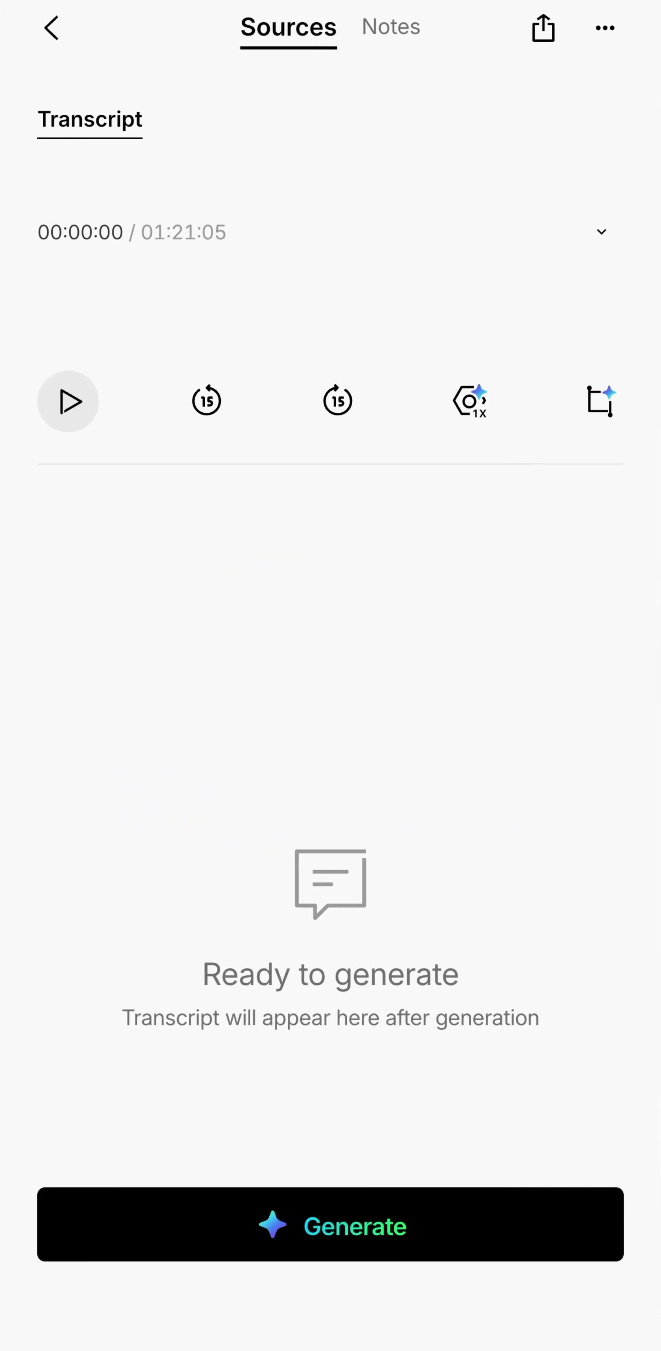
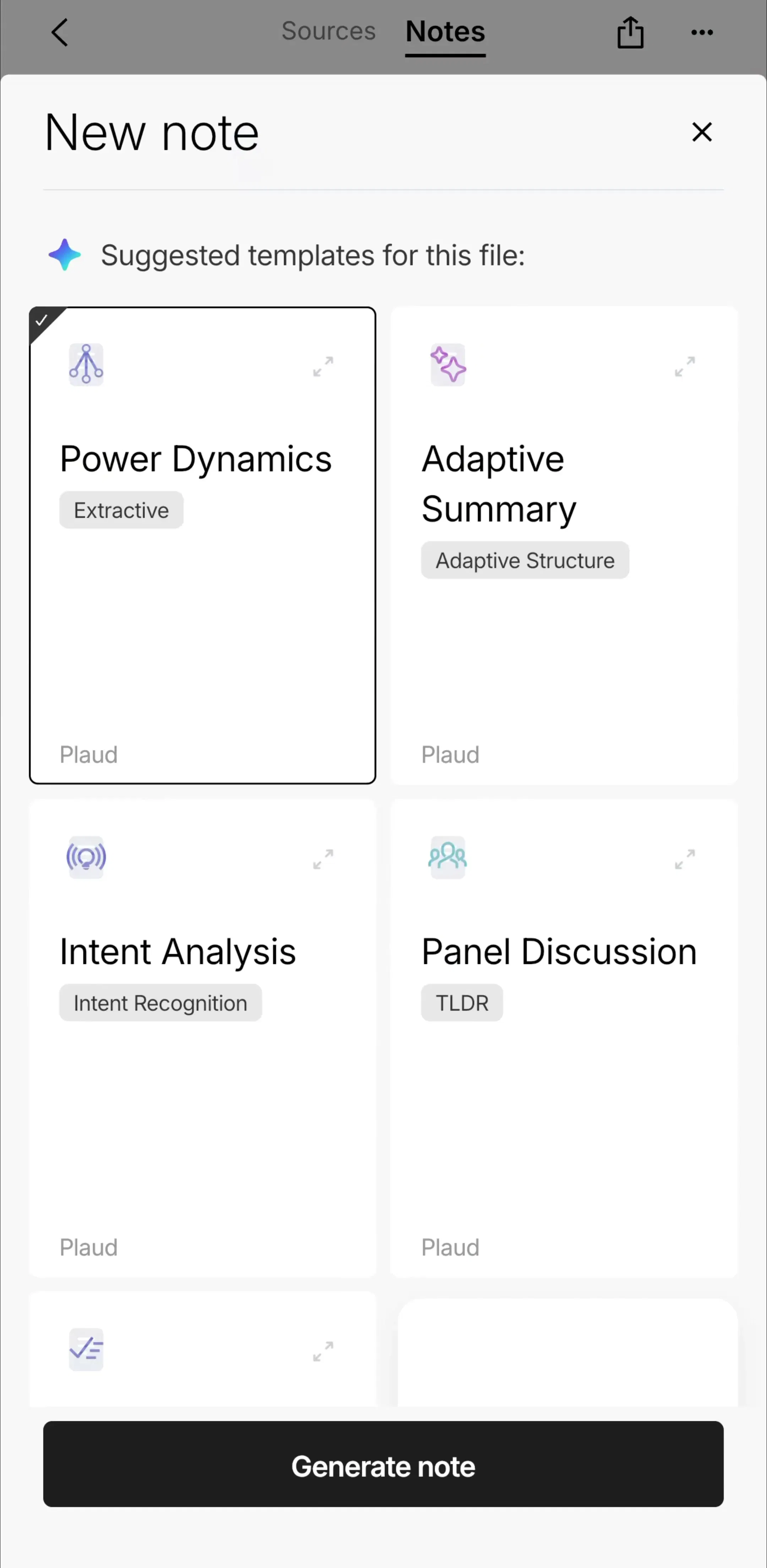
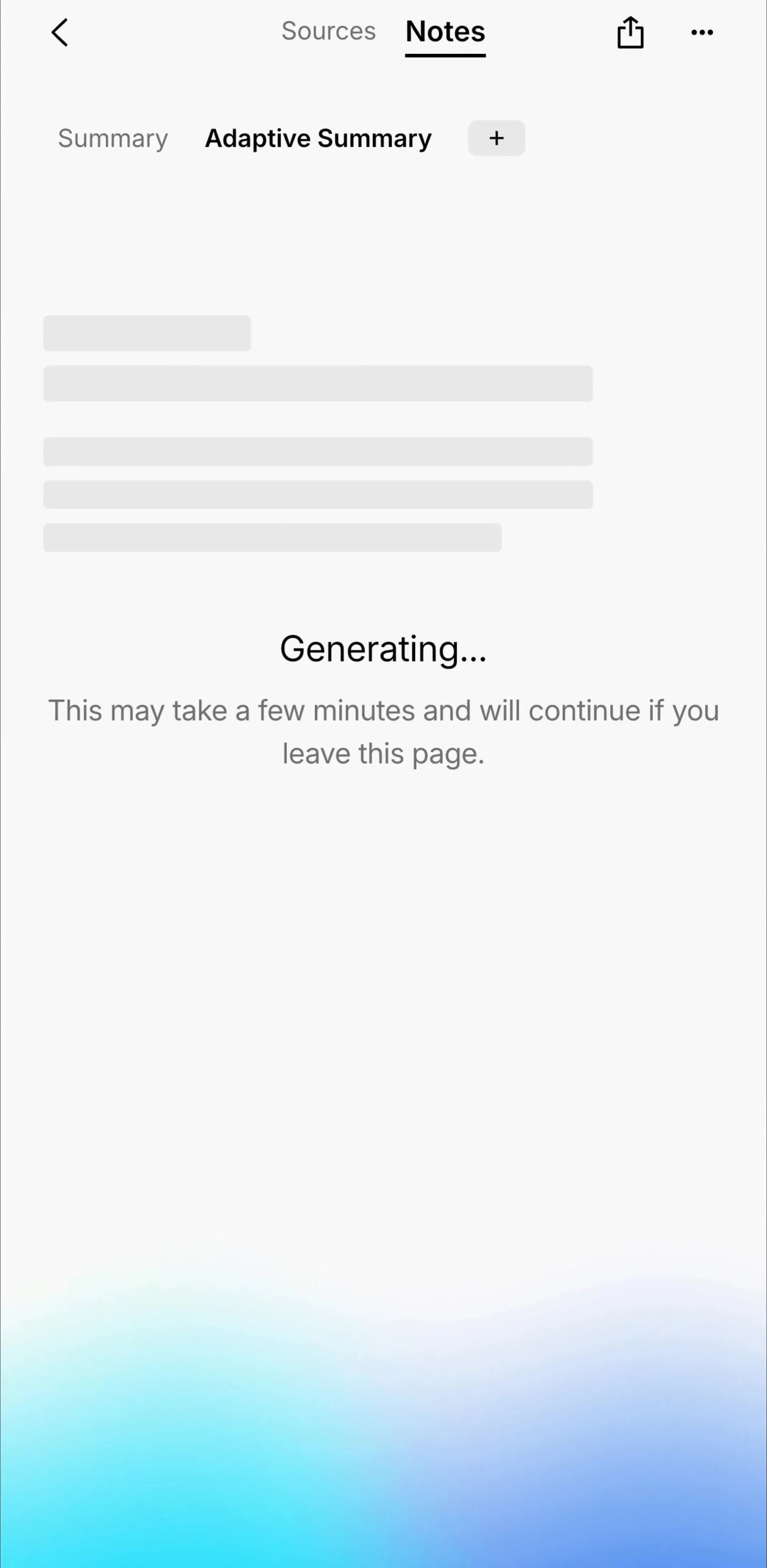
There are three ways to tell rows apart and they are not interchangeable. Hairline dividers are the densest and best for homogeneous content the user scans quickly. Whitespace alone reads as calm and needs generous padding to avoid ambiguity about which text belongs to which item. Cards give the strongest separation and cost the most vertical space, which means fewer items per screen and more scrolling.
Mixing them within one screen is the failure mode: cards for the first section, dividers below, and the user reads two different lists. We covered when a card genuinely earns its container in the card UI breakdown.
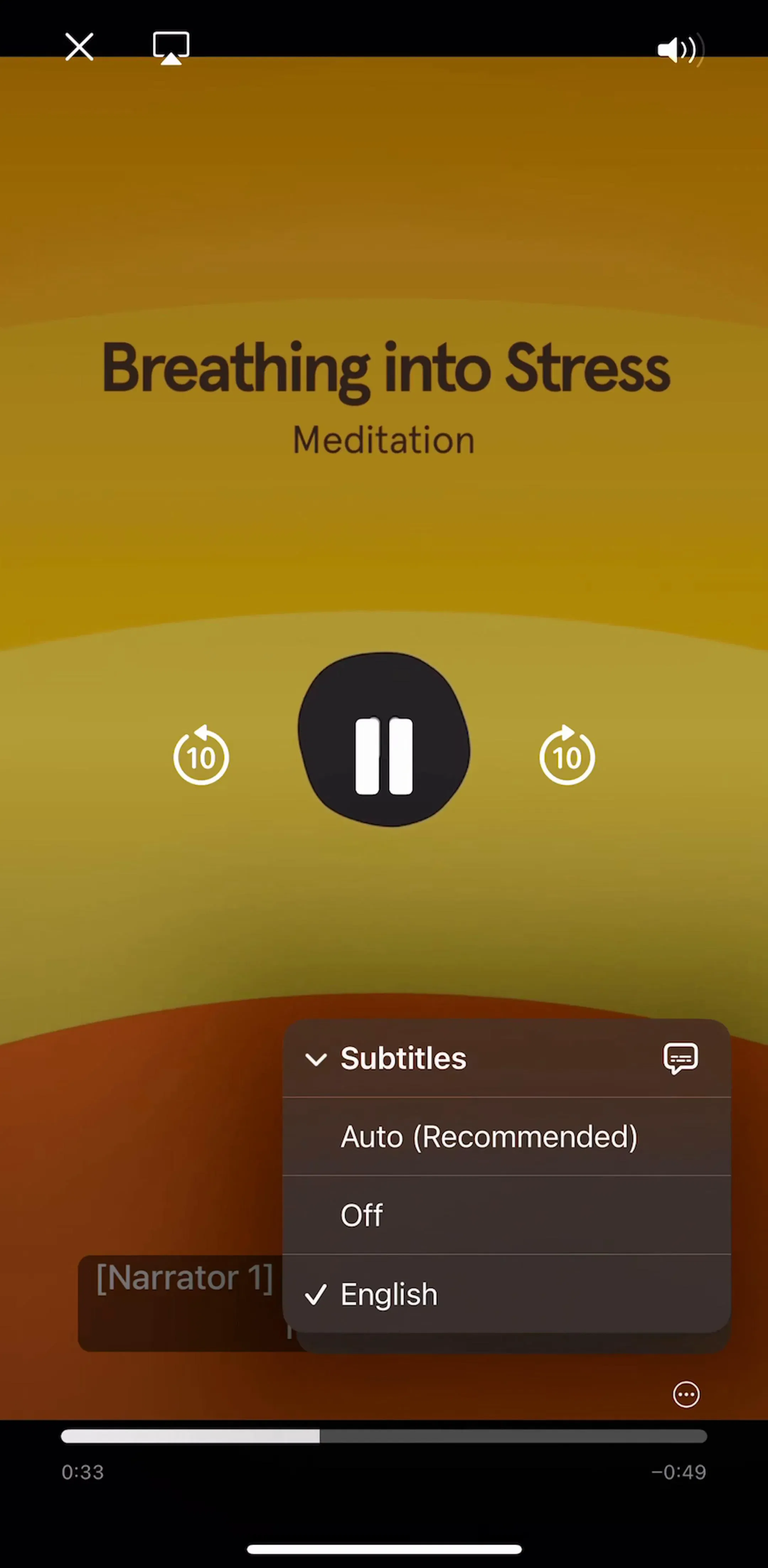
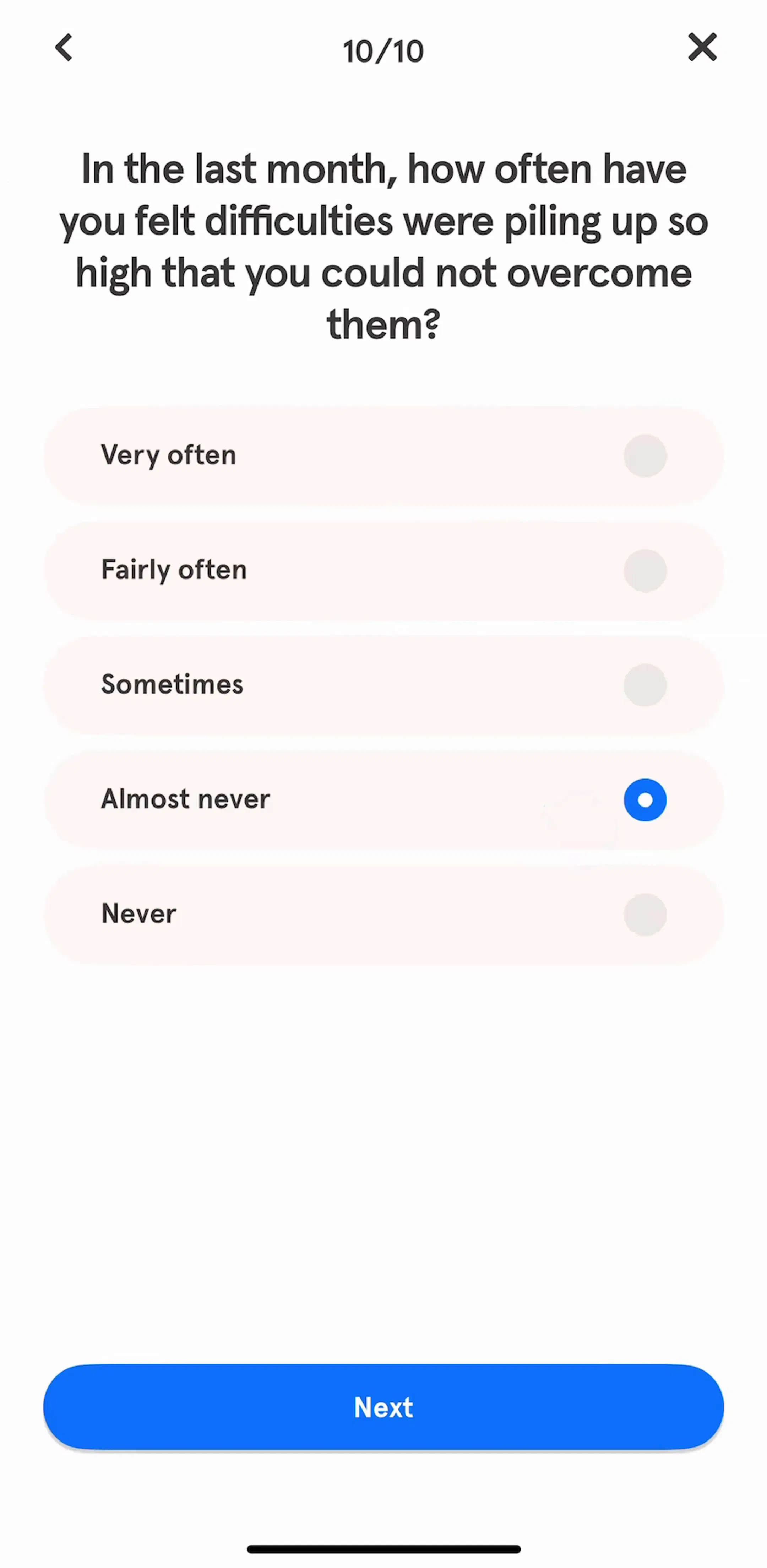
Headspace (est. $2M/mo) and Babbel (est. $3M/mo) are useful contrasts here, since both stack content of different weights on one browse surface.
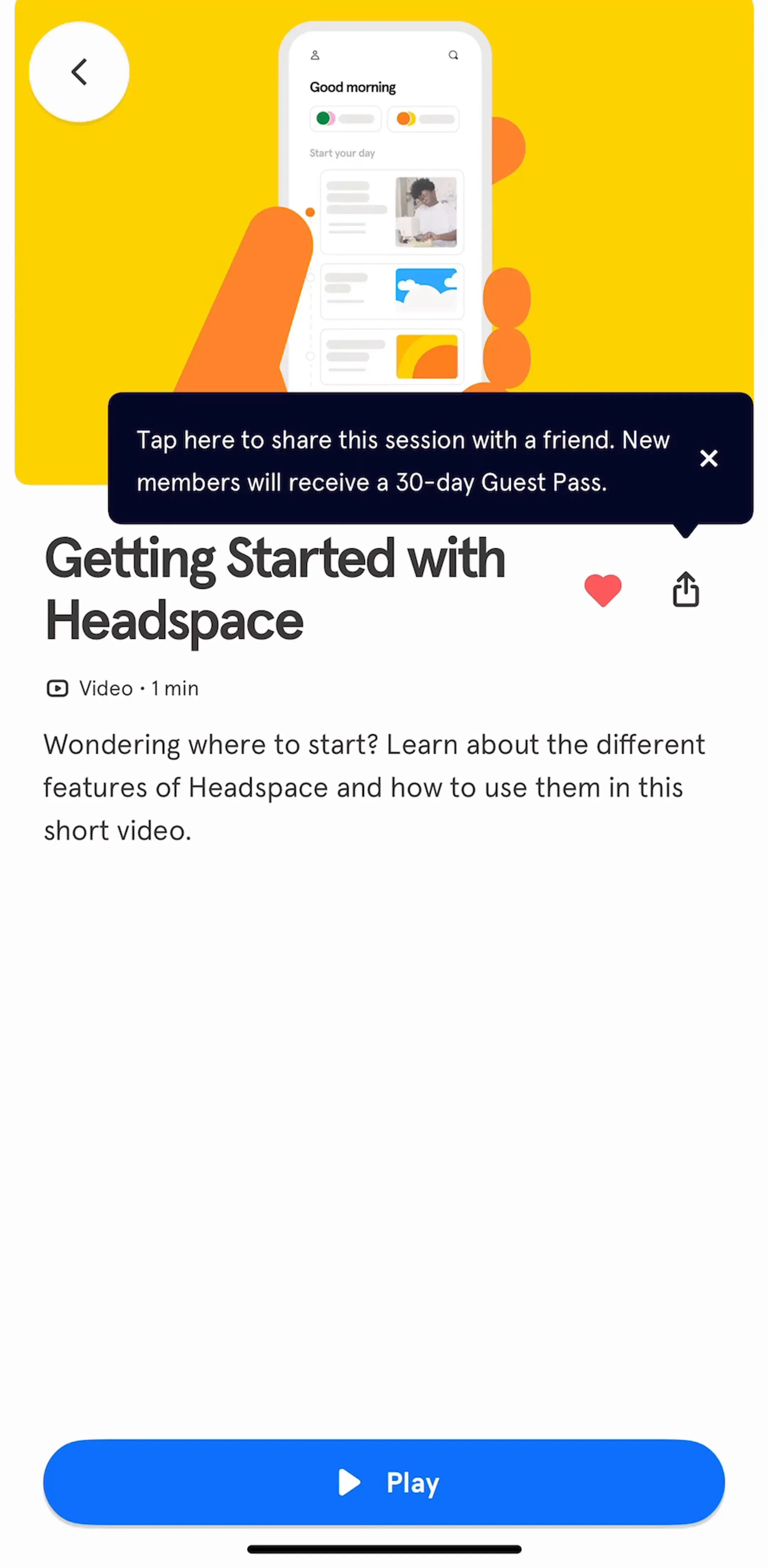
The whole row should be tappable, including its padding. Rows where only the title is live are a persistent source of mis-taps, and they are easy to ship by accident when the row is built as a stack of independently tappable pieces.
Swipe actions belong to the destructive and the frequent: archive, delete, mark done, save. Two rules keep them usable. Never make swipe the only route to an action, because it is invisible and undiscoverable for a large share of users, and keep the count low, since three or four targets on one side of a row are effectively a lottery on a moving list.
A long flat list is hard to navigate even with search, because search requires the user to know what to type. Grouping does not: by date, by status, by first letter, by category. Sticky headers keep the current group visible while scrolling, which turns an undifferentiated scroll into a set of landmarks.
This is the same principle behind the grouped settings screen, where the groups are the entire navigation model. We took that apart in the settings UI breakdown.
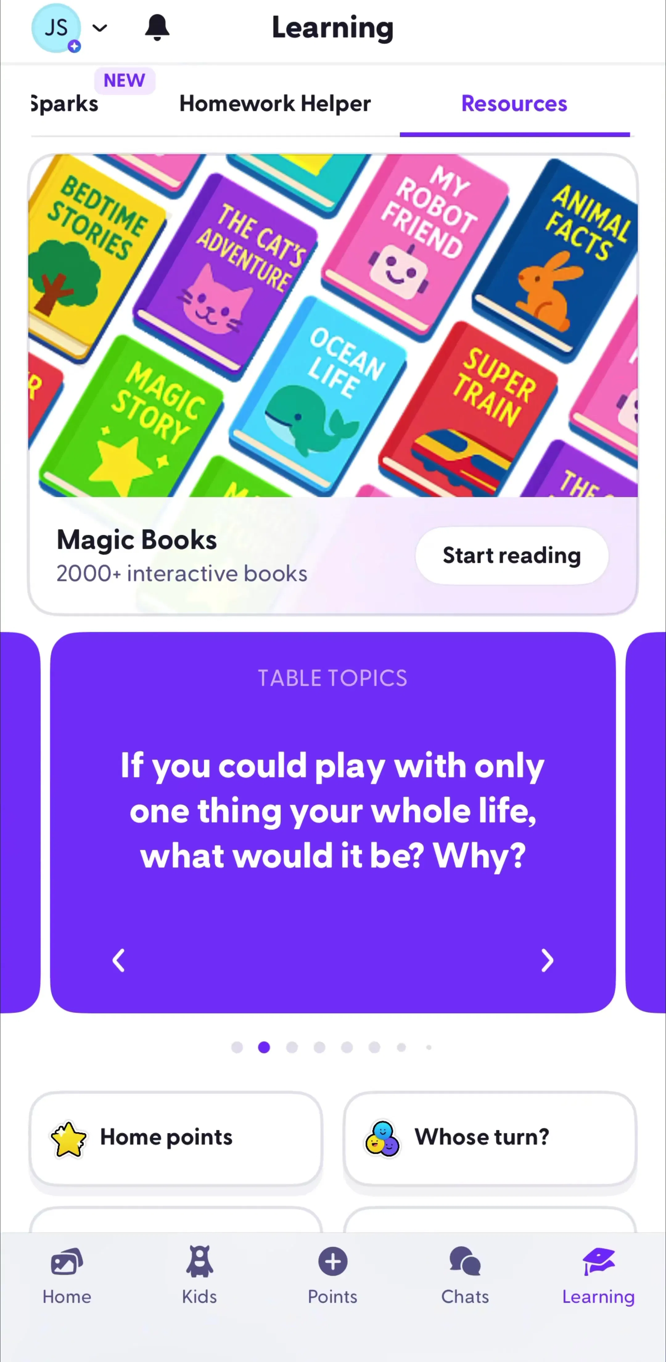
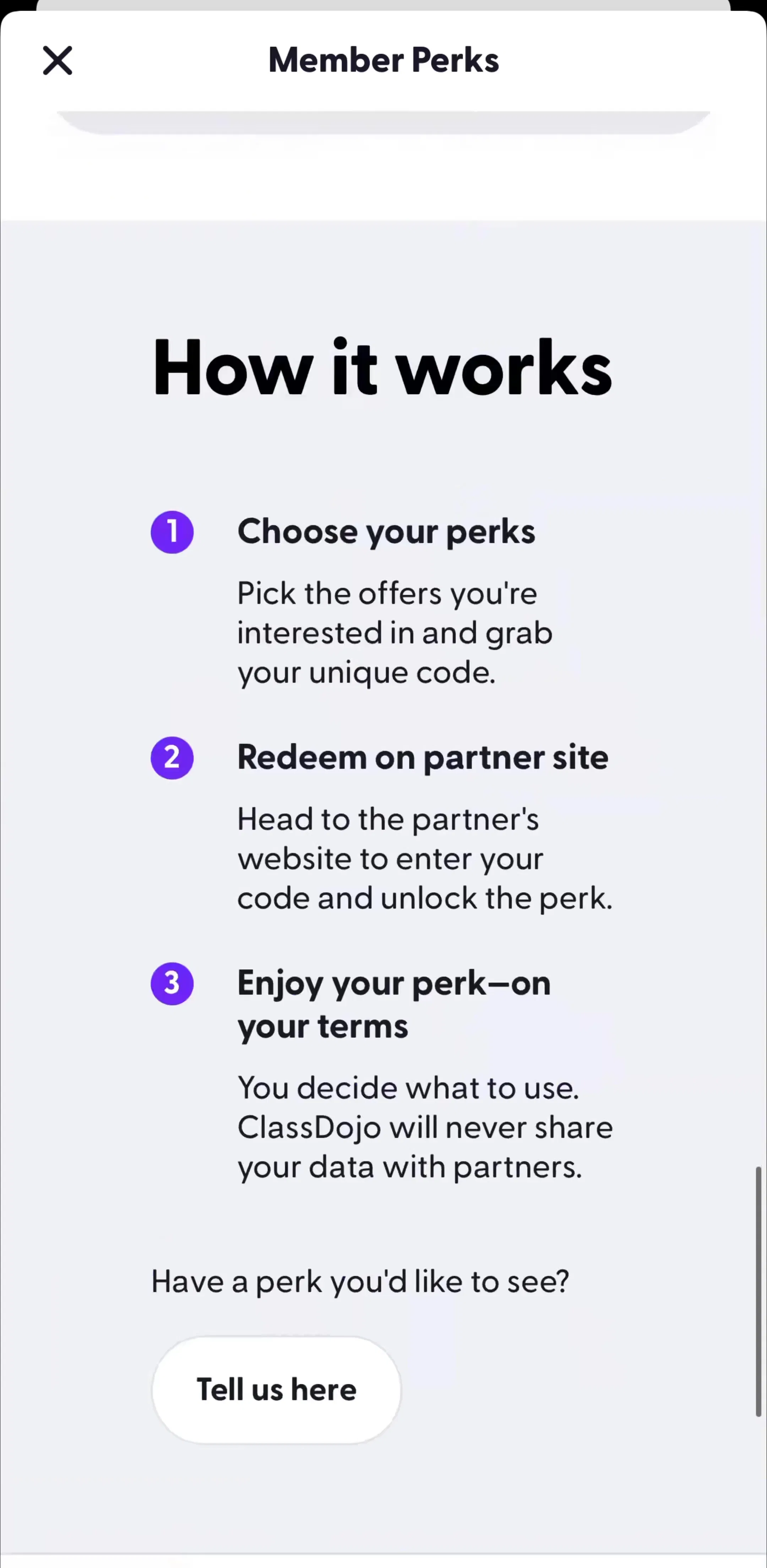
ClassDojo (est. $1.25M/mo) is worth studying for exactly this, since it has to present several different kinds of item to a user who is scanning for one child.
Once a list is long enough to need reduction, the controls need a stable home: a search field at the top, a segmented control or chip row under it, and a sort or filter entry that opens a sheet. What matters is that the applied state stays visible after the sheet closes, because a filtered list that looks identical to an unfiltered one is how users conclude the app has lost their data.
The full set of decisions there, including chips versus sheets and where to put the result count, is in the filter UI breakdown, and the general pattern gallery is search and filter.
On mobile the convention is to load the next page as the user approaches the bottom, with a small inline spinner, rather than to make them tap through numbered pages. Three details decide whether it feels solid. Reserve the row height before content arrives so the list does not jump. Keep scroll position when returning from a detail screen, which is the most commonly broken behaviour in the pattern. And make the end of the list explicit, because an infinite scroll with no terminus gives the user no way to know they have seen everything.
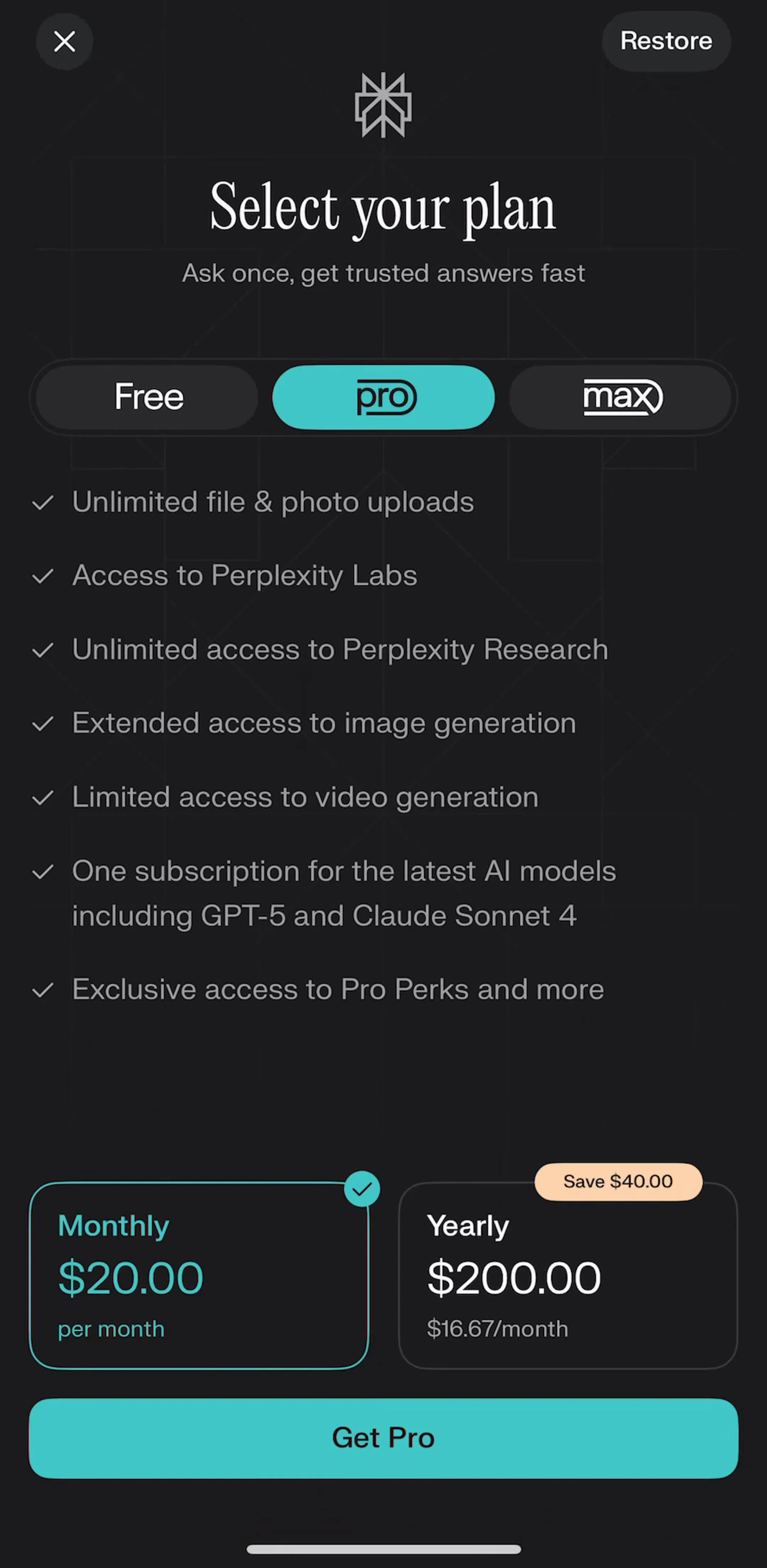
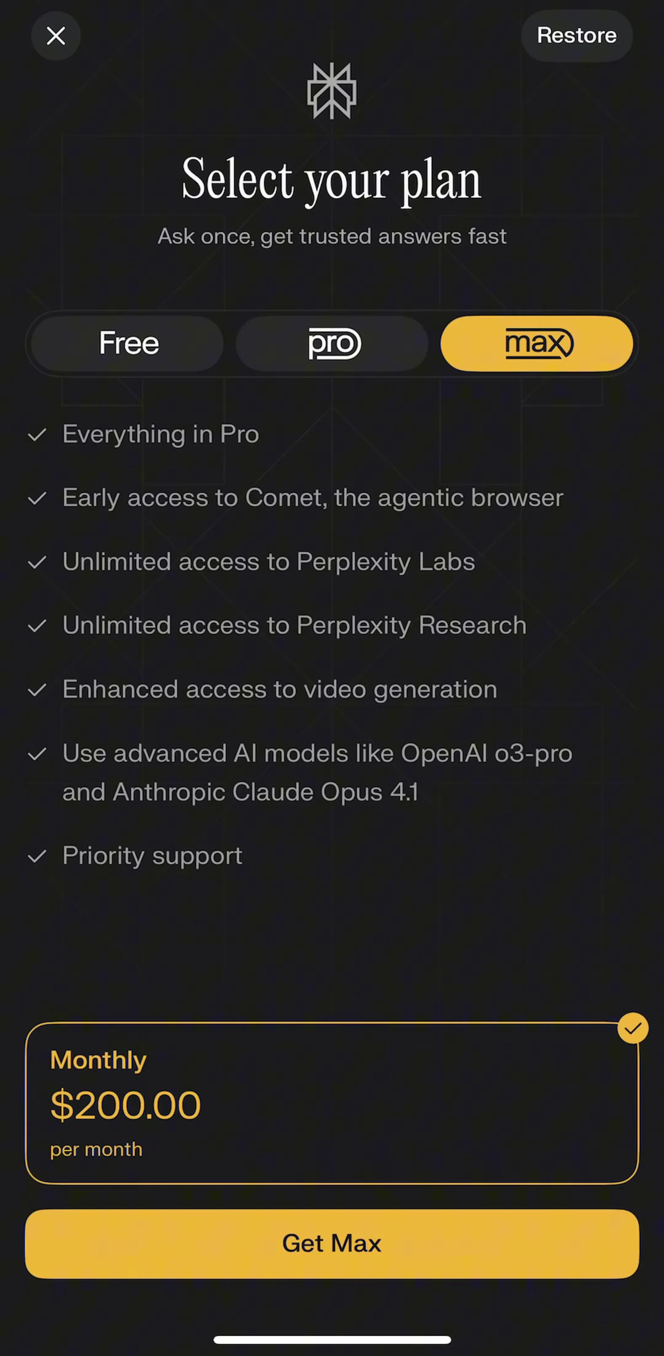
Perplexity (est. $7M/mo) and komoot (est. $4M/mo) both run long, continuously loading surfaces where that behaviour is load-bearing.
Every list has a first day, and on that day it is the onboarding screen for whatever feature it belongs to. The version that works states what will appear here, and offers the one action that fills it. The version that fails is a shrug: an illustration, the words “nothing here”, and no route forward. The same applies to the filtered-to-zero case, which needs a different message and a way to clear the filter, not the first-run copy.
We collected the shapes that work in the empty state breakdown.
Four recurring problems. Rows that grow to three and four lines until the list is a stack of paragraphs. Thumbnails at inconsistent aspect ratios, which makes the left edge ragged and kills scanning. Metadata competing with the primary label at nearly the same size and weight, so nothing leads. And a row that carries three separate tap targets, where the user has to aim rather than tap.
Take the longest list in your product and render it with real worst-case data: the longest name in the database, a missing image, an empty subtitle, and 500 items. Most list problems are invisible against six rows of designed content and obvious against that. Then compare against shipping apps rather than concepts. Every screen in the library sits next to the app’s estimated revenue and downloads, so you can pick references by outcome rather than by how the shot looks, and Meetup (est. $1.75M/mo) is worth adding to the set as a list that has to mix time, place and people in one row.
A note on the numbers: revenue figures cited here are third-party monthly estimates from our library, useful for comparing magnitude, not audited financials.
The design of a repeating row and the surface that holds it. On mobile it covers the anatomy of a single row, how rows are separated, what happens on tap and on swipe, how the list is grouped and headed, and how it behaves when it is empty, loading, or thousands of items long. Most of an app's screens are lists wearing different styling.
One line when the label alone identifies the item, which is true for settings, filters and short names. Two when the user needs a second fact to choose, such as a timestamp, an author, a status or a price. Three lines is usually a sign the row is trying to be a detail screen, and the fix is to move the third fact behind the tap rather than shrink the type.
Cards buy separation and cost density and vertical space. They earn their keep when each item carries an image and several actions, or when items are unrelated to each other. Plain rows with dividers are better for homogeneous, scannable content, which is most lists. Choosing cards for visual richness on a settings-style list is the most common overreach in the pattern.
Give it structure before you give it search. Sticky section headers, an alphabet or date grouping, and a stable sort do more for findability than a search field the user has to think of using. Then add search and filtering for the tail, load additional pages as the user scrolls rather than paging manually, and keep the scroll position when they come back from a detail screen.
The mobileappdesign library holds captured flows from 2,622 revenue-verified iOS apps, including 1,303 with a browse and feed flow. Screens are captured in sequence, so you can see a real list next to the detail screen it opens rather than as an isolated shot.
Browse captured feed and list flows from revenue-verified iOS apps, in the order a real user walks them.
Browse feed and list screens