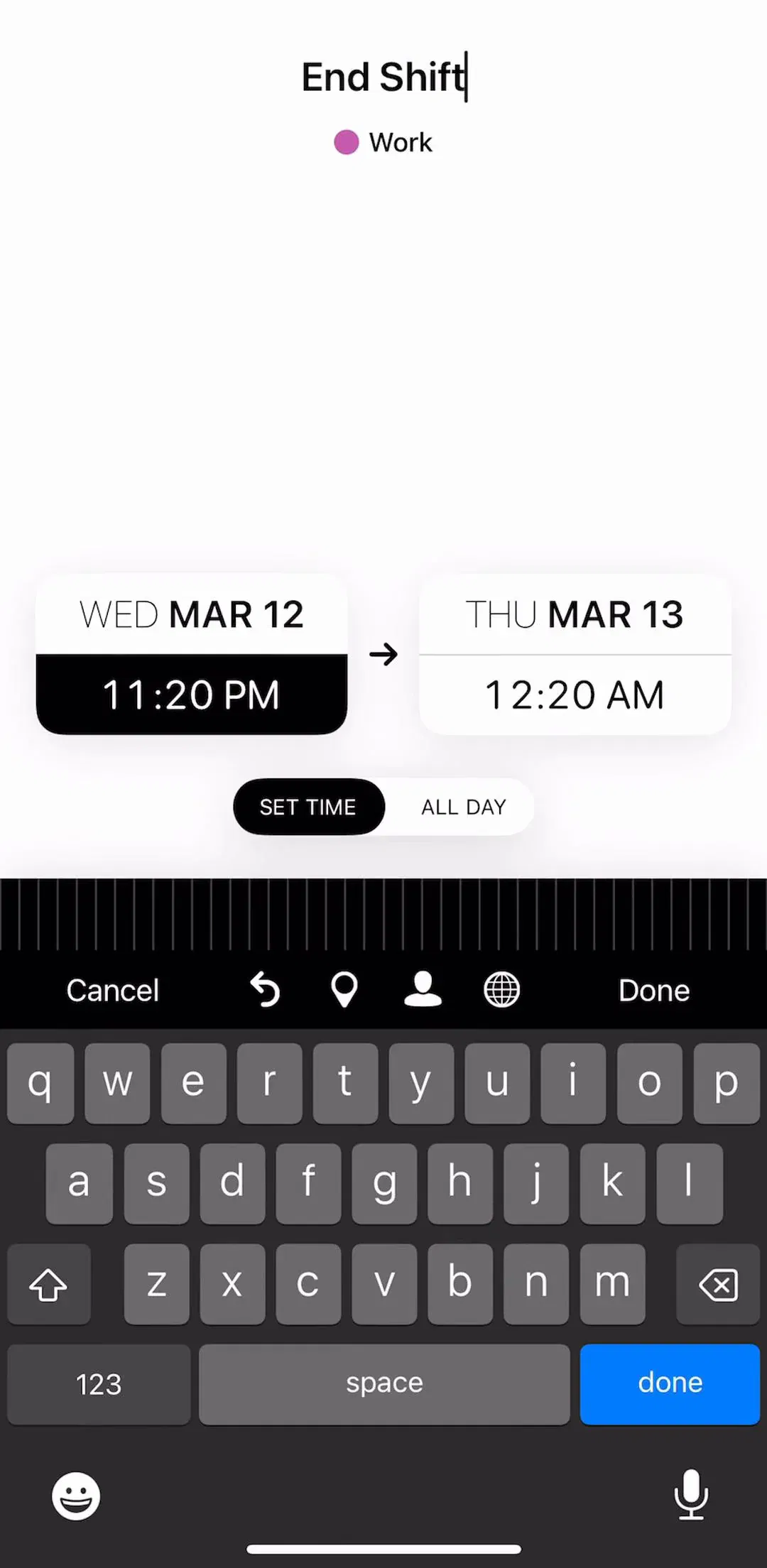
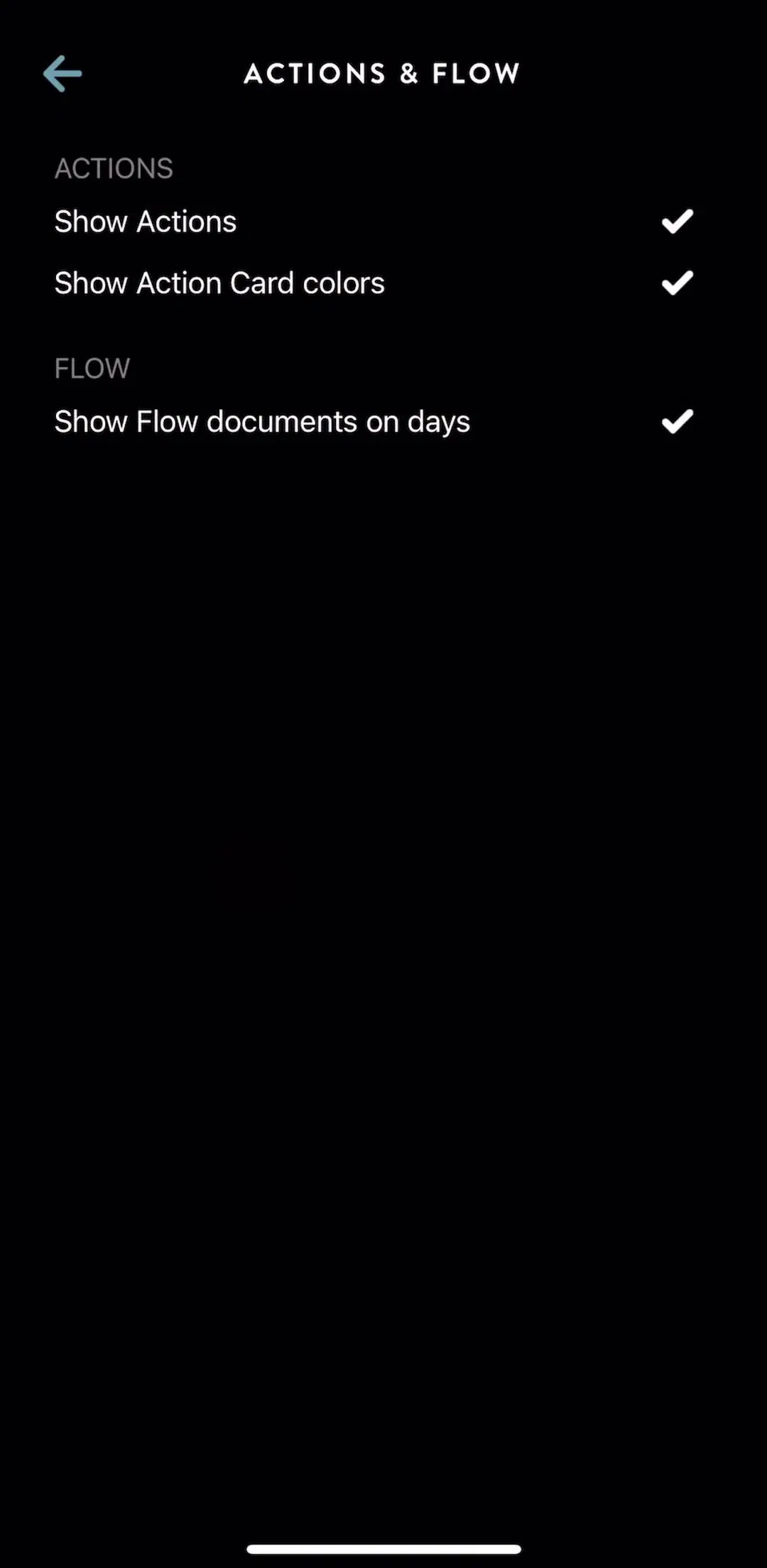
Settings is the screen designers spend the least time on and users visit at the worst moments: when something is annoying them, when they want to turn a notification off, and when they want to cancel. It is also one of the most standardised surfaces in mobile design, which makes it cheap to get right and expensive to get creative with. Our library holds 2,622 revenue-verified iOS apps and 1,520 of them have a captured settings flow, behind only onboarding and the paywall. Here is what that comparison shows.
Nearly every shipping settings screen is the same object: a scrolling column of short groups, each with a quiet header, each row a label on the left and a control or a chevron on the right. Concept work treats this as a failure of imagination. It is closer to the opposite. The user arrived with a specific thing they want to change, they are scanning rather than reading, and the grouped list is the fastest structure to scan on a phone. Design effort here should go into what the groups are and what order they come in, not into inventing a new shape.
The one genuine variation is between apps that put settings behind a profile tab and apps that put it behind a gear icon on the home screen. Both are common in the library, and the choice mostly follows whether the product has a meaningful account.
The top of the screen is where the user confirms who they are signed in as. In shipping apps this is usually a taller row with an avatar, a name, and the email or handle, acting as an entrance to profile editing rather than as a setting itself. It earns the position because it answers the question people most often open settings to answer, which is whether they are on the right account.
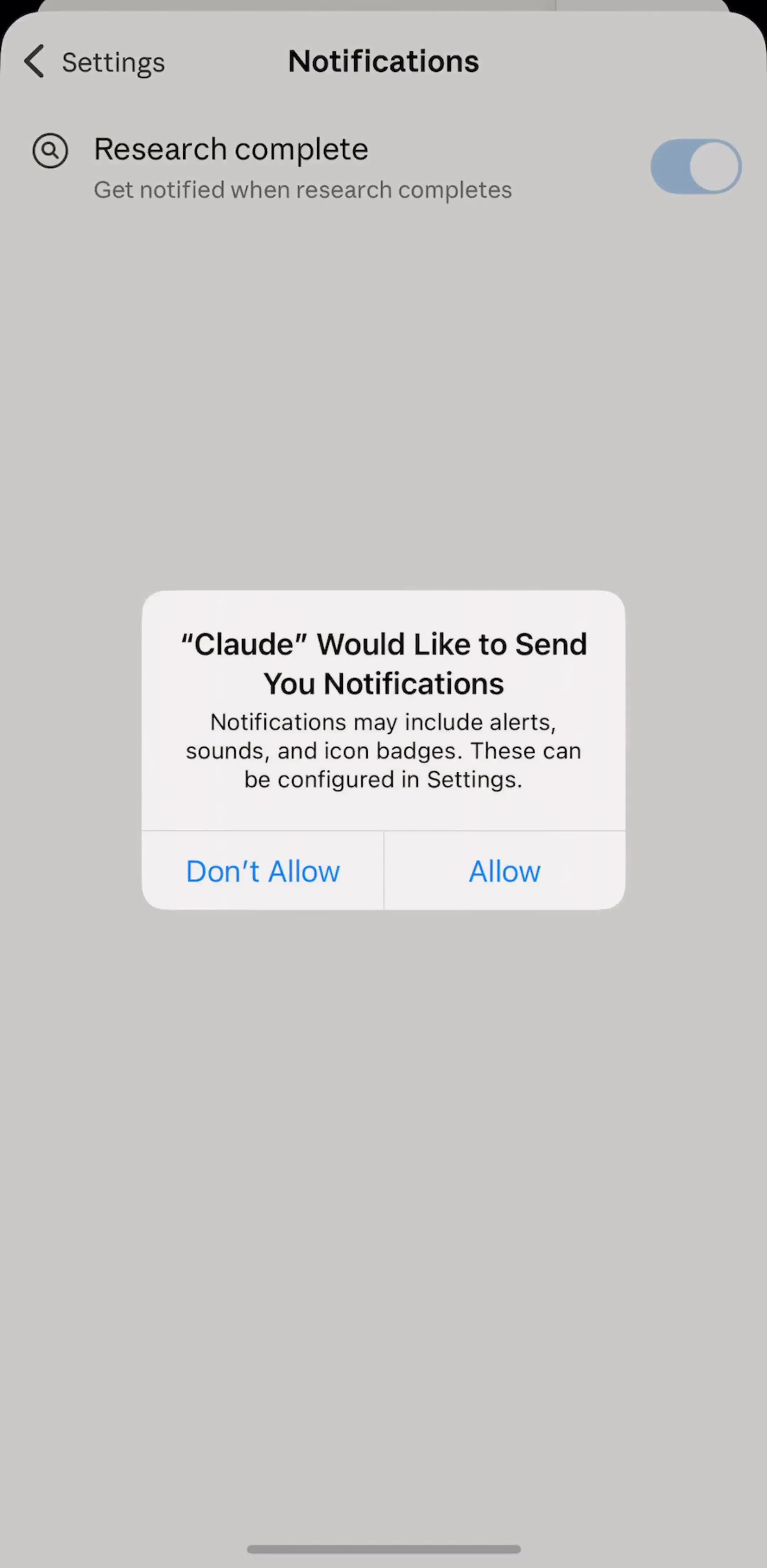
Claude (est. $59M/mo) is a compact reference for the small-surface version of this, where the whole settings tree fits in a handful of screens.
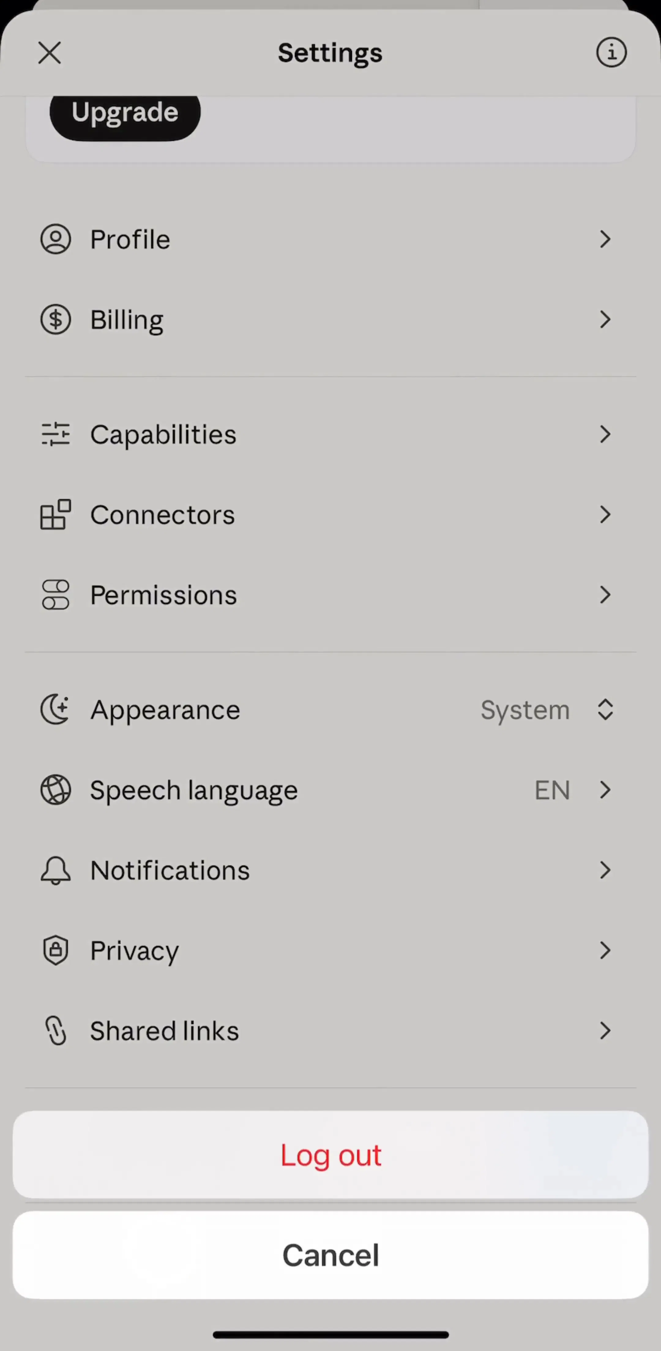
The most common structural mistake is grouping by internal architecture: everything the sync service owns in one block, everything the media pipeline owns in another. Users do not know your architecture. They know they want the app to stop buzzing at night, or to be in kilometres, or to be dark.
The ordering that shows up repeatedly across the library, and that is worth copying, is: account, then the preferences that change the daily experience, then notifications, then data and privacy, then help and legal, then the destructive actions. Frequency of use descending, risk ascending.
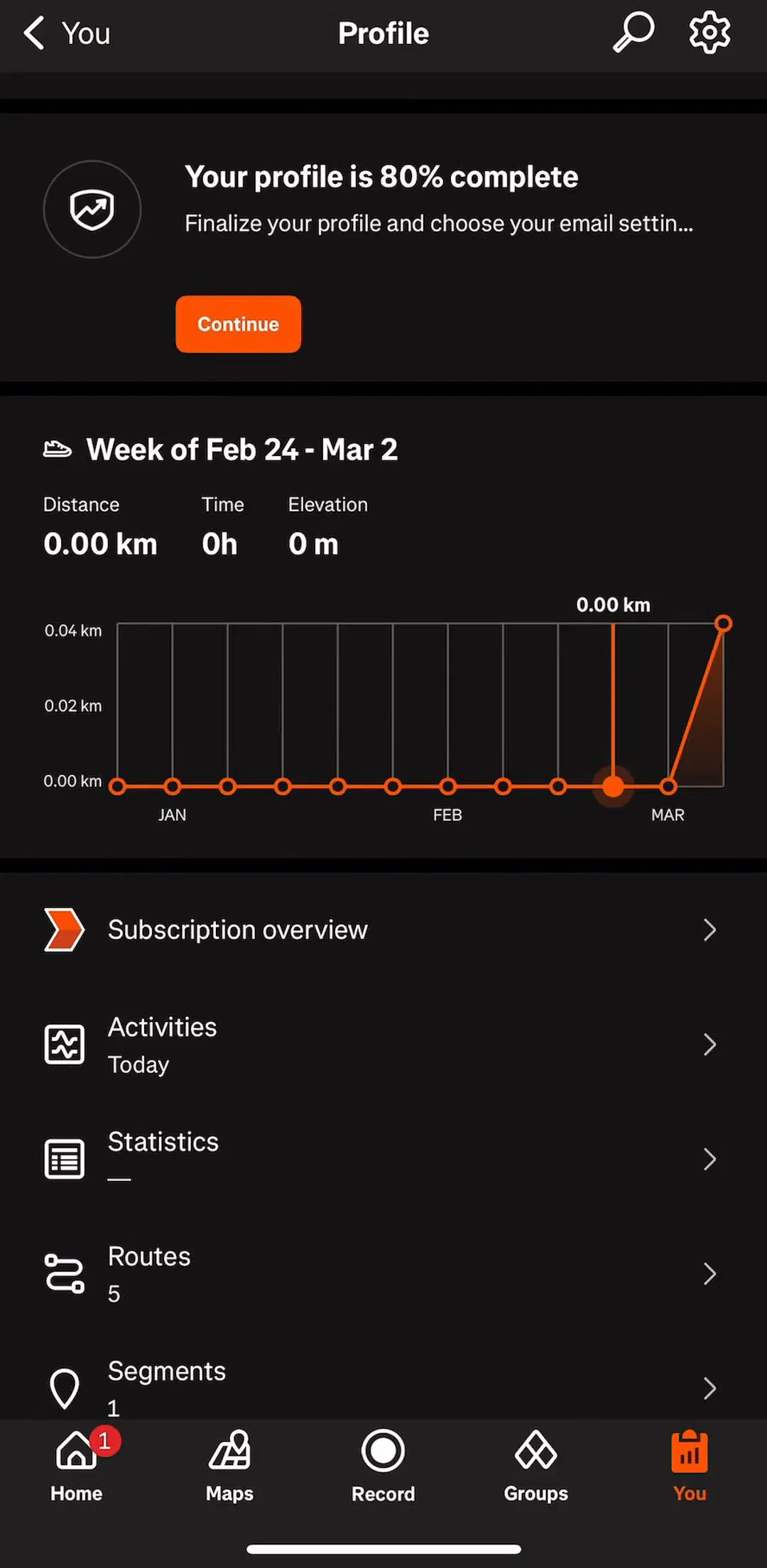
Strava (est. $16M/mo) is worth studying as the large end of the problem, with a settings tree deep enough that the grouping is doing real work.
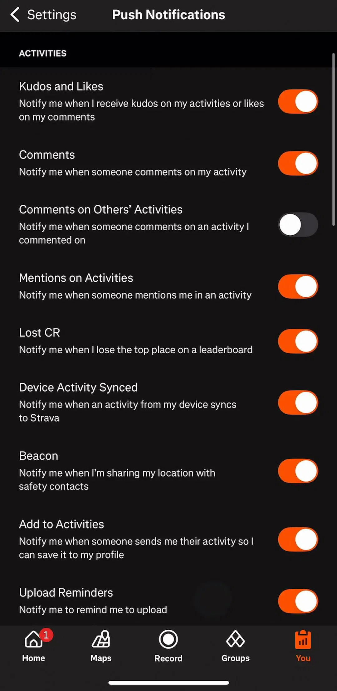
A toggle promises three things: there are exactly two states, the change happens now, and you can put it back. Break any of those and it is the wrong control. A setting with three meaningful options is a drill-down row showing the current value on the right. A setting that needs a server round trip should show that it is working rather than snapping back silently on failure. A setting that cannot be undone is not a toggle at all, it is an action with a confirmation.
The related rule is that a toggle row should be readable without changing it. If the label only makes sense once you have flipped it and observed the result, the label is wrong, and a line of supporting text under it costs almost nothing.
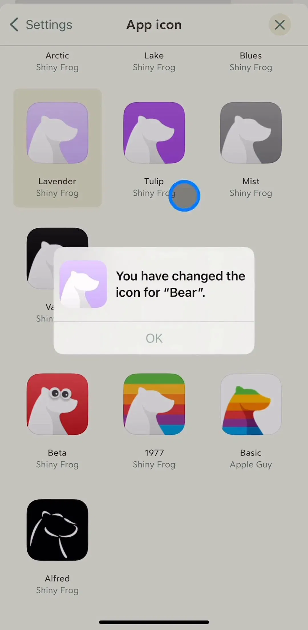
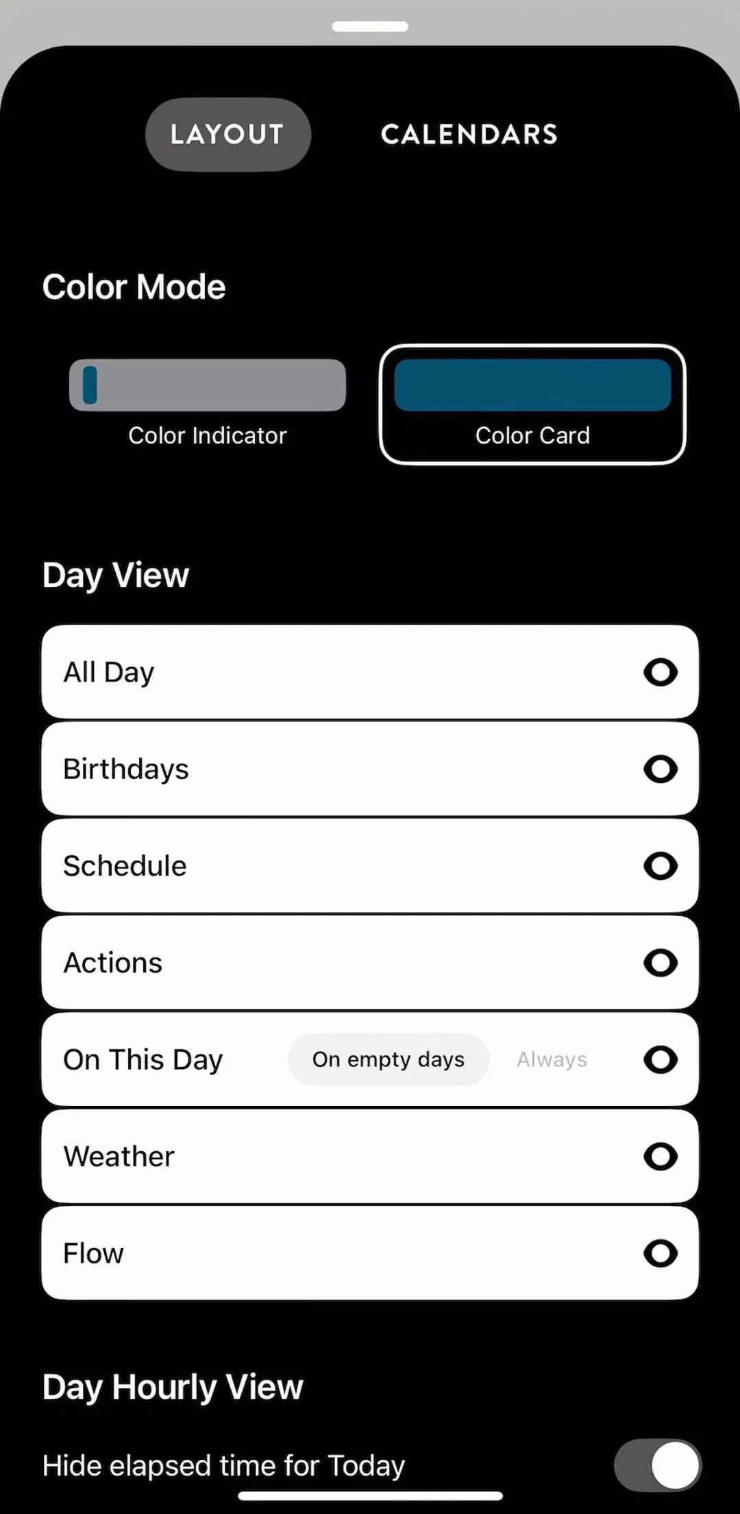
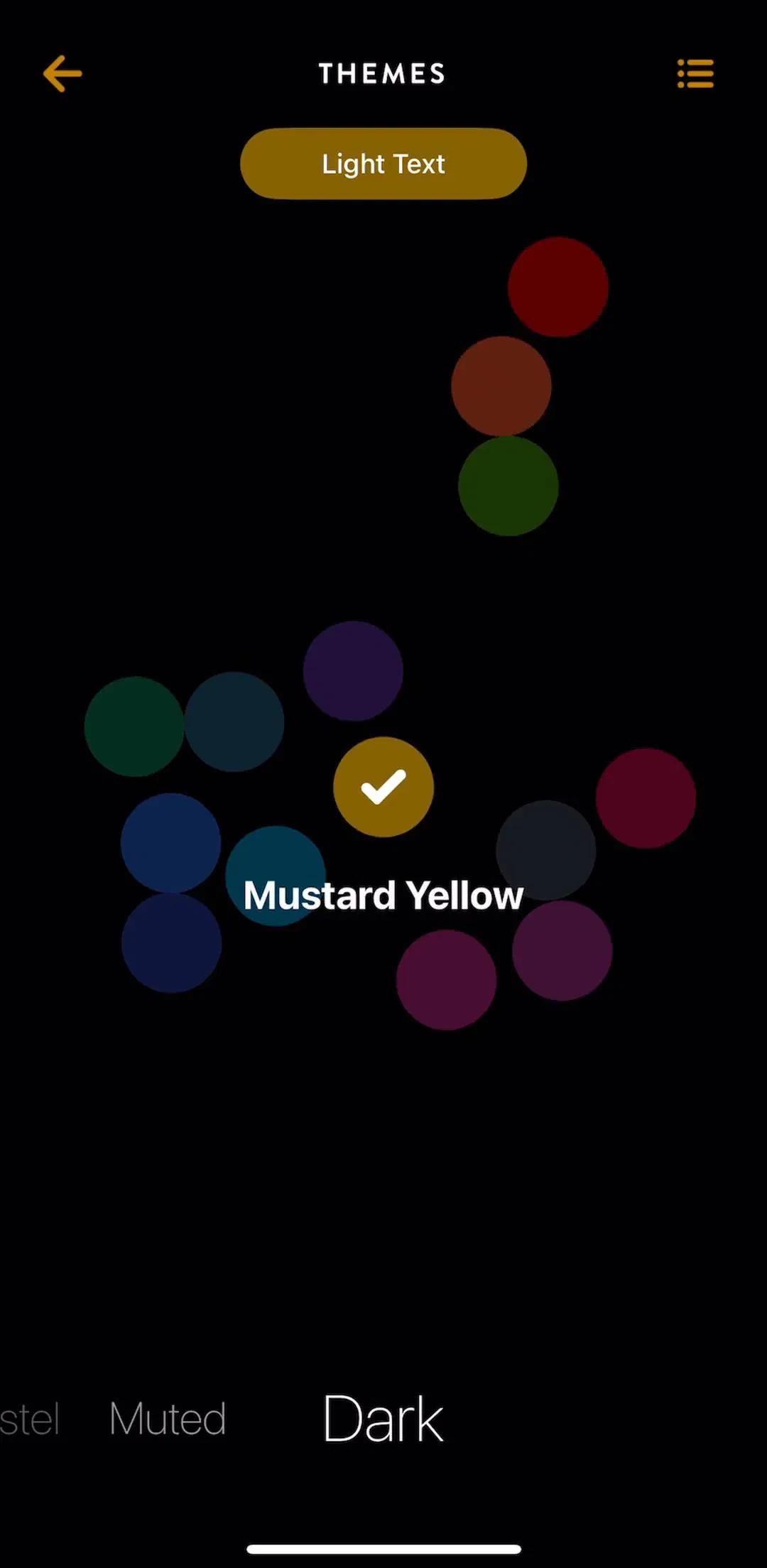
Theme, accent colour, app icon, text size, and layout density used to be one or two rows. In a lot of shipping apps they are now a screen of their own, often with a live preview, because they are the settings people actually enjoy changing and they are cheap retention. The pattern that works shows the result rather than describing it: swatches and previews instead of a list of colour names.
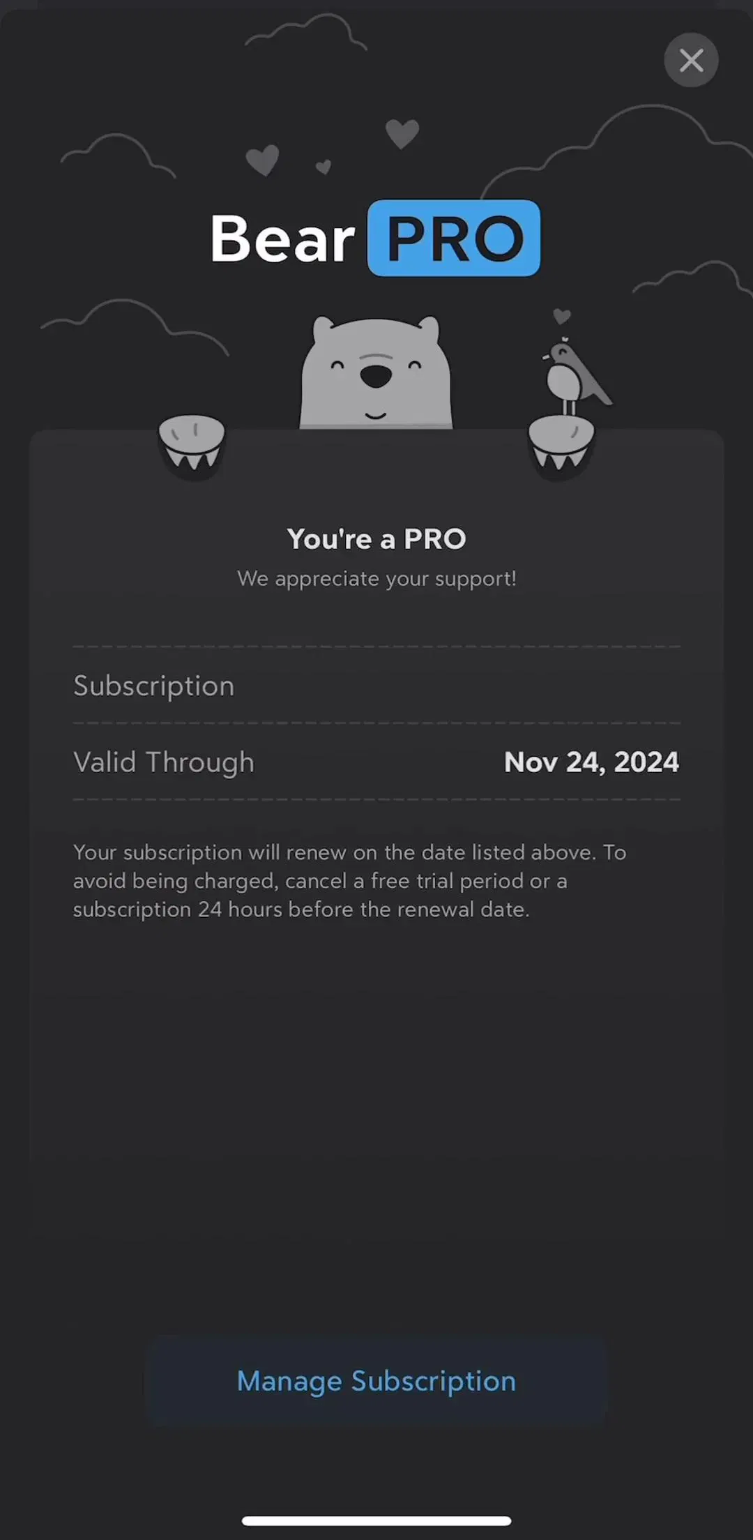
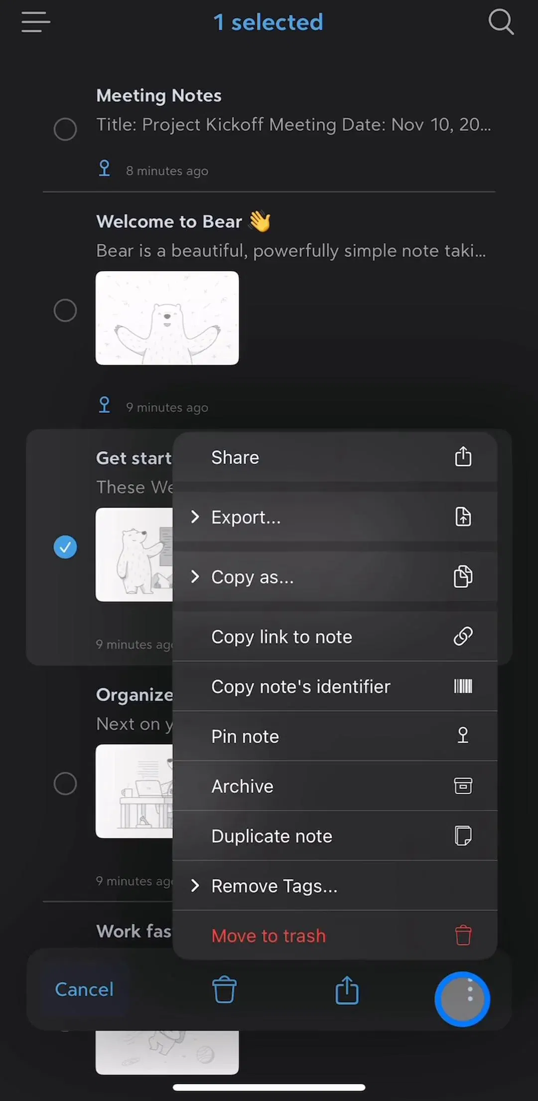
Bear (est. $45k/mo) and Timepage (est. $25k/mo) both invest unusually heavily here for their size, which is a reasonable bet for a tool people keep on a home screen.
If you are deciding whether to ship a light theme, a dark theme, or both, we measured how common each is across the library in the dark mode breakdown.
The notification block in settings does a job the system dialog cannot. It lets someone who turned everything off turn one useful thing back on, which is the only realistic path back from a blanket refusal. That argues for granularity: separate rows for the categories the product actually sends, rather than a single master switch that forces an all-or-nothing decision.
It also argues for honesty in the labels, since a row named Updates that turns out to mean marketing is the fastest route to a permanent opt-out. The notification breakdown covers the priming and message side of the same problem, and the notifications gallery holds the captured screens.
People open settings to find out what they are paying for. A row that shows the current plan, the renewal, and a route to manage it belongs near the top. Products that replace this with an upgrade banner and no plan state are optimising the wrong number: the user who cannot find how to cancel does not stay subscribed, they charge back or leave a one-star review about it.
The upsell still belongs here for free users, and the paywall breakdown covers how shipping apps frame it. Compare that against the account management gallery, which holds the plan, billing, and cancellation screens.
Sign out, delete account, clear data, and reset sit at the bottom, visually separated, usually in red, always behind a confirmation that says what will be lost. Two practical notes. Delete account has to exist and be reachable in-app for App Store apps that support account creation, so treat it as a requirement rather than a nice-to-have. And sign out is not destructive for a synced product but is close to destructive for a local-only one, so the confirmation copy should reflect which of those you are.
The captured examples live in the delete and cancel gallery.
Four failures show up repeatedly. Depth for its own sake, where a single toggle sits three screens down and nobody ever finds it. Groups with one row in them, which is a header doing no work. Settings that silently do nothing because the underlying feature was removed. And the emptiest version of all, a settings screen that is only Rate us, Share, Privacy policy, and Terms, which tells the user the app has no preferences worth having and wastes the tab it occupies. If that is your settings screen, the honest fix is to fold it into the profile screen, which is covered in the profile gallery.
Settings is the cheapest pattern in mobile design to study by comparison, because there are 1,520 captured examples and they are all trying to solve the same shape. Open four apps in your category, list their group headers side by side, and the consensus ordering will be obvious within minutes. Every screen in the library sits next to the app’s estimated revenue and downloads, so you can pick references by outcome rather than by taste, and ChatGPT (est. $267M/mo) and Flo (est. $9M/mo) are useful opposite ends: one a broad tool with a shallow tree, one a personal-data product where privacy settings carry real weight.
A note on the numbers: revenue figures cited here are third-party monthly estimates from our library, useful for comparing magnitude, not audited financials.
As a vertical list of short labelled groups, ordered by how often each group is opened rather than by how the app is built internally. Across shipping iOS apps the recurring order is account first, then the settings that change what the user sees every day, then notifications, then legal and support, then the destructive actions at the very bottom.
A toggle when the setting is genuinely binary and takes effect immediately, a drill-down row when there are three or more options or when the choice needs explanation. The mistake is a toggle for something that is not really on or off, because the user cannot tell what the off state does without changing it and watching what happens.
Near the top, inside or directly under the account block, and it should state the current plan rather than only offering an upgrade. Settings is where people go to check what they are paying for and to cancel, so hiding the plan state there reads as evasive and tends to produce support tickets and refund requests instead of retention.
Only when the list has grown past what a person can scan, which for most apps is a sign the hierarchy is wrong rather than a sign search is missing. Large platform apps do add it. A focused product with four groups does not need it, and adding search there mostly signals that nobody was willing to remove anything.
The mobileappdesign library holds captured flows from 2,622 revenue-verified iOS apps, and 1,520 of them have a settings and preferences flow captured in sequence. That makes settings one of the three most common flows in the library, after onboarding and the paywall, so it is a good pattern to study by comparison rather than from first principles.
Browse captured settings and preferences flows from revenue-verified iOS apps, in the order a real user walks them.
Browse settings screens