Dark mode arguments usually run on vibes. We had a way to settle part of it: the library holds captured screens from 2,622 shipped iOS apps, so we sampled up to ten screens spread across each app’s full flow, 26,086 screens in total, and measured the average brightness of every one. Below is what the measurement says about who ships dark, which categories it belongs to, and what it costs you to do properly.
31.3% of the screens we sampled measured dark, and 27.8% of apps are dark across their whole flow rather than on one or two screens. That is a big number and it is nowhere near a majority. If you are being told that dark is where mobile design has landed, the shipped evidence disagrees: roughly seven in ten iOS apps still present a light interface by default.
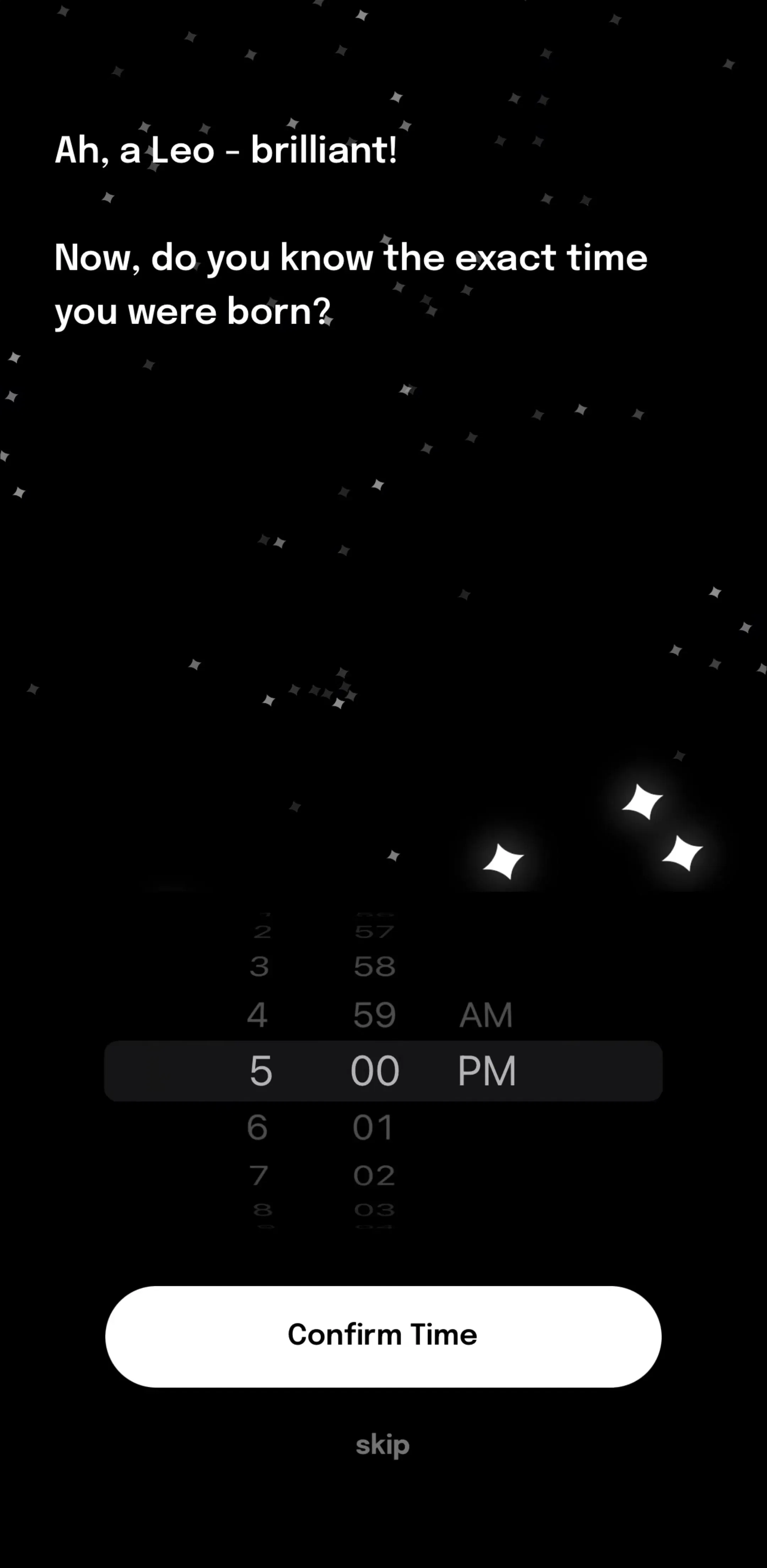
The darkest app in the sample is Astra (est. $450k/mo), which reads at an average brightness of 11 out of 255. It is the shape dark-first apps tend to take: near black ground, one saturated accent, type doing all the structural work because there are no borders left to lean on.
Split the same measurement by App Store category and the pattern is obvious. Dark tracks content type, not fashion.
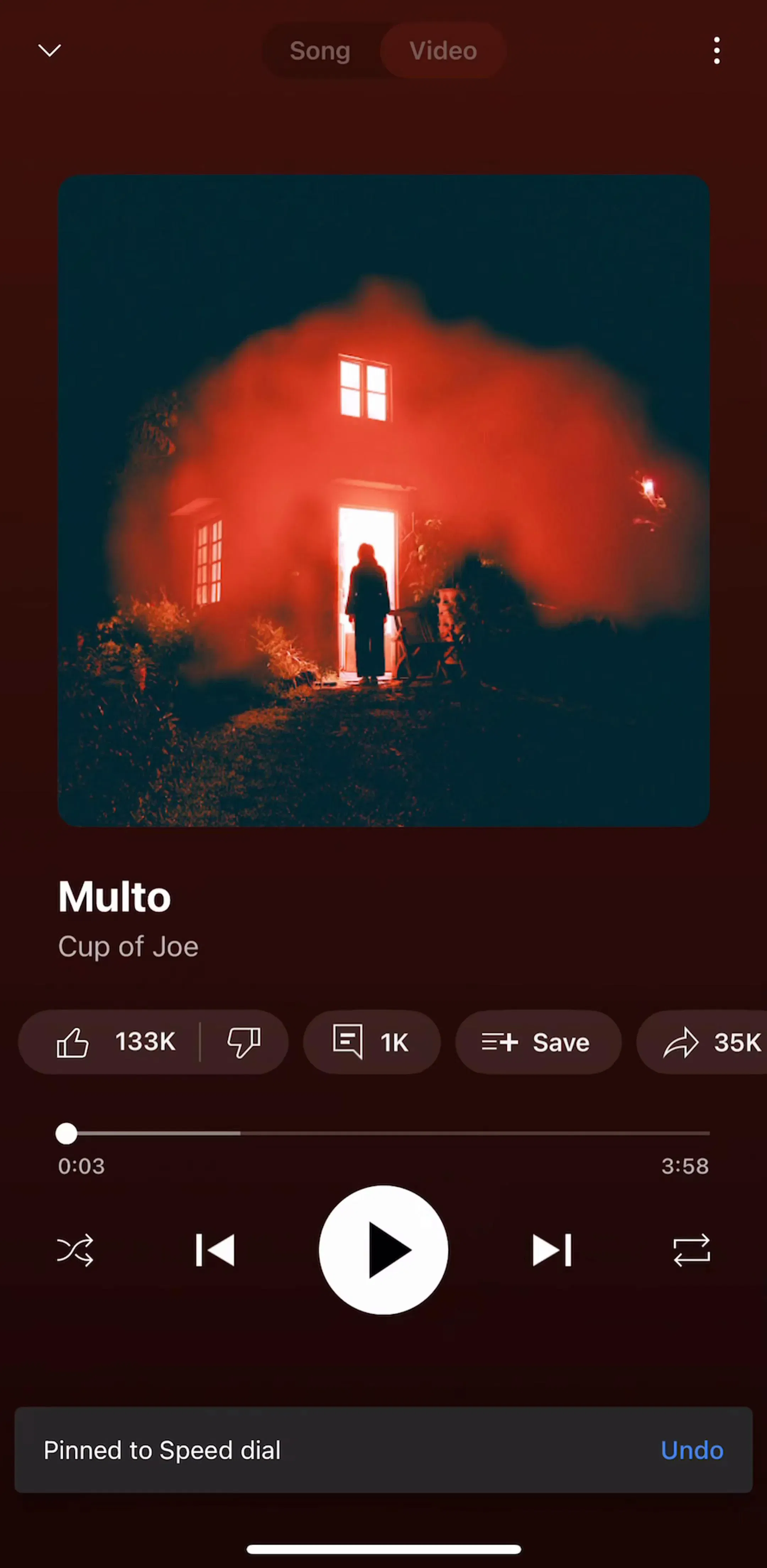
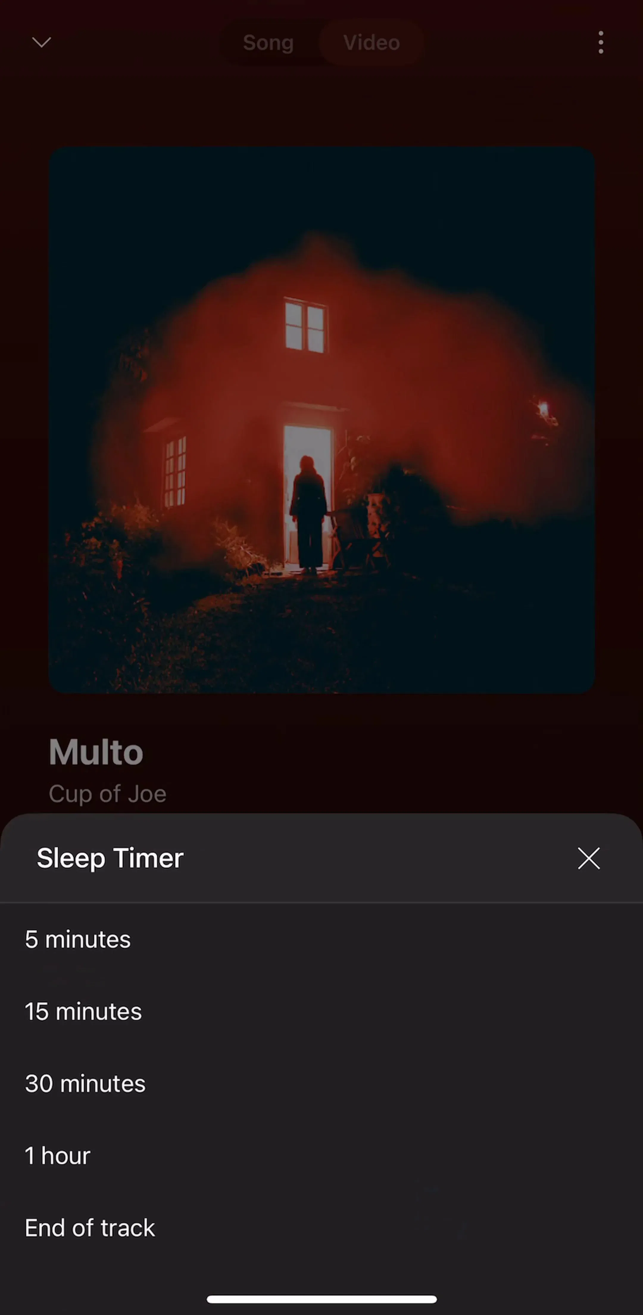
Every category at the top of that list puts media in the frame. Album art, video, photos, and maps all read better against a dark ground, and the interface gets out of the way by disappearing. YouTube Music (est. $38M/mo) and SoundCloud (est. $10M/mo) both sit in the dark half for exactly that reason: the artwork is the product, so the chrome recedes.
Food and drink at 9% is the mirror image. Nobody has ever made a burrito look better by turning the lights off. Before you argue about dark mode, check whether your category has already answered the question, and browse the feed and browse screens in your own vertical to see which ground your competitors chose.
This is the finding most likely to annoy people. Sorting the same apps by revenue estimate:
The relationship, such as it is, runs the wrong way for the dark mode enthusiast. Dark is slightly more common in smaller apps. That does not mean dark hurts, and category mix explains a lot of it, but it does kill the idea that going dark is a growth tactic. The apps at the top that do run dark, such as Strava (est. $16M/mo) and Peloton (est. $3.25M/mo), are dark because their content is video and map tiles, not because a chart told them to be.
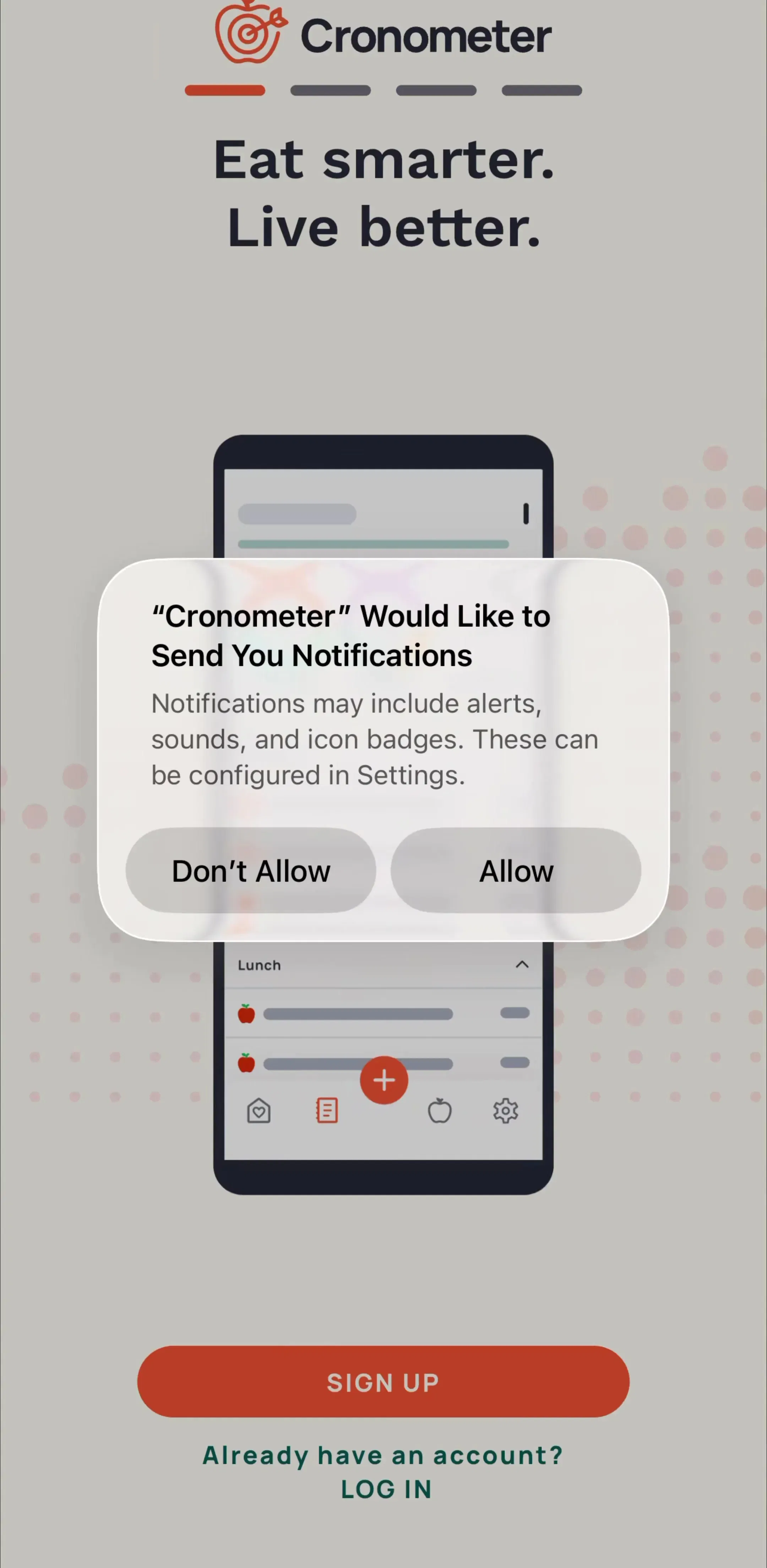
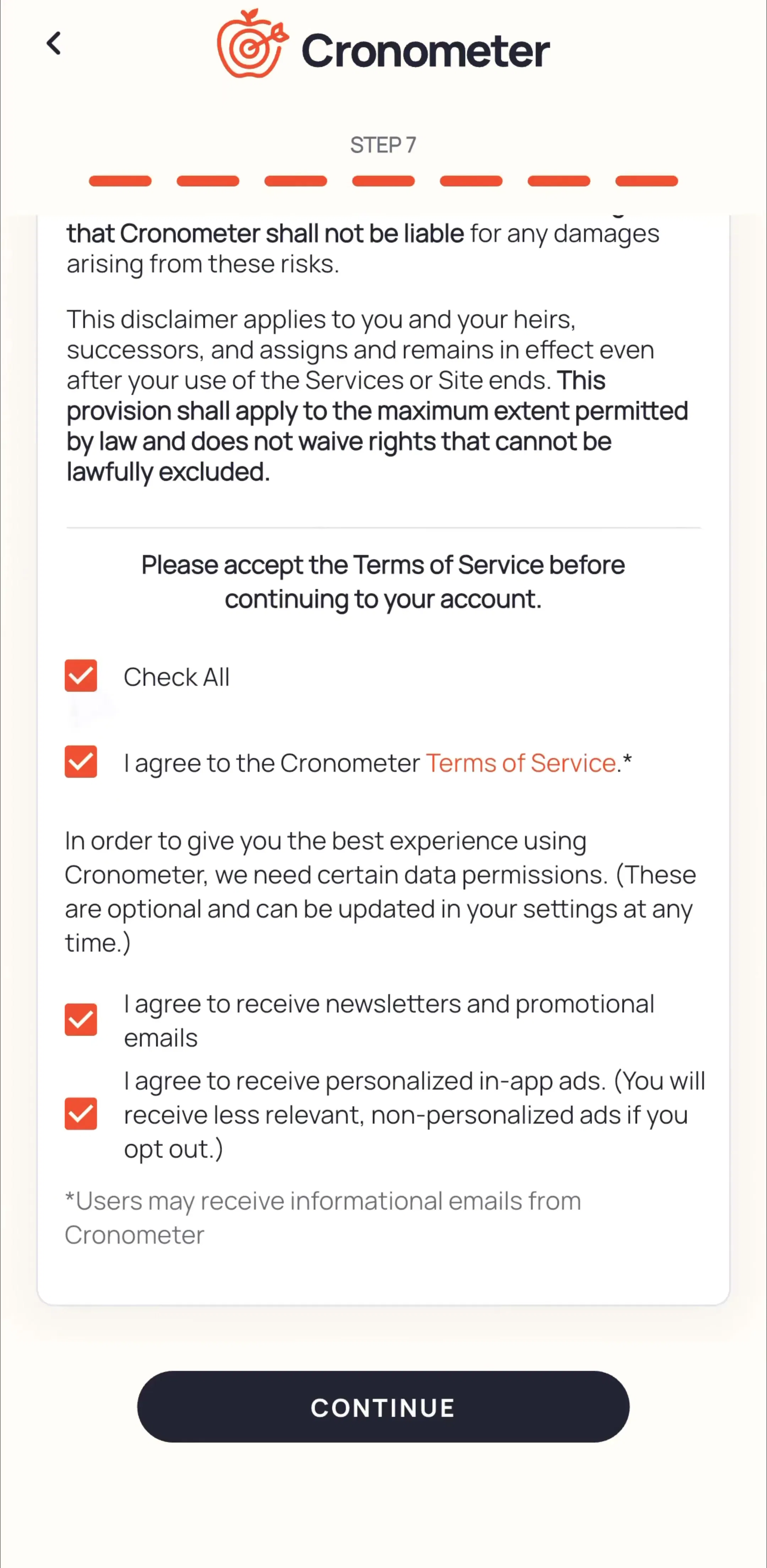
Light-first apps at the top of the market are just as confident about it. Cronometer (est. $1.25M/mo) sits at the far light end of our measurement, and for a dense numeric tracker that is the right call: white ground, hairline rules, and a lot of small type that stays legible in daylight.
The design work is not the palette, it is everything that quietly assumed a white ground.
The cheapest honest answer for most teams is to pick one ground and design it properly. A single well-made dark theme beats a half-finished dark mode with three unstyled sheets and a white PDF viewer. Full dark mode, tracking the system setting, is worth it when your users spend long sessions in the app at night, when your content is media, or when your category already expects it.
Where the toggle lives is its own small design problem, and it is usually solved badly. The convention in shipped apps is a three way control, light, dark, and system, in the appearance section of settings, with system as the default. You can see how a few hundred apps handle it in the settings and preferences gallery, which is more useful than any spec because you can watch the whole flow rather than one frame.
For each of the 2,622 apps in the library we took up to ten screens spread evenly across the app’s captured sequence, so the sample covers onboarding, core use, and settings rather than only the opening screens. For each screen we computed average relative luminance across the image and treated a screen as dark below a fixed threshold. An app counts as dark when its own average falls below the same line. This measures what the app presents by default at capture time, so an app with an excellent optional dark mode that ships light will read as light here.
A note on the numbers: brightness figures are our own measurement of captured screens. Revenue figures are third-party monthly estimates, useful for comparing magnitude, not audited financials.
We sampled 26,086 screens across 2,622 revenue-verified iOS apps and measured average screen brightness. About 31 percent of sampled screens read as dark, and 27.8 percent of apps are dark across their whole flow. Dark is a large minority, not the default.
Music leads by a wide margin at 69 percent of apps measuring dark, followed by photo and video at 43 percent and graphics and design at 40 percent. At the other end, food and drink is 9 percent, travel 14 percent, and education 16 percent.
Our data does not support that claim. Dark UI is more common among apps with no revenue estimate or under 100k per month (about 30 percent) than among apps above 1M per month (21 percent). Dark reads as a category convention and a taste signal, not a revenue lever.
They are different jobs. A dark theme is one fixed look you design and control. Dark mode is a second full theme that has to track the system setting, which doubles the surface you test: every illustration, chart, screenshot, empty state, and third party sheet needs a second pass.
The mobileappdesign library has screens from thousands of shipped iOS apps including the dark-first apps named in this post, so you can study complete flows rather than single dribbble shots.
Browse complete captured flows from revenue-verified iOS apps, dark and light, with revenue and download estimates next to every screen.
Browse settings and preferences screens