The tab bar is the most permanent piece of UI in an app. It sits on almost every screen, it is the first thing a returning user reads, and its four or five slots are a public statement about what the product is for. Get it wrong and every other screen inherits the confusion. We went through in-app screens from revenue-verified iOS apps in the library and pulled out the eight rules the good ones follow.
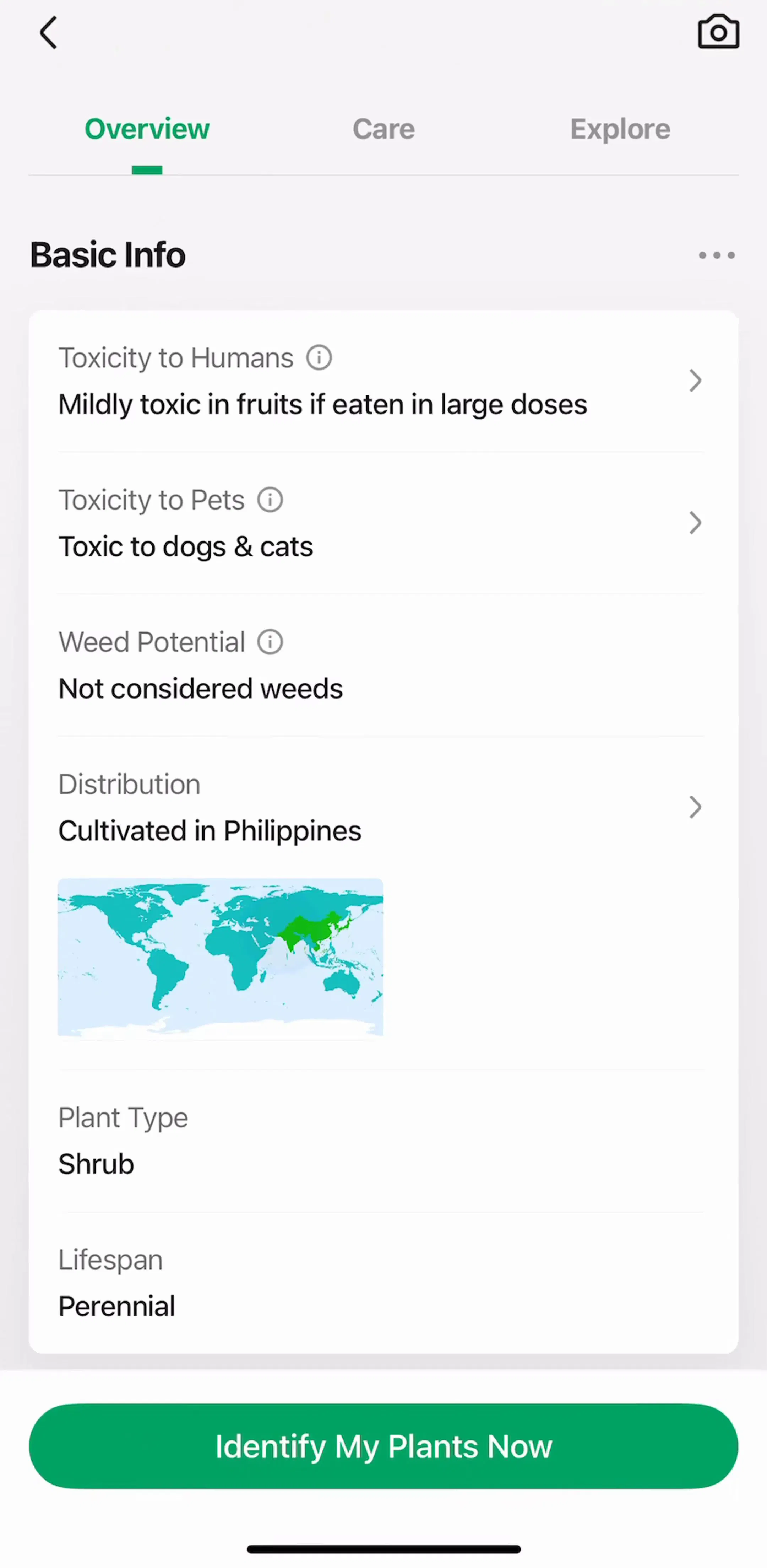
Apple caps the iPhone tab bar at five visible items, and shipped apps cluster tightly around four. The reason is not aesthetic. Each tab is a claim that a section deserves permanent real estate, and most products only have three or four of those. A catalog app like PictureThis (est. $14M/mo) has to hold a capture surface, a browse surface, a saved library, and an account area in the bar at once. If you cannot name what each tab is for in one word, you have too many.
A tab should take the user somewhere they can come back to, with its own state and its own history. Actions belong on the screen, in a navigation bar, or in a sheet. The common failure is the settings gear promoted to a tab: it is a place people visit twice a year sitting in a slot that gets looked at forty times a day. Compare how apps in the settings gallery reach account screens: most of them do it from an avatar in the corner, not from a permanent tab.
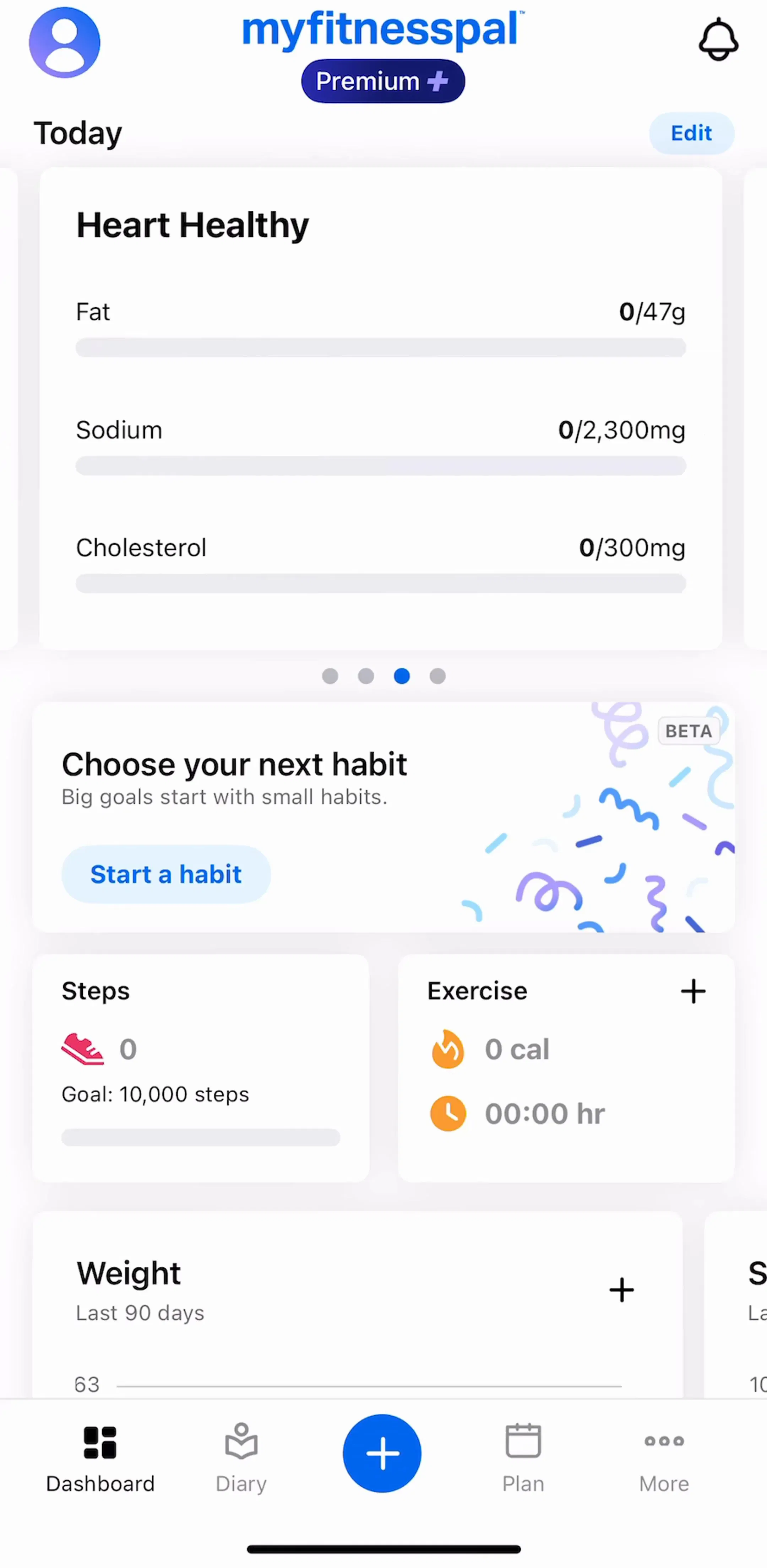
The leftmost tab is where the app opens, so it has to answer the question the user came with. In a tracker, that is today's numbers. In a media app, it is what is new. In a tool, it is the last thing you were working on. The pattern to avoid is a home tab that is really a marketing screen. The apps in the home and dashboard gallery that retain well open on live user data, not on a hero banner.
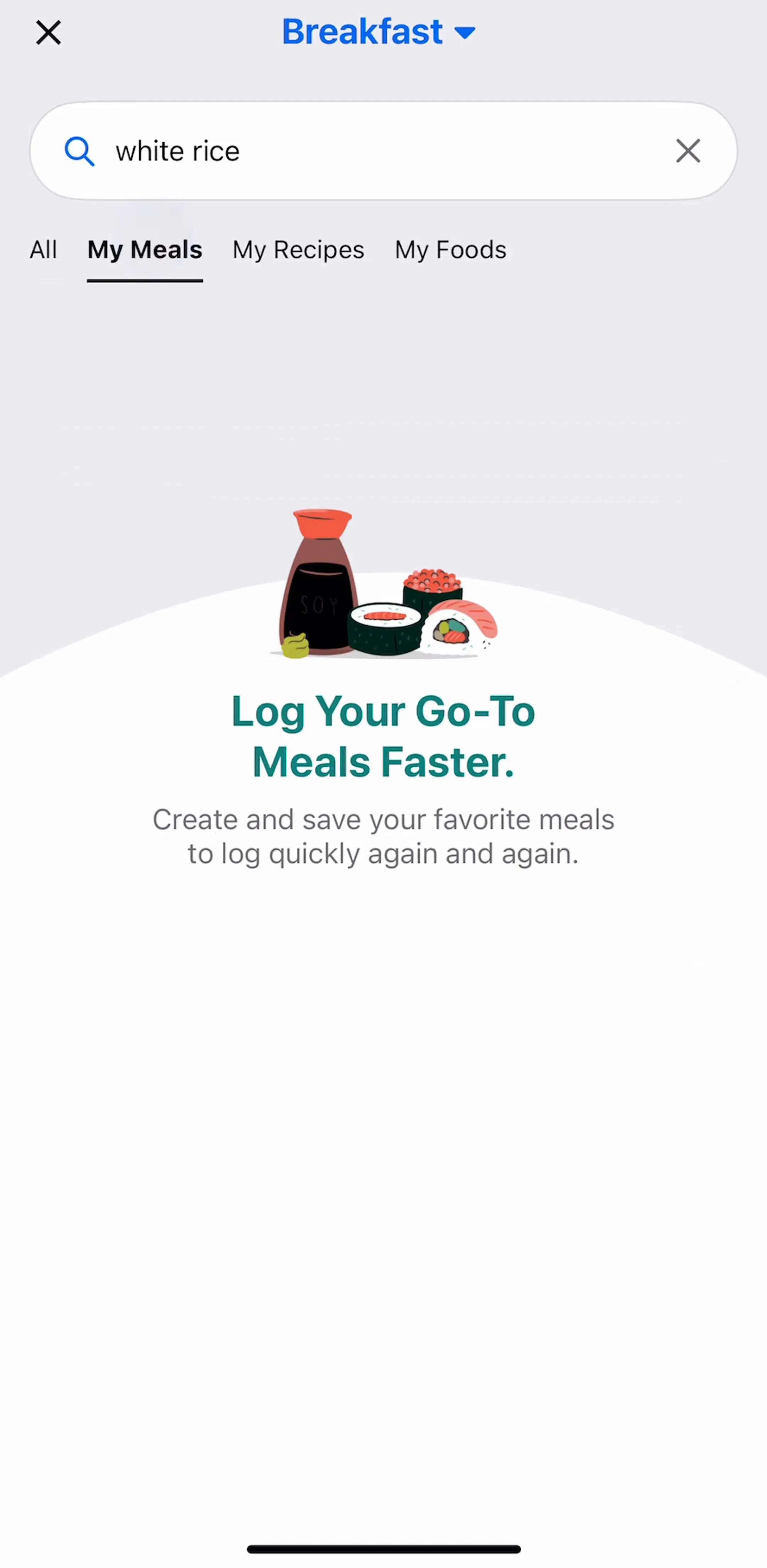
If your app has more content than fits on one screen, discovery needs a permanent home. Burying search behind a magnifying glass in a navigation bar works for apps with ten items and fails for apps with ten thousand. A database-backed product like MyFitnessPal (est. $12M/mo) lives on lookup, so search is not a convenience, it is the core loop. The search and filter gallery is full of variations on this one decision.
Icon-only tab bars look cleaner in a portfolio shot and cost comprehension in the real world. Only a handful of glyphs are truly universal: house, magnifier, person. Everything else, especially the abstract shapes that represent an app's own concepts, needs a word underneath. Almost every high-revenue consumer app in the library keeps its labels, which is a strong signal given how hard those teams fight for vertical space.
Switching tabs and coming back should return the user exactly where they were, scroll position included. Resetting a tab to its root on every visit is the single most common tab bar bug in shipped apps, and it makes the bar feel like a set of page reloads instead of parallel spaces. The one deliberate exception is the double tap on an already active tab, which by convention scrolls to top and pops to root.
The promoted center button, a filled circle or plus that opens a camera, composer, or logging sheet, is right for products where the user's main job is to add something. It is wrong when the main job is to check or consume, because it burns a destination slot on a shortcut. Ask how many times a day the average user creates versus reads. If reading wins, the center slot should be a place, not a plus.
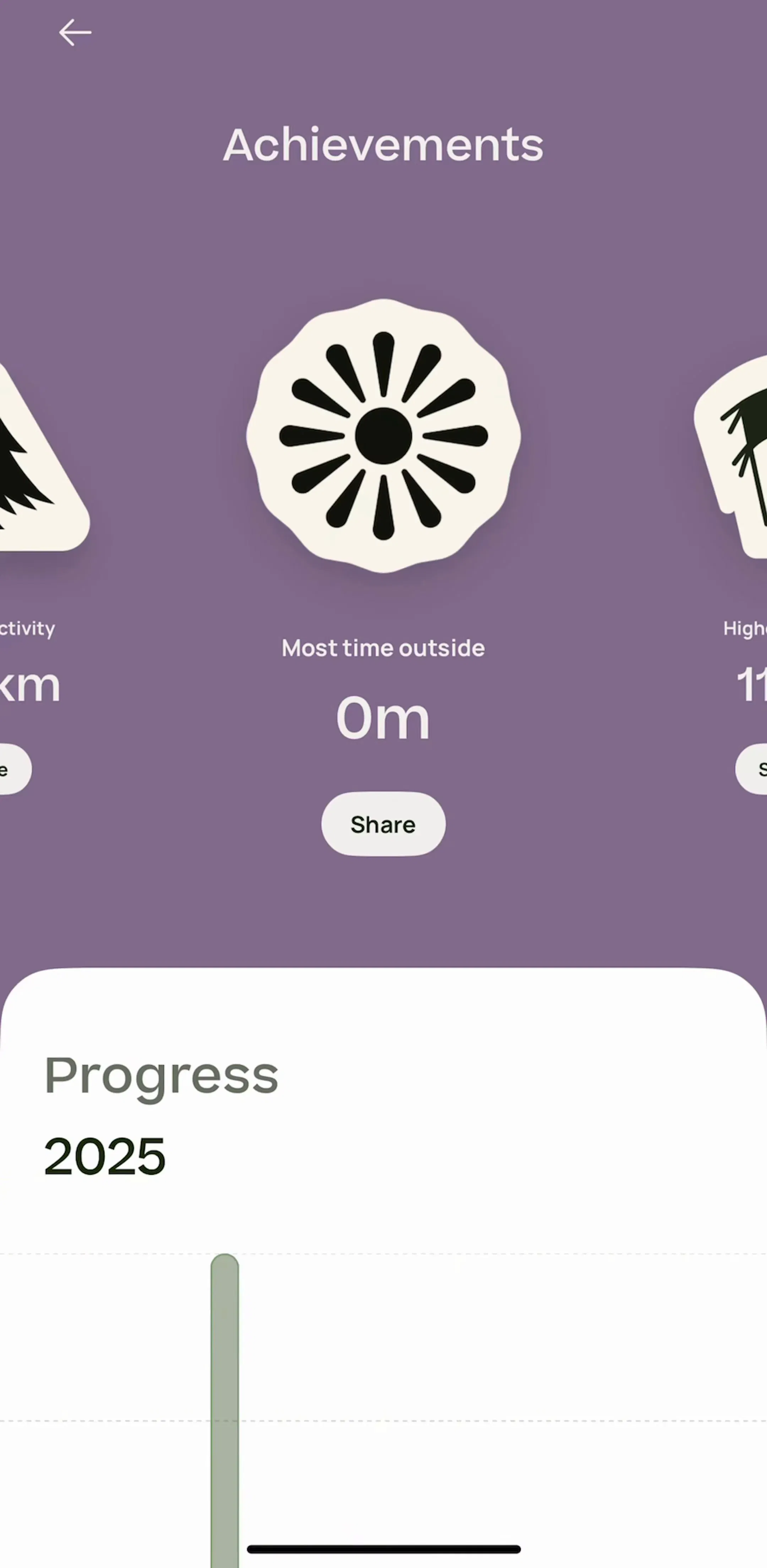
A red dot on a tab is a claim that something waits for the user behind it. Apps that badge for marketing get the badge trained out within a week, and the tab bar loses a real channel. The discipline that separates durable apps is simple: badge only what clears when opened. You can see how carefully the bigger apps ration this by browsing the account and notification screens in the settings gallery. Deep libraries such as AllTrails (est. $6M/mo) push a lot of state into that last tab, which is exactly why the badge on it has to mean something.
Same control, two vocabularies. Apple's Human Interface Guidelines call it a tab bar; Material Design calls it a bottom navigation bar and suggests three to five destinations, which is the same range in practice. If you ship both platforms, the design decisions travel: the tab split, the labels, the state preservation. What changes is the chrome, the icon style, and how the bar behaves on scroll.
Write down the three or four things a user does in a normal week, sorted by frequency. Those are your tabs. Everything else is a screen reachable from one of them. Then go look at what apps in your category actually shipped, not what a component library suggests: the apps with the revenue to back their decisions converged on these patterns for reasons that show up in their retention numbers.
A note on the numbers: revenue figures cited here are third-party monthly estimates from our library, useful for comparing magnitude, not audited financials.
Three to five. Apple's Human Interface Guidelines cap the iPhone tab bar at five visible tabs, and most top-grossing apps sit at four. Below three, a tab bar is not earning its place on screen; above five, targets get cramped and the last slot turns into a junk drawer.
Yes, in almost every consumer app. Icon-only tab bars test badly for anything except universally understood symbols such as home, search, and profile. Labels cost a few points of height and remove a guessing game, which is why the overwhelming majority of shipped iOS tab bars keep them.
They are the same control under two names. Apple calls it a tab bar on iOS, Material Design calls it a bottom navigation bar on Android. The design rules overlap: top-level destinations only, persistent across screens, and state preserved per tab.
Only if creation is the core loop. Apps built around producing something, video editors, social apps, trackers, often promote a create action to the center slot as a filled circle or plus. If your users mostly consume or check status, that slot is better spent on a real destination.
The mobileappdesign library has in-app screens from thousands of revenue-verified iOS apps, so you can see the tab bar in context across a whole app rather than as an isolated component shot.
Browse in-app screens from thousands of revenue-verified iOS apps and study how each one splits its product into tabs.
Browse home and dashboard screens