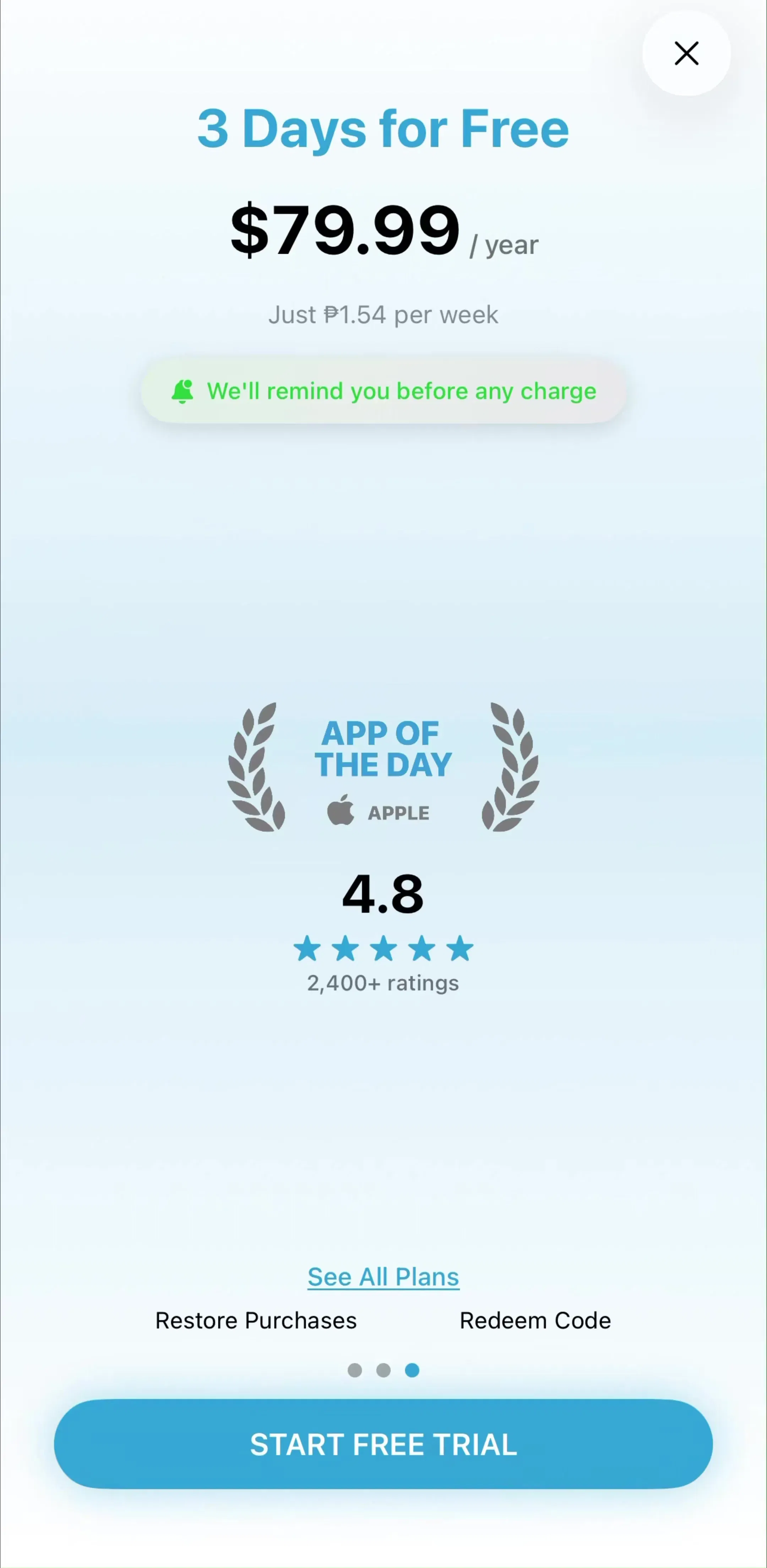
The paywall is the highest-leverage screen in a subscription app: every design decision on it multiplies across your entire funnel. We went through the paywall screens in our library, thousands of screens from revenue-verified iOS apps, and the same nine patterns keep appearing in the apps that earn the most. Here they are, with the apps that execute them best.
The single most common pattern in high-revenue consumer apps: a multi-step onboarding quiz that personalizes the product, followed immediately by the paywall. By the time the price appears, the user has invested a few minutes and been told the product is now tailored to them. Duolingo (est. $48M/mo) and MyFitnessPal (est. $12M/mo) both run long quizzes that end at a subscription screen, and Cal AI (est. $1.75M/mo) compresses the same sequence into a few minutes. See the full flow in our onboarding pattern gallery.
No close button, no free tier: pay or leave. Plant identifiers, photo editors, and scanners lean on this hardest, and Livity(est. $60K/mo) carries one of the longer paywall sequences in the library for a small app. Hard paywalls work when the app’s value is obvious before use (identify this plant, edit this photo) and the free alternative is opening a competitor. They punish apps whose value takes sessions to demonstrate.
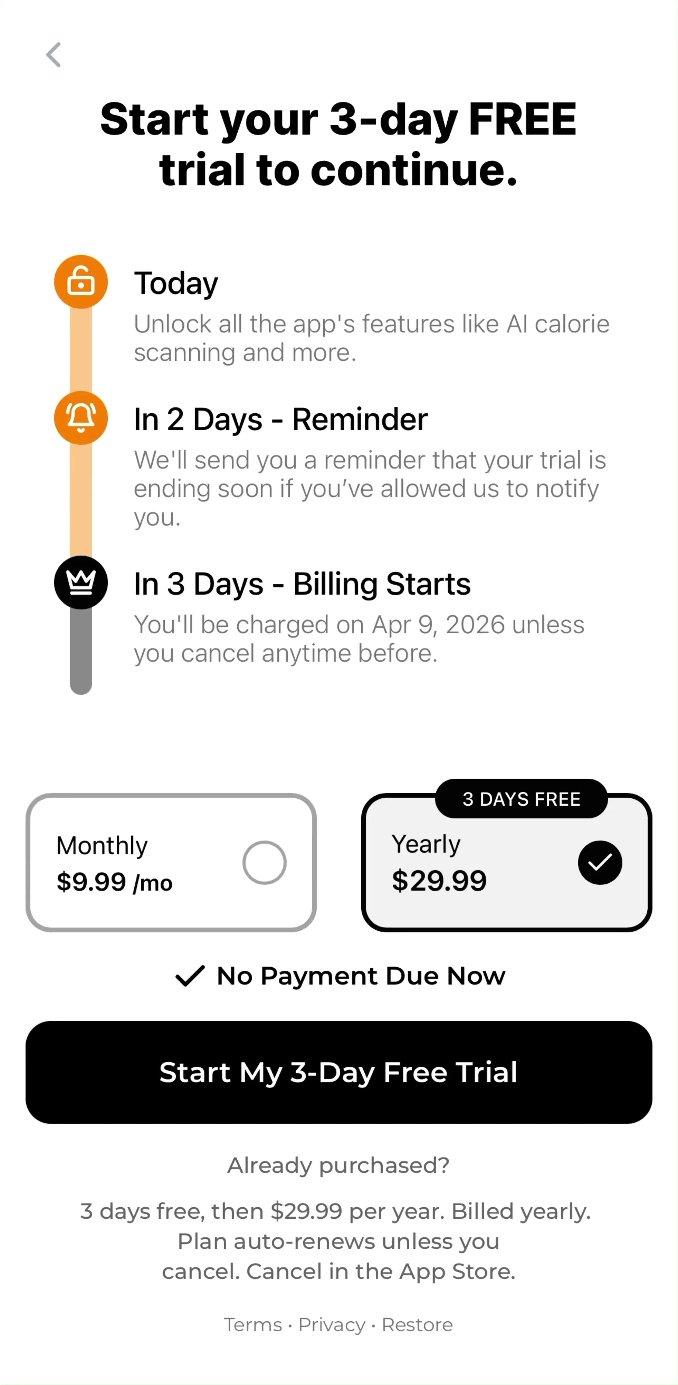
Instead of “7-day free trial,” the paywall draws the week as a timeline: today you get full access, day 5 we remind you, day 7 you’re charged. Popularized by Blinkist and now everywhere in the top charts. It works because it answers the actual objection, “I’ll forget to cancel,” on the screen itself.
Two or three plan cards with the annual plan pre-selected, priced per month (“$4.99/mo, billed annually”), and a badge showing the discount against monthly. The monthly plan exists mostly to make annual look cheap. Nearly every app in our paywall gallery at the $1M+/mo revenue level ships some version of this.
A free-versus-premium grid with checkmarks. It reframes the purchase from “spend money” to “unlock the rest of what you already use.” Canva (est. $33M/mo) is a strong example: the free tier is genuinely useful, so the table sells the delta, not the product.
App Store ratings, subscriber counts, press logos, or user testimonials placed before the price appears. Fitness and education apps lean on this hardest; Strava (est. $16M/mo) sells its subscription with community numbers rather than feature lists.
One price, one button. No plan cards, no toggle. Common in apps where the subscription is the product, like ChatGPT (est. $267M/mo): the paywall states what Plus gets you and shows one price. Removing choice removes deliberation, and works when the brand has already done the selling.
Rather than one paywall screen, the app scatters small locked touchpoints through the experience: a pro badge on a feature, a limit banner, a locked filter. Tapping any of them opens the paywall with context-specific copy. This is why studying home and dashboard screens alongside paywalls matters: the best monetization design mostly lives outside the paywall screen itself.
A discounted price shown only when the user tries to close the paywall or has previously declined it. Photo and utility apps use this aggressively, FaceApp (est. $14M/mo) among them. It captures price-sensitive users without lowering the anchor price for everyone else.
None of these patterns is universally right: hard paywalls would crater an app like Canva, and a comparison table is pointless when there is no free tier. The reliable method is to find apps with your business model at the revenue level you want to reach and study what they actually ship. That is what the library is for: every screen sits next to the app’s estimated revenue and downloads, so you are learning from apps whose numbers you can see.
A note on the numbers: revenue figures cited here are third-party monthly estimates from our library, useful for comparing magnitude, not audited financials.
The paywalls that show up again and again in top-grossing apps do three things: they state the value in the user's words (not the feature list), they make the price comparison trivially easy to parse, and they show up at a moment of demonstrated intent, right after the user has experienced the core value once.
Hard paywalls (no close button) convert better short-term but only make sense when the free product genuinely cannot demonstrate value. Most top-grossing apps use a soft paywall with a visible but de-emphasized dismiss affordance, then re-present the paywall at high-intent moments.
The dominant pattern in high-revenue apps is paywall-after-investment: the user completes a personalization quiz or first core action, then hits the paywall while motivation is highest. Showing it on first launch, before any value, is the pattern most correlated with instant uninstalls.
The mobileappdesign library has over 6,000 paywall screens from revenue-verified iOS apps, filterable by category and revenue, so you can study what apps at your target revenue level actually ship.
Browse 6,000+ paywall screens from revenue-verified iOS apps, with revenue and download estimates next to every screen.
Browse paywall screens