Most card UI advice is written for the web, where a card is a marketing tile in a three-column grid. On a phone it is something else: a card is the unit a feed is made of, tapped hundreds of times a session, and its job is to be scannable at speed and unambiguous to hit. Of the 2,622 revenue-verified iOS apps in our library, 1,176 ship a browse or feed flow, which is where card decisions get made. Here is what those decisions look like in practice.
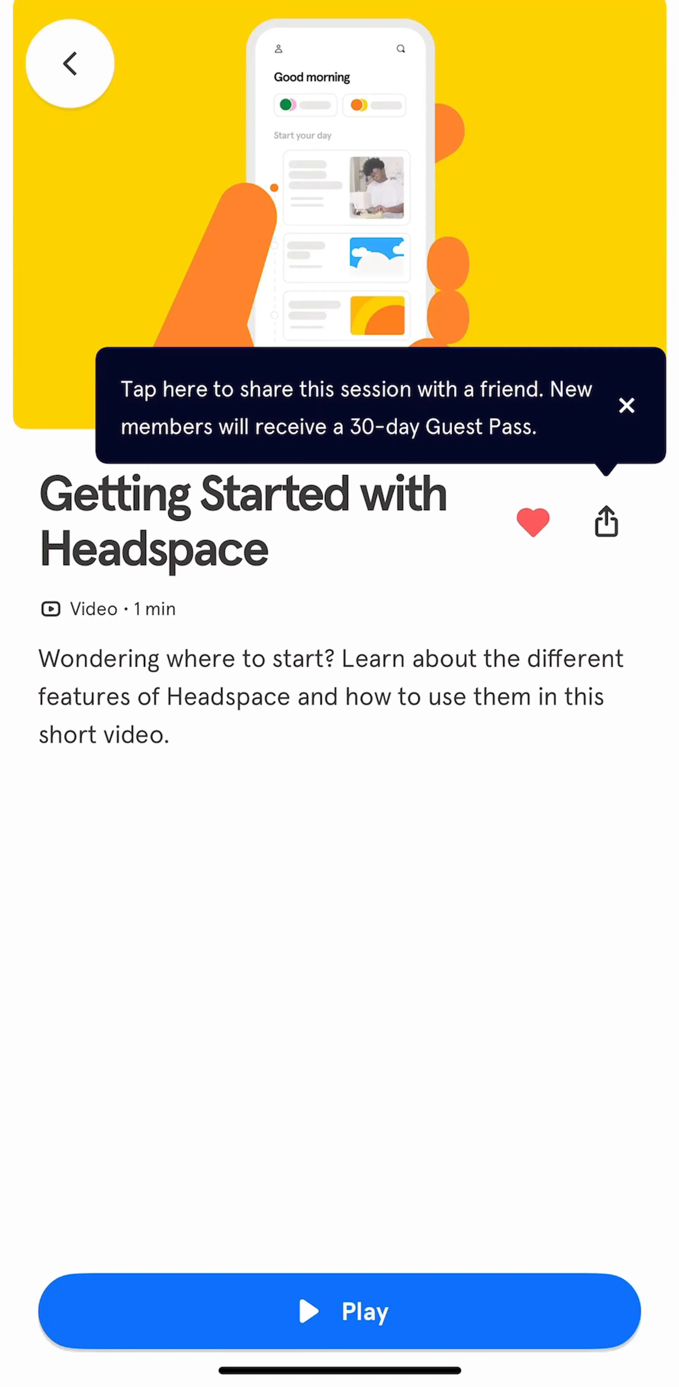
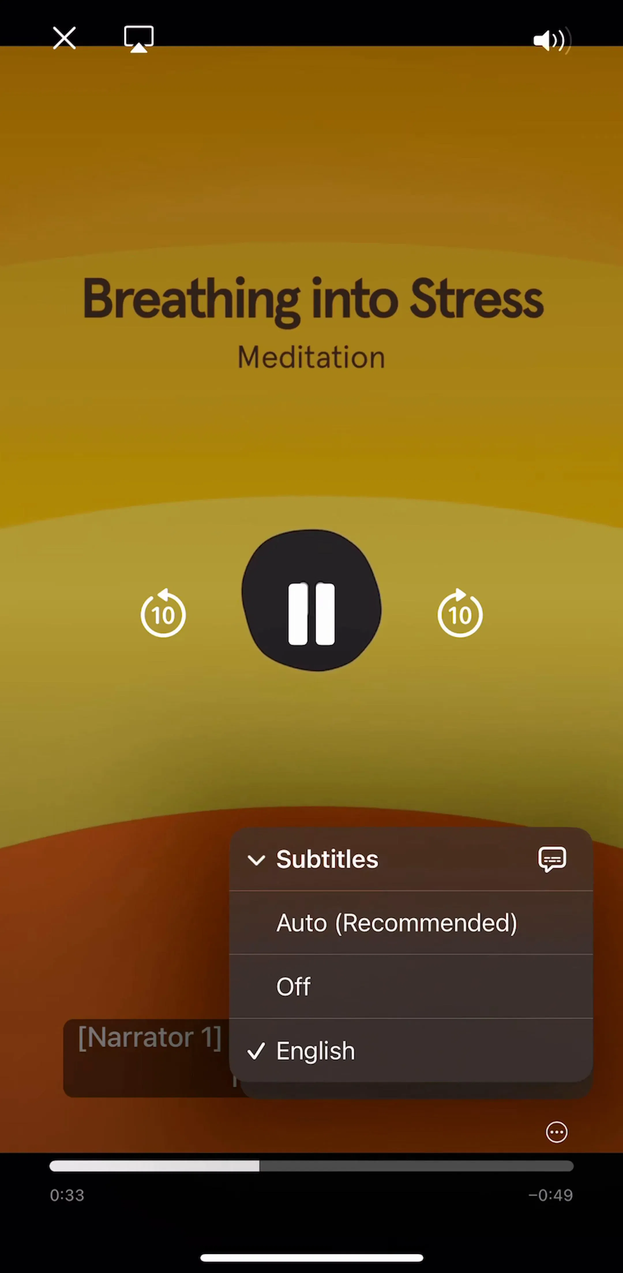
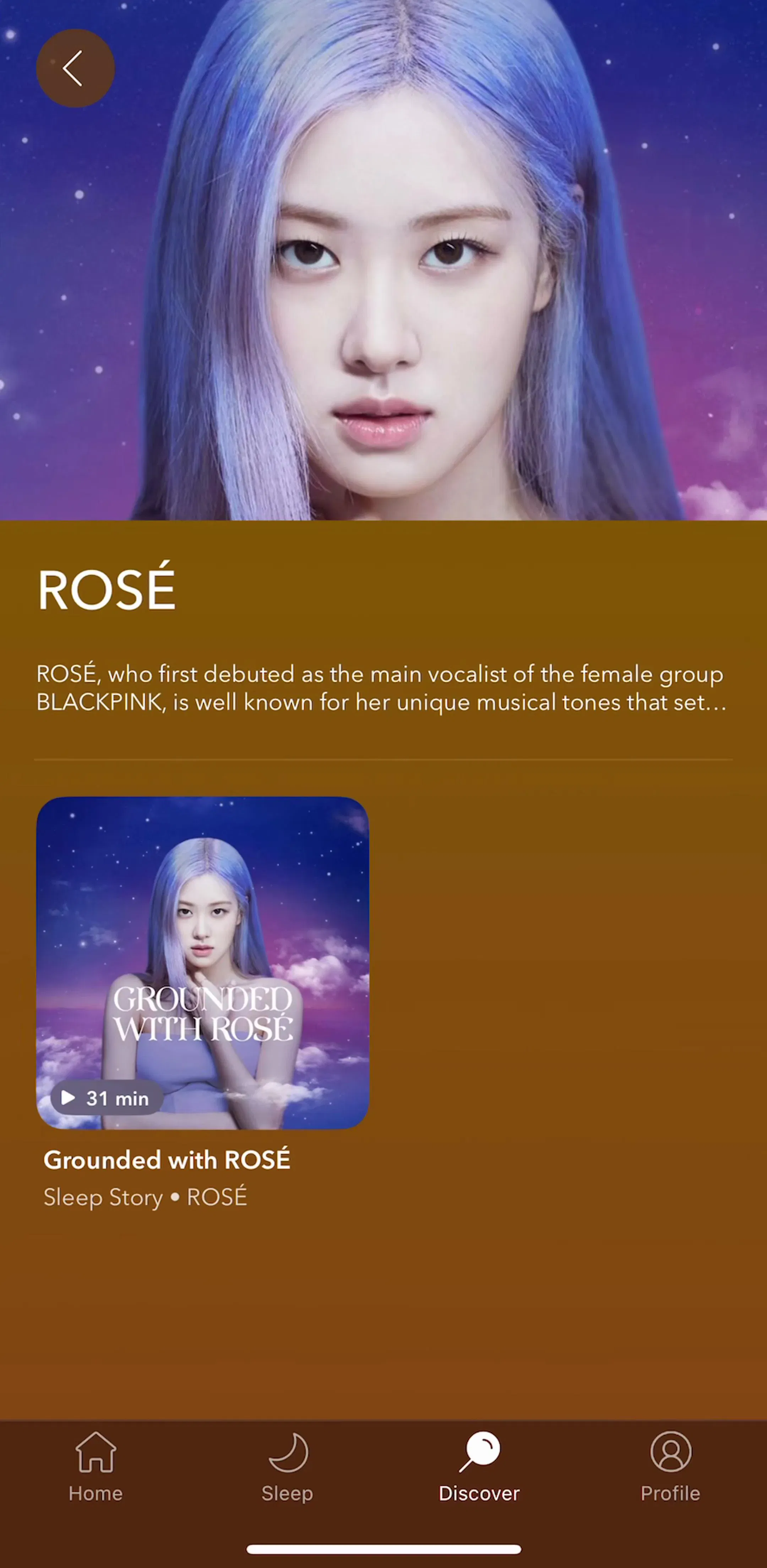
The useful test is whether the card leads somewhere. If tapping it opens a detail view, it is a card. If it is a box drawn around static content that goes nowhere, it is a panel, and drawing it like a card teaches users to tap something that does not respond. Content libraries make this obvious: Headspace (est. $2M/mo) and Calm (est. $2.75M/mo) are both essentially browsers over a catalog, so nearly every surface in them is a preview that leads to a session.
A card should describe exactly one thing: one track, one workout, one article, one recipe. The moment a card carries two subjects it needs two tap targets, and a card with two tap targets is a layout problem wearing a rounded corner. If you find yourself adding a second headline, you probably want a section, not a card.
Across shipped apps, card layouts collapse into roughly three shapes, and mixing more than two of them in one scroll gets noisy fast.
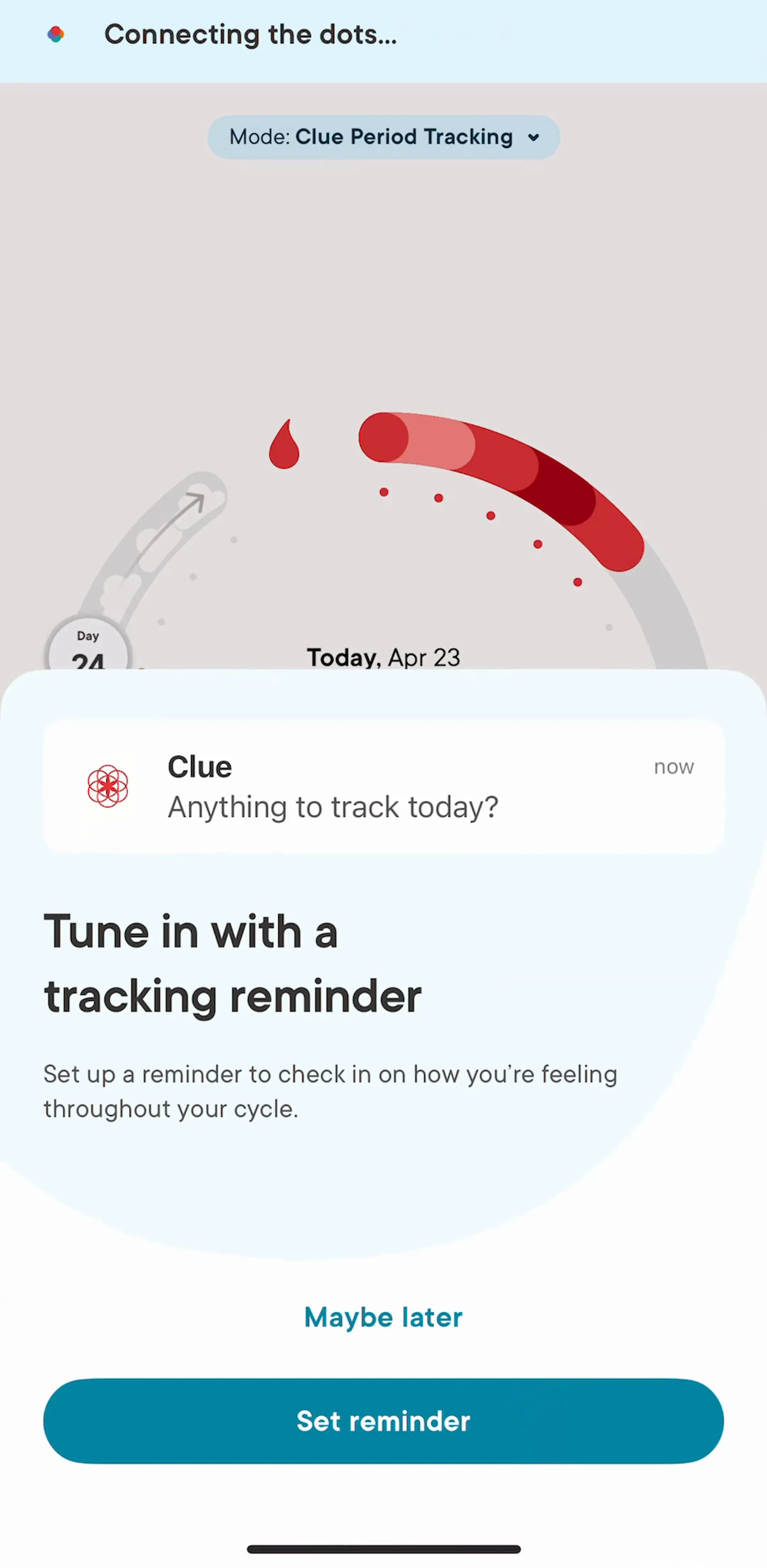
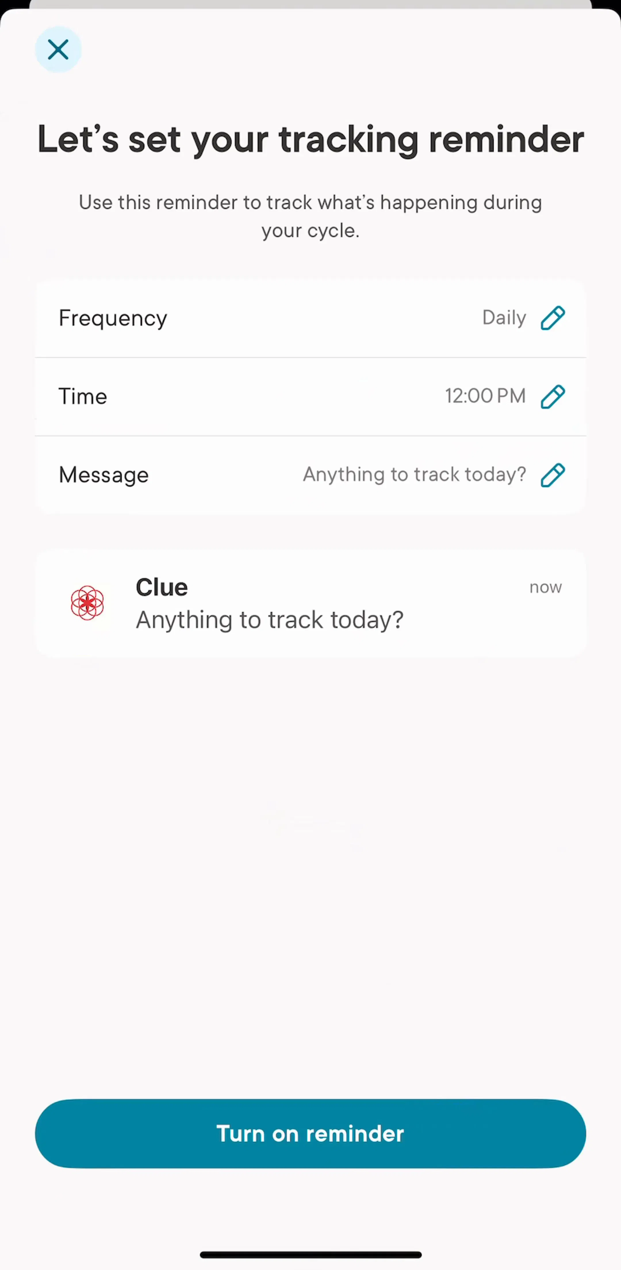
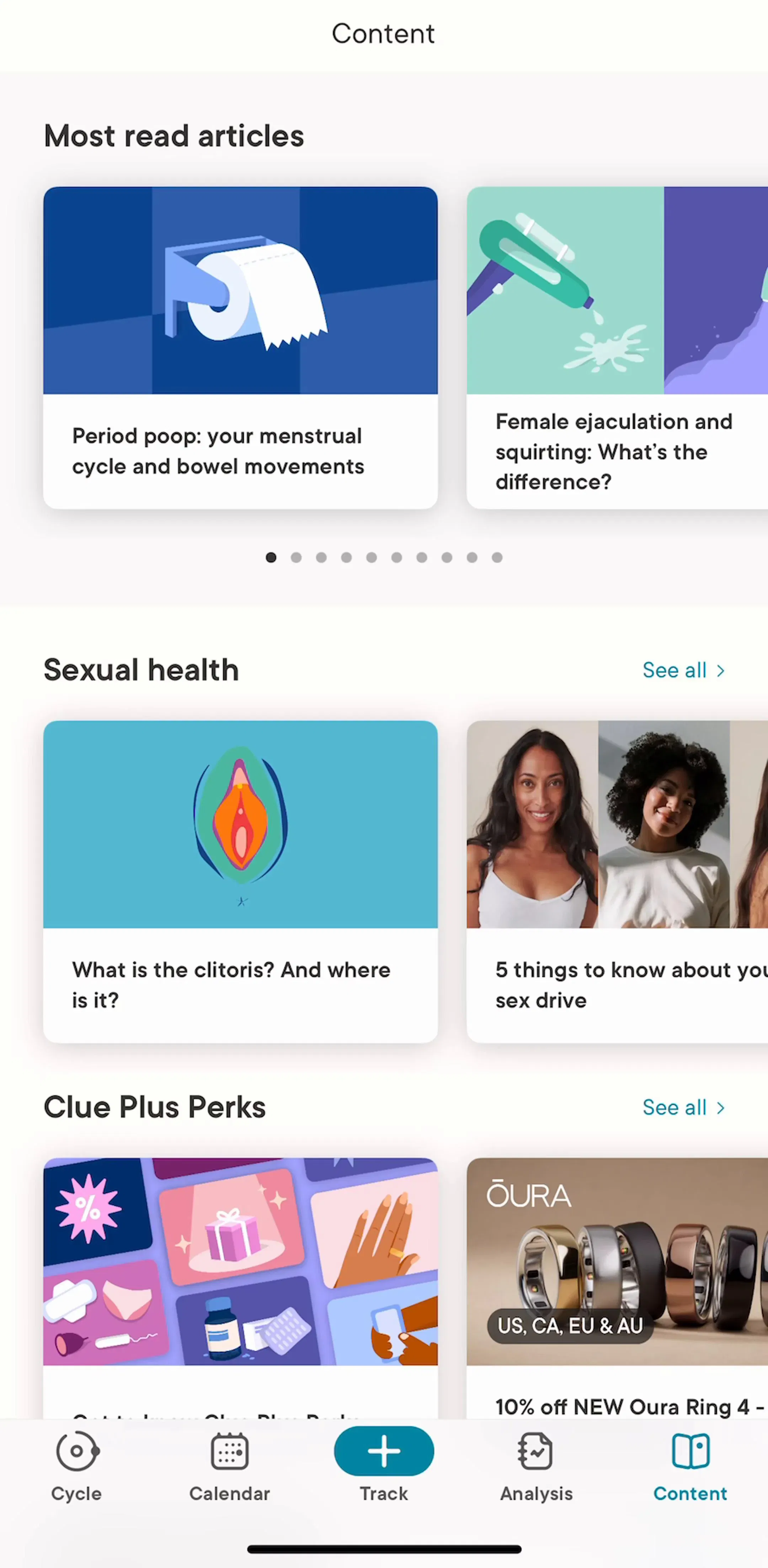
Health and fitness apps run all three in one product, which makes them good study material. Clue (est. $1.25M/mo) and Hevy (est. $750k/mo) both have to mix a data surface with a content surface inside the same app.
Whole-card tapping is the expectation. Every element inside a card that is not the primary destination, a save icon, an overflow menu, a play button, is competing with that expectation and needs enough separation and padding that a thumb aiming at the card does not hit it by accident. The practical rule that survives usability testing: at most one secondary target per card, placed in a consistent corner, with a target box well beyond its visual size.
The drop shadow was doing a job that spacing and radius now do better. Current mobile layouts separate cards with generous gaps, a consistent corner radius, and a slight surface tint against the page background. Shadows survive mainly for genuinely floating things: sheets, dialogs, and elements that overlap other content.
Dark interfaces force the issue, because a dark shadow on a near-black background does not exist. Dark-first apps replace elevation with a lighter surface color or a hairline border, which is one of the reasons a light design does not translate to dark by inverting the palette. We measured how common that is across the library in the dark mode breakdown.
The horizontal shelf, a titled row of cards that scrolls sideways, is how catalogs present many categories without an infinite vertical page. It buys breadth and costs depth: users rarely scroll a rail past the third or fourth item, so anything past that position is close to unpublished. Music and audio apps live on this pattern, which you can see across YouTube Music (est. $38M/mo) and Deezer (est. $8M/mo), and it shows up again in saved libraries and collections, where the same shelf structure organizes content the user already owns.
Stat tiles follow different rules. They should be legible without a tap, which means the number is the largest thing in the tile and the label is secondary. A tile that requires you to open it to learn its value has failed at the only job it had. Tracking-heavy apps like Strava (est. $16M/mo) put a lot of design effort into this surface, and you can compare approaches across our tracking and insights gallery.



Cards cost vertical space and visual weight, and both are scarce on a phone. Skip the card when the items are uniform and text-only, when the list is long enough that density matters more than presentation, or when the screen is already carrying a tab bar, a search field, and a filter row. A screen where every region is a rounded rectangle has no hierarchy left to give.
The fastest way to make card decisions is to look at products in your category that already made them, in full flows rather than single shots, because the interesting part is how a card looks next to the ten screens around it. Every screen in the library sits next to the app’s estimated revenue and downloads, so you can choose your references by outcome rather than by taste.
A note on the numbers: revenue figures cited here are third-party monthly estimates from our library, useful for comparing magnitude, not audited financials.
A card is a bounded container that groups one subject and acts as an entry point to it. The important half of that definition is the entry point: a card is a preview that leads somewhere, not a box you put content in because the layout felt empty.
When everything on the screen is a card, nothing is grouped. If a list has uniform rows with no media and no secondary actions, a plain list row with a divider or spacing reads faster and fits more per screen. Cards earn their weight when items differ in size or carry an image.
Less than they used to. Separation now mostly comes from spacing, corner radius, and a subtle background shift. Shadows also stop working in dark interfaces, since a dark shadow on a near-black surface is invisible, so dark-first apps separate cards with elevated surface colors or hairline borders instead.
The mobileappdesign library holds captured flows from 2,622 revenue-verified iOS apps, and 1,176 of them ship a browse or feed flow, which is where most card layouts live. You can study them in sequence rather than as isolated shots.
Browse captured feed and browse flows from revenue-verified iOS apps, with revenue and download estimates next to every screen.
Browse feed screens