Search for camera app UI and page one is concept work: Dribbble shots, free Figma templates, stock vectors, and a tutorial series. Almost none of it is a camera anyone shipped. Our library holds 2,622 revenue-verified iOS apps, 334 of them photo and video products and 328 with a capture, scan, or record flow, and the shipping version of this screen is more constrained than the concepts suggest. Here is what the constraints are, and what shipping apps do about them.
This is the first thing the library makes obvious. Of the apps with a capture flow, only a minority are cameras. The rest use the camera as an input to something else: a document becomes a PDF, a barcode becomes a food entry, a menu becomes a translation, a plant becomes an identification. If you are designing a camera screen, the question that decides your whole layout is which of those two products you are building, because a camera app is trying to give the user control and an input camera is trying to take control away.
CamScanner (est. $7M/mo), iScanner (est. $3.75M/mo), Translate Now (est. $2.75M/mo) and PictureThis (est. $14M/mo) are all worth reading as input cameras. None of them present themselves as a camera at all.
The live preview runs full bleed to the edges of the screen, and the controls sit on top of it as translucent chrome rather than in a bar that takes width away. This is not a style choice. The preview is the only thing on the screen that tells the user what they are about to capture, and every point of it you cover with an opaque panel is framing information you have taken away. The practical rule that follows is that camera chrome should be dark, semi-transparent, and thin.
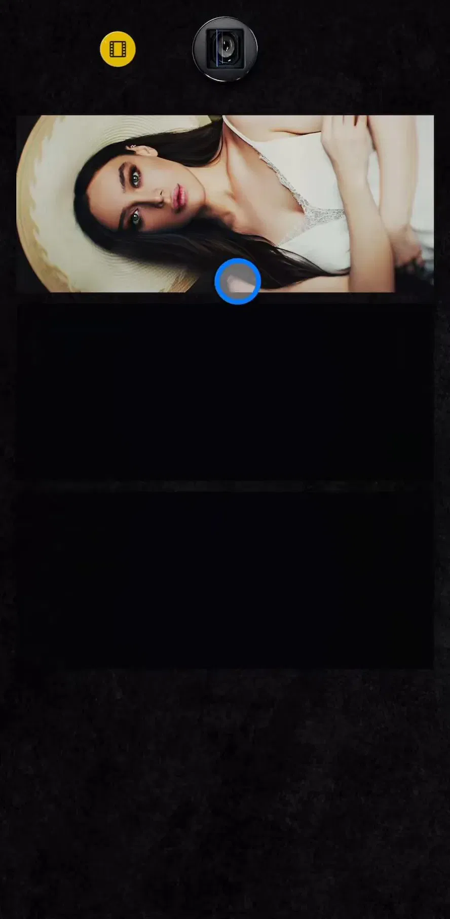
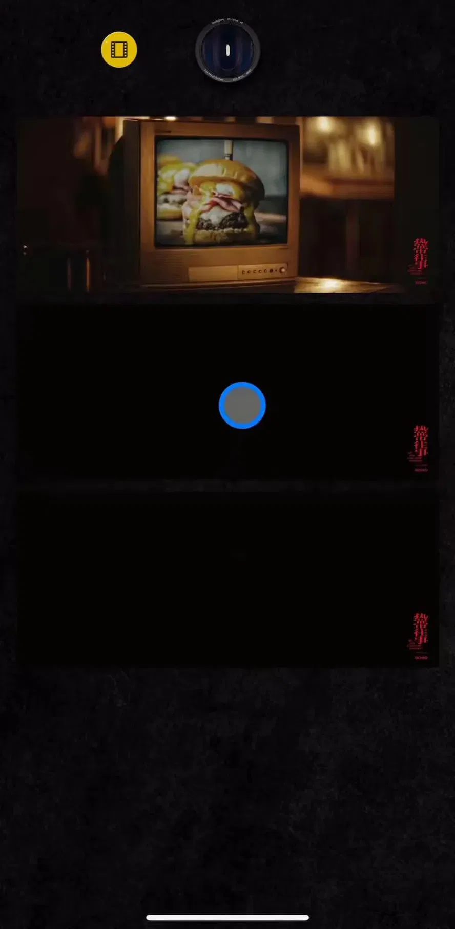
NOMO CAM (est. $35k/mo) is a good study of the minimal end, where the product is a set of simulated film cameras and the interface exists to pick one and shoot.
Across shipping cameras the bottom of the screen holds the same three things in the same relative positions: the shutter in the centre, the last capture on one side, and the front and back flip on the other. That layout is worth treating as a convention rather than a decision. It sits where a thumb lands when a phone is held in one hand for a photo, and users arrive already trained on it by the system camera. Moving the shutter off centre buys almost nothing and costs recognition.
Anything that is not those three controls belongs somewhere else: in the top bar, behind a mode strip, or on a settings sheet.
Where an app has more than one capture behaviour, the pattern that has settled is a swipeable row of labels immediately above the shutter, with the active one centred. It has two advantages over a dropdown. It shows the neighbouring options without a tap, so the user learns the range of the product by looking at it, and switching mode is a thumb swipe in the same place the thumb already is.
The cost is that the strip does not scale. Past roughly five or six modes it becomes a scroll bar full of jargon, at which point the honest answer is that some of those modes are separate features and belong in the app rather than in the camera.
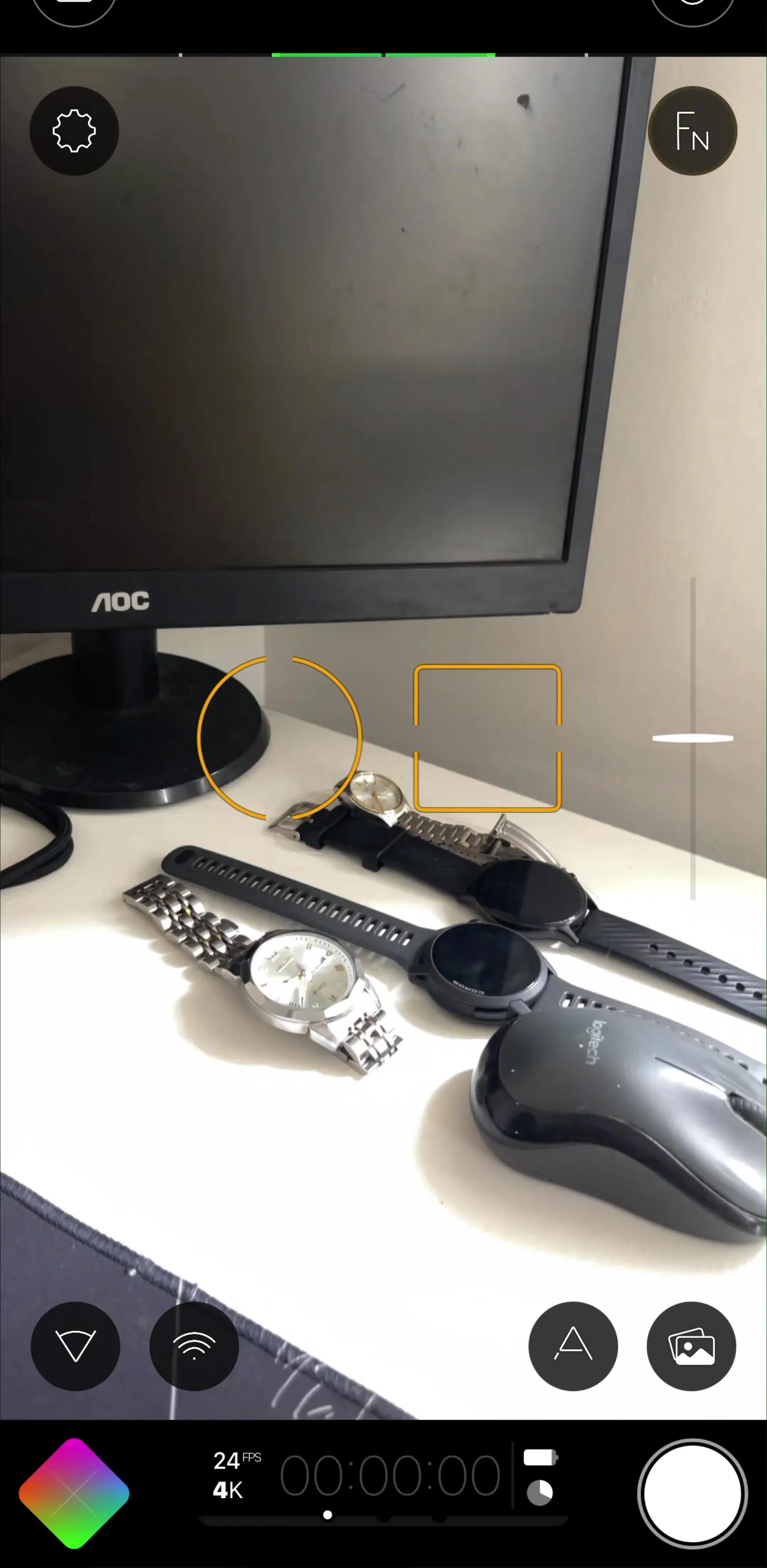
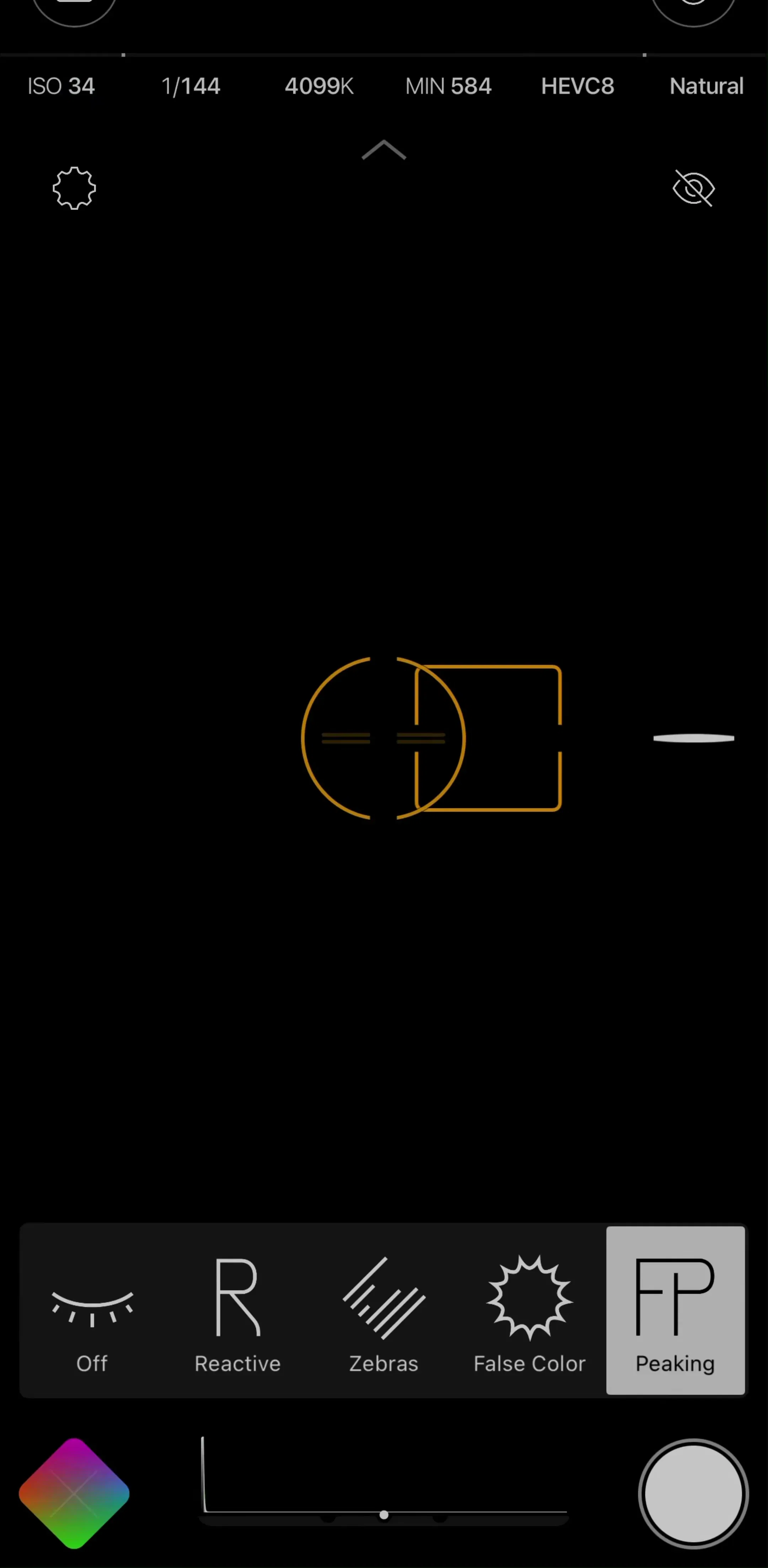
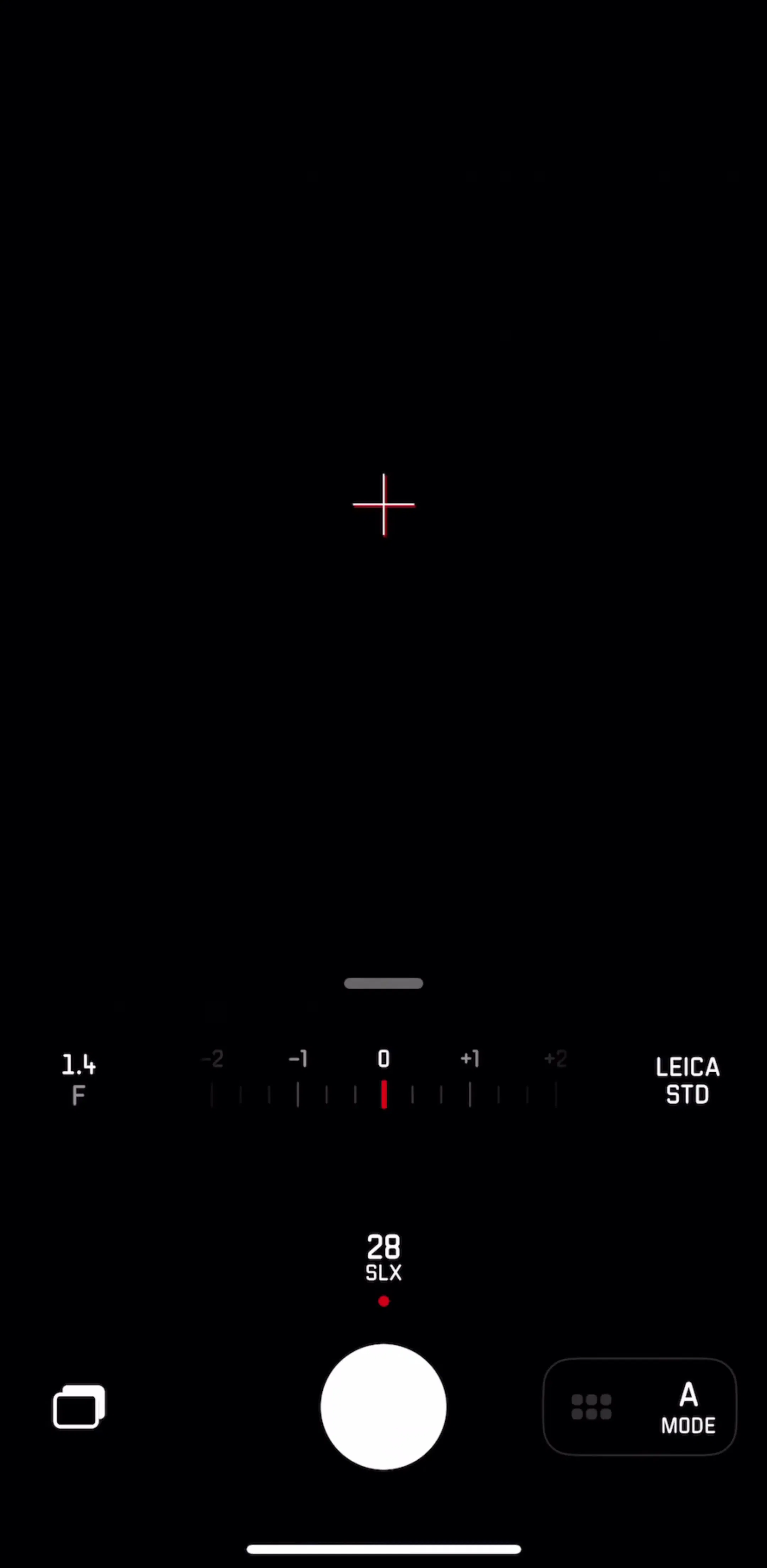
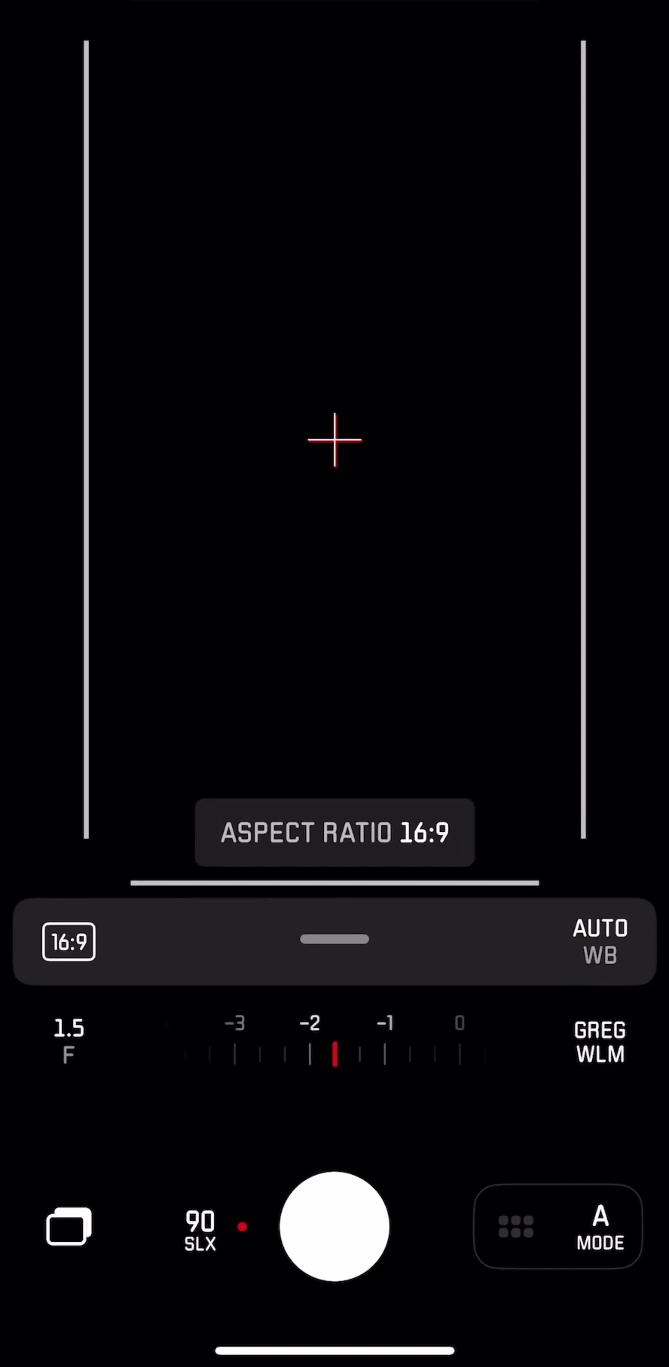
Manual cameras carry a genuinely difficult problem: exposure, ISO, shutter speed, white balance, focus and format all want to be adjustable, and none of them can occupy the viewfinder permanently. The shipping answer is layered disclosure. A compact readout stays visible, tapping it opens a single control at a time as a slider or dial over the preview, and the full grid of settings lives on a separate screen the user visits rarely.
Leica LUX (est. $250k/mo) and Filmic Pro (est. $150k/mo) are the two references in the library for this, and they are useful precisely because they disagree about how much to keep on screen.
Camera access is one of the permissions users refuse most readily, and iOS gives an app one system prompt. The pattern that works is a priming screen first, shown at the moment the camera is actually needed, stating in one line what the camera is for and what happens to what it captures. The system dialog follows immediately after.
Asking during a general onboarding run, before the user has tried to capture anything, is the common mistake. The captured examples across categories live in the permissions gallery, and the notification breakdown covers the same priming logic for the permission apps get wrong most often.
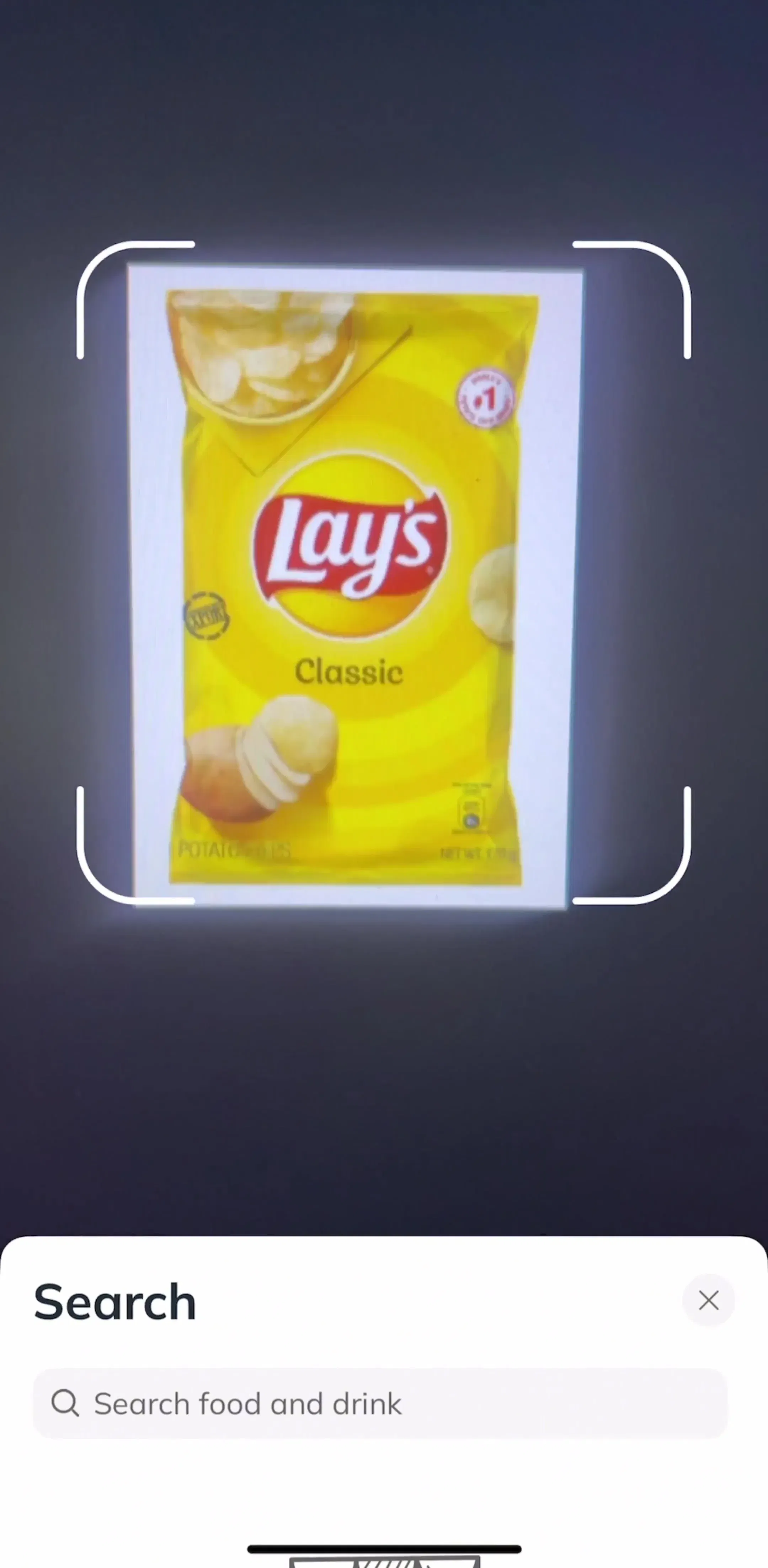
When the camera is feeding a scanner or a recogniser, the design goal inverts. The user does not want control, they want to be told they are doing it right. So the manual controls disappear and an overlay takes their place: a frame that snaps to a detected edge, a target rectangle for a barcode, a hint line that says move closer, and automatic capture once the system is confident. The shutter often survives as a manual override rather than as the primary action.
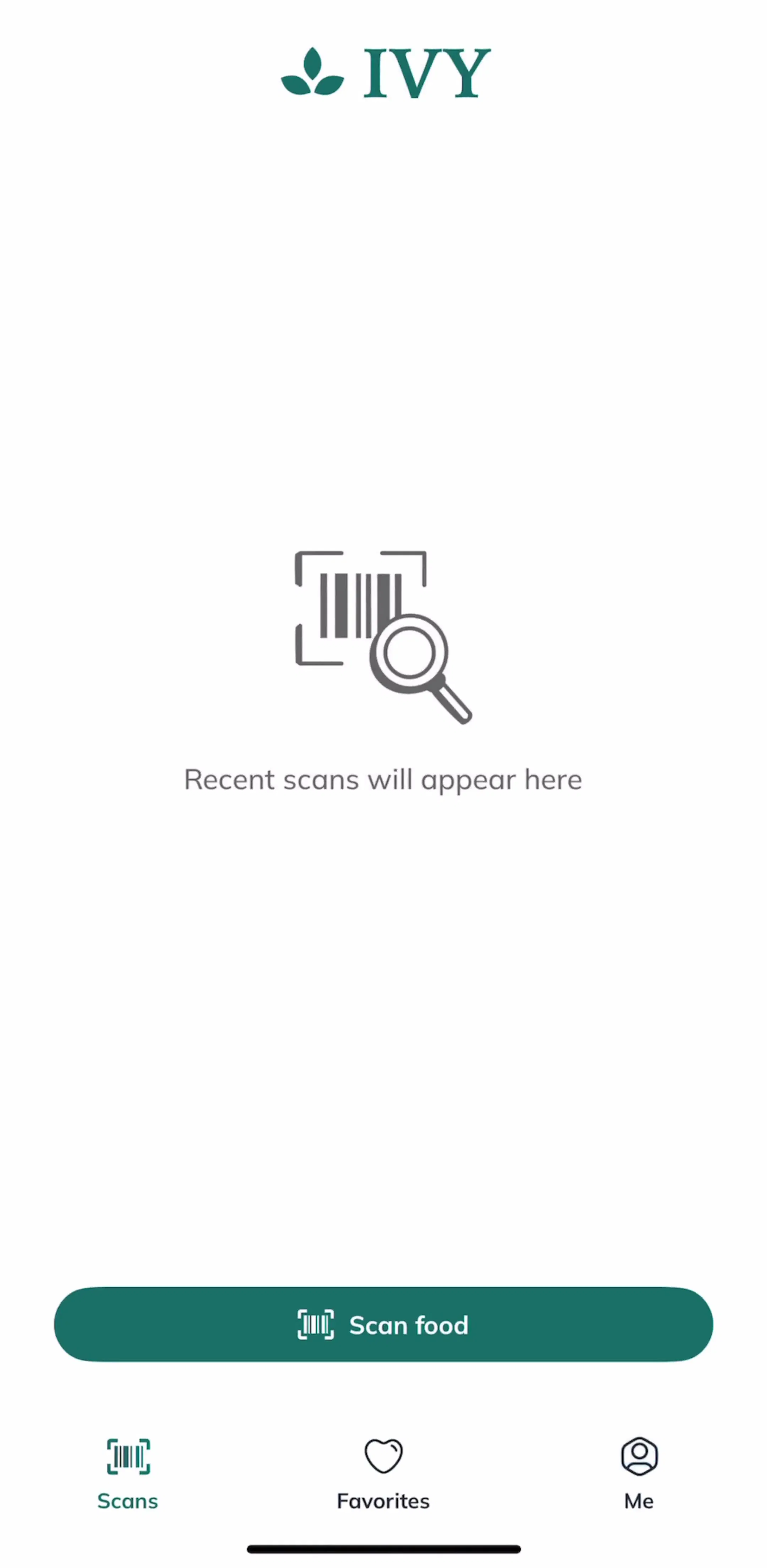
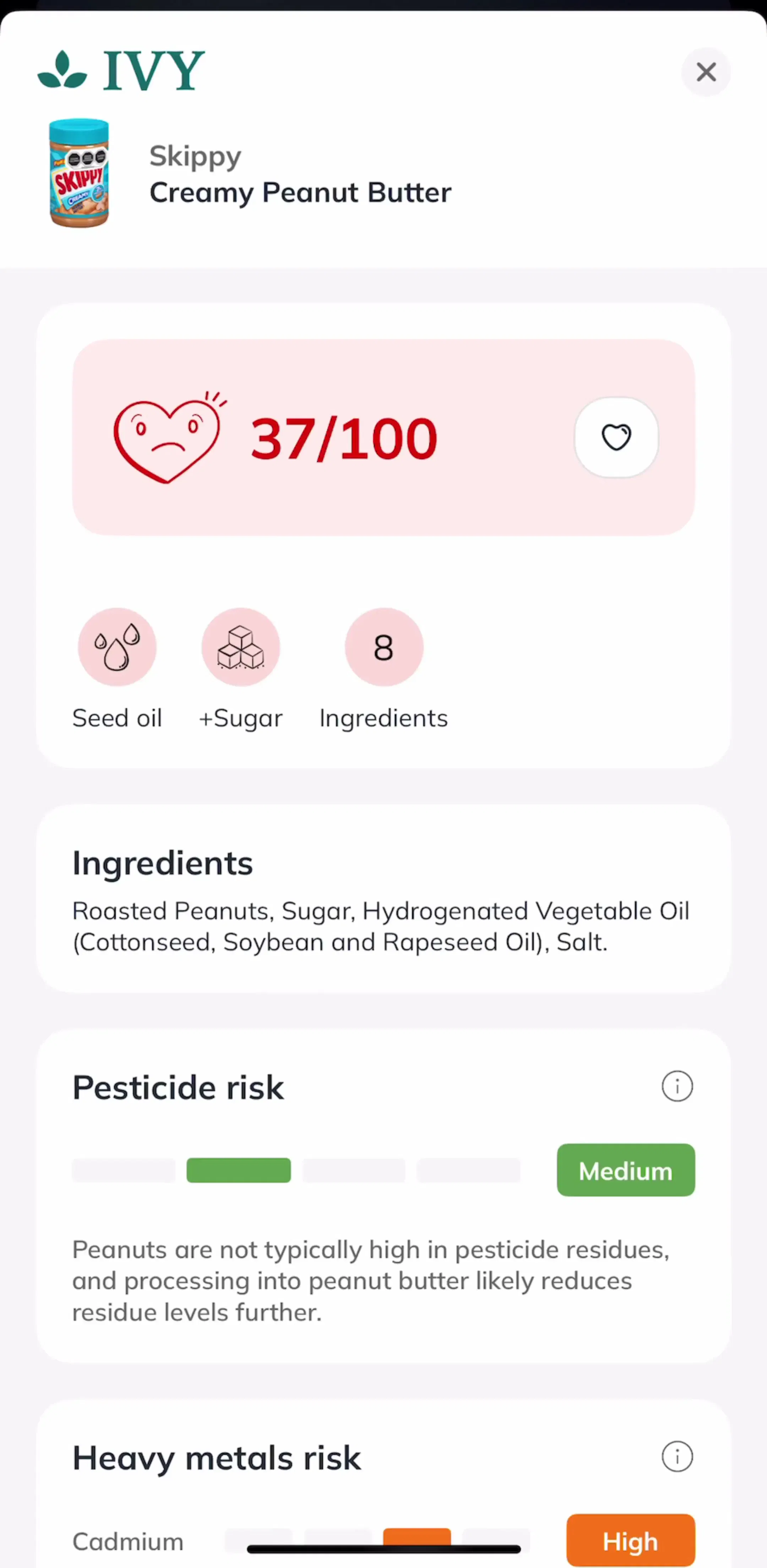
Ivy (est. $150k/mo) is a compact example of the recogniser variety, where a scan is a step in a health flow rather than the product.
The capture itself is the easy part. The screen that decides whether the feature feels good is the one immediately after: the review state. It has to answer three questions fast. Did it work, can I redo it, and where did it go. Apps that jump straight from shutter to a saved file with a toast leave users re-opening their library to check, which is the behavioural signal that the review state was needed.
From there the destination differs by product. A camera app hands off to an editor, which is covered by the edit and customise gallery. A scanner hands off to a document list. A recogniser hands off to a result, and the design of that result screen matters more than the camera did.
Three recurring failures. Opaque chrome that eats a third of the preview, usually because the layout was designed on a static mockup rather than over live video. Mode strips that have become feature dumps, where two of the modes are the same thing under different marketing names. And a paywall placed on the shutter, which is the one control that must always work, since an app that refuses to take the picture has removed the reason the user opened it. The better placement is on the export or the effect, and the paywall breakdown covers where shipping apps put it.
If you are designing a capture screen, open three or four shipping cameras in sequence and note where they agree. The agreements are conventions your users already have, and the disagreements mostly cluster around how much manual control the product is willing to expose. Every screen in the library sits next to the app’s estimated revenue and downloads, so you can pick references by outcome rather than by how the shot looks. The photo and video neighbours worth reading next are BeautyCam (est. $2.75M/mo) and Tezza (est. $2M/mo), both of which run a camera as one entrance to an editing product.
A note on the numbers: revenue figures cited here are third-party monthly estimates from our library, useful for comparing magnitude, not audited financials.
Four, in most shipping apps: a permission priming screen, the viewfinder itself, a review state for whatever was just captured, and a destination such as an editor or a library. Apps that skip the review state and jump straight from shutter to saved file tend to add it back later, because users need a moment to confirm the capture worked before they trust the feature.
The convention that has settled is a full-bleed viewfinder with floating chrome: a thin top bar for settings such as flash and aspect ratio, and a bottom block holding the shutter, the last-capture thumbnail, and the camera flip. Modes sit in a horizontal strip directly above the shutter. This layout survives because the bottom third of a phone is the only area a thumb reaches while the phone is held steady for a shot.
The chrome around a viewfinder is almost always dark or translucent regardless of the app's theme, because it sits on top of live video whose brightness the designer does not control. Translucent dark panels with light icons stay legible over both a white wall and a night scene, which is why they are near universal in this pattern.
At the moment the camera is first needed, after a short screen that explains what it is for. Asking during a generic onboarding run, before the user has tried to take anything, spends the one system prompt available on a moment with no context. A denied camera permission is expensive to recover, since the only fix is sending the user into iOS Settings.
The mobileappdesign library holds captured flows from 2,622 revenue-verified iOS apps, including 334 photo and video apps and 328 apps with a capture, scan, or record flow. Screens are captured in sequence, so you can follow a full capture flow from permission ask to saved result rather than looking at isolated shots.
Browse captured camera, scan, and record flows from revenue-verified iOS apps, in the order a real user walks them.
Browse capture screens