Health and fitness is the most template-driven category on the App Store. That is not an insult, it is a finding: 562 of the apps in our library sit in health and fitness, and when you line their flows up the same five screens appear in the same order almost every time. Below is the shape of that template, measured rather than remembered, plus the places where copying it blindly will cost you.
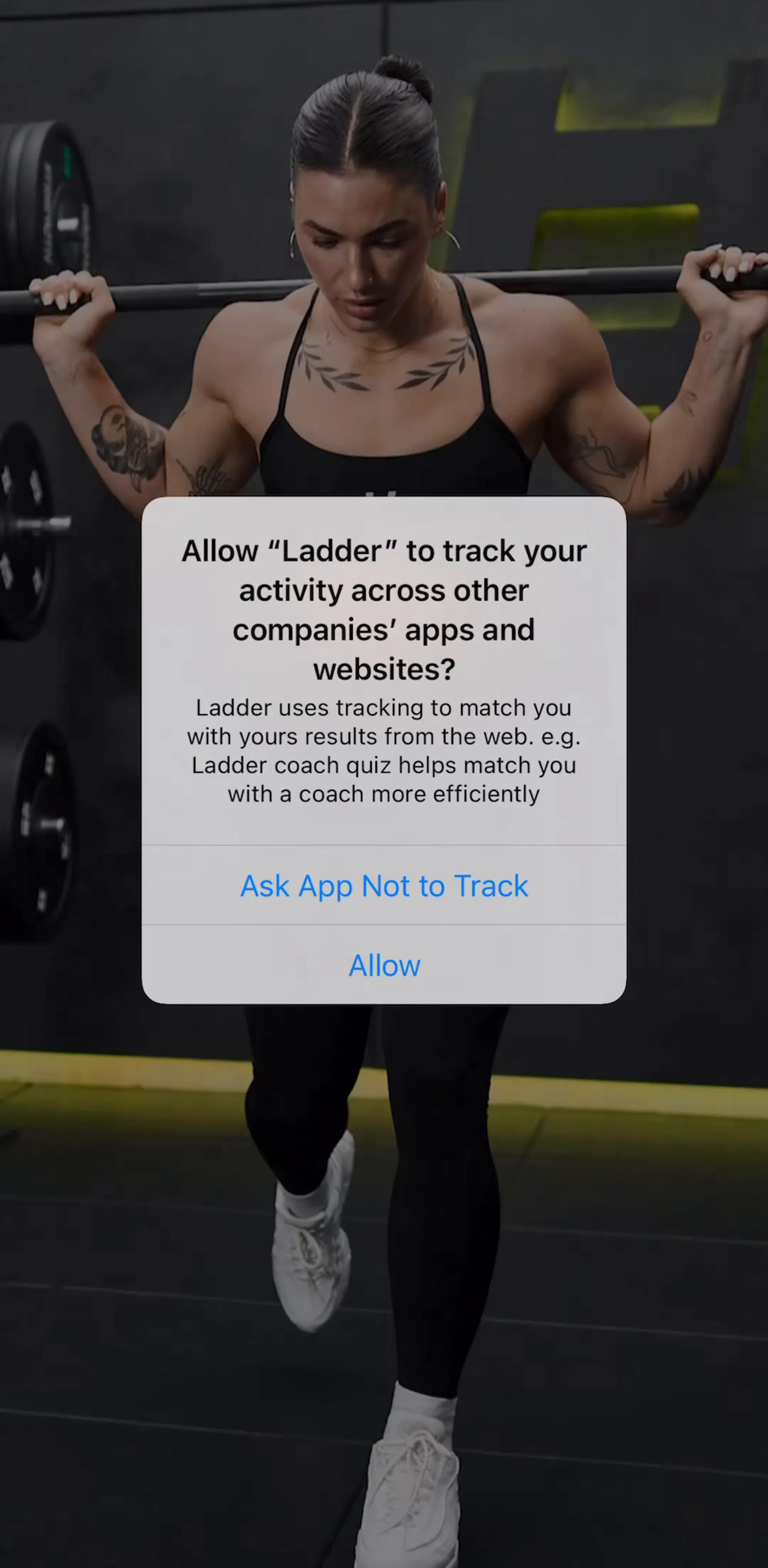
The median health and fitness app in our library runs a 15 step onboarding. The median across the whole library is 5. The category is running onboarding three times longer than everyone else, deliberately, and the top of the market is longer still: Yazio (est. $5M/mo) is recorded at 78 steps, Flo (est. $9M/mo) at 55, MacroFactor (est. $2M/mo) at 47, and Cal AI (est. $1.75M/mo) at 28.
The length works because the quiz is not research, it is the product tour. Each answer about height, goal, activity level, or injury history visibly narrows what the app will produce, so the user builds an artifact rather than filling in a form. The failure mode is a quiz that asks a lot and changes nothing: if the plan looks identical regardless of the answers, you have spent 15 screens of goodwill on a signup form. We broke the general mechanics down in the onboarding patterns post; the fitness specific rule is that every question must alter a number the user later sees.
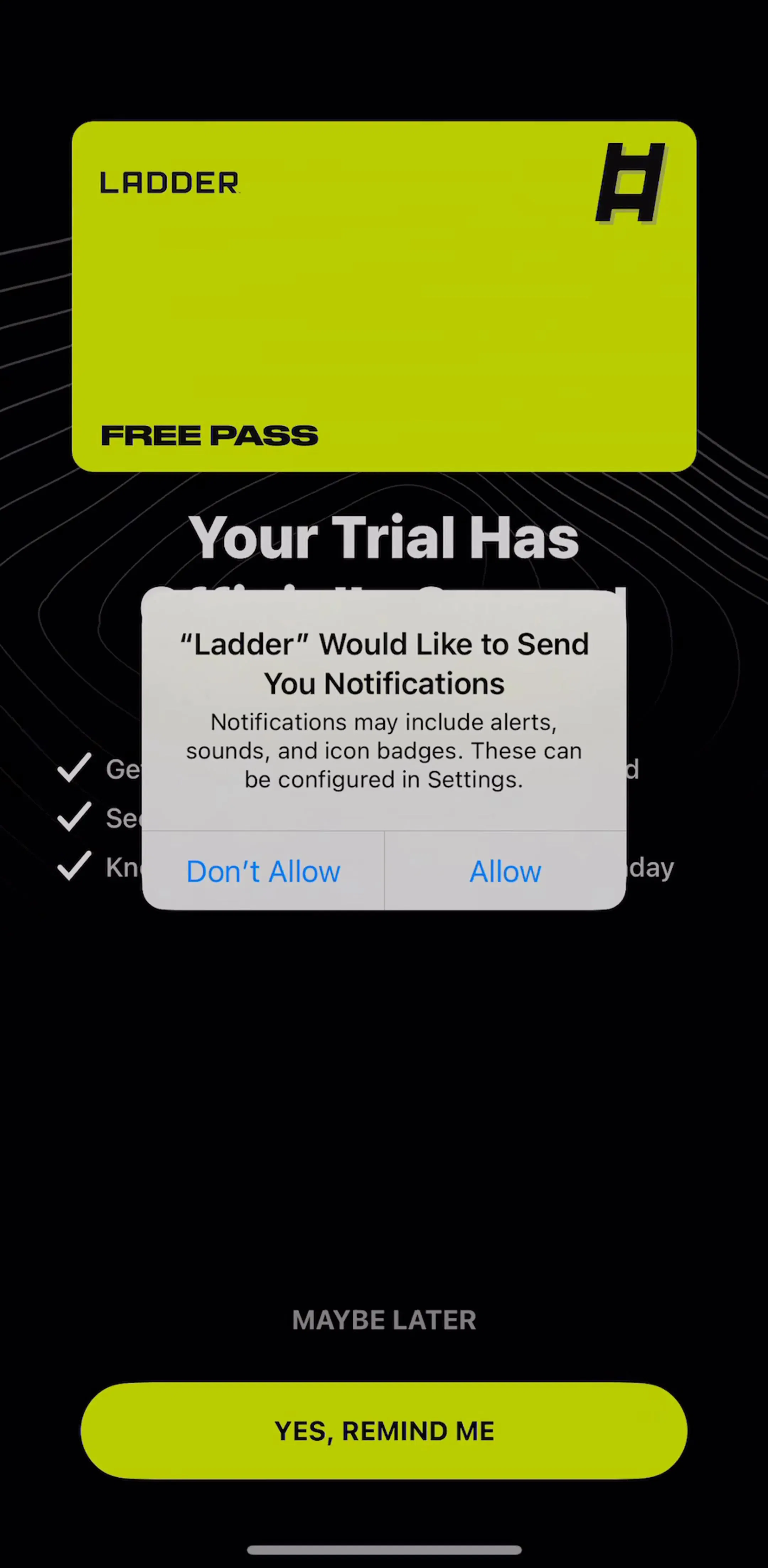
77% of the fitness apps in our library have a paywall flow. Only 22% have a distinct authentication flow. That gap is the category’s clearest structural decision: the money question arrives before the identity question, and often instead of it.
On pricing structure, 69% offer a free trial, split 55% behind a soft paywall you can dismiss and 14% behind a hard one you cannot. 23% run a hard paywall in total, and just 3% ship with no paywall at all. If you are designing a fitness app and debating whether to gate the first session, the category has already voted: gate it, but let a meaningful minority walk past.
The paywall itself follows the same rules as everywhere else, which we covered in the paywall design breakdown, with one category twist. Fitness paywalls almost always restate the plan the quiz just produced, because the offer is not “premium features”, it is “the plan you just watched us build”. Browse the paywall gallery and the health apps are identifiable on sight for exactly this reason.
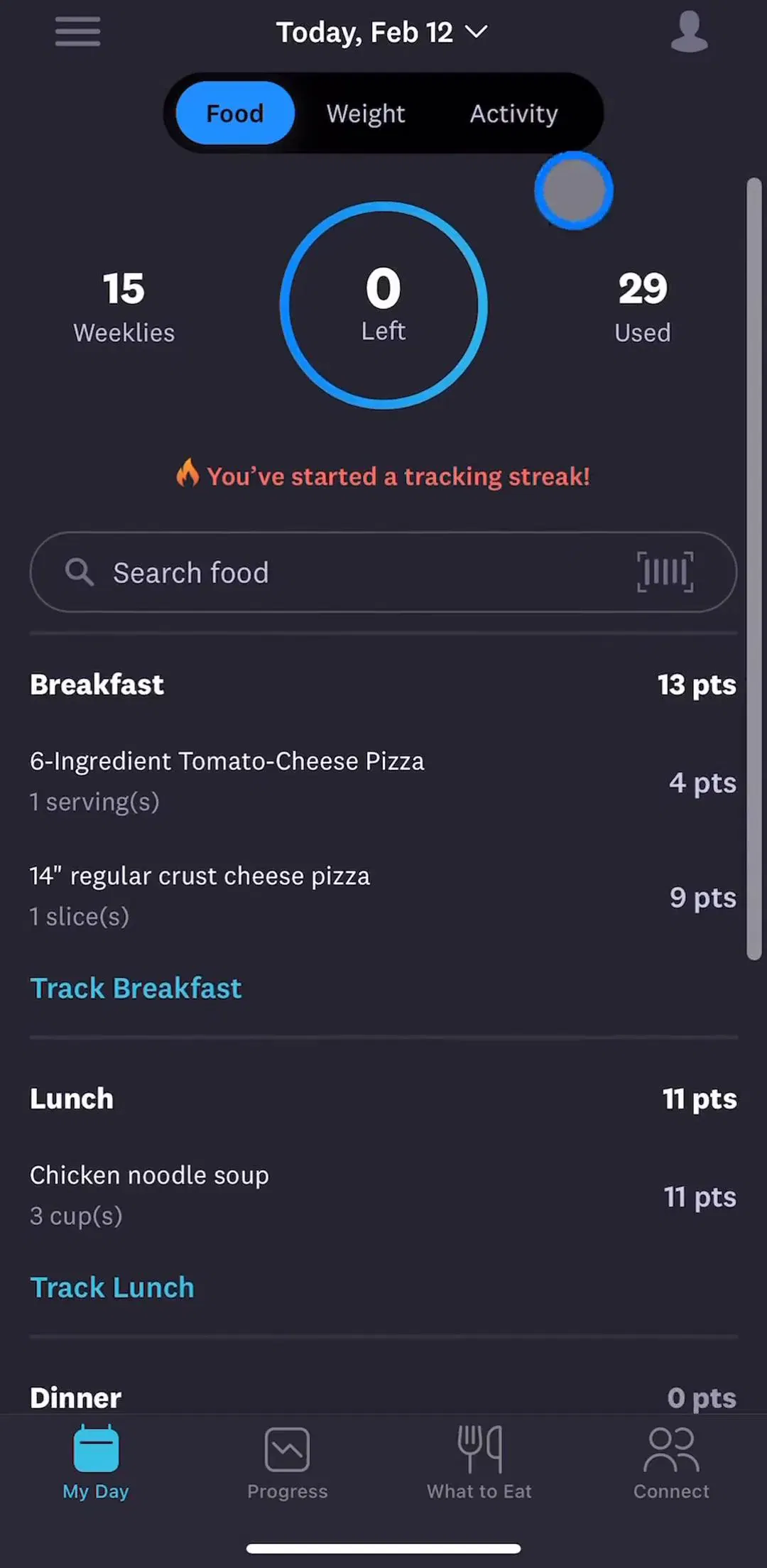
Every tracker competes with a notes app and a shrug. The apps that survive make the log entry a two tap operation and put the fastest path first: MyFitnessPal (est. $12M/mo) leads with search and barcode scan rather than manual entry, which is the difference between a habit and an abandoned install.
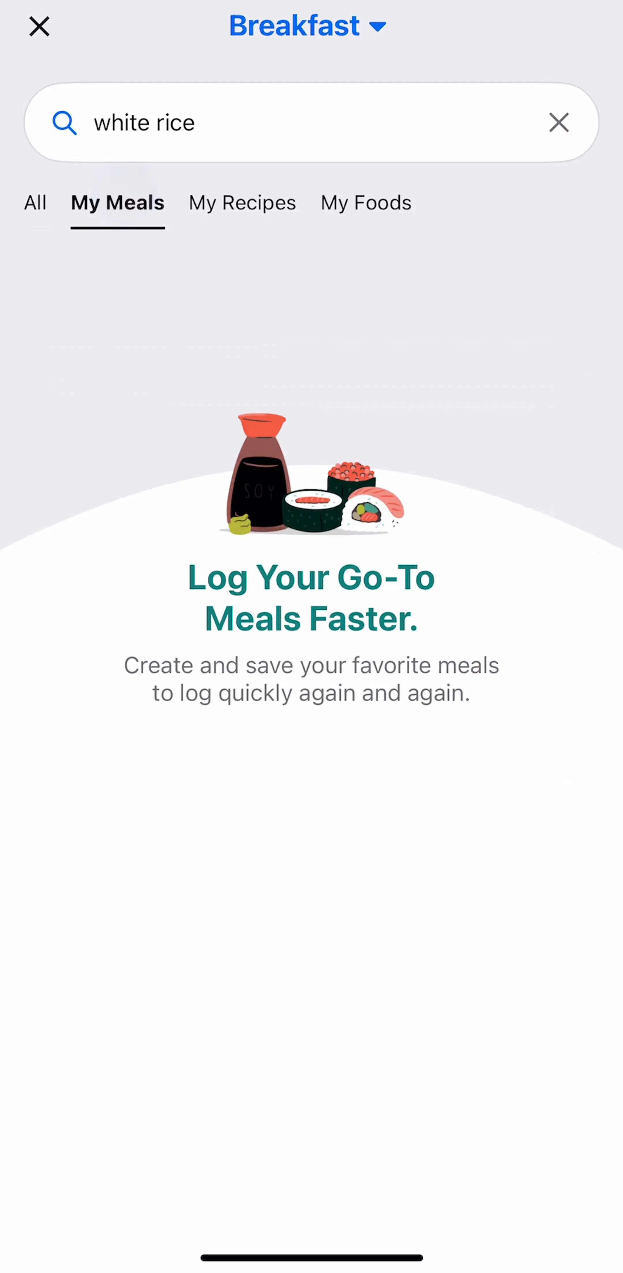
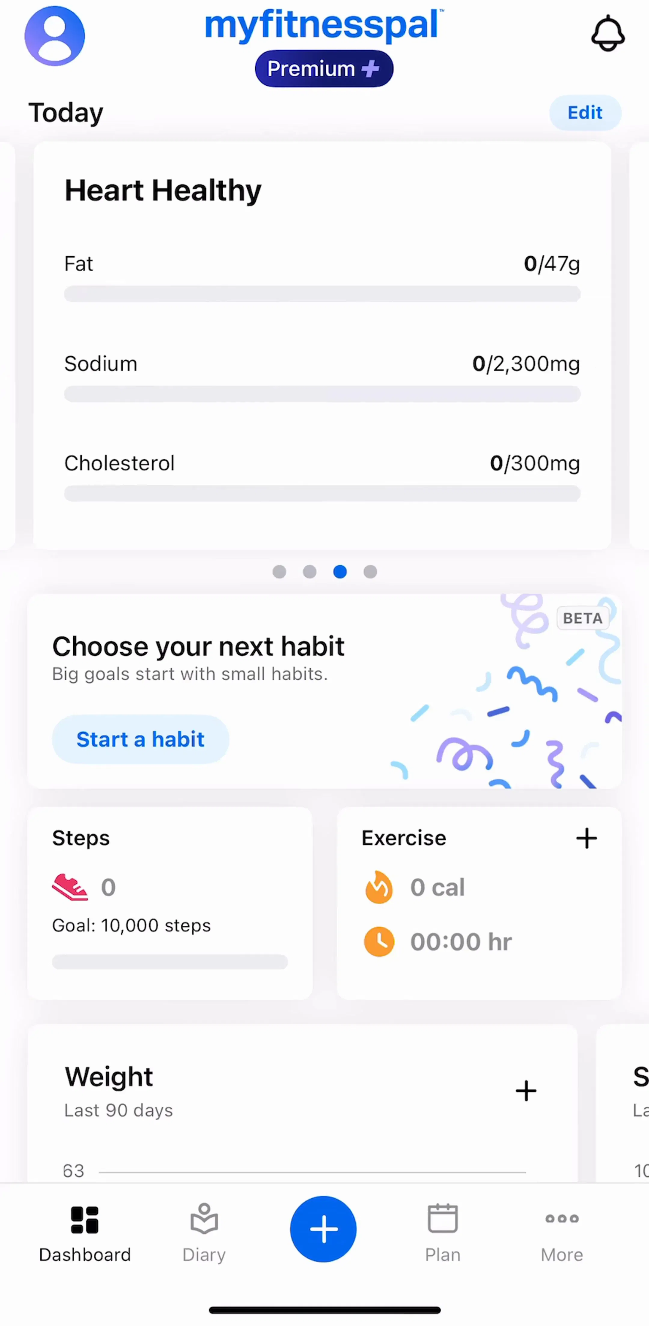
The design constraint is unglamorous: the logging screen is the one your retained users see hundreds of times, and it is usually the least designed screen in the app. Give it the attention normally reserved for onboarding. Recent entries, sensible defaults, an obvious repeat action, and a keyboard that does not cover the confirm button.
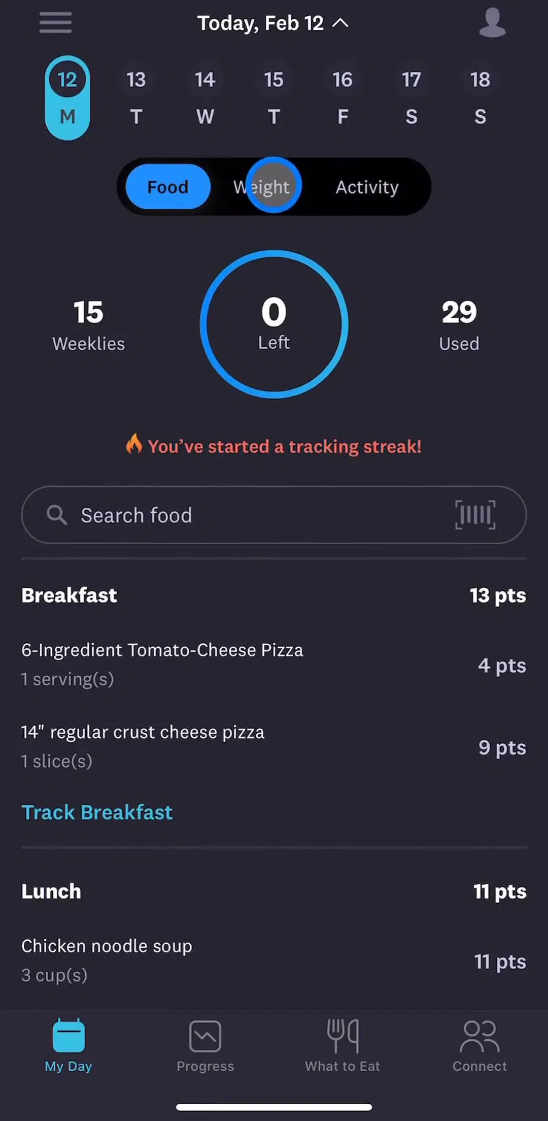
58% of fitness apps in the library carry a dedicated tracking and insights flow. This is the screen that decides whether month two happens, because it is the only place the user gets paid back for the logging work. WeightWatchers (est. $1.25M/mo) is a clear example of the convention: a small number of headline numbers, a trend over time, and a streak or consistency signal, in that order.
Two mistakes are common here. The first is showing an empty chart on day one, which tells a brand new user they have nothing, at the exact moment they are deciding whether to continue. The second is showing everything: seven metrics with equal weight means no metric. Pick the one number that maps to the goal the quiz collected, and make the rest secondary. The tracking and insights gallery is the fastest way to see how apps at different revenue levels rank their numbers.
The 15 step quiz is right for a plan-generating app. It is wrong for a utility. If your app does one mechanical thing well, a scanner, a timer, a tuner, then front-loading a personalization quiz adds friction that buys nothing, and the flows in the onboarding gallery from utility categories show a much shorter shape. The useful question is not “what do fitness apps do” but “what do apps with my business model at my target revenue do”, and that is a question you can answer directly by filtering the library by category and revenue rather than by reading another listicle.
A note on the numbers: onboarding step counts, paywall types, and flow coverage are recorded per app in our library from captured flows. Revenue figures are third-party monthly estimates, useful for comparing magnitude, not audited financials.
Much longer than you think. Across the 562 health and fitness apps in our library the median onboarding is 15 steps, against a median of 5 for the library as a whole. The category has converged on a long personalization quiz because each answer visibly changes the plan the user is shown.
Most do. 69 percent of the health and fitness apps we track offer a free trial, split between soft paywalls you can dismiss (55 percent) and hard paywalls you cannot (14 percent). Only 3 percent ship with no paywall at all.
Not early. Only 22 percent of the fitness apps in our library have a distinct authentication flow at all, while 77 percent have a paywall flow. The dominant sequence is quiz, plan reveal, paywall, and account creation last, if ever.
A personalization quiz, a plan or result reveal, a paywall, a logging or session screen, and a progress dashboard. 58 percent of fitness apps in the library have a dedicated tracking and insights flow, which is the screen that decides whether month two happens.
The mobileappdesign library holds captured flows from 562 health and fitness apps including Strava, MyFitnessPal, Runna, and Peloton, with revenue and download estimates next to every screen.
Browse captured flows from hundreds of health and fitness apps, with revenue and download estimates next to every screen.
Browse health and fitness screens