Search for weather app UI and you get glassmorphism concepts, 3D cloud illustrations and Figma kits. Open the App Store and you get radar. The two sets barely overlap, which makes this a useful category to study: the commercial products have been optimised against a user who opens the app for four seconds and closes it, and that constraint produces a layout almost nobody deviates from. Our library holds 2,622 revenue-verified iOS apps, 45 of them weather products, and here is what they share.
Before copying a layout, decide which product you are building, because the entry screen is different. The forecast app answers a number question: how warm, how wet, when. The radar app answers a picture question: where is the storm and is it coming here. Both eventually carry the other, but the one you open on tells the user what you are for, and the category punishes hedging. An app that opens on a half-height map above a half-height forecast does neither job at a glance.
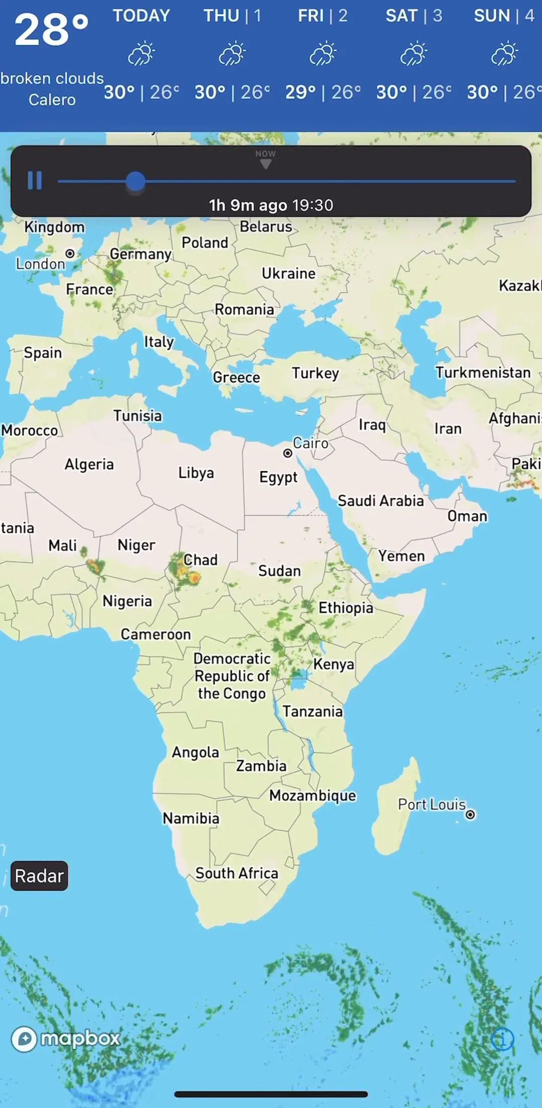
Clime (est. $2.25M/mo) and MyRadar (est. $250k/mo) sit on the radar side of that split, while AccuWeather (est. $500k/mo) and The Weather Channel (est. $2M/mo) carry the full forecast product.
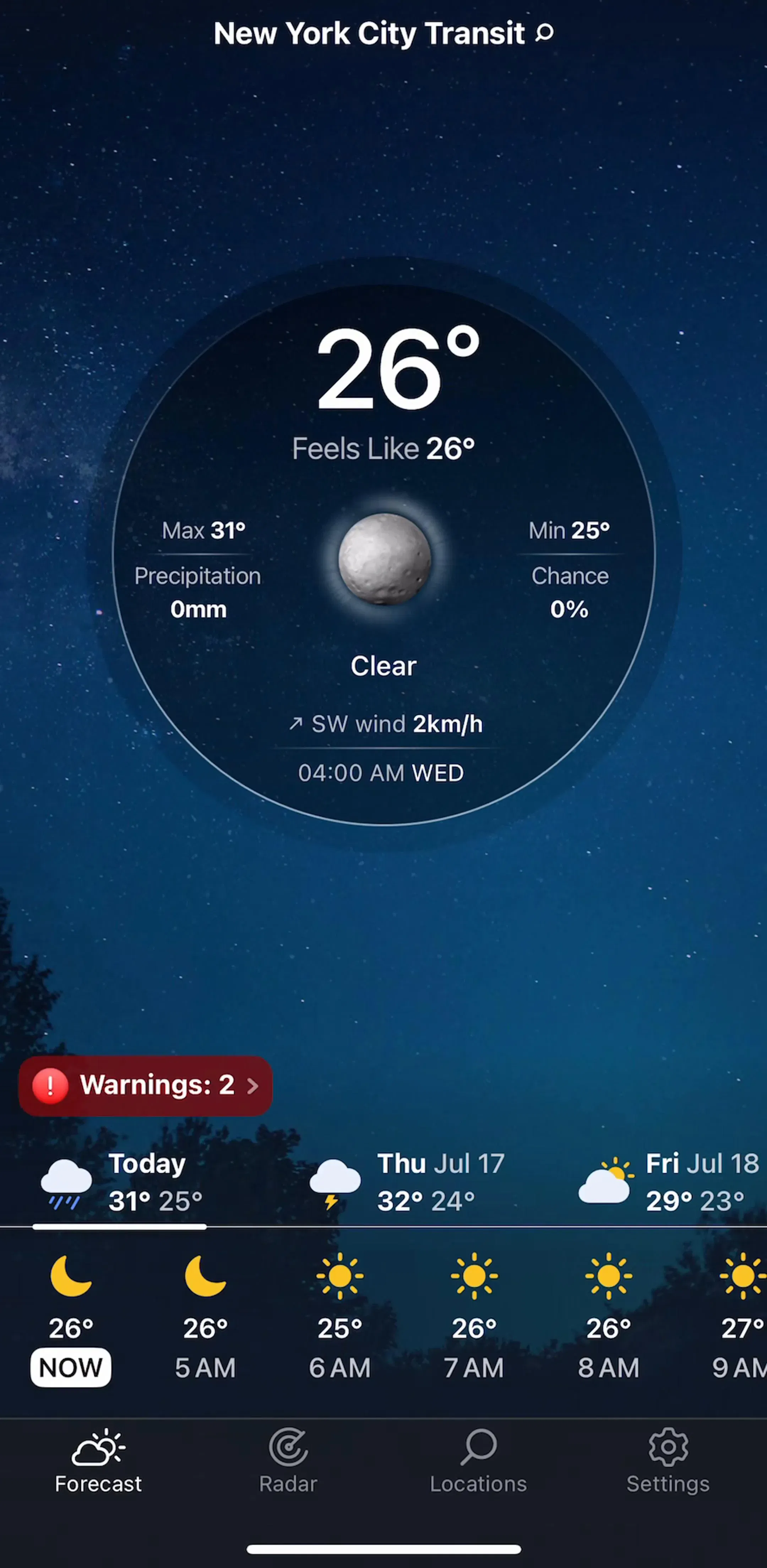
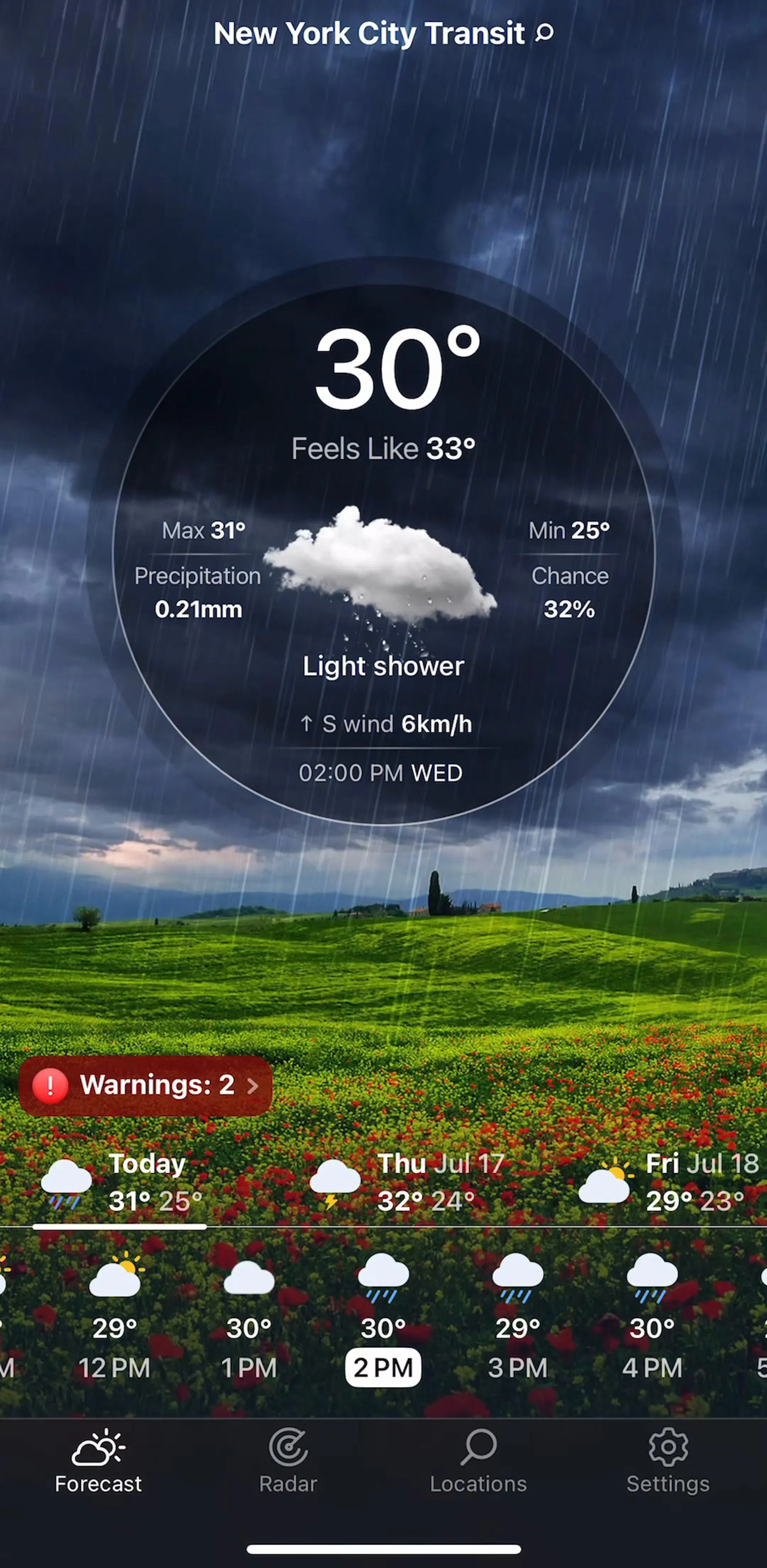
The first screenful is the whole product for most sessions. It carries location, current temperature, a condition word or icon, the high and low, and usually a feels-like value. That is five or six data points, and the reason they are set at wildly different type sizes is that the user is not reading, they are recognising: the temperature is enormous because it is the answer, and everything else is context for it.
The common mistake in concept work is treating this block as a canvas. Full-bleed illustrated skies look excellent in a portfolio and cost legibility in daylight, which is exactly when a weather app gets opened. Shipping apps that use imagery here almost always damp it heavily or push a scrim behind the numbers.
This split is close to universal and it is not arbitrary. Hours are a continuous run the user scans and flicks through, so they sit in a horizontally scrolling strip where more can be added without costing vertical space. Days are a short, bounded list the user compares, so they stack vertically where the eye can run down a column of highs and lows.
Inverting either one reads as broken. A vertical hourly list eats the entire screen for information the user wanted to skim, and a horizontal daily rail makes Thursday hard to compare against Saturday.
Weather Live (est. $250k/mo) and Weather Pro (est. $65k/mo) are compact examples of the same stack, and both are worth reading against the general form of the pattern in the list UI breakdown.
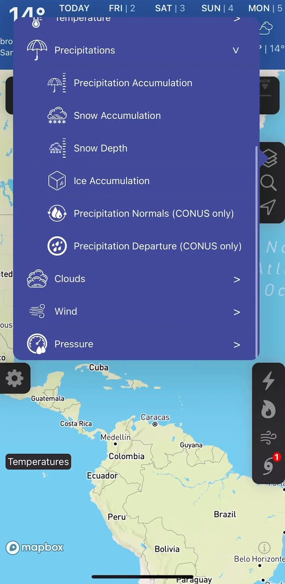
The radar view is the one screen in the category with real interaction design in it. It is a full-bleed map with a raster layer on top, a play control that animates the last few frames, a timeline scrubber, and a layer picker for precipitation, temperature, satellite, wind and whatever else the product sells. The layer picker is where these apps get crowded fastest, because every added data source is a marketing bullet and a new row in a sheet.
The constraint that matters here is the same one every map product hits: controls and legends have to sit over content without hiding the part of the map the user cares about. We covered that problem in general in the map UI breakdown, and it applies directly, with one addition specific to weather: the colour legend is not decoration, and dropping it to save space makes the raster layer unreadable.
NOAA Radar & Weather Forecast (est. $100k/mo) is a small, focused example of the radar-first shape.
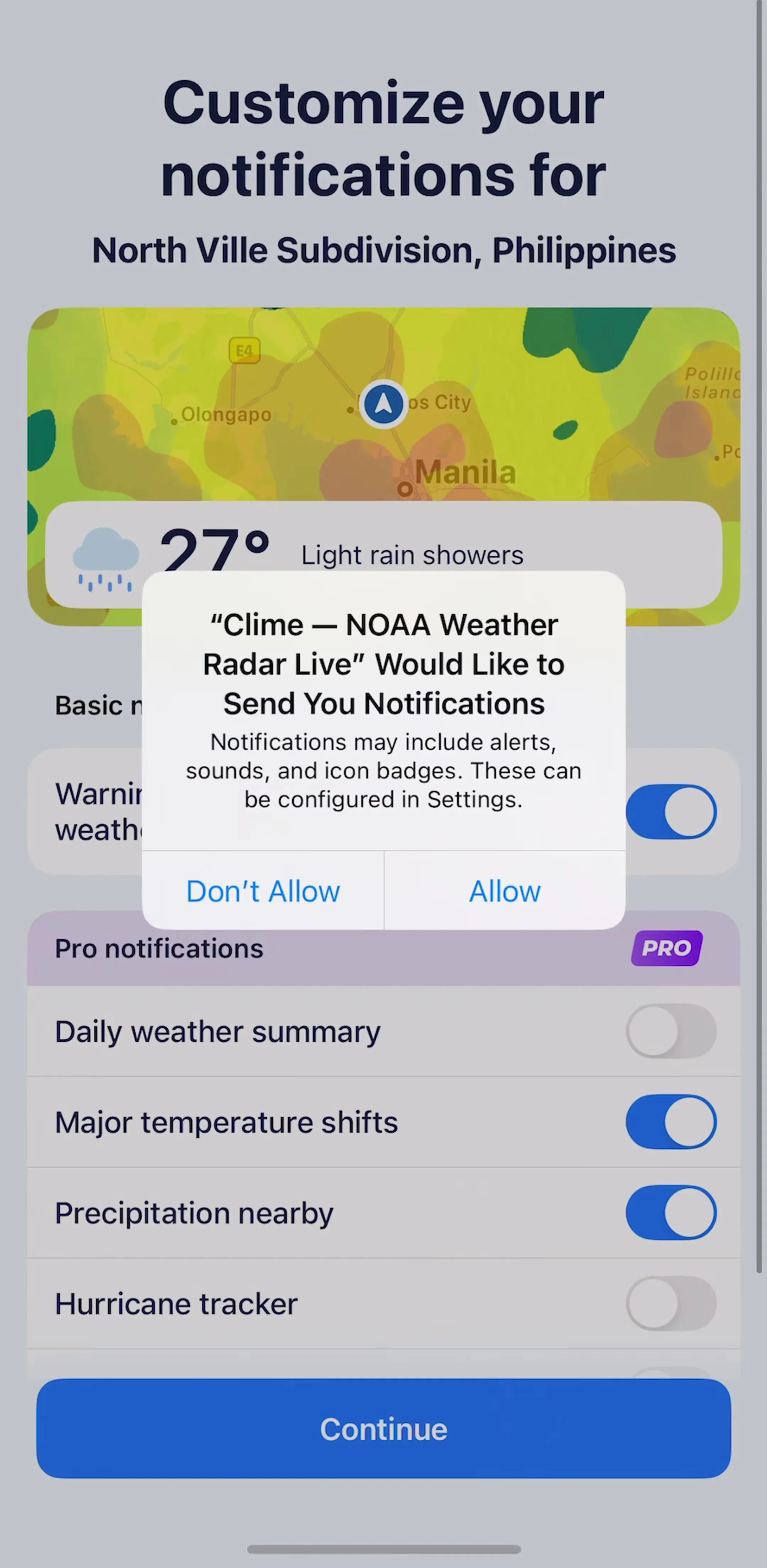
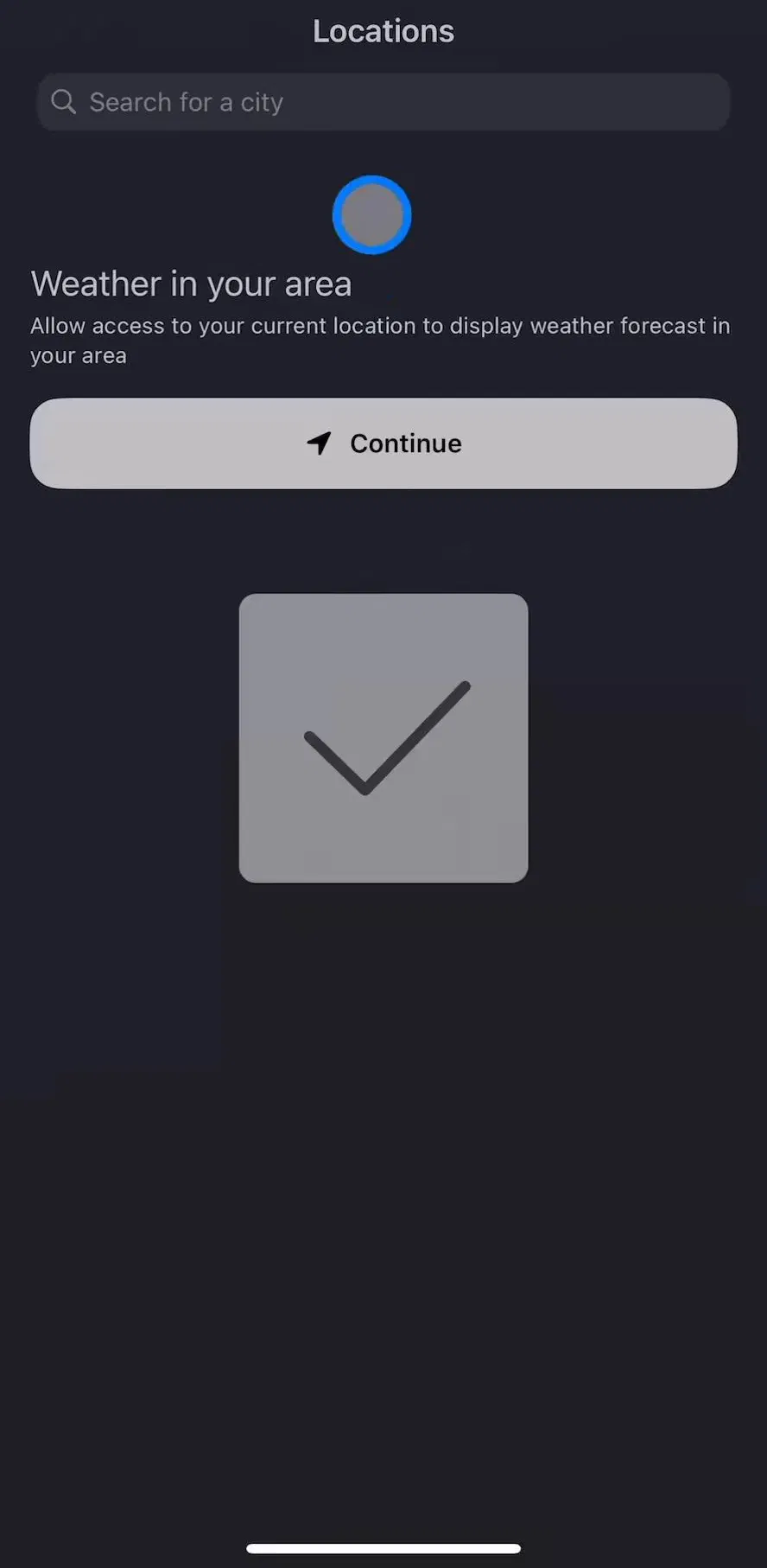
Weather is one of the few categories where a denied permission effectively breaks the app. So the strongest onboarding flows in the category spend their screens earning the ask: a short explanation of what the location does, then the system dialog, then an immediate forecast so the trade pays off in the same session. Firing the dialog on the first frame, before anything has been explained, is still common and still the wrong order.
The general version of this pattern, including the pre-permission explainer screen, is in the permissions gallery, and the wider onboarding shape is in the onboarding breakdown.
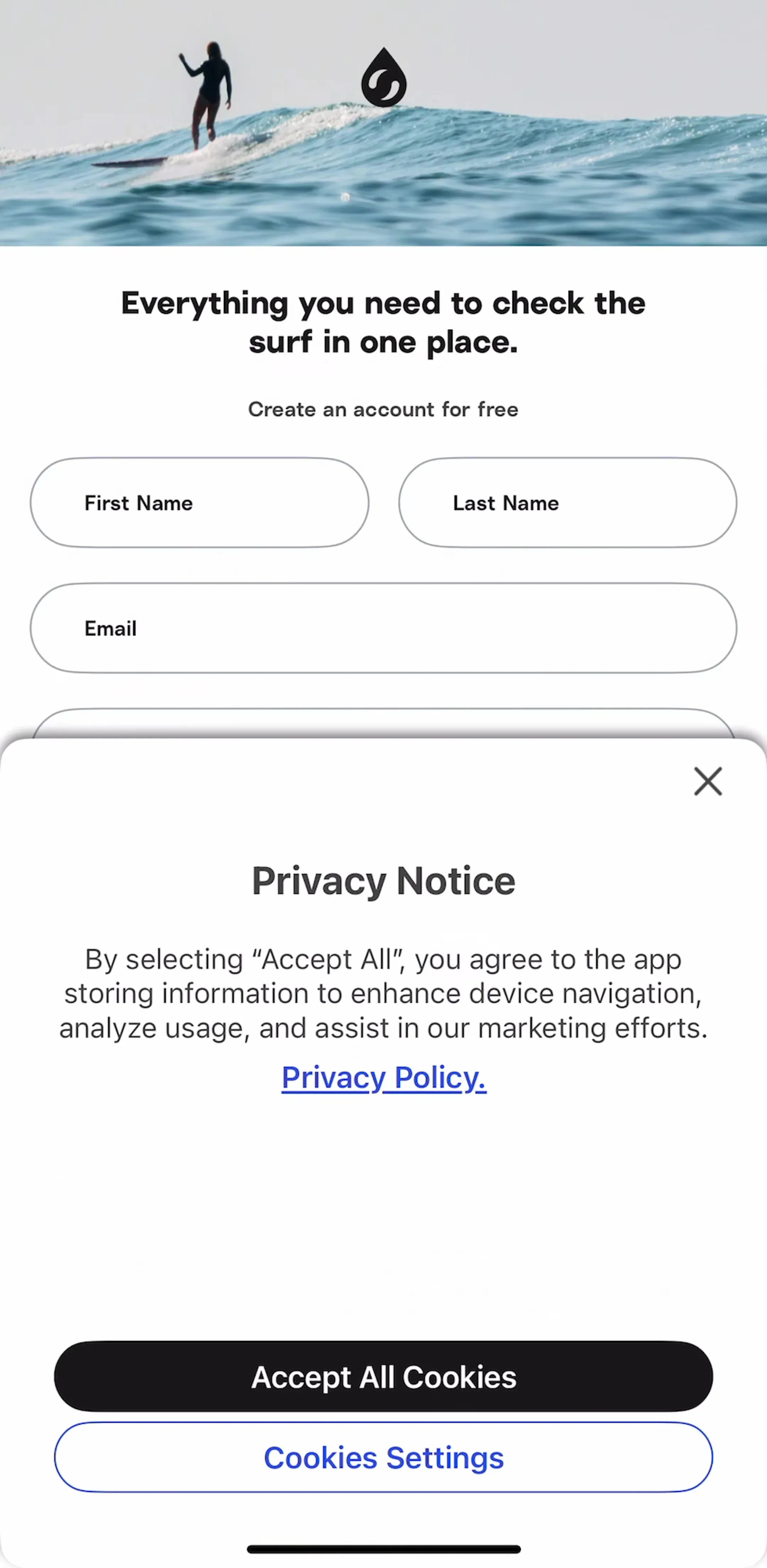
Surfline (est. $450k/mo) is a useful study because it is a location-critical product with a specific audience, so its first-run flow has to establish both a spot and a subscription.
Nearly every product carries multiple places: home, work, a parent, a trip. The convention is a manage-locations screen holding a row per place with its current temperature and condition, reorderable, with the current location pinned at the top. It is worth building early because it is the second most visited screen in the app and it is usually treated as an afterthought.
Windy.com (est. $750k/mo) and Windy.app (est. $1.25M/mo) both carry this alongside a heavy map product, which is a good demonstration of how much structure sits behind an apparently simple app.
Severe weather alerts are the one push notification users genuinely want and the one that most easily becomes noise. The pattern that works is granularity: separate toggles for severe alerts, daily summaries, and rain-starting-soon nudges, because those are three different appetites. Bundling them into one master switch means a user who wants tornado warnings also gets a 7am digest, and eventually turns both off.
The general form is in the notification design breakdown, and the settings structure that holds those toggles is in the settings UI breakdown.
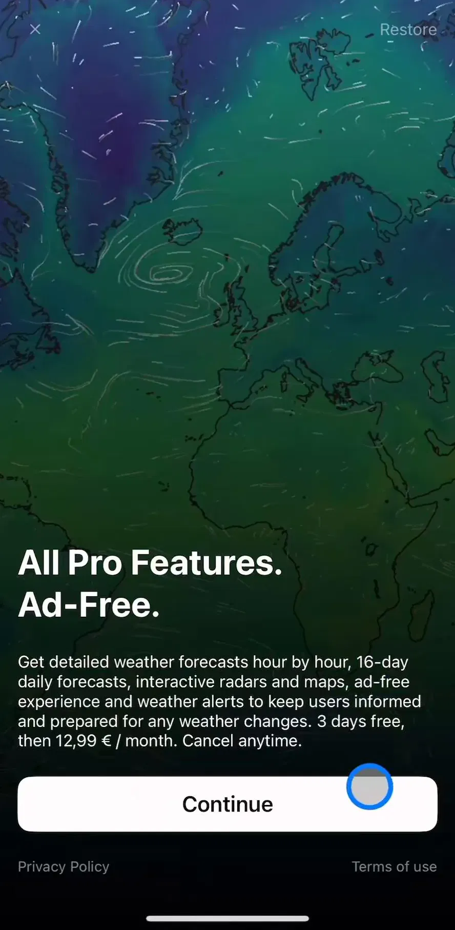
The category is unusual in how visibly it monetises. Free tiers carry a banner or an interstitial, and the premium pitch is typically some mix of removing that, unlocking extra map layers, extending the forecast range, and increasing radar resolution. That means the paywall in a weather app is frequently reached from a layer picker rather than from onboarding, which is a healthier trigger: the user asked for something specific and got a price.
Weather Pro (est. $65k/mo) shows the compact version of that ask, and the paywall breakdown covers where shipping apps across categories place it.
Three recurring problems. Illustration that competes with the numbers, which fails in exactly the conditions the app is used in. Data density presented as sophistication: dew point, UV index, pressure trend and visibility all given equal weight, when the user came for one of them. And ad placement directly under the hourly strip, where a mis-tap sends someone to the App Store instead of tomorrow, which is the fastest way to lose a daily-use product.
Pick three shipping weather apps, open each one cold, and time how long it takes to answer “do I need a jacket in an hour”. That number is the real spec for the top of the screen. Then look at what each app did with its second screen, because that is where the products actually differ. Every screen in the library sits next to the app’s estimated revenue and downloads, so you can choose references by outcome rather than by how the shot looks, and CARROT Weather (est. $250k/mo) is worth adding to the set as the one product in the category with a genuine voice.
A note on the numbers: revenue figures cited here are third-party monthly estimates from our library, useful for comparing magnitude, not audited financials.
Four, and only the first is mandatory. A current-conditions screen that answers the question without scrolling, a forecast surface covering hourly and daily, a radar or map view, and a settings screen for units, locations and alert preferences. Everything else, including widgets, air quality, pollen and marine data, is an extension of one of those four.
Because the task is narrow and repeated. A user opens a weather app for a few seconds, several times a day, usually to answer one question about the next few hours. That pattern rewards a layout the user can read without thinking, which means the temperature block, the hourly strip and the daily list end up in the same place across products. Novel layouts cost recognition time and buy very little.
Depends on the product. General forecast apps open on current conditions because the map is a second question. Radar-first products, which are a large share of the category, open on the map because the user came for the storm, not the number. Deciding which one you are is the single biggest information architecture choice in the category, and it should not be reversible with a toggle buried in settings.
The strongest pattern is asking after a short onboarding that has already explained what the location is for, rather than firing the system dialog on first launch. The apps that ask cold get a higher denial rate, and a denied location permission in a weather app is close to fatal because the fallback is manual city entry on every launch.
The mobileappdesign library holds captured flows from 2,622 revenue-verified iOS apps, including 45 weather products. Screens are captured in sequence, so you can follow a real onboarding and permission ask from first launch to forecast rather than looking at isolated concept shots.
Browse captured forecast and browse flows from revenue-verified iOS apps, in the order a real user walks them.
Browse feed and forecast screens