Search for travel app UI and you get hotel booking concepts: a hero image of a beach, a date picker, a card carousel of destinations. Almost none of that describes the travel apps that actually earn money on iOS. Our library holds 2,622 revenue-verified apps, and 78 of them sit in the travel and navigation categories. 19 are flight and aviation trackers. 26 are map, trail or outdoor navigation tools. Only 11 are booking products. The design problem in this category is a live data screen over a map, not a funnel to a checkout, and that changes almost every decision below.
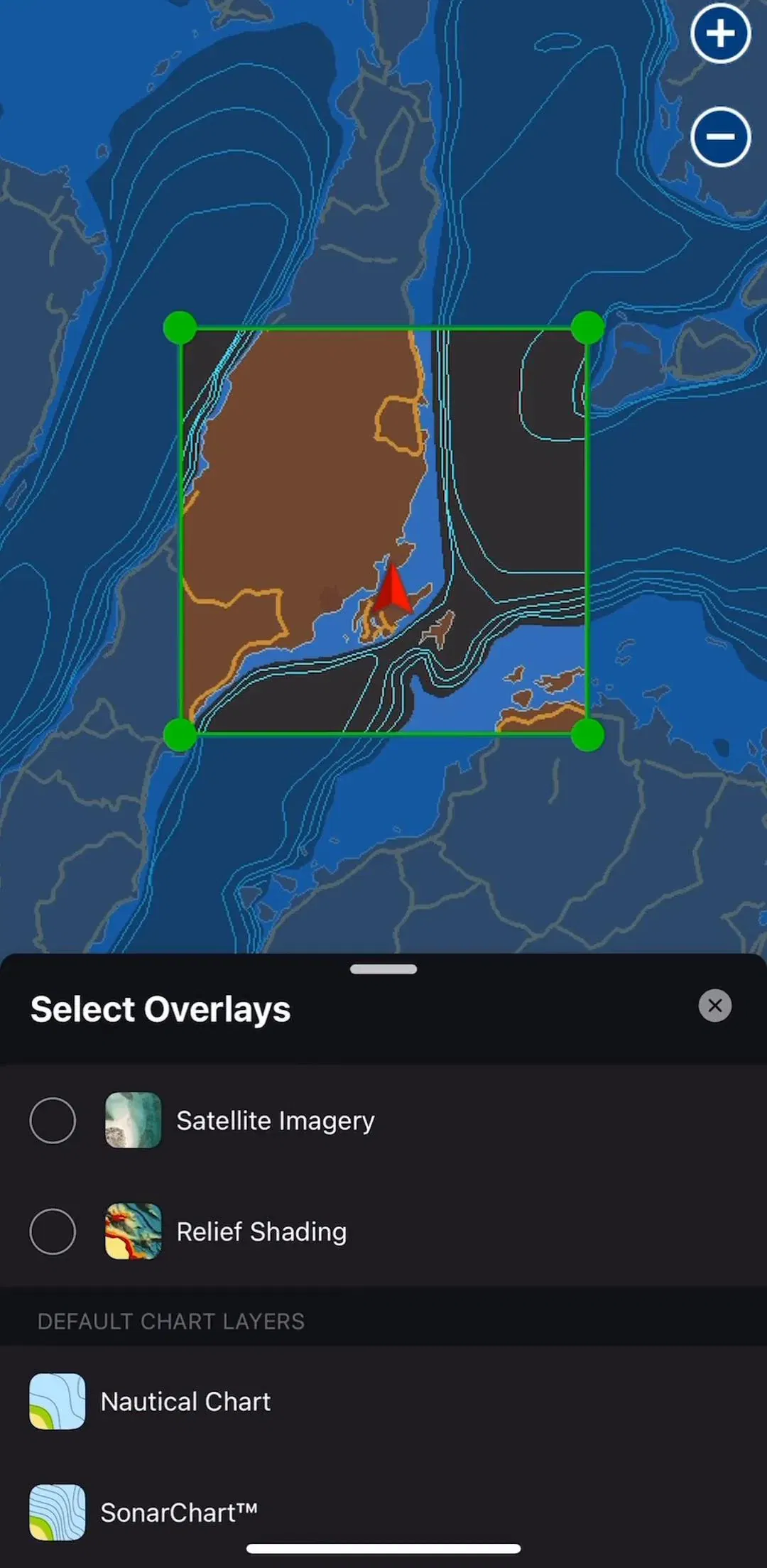
This is the finding that reframes everything else. The travel apps with real revenue in our library are overwhelmingly tools for one repeated job: watch a thing move, or find your way somewhere without a signal. Navionics Boating (est. $4.25M/mo) is a marine chart. Flightradar24 (est. $2.25M/mo) is a live aircraft map. OS Maps (est. $0.65M/mo) and Wikiloc (est. $0.50M/mo) are trail maps.
The booking apps everyone designs for are present, but they are a minority and they are mostly large incumbents. If you are building in this category, the reference set worth studying is the tracker, not the marketplace. The tracker has to make a single moving object legible on a small screen, keep working when the network does not, and justify a subscription for something the user may open four times a year.
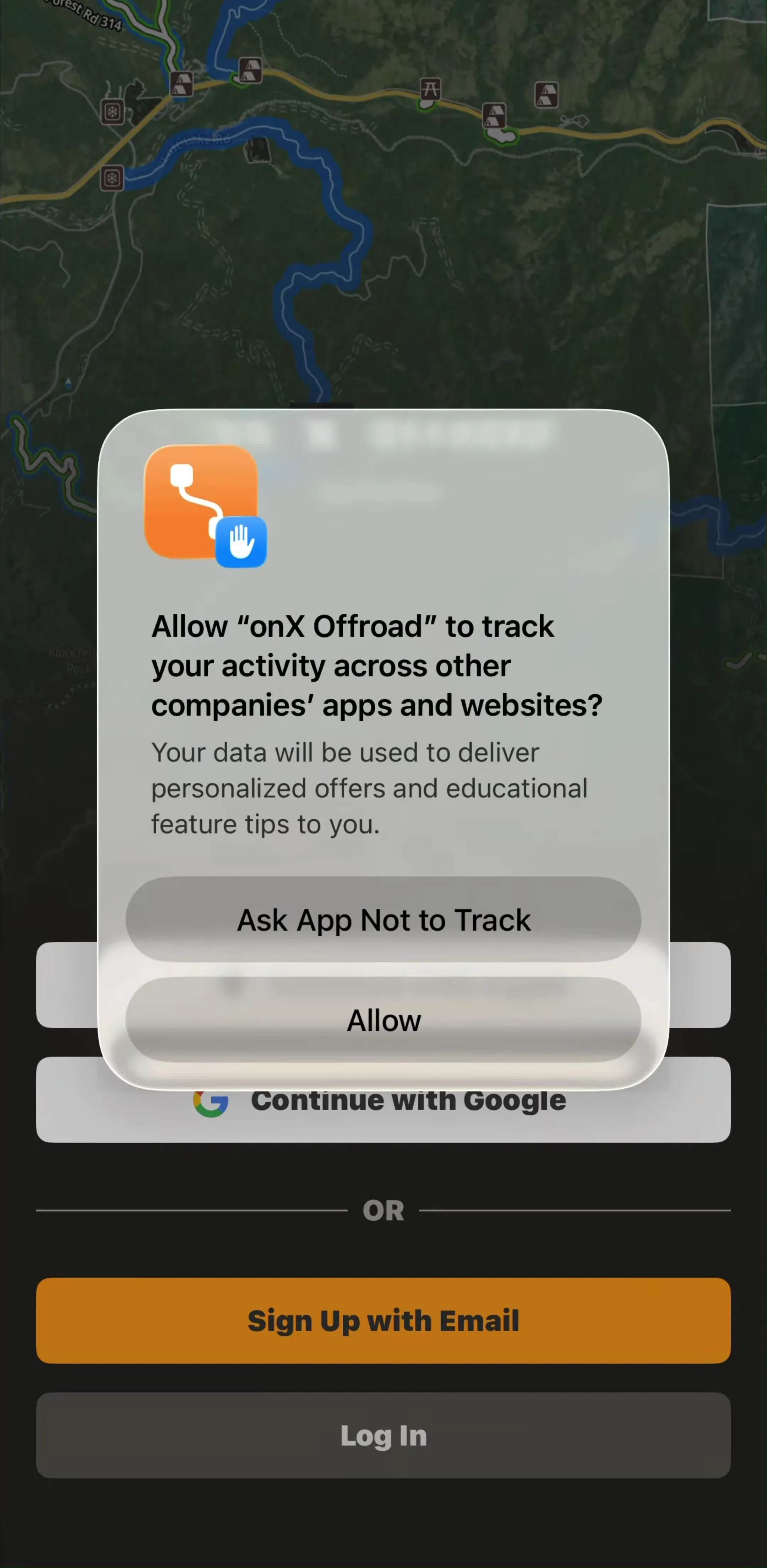
69 of the 78 apps carry an onboarding flow, which is a higher share than the library average, and the reason is structural: nothing in a travel app works before the user grants location. The onboarding is a permission primer with a value argument attached, not a feature tour.
The pattern that holds is the same one described in our onboarding patterns post: explain what the permission buys before the system dialog appears, because the system dialog cannot be asked twice. In this category the explanation is unusually easy to write, since “we need your location to show you where you are on the chart” is self-evidently true. Apps that waste that advantage by firing the dialog on launch are leaving the only easy permission ask in mobile design on the table.
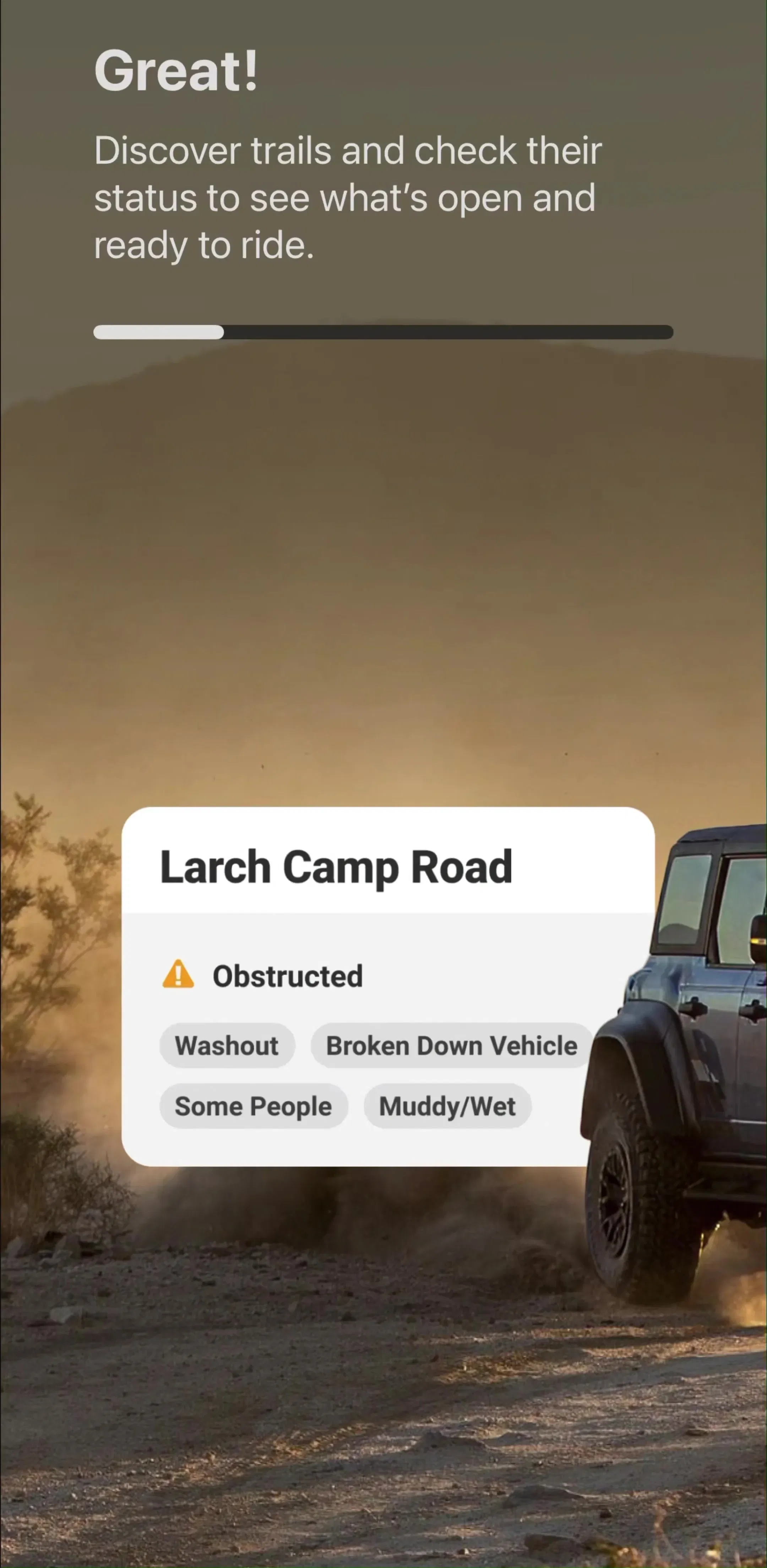
A second thing onboarding is doing here: setting the unit system, the vehicle type, or the activity. calimoto asks about motorcycles, onX asks about off-road vehicles, transit apps ask about a home city. These questions look like personalisation and are really data scoping, and they belong in onboarding because getting them wrong makes the first map screen useless.
33 of the 78 apps carry a dedicated navigation and maps flow, and in those apps the map is not a section, it is the app. There is no dashboard in front of it. This is the arrangement covered in detail in our map UI design post, and the travel category is where it is most consistently applied: full-bleed map, a thin floating control cluster, and a bottom sheet that carries everything else.
The consequence designers underrate is that the sheet becomes the app’s entire information architecture. Search results, the selected object’s detail, the saved list, the route summary and often the paywall all arrive in the same container at different detents. If the sheet is designed as one component rather than five, the app feels coherent. If each surface invents its own sheet height and drag behaviour, it feels broken in a way that is hard to diagnose from a static screenshot.
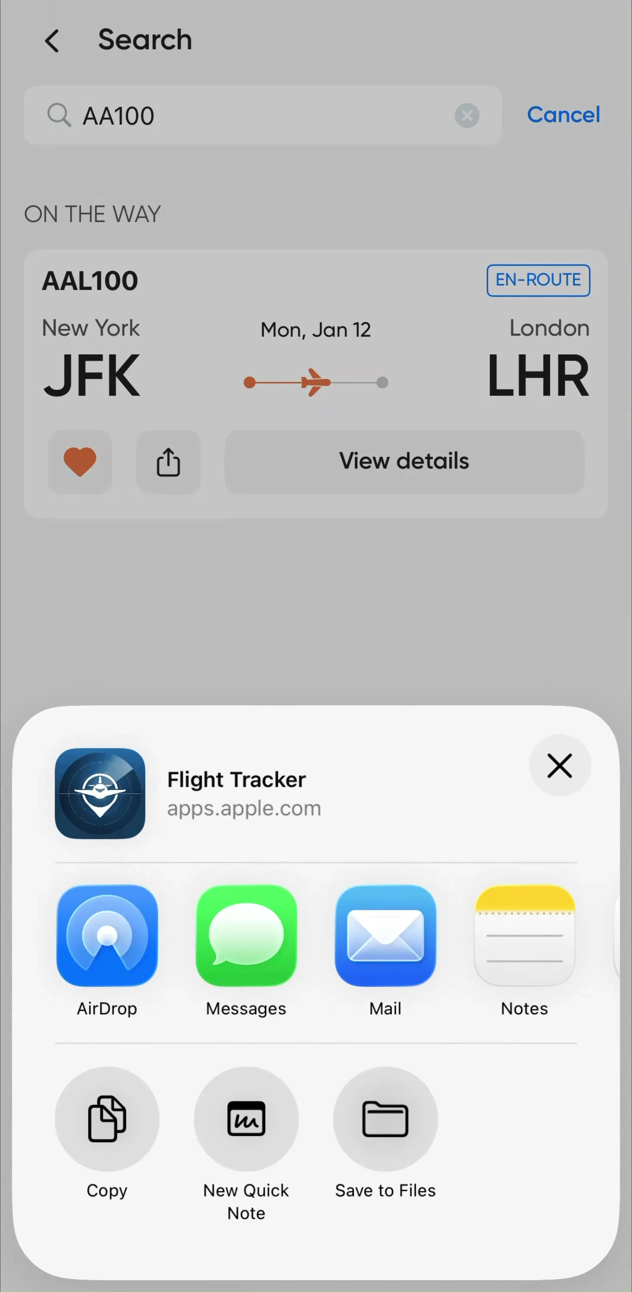
The flight and vessel trackers converge on a screen shape that has no equivalent elsewhere in the App Store. One object is selected. The map is anchored to it. A panel carries status, progress along a route, and a set of numbers that change while you watch: altitude, speed, estimated arrival, delay.
Two rules fall out of that. First, the changing numbers need stable positions, because a value that reflows the layout every few seconds is unreadable. Reserve the width for the widest plausible value rather than letting the number size the container. Second, the screen needs an honest staleness state. A tracker showing a confident position from six minutes ago is worse than one showing an explicit last-updated timestamp, and this is the single most common thing concept work omits.
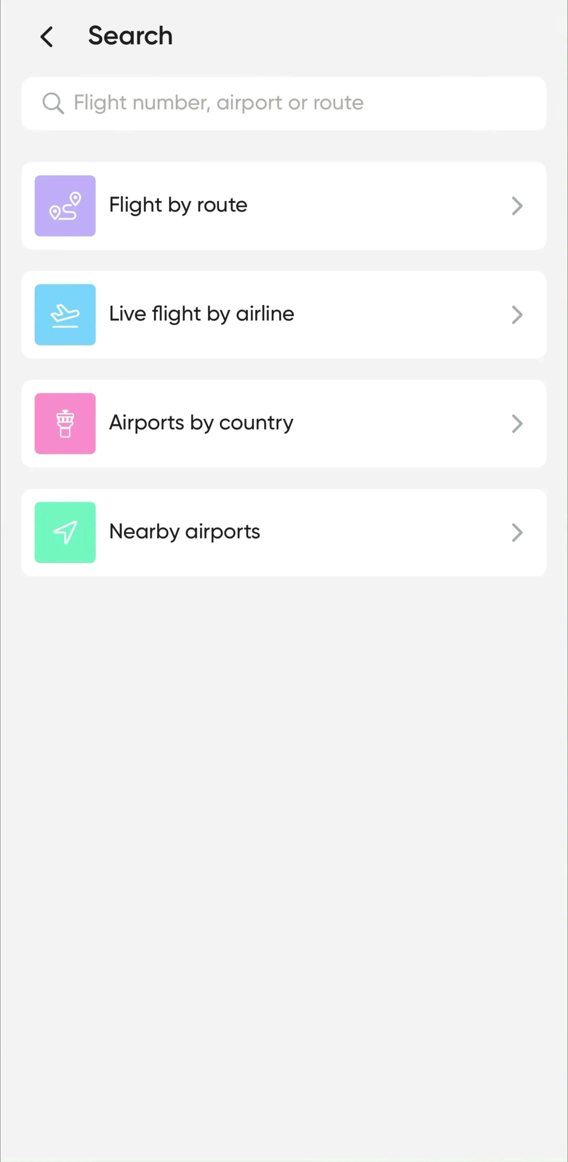
Travel search splits cleanly. Trackers and identifiers have one field: a flight number, a vessel name, a place. Route and booking products have two or more, and the second field is where the interaction cost lives.
For the single-field case the guidance in our search bar post applies directly, and the highest-value work is the screen before the query: recent searches, tracked items, and a clear statement of what the field accepts. A field that will take a flight number but not a route should say so in its placeholder rather than returning zero results.
For the two-field case, the thing to get right is the swap control and the transition from origin to destination. The user who has just typed an origin should land in the destination field with the keyboard still up. Every extra tap here is paid on every single search.
Planning products, which are the smaller half of this category, resolve to a grouped list ordered by day. Wanderlog (est. $0.25M/mo) and TripIt (est. $0.15M/mo) both organise a trip this way.
Two earlier posts cover the mechanics: the row anatomy and section header decisions in our list UI post, and the date-grouping and gap problems in our timeline UI post. The travel-specific addition is the gap itself. A trip has empty afternoons and long transit legs, and a planner that renders those as nothing looks like it lost data. Showing the gap as a labelled span, with its duration, is the difference between an itinerary and a list of bookings.
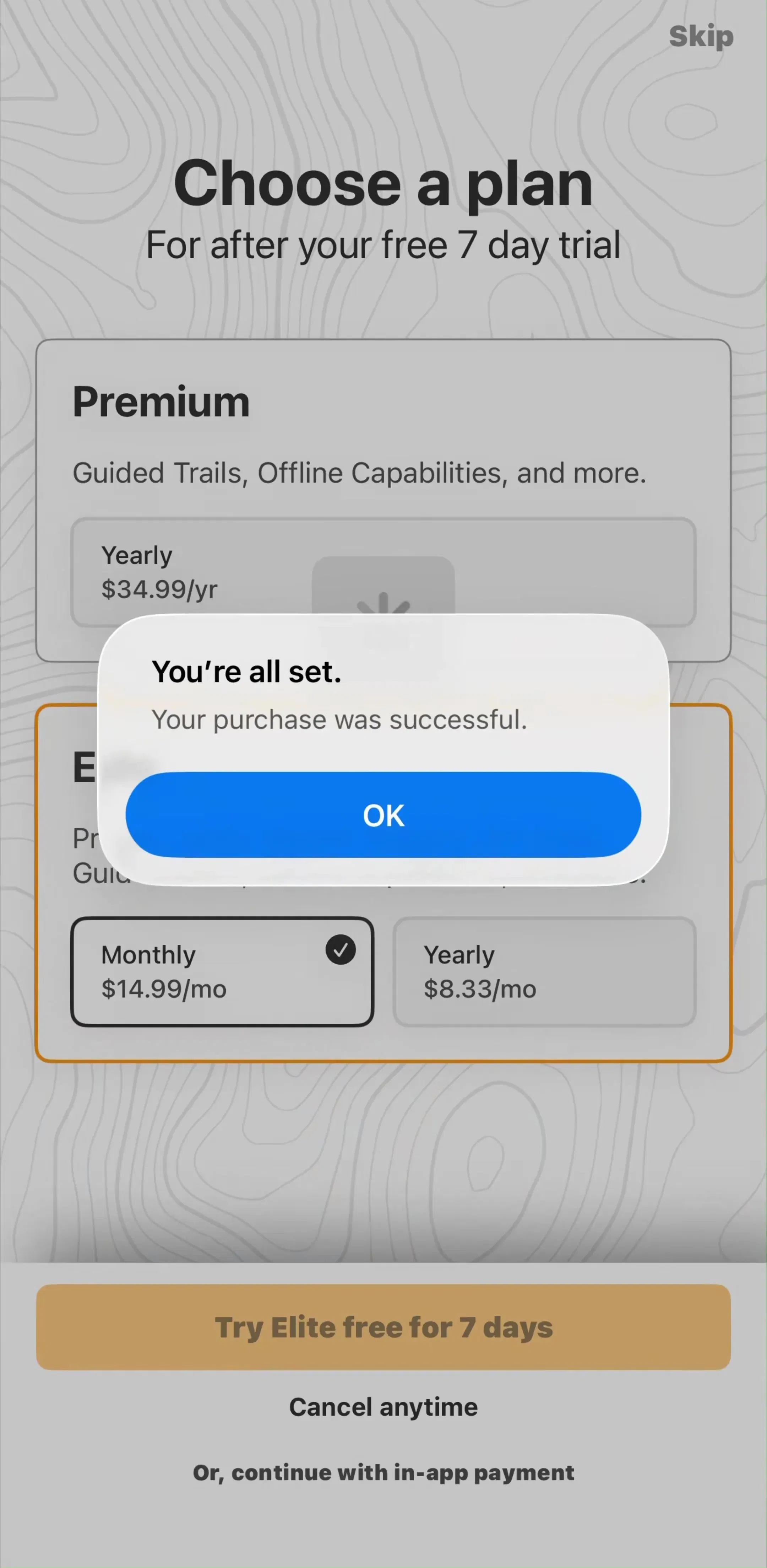
44 of the 78 apps carry a subscription paywall flow, and in the captured sequences the subscription screen most often appears at the end of onboarding rather than at a later feature gate. Several of the section titles in our data name onboarding and subscribing as a single run.
This is more defensible here than in most categories. A trail or marine app is often installed the night before it is needed and opened for one weekend, so waiting for engagement means waiting for a session that may never come. The cost is that the paywall has to do the persuading with no product experience behind it, which puts the whole burden on the preceding onboarding screens. The trial and pricing patterns in our paywall design post apply, with one addition specific to this category: name the offline capability explicitly, because it is the feature most likely to be worth a subscription and least likely to be understood from a screenshot.
The apps in this category are used where the connection is not. That makes offline a design surface with its own screens: what has been downloaded, how much space it takes, how to add a region, and what the map looks like at the edge of the cached area.
Two failure modes are worth naming. Downloading a region without telling the user its size, then filling a phone before a trip, converts a helpful feature into a support ticket. And drawing the cached region with no boundary means the user discovers the edge by walking off it. Both are invisible in a portfolio shot and obvious within one real trip.
Take the structure: a permission-first onboarding, a full-screen map with one well-designed sheet behind everything, stable layouts for values that change while you watch, and an offline model expressed in the interface rather than assumed. Take the honesty about staleness.
Leave the gallery version of this category. The booking concept with the beach hero is a real product shape, but it describes 11 of the 78 apps here and it is dominated by incumbents with distribution you do not have. If you are shipping something new in travel, the tracker and the map tool are the more useful references, and they are also the ones with a subscription model that works at small scale.
Every screen in the library sits next to the app’s estimated revenue and downloads, so you can pick references by outcome rather than by how the shot looks. Flighty (est. $0.80M/mo), calimoto (est. $0.75M/mo) and Gaia GPS (est. $0.30M/mo) are all worth adding to the set as products carrying a subscription on top of a map.
A note on the numbers: revenue figures cited here are third-party monthly estimates from our library, useful for comparing magnitude, not audited financials.
Across the 78 travel and navigation apps in our library the recurring set is small: an onboarding sequence that exists mainly to earn a location permission, a full-screen map or a live tracking screen as the home surface, a search entry point, a saved or planned list, and a paywall. 69 of the 78 carry an onboarding flow, 44 carry a subscription paywall flow and 33 carry a dedicated navigation and maps flow. Booking checkout is the exception, not the rule.
Not in the App Store's revenue-verified tier. Only 11 of our 78 travel and navigation apps are booking products. 19 are flight and aviation trackers and 26 are map, trail or outdoor navigation tools. The concept work that fills design galleries is almost entirely hotel and flight booking, which is why it is a poor reference for the category as it actually ships.
Usually inside onboarding, before the map has proved anything. 44 of the 78 apps carry a paywall flow, and in the captured sequences the subscription screen most often sits at the end of the onboarding run rather than at a feature gate later. That is a defensible choice for a tool people install the night before a trip and may never open again, but it means the onboarding has to carry the entire value argument on its own.
Treat it as a design state, not an error. Trail, marine and transit apps are used exactly where the connection fails, so offline needs a downloaded-region concept in the UI, a visible indicator of what is cached, and screens that degrade to the cached layer instead of showing a blank map with a retry button. This is the constraint that most separates a shipping travel app from a concept.
The mobileappdesign library holds captured flows from 2,622 revenue-verified iOS apps, 78 of them in the travel and navigation categories, with 33 carrying a dedicated navigation and maps flow. Screens are captured in sequence, so you can see how a map screen leads into a detail sheet and into a paywall rather than judging each shot on its own.
Browse captured navigation and maps flows from revenue-verified iOS apps, in the order a real user walks them.
Browse navigation and maps screens