Search for timeline UI design and most of what comes back is a horizontal line with milestones hanging off it, drawn for a marketing page or a project management tool. That shape does not fit a phone. On mobile the timeline is a vertical history screen: scan history, workout log, transcription list, order history, the record of everything the user has already done in the app. It is one of the least designed screens in most products, because it gets built after the feature that fills it and inherits whatever list component was lying around. Our library holds 2,622 revenue-verified iOS apps, 121 with a dedicated history flow and 526 with a tracking and insights flow, and this is what the good ones do differently.
Almost every timeline illustration you will find is horizontal, with a spine running left to right and events alternating above and below it. It is a good shape for a wide canvas and a fixed number of events. On a 390-point-wide screen it becomes a scroll you cannot skim, with labels that either wrap into unreadable columns or get truncated to nothing.
The mobile answer is a vertical list where the spine, if it is drawn at all, is a thin rule down the left with markers on it. That version scales to hundreds of entries, works with the native scroll direction, and reuses the row conventions people already read fluently, which we covered in the list UI design breakdown. If your timeline needs a horizontal axis to make sense, what you actually want is a chart, not a timeline.
Reverse chronological is right for anything still accumulating. The user opening a history screen has a recent event in mind: the scan they just took, yesterday’s workout, the transcription from this morning. Putting the oldest entry at the top means the first thing they see is the least likely thing they want, and the newest entry is buried under every entry that came before it.
The exception is a fixed narrative with a defined start, such as a training programme, a course, or a delivery in progress. Those read forward because the user is asking what comes next, not what just happened. The test is simple: if new entries keep arriving indefinitely, go newest first.
An ungrouped timeline is a wall of rows with a timestamp on each one, and reading it means doing date arithmetic on every line. Grouping into day sections with a sticky header moves that work into the interface. The header stays pinned while its section scrolls, so the user always knows which day they are looking at without scrolling back up.
Label the recent past in words. Today, Yesterday, then the weekday name for the last week, then a date. Beyond a month, a month header is usually enough and the individual day headers become noise. Inside a section the row only needs a time, because the day is already established above it.
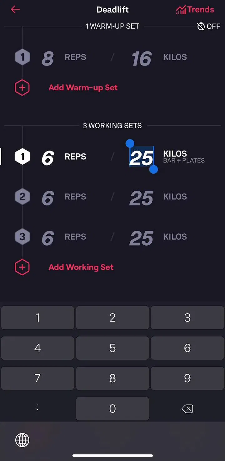
Fitbod (est. $0.75M/mo) is a useful reference here because a workout log is a timeline with a strong natural grouping: sessions on days, exercises inside sessions.
The most common failure in timeline design is row inflation. It starts with a title and a timestamp, then a thumbnail gets added, then a status chip, then a secondary action, and twelve entries no longer fit on a screen. At that point the sequence is no longer legible as a sequence, which was the only reason to draw it as a timeline rather than a feed.
Hold the row to three things: what happened, one number or status that makes the entry worth scanning, and when. Everything else belongs on the detail screen the row opens. If several fields genuinely compete for the row, that is a signal the entries are heterogeneous enough that they should be cards, which is a different container with different rules, covered in the card UI design piece.
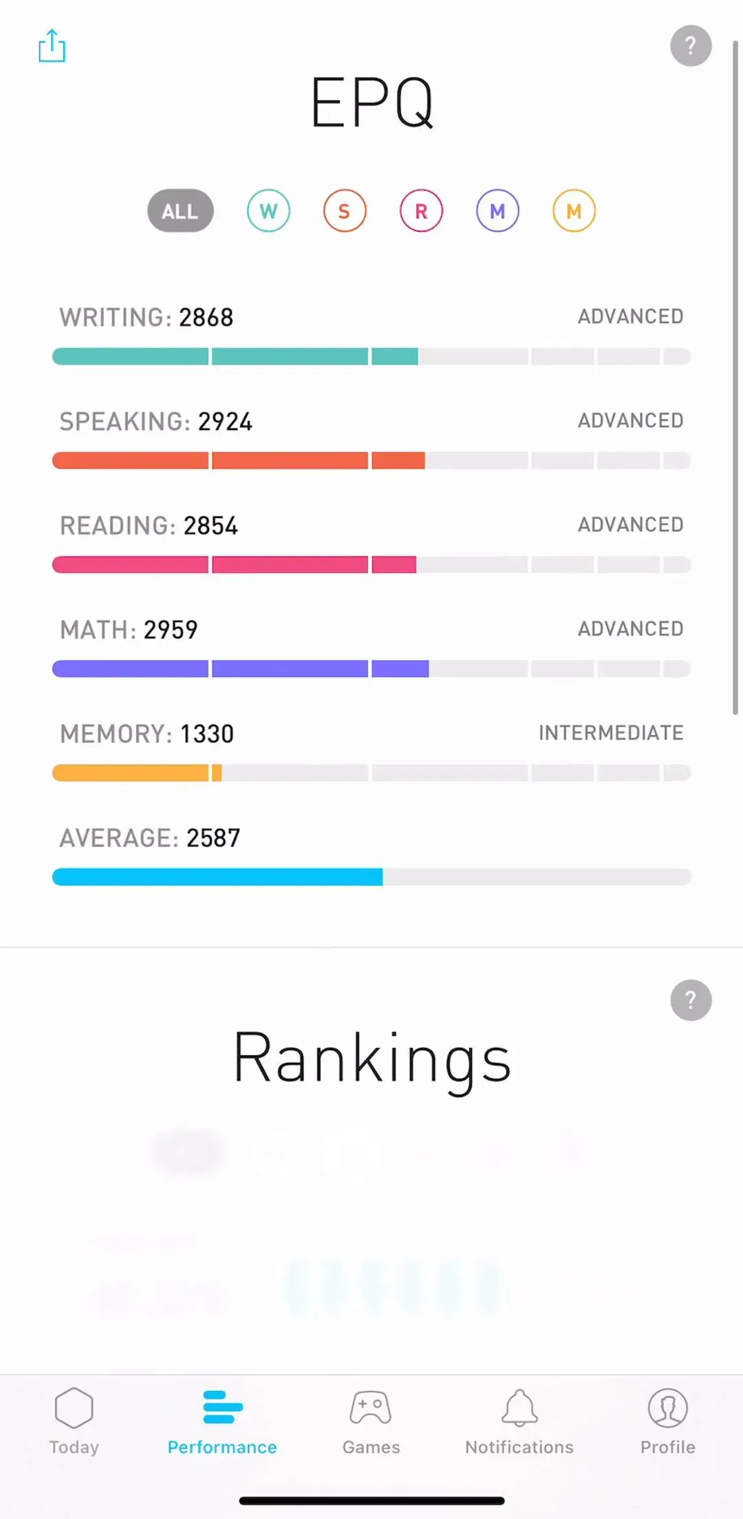
Elevate (est. $0.75M/mo) has the opposite constraint, a long history of short sessions where each entry carries a score, which makes it a good contrast for how much a row can hold before it stops scanning.
Trackers and histories disagree about empty days, and both are right for their case. In a habit tracker, a medication log or a streak record, the missed day is the most important entry on the screen, and collapsing it produces a record that quietly lies about adherence. Draw it, mark it, let it break the run.
In a scan history, a transcription list or an order history, a week with nothing in it means the user did not need the app that week. Rendering empty rows for it fills the screen with nothing and pushes the real entries out of reach. Collapse silently and let the date headers jump.
ThriftAI (est. $0.05M/mo) sits in the second category, where the history exists to let a user find one earlier scan rather than to judge their consistency.
A timeline that works at 20 entries fails at 2,000. Once a history is a year deep, scrolling is not a retrieval mechanism, and the two things that rescue it are a date jump and a type filter. A month or year selector at the top turns an unbounded scroll into a bounded one, and a filter by entry type answers the question people actually arrive with, which is usually about one kind of event rather than one week.
Search is the third option and the weakest for a timeline, because history entries are often not textual. A scan, a workout and a recording have little to type at. Filters do more work here than a search field, and the mechanics of that are in the filter UI design breakdown.
Yuka (est. $0.75M/mo) accumulates scan history quickly by design, which makes it a reasonable place to look at how a history screen holds up once it is long.
A surprising number of apps in the library do not build a history screen at all, and are right not to. If the entries are only ever consumed one at a time and immediately, a history is a tab that collects dust and a maintenance burden. The pattern earns a screen when at least one of three things is true: the user needs to retrieve an earlier item, the sequence itself carries meaning such as progress or adherence, or the record is the product, as it is in a tracker.
When none of those hold, the better placement is a small recent section on the home screen showing the last three entries with no dedicated destination. That gives back the retrieval case without the cost of a screen nobody visits.
Five recurring failures. A horizontal spine borrowed from a web illustration. Oldest first on a history that keeps growing. No date grouping, so every row carries a full timestamp and the user does the arithmetic. Rows inflated into cards until the sequence stops being readable. And unbounded scroll on a history that is now a year deep with no date jump and no filter.
A sixth is the empty state. A brand new history screen is empty by definition, which makes it one of the few screens every user is guaranteed to see, and it is usually the last one designed. It should say what will appear here and point at the action that creates the first entry, which is the argument made at length in the empty state piece.
Populate your timeline with a year of realistic data before you review it. Almost every failure above is invisible at ten entries and obvious at four hundred, and design reviews are usually run against a seeded list of six. Then scroll it with one thumb and see whether the sticky header is still telling you where you are.
After that, compare against shipping apps rather than concept work. Every screen in the library sits next to the app’s estimated revenue and downloads, so references can be chosen by outcome rather than by how the shot looks. The screens that feed a timeline are the logging and capture screens, and those are collected under tracking and insights.
A note on the numbers: revenue figures cited here are third-party monthly estimates from our library, useful for comparing magnitude, not audited financials.
A chronological list of events belonging to one subject, drawn so the order and the spacing between events carry meaning. On mobile it is almost always vertical and almost always reverse chronological, because the most recent entry is the one the user came to check. The web version of the pattern, a horizontal line with milestones hanging off it, does not survive a 390-point-wide screen.
Newest first for anything the user is currently accumulating, which covers scan history, workout logs, chat threads viewed as a list, and order history. Oldest first only makes sense for a fixed narrative with a beginning, such as a course syllabus or a delivery that has a defined start and end. If you are unsure, the test is whether new entries keep arriving. If they do, put them at the top.
Group into day sections with a sticky header, and label relative dates in words for the recent past. Today, Yesterday, then the weekday for the last week, then the date. A user scanning a history is looking for roughly when something happened, and a raw timestamp on every row makes them do arithmetic that the header could have done for them.
One line that identifies the event, one supporting value, and a time. That is usually enough. Timeline rows go wrong by trying to be cards: the moment a row carries a thumbnail, three metadata fields and two actions, the vertical rhythm that made the list readable as a sequence is gone and it is a feed instead.
Only if the gap is information. In a habit or medication tracker the missing day is the point, and hiding it makes the record dishonest. In a scan history or an order history a quiet week means nothing and drawing empty rows for it wastes the screen. The rule is to render the absence when the absence is data, and skip it when it is just time passing.
The mobileappdesign library holds captured flows from 2,622 revenue-verified iOS apps, including 121 with a dedicated history flow and 526 with a tracking and insights flow where the timeline usually lives. Screens are captured in sequence, so you can see the history screen next to the logging screen that fills it rather than as an isolated shot.
Browse captured history flows from revenue-verified apps, in the order a real user walks them.
Browse history screens