Most writing about search bar UI is about websites, where the field is a box in a header and the interesting work happens on the results page. On mobile the field itself is a small part of the pattern. What decides whether search works is where the field lives, what the screen shows before anything is typed, and what happens when the query returns nothing. Our library holds 2,622 revenue-verified iOS apps and 374 of them carry a dedicated search and filter flow, captured in sequence, so the empty state and the results screen sit next to each other rather than being judged separately.
A search bar makes an implicit promise about what is inside the index. When a user types into a field at the top of a screen showing their saved items, they reasonably expect to search saved items. If the query silently searches the entire catalogue instead, or the reverse, the results are confusing in a way that no amount of ranking will fix.
Say the scope in the placeholder and keep it accurate: Search saved recipes, Search all flights, Search this playlist. This one line resolves more confusion than any other change to the pattern, and it is also the cheapest.
A field pinned above the list is the strongest signal that search is a main route. It costs a permanent band of vertical space, so it is worth it when the content set is large and the user usually arrives with a specific target in mind.
A field that scrolls away and returns is the iOS default and the best general answer. It is present when the user is at the top of the list, which is where search intent forms, and invisible while they are reading.
A dedicated search tab is the right call when search is how people mainly navigate the product, as in a catalogue or a reference app. It is also the most expensive decision on the screen, because it consumes one of the five slots in the tab bar. That trade is the subject of the tab bar breakdown.
The placement to avoid is a search icon in a top corner with nothing else near it, which is the arrangement users miss most often, particularly in an app where the rest of the top bar is already busy.
Tapping the field and typing nothing is an extremely common state, and it is where most of the value in mobile search sits. A blank screen with a keyboard is a wasted opportunity; the screen should already be useful.
Three things earn their place there. Recent searches, because repeat queries are the most common queries, with a way to clear them. Suggested or popular items, which teach the user what the index contains and give a new user something to tap. Browsable categories, for the very common case of a user who wants to look rather than to name a thing.
Litres (est. $0.25M/mo) is a useful study because a catalogue with a deep back list has to serve both the user who knows the title and the user who is browsing, from the same entry point.


Results that update as the user types feel fast and are correct for small, local, or predictable sets: contacts, settings, a personal library. They stop being correct when each keystroke is a network call and the list churns underneath a moving thumb.
The workable middle is to show suggestions live and full results on submit. Suggestions are cheap, short, and stable enough to tap; the heavy result list arrives once the user has committed. Whichever route you take, keep the previous results visible while the next set loads rather than clearing to a spinner, and never move the field itself while typing.
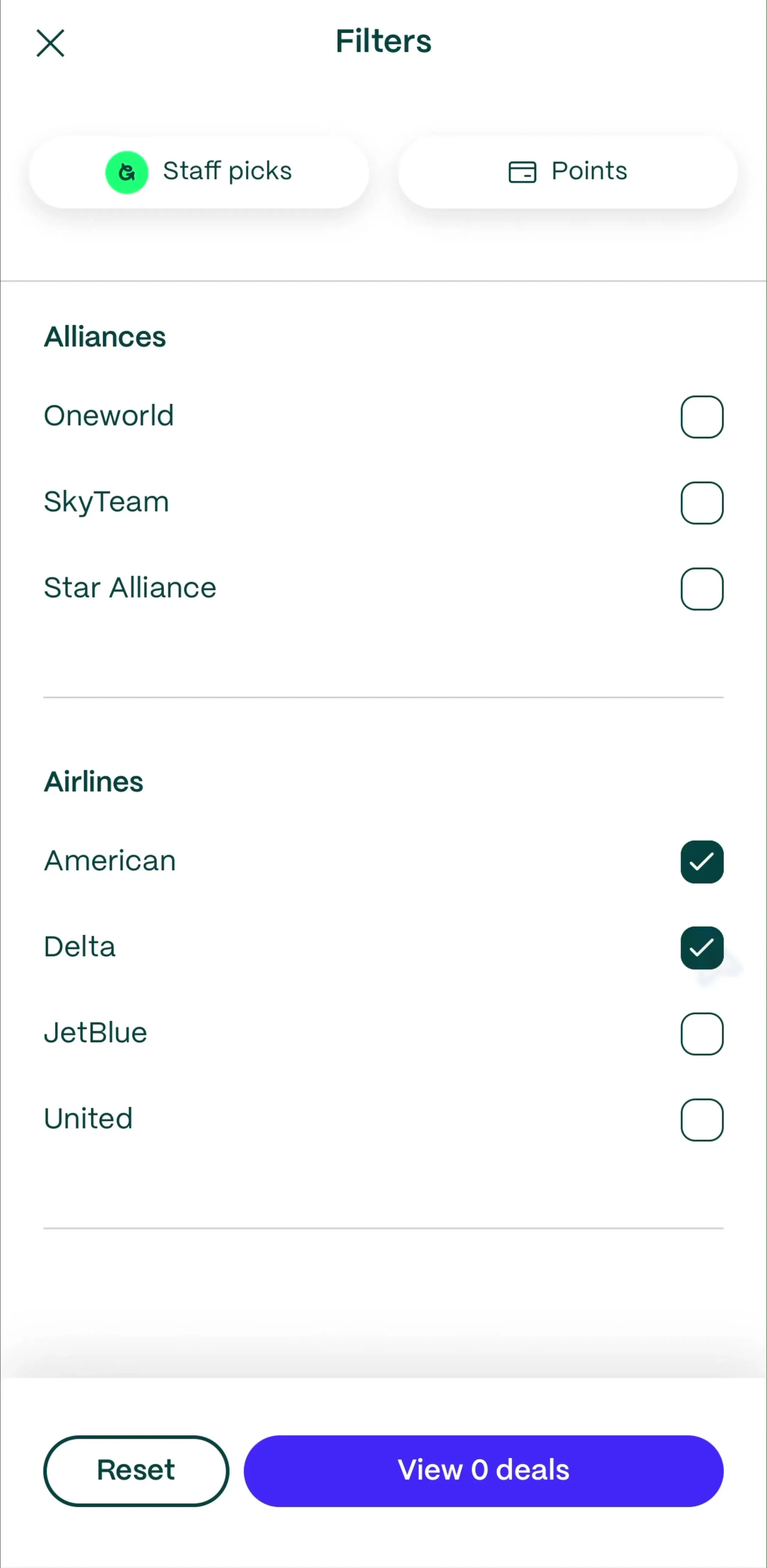
Search and filtering are different acts and mobile screens routinely blur them. The query selects a candidate set; filters and sort refine what came back. When both are present, the applied filters must stay visible after a new query, or the user searches again, sees fewer results than expected, and blames the search.
Scope chips directly under the field are the standard solution when the index has genuinely distinct sections, such as Songs, Albums, Artists. The full set of decisions about chips, sheets, applied state and result counts is in the filter UI breakdown, which covers what happens after the query rather than the field itself.
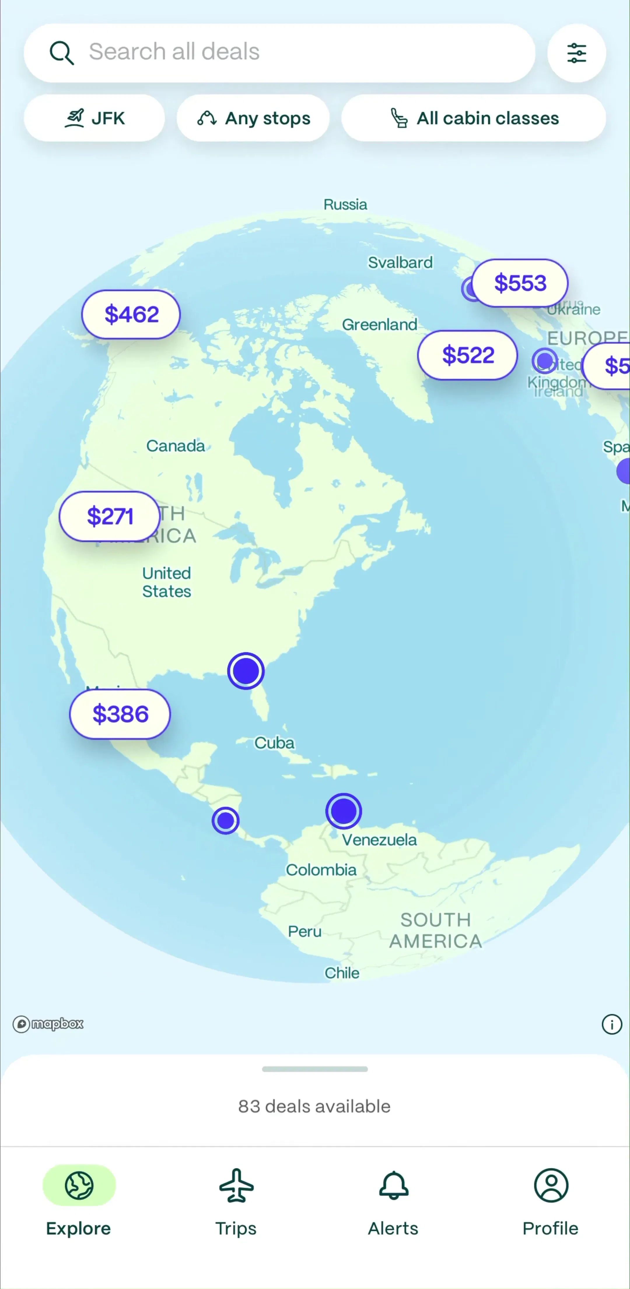
Going (est. $0.07M/mo) is worth a look as a product where the search is the product, and where what the user types is only part of the query being built.
On mobile the keyboard is often the slowest way to express a query. A barcode scanner, a camera identifier, or a microphone sitting inside the search field turns a 20 character type into a single tap, and in categories like food logging, shopping and plant or object identification it is now the primary path rather than a novelty.
Two rules keep it from backfiring. The alternate entry point belongs inside or immediately beside the field, so it reads as another way to search rather than a separate feature. And it must degrade to typing, because permissions get denied, cameras fail in low light, and voice input is socially impossible in plenty of the places people use phones.
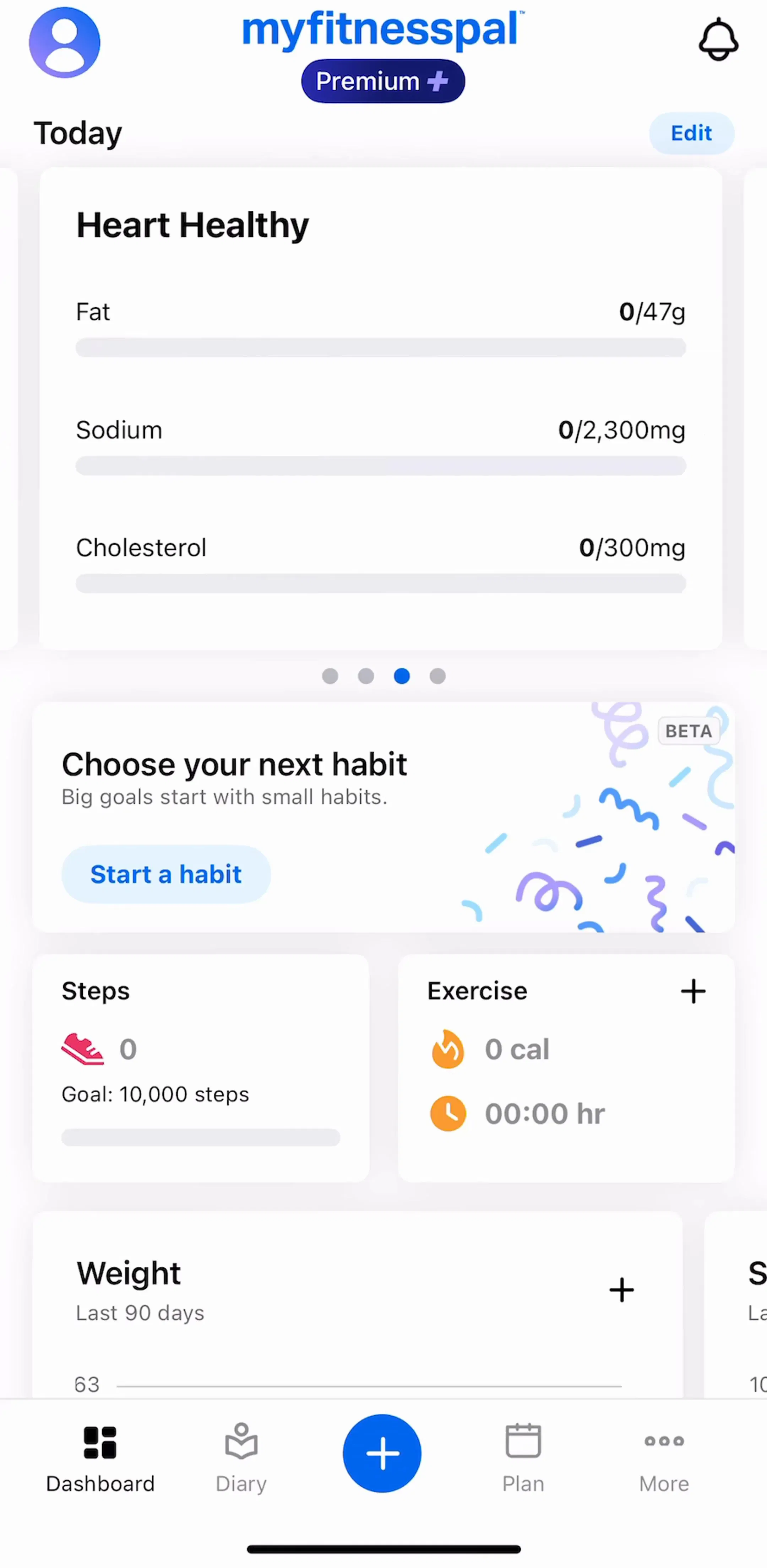
MyFitnessPal (est. $12M/mo) is the reference case, since logging food is a search problem repeated several times a day and the typed query is the slowest of the available routes.
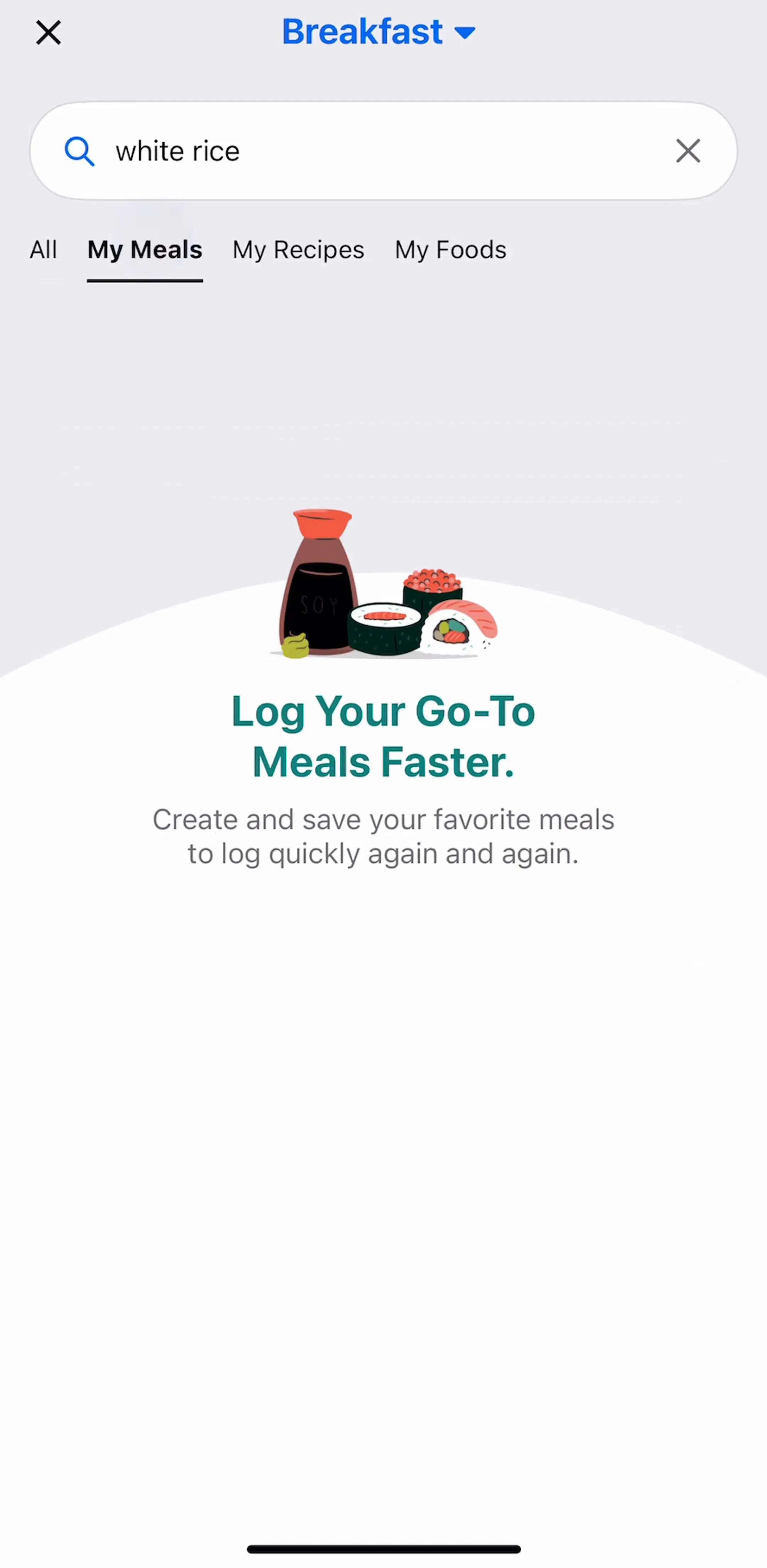
The empty result is where search sessions end, and most apps treat it as a message rather than a fork in the road. A version that works does three things: shows the query back, so a typo is visible and correctable; offers the nearest available thing, whether that is a spelling suggestion, a wider scope, or popular items; and provides one concrete action, such as clearing a filter or adding the missing item.
It also has to distinguish two cases that look identical and are not. An index with nothing matching the query is different from a result set that was filtered to zero, and the second needs a clear-filters action rather than a suggestion to search again. The general shapes are in the empty state breakdown.
Five recurring failures. A placeholder that says only Search, leaving the scope unstated. A field that loses the query on back navigation, so refining a search means retyping it. No clear button, or a clear button that also dismisses the whole search screen. Results that shift under the thumb because each keystroke reorders the list. And the persistent one: recent searches that cannot be cleared, which is a privacy problem in any app with sensitive content, not just a tidiness one.
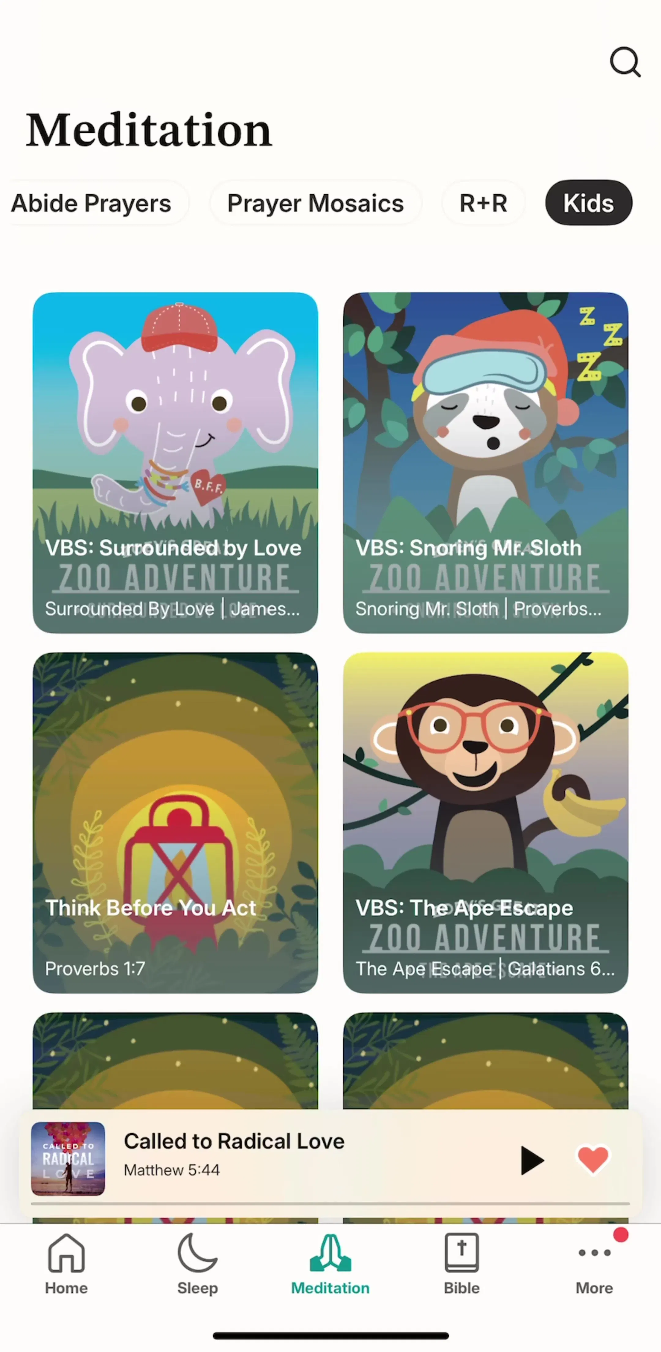
Abide (est. $0.15M/mo) is a reasonable reference for the general case of searching a large reference library from a phone.
Run three tests on a device. Tap your search field and type nothing: if the screen is blank, that is the highest-value fix available. Search for something that does not exist and see whether the screen offers a route forward. Then search, open a result, and press back, and check that the query, the filters and the scroll position all survived, which is the failure users notice most and report least.
Then compare against shipping apps rather than concept shots. Every screen in the library sits next to the app’s estimated revenue and downloads, so you can pick references by outcome rather than by how the shot looks, and Flight Tracker (est. $0.09M/mo) is worth adding to the set as a search over a set that changes by the minute. For the list the results land in, see the list UI breakdown.
A note on the numbers: revenue figures cited here are third-party monthly estimates from our library, useful for comparing magnitude, not audited financials.
Three things, in order. It states its scope, so the user knows what they are searching. It is reachable from wherever the user forms the intent, rather than only from a home screen. And it does something useful before the first character is typed, because the empty search screen is where most mobile search sessions actually begin.
Show the field when search is a primary route into the content, which is true for any library, catalogue or reference app. Use an icon when search is a secondary path and the space is better spent on the content itself. The pattern that satisfies both is a field that is visible at the top of the list and scrolls away with the content, then returns on a scroll up, which is standard on iOS and costs nothing when unused.
The scope, not the verb. Search recipes tells the user what the index covers; Search alone tells them nothing and is the single most common miss. Keep it short enough not to truncate on a small screen, and never rely on the placeholder to carry an instruction the user needs after typing, since it disappears at the first character.
As a routing problem rather than an error. State what was searched, so a typo is visible; offer the nearest thing you have, whether that is a spelling suggestion, a broader scope, or popular items; and give one action that leads somewhere, such as clearing a filter or creating the missing item. An empty screen with a magnifying glass and the words no results is where sessions end.
The mobileappdesign library holds captured flows from 2,622 revenue-verified iOS apps, including 374 with a dedicated search and filter flow. Screens are captured in sequence, so you can see the empty search state, the query, and the results screen it produced rather than judging a search bar from a single isolated shot.
Browse captured search screens from revenue-verified iOS apps, in the order a real user walks them.
Browse search and filter screens