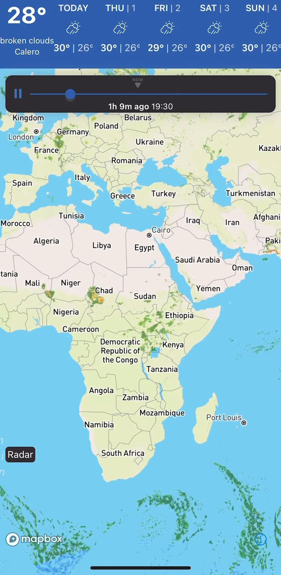
A map is the only component in mobile design that is simultaneously the content, the navigation, and the background. Everything else on the screen has to survive being placed on top of terrain you do not control, in a palette you did not choose, at a zoom level the user picked. That makes map UI design mostly a problem of layering rather than layout. Of the 2,622 revenue-verified iOS apps in our library, 149 ship a navigation or maps flow, and the ones that work share a small number of decisions.
In map-first products the map runs edge to edge and everything else floats. That is not a style choice: a phone-sized map loses a large share of its useful area to any permanent header or panel, and useful area is precisely what a map is for. The consequence is that every control becomes an overlay, and every overlay has to be readable against green, blue, grey, and satellite photography at the same time. This is why floating map controls converge on high-contrast pills with solid backgrounds rather than the transparent or tinted treatments used elsewhere in the same app.
Outdoor and field products push this the furthest, because the map is the entire reason the product exists. Fishbrain (est. $2M/mo) has 31 captured screens in its map exploration flow alone.
Tapping a pin should not leave the map. The pattern that has settled across the category is a bottom sheet with two or three detents: a peek showing name and one key fact, a half height with the main detail, and a full height that behaves like a normal screen. It keeps the selection visible above the sheet, it makes dismissal a drag rather than a back navigation, and it lets the same surface hold both a single result and a list of them.
The design work is deciding what belongs in the peek, because that is the only part most users will read. One name, one number, one action is usually the right budget.
A pin is a small graphic sitting on a surface the user is constantly panning and zooming. Three rules do most of the work. Give the pin a tap target well beyond its drawn size. Cluster as soon as targets start to overlap, and label the cluster with its count so the user knows what a tap will expand. And make the selected state obvious enough to find again after the map has moved, usually by size and color rather than by a subtle outline.
Weather products are a useful contrast here, because their overlay is continuous data rather than discrete points, which changes the interaction from selection to inspection. NOAA Radar (est. $100k/mo) and AccuWeather (est. $500k/mo) both have to make a moving radar layer legible without any pins at all.
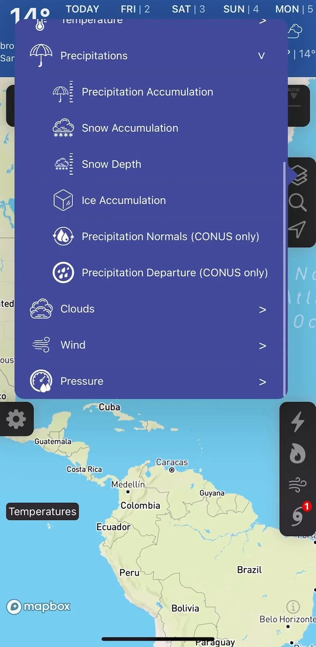
Every serious map app accumulates layers: satellite, terrain, heat, traffic, depth, ownership, weather. They are functionally filters over what the map draws, and they deserve the same discipline covered in the filter UI breakdown: a persistent entry point, visible state once applied, and a one-tap way back to the default view. The specific risk with layers is that they are sticky, so a user who turned one on last week opens a map that does not match their memory of the app.
Specialist mapping products carry the most of these. OS Maps (est. $650k/mo), Gaia GPS (est. $300k/mo), Navionics (est. $4.25M/mo), and LandGlide (est. $300k/mo) are all essentially layer managers with a map attached.
Search inside a map product has an extra step that ordinary search does not: the result has to be placed. The loop that works is query, list of candidates, selection, map recenters with the pin selected and the sheet open. Skipping the recenter is the common bug, because it leaves the user holding a result they cannot see. The general shape of the query surface is the same one covered in the search and filter gallery, but the return state is entirely map-specific.
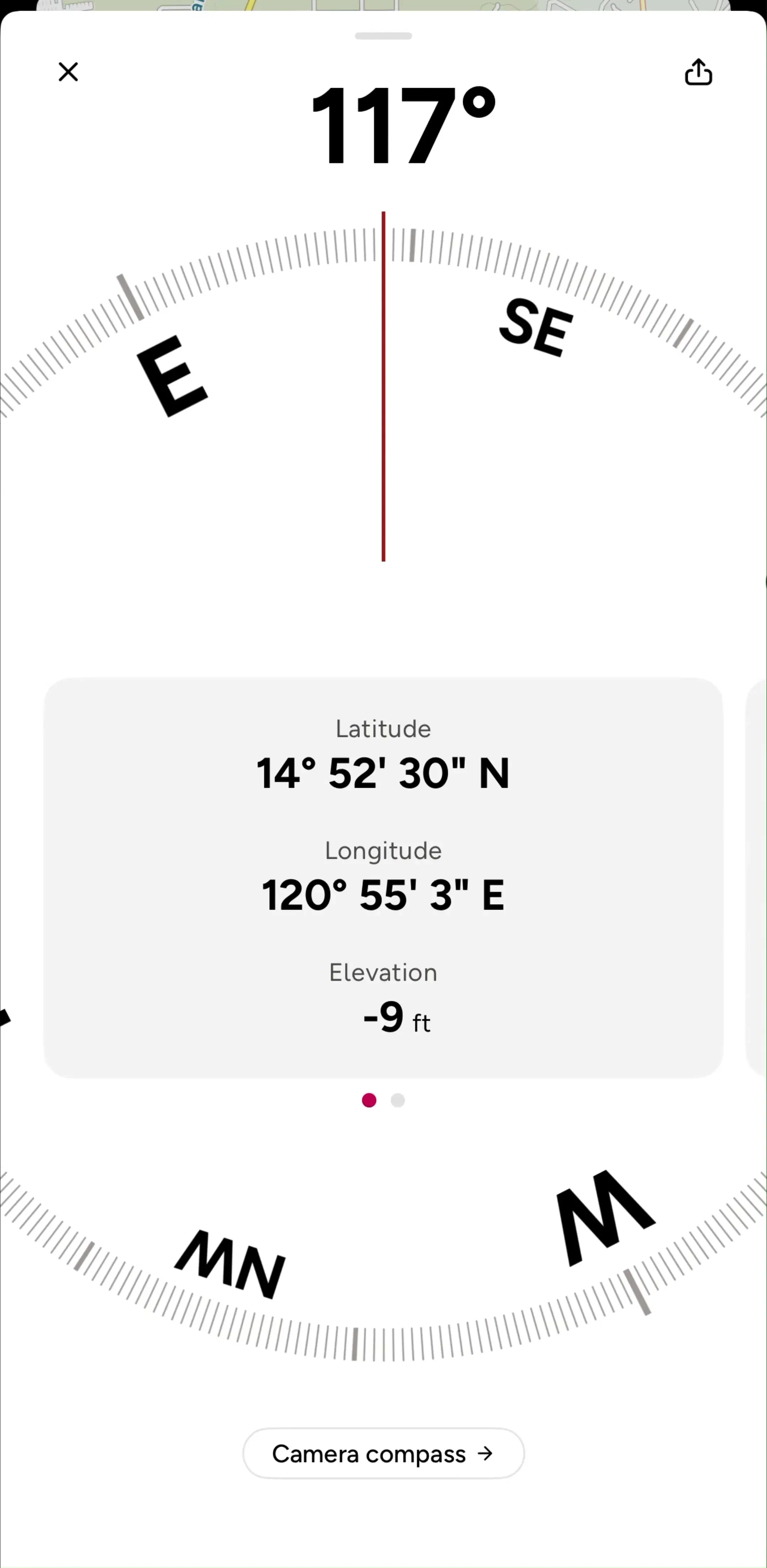
A map that is being explored and a map that is guiding a moving user are not the same interface. Browsing is north-up, freely panned, dense with controls. Turn-by-turn is heading-up, locked to the user, stripped down to the next instruction, and readable at a glance from a handlebar or a dashboard. Apps that try to serve both from one layout end up with a browsing UI that is unusable in motion.
Route-based products make the split explicit. komoot (est. $4M/mo), calimoto (est. $750k/mo), and AllTrails (est. $6M/mo) all separate route discovery from the in-motion screen, and the transition between the two is one of the most consequential moments in the product.
A map app without location access is a worse version of itself, and iOS gives the user several ways to grant less than the app wants, including a coarse location and a one-time allowance. The apps that handle this well ask in context, right when the map has a reason to need it, and design a working degraded state for the coarse and denied cases instead of blocking the screen. Captured examples of the priming screens live in the permissions gallery, and the general pattern is covered in the notification and permission breakdown.
A dark map style is a separate asset from a dark interface, and the two can disagree. A map that stays light while the app around it goes dark produces a glowing rectangle at night, which is the exact situation dark mode exists to avoid. It is worth deciding early whether the map style follows the system appearance, the time of day, or a manual control, because all three appear in shipped products and each implies different overlay contrast work. We measured how widely dark interfaces are shipped across the library in the dark mode breakdown.
Map interfaces are difficult to judge from a single screenshot, because the interesting part is the transition: open map to search, search to pin, pin to sheet, sheet to route. The library keeps screens in captured order next to each app’s estimated revenue and downloads, so you can follow those transitions in products that already work, and compare a consumer fitness map such as Strava (est. $16M/mo) against a specialist tool to see which conventions are universal and which belong to a niche.
A note on the numbers: revenue figures cited here are third-party monthly estimates from our library, useful for comparing magnitude, not audited financials.
Map UI design is the design of the controls, overlays, and states layered on top of an interactive map: search, pins and clusters, the detail sheet, layer and filter controls, the current-location affordance, and the transitions between browsing a map and following a route.
In map-first products, yes. A phone map is small enough that any permanent chrome around it meaningfully reduces the visible area, so shipped apps run the map edge to edge and float controls on top of it. The trade is that everything floating over the map has to stay legible against arbitrary terrain, satellite imagery, and both light and dark map styles.
A bottom sheet is the convention, because it shows detail without leaving the map, keeps the selected pin visible above it, and supports progressive height so a peek can become a full page. Pushing a separate detail screen breaks the spatial context that made the map useful in the first place.
As soon as pins overlap enough that individual ones cannot be tapped reliably. The practical trigger is hit-target collision rather than a fixed count. Clusters should show their size, expand predictably on tap, and split at consistent zoom thresholds so repeated zooming does not produce a different result each time.
The mobileappdesign library holds captured flows from 2,622 revenue-verified iOS apps, and 149 of them ship a navigation or maps flow. Because screens are captured in sequence, you can follow the loop from an open map to a search, a selected pin, and a detail sheet.
Browse captured navigation and map flows from revenue-verified iOS apps, with revenue and download estimates next to every screen.
Browse map and navigation screens