Search for football app UI and the results are concept shots: dark match cards, neon score tickers, a stadium photo behind everything. Shipping sports apps look calmer, and they are organised around one question: which teams do you follow? Our library holds 33 revenue-verified sports apps, and they split in a way the concept work does not suggest. 13 follow professional leagues through scores, news or streaming, among them ESPN, the NFL, the NBA, the WNBA, DAZN, Formula 1 and the Premier League. 10 are fishing, hunting and outdoor trackers, 4 are betting and prediction tools, and 6 are single-purpose utilities such as a darts scorer and a sports card scanner. This post is about the 13, and what their captured screens say about designing a football or sports app.
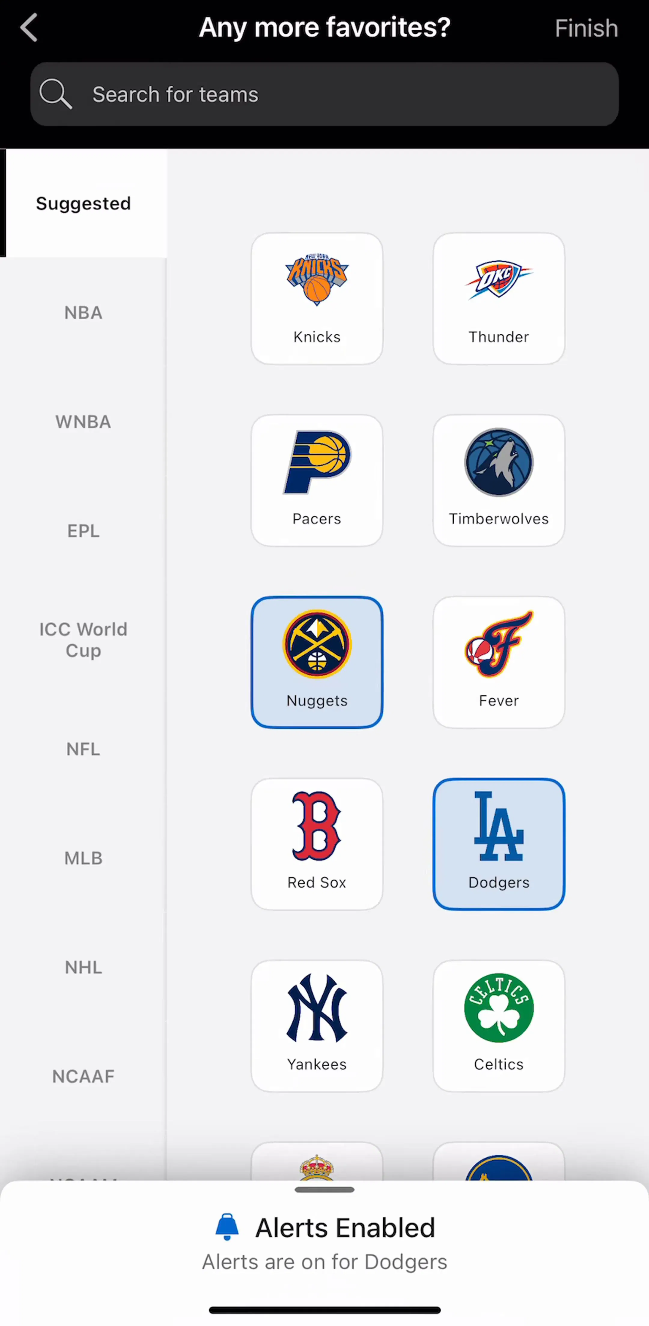
Five of the 13 capture a section for following or personalising teams, and in ESPN, the NFL and Bleacher Report it is folded into the very first onboarding section. ESPN (est. $5M/mo) shows the pattern most completely. Its team picker asks Any more favorites?, puts a search field for teams at the top, runs a rail of leagues down the left, from the NBA, WNBA and EPL to the NFL, MLB, NHL and college football, and fills the rest with a grid of team logos. Picking a team highlights its tile and raises a small confirmation that alerts are now on for that team. Revenue figures throughout this post are third-party estimates, not audited financials.
Three details are worth copying. The search field comes first, because a fan with one team in mind should not have to scroll a league. The league rail keeps a grid of dozens of teams manageable. And the confirmation ties the pick to its consequence: following a team means hearing about it. Apple Sports makes the same choice in a lighter form, a list headed My Leagues with a star beside each league and a More to Follow list below it.
The counter-example is instructive. The NFL app (est. $3.25M/mo) captures an alert over its team hub asking the user to sign in to their NFL account to select a favourite team, followed by an account form in an in-app browser that asks for date of birth, country and zip code. Gating the most basic personalisation behind account creation puts a form between the user and the one thing they came to do. If an account is needed for syncing, let people pick teams first and ask for the account when there is something to save. Our login screen post covers where sign in belongs in a flow.
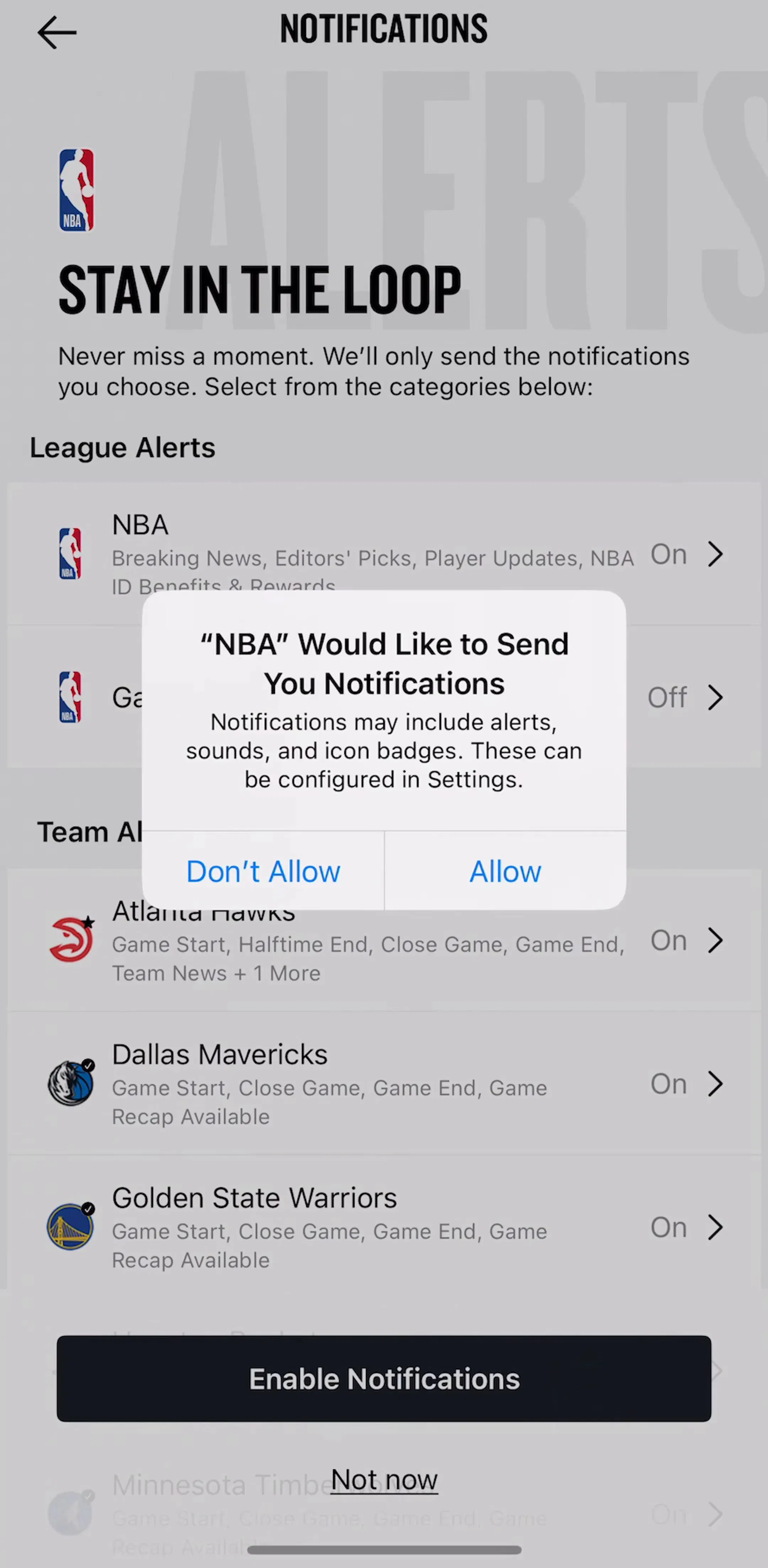
Sport is live, and the value of a sports app is knowing when something happens: kickoff, a close game, a final score. So the screen that follows team picking is often an alerts screen, and it is the most carefully designed screen in several of these flows. The NBA app (est. $1.75M/mo) captures a Stay in the Loop screen that promises to send only the notifications the user chooses, lists League Alerts and Team Alerts as rows, and describes each team row with the events it covers: game start, halftime end, close game, game end and team news. An Enable Notifications button sits at the foot with a Not now link beneath it, and the system prompt appears over the list.
The WNBA app (est. $0.75M/mo) captures nearly the same screen, with toggles for league and team alerts and per-team rows listing team news, game start, close game and final score. Real (est. $0.2M/mo) makes the promise inside onboarding itself, telling the user it will notify them when their favourite teams and players have big moments.
This is the permission priming pattern from our notification design post, done well: the user sees exactly what they are agreeing to before the system asks, and the categories are granular enough that saying yes does not mean accepting everything. For a sports app it is also the retention mechanism. A fan who allows game alerts comes back every game day without being asked.
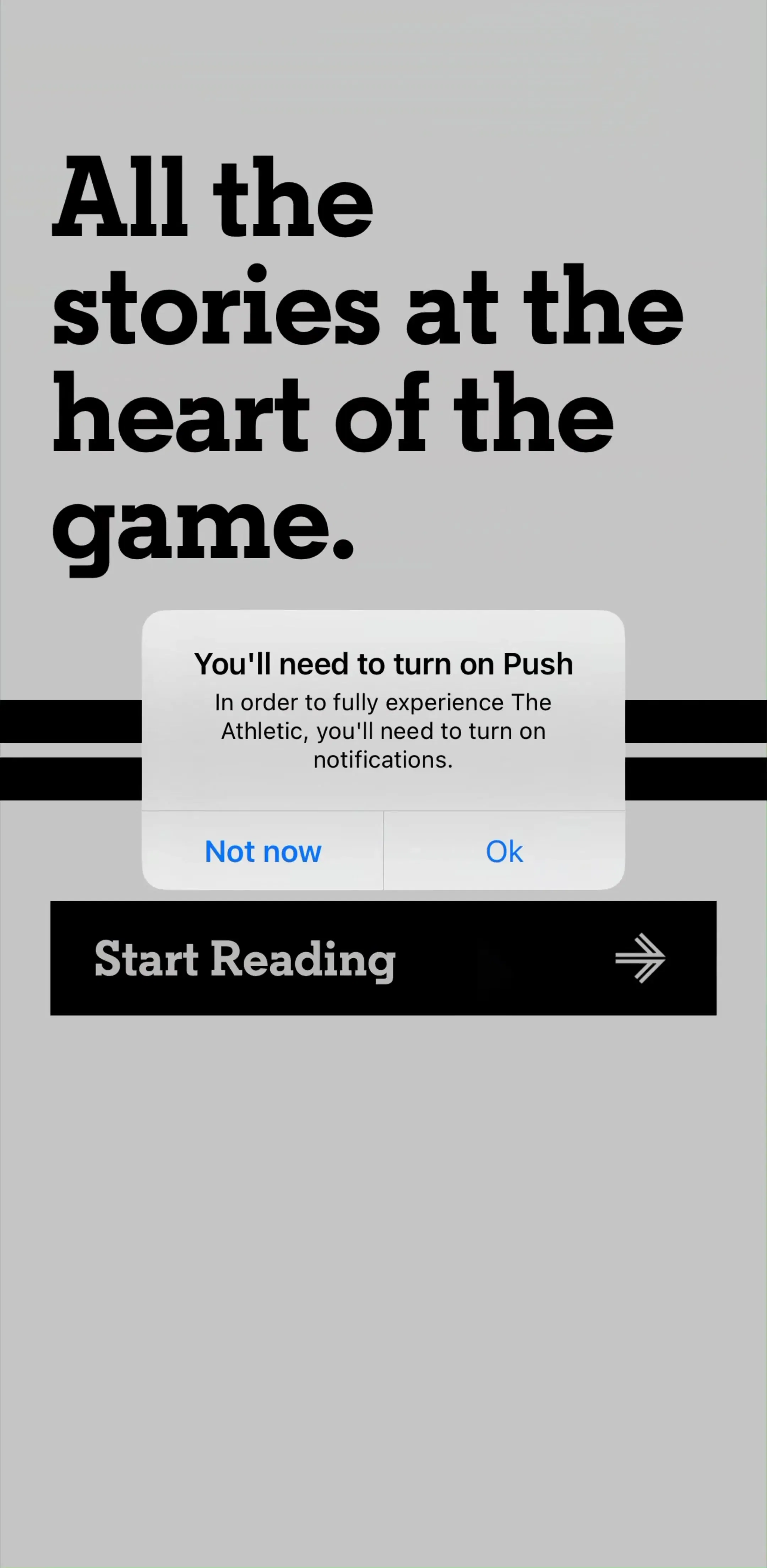
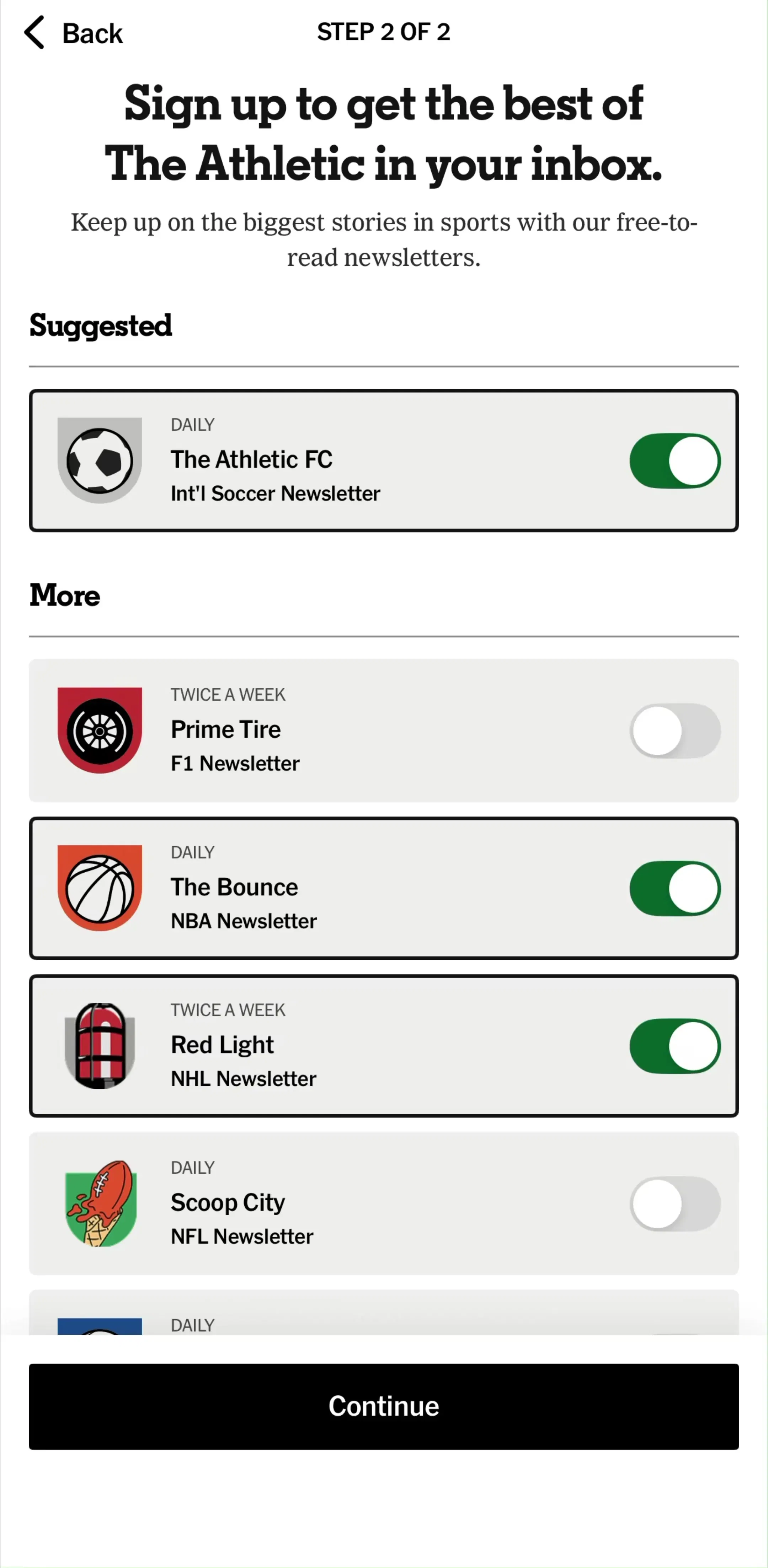
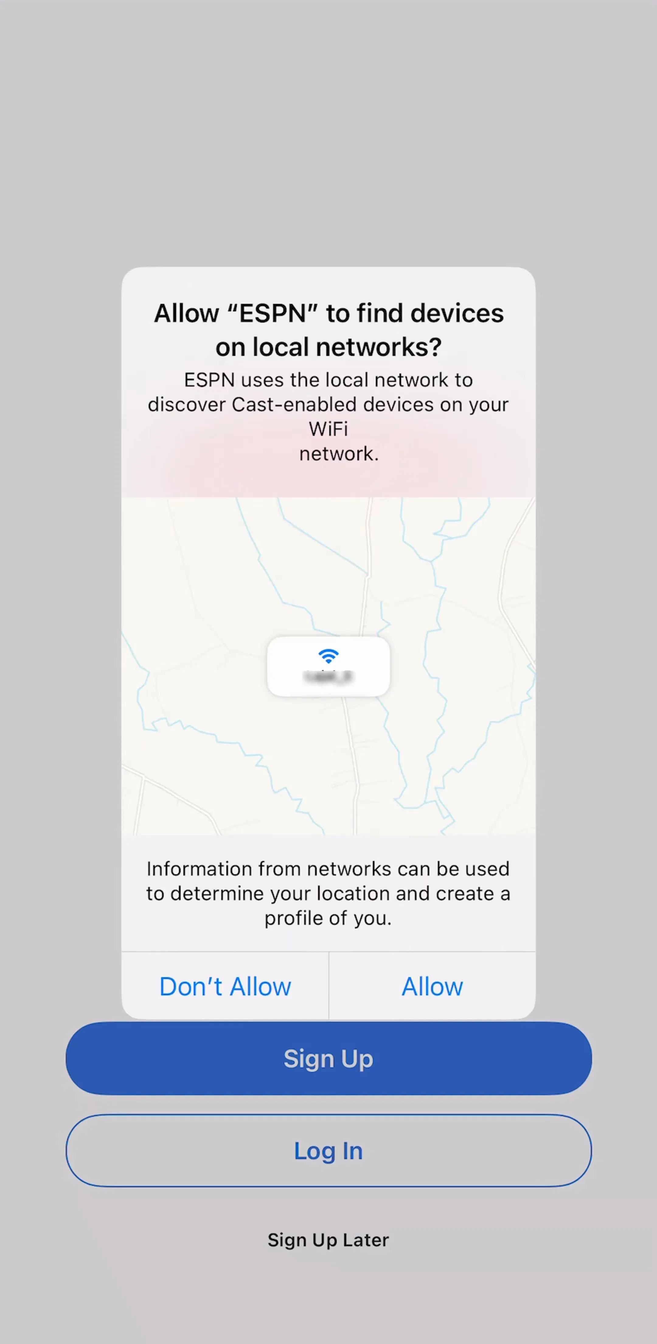
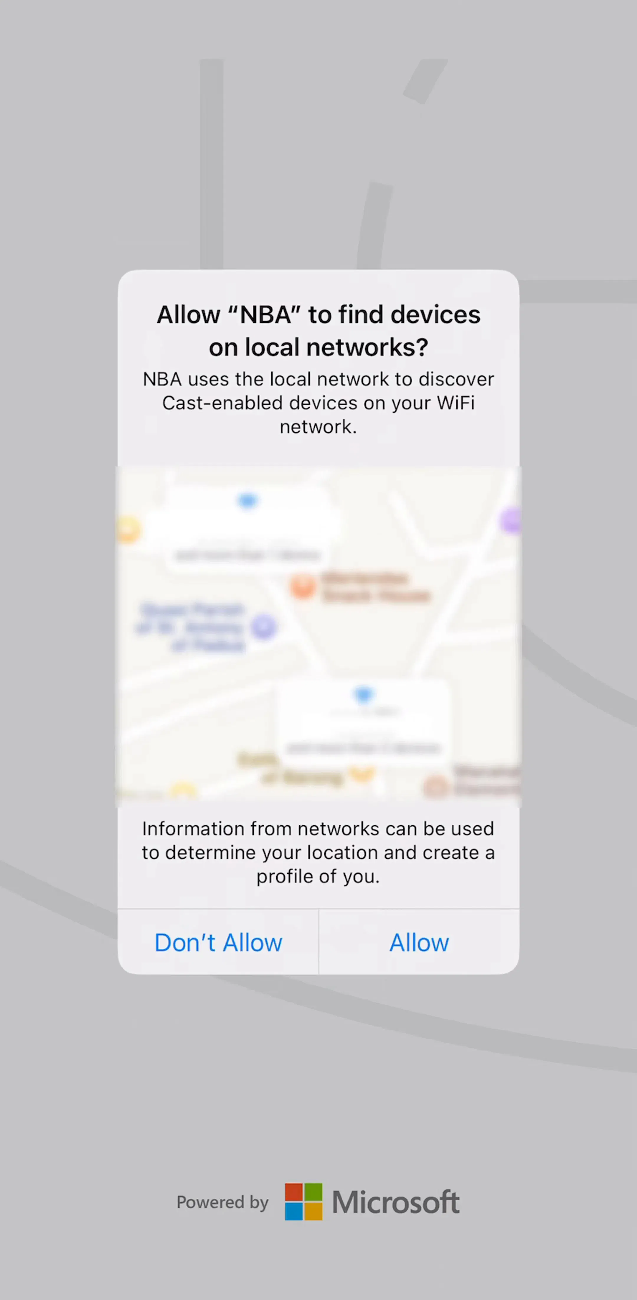
The free screens show how many system prompts a sports app can raise before the user sees a score. ESPN asks for access to find devices on the local network, a request made for casting, over its sign up screen. The NBA raises the same local network alert straight after its splash screen. The WNBA and DAZN both show the App Tracking Transparency prompt early, and DAZN (est. $3M/mo) follows it with a Face ID prompt over its login screen. The Athletic (est. $0.55M/mo) opens with its own alert telling users they will need to turn on push notifications to fully experience the app, with Not now and Ok as the choices, and follows it with a newsletter picker that gives each newsletter its own toggle.
Each prompt has a reason; together they are a wall. The local network request only matters to someone about to cast a stream, so it belongs at the first tap on a cast button, where the reason is obvious. Tracking and notifications compete for the same moment of goodwill, and in this category the notification ask has the better story, so it should get the early slot. And a custom pre-prompt should ask rather than demand: telling users they will need notifications is less persuasive than showing them what they will get, which is exactly what the NBA and WNBA alert screens do. The full set of captured permission flows is on the permissions pattern page.
8 of the 13 capture a scores, schedule, match or race results section. Real shows a mature game screen in its free preview: the two teams and the final score across the top, tabs for the feed, the game and each team, then a box score, a biggest leads summary and head-to-head statistics drawn as paired bars. The NFL’s team hub puts the team’s record in its header, splits the page into Team, News and Players tabs, and leads the team tab with the next game and a schedule link.
The rules that follow are about glanceability. Keep the score and the game state, live, final or scheduled, pinned where scrolling cannot move them. Use a small set of tabs, the case our segmented control post covers, rather than one endless page. Update live numbers in place so the layout does not jump while someone glances between plays. And design the off-season: a team hub with no next game needs to show something other than an empty schedule, which is where the principles in our empty state post apply.
Statistics are the part of sports UI that concept work tends to hide and shipping apps put front and centre. ESPN’s captured player page opens with a photo, team, number and position, height and weight, birthdate and college, a Following button, and a strip of season averages with the player’s league rank beneath each. Below it, a row of tabs, Overview, News, Stats, Bio, Splits and Game Log, leads to a splits table filtered by league, season and per-game values through three dropdowns.
Two lessons carry over. Summarise before you tabulate: four numbers with ranks answer the casual question, and the full table is one tap away for the fan who wants it. And treat the table as a table: fixed row labels, aligned numerals, and horizontal scrolling for extra columns rather than shrinking the type until nobody can read it. Following a player on this page raises the same alerts confirmation as following a team, which keeps one mental model across the app. Row conventions in general are covered in our list UI post.
Only 3 of the 13 capture a paywall section: MotoGP’s video pass, the NBA’s plan screen and The Athletic’s subscription, which sits inside its onboarding. That is a striking gap in a library where 1,294 of 2,622 apps capture a paywall section, and it reflects how sports money moves. Streaming rights are often sold through a TV provider or a website, advertising pays for scores and news, and some apps earn through games instead: Formula 1 and the Premier League both capture fantasy sections.
DAZN is the model for the streaming case. Its captured login screen offers Google, Facebook and Apple sign in and a Restore purchase link, which serves the users who bought their subscription somewhere other than the App Store. If your sports app sells access through several channels, the sign in screen does the job a paywall does elsewhere, and every route in has to be obvious. Our paywall design post covers the apps where the paywall is the front door.
Sports traffic follows the fixture list: game days, the start of a season, a tournament. The Athletic’s launch screen in the library reads Your home for World Cup coverage, a splash that changes with the calendar, and Bleacher Report’s onboarding ends on a Customizing Your Feed loading screen that shows team badges while the feed is built. Both are small ways of making the app feel current. Plan for the swings in both directions: themed launch screens and alerts for the big events, and useful team pages for the weeks when nothing is scheduled.
The other 20 sports apps in the library look less like these and more like map and tracker products, for fishing spots, hunting areas, ski runs and rides, and they are better studied alongside our map UI post and our travel app UI study. For league and scores apps the pattern is consistent: pick teams, allow alerts, glance at the score. The captured personalisation flows behind the first step are collected on the personalization pattern page.
For an app that follows professional sports: a team and league picker, an alerts screen, a scores and schedule view, a game screen, and team and player pages. Of the 13 league, media and scores apps in our library, 8 capture a scores, schedule, match or race results section and 5 capture a section for following or personalising teams. Everything else, news, video, podcasts and fantasy games, hangs off those.
By asking which teams they follow, as early as possible. The strongest onboarding flows in our library put a team search field first, group team logos by league, confirm each pick immediately, and turn picks into alerts. Asking for an account before the user can pick a favourite team puts a form between the user and the one thing they came to do.
Right after the user picks teams, on a screen that lists exactly what they will be notified about. The NBA and WNBA apps both capture a Stay in the Loop screen with league and team alert rows, each describing the events it covers, such as game start, close game and final score, with an Enable Notifications button at the foot. That makes the request specific instead of open-ended.
Put the score and the game state, live, final or scheduled, at the top where scrolling cannot move them, then break the rest into a few tabs such as feed, box score and team stats. Update scores in place without shifting the layout, because users glance at this screen repeatedly during a game and anything that jumps costs them their place.
The mobileappdesign library holds captured flows from 2,622 revenue-verified iOS apps, including 33 sports apps, from ESPN, the NFL, the NBA and DAZN to fishing and betting tools. Screens are captured in the order a user walks them, so you can see the team picker, the permission prompts and the alerts screen the way a new fan meets them.
Browse captured personalisation and onboarding flows from revenue-verified iOS apps, from team and interest pickers to the alert screens and prompts that follow.
Browse personalization screens