Apple and Material both document the segmented control well, and neither can tell you the thing that actually decides whether it works: what it is competing with on the screen. In a real app the same three options could plausibly be a segmented control, a tab bar, a row of filter chips, or a dropdown, and the choice changes how the whole screen behaves. Our library holds 2,622 revenue-verified iOS apps, 526 with a tracking and insights flow and 1,303 with a browse and feed flow, which are the two surfaces where this control does most of its work. This is the mobile version of the question, decided against shipping screens rather than component specs.
The defining property is that nothing navigates. The screen, its title, its scroll container and its primary action all stay. Only the content inside the container is exchanged for a different rendering of the same subject. Day, Week, Month. List, Map. Mine, Everyone.
This is why a segmented control should never trigger an action. A segment labelled Delete, or Export, or Share, is a button wearing the wrong costume, and it breaks the one guarantee the component makes: that a selection is reversible by selecting the other one. If tapping it does something the user cannot undo by tapping back, it is not a segment.
Ask whether the options survive navigation.
If they should still be visible when the user is two screens deep, they belong in a tab bar, which is the app’s permanent navigation and answers a different question about where the user is in the product.
If more than one can be active at once, they are filter chips, not segments. Exclusivity is the whole contract here: exactly one selected, always. A chip row also scrolls, which segments cannot, so chips are the correct escape hatch once the option count grows. The chip and sheet decisions are in the filter UI breakdown.
If the options are many and rarely changed, a dropdown or a menu costs less space and is the right trade. A segmented control is expensive: it occupies a full-width band near the top of the screen permanently, in exchange for making the current state visible without a tap. That trade is worth it for two to four options the user switches often, and wasteful for eight options they set once.
Segments are usually equal width, which means one long label makes every segment as wide as it is, and on a 390 point screen four segments leave roughly 90 points each before padding. That is enough for Week, not enough for This quarter.
The practical rules are narrow. One or two words per segment. Parallel grammar across all of them, so Day, Week, Month rather than Daily, This week, Month view. No truncation, ever, because a truncated segment label is unreadable at that size and cannot be tapped to reveal itself. If the labels do not fit, the control is the wrong control.
The single most common instance on mobile is a time range switch above a chart. It is a good fit because the segments are short, mutually exclusive, parallel, and switched often, and because the alternative of a separate screen per range would be absurd.
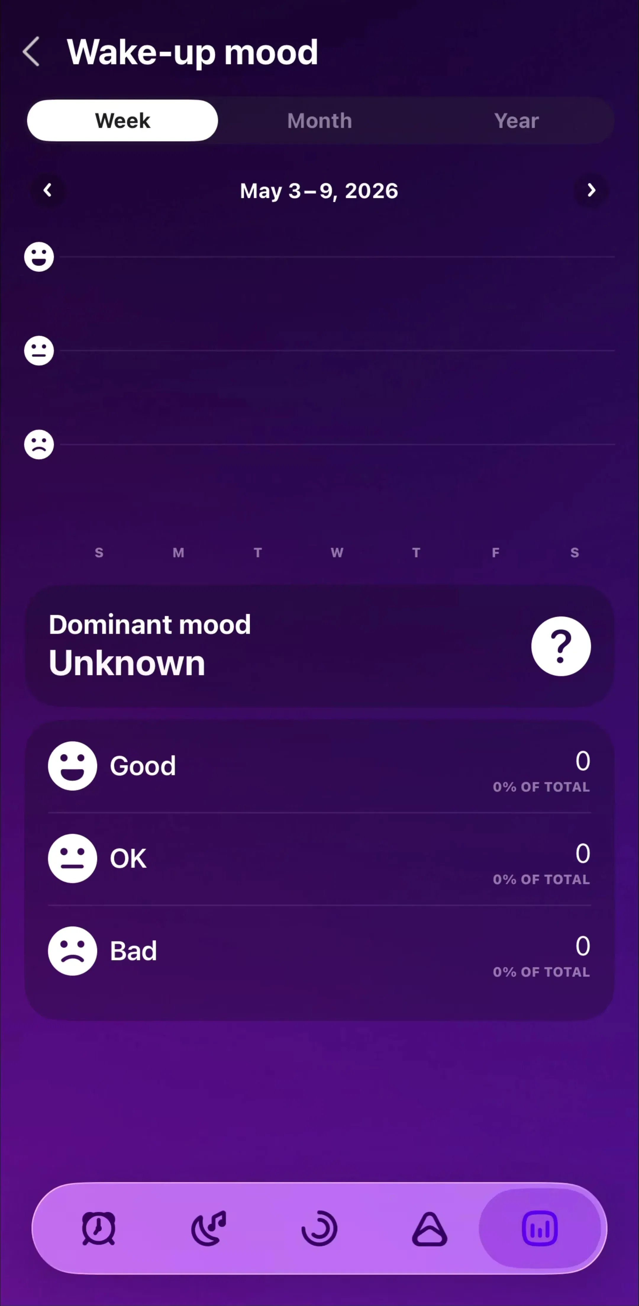
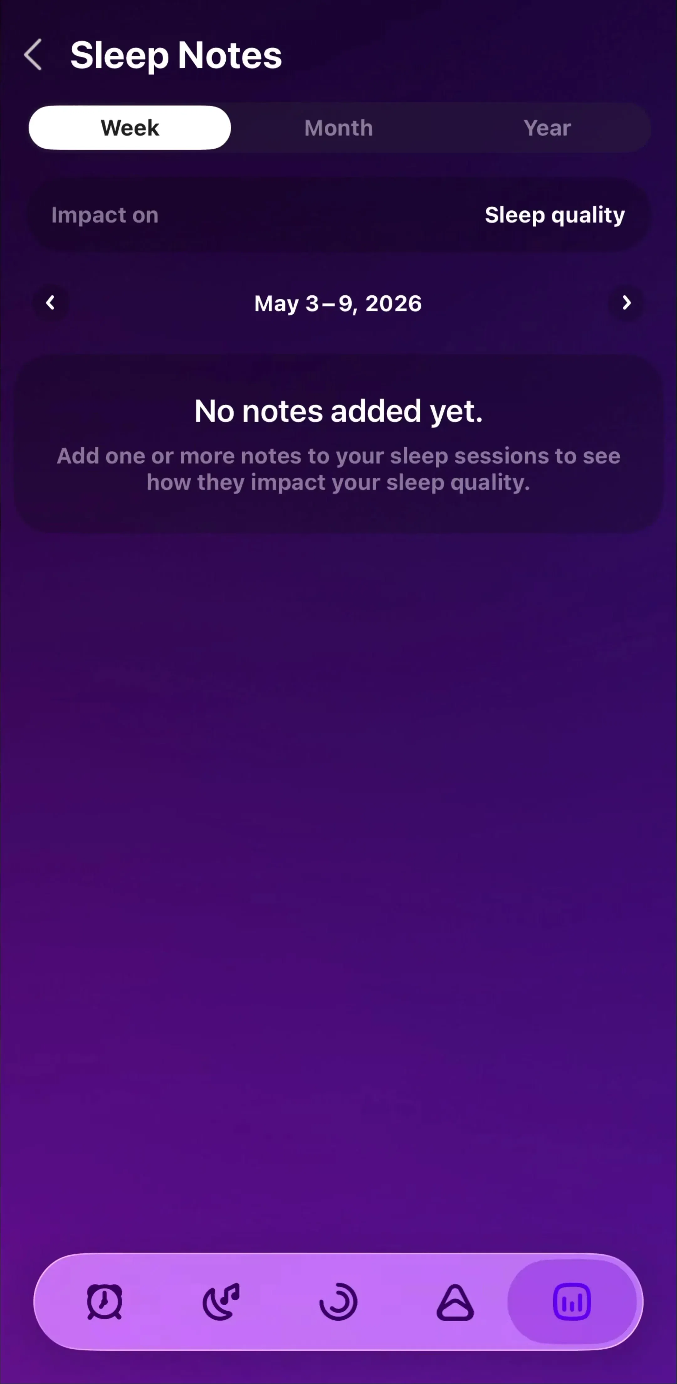
Pillow(est. $0.15M/mo) is a useful study here, since a sleep tracker’s entire value is in comparing one night against a trend, which means the range switch is load-bearing rather than decorative.
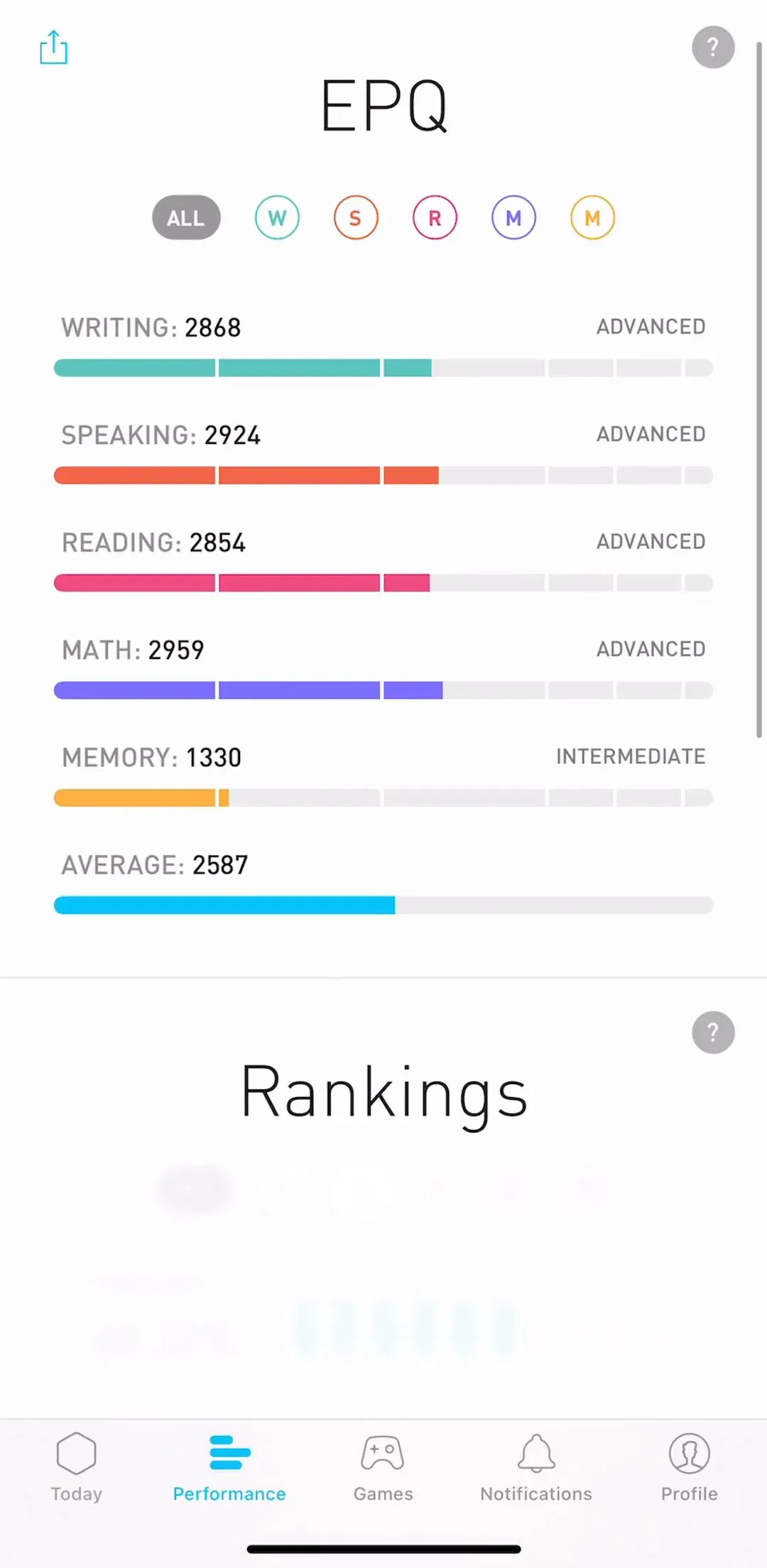
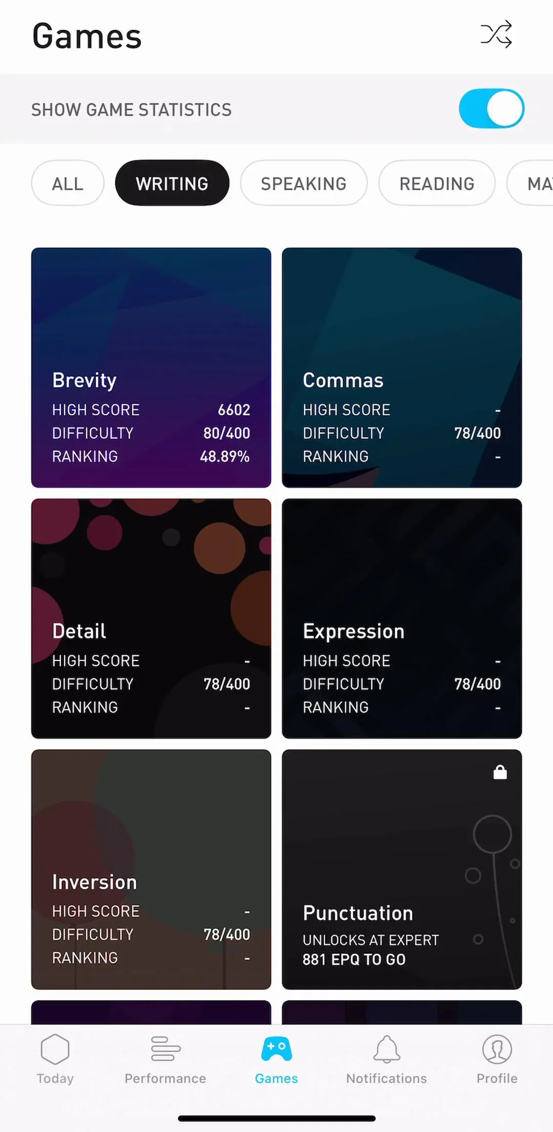
Elevate (est. $0.75M/mo) shows the adjacent case, where the switch is between different measures of progress rather than different windows of time.
One detail separates the good implementations from the rest: the axis, the summary figure and the units all have to change with the segment. A chart that switches from seven bars to thirty while the headline number still reads last night’s value is the most common bug in the pattern, and it is invisible in a static mockup.
Something is always selected, so something must be chosen for the user on first launch. Pick the segment that is correct for the empty case, not the one that is most impressive. A new user landing on Month sees an empty chart; landing on Day sees the one data point they just created.
Persistence follows from meaning. A time range is a preference and should survive the session. A view mode tied to a specific task should reset. The rule that prevents the worst outcome: never persist a selection that can hide all the content, because the user comes back to a screen that looks broken and has no reason to suspect a control they set last week.
The selected segment needs to read as selected without colour alone doing the work. The iOS convention of a raised, filled pill sliding within a recessed track works because it changes fill, elevation and background at once. Underline-only or tint-only treatments fail on the same screens where everything else fails: bright sunlight, low vision, and monochrome.
The other floor is the touch target. The control’s visible height is often 32 points, which is below the 44 point minimum, so the tappable area needs to extend beyond the drawn pill. Narrow segments with icons and no labels compound this, and icon-only segments carry the additional cost that nothing on screen says what the alternative view is.
A segmented control implies the other view is already at hand. If tapping a segment produces a full-screen spinner, the interaction is lying about its cost and a different pattern would be more honest. Where the data genuinely has to be fetched, keep the previous content in place under a light loading treatment rather than clearing the container, and preserve scroll position when the user switches back.
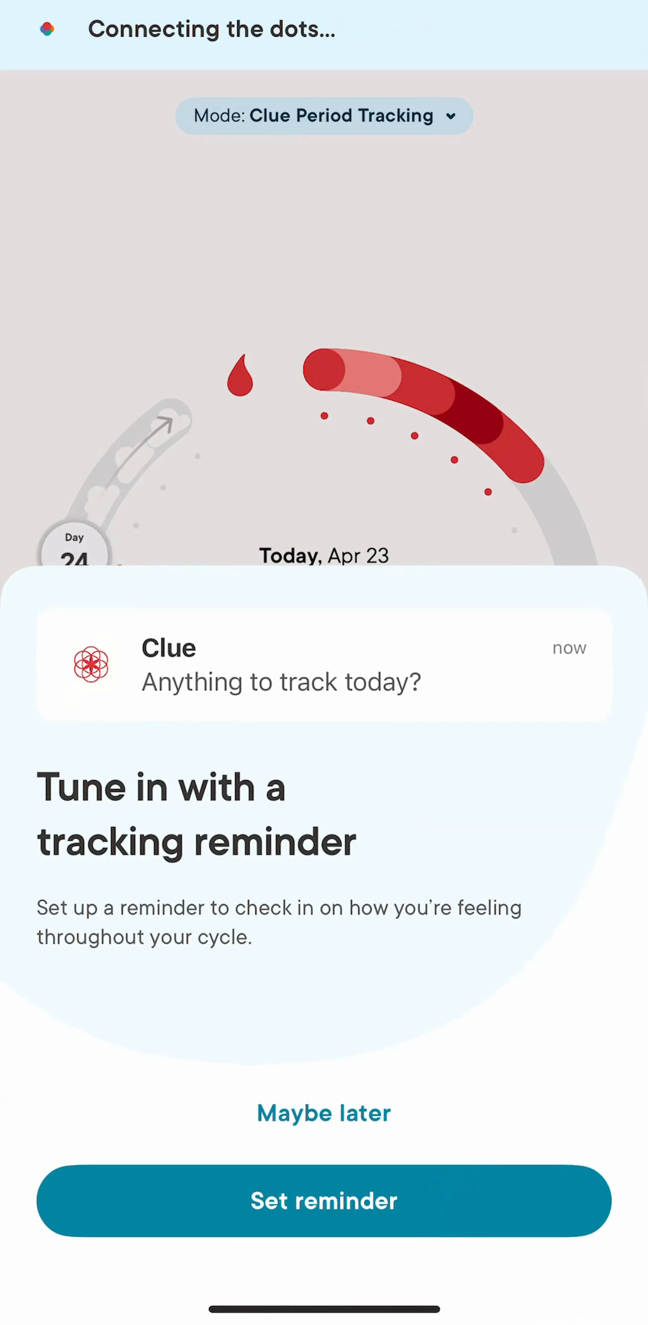
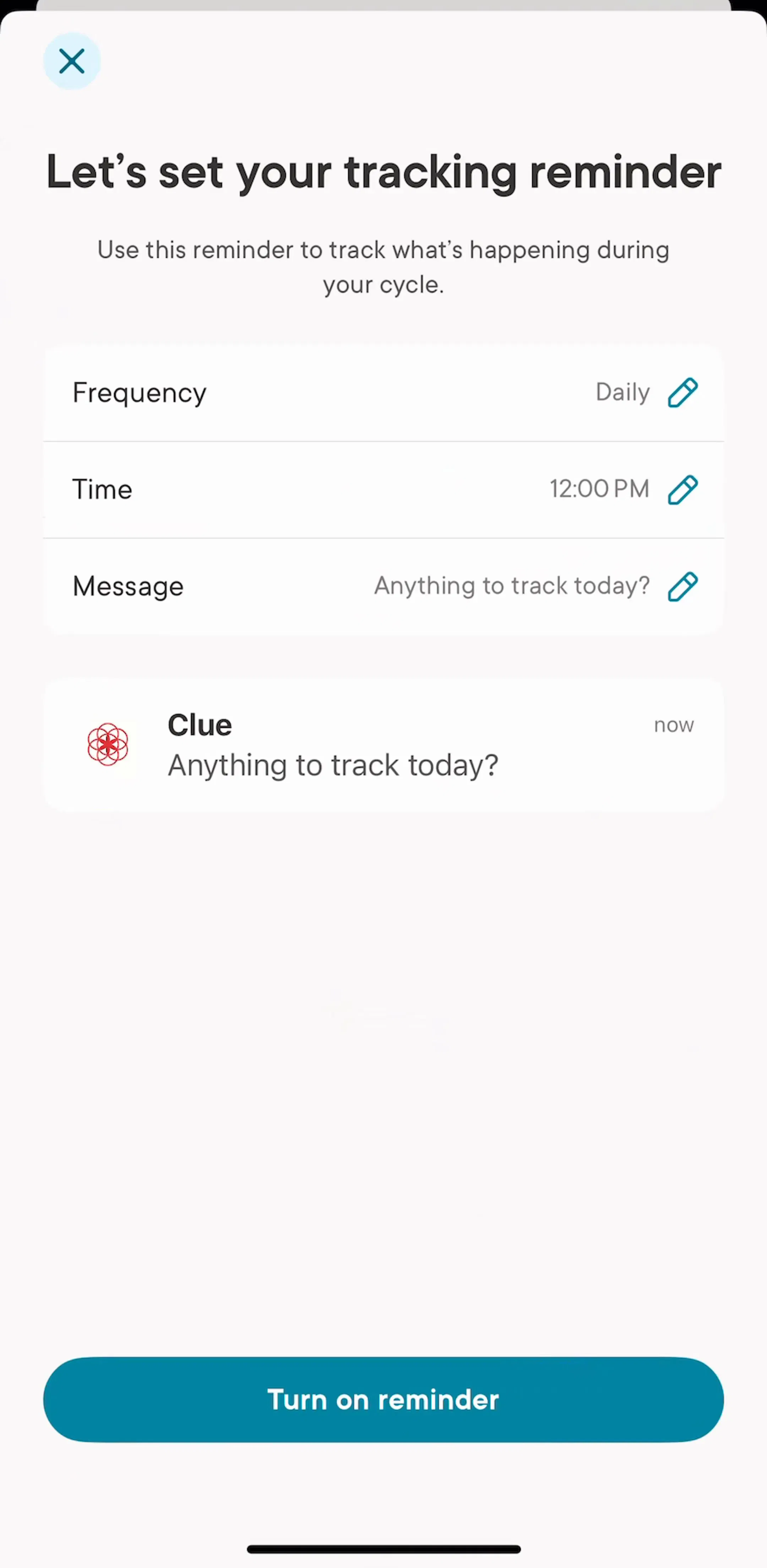
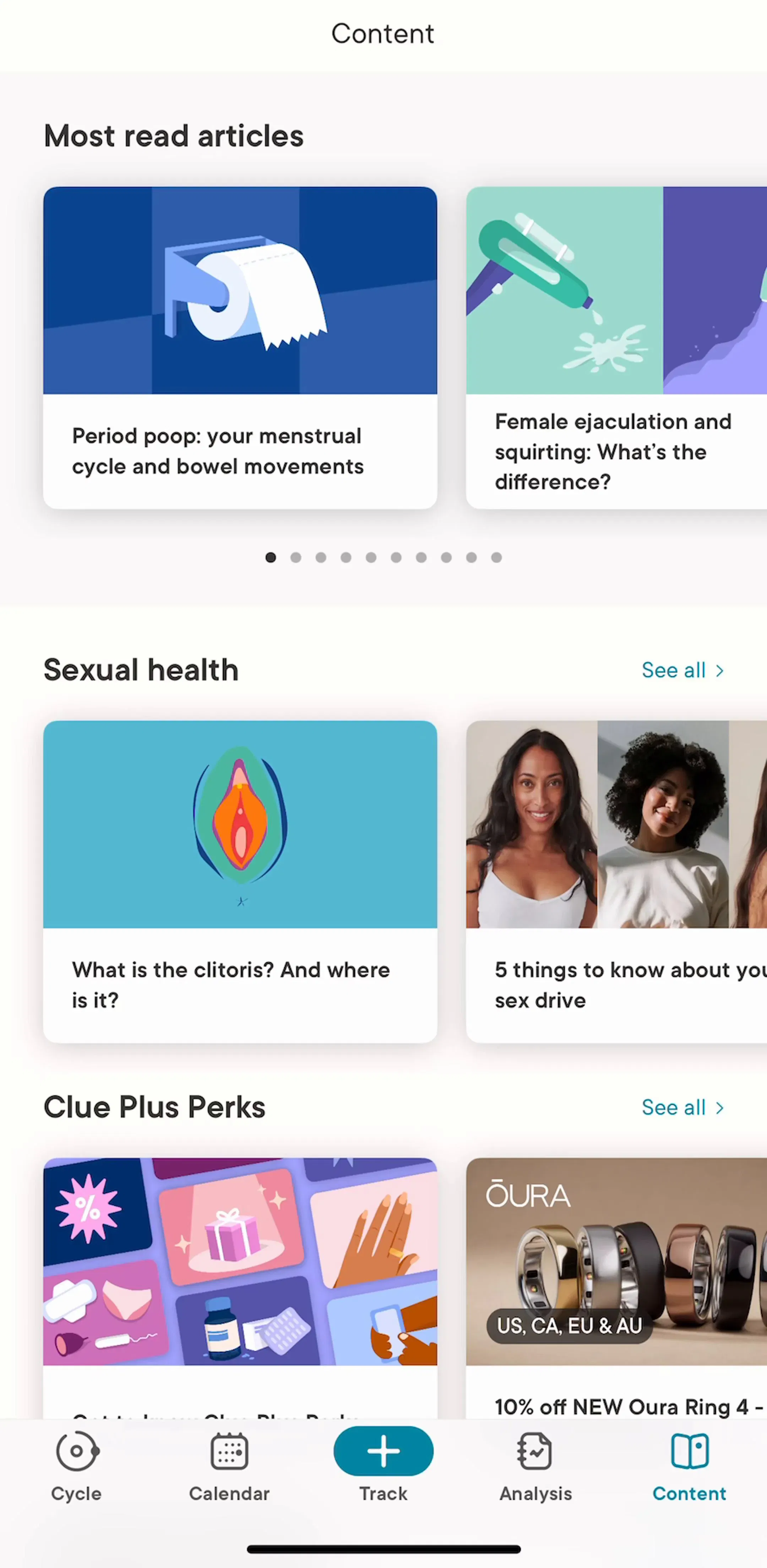
Clue (est. $1.25M/mo) is worth studying as a browse surface where the same underlying record is presented several ways.
Five recurring failures. Five or more segments, so the labels truncate. Non-parallel labels, where one segment is a noun and the next is a verb. A segment that performs an action rather than changing a view. Stacking a segmented control directly under a tab bar or a set of top tabs, which gives the user two rows of horizontal choices and no way to tell which one governs what. And the quiet one: a segmented control with exactly two segments that never change anything meaningful, which should have been a toggle or should not exist.
There is also a layout failure specific to lists. Putting the control inside a scrolling list rather than pinned above it means the user scrolls past the only thing that tells them which view they are in. The controls that reduce a list belong in a stable band at the top, which we covered in the list UI breakdown.
Take the segmented control in your product and try to delete it. If the screen still works because the second view was never really used, that is the answer. If it does not, check three things on a device: that every label fits at the largest supported text size, that the summary figures change with the segment and not just the chart, and that the selection you persist cannot leave a returning user staring at an empty screen.
Then compare against shipping apps rather than component galleries. Every screen in the library sits next to the app’s estimated revenue and downloads, so you can pick references by outcome rather than by how the shot looks, and Fitbod (est. $0.75M/mo) and MacroFactor (est. $0.20M/mo) are both worth adding to the set as products whose main screen has to present one log several ways.
A note on the numbers: revenue figures cited here are third-party monthly estimates from our library, useful for comparing magnitude, not audited financials.
A short horizontal set of two or more mutually exclusive segments, each acting as a button, where exactly one is always selected. On iOS it is the pill with a sliding highlight; Material calls the equivalent component a segmented button. It changes which view of the same content you are looking at, without navigating anywhere.
Scope and permanence. A tab bar is the app's top-level navigation and stays put no matter which screen is showing. A segmented control belongs to one screen and dies with it. If the options would still make sense after the user navigates two screens deep, they are tabs. If they only make sense while looking at this particular content, they are segments.
Two to four. Five is possible only with very short labels and no icons, and past that the segments become too narrow to read or to hit reliably on a phone. When the real option count exceeds four, the pattern to reach for is a scrollable chip row or a dropdown, not a thinner control. Equal-width segments mean the longest label sets the width for all of them.
Usually yes, if the choice reflects a stable preference such as a preferred time range or a favoured view. Reset it when the choice is tied to a task the user has finished. The failure case worth avoiding is persisting a selection that hides data, such as a filter left on Completed, so the user returns to a screen that looks empty and concludes their content is gone.
The mobileappdesign library holds captured flows from 2,622 revenue-verified iOS apps, including 526 with a tracking and insights flow and 1,303 with a browse and feed flow, which are the two places the control appears most. Screens are captured in sequence, so you can see the same screen under different segments rather than as an isolated shot.
Browse captured tracking and insights flows from revenue-verified iOS apps, in the order a real user walks them.
Browse tracking and insights screens