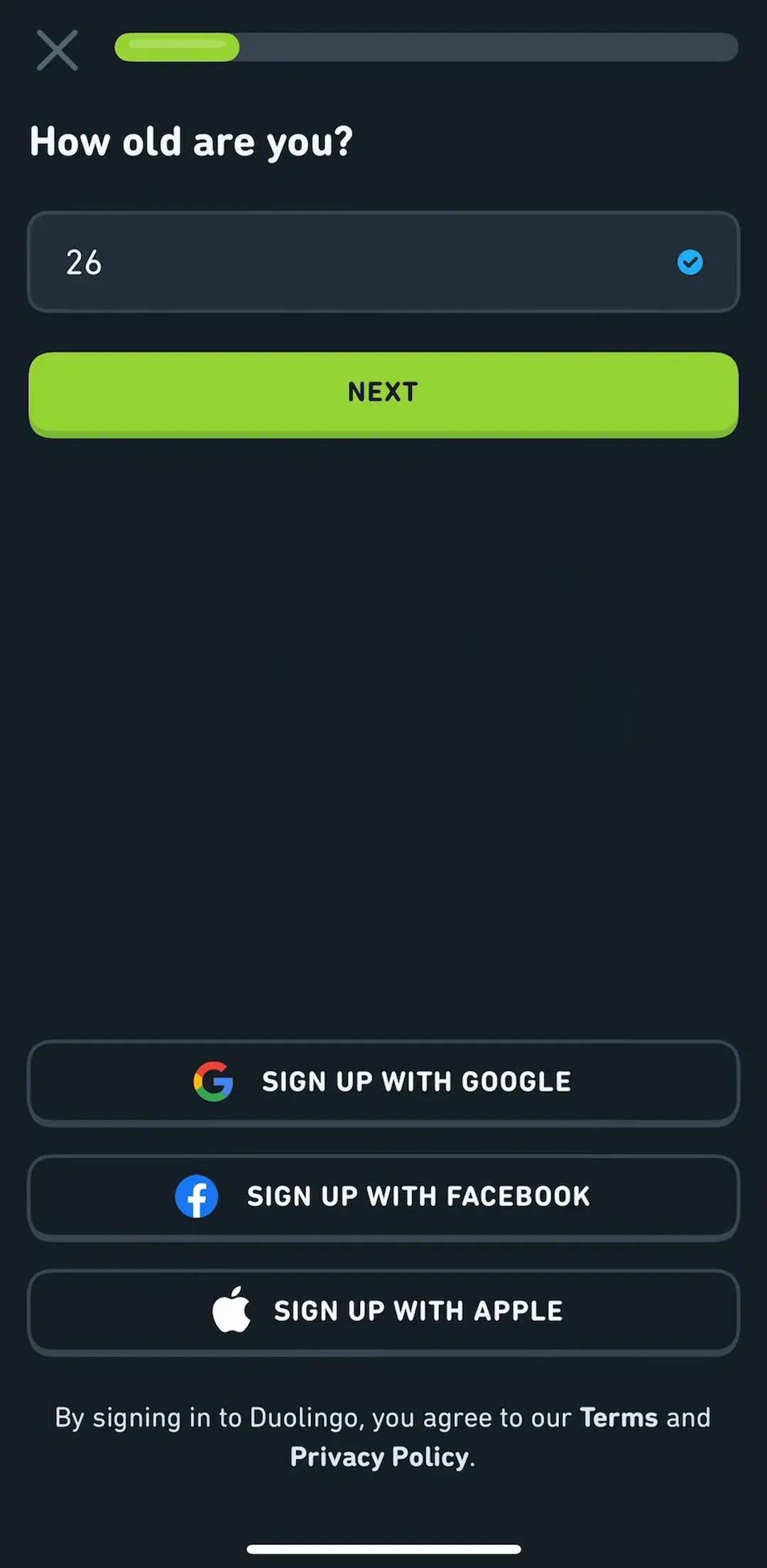
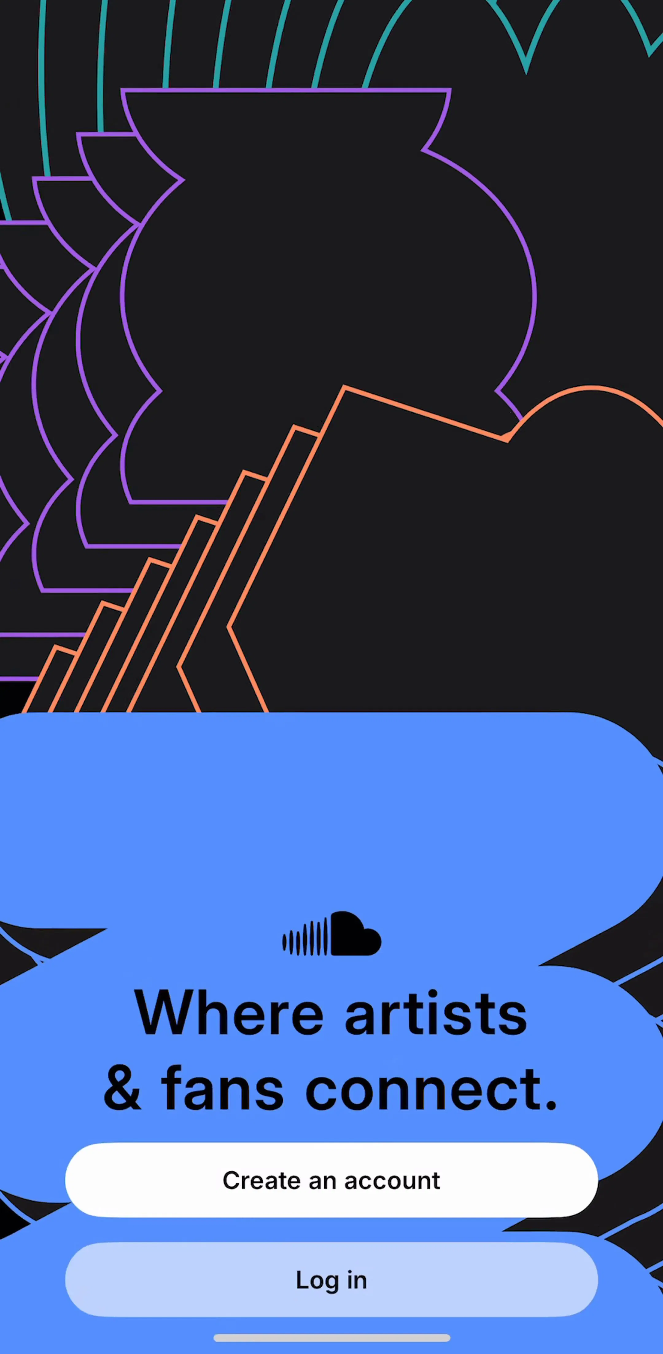
The login screen is a wall. Every user has to climb it, nobody enjoys it, and the design decisions around it are worth more retained users than most feature work. We went through sign-in and sign-up screens from revenue-verified iOS apps in the authentication gallery and pulled out nine patterns that keep showing up in the flows that work.
The strongest predictor of a good auth flow is where it sits. Apps that open on a login wall are asking for commitment from someone who has seen nothing. The current default in consumer apps is the reverse: run the onboarding, show the personalized result, then ask for an account so the result can be saved. We covered the full sequence in our onboarding patterns breakdown, and the auth step is the last beat of it, not the first.
“Log in” and “Sign up” as two separate entry points is a quiz the user fails regularly, especially returning users who forget whether they ever made an account. A single email field that routes to the right next step removes the question. Apps with a library tied to the account, like SoundCloud (est. $10M/mo), have to get this right because a duplicate account looks to the user like lost history.
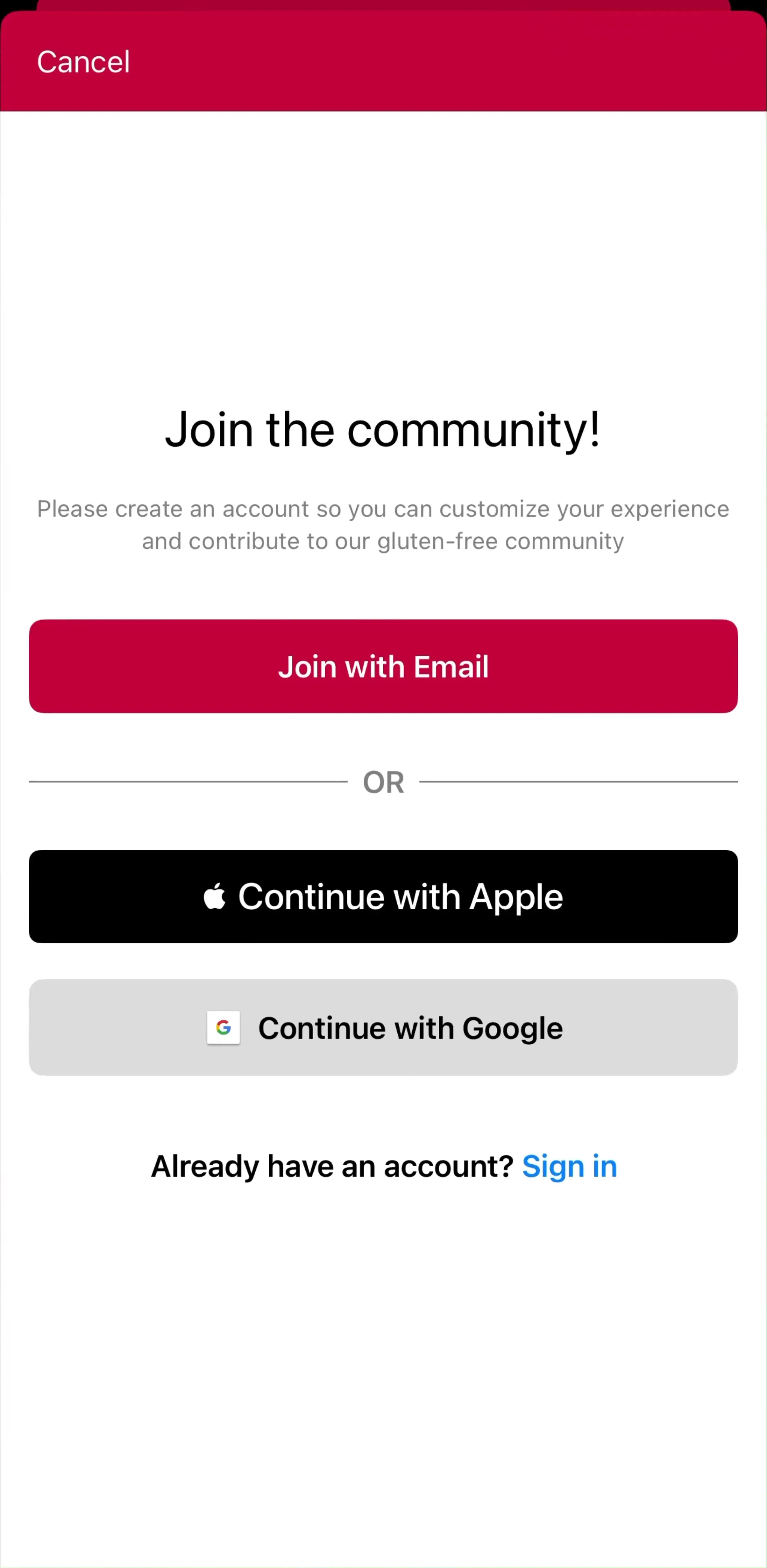
If you offer any third-party login, App Store review requires Sign in with Apple alongside it. Practically, one or two providers plus email covers almost every user. Every extra button adds a decision at the exact moment you want zero decisions, and it multiplies the number of “wrong provider” support tickets you will answer later.
The most avoidable auth failure is an existing user picking a different provider than last time and landing in a fresh empty account. Persisting a small hint on the device, a “last used” marker on the button, cuts that class of error to near zero and costs one line of storage.
A six-digit code or a magic link deletes password creation, storage, and reset from your product. It works when the code field supports iOS autofill so the user never leaves the app to read it. Long-tail health and finance apps in the library increasingly ship this as the only method, which tells you how the support economics come out.
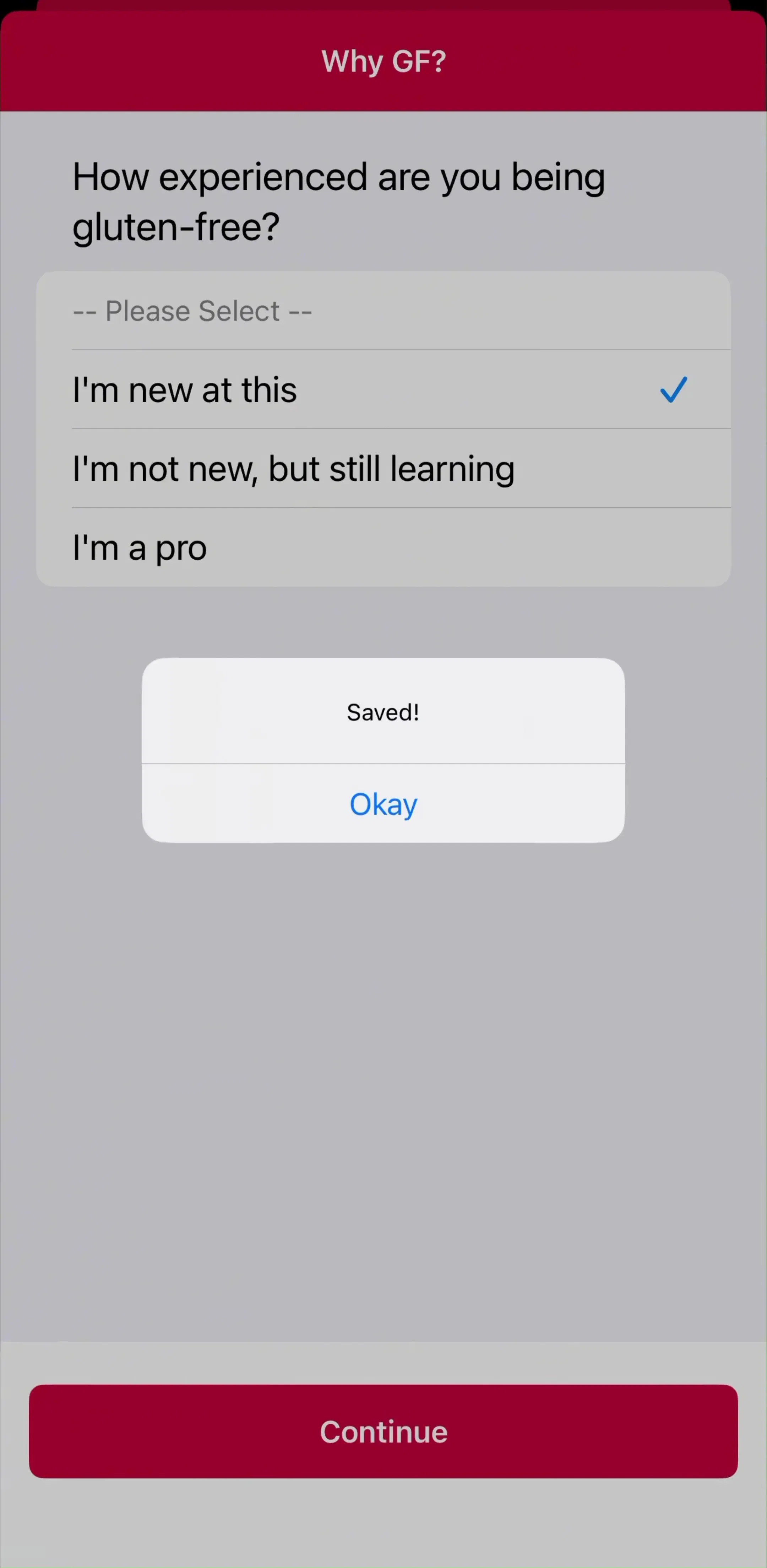
One line above the fields, in plain language, doing a specific job: your data syncs across devices, your plan is saved, your streak survives a new phone. The generic “Create an account to continue” is a toll booth. A sentence that names what the user keeps turns it into a save button. Apps built on saved places and lists, such as Find Me Gluten Free (est. $150K/mo), have the easiest version of this argument, because the account is visibly the thing that keeps the list.
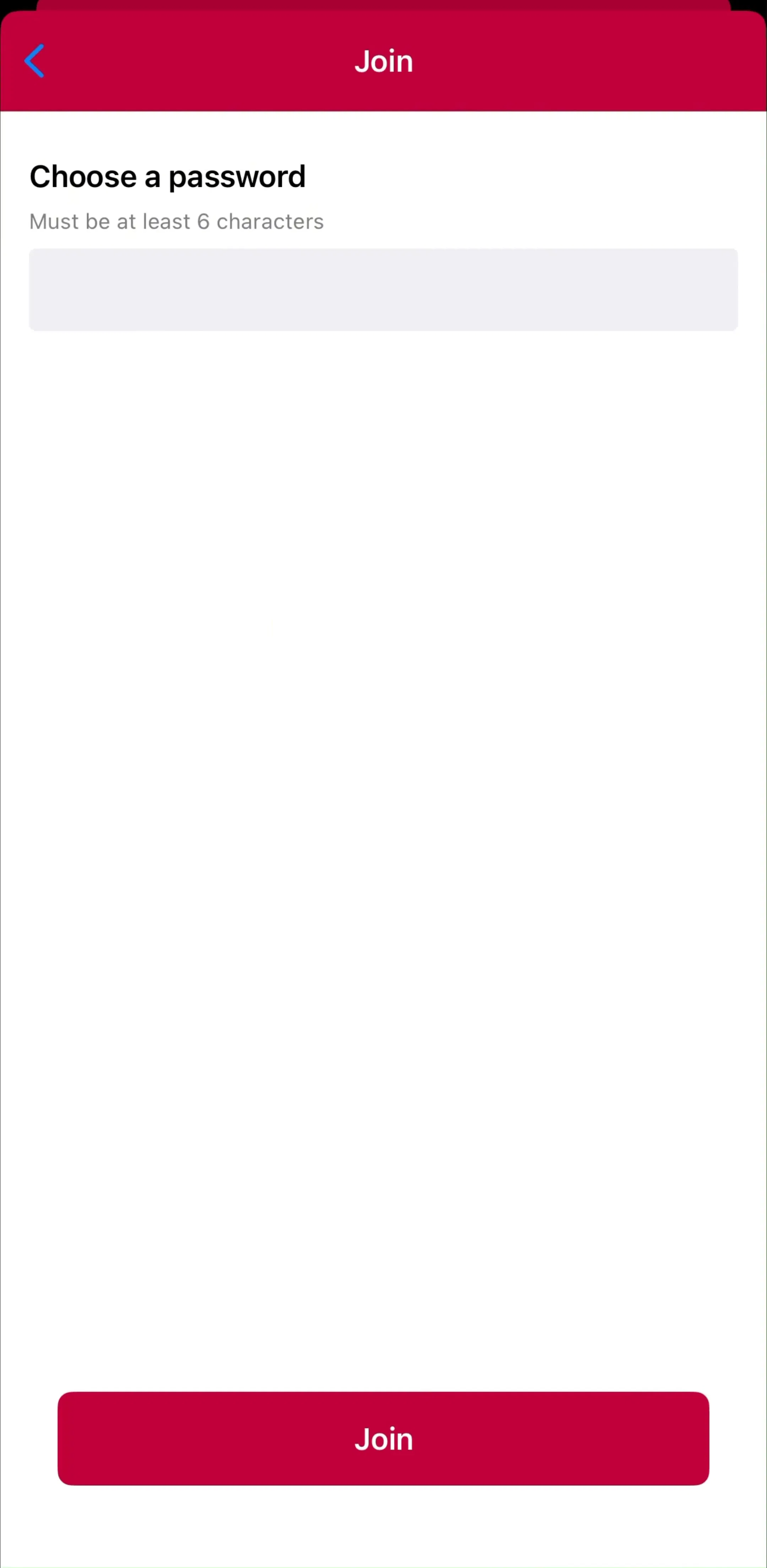
Inline, specific, and written for a person: which field is wrong and what to do about it. A red banner at the top of the screen that says “Invalid credentials” is the design equivalent of a shrug. Also worth stating plainly: never confirm whether an email exists in a way that turns your login screen into an account enumeration tool, but do give the user a path forward when they are stuck.
Forgotten password, wrong email, expired code, and account deletion are all part of the auth surface, and they are where real users end up. The apps that treat recovery as a first-class flow instead of a link in six-point type see fewer abandoned accounts. Browse the authentication gallery and the difference between teams that designed this and teams that shipped a default is visible immediately.
Auth and permissions are the two hard asks in a new session, and stacking them back to back is how apps lose users in the first minute. Separate them with a beat of value, and prime the permission before the system dialog fires, which is the same discipline you can see across the permissions gallery.
Ask late, ask once, offer two ways in, explain what the account protects, and design the failure paths. Everything else on a login screen is styling. If you want to see how apps at a given revenue level sequence it, every screen in the library sits next to the app’s estimated revenue and downloads, so you can compare against products in your own weight class.
A note on the numbers: revenue figures cited here are third-party monthly estimates from our library, useful for comparing magnitude, not audited financials.
In most current consumer apps, after the value is visible and not before. The dominant pattern is onboarding first, account creation near the end, often right before or at the paywall. Apps that hold data server side, or that sync across devices, are the exception and ask earlier.
Sign in with Apple is required by App Store review whenever you offer another third-party login such as Google or Facebook. Beyond that, two options plus email covers nearly everyone. Long provider lists mostly create a decision, and returning users forget which button they used last time.
One screen that detects the account state is the more forgiving pattern: the user enters an email, and the app decides whether to ask for a password or send a code. Two separate screens force a choice the user often gets wrong, and the resulting error is the most common drop-off point in the flow.
For consumer apps, usually yes. A six-digit code or magic link removes password creation, password reset, and most support load. The trade is a round trip through email or SMS, so keep the code field autofill friendly and never make the user leave and come back manually.
The authentication gallery in the mobileappdesign library collects sign-in, sign-up, and account recovery screens from revenue-verified iOS apps, in the order the apps actually ship them.
Browse sign-in, sign-up, and account recovery screens from revenue-verified iOS apps, in the order they ship them.
Browse authentication screens