Onboarding is where subscription apps are won: the sequence between first launch and the paywall decides whether a download becomes a trial. We went through the onboarding screens in our library, thousands of screens from revenue-verified iOS apps, and the same eight patterns keep appearing in the apps that earn the most. Here they are, with the apps that execute them best.
The defining pattern of high-revenue consumer onboarding: a long series of single-question screens that tailor the product before the user touches it. Duolingo (est. $48M/mo) asks why you are learning, how much time you have, and what level you are at; Flo (est. $9M/mo) runs one of the longest quizzes in the App Store; PictureThis (est. $14M/mo) proves the pattern is not limited to health and education. The quiz is not research, it is investment: every answer raises the cost of quitting before the plan reveal.

The first screen states the outcome, not the features: lose the weight, speak the language, sleep better. Cal AI (est. $1.75M/mo) opens by showing the product doing its one trick, calorie counts from a photo, before asking for anything. If your first screen is a carousel of feature bullets, you are shipping the pattern that top grossers abandoned years ago.
Long quizzes only work when the end feels near. Nearly every app running pattern #1 shows a progress bar, step counter, or section labels. Some break the quiz into named chapters (“About you”, “Your goals”) so 25 screens read as 3 sections. The moment progress disappears, drop-off spikes; you can see the discipline in almost every flow in the onboarding gallery.
A screen of ratings, user counts, or transformation stories placed inside the quiz, usually right before a commitment moment like the plan reveal or the paywall. Fabulous and Impulse both interrupt their quizzes with “millions of users” screens. It reads as reassurance exactly when doubt peaks.
After the quiz, a fake-work screen: “Building your plan…” with a spinner or animated checklist. It converts the quiz answers into a visible artifact, your plan, and makes the reveal feel earned. Impulse (est. $1M/mo) and most weight-loss apps stage this beat deliberately. It is theater, and it works.
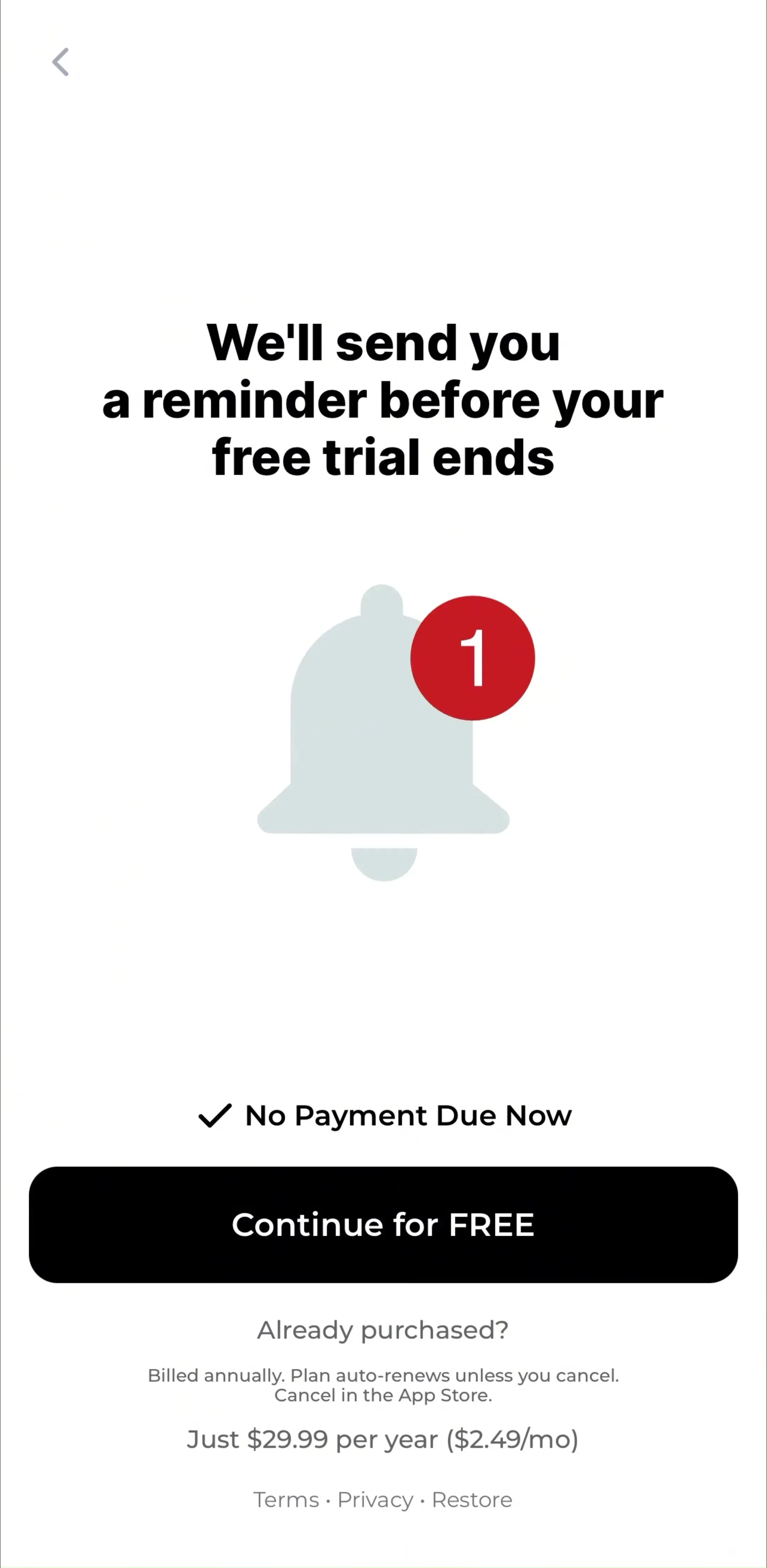
Top-grossing apps never fire the iOS notification dialog cold. A primer screen explains what the notifications do (“reminders keep streaks alive”) and only shows the system dialog after the user taps a friendly button. Decline the primer and the system prompt is saved for later. Compare the flows in our permissions gallery: the primer-first pattern is near-universal above $1M/mo.
Sign-up used to be screen one; in current top grossers it is nearly the last step, placed after the quiz and plan reveal, often merged with the paywall. Finch (est. $1M/mo) lets you play with your pet before ever asking who you are. The logic is simple: an account request is a wall, and walls convert better when the user already wants what is behind them. See how apps stage it in the authentication gallery.
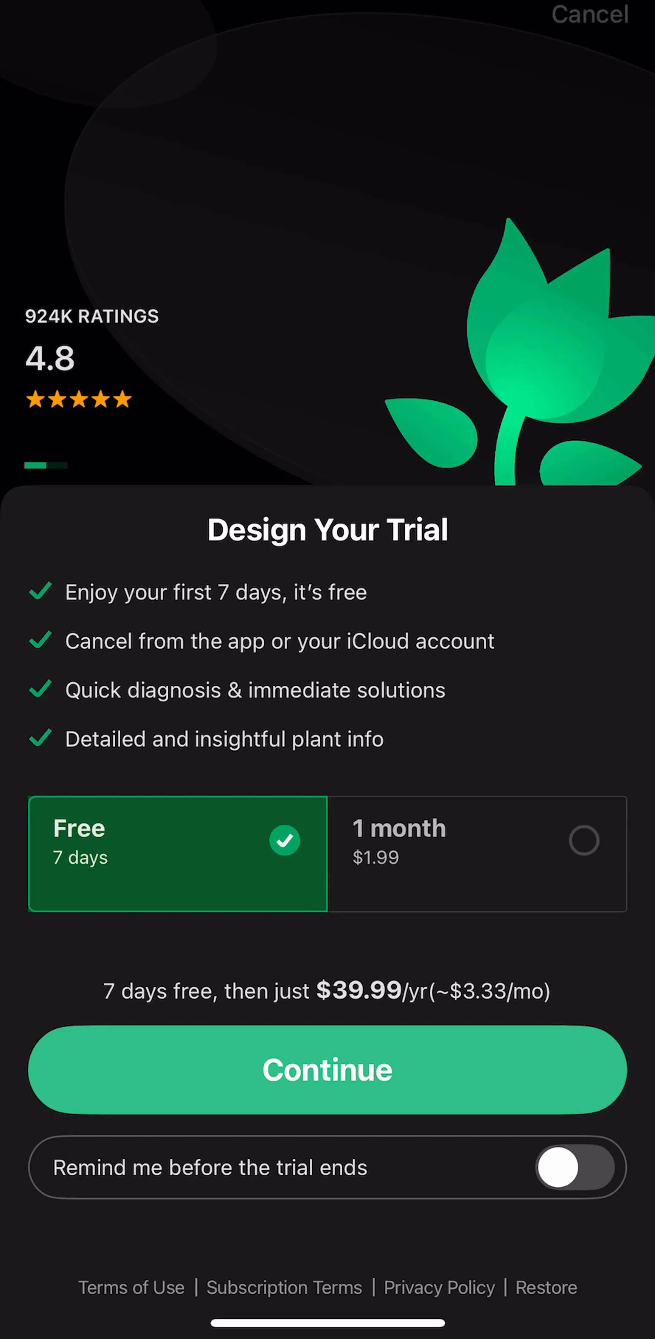
The quiz ends, the plan is revealed, and the paywall appears while motivation is highest. This is the same paywall-after-investment pattern we broke down in our paywall deep dive: onboarding and monetization are one funnel in high-revenue apps, not two features. If you design the onboarding without designing the paywall handoff, you are designing half a flow.
Not every app should run a 25-screen quiz: utilities that deliver value in the first minute (scanners, editors, cleaners) convert with 3 screens and a hard ask. The reliable method is to find apps with your business model at the revenue level you want to reach and study what they actually ship. Every screen in the library sits next to the app’s estimated revenue and downloads, so you are learning from apps whose numbers you can see.
A note on the numbers: revenue figures cited here are third-party monthly estimates from our library, useful for comparing magnitude, not audited financials.
Top-grossing consumer apps run surprisingly long onboarding: 10 to 30 screens is normal in health, fitness, and education. The length works because each screen asks one small question and visibly personalizes the product. Utility apps that deliver value in the first session keep it to 3 to 5 screens.
The dominant pattern in high-revenue apps is onboarding first, account creation last. The user invests in a quiz, sees their personalized plan, and only then is asked to create an account, usually right before or at the paywall, when abandoning would mean losing their answers.
The flows that repeat across top-grossing apps do three things: ask questions whose answers visibly change the product, show progress so the end feels near, and stage permission requests with a priming screen before the iOS system dialog.
The mobileappdesign library has thousands of onboarding screens from revenue-verified iOS apps, filterable by category and revenue, so you can study the exact flows apps at your target revenue level ship.
Browse thousands of onboarding screens from revenue-verified iOS apps, with revenue and download estimates next to every screen.
Browse onboarding screens