Music app UI is the most redesigned screen on Dribbble and one of the most conservative screens in the App Store. That gap is the interesting part. Our library holds 2,622 revenue-verified iOS apps, 84 of them music products and 215 with a play and entertainment flow, and the shipping music app has settled on a small set of components that almost nobody deviates from. Here is that set, and the reasons each piece is hard to replace.
Before copying anything, be clear which one you are building, because the home screen differs completely. There is the streaming product, where the job is choosing from a catalogue you do not own. There is the creation product, where the job is making something, now including a fast-growing set of AI song generators. And there is the musician tool, which is a utility with a specific task such as tuning, practising, separating stems, or mixing. All three end up needing a player, which is why they look related, but only the first one needs a feed.
The single most consequential component in the category is the bar that sits above the tab bar once something is playing. It is what lets playback survive navigation, and it is worth designing first, because everything else has to make room for it: scroll views need bottom padding that changes when it appears, sheets have to decide whether they cover it, and the tab bar has to stay legible under it.
The conventions inside it are tight. Artwork thumbnail, title and artist, one play or pause control, and a tap target that covers the whole bar and expands to the full player. Adding a third or fourth control here is the common overreach: at that width they become mis-tap targets, and skip already lives on the lock screen and in the headphones.
Because the mini player and the tab bar are effectively one stacked component, the tab bar breakdown is the companion piece to this section.
Streaming homes are almost universally a vertical scroll of horizontally scrolling rows, each with a short title and a see-all. The structure survives because the catalogue is enormous and the rail is the cheapest way to show many entrances without committing screen height to any of them. It is also honest about what it is: a stack of recommendations, each of which the user can ignore with a flick.
YouTube Music (est. $38M/mo) is the largest example in the library and a good study of how much personalisation the top of that stack carries.
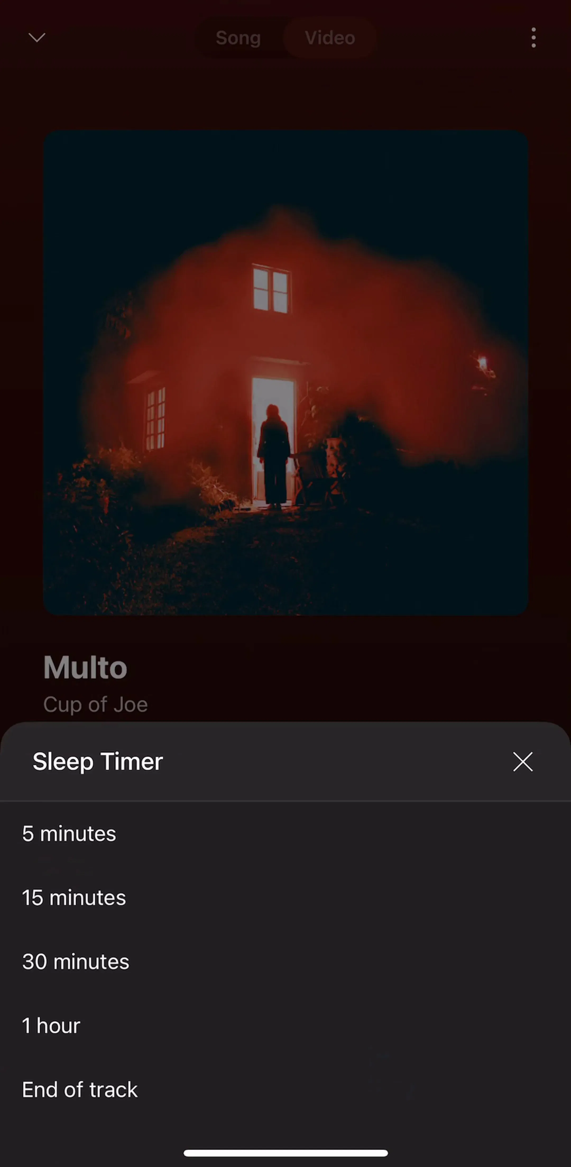
Deezer (est. $8M/mo) and Anghami (est. $650k/mo) are worth comparing against it, since both carry music and podcasts in one shell and have to solve the same rail problem for two content types.
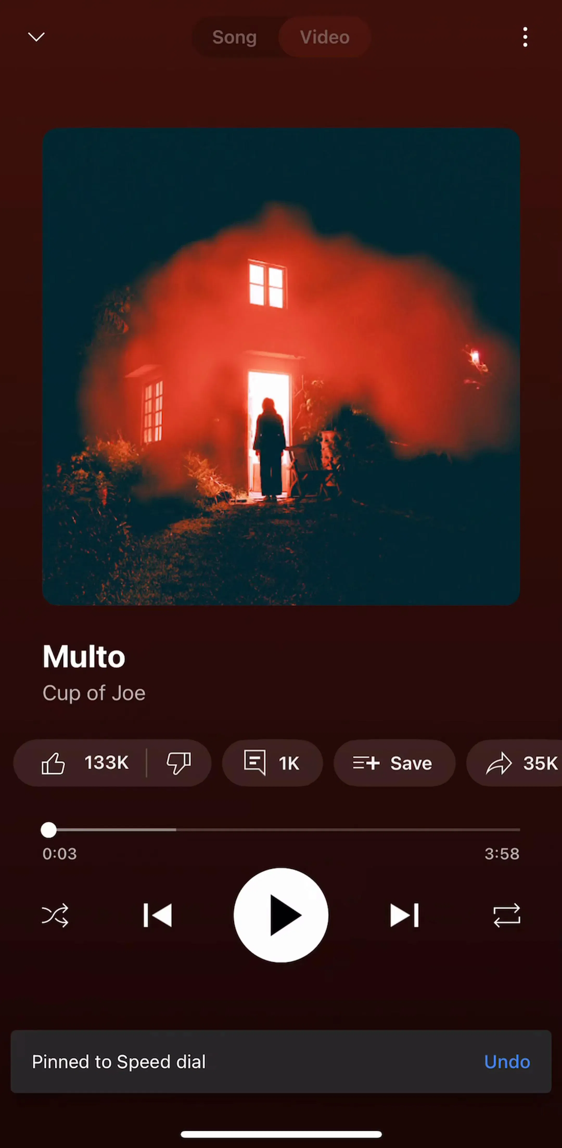
The expanded player covers everything, including the tab bar, and is dismissed by a downward swipe back into the mini player. Treating it as a normal pushed screen with a back button is the wrong model, because the user is not navigating away from browsing, they are temporarily surfacing something that is already running underneath. The layout inside is stable across products: large artwork, title and artist, a scrubber with elapsed and remaining time, transport controls with play largest, and a row of secondary actions such as favourite, queue, lyrics, and share.
The one place products genuinely differ is what they push up from the bottom: lyrics, a queue, credits, or a social layer. That choice says more about the product strategy than any other decision on the screen.
The saved tab looks like a housekeeping surface and behaves like a retention surface. Playlists, albums, artists, and downloads are the accumulated cost of leaving, and the design job is to make that accumulation visible. Downloads deserve particular care, since the offline state is both the clearest premium benefit and the most common source of confusion about what is actually on the device.
The general form of this pattern across categories is in the collections and library gallery.
The fastest-growing shape in the category inverts the entry screen. A generation product has nothing in the user’s library on first launch, so a browse home would be empty, and the shortest path to value is one prompt and one generated track. Onboarding in these apps therefore tends to run straight into a first creation rather than into a catalogue tour.
Suno (est. $5.25M/mo) is the largest example in the library, and it is instructive because downstream of the prompt it re-adopts the streaming conventions almost exactly.

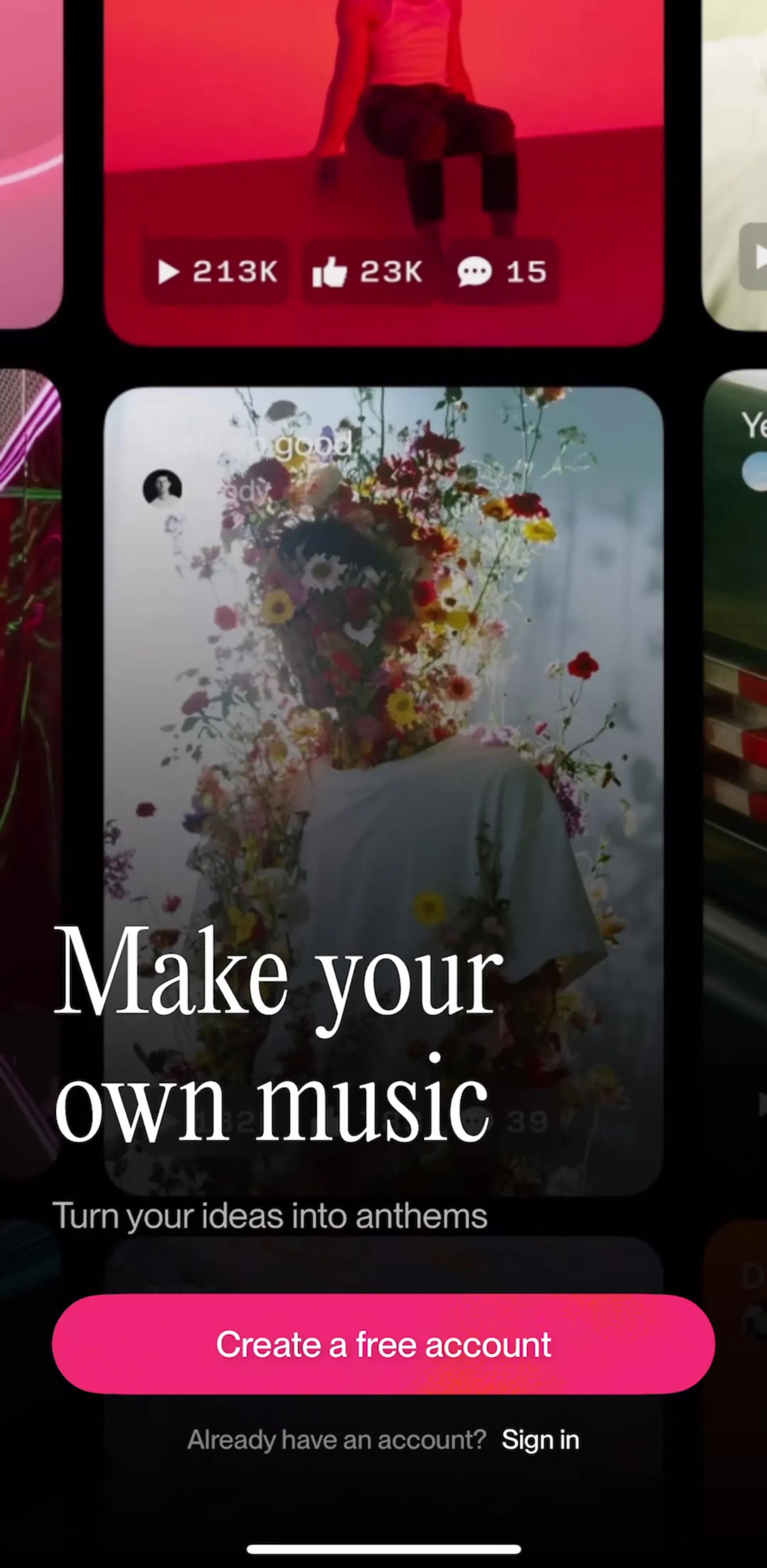
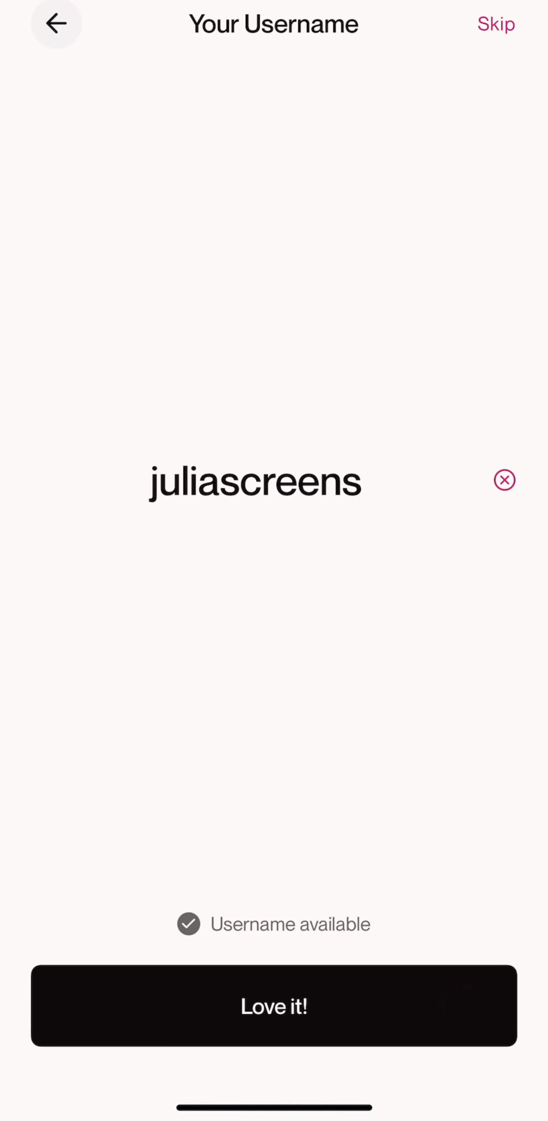
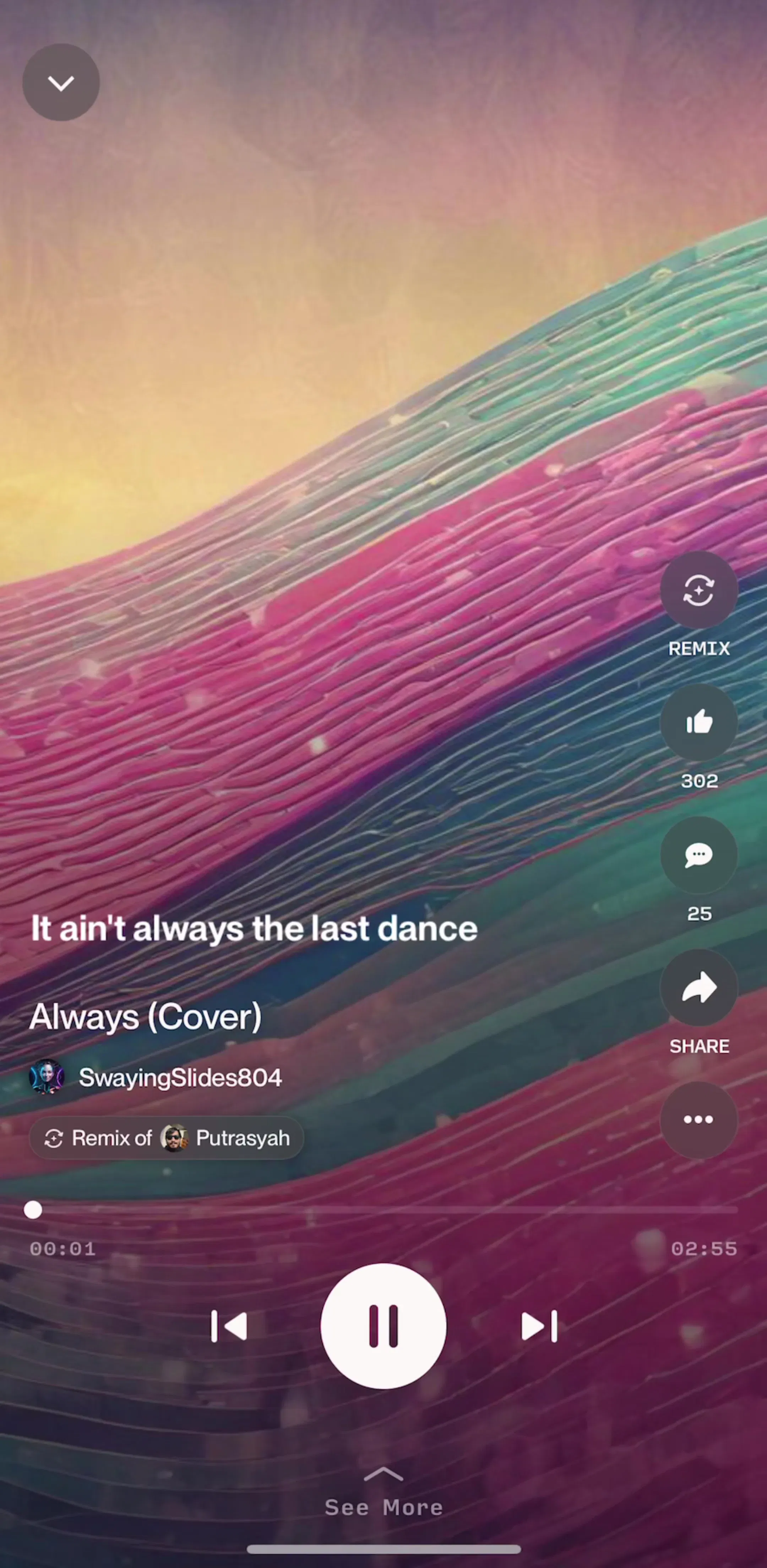
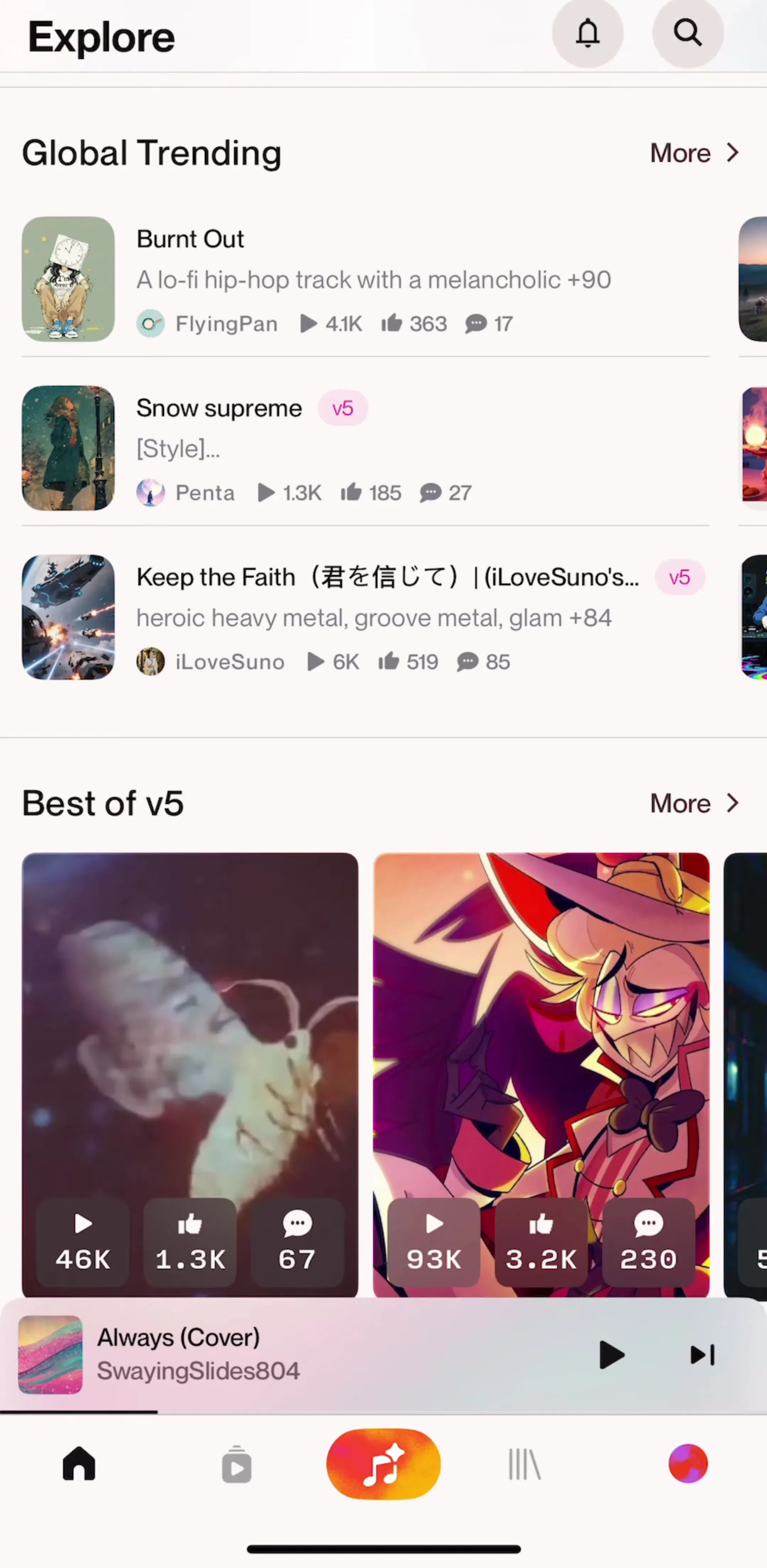
BandLab (est. $1M/mo) sits between the two models, carrying a real creation studio and a social feed in the same shell.
A tuner, a stem separator, or a DJ mixer is not a media product. There is one core task, it is performed repeatedly, and the interface should open directly onto it. These apps tend to have the shortest paths in the category and the most task-specific main screens, which makes them a useful corrective if you have been looking at streaming layouts for too long.
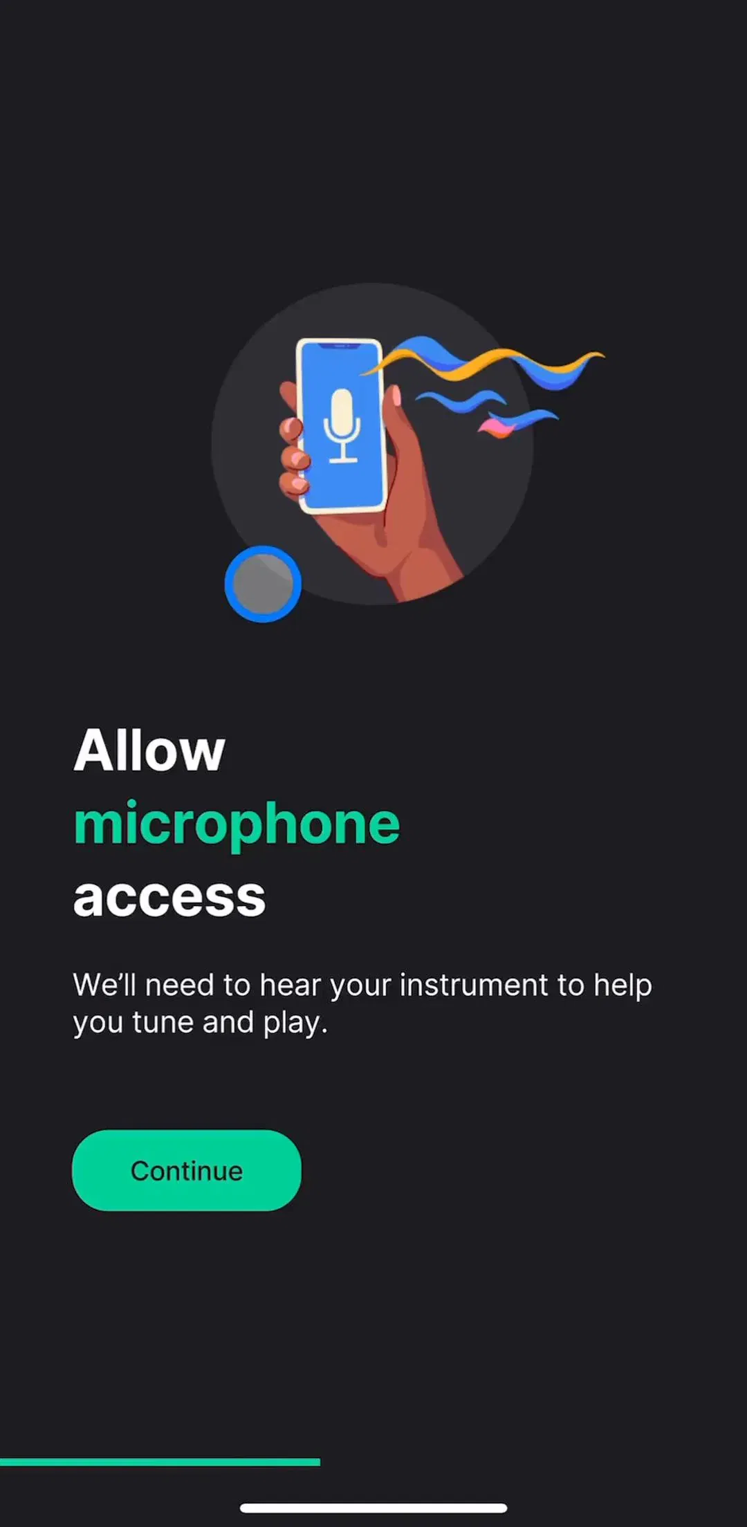
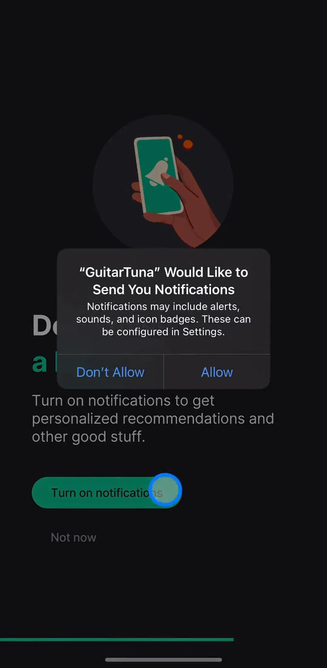
GuitarTuna (est. $1M/mo) is the clearest example, and Moises (est. $1.25M/mo) and djay (est. $750k/mo) show what happens when the core task needs real controls rather than a list.
Music products lean dark more than almost any other category. The functional argument is that album art carries the colour, and a dark field lets it do that without competing. The related convention is extracting a dominant colour from the artwork to tint the now playing background, which is effective and easy to overdo: at full saturation it makes text unreadable for a meaningful share of the catalogue, so shipping apps damp it heavily. We measured how common dark interfaces are library-wide in the dark mode breakdown.
Three recurring problems. Now playing screens designed as portfolio pieces, with controls sized for a mockup rather than for a thumb in a coat pocket. Home feeds that bury the user’s own library under recommendations, which is a business decision presented as a design one and tends to be resented. And free tiers that interrupt the first play with a paywall, before the product has demonstrated anything, which is a worse trade here than in most categories because the alternative is one tap away. The paywall breakdown covers where shipping apps place the ask.
Open three or four shipping music apps and note the components rather than the styling. The mini player, the rail stack, the takeover player, and the library tab are effectively standard, and the interesting decisions are all about what you put in the secondary action row and what you push up from the bottom of the player. Every screen in the library sits next to the app’s estimated revenue and downloads, so you can pick references by outcome rather than by how the shot looks, and SoundCloud (est. $10M/mo) is worth adding to the set as the one large product where the feed is genuinely social rather than editorial.
A note on the numbers: revenue figures cited here are third-party monthly estimates from our library, useful for comparing magnitude, not audited financials.
A streaming product converges on five: a rail-stack home, a search or browse surface, a library of saved things, a full-screen now playing view, and a persistent mini player that sits above the tab bar on every other screen. Creation tools replace the first three with a project list and an editor, but keep a playback surface that looks much the same.
Because playback has to survive navigation. Once audio is running, the user still wants to browse, search, and open other screens, and the mini player is the component that keeps the current track reachable without leaving whatever they are doing. It is the single most load-bearing piece of layout in the category, and it constrains the tab bar, the scroll padding, and every sheet in the app.
The entry screen changes from browse to create. Generation products open on a prompt field rather than a feed, because the user has nothing in their library yet on first launch and the fastest proof of value is one generated track. They still borrow the streaming conventions downstream, since a generated song still needs a player, a library, and a share sheet.
Most shipping music products are dark or ship a dark default, partly because artwork sits better on a dark field and partly because listening is often an evening and background activity. It is a stronger convention here than in most categories, though it is not a functional requirement the way it is for a sleep app.
The mobileappdesign library holds captured flows from 2,622 revenue-verified iOS apps, including 84 music products and 215 apps with a play and entertainment flow. Screens are captured in sequence, so you can follow a full flow from onboarding to playback rather than looking at isolated shots.
Browse captured playback and entertainment flows from revenue-verified iOS apps, in the order a real user walks them.
Browse playback screens