The bottom sheet won mobile navigation quietly. Ten years ago a secondary task meant pushing a screen and giving the user a back button; now it usually means raising a surface over what they were already looking at. The reason is physical rather than aesthetic: the bottom of a phone is where the thumb is, and a sheet is the only overlay that puts controls there without displacing the content above them. That also makes it the most over-used container in modern app design, because once a team has a sheet component, everything starts looking like it fits in one. Our library holds 2,622 revenue-verified iOS apps, and sheets turn up across all of them, which makes the interesting question not how to draw one but when to stop reaching for it.
Pushing a screen replaces the user’s view. Raising a sheet keeps it. Every legitimate use of the pattern comes back to that one difference: the task in the sheet is about the thing still visible behind it.
Filtering a list is the cleanest example. The user needs to see results change, or at least remember what they were filtering, and a full-screen filter form breaks that thread. The same logic covers picking a share target, adjusting a setting that alters what is on screen, or confirming a destructive action against a specific item.
The inverse test is just as useful. If the content behind the sheet is irrelevant to the task in it, the sheet is being used as a screen with rounded corners, and the user pays for that in a shrunken viewport and a lost back button.
A modal sheet dims the screen behind it and blocks interaction until dismissed. A non-modal sheet floats over live content the user can still touch, scroll and tap.
Modal suits anything with a commit: a form, a confirmation, a purchase step. The block is the feature, because it stops the user acting on stale state underneath.
Non-modal suits anything that is a persistent companion to the main view. The full-screen map with a draggable sheet of results over it is the pattern most people picture, and it works because panning the map and reading the list are the same task. We took that specific case apart in the map UI breakdown.
Getting this wrong produces the two most common sheet complaints. A modal sheet where the user expected to keep scrolling feels like a trap. A non-modal sheet over a form feels like a bug, because taps land in two places and the user cannot tell which surface has focus.
Resizable sheets stop at defined heights rather than anywhere the finger lets go. A small detent shows a summary, a medium one shows the list, a large one shows everything. Two stops is usually enough and three is the practical maximum before the gesture becomes a guessing game.
The failure to watch for is the sheet that expands to full height and stays there. At that point the content behind is fully covered, the reason for choosing a sheet is gone, and the user is on a screen with no navigation bar, no title, and no back button. If a sheet routinely ends up at full height, it wanted to be a pushed screen from the start.
The drag handle should follow the same honesty. Draw it when the sheet resizes; leave it off when the height is fixed. A handle is a claim about a gesture, and a gesture that does nothing is a defect the user blames on the app rather than on the component.
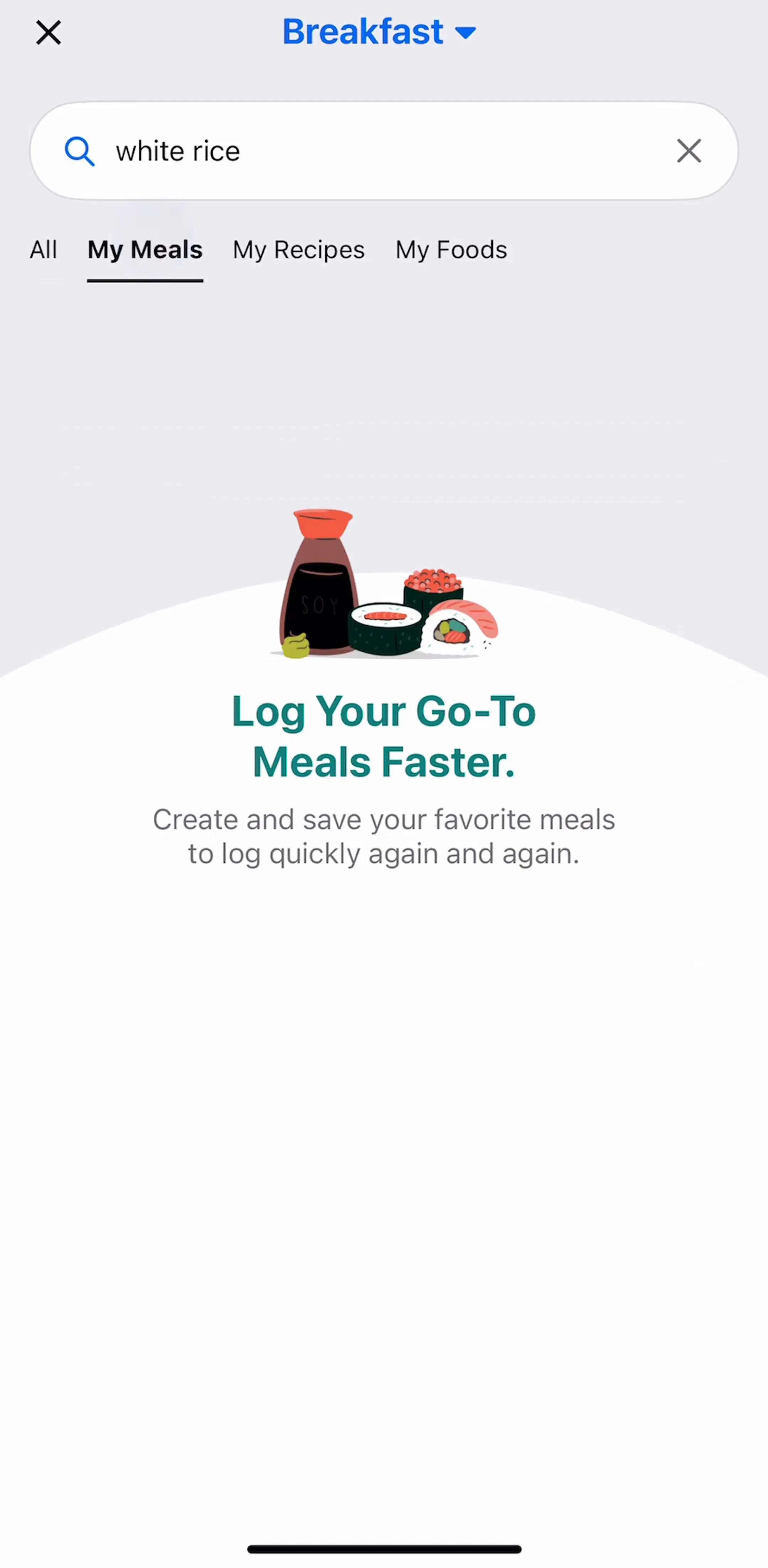
Search and filter is the flow where the sheet does the most obvious work, because the user is holding a query in their head and the results behind the sheet are the feedback. Our library has 374 apps with a search and filter flow, and the same shape recurs: a filter or scope sheet raised from a list, applied, dismissed, list updated.
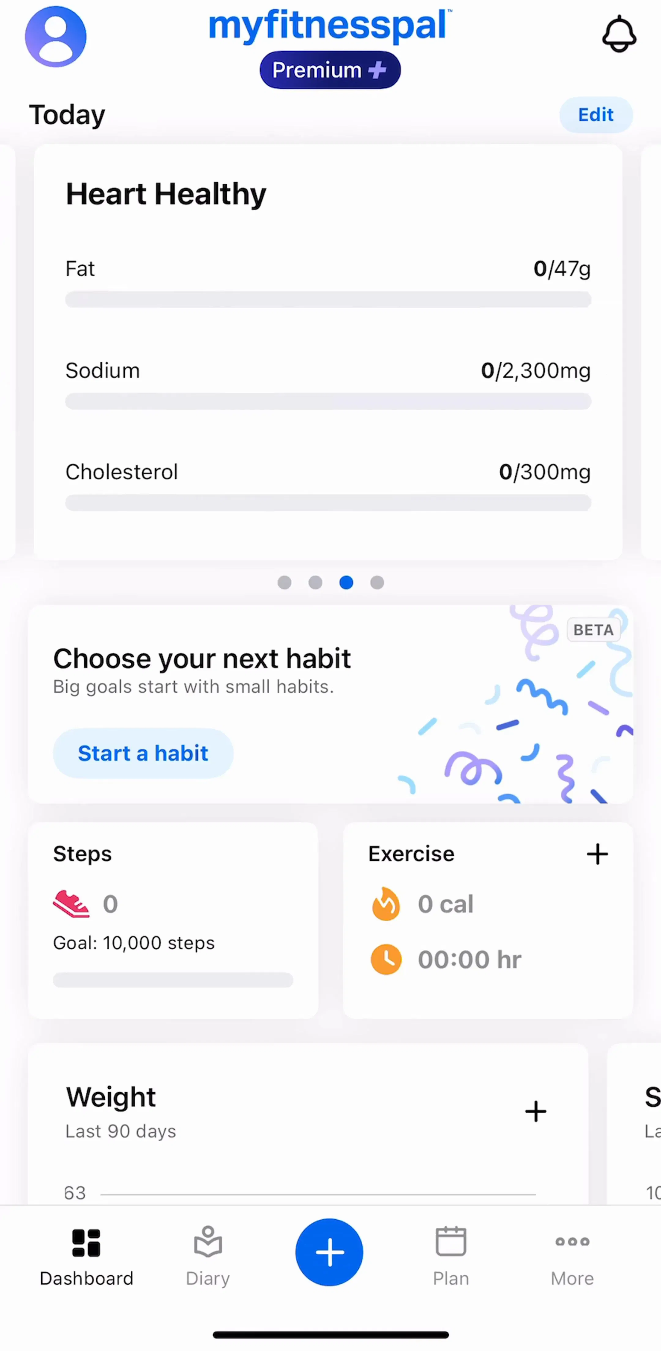
MyFitnessPal (est. $12M/mo) is a useful study because logging food is a search task performed many times a day by the same person, which is the case where the cost of an extra screen transition compounds.
The decisions inside a filter sheet, where sort lives, whether to show a result count, how to clear applied state, are a separate problem from the container, and we covered them in the filter UI breakdown.
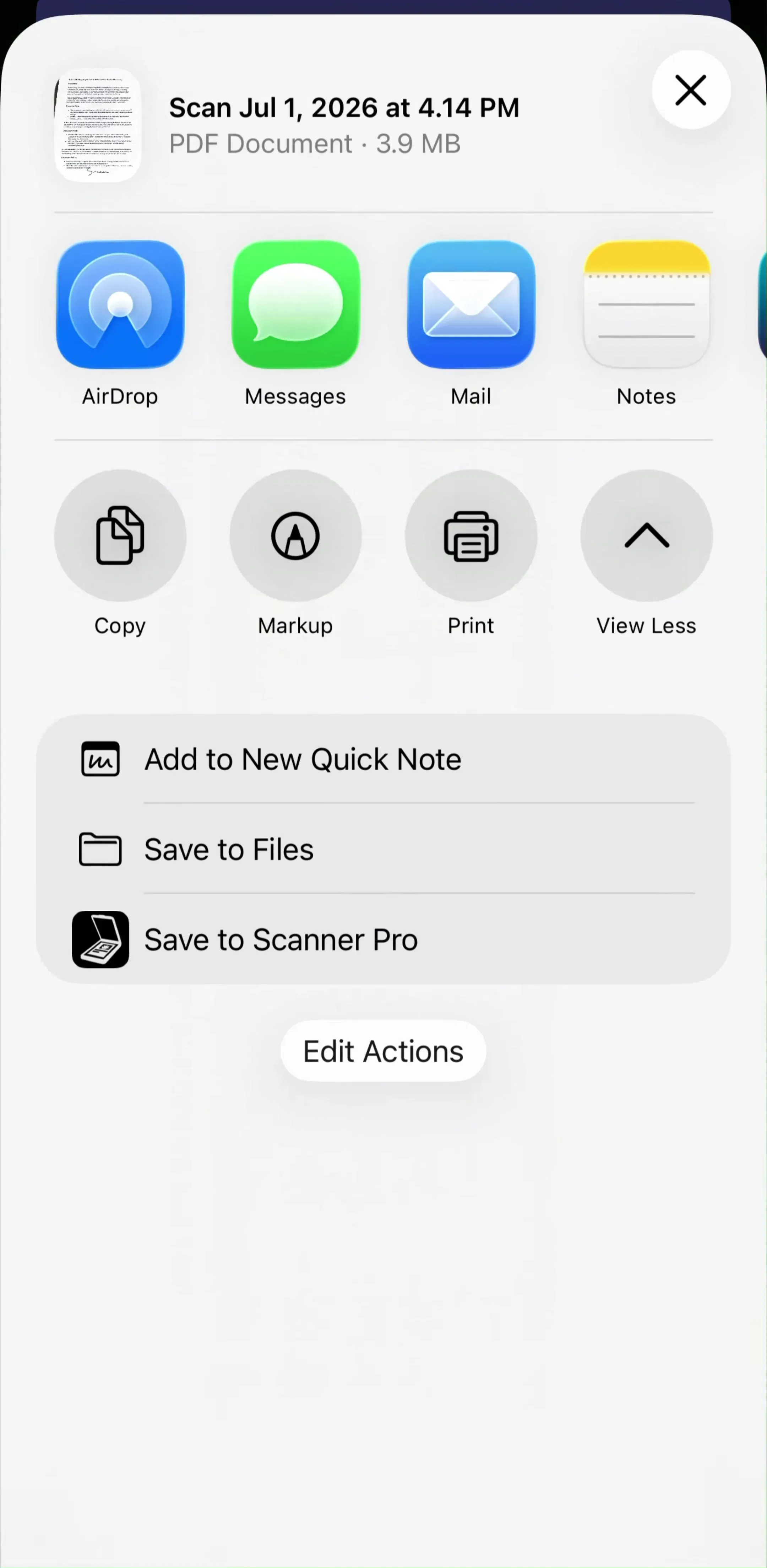
The other high-traffic case is share and export, where a sheet lists destinations over the artifact being sent. Here the sheet is doing something a screen cannot: keeping the thing being shared visible while the user chooses where it goes.
Scanner Pro (est. $550K/mo) is worth looking at for the general shape of a document tool that ends most sessions in an export step rather than in the app itself.
The trap in export sheets is length. A destination list that scrolls past a screen and a half has become a directory, and directories deserve search, sections and a real screen.
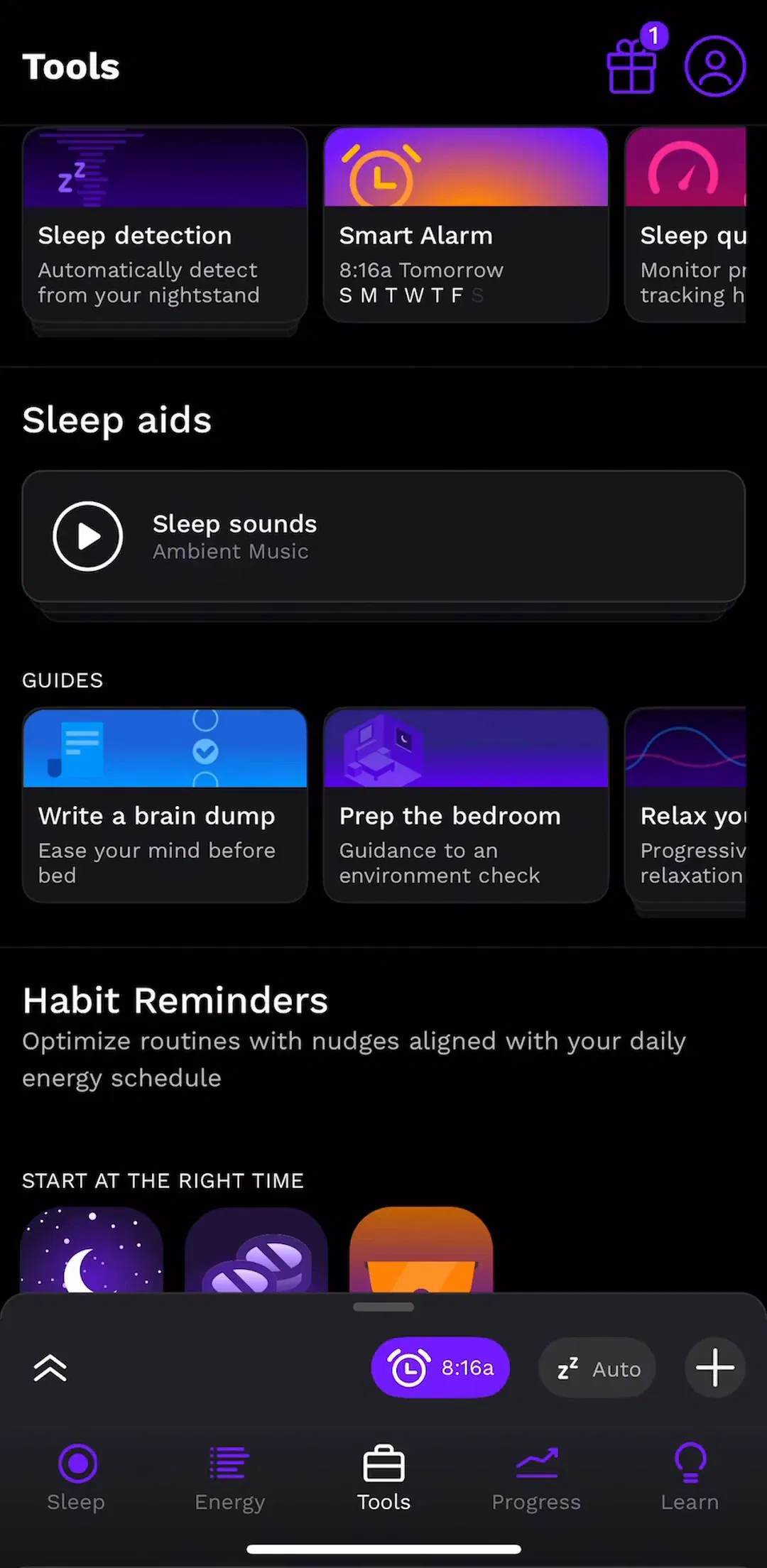
Sheets are increasingly used for single settings raised from the screen they affect: a reminder time, a unit toggle, an alarm sound. This is a good use, because the setting and its effect stay in view together, and it avoids sending the user on a round trip into a settings tree for a one-field change.
RISE (est. $300K/mo) sits in a category where configuration is the product rather than an afterthought, which makes it a reasonable reference for how much adjustment a well-behaved app is willing to surface in-place.
The limit is nesting. A sheet that opens another sheet has built a stack with no visible back affordance, and the user’s only exit is a swipe that may dismiss one layer or both. If a setting has children, it belongs in the settings hierarchy, which we mapped across 1,520 apps in the settings UI study.
There are three ways out of a sheet: drag it down, tap the dimmed area above it, or tap an explicit close control. Ship all three where you can, and never ship only the first.
Gesture-only dismissal fails two groups reliably. Users who never learned the gesture, who then hunt for a button that is not there. And anyone whose sheet contains a scrolling list, where dragging down scrolls the list rather than moving the sheet until the list is already at the top, so the same gesture does two different things depending on invisible state.
One more rule that gets skipped: a sheet with unsaved input should confirm before a drag throws it away. Drag-to-dismiss is easy to trigger accidentally, which is fine for a filter panel and destructive for a half-written note.
Five recurring failures. A sheet used where a screen was needed, identifiable by it always sitting at full height. A drag handle on a sheet that does not resize. Nested sheets. Gesture as the only dismissal. And a keyboard that opens under a sheet and covers the field the user was typing into, which is the single most common sheet bug in shipped apps and shows up the moment a form goes into one.
A sixth is quieter: an action sheet styled as a general sheet. A short list of verbs read faster when it looks like a list of verbs, and dressing it in headers, illustrations and a drag handle slows down the one interaction the component exists to make fast.
Take every sheet in your app and ask what is behind it. If the answer is nothing the user needs, convert it to a pushed screen and give back the navigation bar. Then open each remaining sheet with the keyboard up, on the smallest device you support, and check that the field being edited is still visible. Those two passes catch most of what ships broken.
After that, compare against shipping apps rather than concept shots. Every screen in the library sits next to the app’s estimated revenue and downloads, so references can be chosen by outcome rather than by how the shot looks. Sheets and lists are usually the same screen viewed from two angles, and the row-level decisions are in the list UI breakdown.
A note on the numbers: revenue figures cited here are third-party monthly estimates from our library, useful for comparing magnitude, not audited financials.
A surface that slides up from the bottom edge and covers part of the screen while leaving the rest of the current context visible behind it. It is a mobile pattern rather than a web one, because it is the only overlay that reaches the thumb without moving the content the user was already reading. Sheets are either modal, blocking the screen behind them until dismissed, or non-modal, letting the user keep working underneath.
An action sheet is a narrow case of a bottom sheet: a short list of one-tap choices, usually a destructive option and a cancel, with no scrolling and no controls beyond the list. A bottom sheet is the general container and can hold anything, including forms, filters, maps and media controls. If your sheet has more than a list of verbs in it, it is a bottom sheet, and it should not be styled like an action sheet.
When the task is short and the context behind it matters. A filter panel, a share target, a date picker or a quick edit all benefit from the user still seeing what they are acting on. Push a full screen instead when the task is long, when it has its own sub-navigation, or when the user needs to be able to leave and come back to it. A sheet that scrolls the full height of the display has stopped being a sheet.
Show one when the sheet is resizable, and leave it off when the sheet has a single fixed height. The handle is a promise that dragging does something. A handle on a sheet that cannot be resized teaches the user to try a gesture that fails, which is worse than no affordance at all. Keep drag-to-dismiss working either way, and always pair it with a visible close control for anyone who does not reach for the gesture.
The mobileappdesign library holds captured flows from 2,622 revenue-verified iOS apps. Sheets are easiest to study in flows where they carry real work: 374 apps have a search and filter flow, 1,520 have a settings flow, and 205 have a share flow. Because screens are captured in sequence, you see the screen the sheet was raised over rather than the sheet alone.
Browse captured search and filter flows from revenue-verified apps, in the order a real user walks them.
Browse search and filter screens