Most audio player UI references are a wide bar with play, scrub, volume and a waveform, designed for a desktop web page. On a phone the pattern is a pair of surfaces rather than a bar: a persistent mini player that follows the user around the app, and a full screen they expand into when they want to do something more than pause. And audio playback is no longer mostly music. In this library it is as often a transcription, a text-to-speech read of an article, an audiobook sample, or a track a generator just produced. Our library holds 2,622 revenue-verified iOS apps, 84 of them in Music, 38 in Books, and 506 carrying a view or consume flow. This is what those apps put around the audio, and how the controls shift when the content stops being a song.
A video player fights its own content for pixels, which is why its controls auto-hide, why volume moved to the hardware buttons, and why everything except play and scrub hides behind an overflow icon. We went through that whole set of constraints in the video player UI piece.
Audio has none of them. There is nothing behind the controls that the user needs to see, so nothing has to hide, buttons can be large, and secondary controls such as speed, sleep timer and output routing can sit on the main surface instead of behind a menu. Designers who carry video habits into an audio player end up hiding controls that had no reason to hide, and the result feels needlessly sparse.
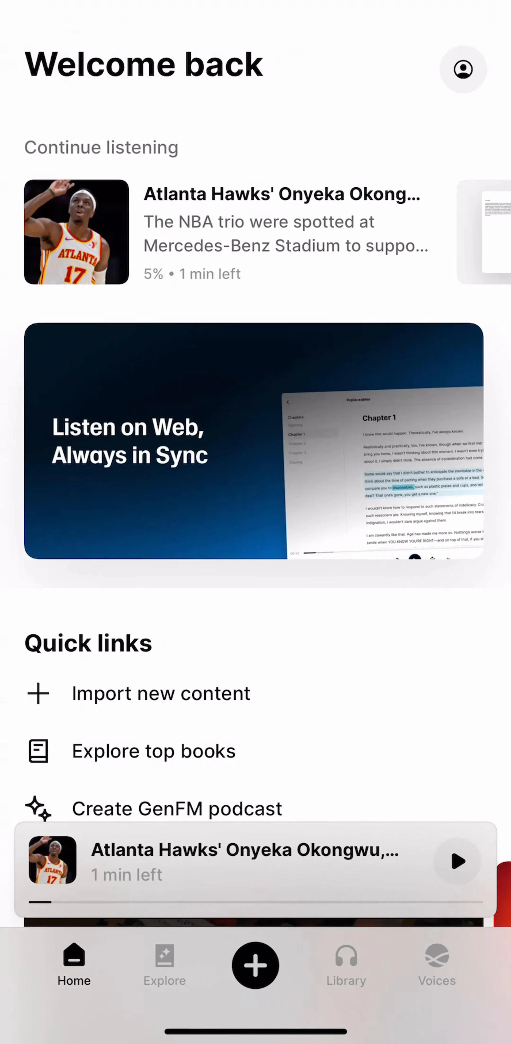
Audio is the media type people consume while doing something else, including something else inside the same app: browsing the next episode, reading the transcript, editing a note. That makes a persistent mini player the default rather than an enhancement. It docks above the tab bar, carries a title, a play or pause control and a progress hairline, and expands into the full player on tap.
Three details decide whether it works. It has to survive every navigation in the app, not just the tab it started in. The whole bar should be the tap target for expansion, not a small chevron. And it should be dismissible by swipe, with dismissal meaning stop, not hide, because a mini player that can be hidden while still playing produces audio with no visible control anywhere.
It also permanently occupies the strip above the tab bar, which is a real cost to every screen underneath it. That tradeoff is the same one covered in the tab bar design rules.
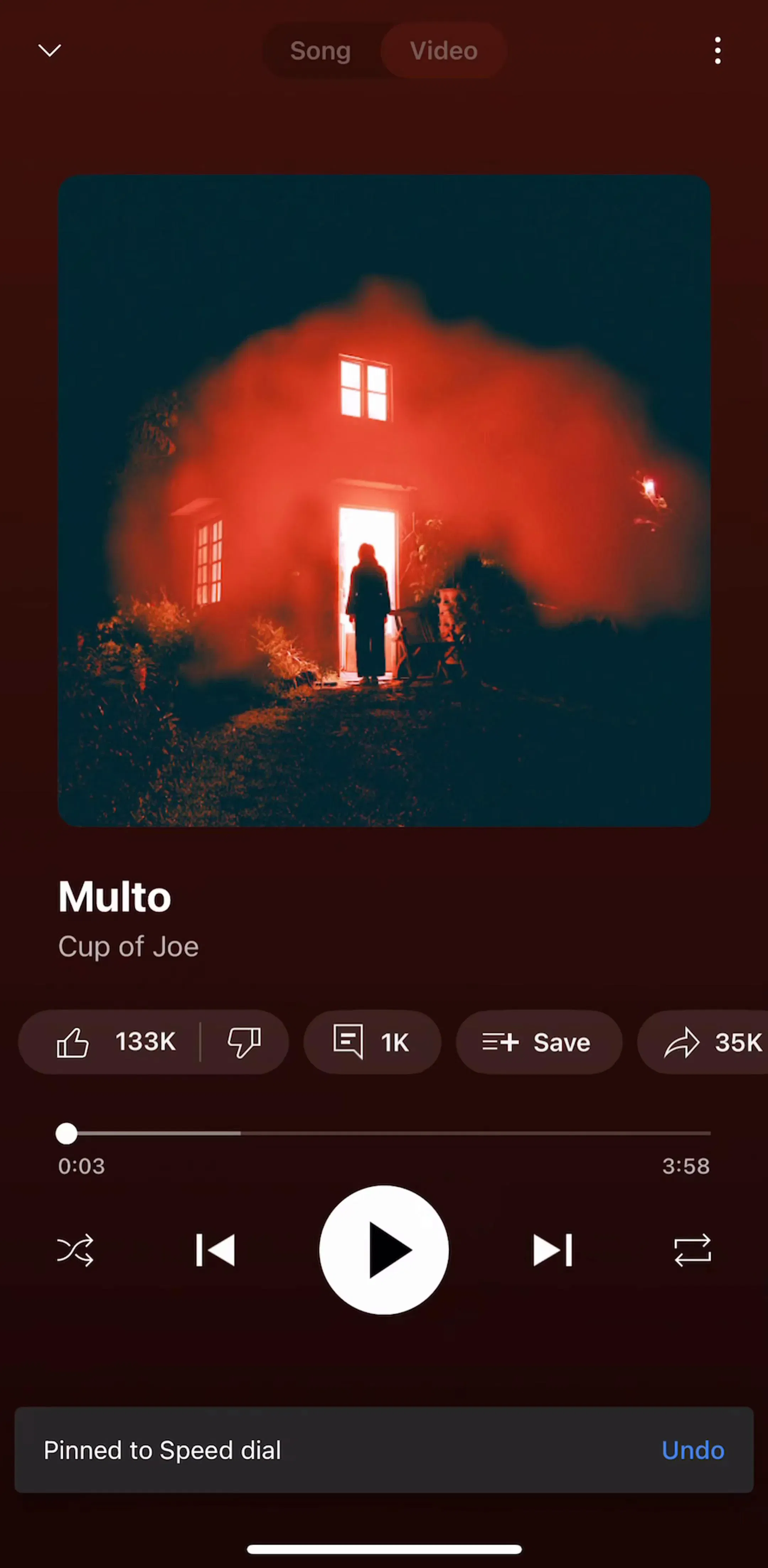
YouTube Music (est. $38M/mo) is the largest music app in the library by estimated revenue and a reasonable place to see how a mature catalogue app divides browsing from playback.
The transport controls look interchangeable and are not. Music takes previous and next, because the unit of navigation is the track and nobody wants to seek fifteen seconds into a three-minute song. Spoken audio takes skip back fifteen and skip forward thirty, because the unit is the sentence that got missed when someone spoke to you.
Shipping the wrong pair is the most common mismatch in this pattern. A text-to-speech reader with next track buttons makes it impossible to re-hear a sentence, which is the single most frequent action in spoken audio. A music player with skip-back-fifteen makes the user tap repeatedly to reach the start of a song. Pick from the content type, and if an app carries both, switch the control set with the content rather than choosing one for the whole app.
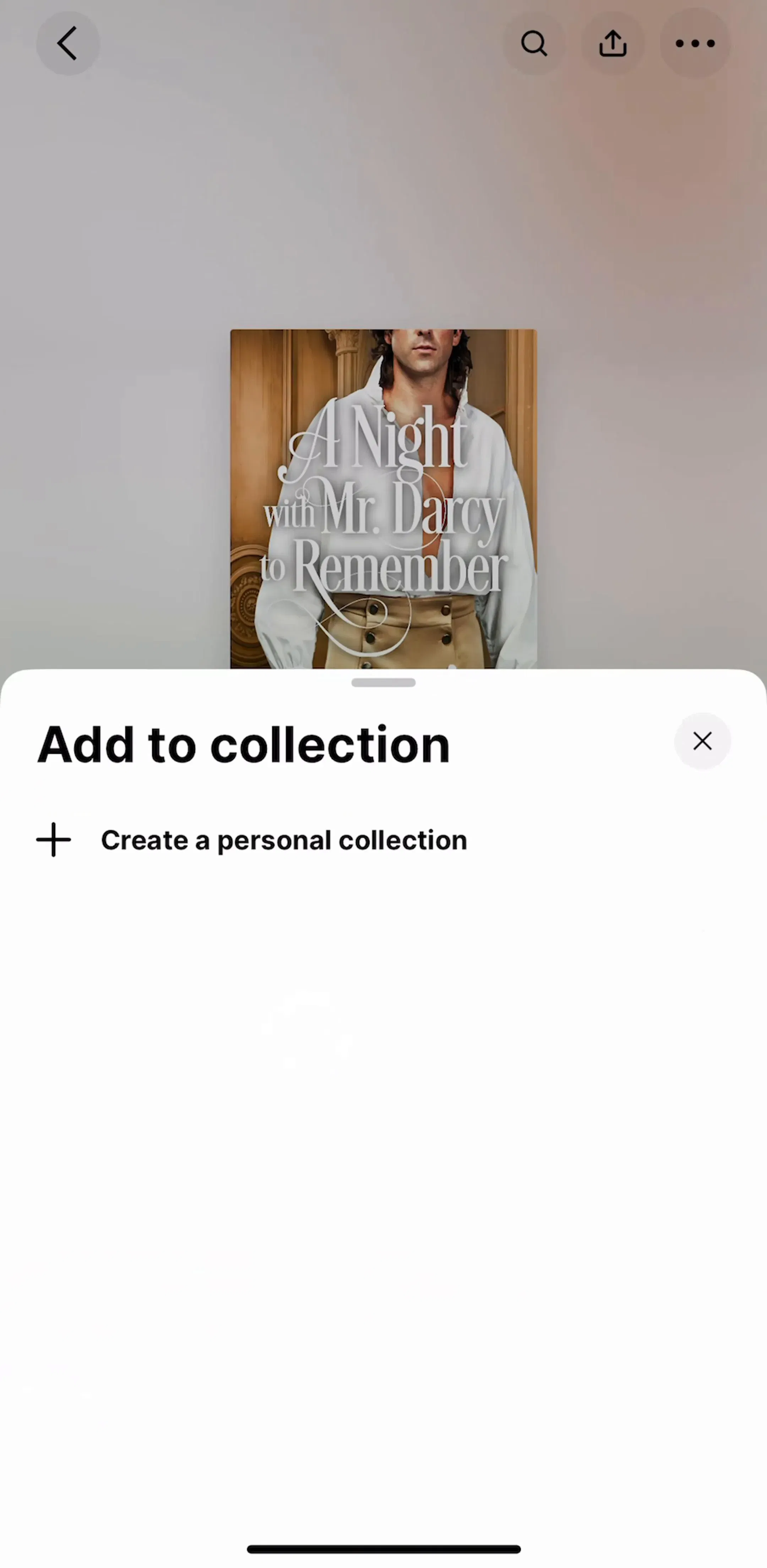
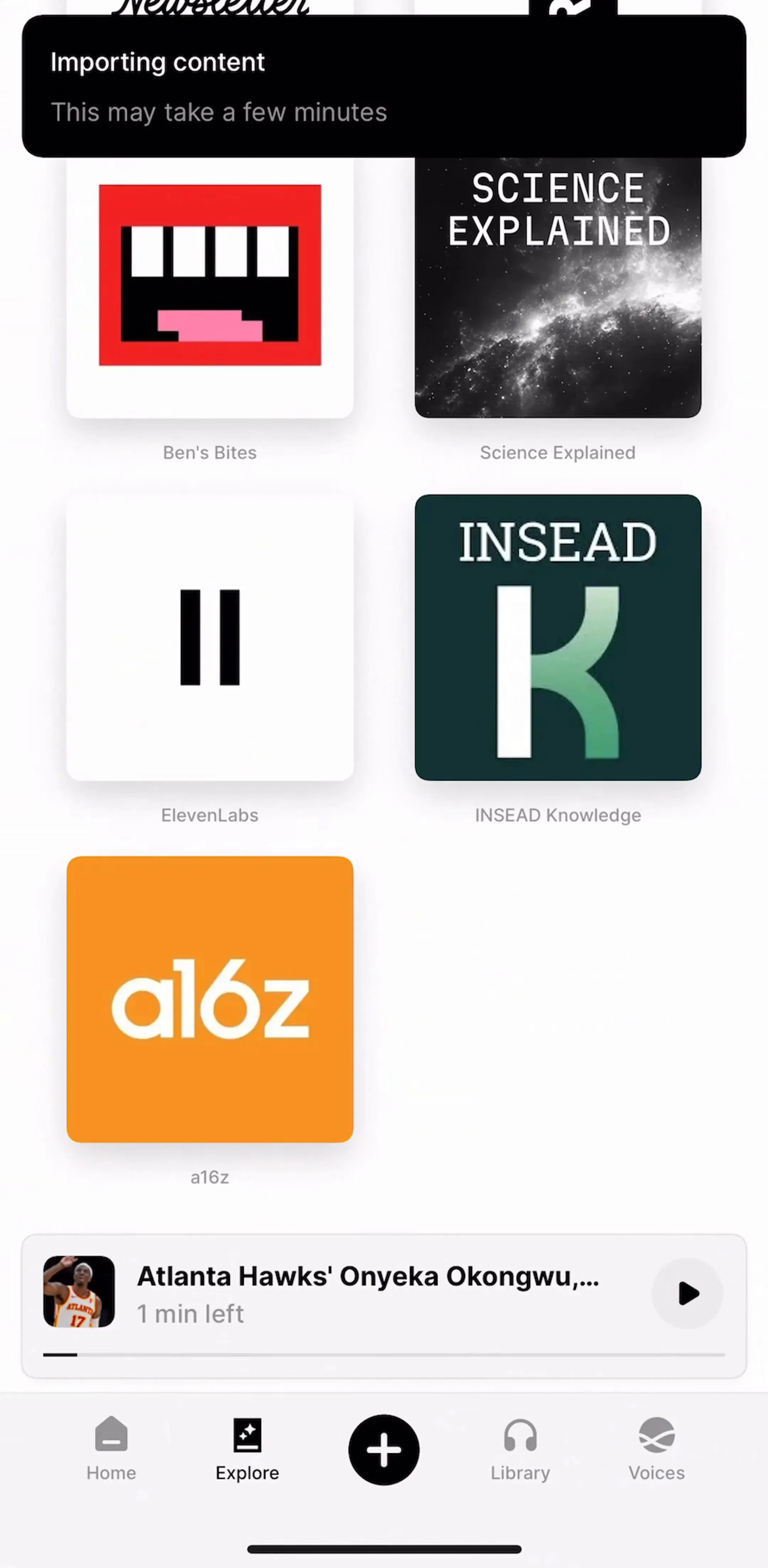
ElevenReader (est. $0.15M/mo) is a text-to-speech reader rather than a music app, which makes it a useful contrast for how a library and a player fit together when the content is spoken.
Scrubbing audio is a far kinder interaction than scrubbing video. The finger is not covering the content, there is no moving image to judge against, and a rough landing is recoverable with one skip-back tap. That slack should be spent on making the bar informative rather than on making it thinner.
Elapsed and remaining time on both ends of the bar, a chapter or segment marker where the content has structure, and a genuinely large touch target, at least the standard 44 points tall regardless of how thin the drawn line is. On an audiobook or a long episode, the bar should also expand its scale while dragging, so a small movement is not twenty minutes.
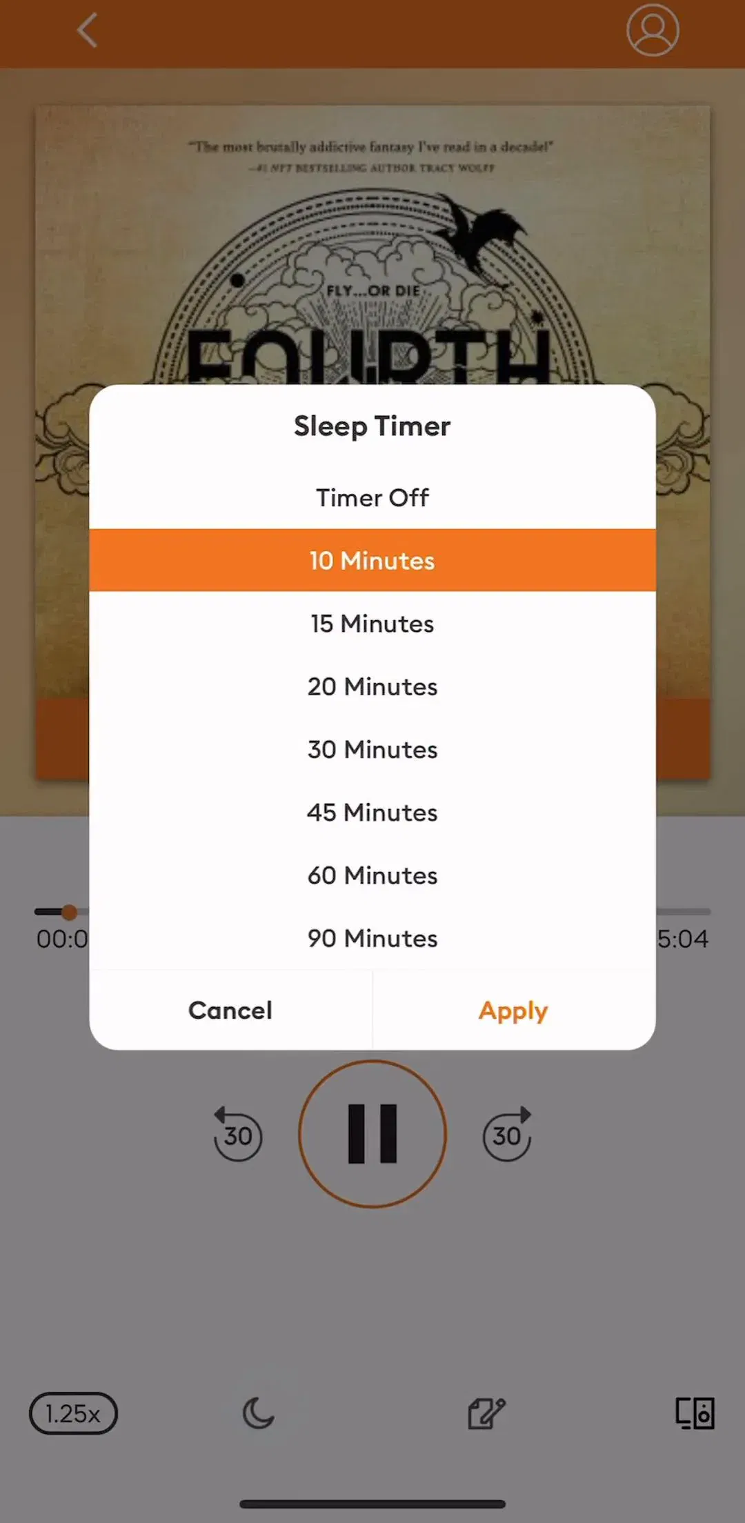
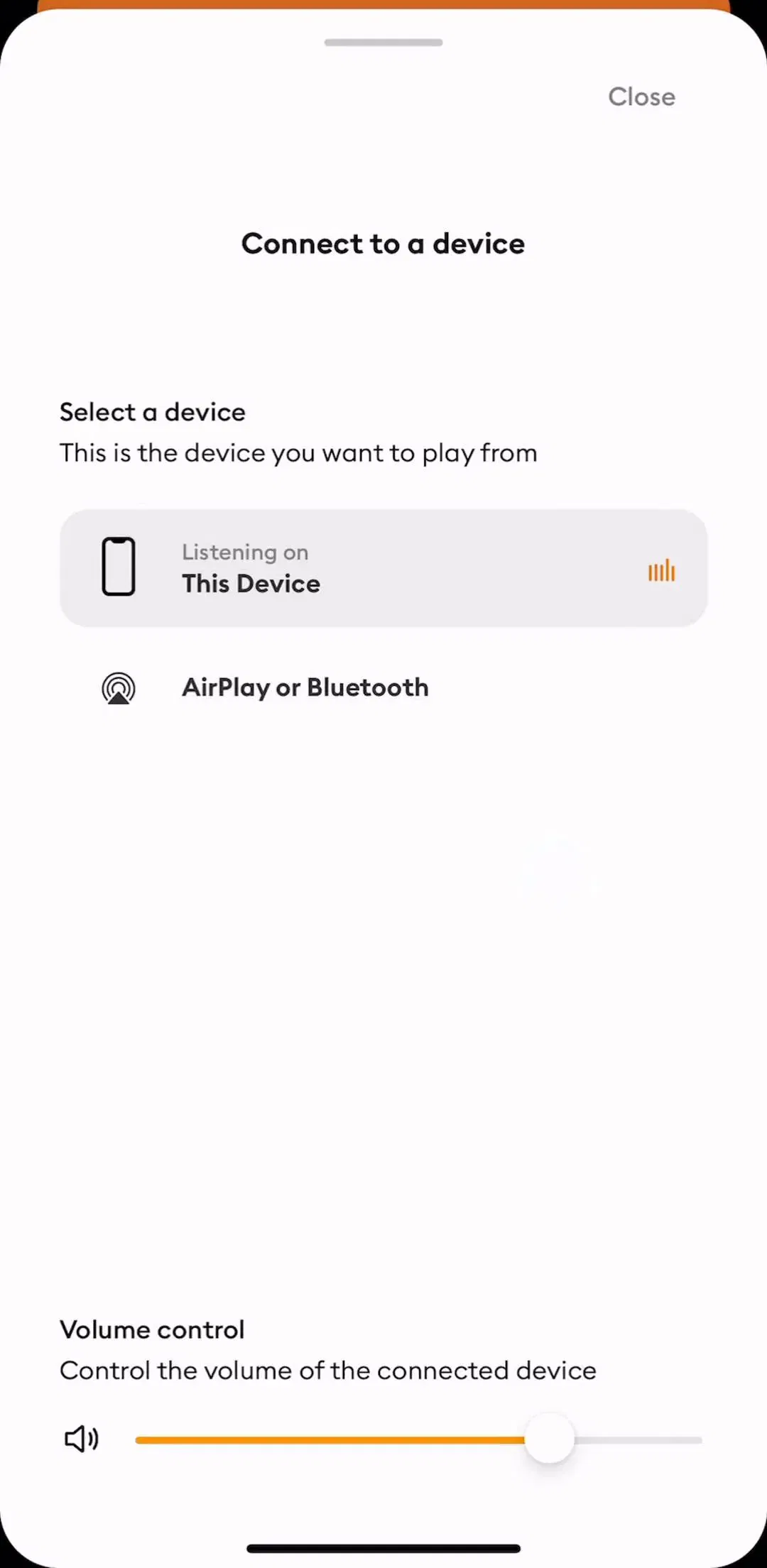
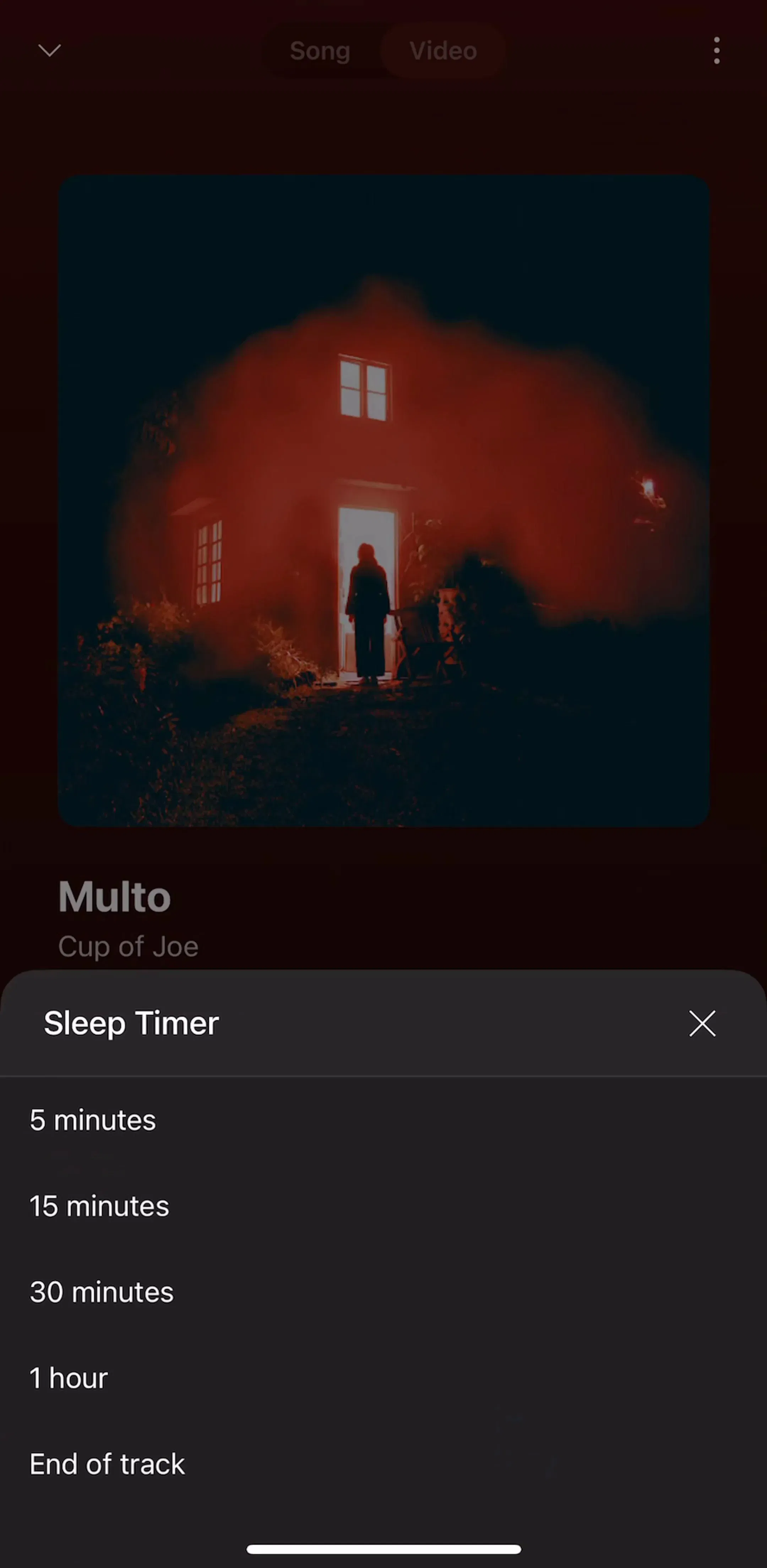
Three secondary controls earn permanent placement on a spoken-audio player because they are used often enough that a menu is friction. Playback speed, which a large share of podcast and audiobook listeners change and then never change back. A sleep timer, which is the only control that matters to someone listening in bed. And output routing, which people reach for the moment headphones connect or disconnect.
None of these belong on a music player, and that is the point. The control set is not a fixed component you drop into every audio context. It is chosen per content type, and the fastest way to make a player feel wrong is to ship one set everywhere.
Audiobooks.com (est. $0.15M/mo) sits in the long-form spoken case, where a listening session is measured in hours rather than minutes.
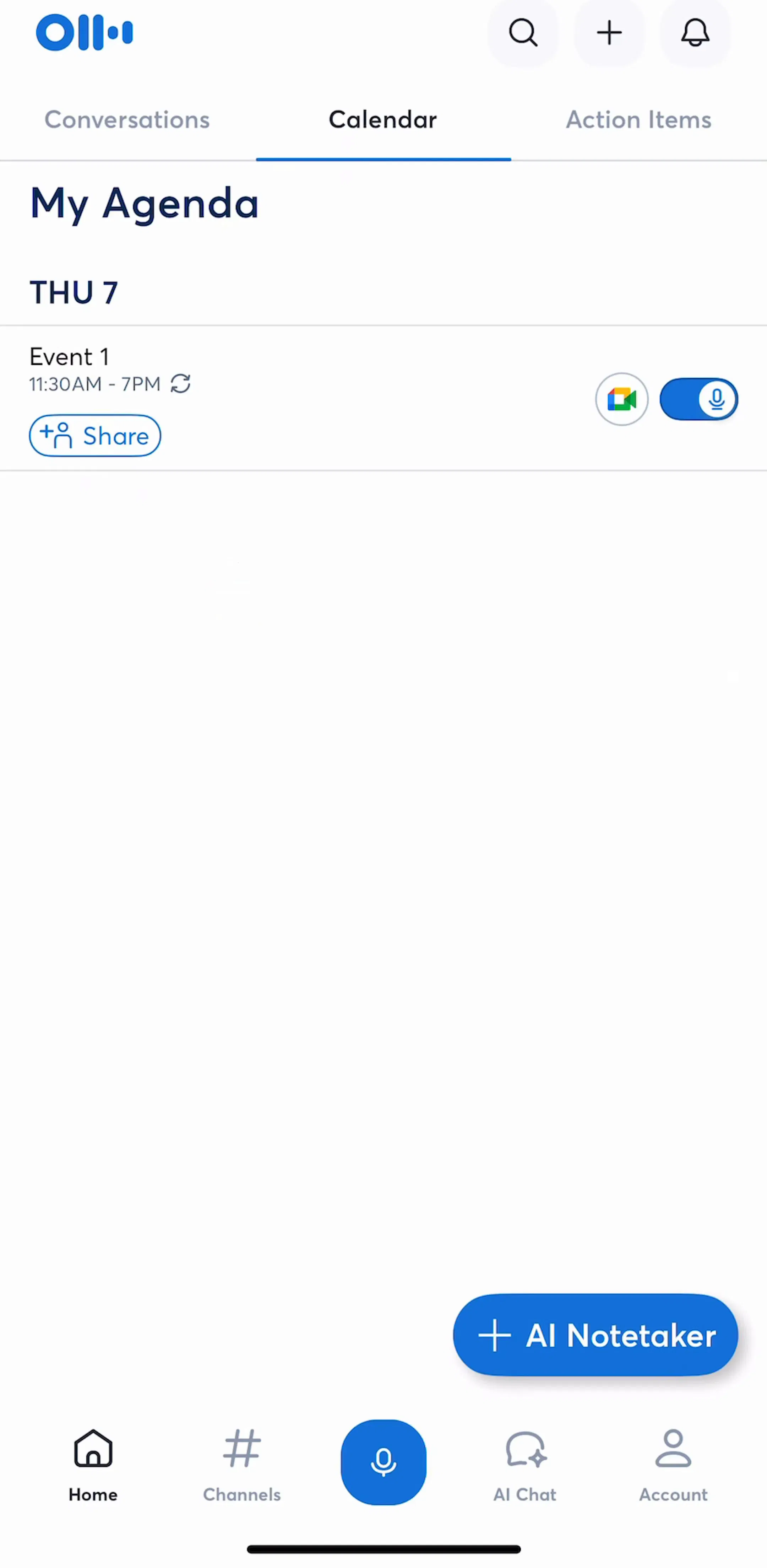
Recording and transcription apps are a large part of audio playback in the App Store, and they are the one case where a waveform is not decoration. A waveform lets a user see the silence between two speakers, find where the meeting actually started, and trim a false start off the front. Those are real tasks and the shape supports them.
A waveform drawn behind a podcast because it looks like audio is a different thing. It costs rendering, it is usually fake, and it communicates position less precisely than the plain bar it replaced. The test is whether a user could act on the shape. If not, draw a progress bar.
The stronger move in transcription apps is to pair playback with the transcript itself, so tapping a line seeks to it and the playing line highlights. That turns the transcript into the scrub bar and makes precise navigation possible in a way no waveform can.
Otter (est. $1M/mo) is the largest transcription app in the library by estimated revenue and a reasonable place to see how recordings, transcripts and playback are organised together.
AI song and voice generators have produced a context that barely existed a few years ago: a short clip the user has never heard, which they are about to judge. The controls that matter there are keep, regenerate, edit and share. Playback is a loop with a play button.
Shipping a full transport bar with previous and next track on a thirty-second generated clip adds navigation to something with nowhere to navigate. The screen should be weighted toward the decision, with the player reduced to the smallest thing that lets the user hear the result again.
Suno (est. $5.25M/mo) is the largest AI music generator in the library and sits squarely in this shape, where the output is short and the next action is a judgement rather than a seek.
Five recurring failures. Track buttons on spoken content, so a missed sentence cannot be re-heard. No mini player, so leaving the player screen means losing control of playback. A mini player that can be dismissed while audio keeps playing. A scrub bar with a 4-point touch target because the drawn line is 4 points. And a decorative waveform standing in for a progress indicator.
A sixth is lock screen and Control Center behaviour, which is not strictly UI you draw but is where a large share of audio is actually controlled. An app that ships a beautiful in-app player and wrong or missing metadata on the lock screen has designed the surface people use least.
Test the player with the screen off and the phone in a pocket. That is the real usage condition for audio, and it immediately exposes anything that depends on looking: the missing skip-back, the lock screen metadata, the sleep timer buried three taps deep. Then test it while navigating the rest of the app, which is what the mini player exists for.
After that, compare against shipping apps rather than Figma kits and concept shots. Every screen in the library sits next to the app’s estimated revenue and downloads, so references can be chosen by outcome rather than by how the shot looks. The wider set of conventions for music apps specifically is in the music app UI study.
A note on the numbers: revenue figures cited here are third-party monthly estimates from our library, useful for comparing magnitude, not audited financials.
Audio has no frame to protect, so nothing has to auto-hide and controls can be permanent, large and generous. That single difference drives most of the divergence: audio players get a persistent mini bar across the whole app, full-size buttons, a speed control on the main surface, and a sleep timer, none of which a video player can afford because every control there covers the content.
Yes, for anything longer than about a minute. Audio is the one media type people consume while doing something else in the same app, so playback has to survive navigation. The mini bar docks above the tab bar, carries the title, a play control and a progress hairline, and expands to the full player on tap. Without it, leaving the player screen means either stopping playback or losing all control of it.
Both, and the split depends on the content. Music gets previous and next track, because the unit of navigation is the track. Spoken audio, meaning podcasts, audiobooks, transcriptions and text-to-speech, gets skip back fifteen and skip forward thirty, because the unit is the sentence you missed. Shipping a music control set on spoken content is the single most common mismatch in this pattern.
Only if the waveform is being used for something. A waveform that lets a user find the silence between two speakers, or trim the start, is doing work. A waveform drawn as decoration behind a recording is an expensive way to say audio is playing, and a plain progress bar communicates position more precisely. Ask whether a user could act on the shape before drawing it.
The mobileappdesign library holds captured flows from 2,622 revenue-verified iOS apps, including 84 in Music, 38 in Books, and 506 with a view or consume flow, which is where most audio playback surfaces live. Screens are captured in sequence, so the player appears next to the library and browse screens that lead into it.
Browse captured view and consume flows from revenue-verified apps, in the order a real user walks them.
Browse playback screens