Search for video player UI and you get control bars: play, scrub, volume, fullscreen, laid out on a wide rectangle. That is a description of a desktop web player, and it is not what most people meet on a phone. In the App Store the majority of video playback is not a streaming service. It is the preview above an editing timeline, the result screen after a generator finishes, and the vertical feed that has thrown the control bar away entirely. Our library holds 2,622 revenue-verified iOS apps, 334 of them in Photo and Video, and 316 of those carry a create or edit flow, which is where a mobile player usually lives. This is a look at what those apps put over the frame, and what they deliberately leave off.
A player is the one surface where the interface and the content compete for the same pixels. On a settings screen a control costs nothing but space; on a player it costs visible frame. That single constraint explains most of the conventions, including the ones that look lazy.
It is why controls auto-hide, why volume moved to the hardware buttons, why quality and captions live behind one overflow icon, and why the scrub bar sits at the very bottom edge where it obscures the least interesting part of most compositions. A player that shows everything at once is not more capable, it is just further from the video.
Controls should fade after roughly three seconds of no input and return on a tap anywhere on the frame. Requiring the user to hit a specific target to bring back the controls fails, because they are trying to reach an interface that is currently invisible.
The exception is pause. A paused player should keep its controls up indefinitely. Someone who paused is mid-decision, and hiding the controls means they have to tap once to reveal and again to act. Getting this wrong is common and the symptom is a player that feels like it is fighting the user.
The second half of auto-hide is the scrim. Controls drawn straight onto video are unreadable against whatever frame happens to be bright, so they need a gradient behind them. That gradient is the same problem faced by any overlay on unpredictable imagery, which we covered in the dark mode UI study.
Playing and pausing is a tap on a huge target. Scrubbing is a precise drag along a thin line, on a surface that is moving, with a finger that covers the destination. It is where players are actually judged.
Three things separate a bar that works from one that does not. The touch target has to be far taller than the drawn line, at minimum the standard 44 points. Elapsed and remaining time need to be legible during the drag, not only when idle. And on longer content the bar should expand or slow its ratio while dragging, so a 40-point movement is not two minutes of video.
The skip-back control deserves separate mention. For anything longer than a minute, a jump back of ten or fifteen seconds is the most-used control after play, because it fixes the most common failure in mobile viewing, which is a distraction rather than a desire to navigate. It is also the control most often omitted in favour of a scrub bar that cannot make a fifteen-second adjustment accurately.
Most mobile video starts in portrait, inline, with content underneath it. Fullscreen is something the user asks for, not the default, and the transition between the two is where apps drop state: playback position resets, the control bar re-appears, or the video restarts.
Two rules cover most of it. Keep the exact playback position and the play or pause state through the rotation, which sounds obvious and fails regularly. And make the exit as discoverable as the entry, since a fullscreen player that hides its own way out leaves the user pressing the home indicator.
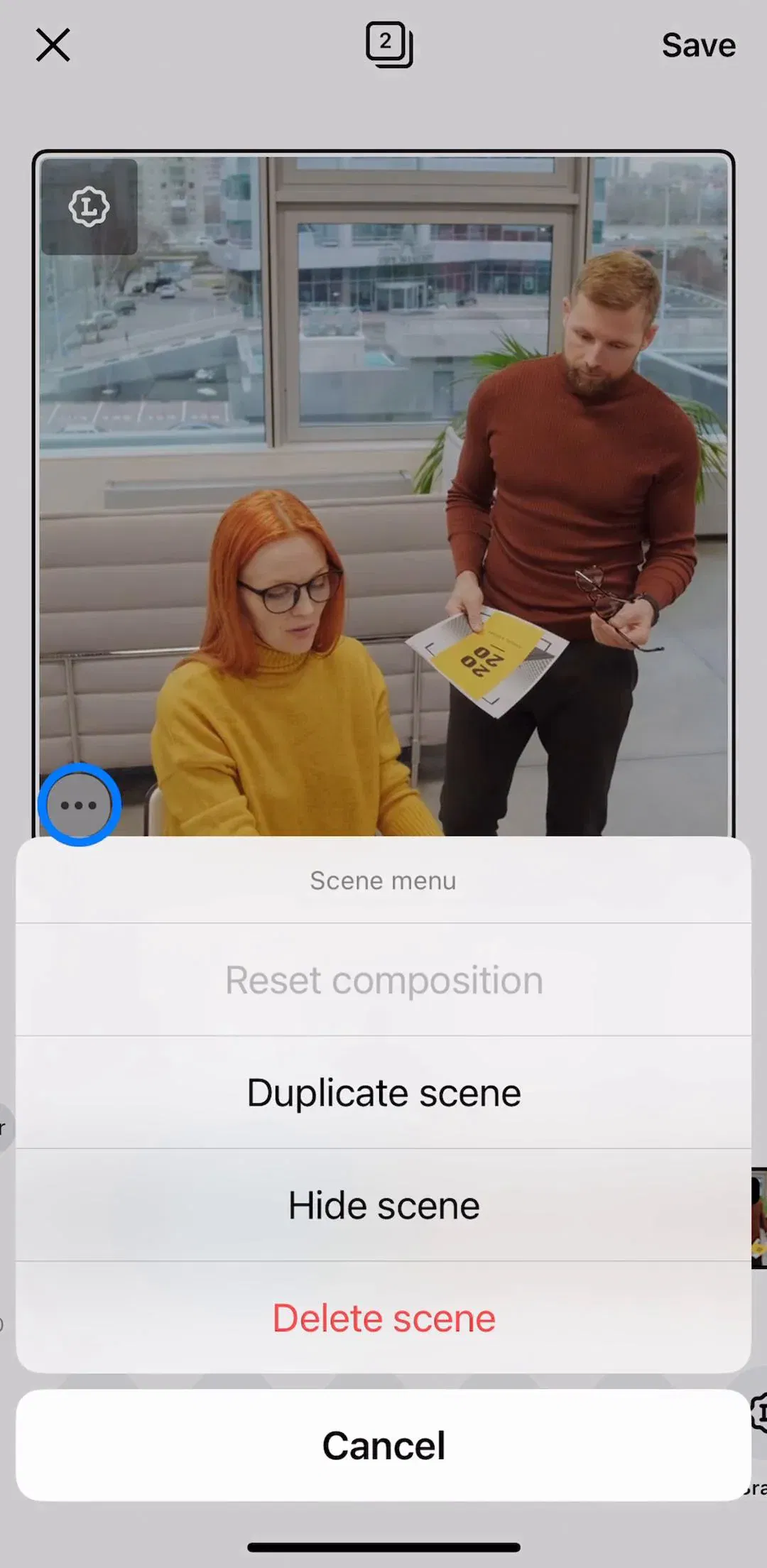
In this library the player is more often part of a workbench than a destination. A video editor puts a preview at the top and a timeline underneath, and the preview is a player with a specific job: showing the effect of the edit currently being made.
That changes the priorities. Frame accuracy matters more than smooth scrubbing, the play control is used in short bursts rather than for sustained watching, and the controls cannot auto-hide, because the user is switching between the preview and the timeline constantly.
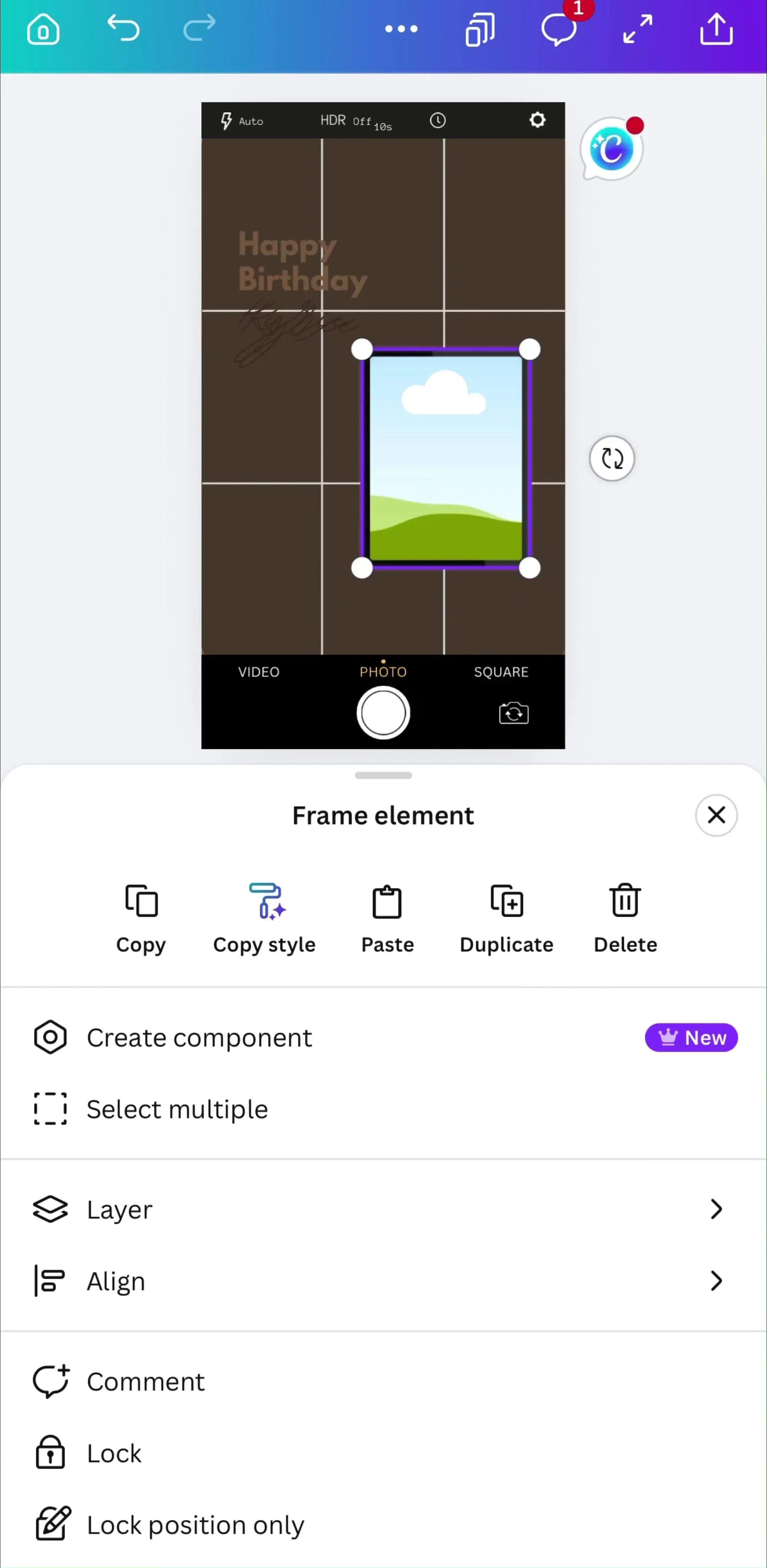
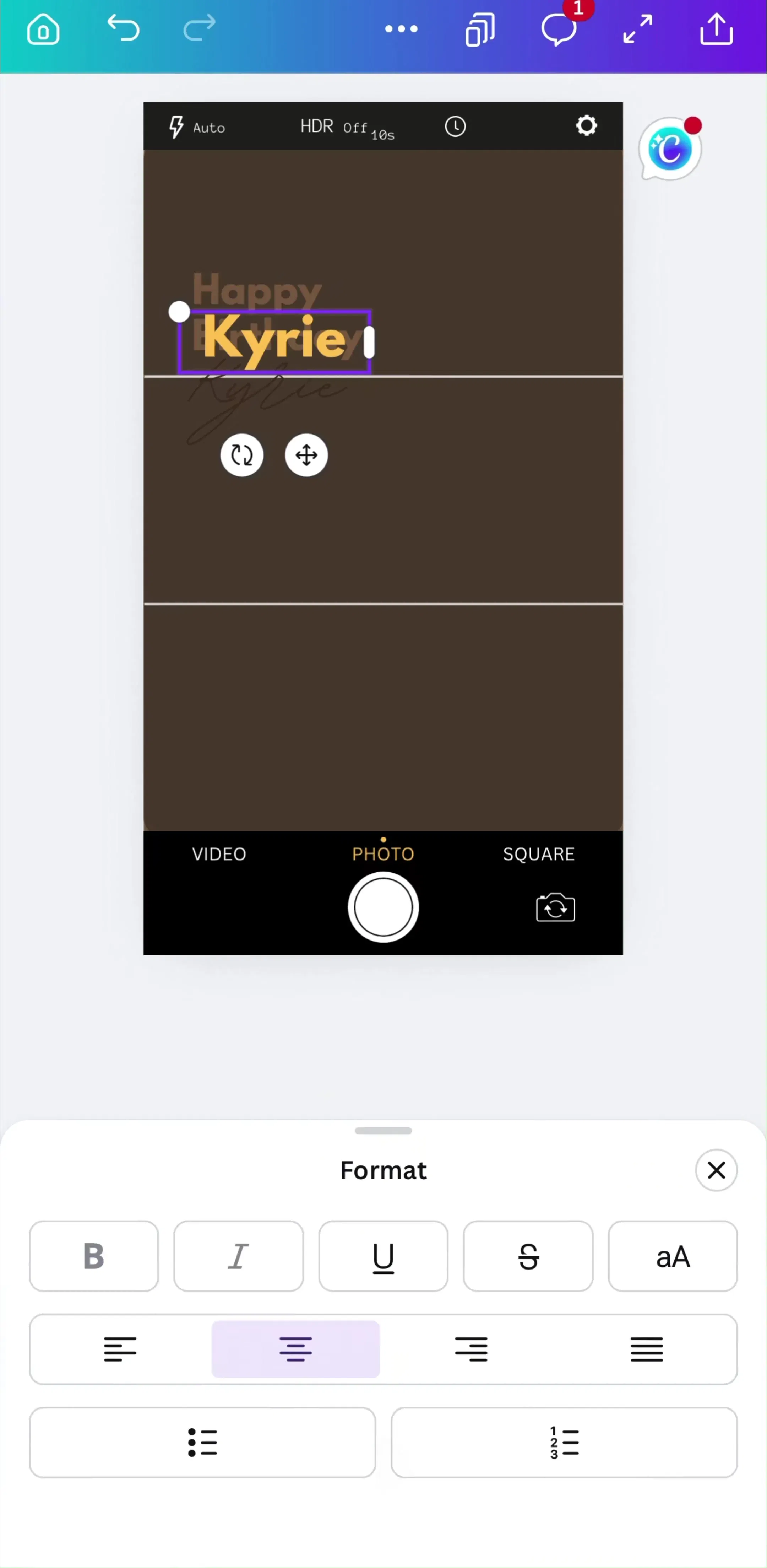
Canva (est. $33M/mo) is the largest creation tool in the library by estimated revenue and a reasonable place to see how a general-purpose editor divides a phone screen between a preview and the controls acting on it.
InShot (est. $1M/mo) comes at the same problem from a video-first direction, which makes it a useful contrast for how much of the screen a dedicated editor is willing to give the frame.
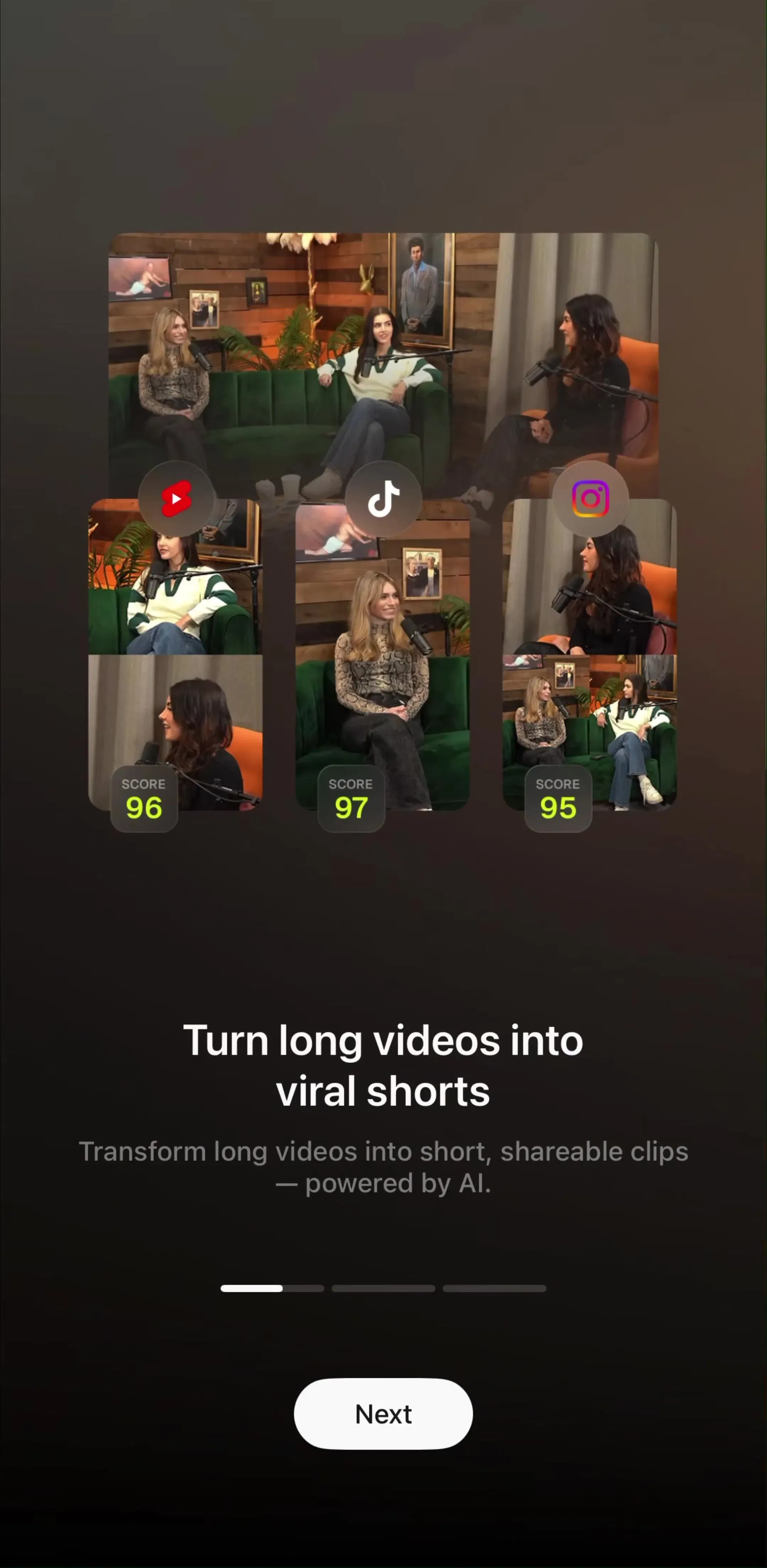
AI video tools have created a player context that barely existed five years ago: the result screen. The user waited, something rendered, and now they are watching a short clip they have not seen before, deciding whether to keep it.
The controls that matter here are not playback controls. They are keep, regenerate, edit and export, and the player is mostly a viewport with a loop. Apps that ship a full playback chrome on a six-second generated clip have added a scrub bar to something nobody scrubs.
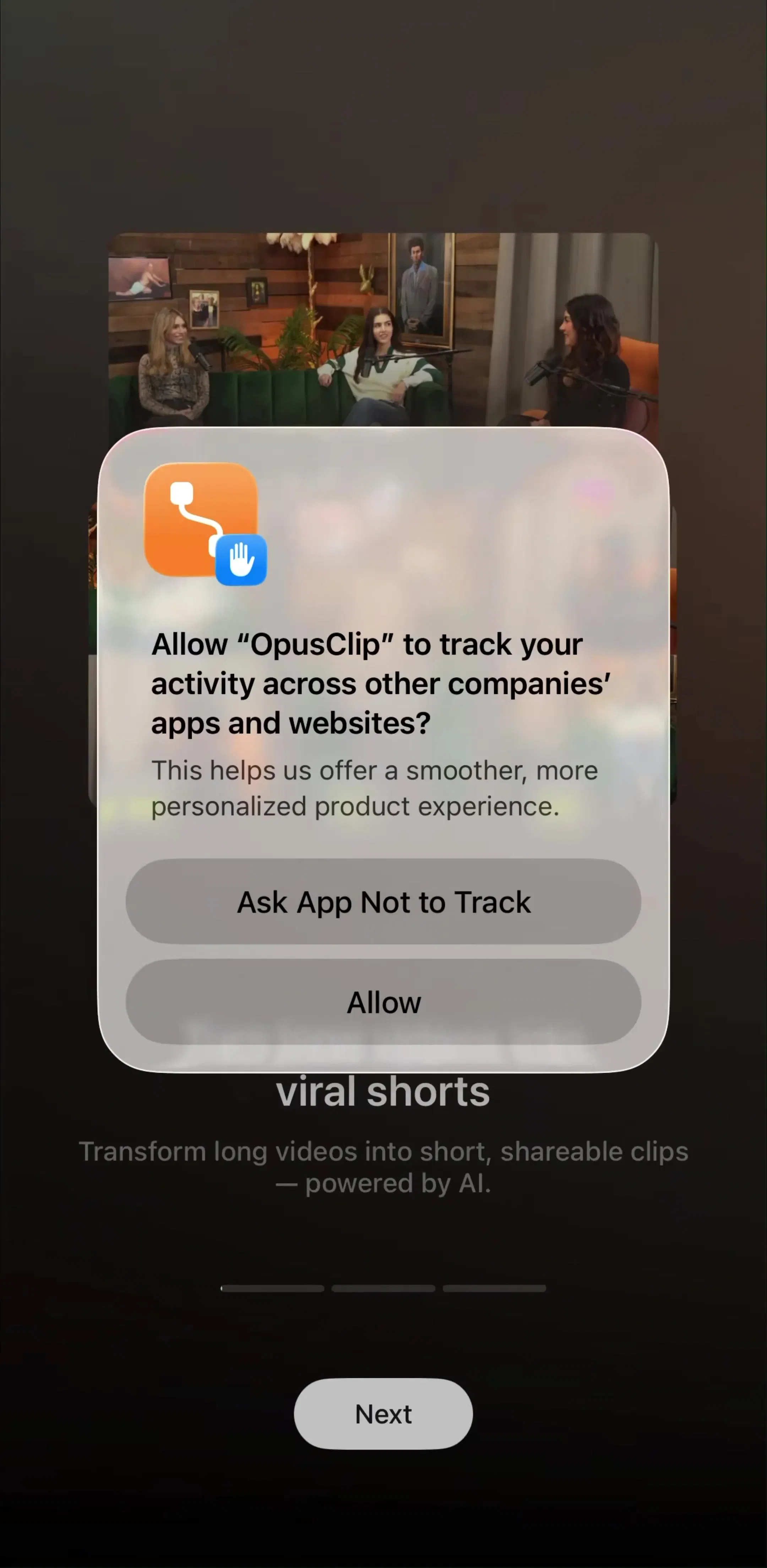
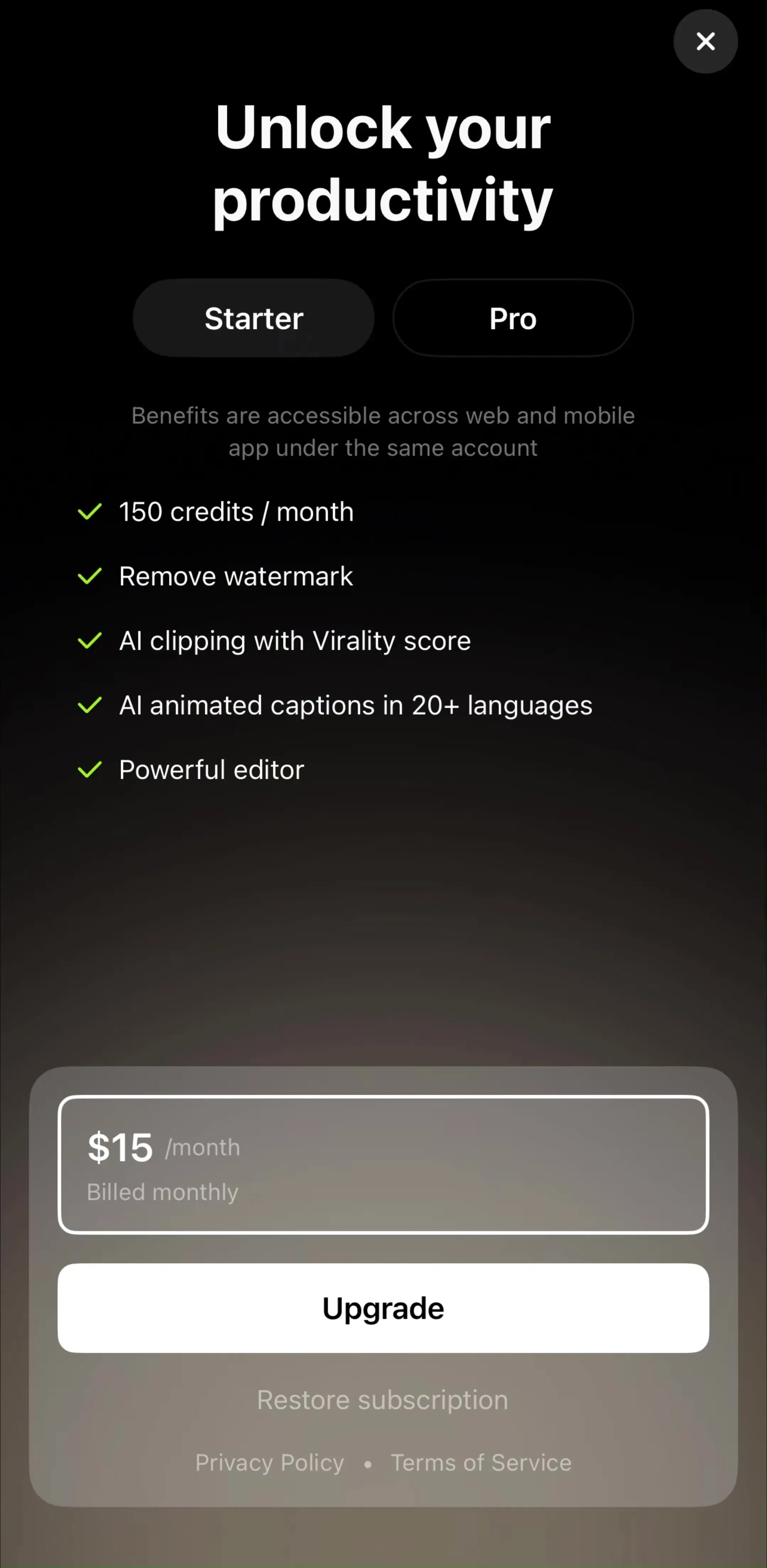
OpusClip (est. $350K/mo) sits squarely in this shape, since the product’s output is short clips a user reviews and then keeps or discards.
Vimeo (est. $200K/mo) is worth adding as the case where playback and library management sit in the same product, which is a different balance again from a pure generator.
Full-screen vertical feeds have no visible control bar. There is no scrub, often no explicit pause, and no timeline. This is not an oversight, it is a decision that the interaction is swipe to the next thing rather than navigate within this thing, and it works because the content is short enough that navigating within it has no value.
The mistake is copying the aesthetic into apps where content is longer. Strip the scrub bar off a ten-minute video and the user has lost the ability to skip back thirty seconds, which is the single most valuable thing a player can offer. Borrow the full-bleed frame and the edge-anchored actions from short-form feeds; keep the timeline.
The audio equivalent of this whole discussion is the now-playing screen, which solves the same problem without the constraint that controls cover the content, and we broke it down in the music app UI study.
Five recurring failures. A scrub bar whose touch target is as thin as the drawn line. Controls that hide while paused. Playback position lost on rotation into fullscreen. A volume slider taking frame space that the hardware buttons already handle. And controls drawn without a scrim, so they vanish on any bright frame.
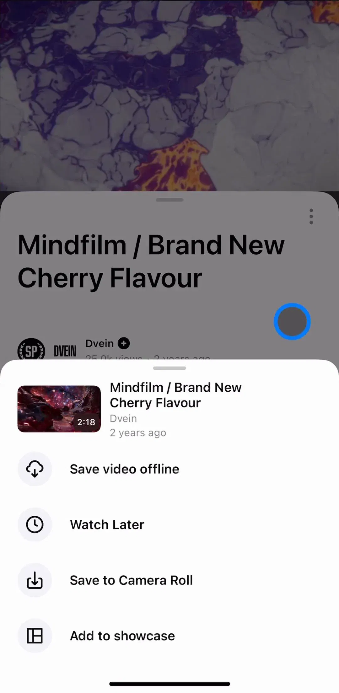
A sixth is structural: settings, captions, speed and quality laid out across the control bar instead of behind one overflow icon. Everything that is not play, scrub and fullscreen is used rarely enough to hide, and hiding it buys back the frame.
Test your player one-handed, on the largest device you support, while walking. That is the real usage condition and it kills thin scrub bars, small skip buttons and low-contrast controls faster than any review. Then rotate into fullscreen mid-playback and check the position and play state survive it.
After that, compare against shipping apps rather than concept shots and Figma kits. Every screen in the library sits next to the app’s estimated revenue and downloads, so references can be picked by outcome rather than by how the shot looks. Capture and playback are two halves of the same product in most video apps, and we covered the other half in the camera app UI breakdown.
A note on the numbers: revenue figures cited here are third-party monthly estimates from our library, useful for comparing magnitude, not audited financials.
Less than a desktop one. A play and pause control, a scrub bar with elapsed and remaining time, and a fullscreen toggle cover most playback. Volume usually belongs to the hardware buttons rather than an on-screen slider, and captions, speed and quality belong behind a single overflow control rather than on the main bar. Every control on the frame is covering the content the user opened the app to watch.
Yes, on a fixed delay of roughly three seconds, and they should reappear on a tap anywhere on the frame rather than only on a small target. The one exception is a paused player, where controls should stay up, because a user who paused is deciding what to do next and hiding the controls forces an extra tap to get them back.
The drawn bar can be a few points tall, but the touch target has to be at least 44 points, which means an invisible hit area extending well above and below the line. Scrubbing is the hardest interaction on a player because it is a precise drag on a moving surface, and a thin literal target is the reason so many players feel imprecise on a phone.
It is a deliberate rejection of one. Full-screen vertical feeds strip the scrub bar, the timeline and often the pause control, because the interaction model is swipe to move on rather than navigate within. Copying that model into an app where people watch longer content removes the one control they need, which is the ability to skip back thirty seconds.
The mobileappdesign library holds captured flows from 2,622 revenue-verified iOS apps, including 334 in Photo and Video, 316 of which carry a create or edit flow where a preview player sits above the editing surface. Screens are captured in sequence, so you can see the player in the state the app actually shipped it in rather than as an isolated marketing shot.
Browse captured create-content flows from revenue-verified apps, in the order a real user walks them.
Browse creation screens