Most button UI design advice is written for a wide canvas: hierarchy across a row of actions, hover states, sizes from extra small to large, a palette of filled, outlined and ghost variants. Open almost any top-grossing iOS app and the screen looks nothing like that. There is one button, it is nearly the width of the display, it sits near the bottom inside the thumb arc, and it is the only filled thing in view. Our library holds 2,622 revenue-verified iOS apps, 2,512 with an onboarding flow and 1,834 with a paywall, and across those the same shape shows up again and again. This is why it wins on a phone, and the decisions that go with it.
A phone is held in one hand and operated with one thumb, and the thumb sweeps a comfortable arc across the lower half of the screen. A control that spans the width of that arc requires no aiming at all. That is the entire argument, and it is why the pattern survived across device sizes while most visual trends did not.
The second reason is hierarchy by elimination. A full-width filled button is unmistakably the primary action, so the screen does not have to communicate priority through colour weight or size relationships that people have to compare. There is one obvious thing, and everything else is text.
Where the shape gets misapplied is on screens that genuinely have several equal actions, such as a settings screen or a content detail view. Making four things full width does not create four primaries, it creates a stack of identical bars with no hierarchy at all.
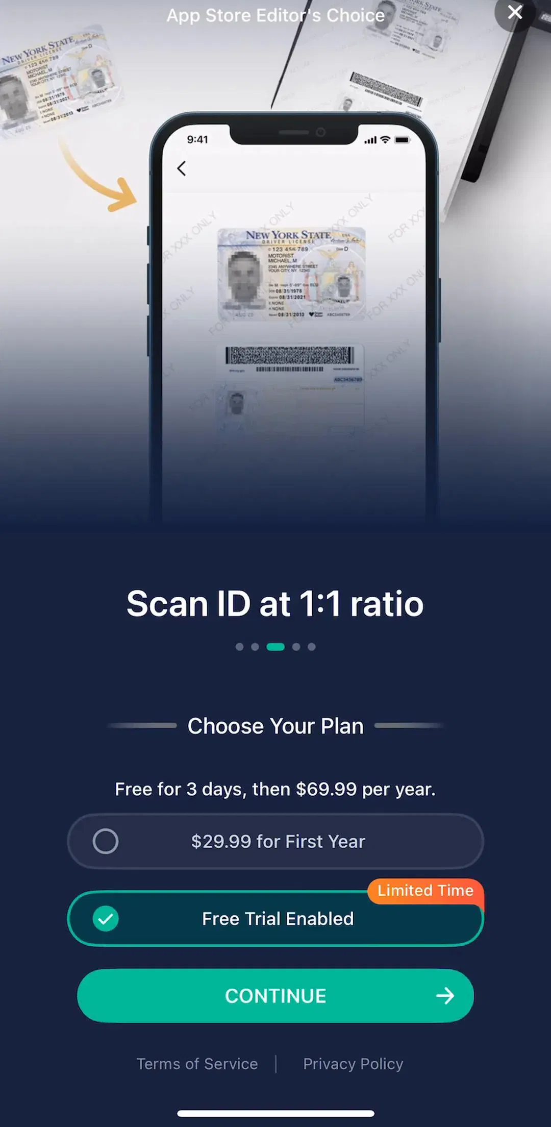
Primary styling is a claim: this is what to do next. Two filled buttons on a screen make the claim twice, which returns the decision to the user at exactly the moment the design was supposed to remove it. The most common place this happens is a paywall with a monthly and an annual option both drawn as filled buttons.
The fix is to demote. If one action matters more, make it primary and drop the other to a text button or a plain row. If they are genuinely equal, make both secondary and let the screen say so honestly. The paywall version of this problem, where the plan choice and the purchase action get confused with each other, is worked through in the paywall design breakdown.
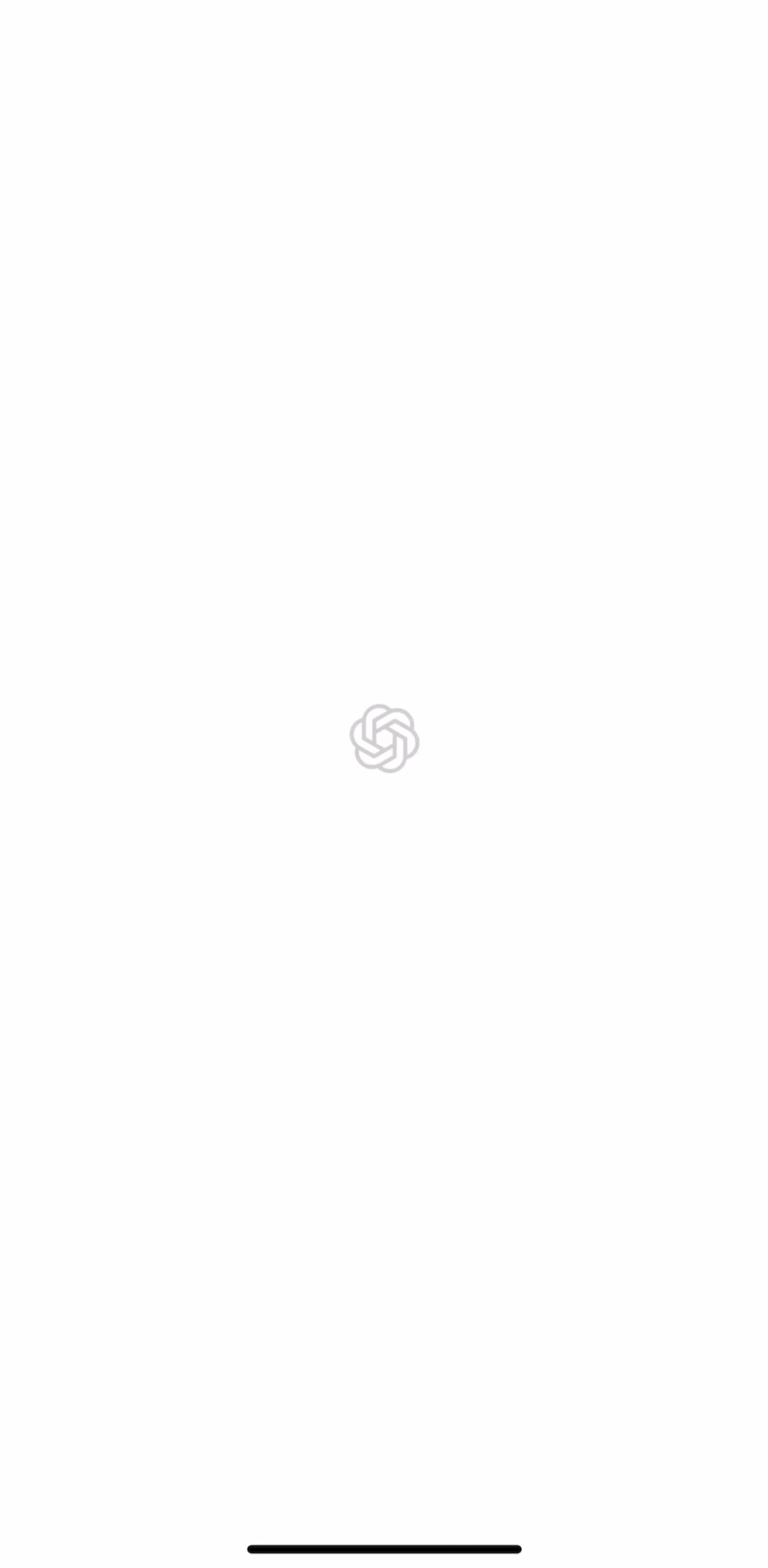
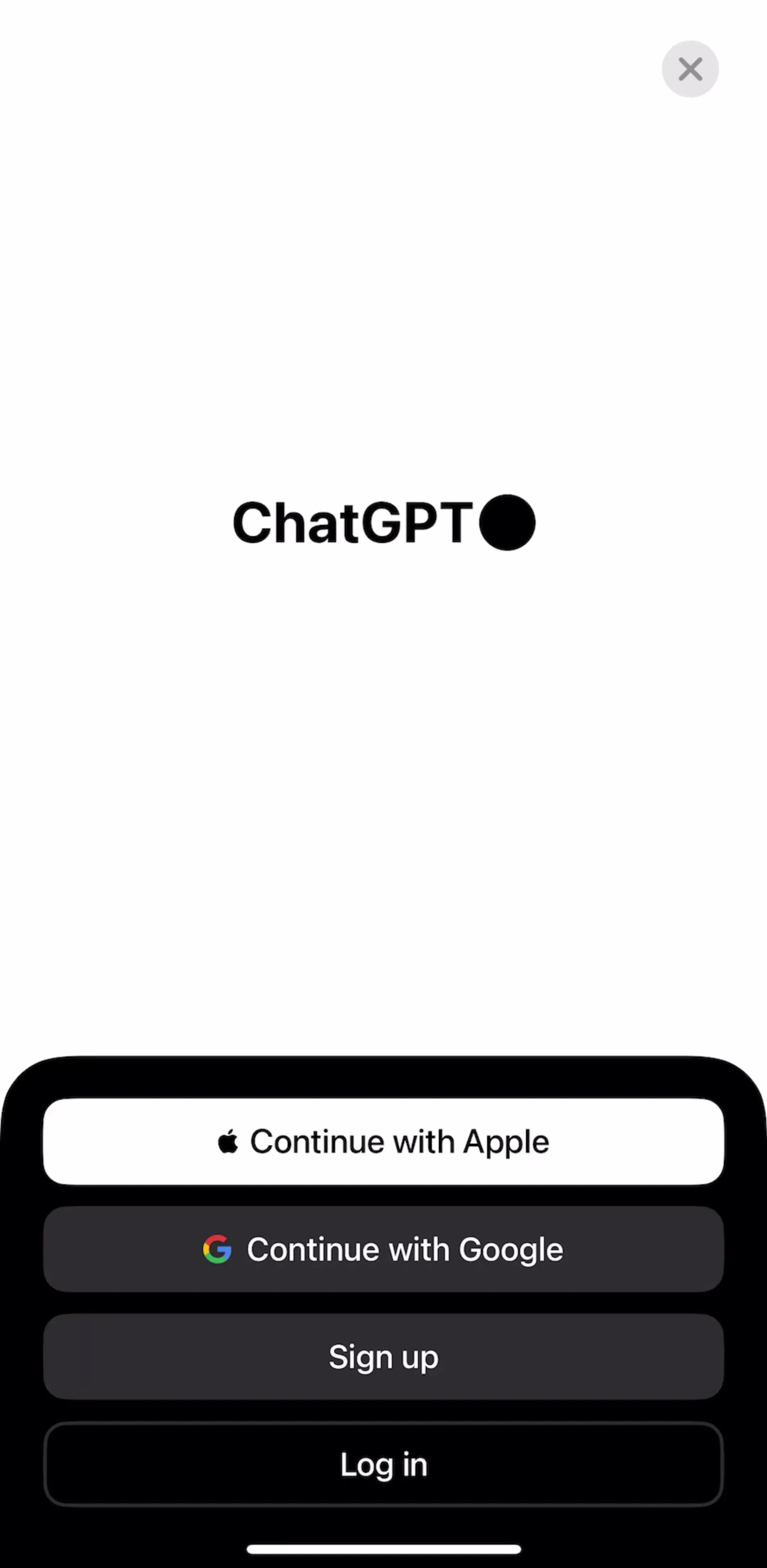
ChatGPT (est. $267M/mo) is the largest app in the library by estimated revenue and worth looking at for how little it puts on screen at the moments where it needs one decision.
On any screen taller than the viewport, the primary button gets pinned to the bottom rather than left at the end of the content. A user who has to scroll to find the way forward will sometimes not scroll, and the button that was below the fold might as well not exist.
Pinning has a price. The bar permanently covers a strip of content, so the scroll container needs bottom padding equal to the bar height or the last item hides under it forever. It also needs a background: a floating button over scrolling content becomes unreadable the moment something light passes beneath it, so it wants either a solid bar or a gradient scrim.
On long quiz-style onboarding this bar is effectively the whole navigation, which makes it the single most-tapped element in the product. The onboarding sequences it drives are covered in the onboarding examples piece.
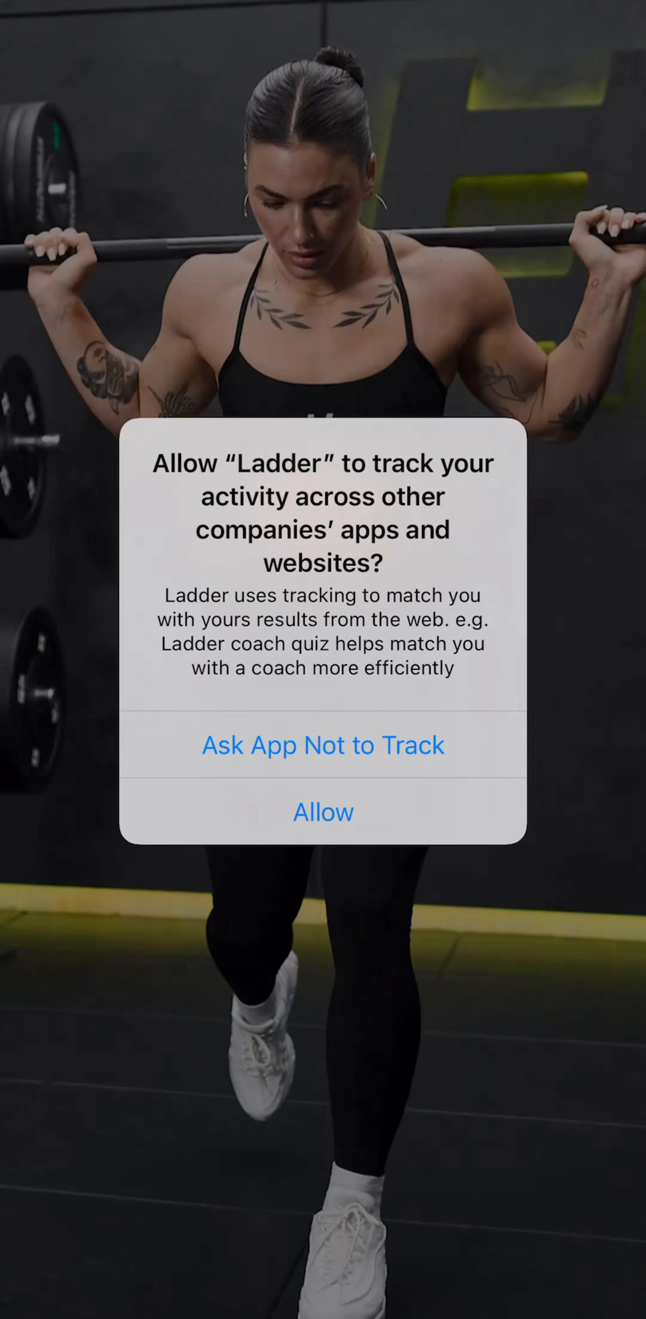
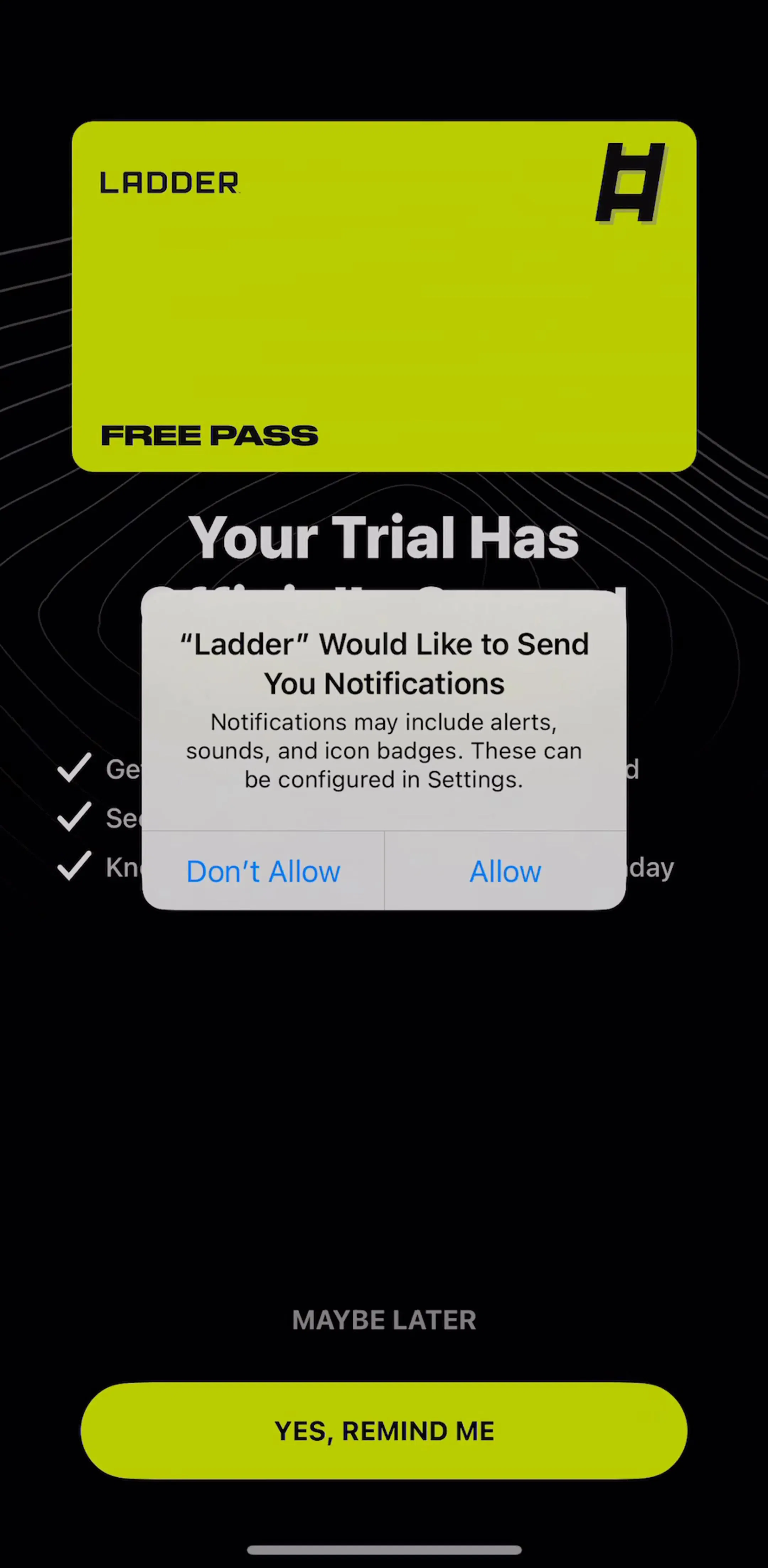
LADDER (est. $6M/mo) runs a long onboarding of exactly this shape, where a single bottom control advances a sequence of questions.
Apple publishes 44 by 44 points as the minimum touch target, and the number applies to the hit area rather than the artwork. This distinction is where most tap failures come from: an icon button drawn at 24 points and given a 24-point target is a control that misses about as often as it hits, and no amount of visual polish rescues it.
Three places this shows up repeatedly. The close X on a paywall, which is often deliberately small and ends up feeling hostile rather than persuasive. Text buttons such as Skip and Restore purchases, which get a target the exact size of their glyphs. And icon rows in a toolbar, where buttons are packed tightly enough that adjacent targets overlap. Keep at least 8 points of dead space between adjacent targets so a near miss does nothing rather than the wrong thing.
People read the button before they read the screen. A label that only makes sense in the context of the heading above it is doing none of the work, which is why OK and Submit are weak: they describe the mechanism instead of the outcome. Continue, Start free trial, Save note and Send all survive the rest of the screen being covered.
Two more rules hold in practice. Keep labels to one or two words, because a label that wraps to two lines in English will break in every other language you ship. And match the label to what actually happens next: a button reading Start free trial that opens a plan picker has told the user something untrue, and that is where trust in a paywall is usually lost.
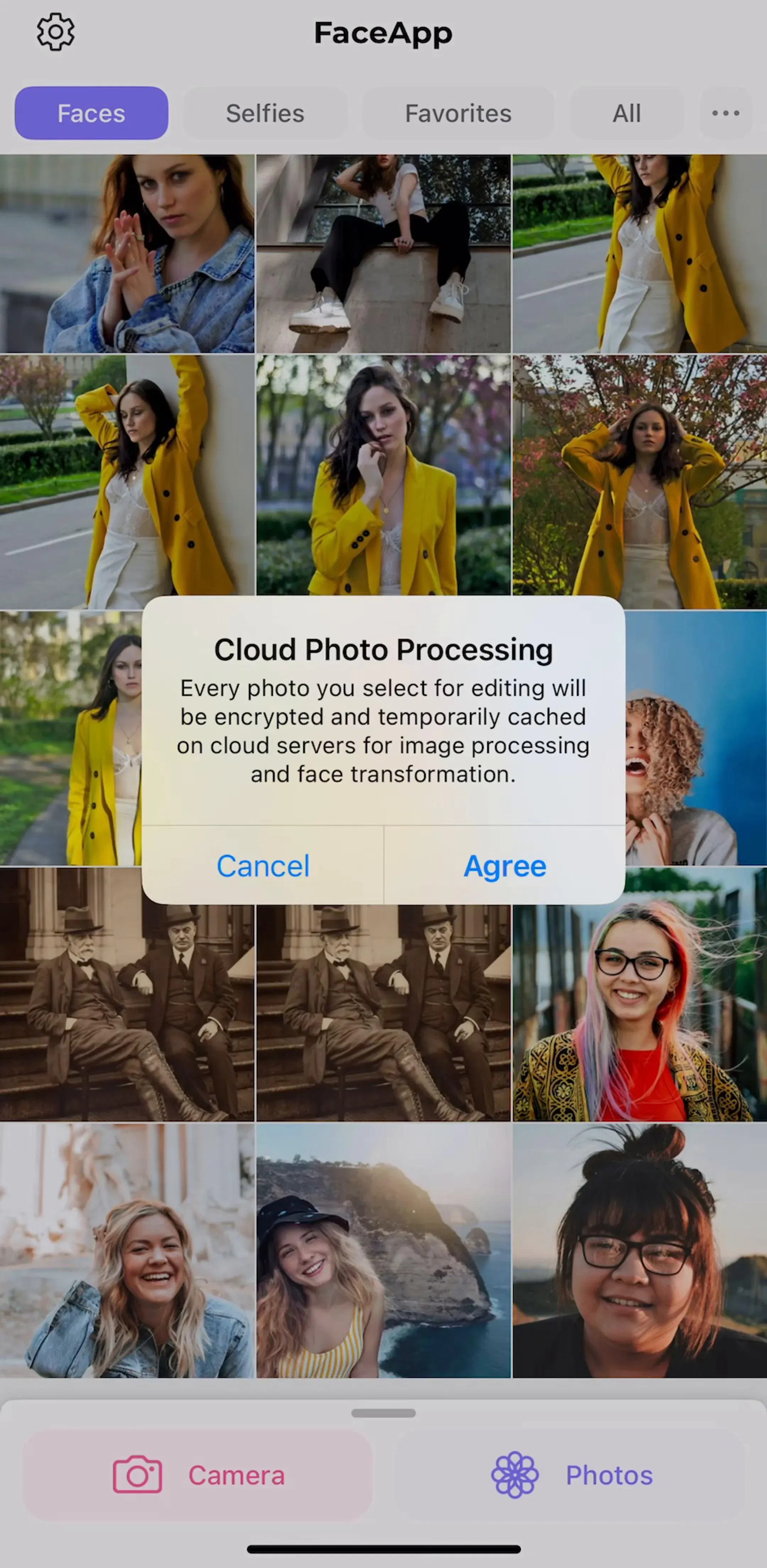
FaceApp (est. $14M/mo) runs a compressed onboarding into subscription, which makes it a useful place to see how few words a high-revenue app is willing to put on its main control.
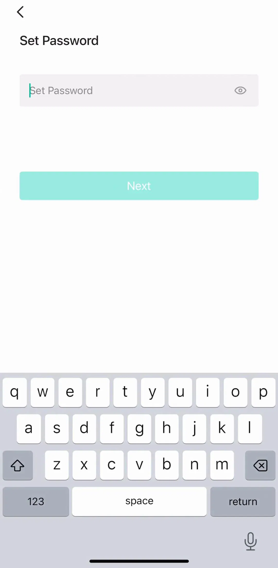
A disabled button is a dead end that explains nothing. The user taps, nothing happens, and they are left to work out which of six fields is at fault. Keeping the button enabled and surfacing the error on the offending field converts a mystery into an instruction.
There is one honest use of disabled, which is a state where tapping is genuinely meaningless, such as a purchase button before the store has returned prices. Even then, loading is the better representation, because it says wait rather than no.
Loading state has its own rule: the button must keep its size. Replacing a full-width button with a small spinner collapses the layout, shifts everything below it, and gives the user a moving target if they tap again. Put the spinner inside the button and leave the frame where it was.
CamScanner (est. $7M/mo) is a high-volume utility where the same primary control has to carry both a processing state and a purchase decision.
Delete account, clear history and cancel subscription are the only buttons in most apps that should be red, and red should be reserved for them so it keeps meaning something. They also need physical distance from whatever sits above them, because a destructive control adjacent to a routine one is a mis-tap waiting to happen.
The confirmation should name the consequence rather than ask a generic question. Are you sure, with OK and Cancel, is a worse dialog than Delete all 340 scans, with Delete and Keep. Repeating the verb on the confirming control also removes the classic failure where the user cannot remember which of two buttons was the dangerous one. This is a natural fit for a bottom sheet or an action sheet rather than a full screen, and the differences between those containers are in the bottom sheet UI piece.
Five recurring failures. Two filled buttons competing on the same screen. A primary action below the fold on a scrolling screen. Touch targets that match the artwork instead of meeting 44 points. Disabled buttons standing in for an explanation of what is wrong. And a loading state that shrinks the button and shifts the layout under the user’s thumb.
A sixth is contrast in dark mode. Buttons are usually specified against a light background and then inherited into a dark theme, where a mid-tone fill that read as prominent becomes nearly the same value as the surface behind it. Elevation and contrast both behave differently once the background is dark, which is the subject of the dark mode UI study.
Audit one screen at a time and ask which single action it exists for. If you cannot answer, the screen has a structure problem that no button styling will fix. If you can, check that exactly one control is styled as the answer, that it sits in the thumb arc, and that its label would survive the rest of the screen being covered.
Then compare against shipping apps rather than component libraries and CSS galleries. Every screen in the library sits next to the app’s estimated revenue and downloads, so references can be chosen by outcome rather than by how the shot looks. The screens where the primary button carries the most weight are collected under subscription paywall.
A note on the numbers: revenue figures cited here are third-party monthly estimates from our library, useful for comparing magnitude, not audited financials.
Because on a phone there is usually only one thing to do next, and width is the cheapest way to say so. A full-width button pinned near the bottom is inside the thumb arc on every device size, needs no aiming, and removes the question of which control is the primary one. On a wide screen a button is sized to its label because several actions share the row. On a phone that constraint mostly does not exist.
At least 44 by 44 points of touch target, which is Apple's published minimum, and in practice a primary button runs closer to 50 points tall so the label has room. The number that matters is the target, not the drawn shape: a small icon button can keep its visual size while carrying an invisible hit area that meets the minimum. Most tap failures come from targets that match the artwork exactly.
One. Primary styling is a claim about what to do next, and two filled buttons on the same screen make that claim twice, which leaves the user deciding rather than acting. If a screen genuinely has two equal actions, both should be secondary. If one matters more, make it primary and demote the other to a text button.
The action, in the user's words, in one or two words. Continue, Start free trial, Save, Send. Avoid OK and Submit, which describe the form rather than the outcome, and avoid labels that only make sense next to the heading, because people read the button first. A label that would still be understood with the rest of the screen covered is a good label.
Usually not. A disabled button explains nothing, so a user who cannot proceed has to guess which field is wrong. Keep it enabled, let the tap happen, and put the error on the field that caused it. The exception is a state where tapping is genuinely meaningless, such as a purchase button before prices have loaded, and that state is better shown as loading than as disabled.
The mobileappdesign library holds captured flows from 2,622 revenue-verified iOS apps, including 2,512 with an onboarding flow and 1,834 with a subscription paywall flow, which are the two screens where the primary button carries the most weight. Screens are captured in sequence, so you can see the button in the flow it belongs to rather than as an isolated component shot.
Browse captured onboarding flows from revenue-verified apps, in the order a real user walks them.
Browse onboarding screens