The page indicator is the smallest component most apps ship and one of the few that carries a genuine promise: there are this many screens, and you are here. Component documentation describes the anatomy well enough. What it does not tell you is how the dots behave once a real product puts eleven questions behind them, or what happens when the same row of dots is asked to sit under an onboarding flow the user cannot reverse. Our library holds 2,622 revenue-verified iOS apps and 2,512 of them carry an onboarding flow, which makes this the most observable small component we have.
A page indicator does one thing that nothing else on the screen does: it states the size of the set. Everything else about the pattern follows from that. The moment a user cannot tell at a glance whether there are six dots or eight, the component has stopped reporting a quantity and started acting as decoration under the content.
Practically this puts the ceiling at around five. Four or five dots are read as a number. Nine are read as a smear. This is not a stylistic preference, it is the limit of what people count without deliberately counting, and it is the reason so many long onboarding flows quietly abandon dots in favour of a bar.
There are only three serious options and they say different things.
Dots say: this is a small set you can move around in. They suit a browsable carousel where forward and back are equally valid, such as a photo gallery or a three-slide value pitch.
A filling progress bar says: this is a linear task with an end. It suits a questionnaire, a setup wizard, or any flow where the user wants to know how much is left rather than where they are. Most modern onboarding is this, not a carousel, and the control should match.
A numeric counter such as 4 of 12 says: this set is too big to draw. It is the correct fallback for galleries and long sequences, and it is under-used because it looks less designed than a row of dots. It is also the only one of the three that stays accurate at any length.
Picking the wrong one is a small lie. A row of five dots under a flow that actually runs fourteen screens promises a short trip and delivers a long one, and the user finds out at screen six.
The classic instance is the three or four slide intro shown before sign-in: a headline, an illustration, a Next button, and the dots underneath. It is the one carousel almost every app has shipped at some point, which makes photo and utility apps a useful place to compare treatments side by side.
Facetune (est. $11M/mo) is worth studying here because the intro sequence has to explain a visual product to someone who has not opened it yet, which is exactly the case where a user wants to know how many slides stand between them and the app.
CamScanner (est. $7M/mo) makes a useful contrast, since a utility with a concrete job has a shorter story to tell and a correspondingly shorter sequence.
We took apart the wider question of what those slides should contain, and how many of them earn their place, in the app onboarding breakdown.
The most common defect in a shipped page indicator is an active dot that is only slightly brighter than the inactive ones. At 8 points across, on a busy illustration, at arm’s length, a 20 percent opacity difference disappears.
The treatments that survive real screens use two signals at once: fill plus size, or fill plus shape. The stretched pill, where the active dot elongates and the rest stay circular, works because the difference is structural rather than tonal. Anything that relies on colour alone also fails the contrast case, which matters because these dots frequently sit on photography.
The same trap appears in the dark theme. A row of white dots at 30 and 100 percent opacity reads clearly on a dark background and turns to mush on a light photo, and most apps ship one set of values for both. We covered how shipping apps handle that split in the dark mode UI study.
Apple’s page control can respond to taps, and plenty of design systems draw the dots as interactive. In practice a 7 point target is not a button. Users who try to jump to the last dot and land one short conclude the control is broken, which is worse than it being inert.
If you do make them tappable, expand the invisible hit area well past the drawn dot, keep the swipe gesture as the primary route, and never let tapping be the only way to skip ahead. When the set is genuinely large enough that jumping matters, a thumbnail strip or a counter with arrows is the honest control and the dots should be replaced rather than upgraded.
Dots conventionally sit below the paged content and above the primary action. The mistakes are predictable. Placing them directly above a full-width Next button crowds two competing signals into the same band. Placing them at the very bottom of the screen puts them into the home indicator’s territory on modern iPhones, where they are both cramped and occasionally intercepted by the system gesture. Floating them on top of edge-to-edge imagery without a scrim leaves them illegible on whichever photo happens to be pale.
The second common home for the pattern is the horizontally scrolling card rail on a home or browse surface. Here the count is usually unknown at design time, driven by however many items the backend returns, which is precisely the case where a fixed row of dots cannot work.
The convention that holds up is to show a partial next card at the right edge so the rail reveals its own scrollability, and to drop the indicator entirely. A dot row that renders fourteen dots for fourteen promoted items is noise.
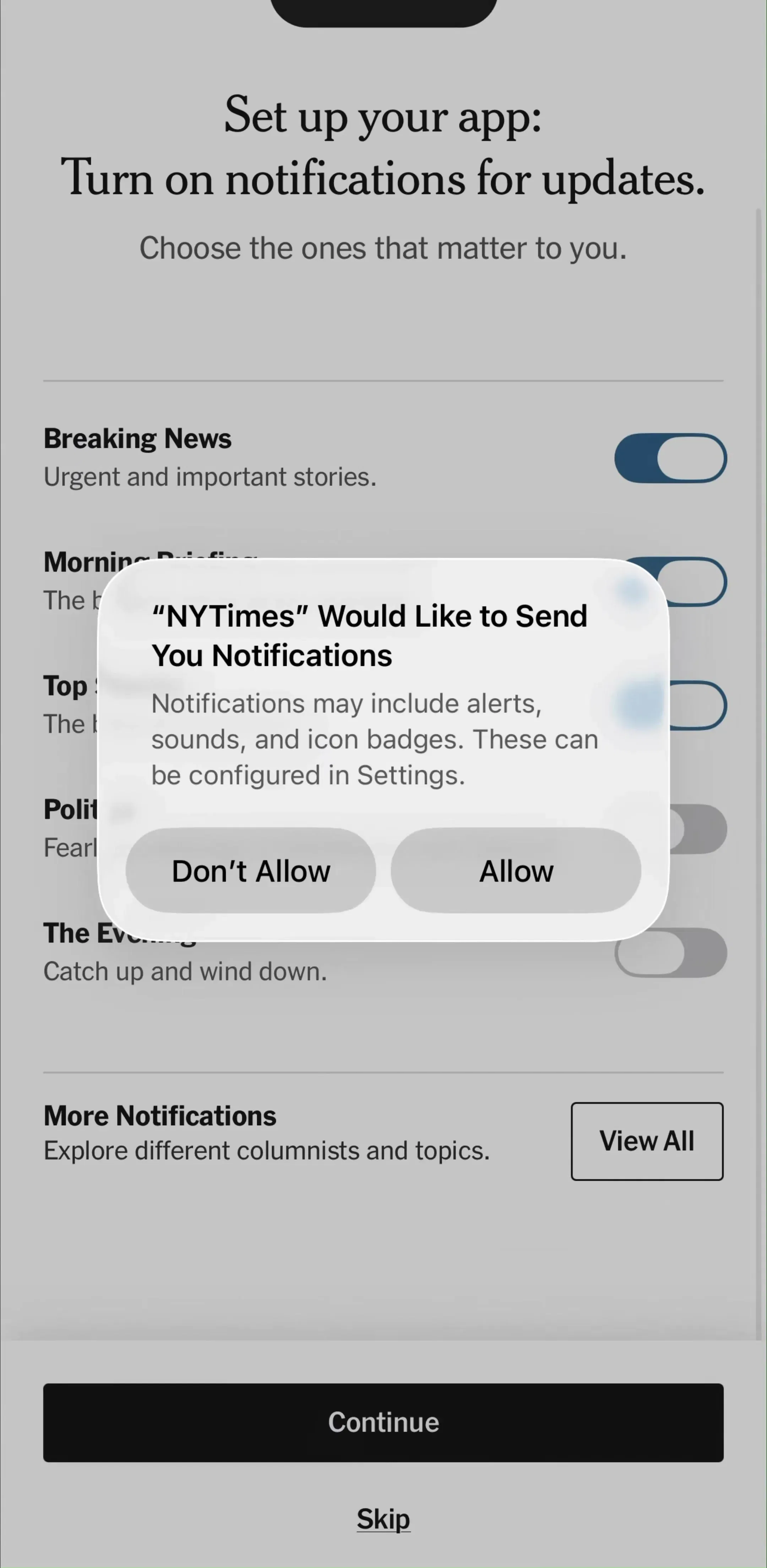
NYTimes (est. $6M/mo) is a reasonable reference for the general problem of paging a reader through a set they did not choose the size of.
Four recurring failures. Dots that stay static while the content pages, which happens when the indicator is bound to a tab index that the swipe gesture never updates. Dots that outnumber what anyone can count, usually eight or more. An active state carried by opacity alone. And a dot row shown under a view that does not page at all, which teaches the user to swipe on something that will not move.
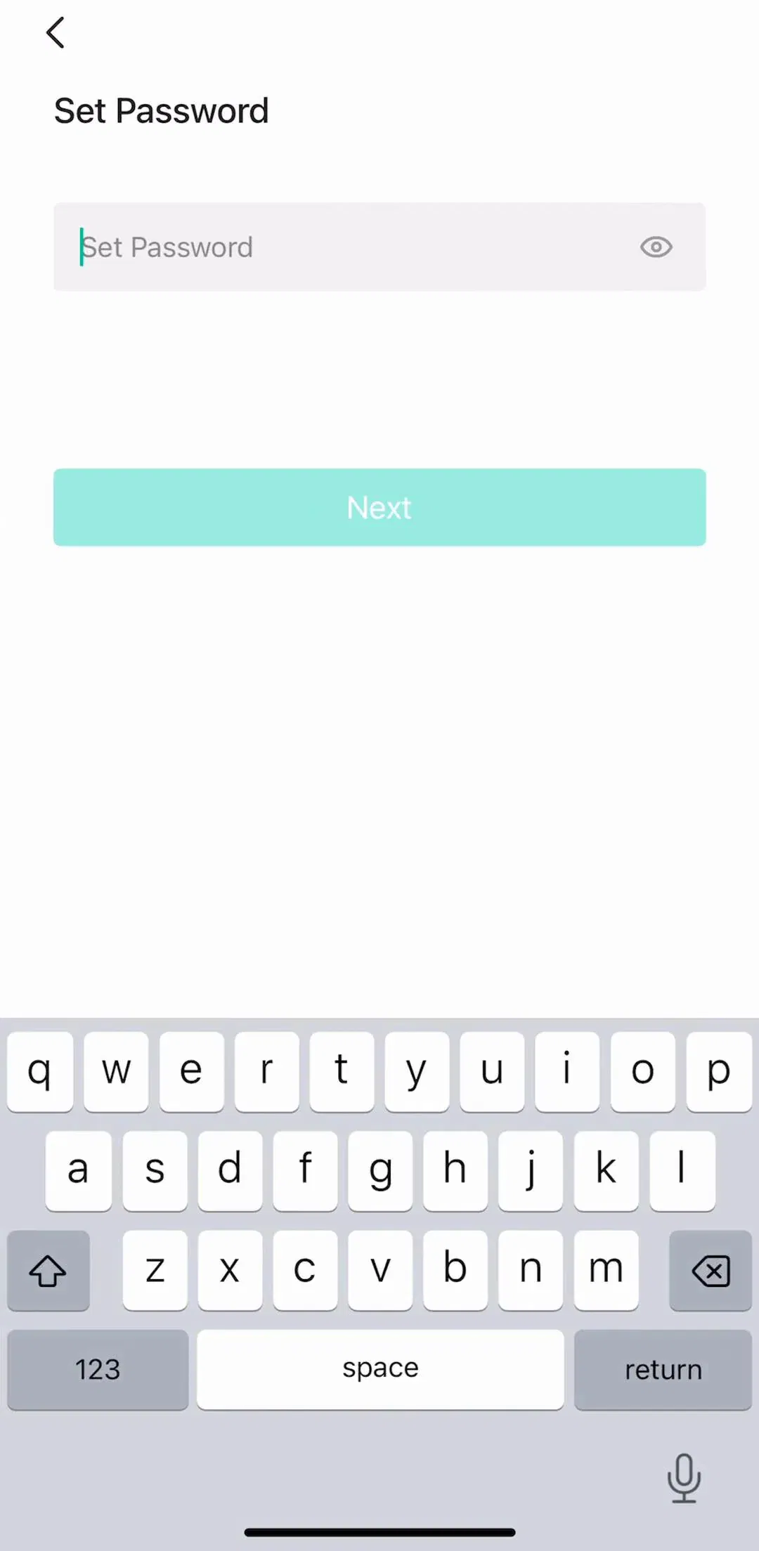
A fifth, subtler one: dots that persist after the sequence has become a form. Once the user is answering questions rather than reading slides, they are measuring effort, not position, and the control should have changed with the content.
Open your own onboarding on a device rather than in a canvas and count the screens. If the number is above five, your dots are already the wrong control and the fix is a bar or a counter, not smaller dots. Then check the active state at arm’s length against your palest background image, and check the indicator still advances when you swipe rather than tap Next, which is the bug that ships most often.
After that, compare against shipping apps rather than concept shots. Every screen in the library sits next to the app’s estimated revenue and downloads, so you can pick references by outcome rather than by how the shot looks, and Picsart (est. $5M/mo) is worth adding to the set as a long sequence that has to keep a user oriented across many steps. The first screen before any of this is the launch screen, which we covered in the splash screen breakdown.
A note on the numbers: revenue figures cited here are third-party monthly estimates from our library, useful for comparing magnitude, not audited financials.
A small row of dots, or a numeric counter, that tells the user how many screens sit in a horizontally paged view and which one they are on. Apple calls the component a page control. It appears most often under an onboarding carousel, under an image gallery on a detail screen, and under a horizontally scrolling card rail. Its job is to convert a hidden sequence into a visible one.
Five or fewer is comfortable. Past that the dots stop being countable at a glance and the user reads them as texture rather than as a quantity, which defeats the point. Above roughly six pages the honest options are a numeric counter such as 3 of 12, a fill-style progress bar, or a shrinking window of dots where the outermost ones scale down to hint at more. Adding a tenth dot does not add information.
Treat tapping as a bonus, never as the route. A standard dot is around 7 to 8 points wide, well under any sensible touch target, so users who try to tap dot four and land on dot three learn to stop trying. If you make them interactive, expand the hit area behind them and keep swipe fully functional. The one case where tapping matters is a gallery with many images, and there a thumbnail strip serves better than dots.
Dots suit a browsable carousel the user can move through in either direction. A filling progress bar suits a linear flow with a defined end, which is what most onboarding questionnaires actually are. If the user cannot go back, or if the sequence is long enough that they want to know how much is left, the bar is the more honest control because it communicates remaining effort rather than position.
The mobileappdesign library holds captured flows from 2,622 revenue-verified iOS apps, and 2,512 of them carry an onboarding flow, which is where most page indicators live. Screens are captured in sequence, so you can see the indicator advance across a real carousel rather than judge it from a single isolated shot.
Browse captured onboarding sequences from revenue-verified iOS apps, in the order a real user walks them.
Browse onboarding screens