The splash screen is the least glamorous screen in your app and one of the easiest to get wrong. Hold it too long and you have added a loading tax to every launch; skip the thought entirely and the first paint feels broken. We went through the opening screens of thousands of revenue-verified iOS apps in the onboarding gallery and pulled out how the best-earning apps handle launch, first paint, and the loading beats that come right after.
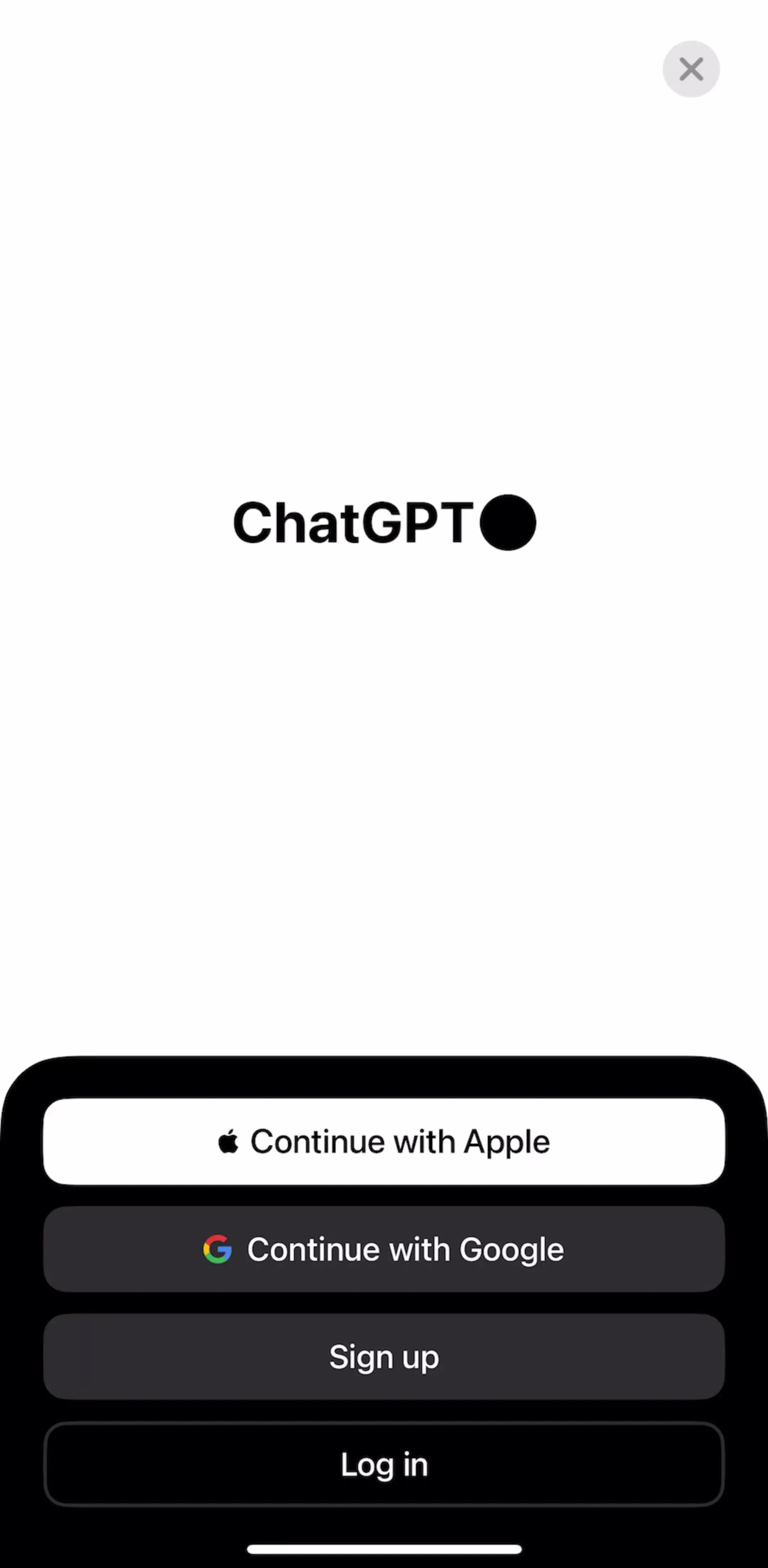
The real splash screen, the iOS launch screen, is not a design opportunity; it is a promise that the app opened. Top grossers keep it to the logo or brand mark on the app’s base color and let it vanish the instant the first view renders. ChatGPT (est. $267M/mo) opens straight into its interface with almost no ceremony. The rule that separates fast-feeling apps from sluggish ones is simple: never add a timer to a launch screen. If it lingers, it should be because real work is happening, and that work deserves an honest loading state, not a fake one.
A splash is your one guaranteed brand impression, so spend it on a single clean mark, not a crowded illustration. Duolingo (est. $48M/mo) leans on one instantly recognizable character and color, then moves immediately into the flow. The discipline is restraint: one logo, one color, no tagline paragraph. Everything you can see in the opening frames of the onboarding gallery points the same way, the strongest brands say who they are in a beat and spend the user’s attention on the next screen.
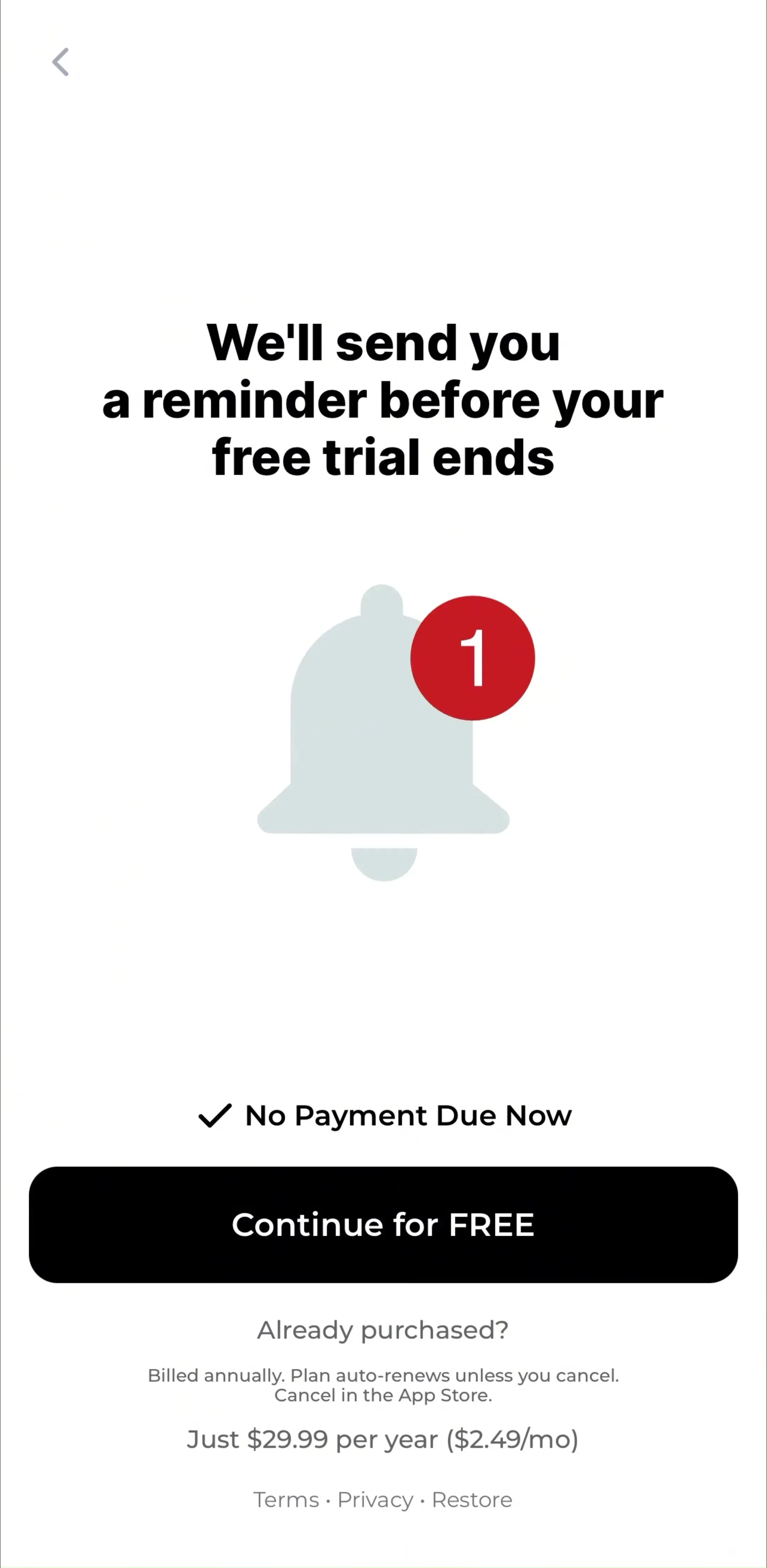
The interesting loading moment in modern apps is not launch, it is the wait after the onboarding quiz while a personalized plan is built. Cal AI(est. $1.75M/mo) and most health and fitness apps stage a “building your plan” screen with an animated checklist rather than a bare spinner. A determinate progress animation makes the same wait feel faster and turns dead time into anticipation. We broke this “plan-building moment” down in our onboarding patterns guide, and it is one of the highest-leverage loading screens in a subscription funnel.
The most common splash mistake is a hard visual jump: a dark logo screen that snaps into a bright white home. The best-feeling launches use the same background color and mark position on the launch screen as on the first view, so the transition reads as the interface arriving rather than a page swap. On iOS this means your launch storyboard should visually rhyme with your first onboarding or home screen, not fight it.
If your data is ready, show the app. Padding a splash with a two-second brand animation on every cold start is a tax users pay hundreds of times, and it is the single fastest way to make a fast app feel slow. Finch (est. $1M/mo) gets you to something playable quickly rather than holding a logo. Reserve motion and delay for moments where the app is genuinely working, and make that work visible.
Treat the splash and loading system as three distinct jobs: an instant launch frame, a transition that matches your first screen, and honest progress states for real waits. The fastest way to calibrate is to open apps in your category at the revenue level you want to reach and watch their first three seconds. Every opening flow in the library sits next to the app’s estimated revenue and downloads, so you are studying launches that ship at scale.
A note on the numbers: revenue figures cited here are third-party monthly estimates from our library, useful for comparing magnitude, not audited financials.
A splash screen is the first thing an app shows while it loads, usually the logo or brand mark on a solid background. On iOS it maps to the launch screen, which Apple requires and which should render instantly before any code runs. Good splash screens are quiet and fast; they exist to bridge the gap between tap and first real screen, not to advertise.
The splash screen is the launch frame shown the instant the app opens, before content is ready. A loading screen is any screen that fills a wait later in the flow, such as a spinner while data fetches or a progress animation while a personalized plan is generated. The best apps keep the true splash under a second and design the later loading moments to feel productive.
As short as physically possible. On iOS the launch screen should disappear the moment the first view is ready, often under a second. Deliberately padding a splash with a timer to show branding is a dark pattern that top-grossing apps avoid; if you need to hold attention during a real wait, design an honest loading screen with progress instead.
The mobileappdesign library captures the opening screens of thousands of revenue-verified iOS apps, so you can study how apps at your target revenue level handle launch, first paint, and the loading beats inside onboarding.
Browse the opening and onboarding screens of thousands of revenue-verified iOS apps, with revenue and download estimates next to every screen.
Browse onboarding screens