Search for an iOS radio button and the first thing you find is people asking what the iOS alternative is. That is the correct question, because the control does not exist. UIKit and SwiftUI never shipped one, Apple’s guidance sends single choice to a checkmark list, a picker, a menu or a segmented control, and the small circle that fills in is a web and Android convention that simply never made the crossing.
Meanwhile single select is everywhere in the App Store, because onboarding turned into a questionnaire. Of 2,622 revenue-verified apps in our library, 2,494 have a captured onboarding section and 609 are flagged as running an onboarding quiz, 254 of them in health and fitness. Those flows are made almost entirely of pick-one questions. So this post is about what shipping apps actually use in the radio button’s place, and how to make the selected state read at a glance.
There is no radio button in the iOS toolkit, and that absence is deliberate rather than an oversight. A radio group is a desktop idea: a column of small targets sitting next to a column of labels, priced for a mouse. On a phone the target has to be the row, at which point the circle stops carrying information and becomes decoration next to a control that is already selectable.
Apple’s replacement in system apps is the checkmark: a list of rows where the selected one carries a tick at the trailing edge. That convention is worth knowing before you draw anything, because users read a trailing checkmark as “this is the one” without being taught.
It is not the settings screen. It is onboarding. The modern App Store onboarding is a questionnaire that asks age, goal, experience level and habits before it shows the product, and every one of those screens is a single select question. The median captured onboarding in our library runs 6 steps, but the top decile runs 25 or more, which means an app in that band is asking the user to make twenty-plus consecutive single choices before anything else happens.
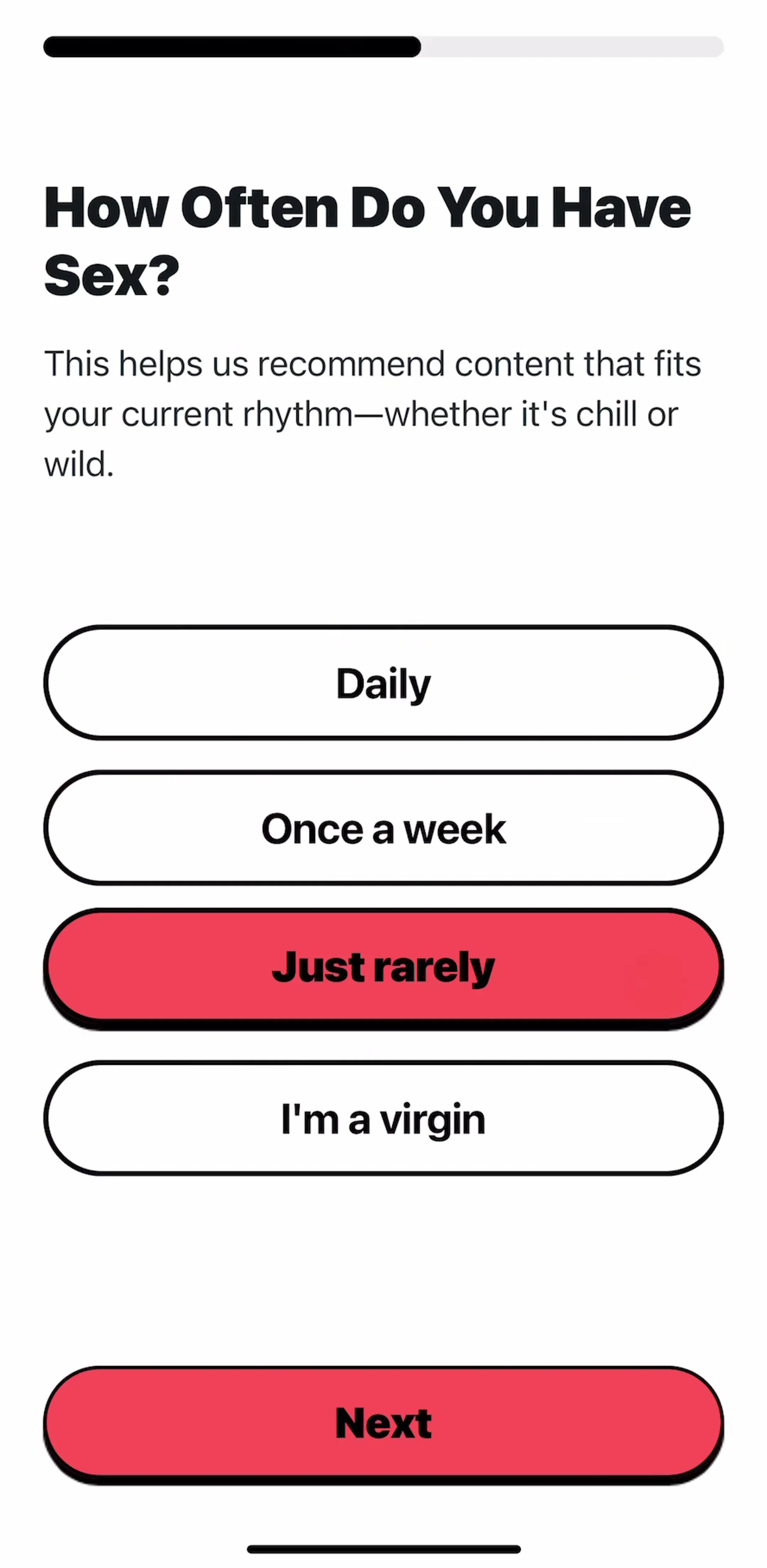
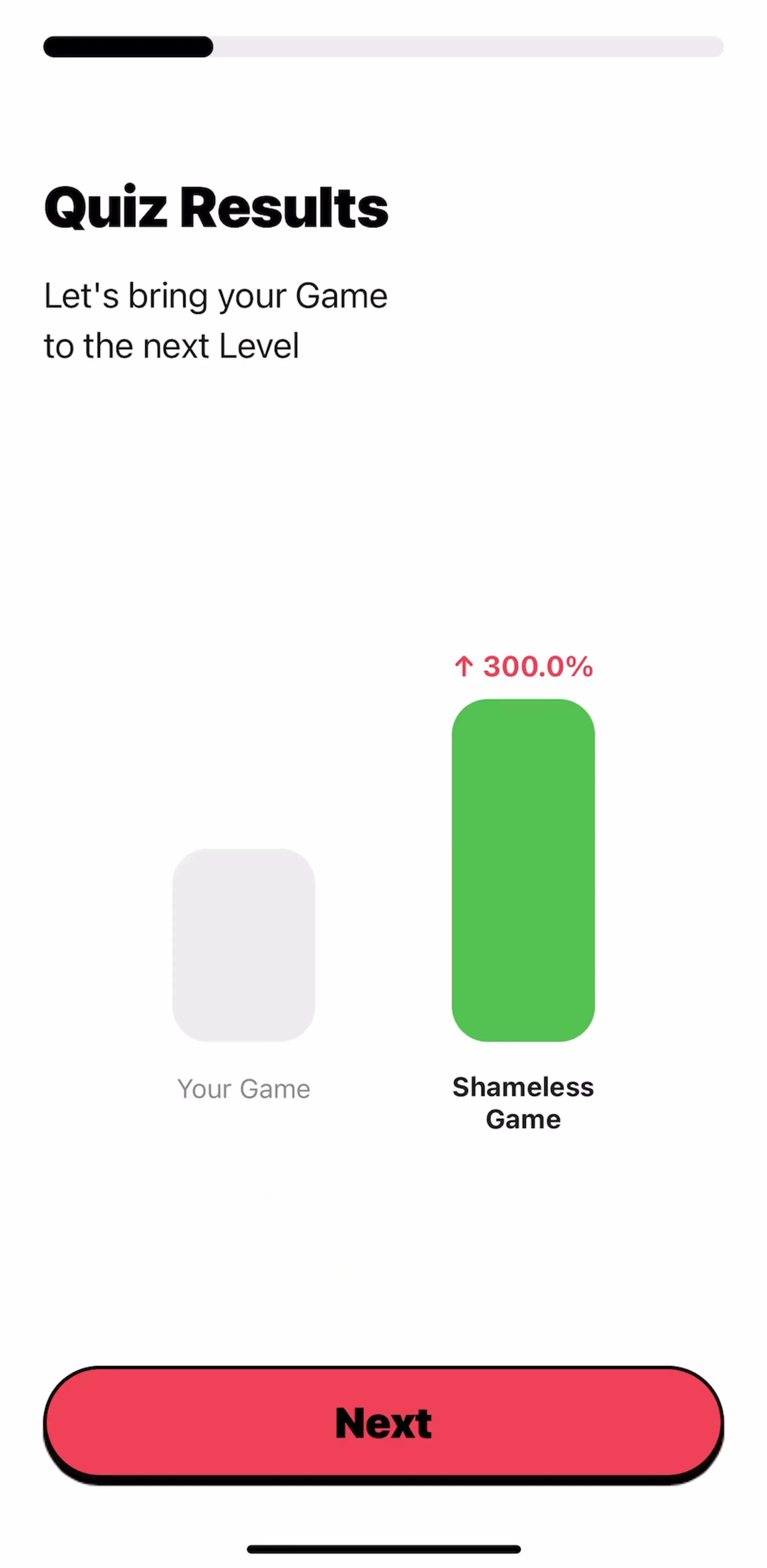
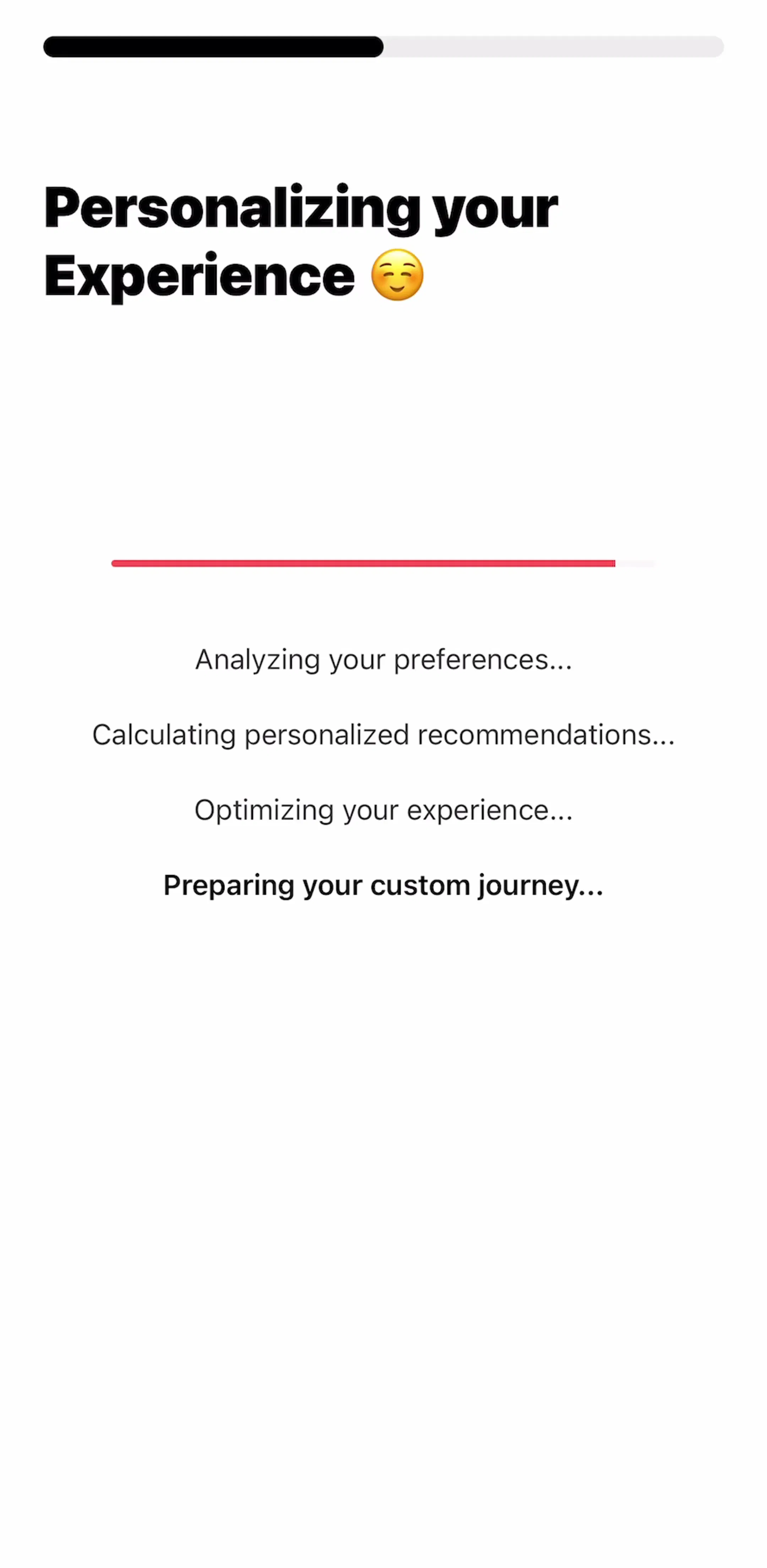
That volume is why the pattern converged on one shape: one question per screen, four to six full width options, a selected state you cannot miss, and either an auto advance or a single button at the bottom. Shamelesss builds its questions this way, with the whole pill as the target and the fill doing the selected state.
Our onboarding examples post covers the flow those questions sit in, including where to place the paywall relative to them. This post stays on the control itself.
The full width option row. The default for onboarding. Each option is a tall rounded row or pill, the entire row is tappable, and selection is shown by a fill or a heavy border rather than by a separate glyph. It scales to long labels, which a radio row does not.
The checkmark list. The iOS settings convention: plain rows, a tick on the selected one. This is the right choice inside a settings drill-down, where the list may be long and the styling should stay native. Our settings UI post covers the screen that list usually lives on.
The segmented control. Two or three options, changed often, where both choices should stay visible. Billing period switchers on paywalls are the most common instance in the library. The segmented control post covers the limits: past three options, or with labels longer than a word or two, it stops working.
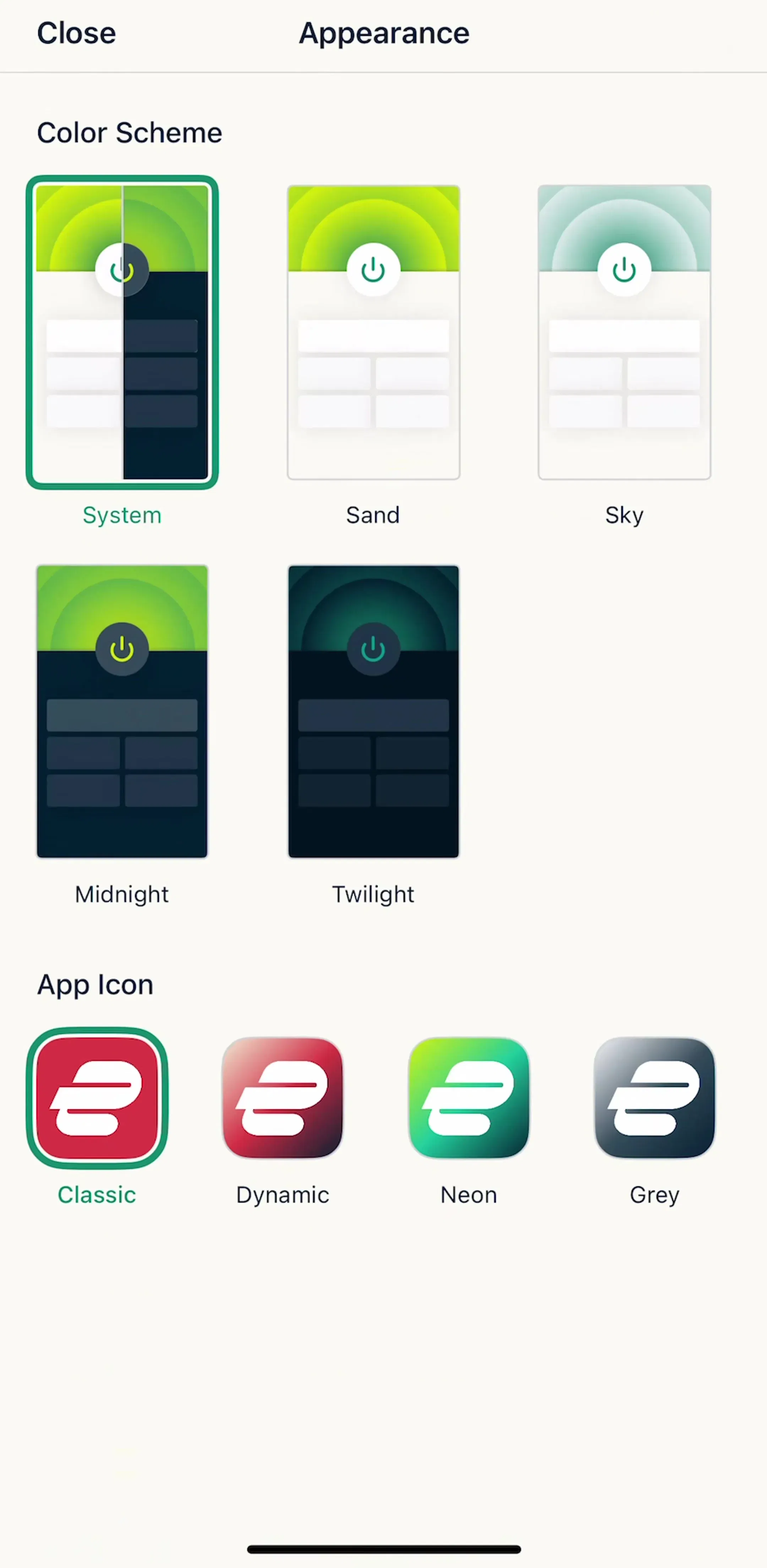
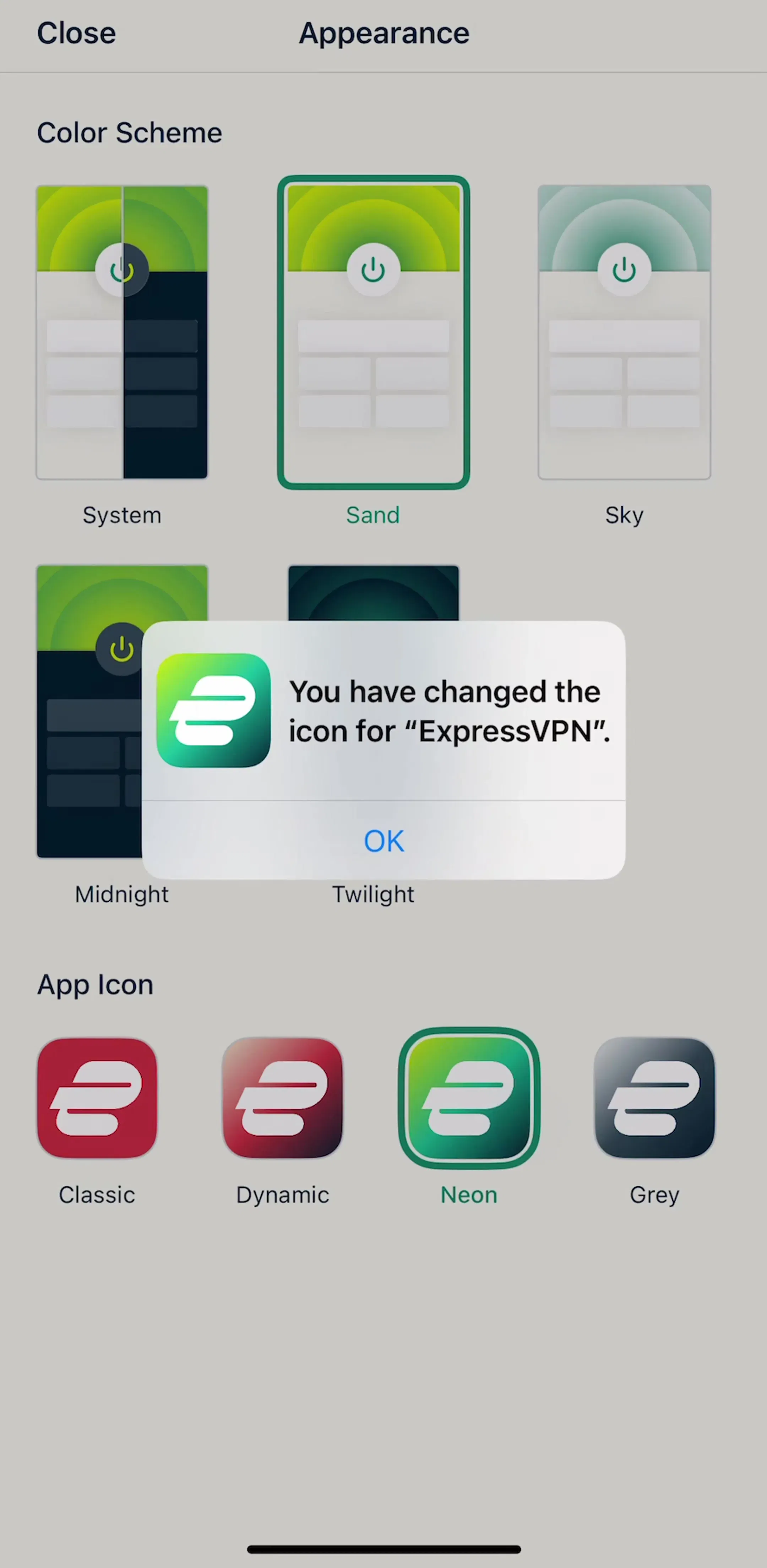
The swatch or thumbnail grid.When the options are visual, show them. ExpressVPN’s appearance screen picks a colour scheme and an app icon from selectable tiles, with the current choice marked by border and colour.
The plan card. On paywalls each option carries a price, a period and sometimes a feature list, so the option is a card rather than a row, and the selected one is raised or outlined. That is single select carrying a lot more content than a radio button was ever designed to hold, and the paywall design post goes through the pricing patterns around it.
A pick-one screen fails when the user cannot tell what is selected in half a second, and the usual cause is a selected state carried by a single weak signal. Colour alone fails for colour blind users and in sunlight. A thin border alone disappears on a busy background. A small glyph alone is invisible at arm’s length.
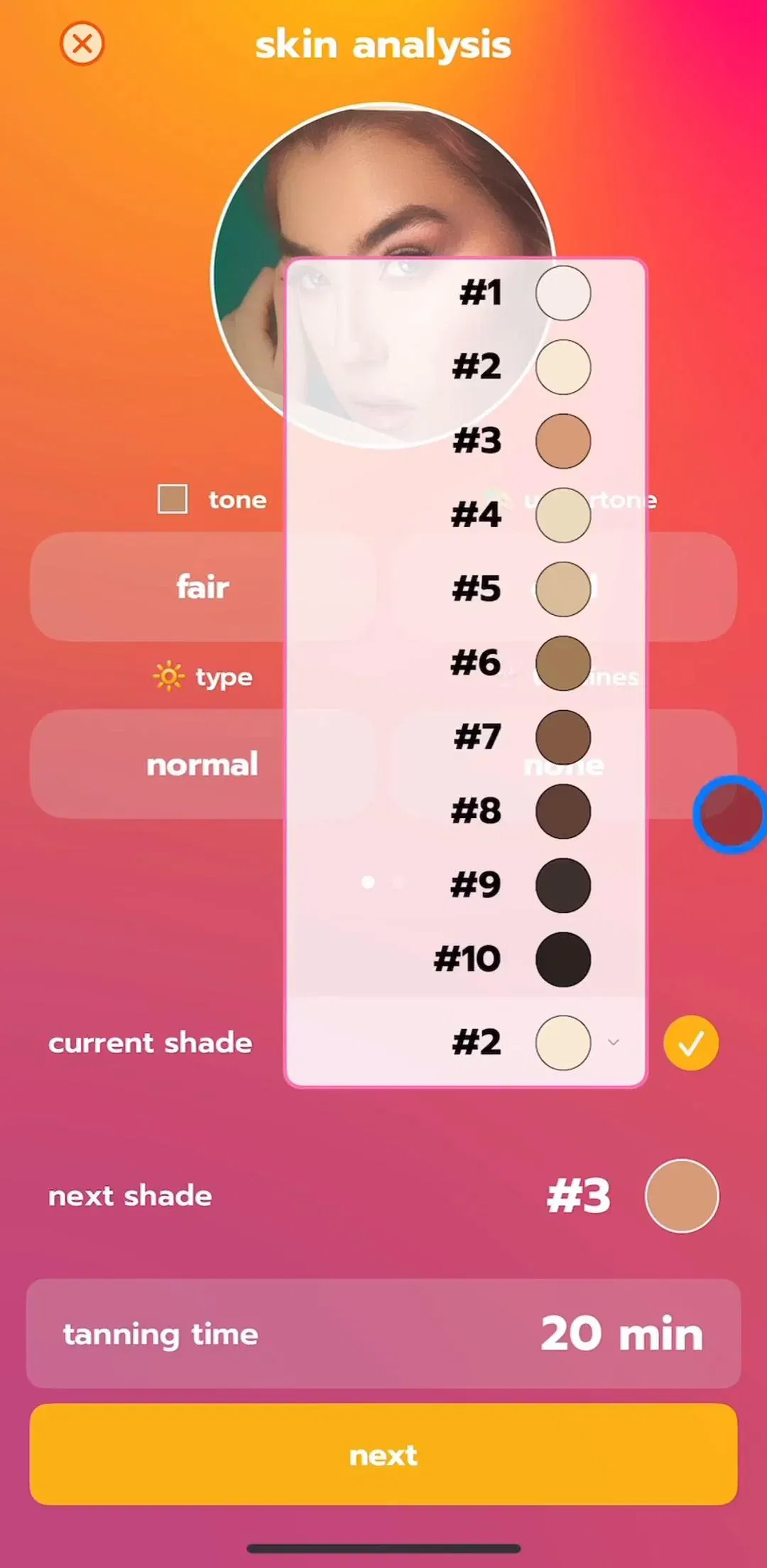
Stack at least two signals: fill plus border, or border plus checkmark, or fill plus a weight change in the label. Beam Tanning’s shade picker marks the current choice with both a highlighted row and a checkmark, which is the belt and braces version.
One more constraint that is easy to miss: the unselected state has to stay readable. Dimming every option except the chosen one turns the rest of the list into something the user has to squint at if they change their mind.
Auto advance removes one tap per screen. Across a twenty-question onboarding that is twenty taps, which is why long quizzes almost always do it. The cost is that the user sees their answer for a fraction of a second, so give the selection 200 to 300 milliseconds to register before the transition, and make going back cheap: a back control on every question, not just on the first.
Keep an explicit Continue button when the screen holds more than one control, when the answer deserves a second look, or when the question is one people commonly get wrong the first time. A mixed flow is fine, but the rule should be consistent inside a run of questions, because a user who has learned that tapping advances will tap an option and then look up to find the screen has not moved.
The most common defect in quiz onboarding is a screen where the user cannot tell how many options they may pick. If the answer is one, the screen should say so in the question or prove it on the first tap by deselecting whatever was chosen before. If the answer is several, use checkmarks or filled boxes, let the selections accumulate visibly and keep a button at the bottom, since there is no other way to know the user is done.
This is the only place where a mobile checkbox genuinely earns its keep: multi select lists, and form agreements where the choice is submitted later rather than applied instantly. When the choice applies instantly and has exactly two states, the control is a switch, which our toggle switch post covers.
Pre-selecting an option is a product decision disguised as a design one. On a paywall the pre-selected plan is what most people buy. In a quiz the pre-selected answer is what a rushed user will submit, which corrupts the personalisation the quiz exists to collect.
The defensible rule: pre-select when there is a genuine safe default and the cost of being wrong is low, leave everything unselected when the answer is data you will act on. If nothing is selected, the Continue button should be visibly disabled rather than silently inert, so the user knows the screen is waiting on them.
Make each option at least 44 points tall and the full content width, with the whole row tappable. Full width matters more on this control than most, because options in a pick-one list are often read in a single downward scan and a narrow target forces a horizontal correction on every tap.
Where options sit matters too. A question at the top and options starting in the middle of the screen puts the whole set inside thumb reach; options that start high and end at the bottom bezel put the last ones somewhere users hit by accident. The same reach argument runs through our button UI post.
If your component library came from the web, it probably has a Radio component. Rename it or wrap it. Calling the component a radio button on an iOS project drags the circle along with the name, and designers keep drawing a control that Apple does not have and users do not expect. “Option row”, “single select list” or “choice card” describes what ships.
There is no iOS radio button, and no reason to build one. Pick the control by how many options there are and what they contain: a full width option row for onboarding questions, a checkmark list inside settings, a segmented control for two or three visible alternatives, a swatch grid when the choice is visual, a card when the option carries a price. Show the selection with more than one signal, decide auto advance deliberately, and never let single select and multi select look the same.
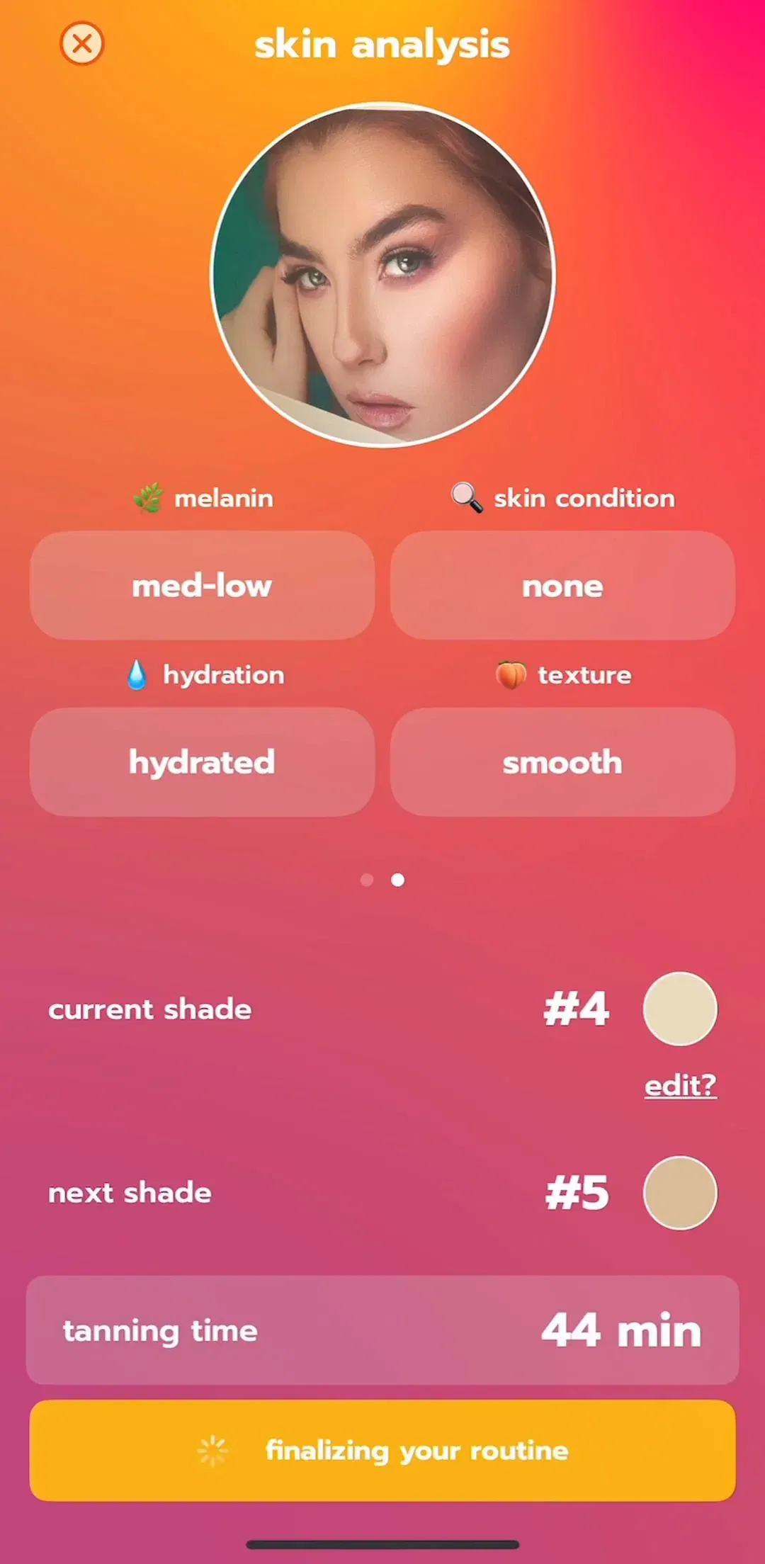
Every screen in the library sits next to the app’s estimated revenue and downloads, so you can pick references by outcome rather than by how the shot looks. Remini (est. $4M/mo), ExpressVPN (est. $3.25M/mo) and Beam Tanning (est. $150K/mo) are useful references, because each one solves single select for a different kind of option: a plan, a visual theme and a value on a scale.
A note on the numbers: revenue figures cited here are third-party monthly estimates from our library, useful for comparing magnitude, not audited financials.
No. UIKit and SwiftUI ship no radio button control, and Apple's guidance points single choice at a checkmark list, a picker, a menu or a segmented control depending on how many options there are and how often the user changes them. That is why an iOS app that looks like it has radio buttons almost always has something else: a list row marked with a checkmark, or a full width option card whose selected state is shown by fill and border.
Five controls do the job in practice. A full width option row selected by fill, common in onboarding questions. A list of rows with a checkmark on the selected one, which is the iOS settings convention. A segmented control for two or three options that should stay visible. A grid of swatches or thumbnails when the choice is visual. A stack of plan cards on paywalls, where each option carries its own price and feature list.
Auto advance when the question has one answer and the user cannot be wrong for long, which is most onboarding quiz questions: it removes a tap per screen across a flow that may run twenty screens. Keep an explicit Continue button when the answer needs review, when several controls share the screen, or when going back is awkward. A short delay of around 200 to 300 milliseconds before advancing lets the user see their selection register, which matters because the screen is about to disappear.
A radio button picks exactly one option from a set, a checkbox toggles each option independently. On mobile the distinction should be visible before the first tap: single select usually means one highlighted row and an immediate move forward, multi select usually means checkmarks or filled boxes that accumulate plus a Continue button that stays put. Shipping the same row design for both is the fastest way to confuse people about whether they can pick more than one.
The mobileappdesign library holds captured flows from 2,622 revenue-verified iOS apps, 2,494 of which have a captured onboarding section. 609 of those apps are flagged as running an onboarding quiz, which is where most single select on iOS lives. Because flows are captured in sequence, you can see the question, the selected state and the screen it leads to rather than one isolated shot.
Browse captured onboarding flows from revenue-verified iOS apps, in the order a real user walks them.
Browse onboarding screens