
The on/off switch is the most copied control in mobile design and the most over-applied. It looks like the default way to express any setting, so teams reach for it the moment a preference has two states. Then the row needs an explanation, or a confirmation, or it turns out the choice has three options, and the switch starts working against the screen.
Open the settings flows in our library and the striking thing is how few switches are in them. Of 2,622 revenue-verified iOS apps, 1,456 have a captured settings and preferences section, and the rows in those sections are mostly not switches: they are drill-down rows with the current value on the right, grids of swatches, segmented controls, and whole screens that explain a feature and end in a button. So this is not a post about designing a prettier switch. It is about the test a row has to pass before it deserves one.
A switch makes three promises at once, and users read all three without thinking about it. The change applies immediately, with no save step. The change is reversible, at the same cost as making it. And the change is self-explanatory, because a switch carries no room for an explanation beyond its label.
Every misuse of the control is a broken version of one of those three. A switch that opens a dialog breaks the first. A switch that cancels a subscription breaks the second. A switch labelled with a feature name nobody recognises breaks the third, and it is the most common failure of the three because it is the easiest to ship.
Before a preference gets a switch, ask three questions in order. Does it have exactly two states, with no meaningful third? Does it take effect the moment it is flipped? Can a user who has never seen this screen predict what happens? Three yeses means a switch. One no means a different control, and the library shows which ones apps actually use.
The third question is where most rows fail. If the feature needs a sentence to justify turning it on, that sentence has nowhere to live in a switch row, and squeezing it into a subtitle produces the two-line settings row that every long settings screen is made of.
Four controls take over most of the work a switch is usually asked to do, and you can see all four in the settings flows we capture.
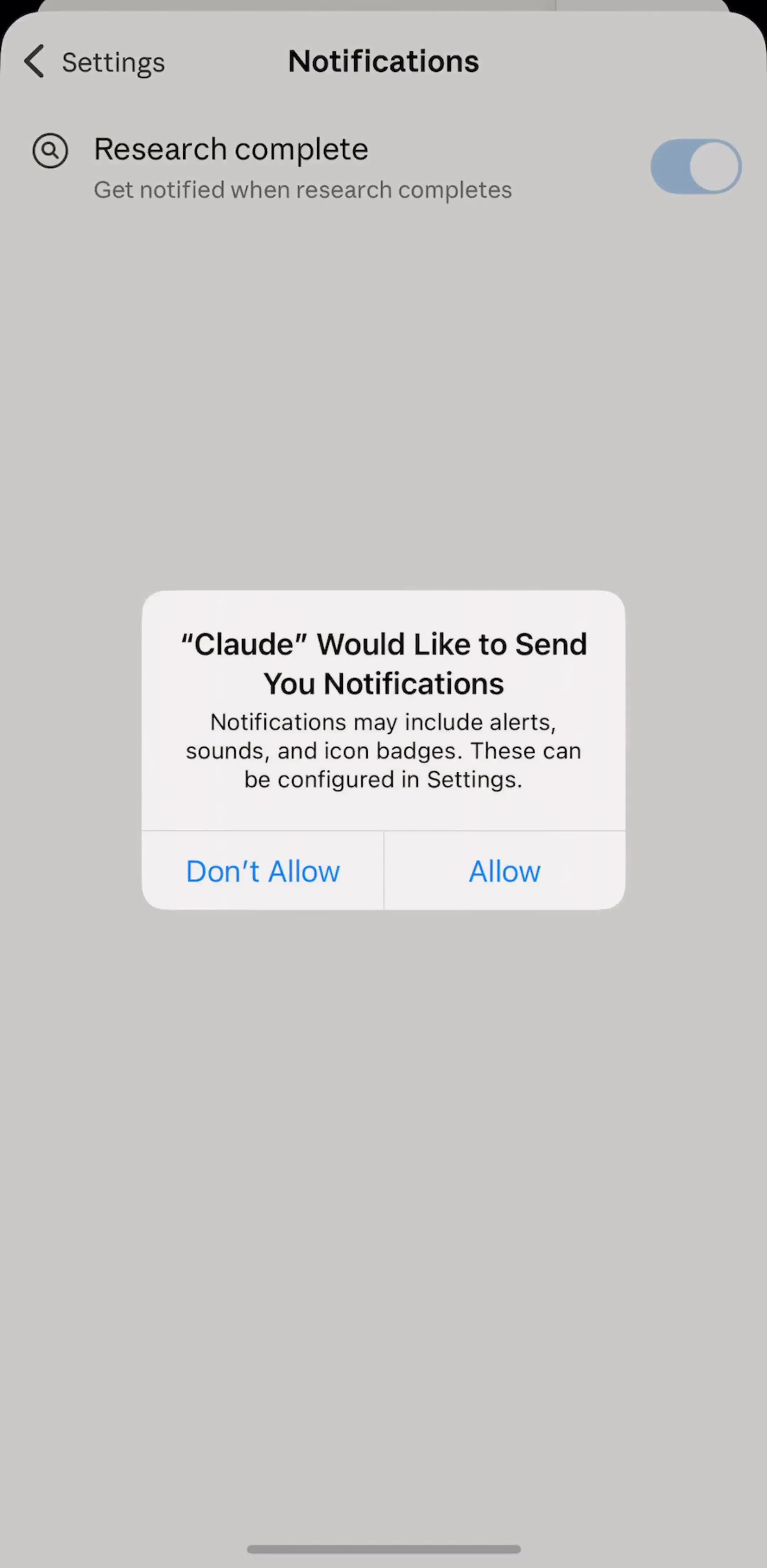
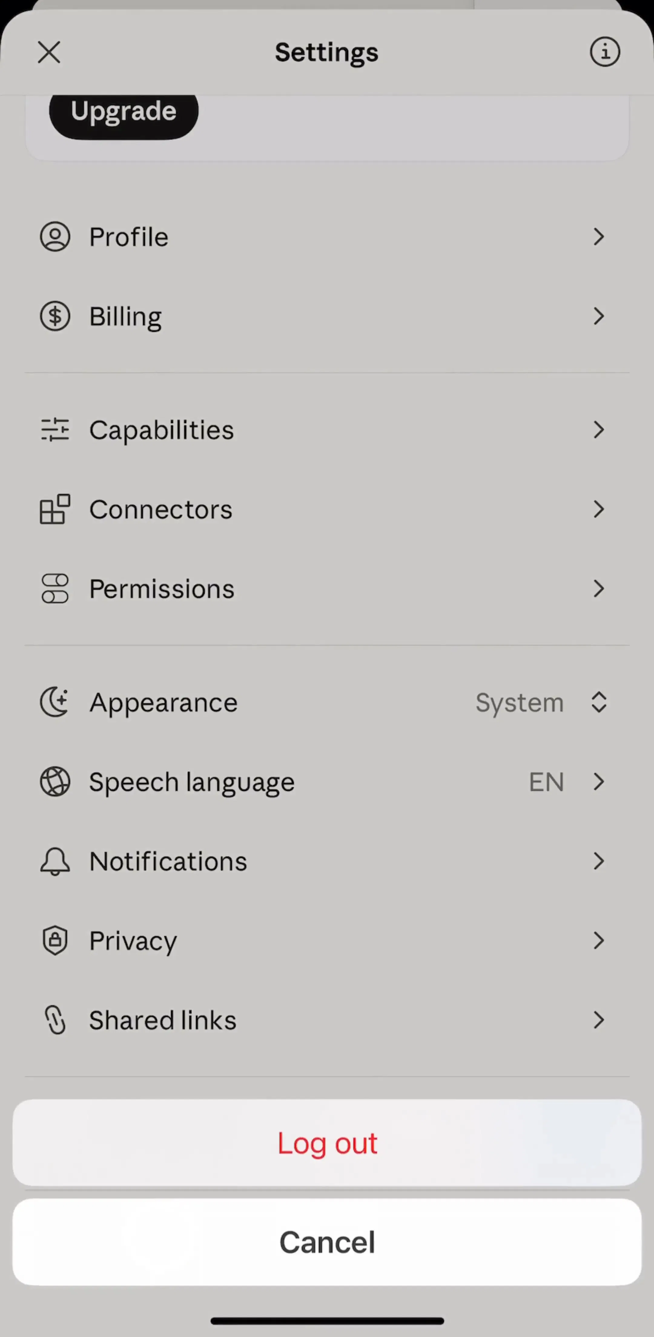
The drill-down row with its value on the right.This is the workhorse of the mobile settings screen: a label, the current value in secondary text, a chevron. It handles any number of options, it shows the current state without the user opening anything, and the options get a full screen to explain themselves. Claude’s settings screen is built this way, and its appearance row shows the current choice in place rather than hiding it.
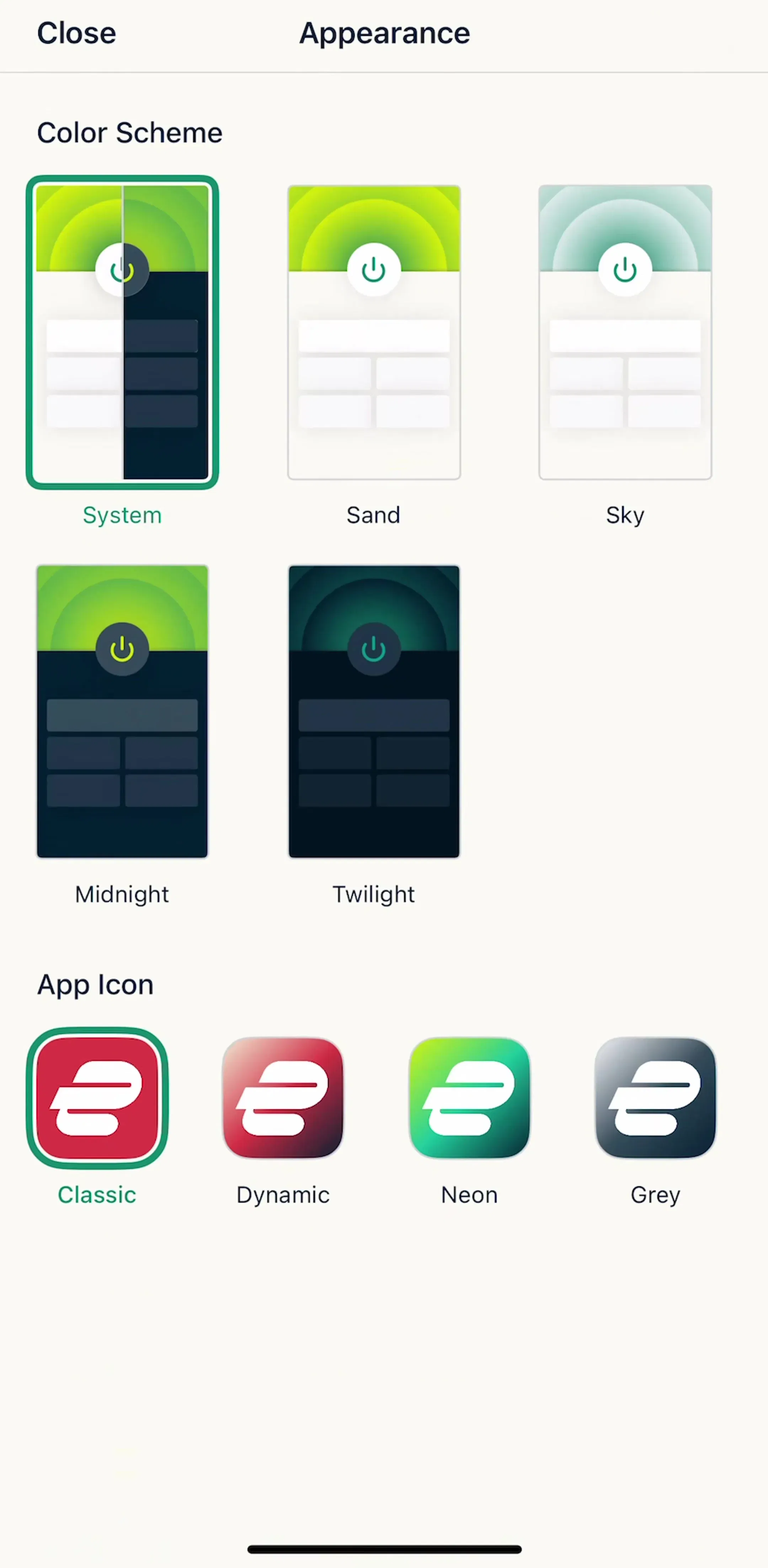
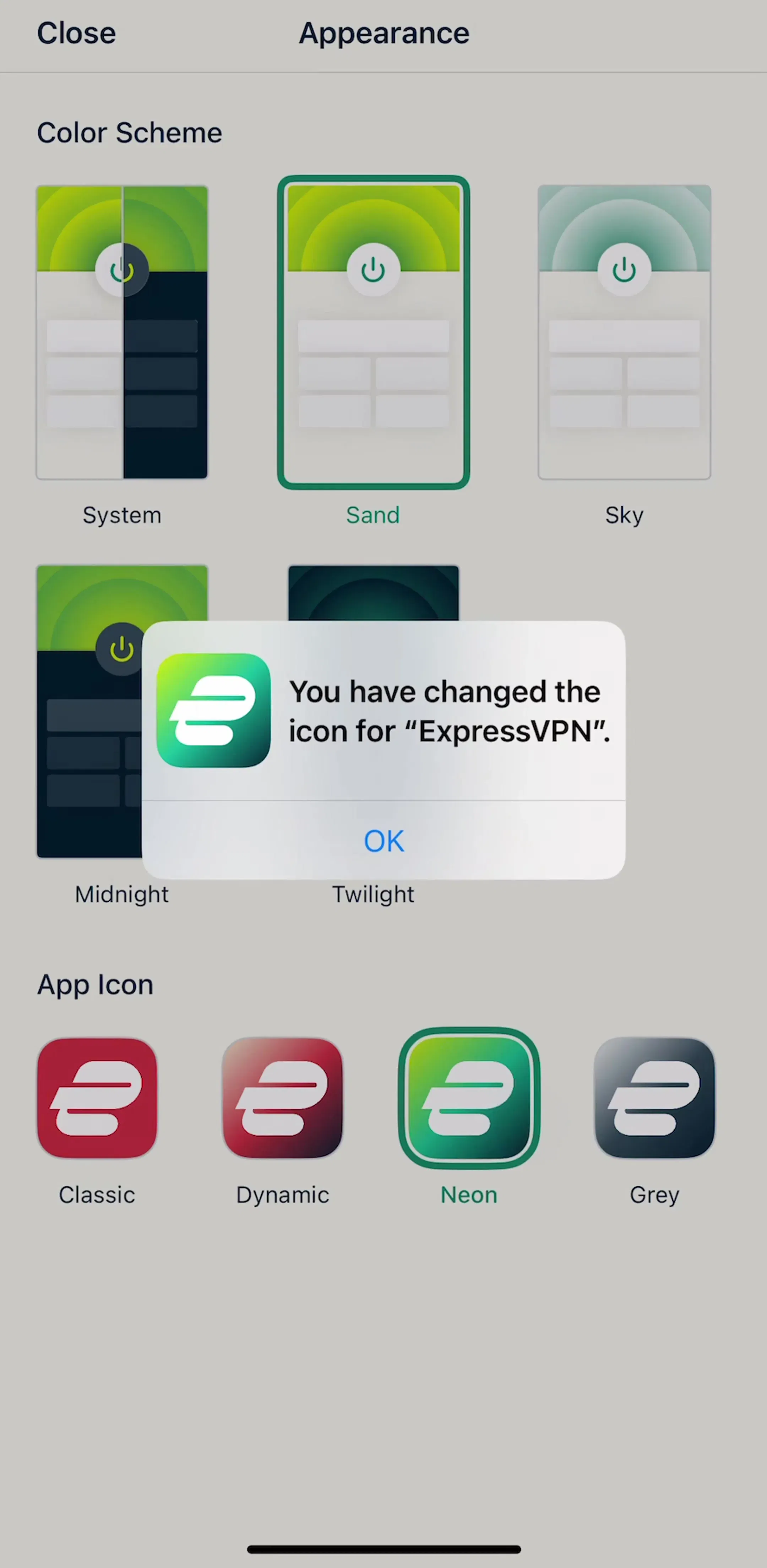
The swatch or thumbnail grid.When the choice is visual, a preview beats a label. Theme pickers and alternate app icons are the standard case, and ExpressVPN’s appearance screen puts both on one screen as selectable tiles.
The segmented control. Two or three mutually exclusive options that the user switches between often, where both options should stay visible. Our segmented control post covers when that beats a switch in detail; the short version is that a segmented control names both states, and a switch only names one.
The explainer screen with a button. When a feature needs selling or explaining before it is enabled, apps give it a screen: what it does, three reasons, one button. This is the pattern behind most security and privacy features, and it is the honest answer to a switch whose label nobody understands.
A switch label should name the thing being controlled, phrased so it reads correctly in the on position. “Daily reminders”, “Sync over cellular”, “Show completed tasks”. The user supplies the on or off from the switch itself.
Two habits break this. The first is labelling the action: “Turn on sync” next to a switch is unreadable, because turning off a control labelled turn on is a puzzle. The second is the negative: “Hide read items” in the off position means show read items, and every user has to do that translation every time. State the positive and let the switch carry the negation.
An iOS switch is roughly 51 by 31 points, which is smaller than the 44 point minimum target on one axis. The fix is not a bigger switch. It is a row that is at least 44 points tall and tappable across its full width, with the switch as the state indicator sitting at the trailing edge. Users flick at the right side of a row, not at a 31 point tall glyph, and the ones who most need a generous target are the ones least able to hit a small one.
The same rule shows up in every list-shaped pattern we have written about, from list rows to accordion headers: the visible affordance is small, the hit area is the whole row.
Because a switch applies immediately, it owns whatever happens next. If the change hits the network, the switch has to handle the failure case: revert to its previous position and say why, rather than sitting in the new position while the server disagrees. A switch that silently reverts on the next screen load is worse than a form with a save button, because the user believed the change had already happened.
If the change takes long enough to need a spinner, consider whether it is really a setting or an action. Connecting, downloading and syncing are actions with progress and a result, and they usually read better as a button and a status line than as a switch that stays ambiguous for six seconds.
The switch that mirrors a system permission. An in-app notifications switch cannot grant a permission the user denied at the system level, so flipping it on when notifications are off at the OS level does nothing and says nothing. The honest version detects the denied state and sends the user to iOS Settings with an explanation. Our notification design post covers the permission itself, including what to do after a denial; the rule for this row is simply that it should never claim a state it does not control.
The switch that is a purchase. A trial switch on a paywall, or a plan toggle that changes what is billed, reads as instant and reversible because it looks like every other switch in the product. It is neither. When the toggle changes money, the screen owes the user the price, the date and the consequence in text next to it, which is one of the patterns in our paywall design post.
Dark mode is the most common three-state setting that keeps getting shipped as two. The options are light, dark and match the system, and a switch cannot express the third. Apps that ship a dark mode switch either abandon system matching or add a second switch labelled “Use system setting” that disables the first, which is a segmented control with extra steps. We measured how shipping apps handle this in our dark mode UI post.
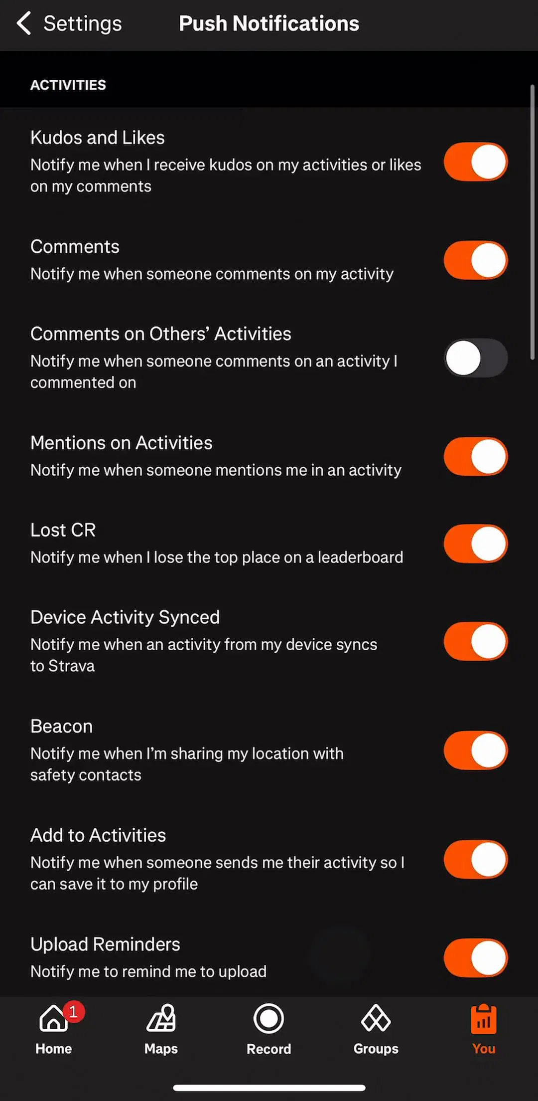
A screen of ten unrelated switches is a screen the user has to read in full. Grouping is what makes it scannable: related switches under a header, with the group name doing the explanatory work the individual labels cannot. Our settings UI post covers that structure, including when a group deserves its own drill-down screen instead.
Defaults matter more than the control. Every switch you ship on by default is a decision you have made for every user who never opens settings, which is most of them. That is defensible for a feature that genuinely helps by default and indefensible for anything that sends notifications, shares data or costs money. Ship those off, and earn them on a screen that explains itself.
Use a switch when the setting is binary, instant, reversible and obvious from a two or three word label. Use a drill-down row when there are more than two options or the current value is worth showing. Use a segmented control when both states should stay visible. Use a screen with a button when the feature needs explaining or the change costs something. The settings flows in the library are full of all four, which is the clearest evidence that the switch was never meant to carry the whole screen.
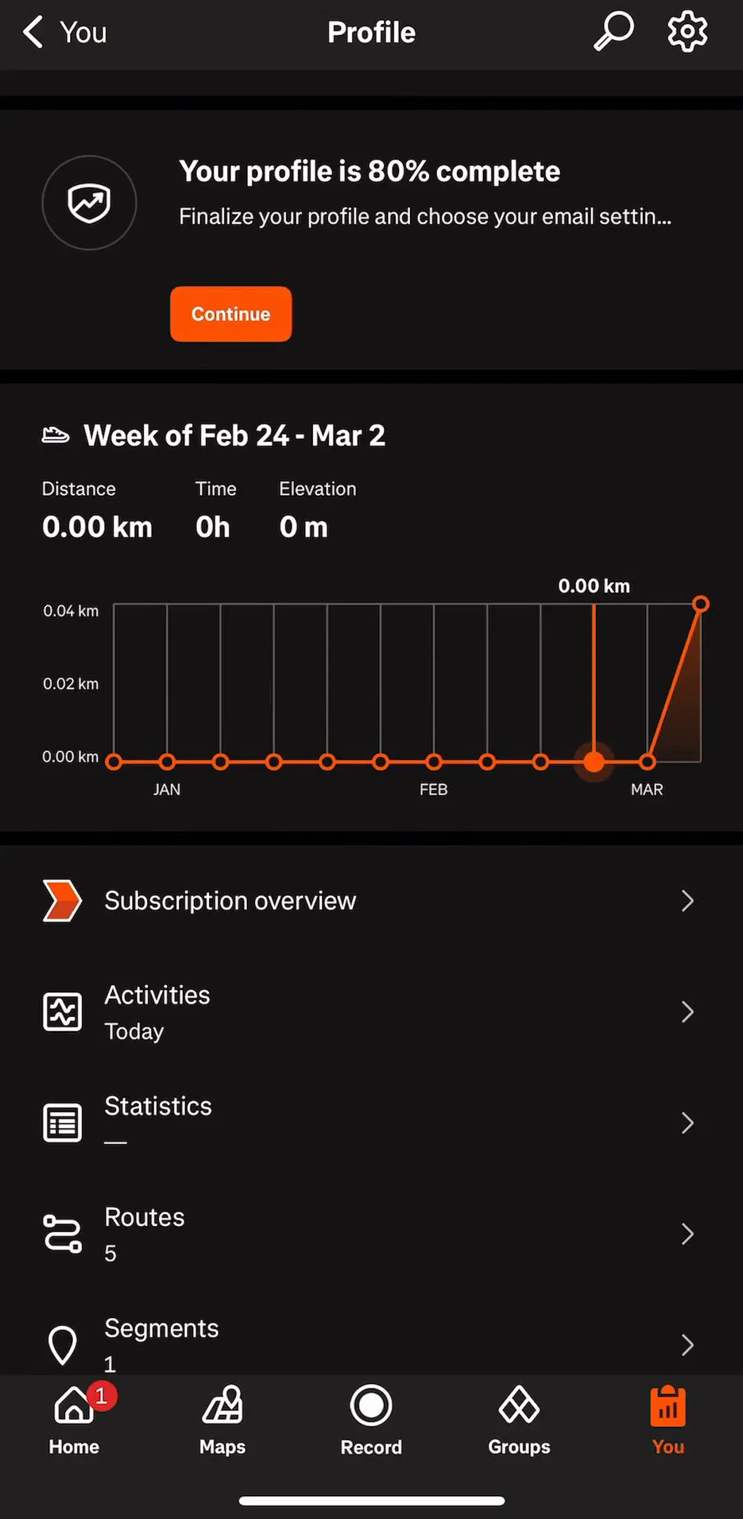
Every screen in the library sits next to the app’s estimated revenue and downloads, so you can pick references by outcome rather than by how the shot looks. Claude (est. $59M/mo), Strava (est. $16M/mo) and ExpressVPN (est. $3.25M/mo) are good starting points, because all three carry deep preference screens without turning them into a wall of switches.
A note on the numbers: revenue figures cited here are third-party monthly estimates from our library, useful for comparing magnitude, not audited financials.
Use a switch when the change applies immediately and there is no save button on the screen. Use a checkbox when the choice is part of a form that gets submitted later, such as agreeing to terms or picking options before tapping Continue. The switch is a control that acts; the checkbox is a control that records an answer. On iOS the switch is the native settings control and the checkbox barely exists outside forms, which is why so many apps end up with a checkmark row instead.
Name the thing being controlled in its on state, not the action. "Daily reminders" with a switch reads correctly in both positions. "Turn off reminders" with a switch means the user has to work out whether on means off. Avoid negatives entirely, because a switched-on negative is a double negative, and never rely on the word next to the switch changing between On and Off to carry the meaning.
The switch itself is about 51 by 31 points on iOS, which is under the 44 point minimum on one axis, so the row is the control rather than the switch. Make the entire row height at least 44 points and let a tap anywhere on it flip the state. A switch-only hit area is the most common defect in this pattern, and it punishes exactly the users who have the most trouble hitting small targets.
If it needs a confirmation dialog, it is not a switch. A switch promises an instant, reversible change, and a confirmation breaks both halves of that promise. Destructive or expensive actions belong on a button that says what will happen, with the consequence spelled out before the tap rather than after it.
The mobileappdesign library holds captured flows from 2,622 revenue-verified iOS apps, including 1,456 with a settings and preferences section that carries screens. Flows are captured in sequence, so you can see the settings screen, the drill-down it leads to, and the state after the change rather than a single isolated shot.
Browse captured settings and preferences flows from revenue-verified iOS apps, in the order a real user walks them.
Browse settings screens