
The accordion is a web pattern that emigrated to mobile and lost most of its job on the way. On a desktop page it is a legitimate way to structure a long document, because the alternative is scrolling past content you do not want. On a phone the alternatives are better: a tap can open a full screen with its own title and back gesture, or a sheet that sits over the content. Both give the content more room than an accordion ever will. So the honest version of this article is not eight ways to design an accordion. It is where the pattern still wins on mobile, which surfaces it genuinely owns, and what shipping apps use instead everywhere else.
An accordion expands in place. The content appears between the header you tapped and the header below it, and everything under it moves down. Nothing navigates, nothing covers the screen, and the user’s position in the page is preserved except for the shift the new content causes.
That single property is the whole argument for and against the pattern. For: the user keeps their context, and can see the other headers while reading one section. Against: the content is trapped in a narrow column inside a scrolling page, competing for the same vertical space as everything else, and the layout moves under the user’s thumb when they tap.
This is the decision that matters, and it has a clean test. Does the user need to see one section in relation to another?
If yes, an accordion. Someone comparing three shipping options, or reading two FAQ answers to work out which applies to them, is served by keeping the headers visible. If no, a drill-down. A settings group the user opens, changes and leaves does not benefit from staying in a list, and the drill-down hands you a full screen, a real title, a scroll container of its own and a back gesture the user already knows. The grouped-list conventions in our settings UI post exist because most settings content passes this test in the second direction.

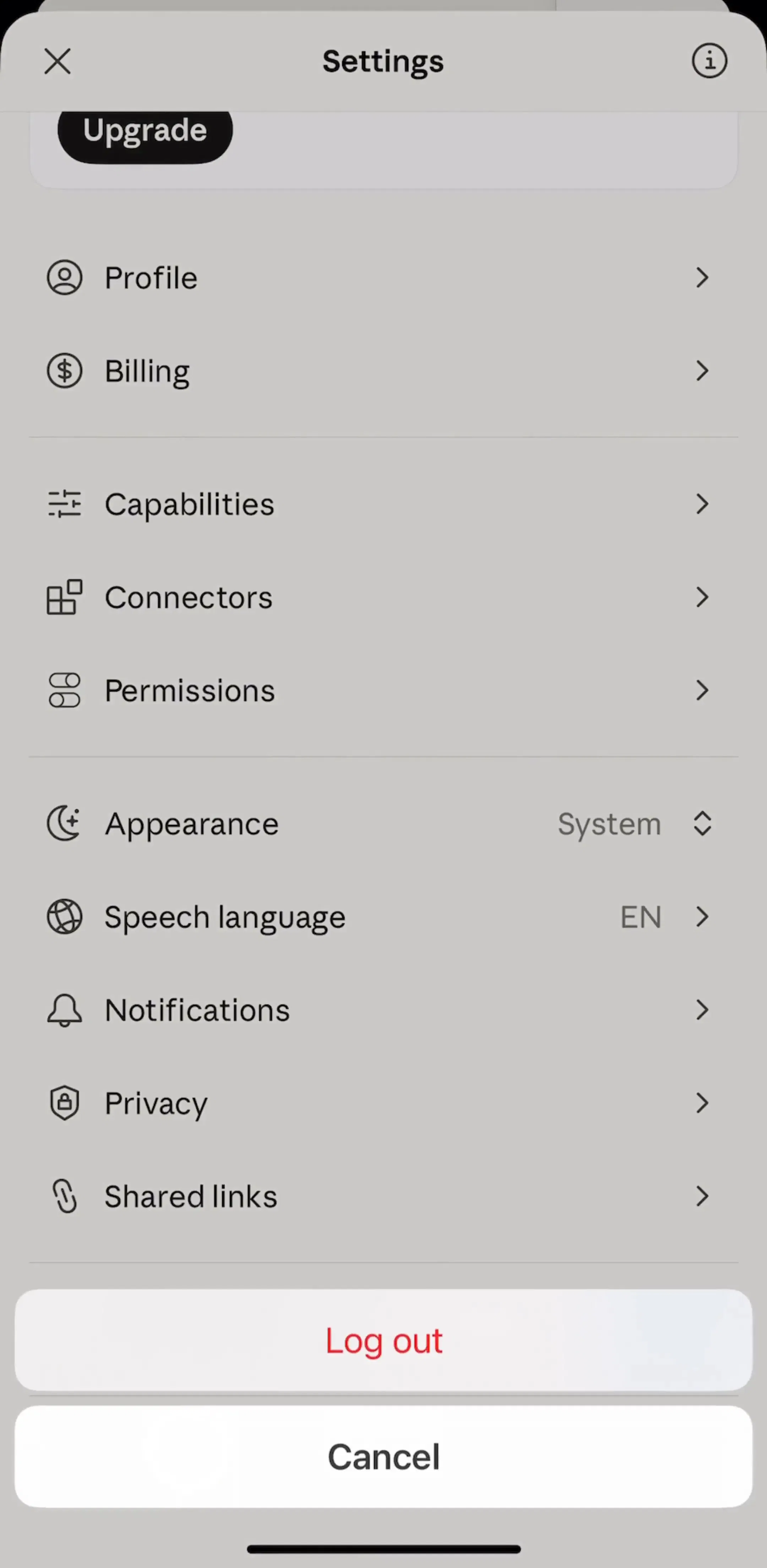
What you see across the settings flows in the library is that the drill-down wins the general case decisively. Shipping apps build grouped rows with chevrons that push a new screen, and they reserve in-place expansion for the small number of groups where a value can be shown and changed without leaving.
The other neighbour is the bottom sheet, and the test there is different. A sheet is a detour: it covers the screen, the user does something, the sheet dismisses and they are back where they were. An accordion is not a detour, it is part of the page.
So content the user reads belongs in an accordion, and content the user acts on belongs in a sheet. The moment an expanded section contains a form, a picker or a confirm button, the expansion is doing a sheet’s job badly: the action sits below the fold, the keyboard covers the section that opened it, and dismissing means finding the header again. Our bottom sheet post covers the detents and dismissal behaviour that make the alternative work.
This is the accordion’s strongest remaining claim on mobile, and it appears in two places. Inside a help or support screen, and inside a paywall.

The paywall case is the more interesting one. A subscription screen has to answer a set of predictable objections, cancellation, what happens after the trial, what is actually included, without pushing the price and the button below the fold. A collapsed FAQ stack does exactly that: it signals that the answers exist, costs almost no vertical space, and lets the buyer who wants one answer get it without leaving the purchase screen. Sending them to a separate FAQ screen mid-purchase is measurably worse, and the patterns in our paywall design post assume the price and the primary button stay visible.
Two rules for this case. Allow several sections open at once, because readers compare. And write the headers as the questions users actually ask, in their words, since these headers are the only thing most people will read.
The second surface is a total the user might want to break down. An order summary with a shipping and tax line. A nutrition figure with its macros. A route with its legs. A price with its fees.
Here the accordion is the right shape because the collapsed state is genuinely useful on its own. The user who trusts the total never expands anything, and the user who wants to check the arithmetic gets it without losing the total from the screen. A drill-down would fail precisely because it takes the total away at the moment the user wants to reconcile it against the detail.
A long filter sheet with several categories is the one case where expansion beats both neighbours, because the user is assembling a combination across groups and needs to see what they have already chosen while choosing the next thing. Our filter UI post covers the surrounding decisions, applied-filter display, result counts and clearing, that make this work.
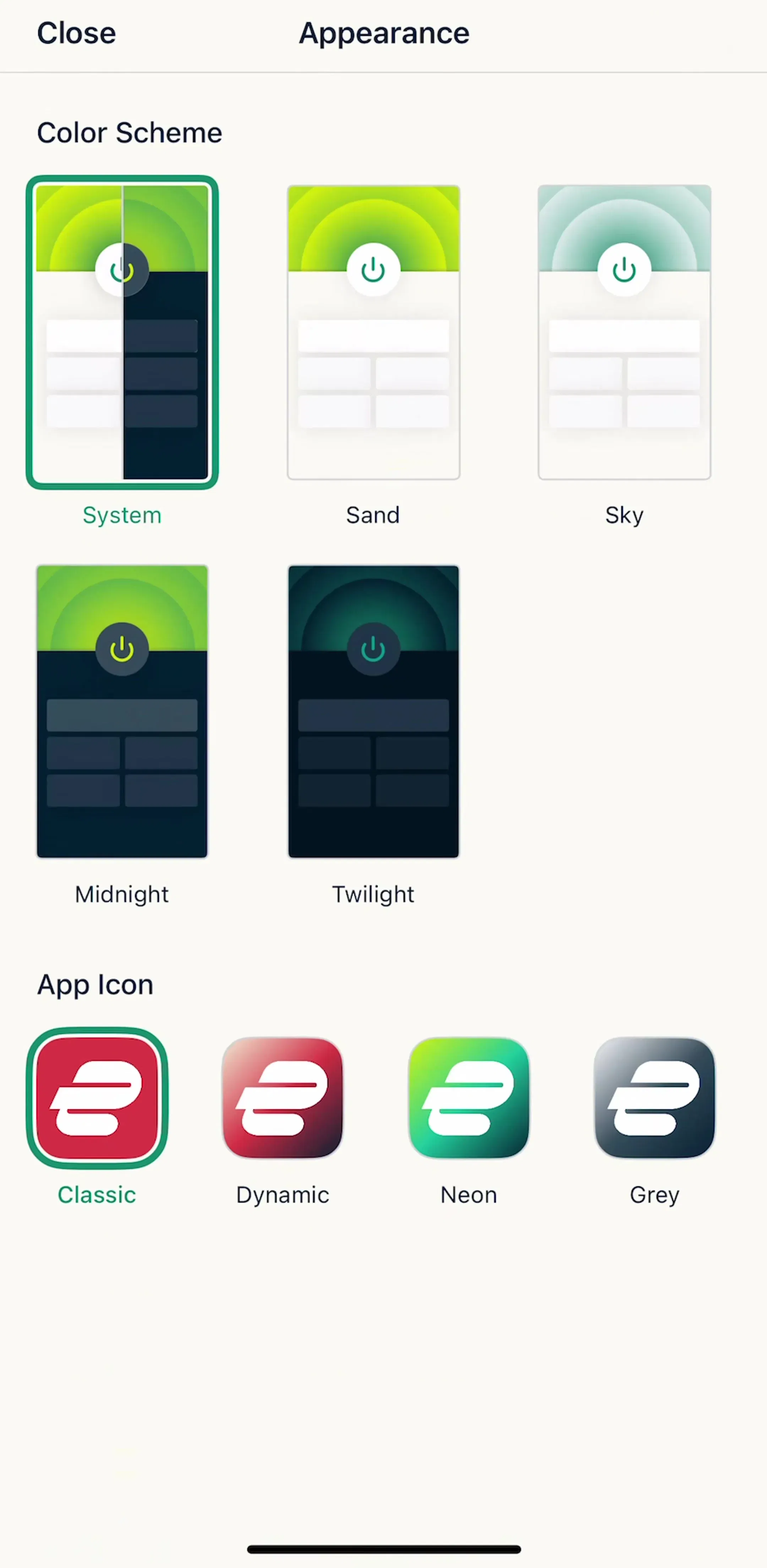
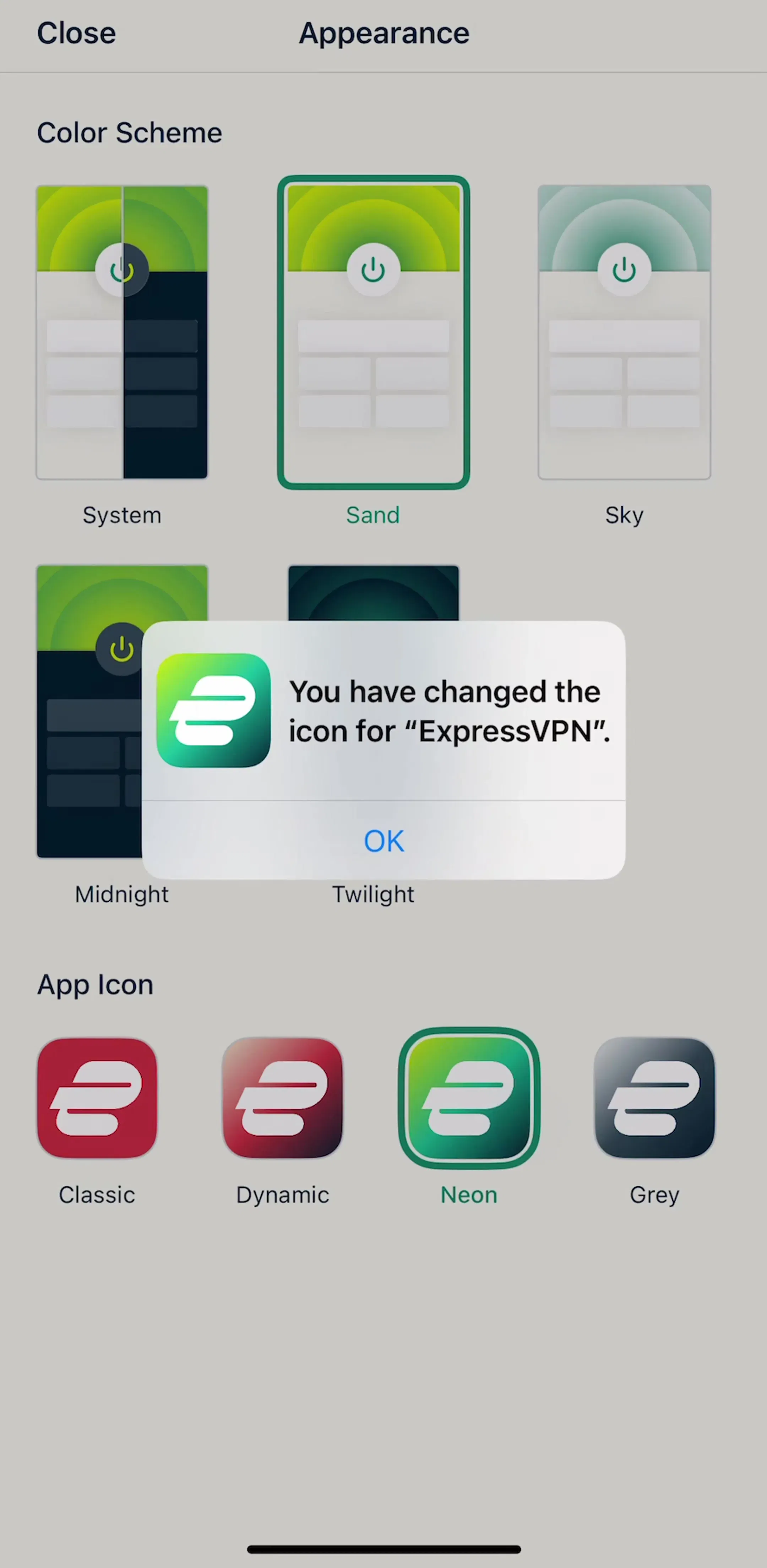
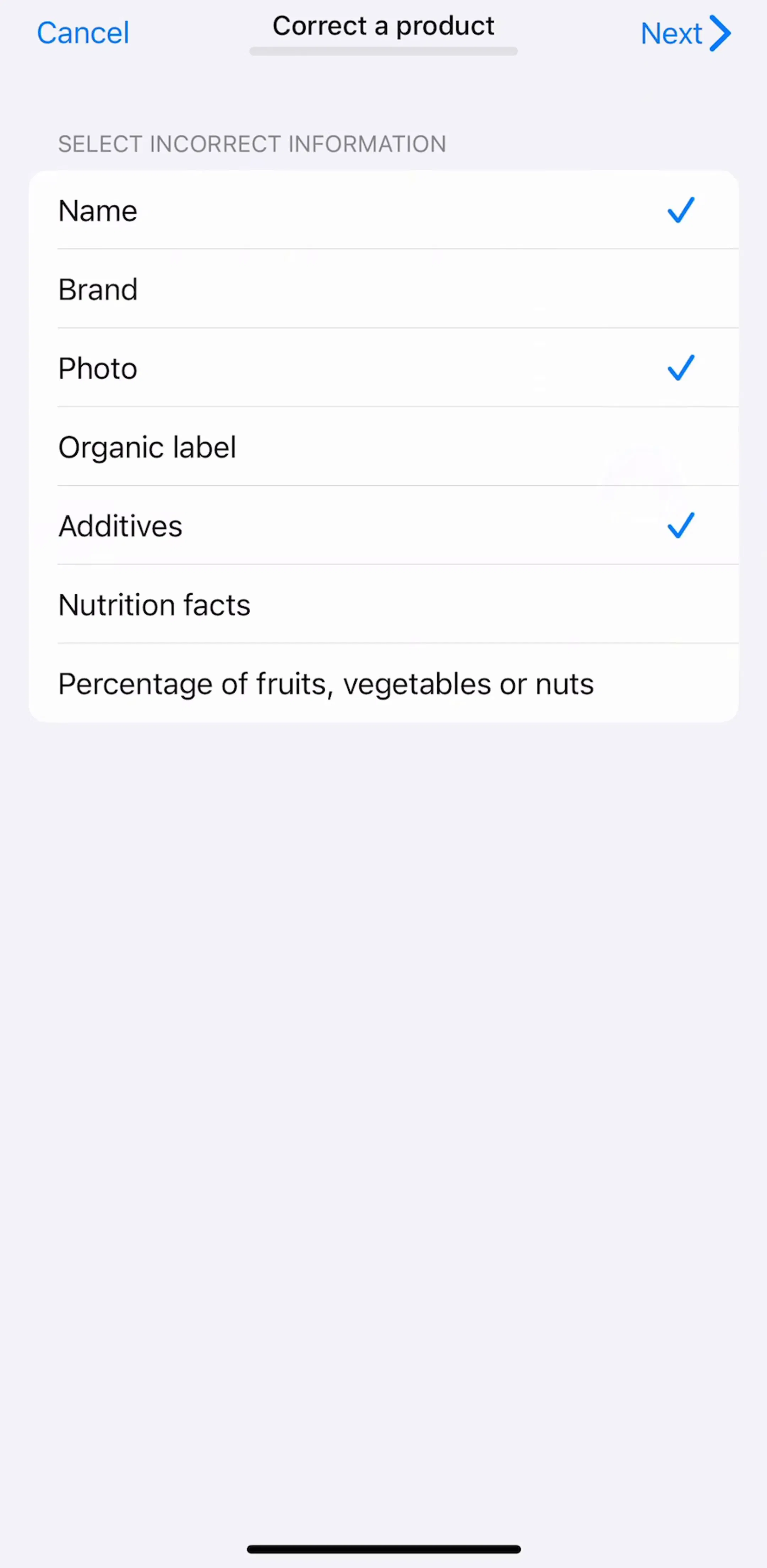
The related case is the preference screen dense enough that every option is a toggle with an explanation. Expanding to reveal the explanation, rather than pushing a screen to show one sentence, keeps the screen scannable for the user who already knows what the setting does.
Hit target. The whole header row, full width, minimum 44 points tall. A chevron-only tap target is the most common defect in this pattern and it is invisible in a screenshot.
Chevron state. Down or trailing when collapsed, up when expanded, animated so the rotation reads as a state change. A plus and minus pair works too, but do not mix the two conventions in one app.
Scroll position on collapse. When a user collapses a section they have scrolled past, the content above them disappears and the page jumps. Anchor the collapsed header to its position on screen rather than letting the scroll offset survive unchanged.
Never nest. An accordion inside an accordion produces indentation the phone cannot afford and a hit-target ambiguity at the boundary. If the content needs two levels, the second level is a screen.
Deep links. If a support link points at one answer, the app should open that section expanded and scrolled to. Landing on a wall of collapsed headers after tapping a link about a specific problem is a broken promise.
Content that is long.Once an expanded section is taller than the screen, the user is scrolling inside a page whose other headers are now far away, which is the drill-down experience without any of the drill-down’s affordances.
Hiding the primary action. If the thing the user came to do is inside a collapsed section, most users will not find it. Collapsed content is opt-in, so anything on the main path has to be visible by default.
Using it to make a screen look shorter. Collapsing eight sections does not reduce the amount the user has to read, it just makes the reading interactive. If a screen is too long, the fix is usually less content or a different information architecture, the same conclusion our list UI post reaches about over-sectioned lists.
Reach for an accordion when the sections are short, the user compares across them, and the content is read rather than acted on. That is the FAQ block, the inspectable summary and the grouped filter. Everywhere else on a phone, the drill-down and the sheet are better tools, and the settings flows across the library show that shipping apps have largely settled on them.
Every screen in the library sits next to the app’s estimated revenue and downloads, so you can pick references by outcome rather than by how the shot looks. Claude (est. $59M/mo), Strava (est. $16M/mo) and Finch (est. $1M/mo) are all worth adding to the set as products whose settings screens carry a lot of options without becoming a wall.
A note on the numbers: revenue figures cited here are third-party monthly estimates from our library, useful for comparing magnitude, not audited financials.
A vertical stack of headers, each of which expands in place to reveal its own content and collapses again. The defining property is that the content appears inside the current screen and pushes the rest of the list down, rather than opening a new screen or a sheet. On the web it is a primary navigation device. On mobile it is a supporting one.
Use an accordion when the user needs to compare or scan across sections, and the content inside each section is short. Use a drill-down when the content is long enough to deserve its own screen, or when the user will act inside it. The test is whether the user needs to see two sections in relation to each other. If they only ever need one at a time, a drill-down is clearer and gives you a full screen, a title and a back gesture for free.
For FAQ-style content, allow several. Readers hunting an answer often open two or three headers and compare, and auto-collapsing the previous one feels like the interface is fighting them. Enforce one open section only when the sections are alternatives, such as a payment method or a plan choice, where having two expanded implies a choice you have not actually made.
Collapsed points down or trailing, expanded points up, and the rotation is animated so the change is legible. What matters more than the direction is that the whole header row is tappable, not just the chevron. A 44 point minimum target across the full row width is the standard, and a chevron-only hit area is the most common accessibility defect in this pattern.
The mobileappdesign library holds captured flows from 2,622 revenue-verified iOS apps, including 1,520 with a settings and preferences flow and 1,834 with a subscription paywall flow, which are the two surfaces where mobile accordions most often appear. Screens are captured in sequence, so you can see the collapsed and expanded state of the same screen rather than one isolated shot.
Browse captured settings and preferences flows from revenue-verified iOS apps, in the order a real user walks them.
Browse settings screens