Search for dashboard UI design and you get a wall of dark analytics panels: four chart widgets, a sidebar, a KPI row, a data table. That is a desktop form. It exists because a 27 inch monitor can hold six things at once and a phone cannot. On iOS the screen people actually call a dashboard is something narrower and more specific, and our library says so plainly. Of 2,622 revenue-verified apps, 526 carry a tracking and insights flow. 324 of those are health and fitness. Ten are finance. The mobile dashboard is the progress screen of a tracker, and almost every design decision below follows from that.
This is the finding that reframes the rest. When we count the apps carrying a dedicated tracking and insights flow, the category distribution is lopsided: 324 of 526 are health and fitness, then 36 lifestyle, 24 education, 21 productivity, 14 medical. Finance, the category the concept work is almost entirely modelled on, contributes ten apps.
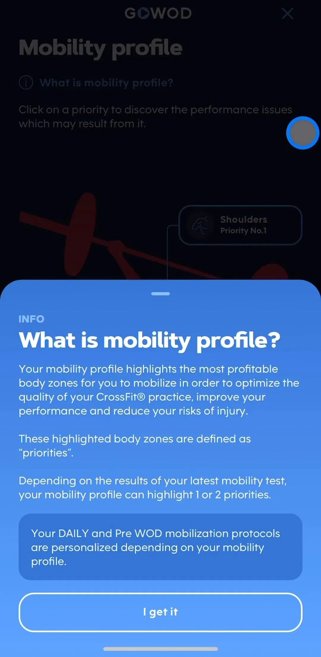
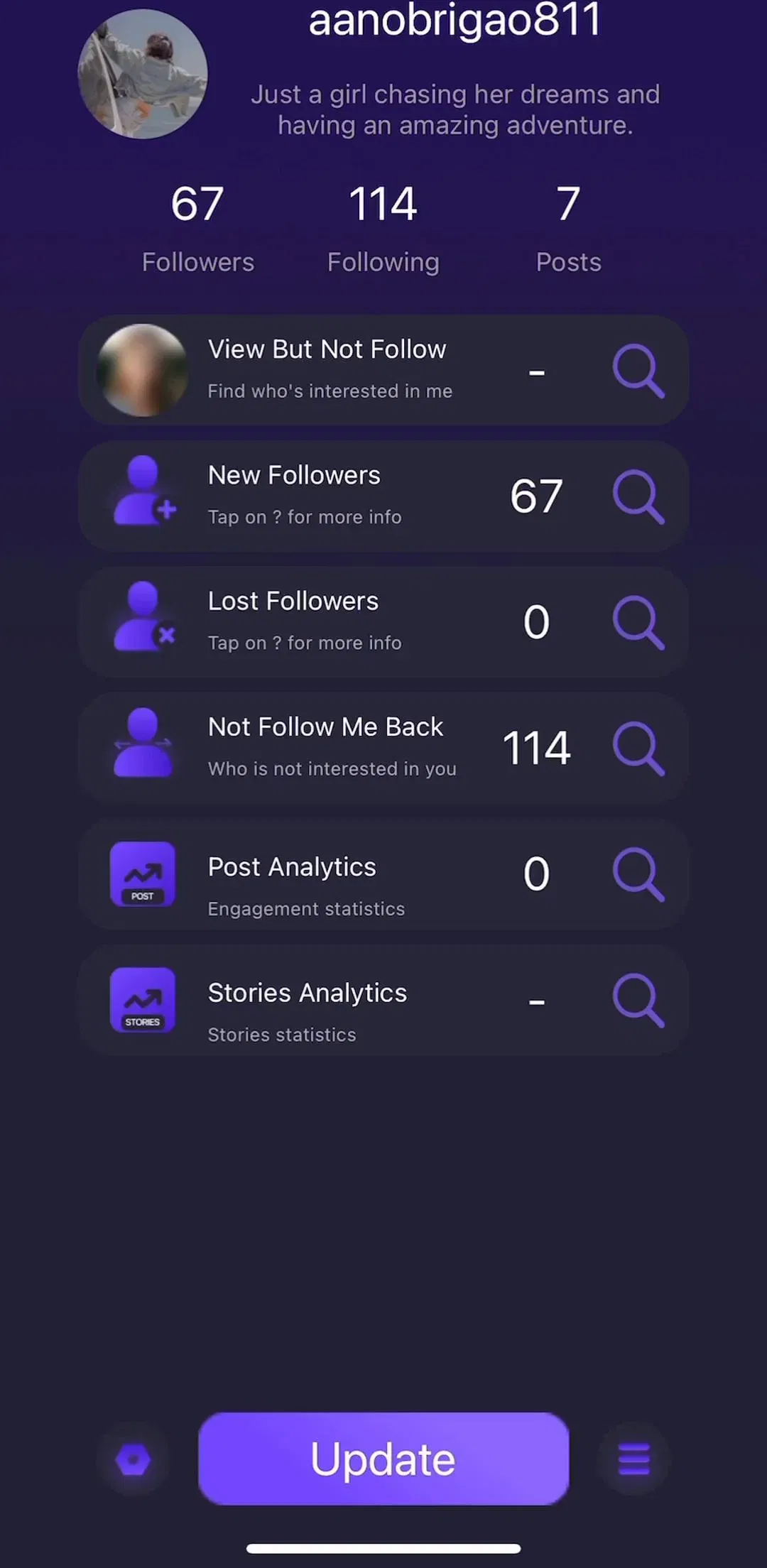
So the reference set worth studying is not the fintech portfolio screen. It is the app that measures one repeated behaviour and has to make the user feel something about the number. Elevate (est. $0.75M/mo) does it for cognitive training scores. BePresent (est. $0.30M/mo) does it for screen time. Unfollow Tracker (est. $0.55M/mo) does it for follower counts. None of these are fitness apps and all three build the same screen. Revenue figures throughout this post are third-party estimates, not audited financials.
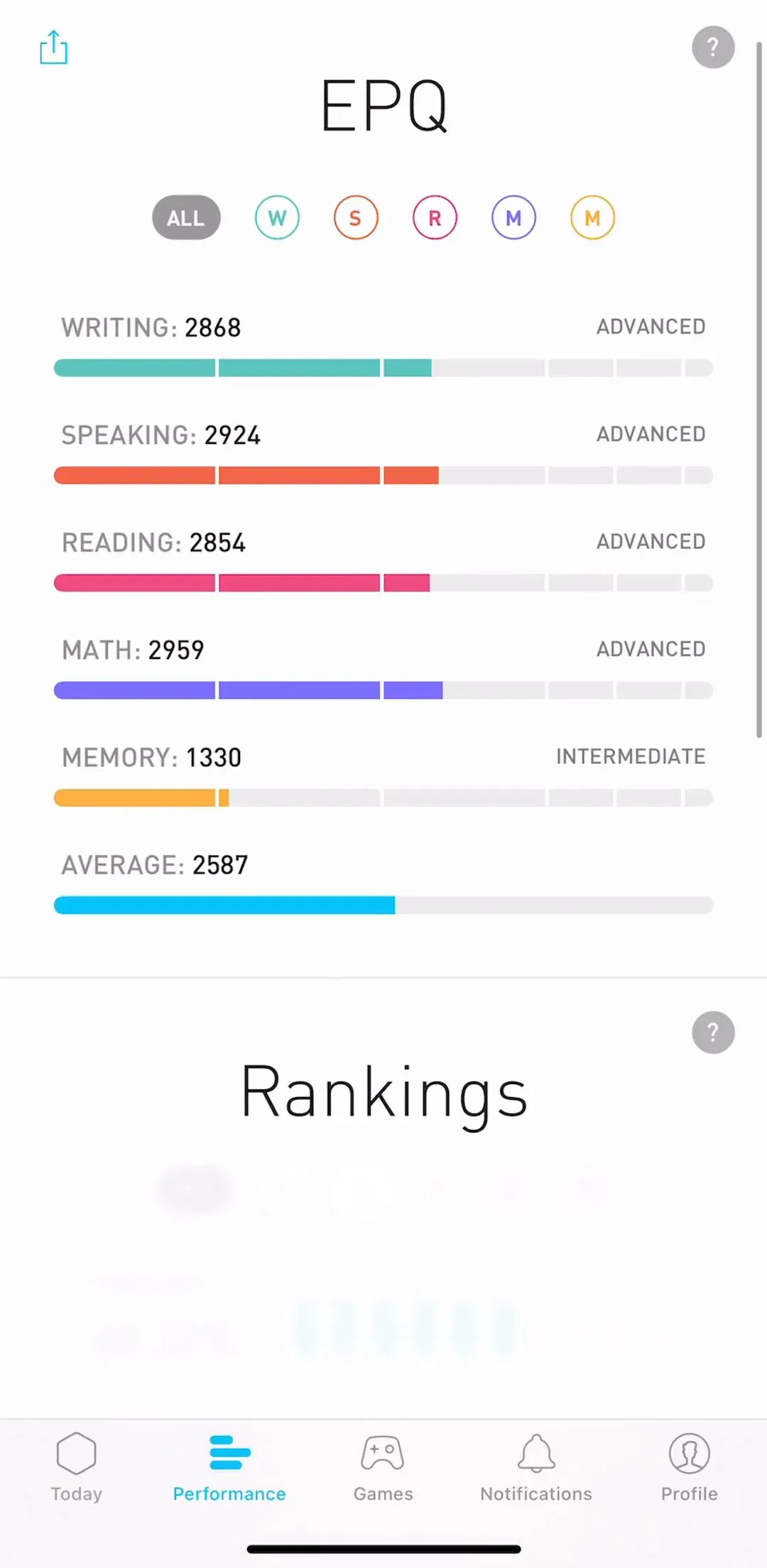
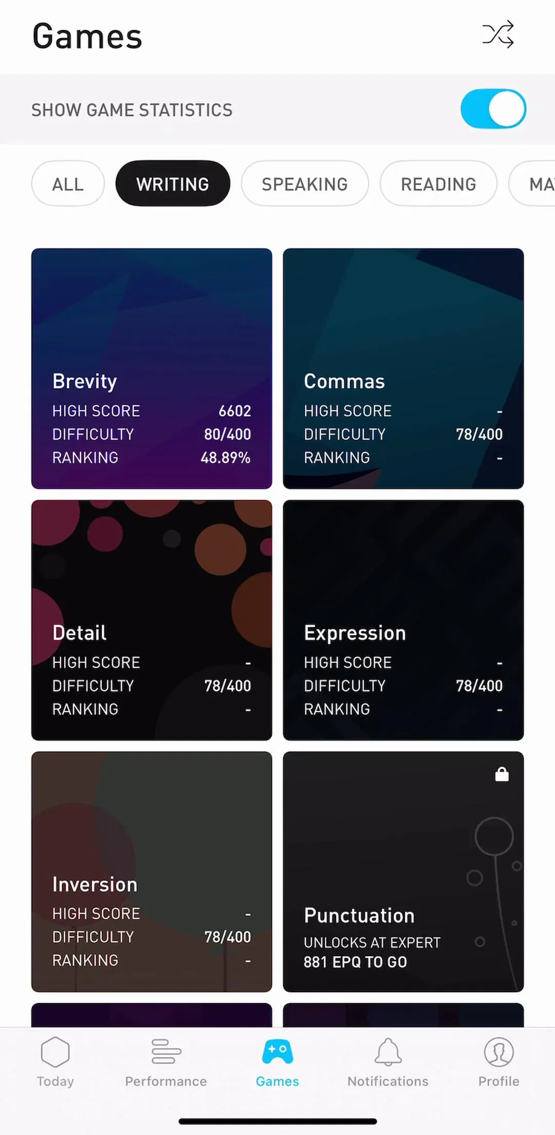
The single most consistent thing in these captures is that one number is much larger than the others. Not two, not a row of four equal tiles. One figure, usually today or this week against a goal, sized so it reads without focusing, with the supporting detail visibly demoted below it.
The reason is the screen, not taste. A phone gives you roughly 390 points of width and a top third that every user sees before deciding whether to scroll. A KPI row of four tiles divides that space into four cells too small to hold a label, a value and a comparison, so each cell drops one of the three and becomes ambiguous. Choosing the hero metric is the actual design work on this screen, and it is a product decision disguised as a layout decision: whatever you make biggest is what you are telling the user the app is for.
Secondary metrics still belong on the screen. They belong in the scroll, as cards, at a size that says they are secondary.
Day, week, month, year. This control appears on almost every populated dashboard in the library, and it is doing more work than it looks like it is doing: it is the only navigation many of these screens have. The user is not moving between sections, they are moving between time windows of the same section.
Mechanically this is a segmented control, and the rules from that post apply directly: four options is near the practical ceiling, the labels have to survive at small sizes, and the selected state needs to be obvious rather than tasteful. Two additions are specific to dashboards. First, the default range should be the one the user checks most, which for a daily tracker is today and not this year. Second, changing the range must change the hero metric too, not just the chart underneath it, or the screen starts telling the user two different things at once.
Three chart shapes cover nearly everything on these screens, and each answers a different question.
A ring or arc answers “how far through a target am I?” It needs a defined goal to be meaningful, and it degrades badly without one, which is why apps with no goal concept should not reach for it. A bar series answers “which periods were bigger?” and is the right default for anything counted per day. A line answers “which way is this going?” and needs enough points to have a direction, which a week-old account does not have.
The failure worth naming is the fourth shape: a chart chosen because the screen looked empty. A dashboard with a decorative area graph that no one can read a value off is worse than the same screen with a number and a sentence, because it costs vertical space and returns nothing. If you cannot say which question a chart answers, it is decoration.
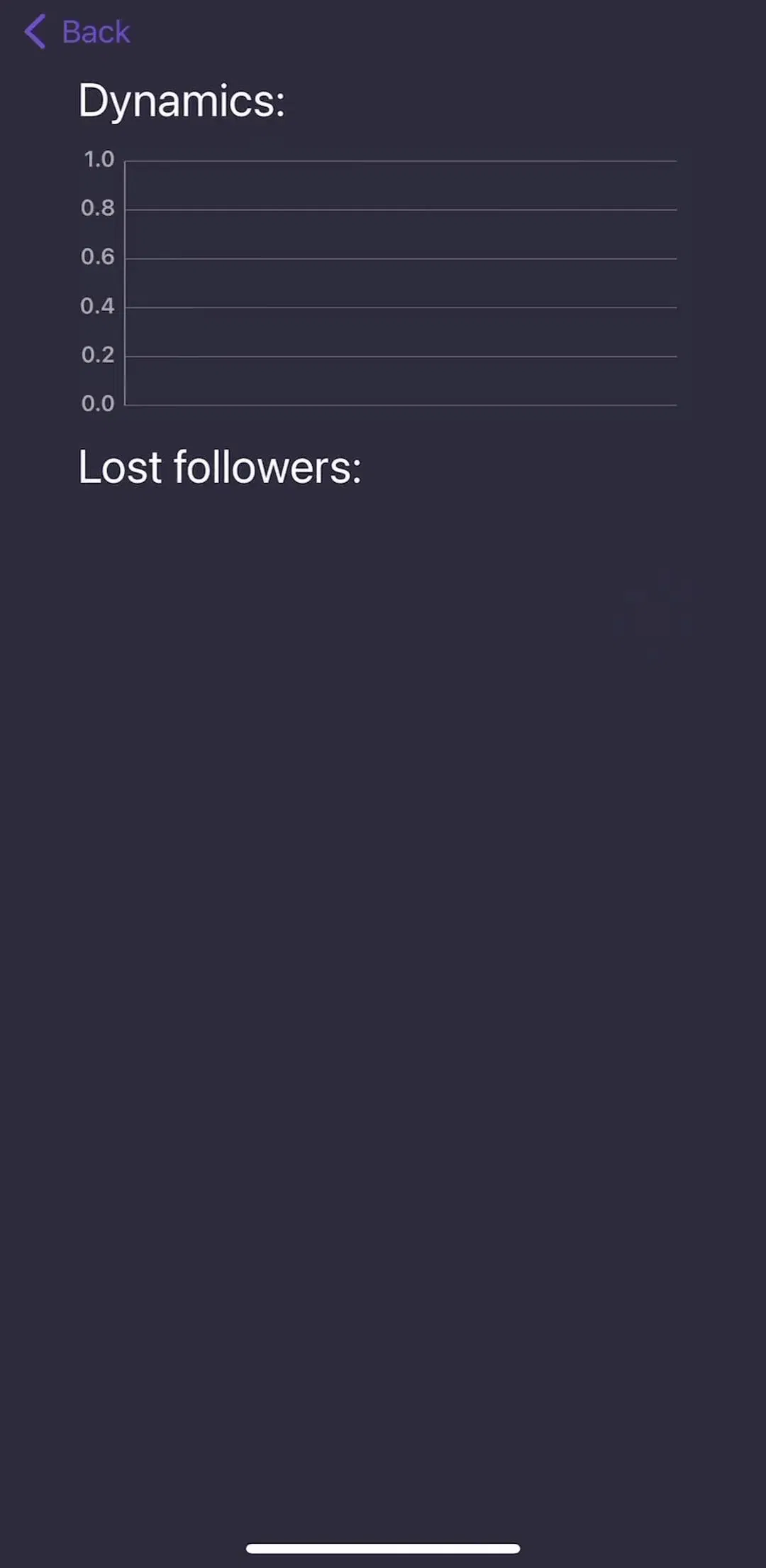
Every user meets the empty dashboard and almost no concept work draws it. On day one there is no history, no average, no trend, and the charts above have nothing to render. Showing an empty axis with a flat line at zero is the common mistake: it reads as broken rather than new.
The pattern that holds in shipping apps is to swap the chart for the action that produces the data, and to state what the screen will become. The principles in our empty state postapply, with one addition for this screen: a tracker’s empty state has a known end. You can tell the user exactly how many entries the chart needs before it appears, and that is a far better prompt than a generic illustration.
There is a second, less obvious empty state: the lapsed dashboard. A user who logged for a fortnight and then stopped returns to a screen with a gap in it. Rendering the gap as zero is a lie, and rendering nothing looks like data loss. Label the gap.
Under the hero metric these screens resolve into stacked cards: one per secondary metric, per streak, per recent entry, per suggestion. The anatomy questions are the ones covered in our card UI post, and the dashboard-specific rule is that on this screen every card should be tappable and should lead somewhere real.
A dashboard card that displays a number and does nothing when pressed teaches users the screen is inert, and they stop trying. Each card is the entry point to that metric’s detail view, which is where the full history, the filters and the export live. That drill-down is what lets the dashboard stay short: it does not have to be complete, it has to be a good index. Where the detail view is a chronological record, the grouping and gap problems in our timeline post take over.
One boundary worth drawing, because it is easy to blur: the streak card and the daily check off are a different pattern with their own logic, covered in our habit tracker post. This post is about the screen those cards sit on.
1,834 of the 2,622 apps in the library carry a subscription paywall flow, and on trackers the gate lands in a predictable place: logging is free, understanding costs money. The current value is visible, the trend, the breakdown and the history are behind the subscription.
Designing that gate on a dashboard has a specific trap. A locked card that shows only a lock icon gives the user nothing to want. A locked card that shows the shape of the answer, blurred or partial, with a plain statement of what unlocking reveals, is asking for money in exchange for something legible. The trial and pricing mechanics in our paywall design post apply unchanged. The dashboard-specific point is timing: this gate works best after the user has data worth analysing, because a locked insight on day one is locking an empty room.
The desktop tradition is worth reading and mostly worth ignoring on a phone. Leave the sidebar, the KPI row, the dense data table, the multi-chart grid and the filter bar. None of them survive at 390 points, and the mobile substitutes already exist: the tab bar covered in our tab bar post replaces the sidebar, the card stack replaces the grid, and a bottom sheet replaces the filter panel.
Two things do transfer. The first is the discipline of stating a comparison rather than a bare number: 8,412 steps means little, 8,412 steps against a 10,000 goal or against last week’s average means something, and every good desktop dashboard does this. The second is reserving layout space for changing values so a refresh does not reflow the screen, the same rule that governs live tracking screens in our travel app UI post.
If you want to see how this resolves across categories rather than in one app, the captured flows are the fastest way in: the tracking and insights pattern page holds the progress screens, and the home and dashboard pattern page holds the 65 apps that treat this screen as their front door.
On mobile it is almost always the progress screen of a tracker: the surface a user opens to see how they are doing against something they are measuring. Of the 526 revenue-verified iOS apps in our library carrying a tracking and insights flow, 324 sit in health and fitness. Only 10 are finance apps. The multi-panel analytics dashboard that dominates image search is a web and desktop form, and it does not survive the transfer to a phone screen.
One that reads at a glance, then everything else at a lower rank. The screen is roughly 390 points wide and the top third is all a user reliably sees before scrolling, so a dashboard that gives six numbers equal weight gives none of them any weight. Shipping apps pick a single hero figure, usually today's value against a goal, and push comparisons, history and secondary metrics into cards below it.
In our data they are separate flow families and they overlap less than you would expect: 65 apps carry a home and dashboard flow, 526 carry tracking and insights, and only 26 apps carry both. A home screen routes you somewhere. A dashboard answers a question and then offers a drill-down. Apps that try to make one screen do both usually end up with a hero metric fighting a navigation grid for the same space.
Design the first run before the populated state, because every user sees it and it is the state most concept work omits. A tracker on day one has no history, no trend and no average, so charts have nothing to draw. The honest approach is to replace the chart with the action that produces the data rather than showing an empty axis, and to say what the screen will show once there is something to show.
The mobileappdesign library holds captured flows from 2,622 revenue-verified iOS apps, 526 of them with a dedicated tracking and insights flow and 65 with a home and dashboard flow. Screens are captured in sequence, so you can see how a dashboard leads into a detail view and into a paywall rather than judging a single shot on its own.
Browse captured tracking and insights flows from revenue-verified iOS apps, in the order a real user walks them.
Browse tracking and insights screens