Search for profile UI design and nearly every result is the same screen: a cover image, a round avatar overlapping it, three counts for posts, followers and following, and a grid of content underneath. That is a social network profile, and it is a real pattern. It is also not what most shipping apps build. Across the 2,622 revenue-verified iOS apps in our library, 446 carry a captured profile section, and when you read those sections the dominant form is an account screen: who you are signed in as, what you pay for, and how to change it. This post is about designing that screen well, and about the smaller set of apps where the profile really is the product.
The 446 apps with a profile section hold 459 profile sections between them. Sorting those sections by title makes the shape obvious. 211 combine profile and settings in one section. 180 are edit or manage profile flows. 25 are profile creation or setup, usually inside onboarding. Only 14 are titled around viewing a profile or its stats, and some of those are not the user’s own profile at all.
The category mix explains why. 158 of the 446 are health and fitness apps, 53 are education and 39 are lifestyle. These are subscription products where the user is a customer, not a creator with an audience, and 298 of the 446 also carry a separate settings flow. Nobody visits a sleep tracker to look at someone else’s profile. So the design question is rarely “how do I present this person to others?” and usually “how do I let this person see and change their account without hunting for it?”
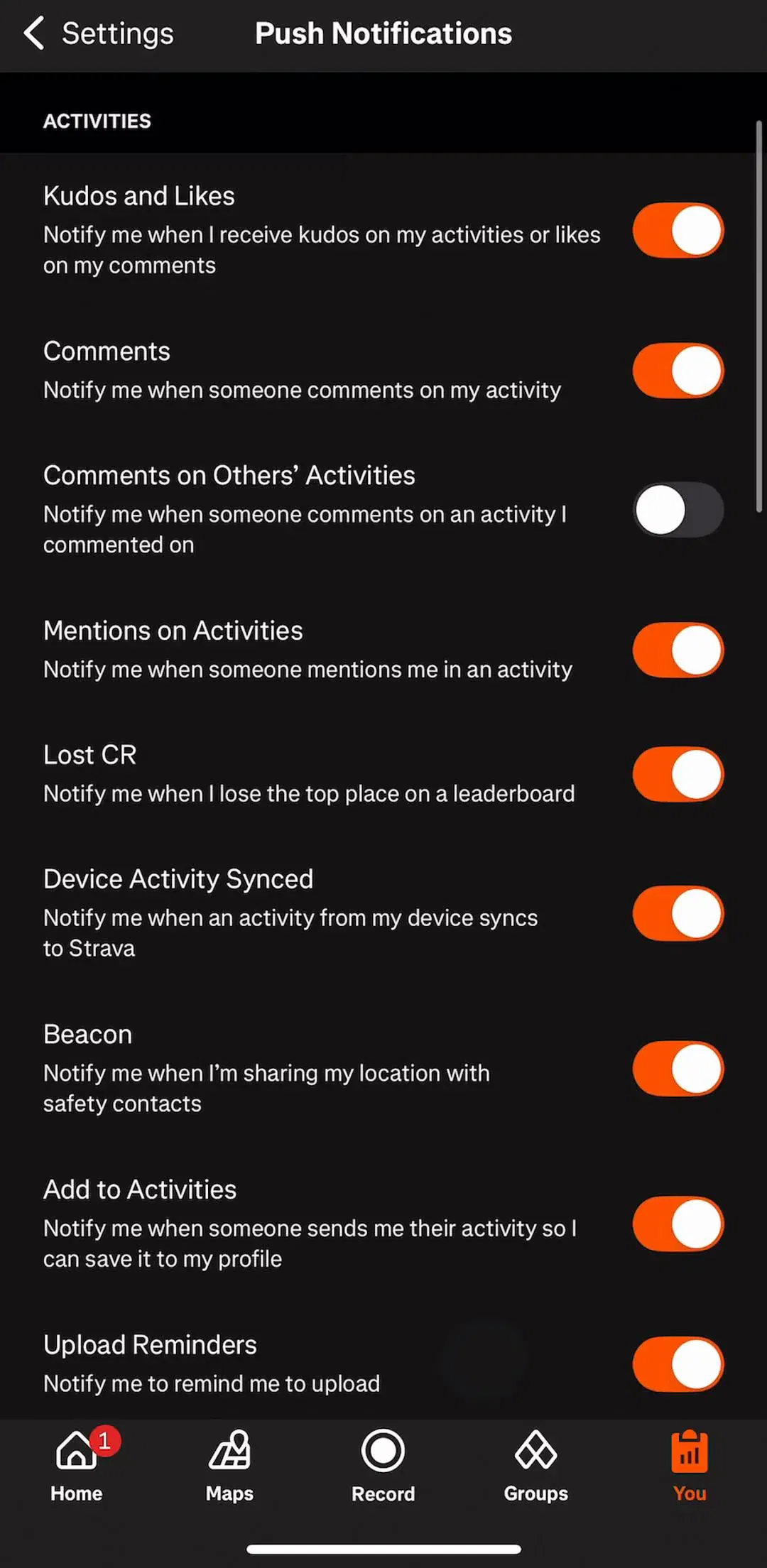
Strava (est. $16M/mo) is a useful example precisely because it is a social product and its captured section is still titled Editing Profile and Settings: even where the profile is public, the part a user spends time in is the administrative half. Revenue figures throughout this post are third-party estimates, not audited financials.
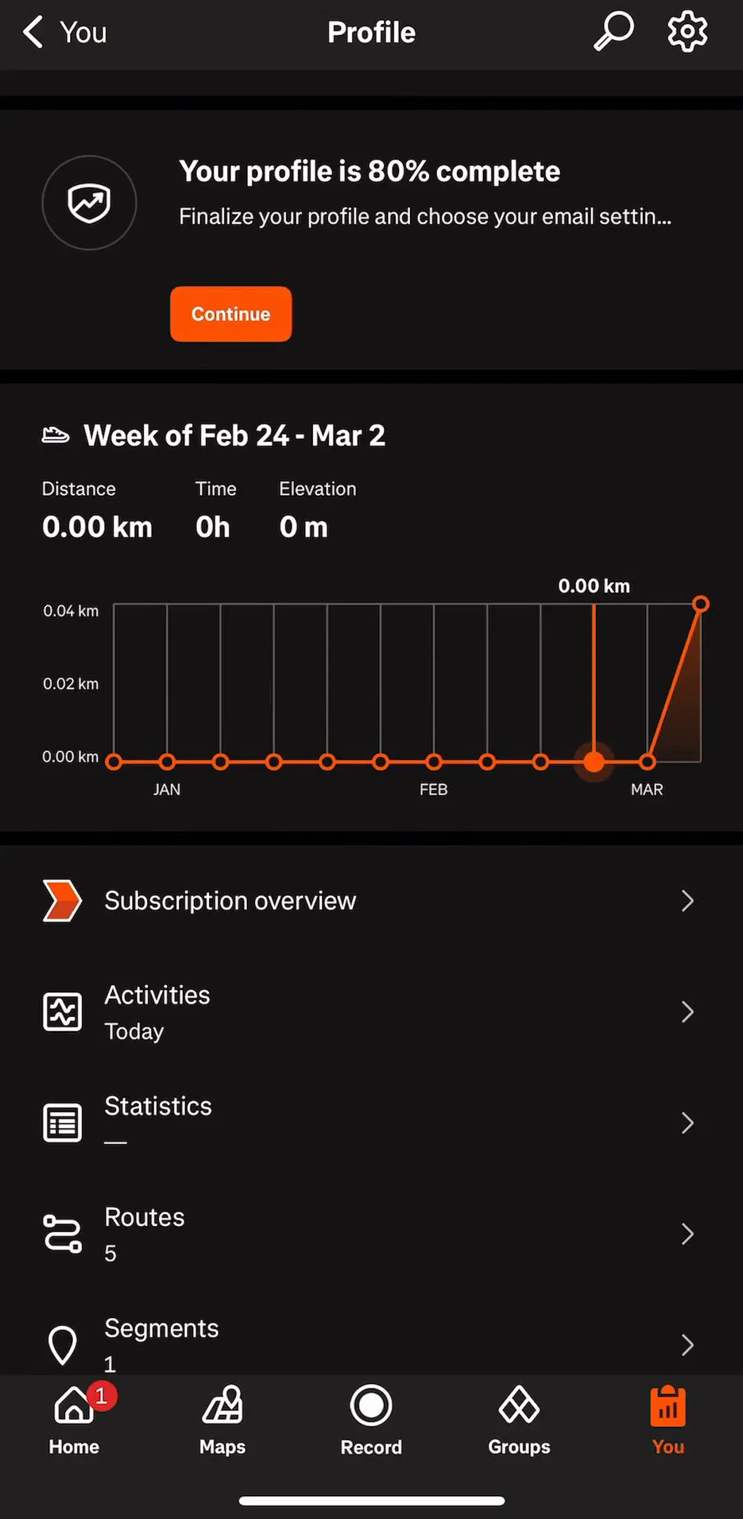
There are two common entrances and each makes a different promise. A profile tab, usually the rightmost item in the tab bar, says this screen is worth a daily visit. It earns that slot when the profile shows something that changes: a streak, a level, progress toward a goal. An avatar button in the top corner of the home screen says this is administration you will need occasionally, and it leaves the tab for a core feature.
The mistake is spending a tab on a screen that holds nothing but an email address and a sign out row. Tab bars hold four or five items, and a slot that users open twice a year is a slot taken from something they would open every day. If you cannot name what changes on the profile between visits, the corner avatar is the more honest entrance.
The top of the profile is where the concept work and the shipping apps diverge most. The social template spends the header on counts. An account screen should spend it on recognition and state: an avatar or initials, a display name, and a single line that tells the user where they stand. For a subscription app that line is often the plan itself, whether the user is on a trial, a paid tier or the free tier, because that is the single most requested piece of account information and the one support teams get asked about.
Two details matter more than they look. First, the avatar needs a fallback that does not look broken, because most users never upload a photo: initials on a colour tile read as intentional, a grey silhouette reads as missing. Second, the header should be tappable as a whole and lead to the edit form, since that is what almost everyone tapping it wants.
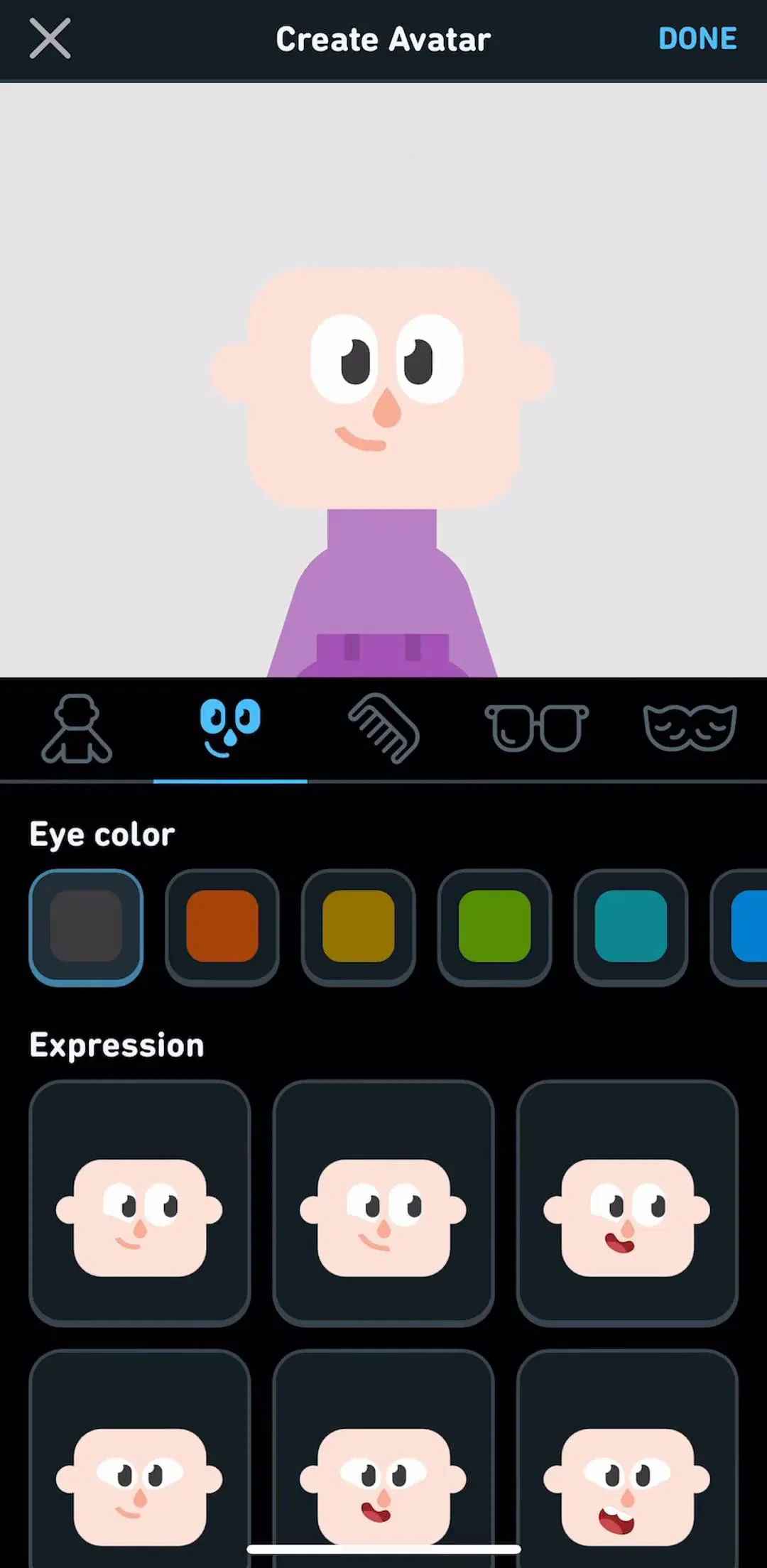
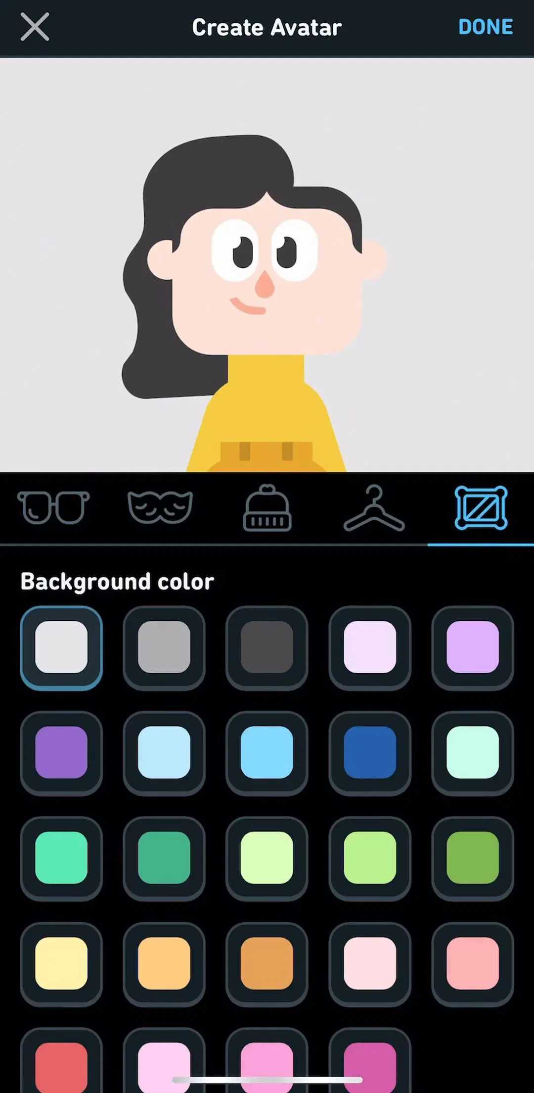
180 of the profile sections in the library are edit or manage flows, which makes the edit form the most frequently captured profile surface after the combined profile and settings screen. The good ones are short. Duolingo (est. $48M/mo) captures its Edit Profile section in four screens, and the discipline worth copying is scope: show the fields the app actually uses and nothing it collected out of habit.
The practical rules follow from the fact that this is a form. Prefill everything you already know from sign up, which the flows in our login screen post will have collected. Make the avatar the first and largest target, since changing it is the most common edit. Group fields into rows the way a settings list does, following the row anatomy in our list UI post. And give the user one unambiguous save action, with a clear way to leave without saving, because an edit form that auto-saves some fields and not others teaches people to distrust it.
Sensitive fields deserve their own path. Changing an email address or a password is an account security action, not a profile edit, and it should confirm the change rather than saving it inline alongside a display name.
Merging is the majority choice in the library, 211 of 459 sections, and for most apps it is correct. Finch (est. $1M/mo) titles its section Edit Profile and Settings, and Speak & Learn English: Learna(est. $5M/mo) titles its section Navigating Settings & Profile. When the profile holds a name, a photo and a plan, a separate screen for it adds a tap and a decision without adding anything the user needs.
Split them when the profile is seen by other people. A public profile and a list of private preferences have different audiences, and putting them on one screen invites a user to wonder whether their notification settings are visible to their friends. The organisation of the settings half, grouping, toggles versus drill-downs and where destructive rows go, is covered in our settings UI post; this post is about the identity half that sits above it.
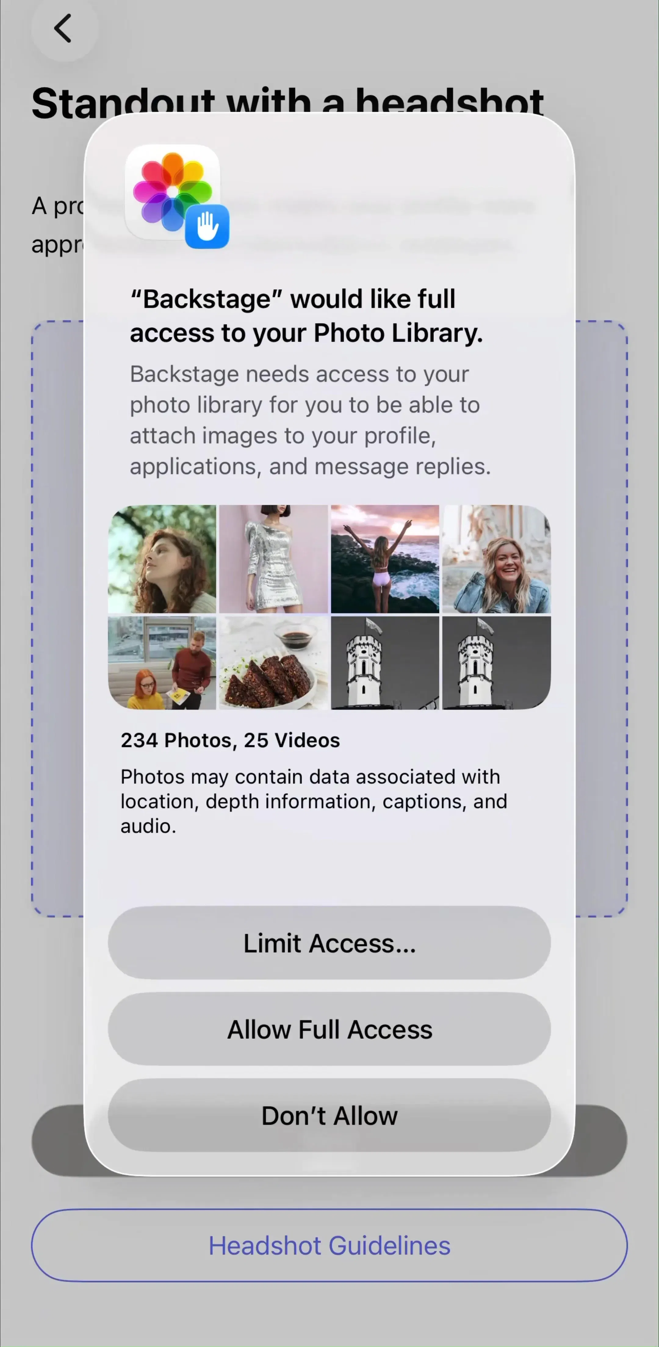
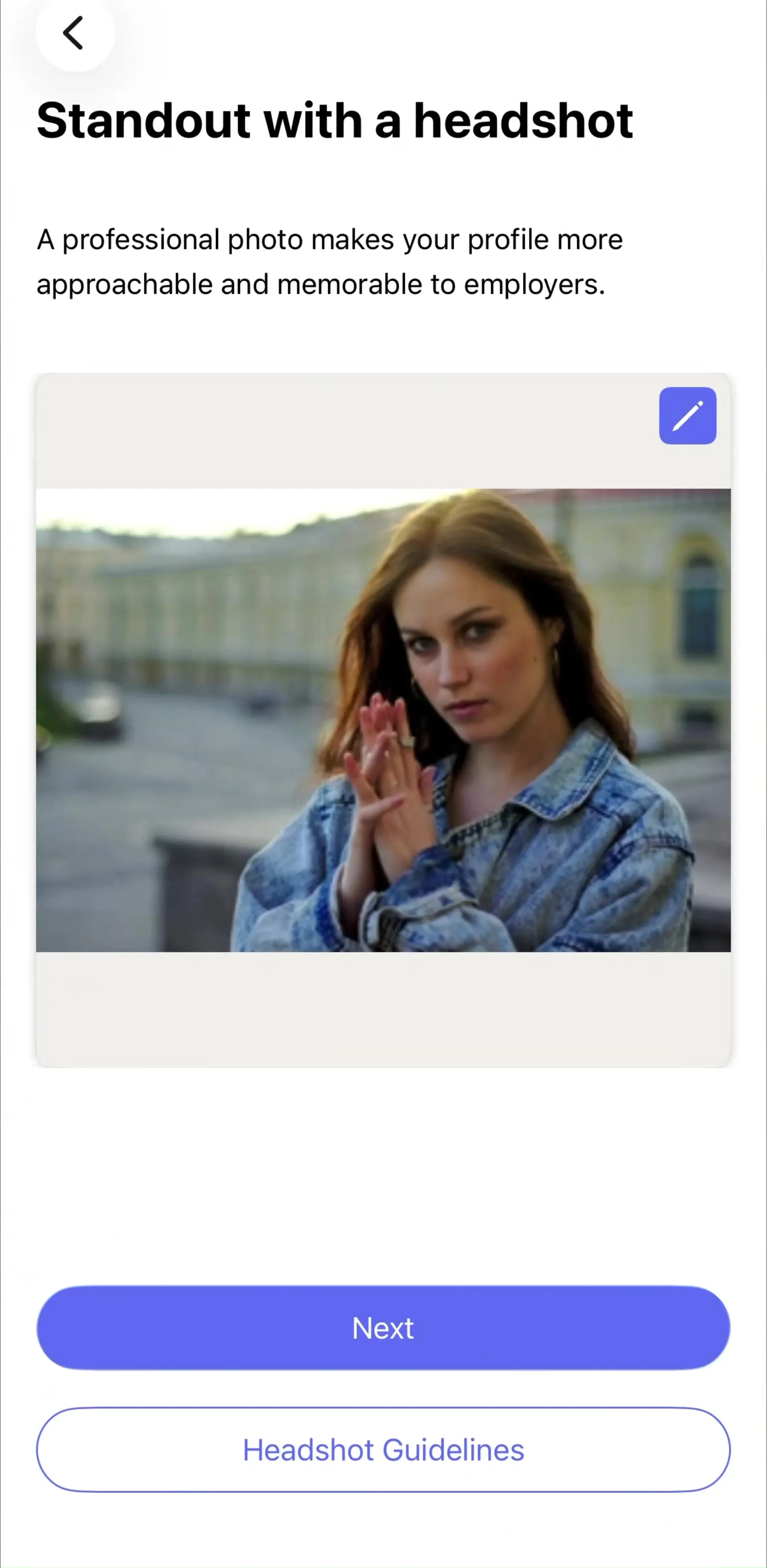
A minority of apps invert everything above, and they are worth studying because the stakes are higher. Backstage (est. $0.35M/mo) is a casting marketplace whose captured section is titled Creating a Profile: there the profile is what the user is selling to casting directors, so every field is a reason to be picked or passed over, and completeness matters more than brevity.
The same inversion shows up in quieter forms. Vivino(est. $0.35M/mo) has a section titled Personalizing Taste Profile, where the profile is a model of preferences that drives recommendations rather than an identity at all. When the profile is the product, it usually gets built during onboarding rather than after it, which is why 25 of the library’s profile sections are creation or setup flows. The questionnaire patterns in our onboarding examples post apply directly, with one addition: show the user a preview of the finished profile before the last step, so they can see what their answers produced.
Every profile starts empty, and the empty version is the one most users see first. No photo, no history, no stats, often no display name beyond an email address. The principles from our empty state post carry over: replace the missing content with the action that fills it, and say what the screen will show once there is something to show.
Be careful with completion meters. A progress ring that says a profile is 40 percent complete works in an app where a complete profile gets the user something, such as better matches or more visibility. In a utility where the profile does nothing, it nags the user to fill in fields that serve the company rather than them, and it is better left out.
Below the identity and the settings, the profile is where account-level actions live: subscription management, restore purchases, sign out, and account deletion. These are rare actions that users need to find fast when they need them, and the convention of placing them at the foot of the profile is strong enough that users look there first.
Deletion is not optional on iOS. Apple’s App Store Review Guidelines require apps that support account creation to let users start account deletion inside the app, so it has to exist and it has to be findable. Put it last, style it as destructive, and confirm it, but do not hide it behind a support email. If the user has an active subscription, say plainly that deleting the account does not cancel billing through the App Store, since that confusion is a common source of refund requests. The subscription side of this screen connects to the patterns in our paywall design post.
To see how these pieces fit together across hundreds of apps rather than one, the captured flows are the fastest route: the profile pattern page collects the profile sections, the account management pattern page holds the sign out, subscription and deletion flows, and the settings pattern page covers the half of the screen this post leaves to its sibling.
Less than the concept work suggests. A header with an avatar, a name and one line of status, an entry point to edit those details, and the account-level actions the user cannot find anywhere else: subscription status, sign out and account deletion. Follower counts and a content grid belong only in apps where other people actually look at the profile. In our library most profile sections are account screens, not social identity pages.
Often, yes. Of 459 profile sections captured across 446 revenue-verified iOS apps, 211 combine profile and settings in a single section. Merging them is the right call when the profile carries little identity, which is true of most subscription utilities and trackers. Split them when the profile is public, because a screen other people see and a screen of private preferences have different jobs and different audiences.
Usually in one of two places: the last tab of the tab bar, or an avatar button in the top corner of the home screen. The tab earns its place when users visit the profile often, for example to check a streak or a level. The avatar button suits apps where the profile is mainly account administration that people visit a few times a year, because it keeps a tab free for a core feature.
Treat it as a short form, not a page. Show only the fields the app actually uses, prefill everything you already know from sign up, make the avatar the first and largest target, and give the user one obvious way to save or discard. 180 of the 459 profile sections in our library are edit or manage flows, and the ones that work keep the form to a single screen.
The mobileappdesign library holds captured flows from 2,622 revenue-verified iOS apps, 446 of them with a dedicated profile section. Screens are captured in the order a user walks them, so you can see how an app reaches its profile, what the edit form asks for, and where account actions such as sign out and deletion sit.
Browse captured profile flows from revenue-verified iOS apps, from the tab or avatar that opens them to the edit form and the account actions at the bottom.
Browse profile screens