Search for keyboard UI and almost everything you get is a picture of a keyboard: Figma kits, vector packs, a mockup of the keys themselves. That is the least interesting part of the subject. You do not design the keyboard. Apple and Google design the keyboard. What you design is the screen underneath it, in the state where a third to a half of it has just disappeared.
That state is common. Of the 2,622 revenue-verified iOS apps in our library, 540 have a captured authentication section across 565 sections, 1,204 have a content creation section across 1,834 sections, and 374 have a search and filter section across 442 sections. Those are three different keyboard problems, and a screen that only works with the keyboard down is a screen that does not work.
Every text field on a phone has two layouts. One is the screen you drew. The other is the screen with the bottom third to half removed, the content pushed up or clipped, and one field holding the entire user’s attention. Most design files contain only the first one, which is why the second one is where the bugs live.
The size of the cut is not fixed. It moves with the device, the keyboard language, whether the predictive row is on, and whether the app adds its own bar above the keys. Anything you position by a hard-coded offset from the bottom will be wrong for someone. The only reliable approach is to treat the keyboard as a variable-height inset and let the layout respond to it.
The practical test is simple and almost nobody runs it: open the screen, focus the field, and check that the thing the user needs next is still on screen. Not the logo, not the header. The field they are typing in, the error they need to read, and the button they are about to press.
The form. Several fields, a known order, and a submit at the end. The user moves down a sequence, so the job is keeping the current field visible and making the path to the next one obvious.
The search field. One field, no submit, and results that change while typing. The keyboard is up for a short burst and the screen behind it is a live list, so the job is keeping enough of that list visible to be worth reading.
The composer. One multi line field, an attached send action, and content the user is replying to. The keyboard may stay up for minutes, so the job is keeping the context above it legible while the input grows.
These pull in different directions, and a shared text field component that ignores the difference will be wrong on at least two of the three.
On a sign-up or sign-in screen the keyboard appears almost immediately and stays up for the whole flow. The New York Times account creation section is a useful reference for the shape, because the form sits inside a longer onboarding sequence rather than standing alone.


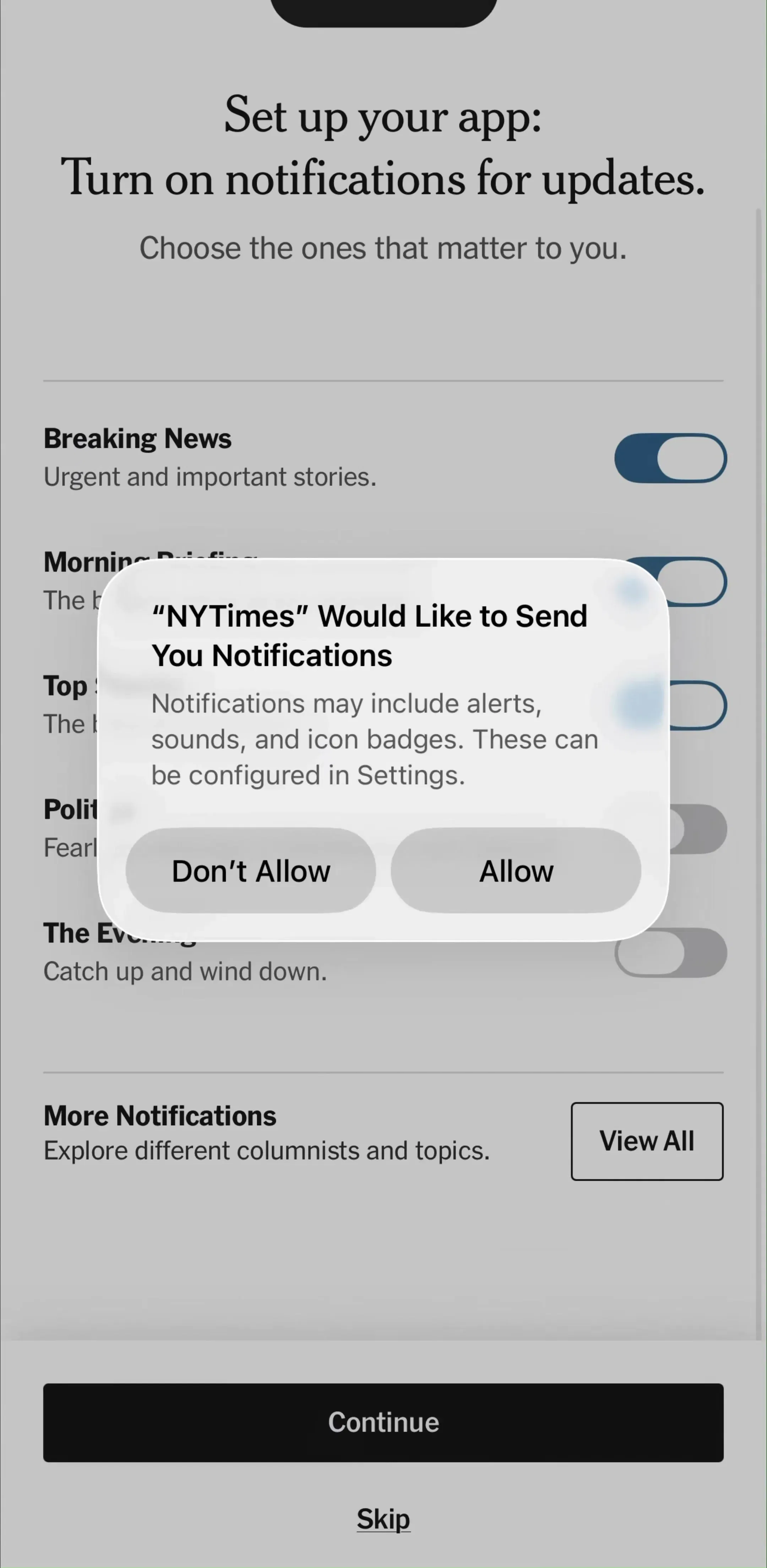
Three rules carry most of the value here. Scroll the focused field into view with enough room above it to see its label and enough below it to see its error, because a validation message rendered underneath the keyboard is a message nobody reads. Wire the return key to move to the next field so the user never has to aim at a target the keyboard is covering. And validate on blur rather than on every keystroke, so the layout is not reflowing while someone is still typing. The rest of the sign-up screen, including which providers to offer and in what order, is covered in our login screen post.
SoundCloud’s account creation section shows the same problem in a shorter flow, where the form is the only thing between the user and the product.
Search is the case where the keyboard covers the thing the user is trying to look at. They are typing to change a list, and half that list is now behind the keys. If four results fit before focus and one fits after, the field works and the screen does not.
MyFitnessPal’s food logging section is a good example of the shape, because search there is a step inside a task rather than a destination.
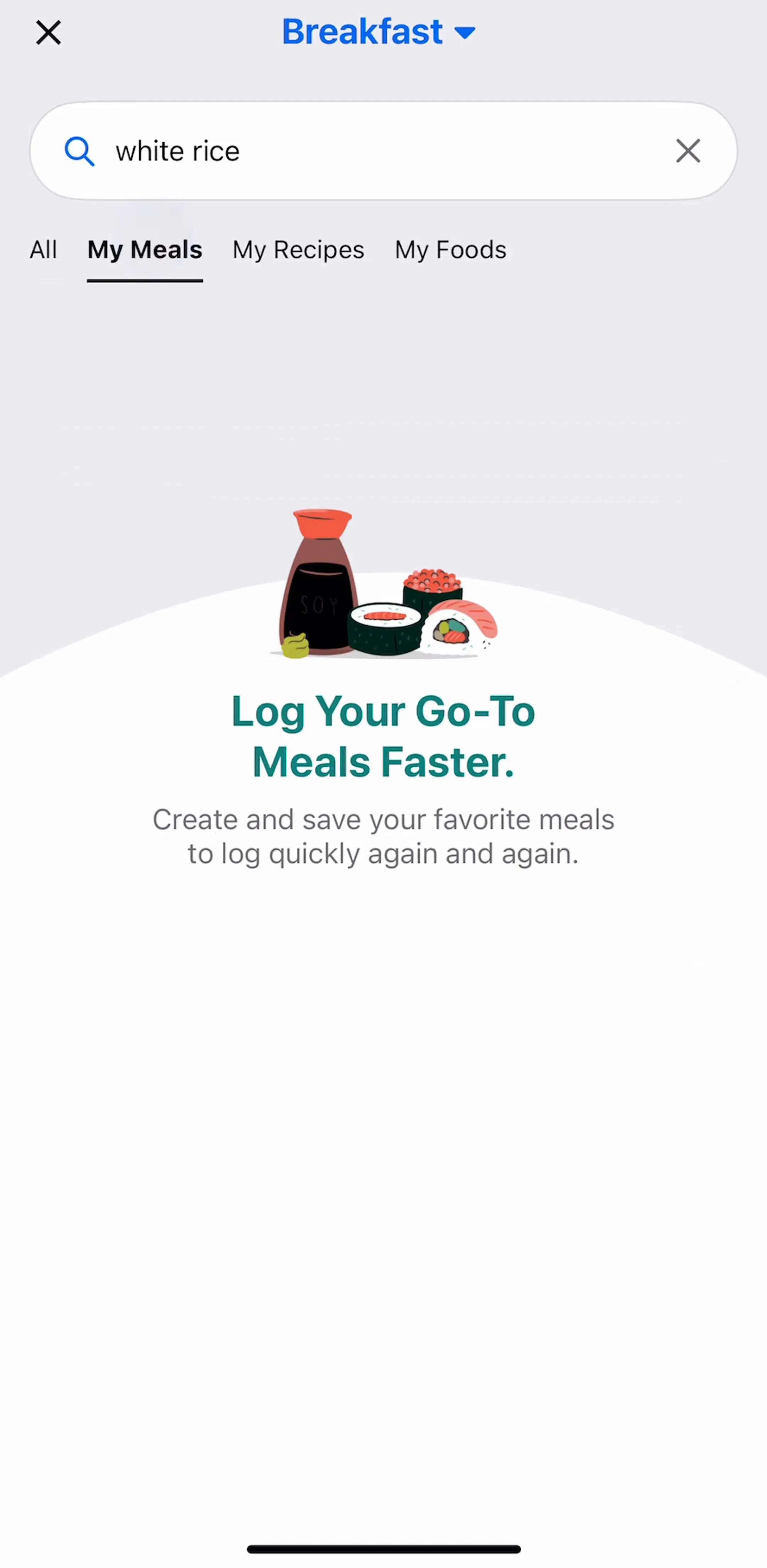
What helps: collapse or hide the header while the field is focused, so the space goes to results rather than to chrome. Keep rows compact in the focused state. Show recent searches and suggestions in the space that is left rather than an empty panel. And decide deliberately whether the keyboard stays up when the user starts scrolling results, because dismissing it on scroll gives back the screen but costs a tap if they want to refine the query. Our search bar post covers the field itself, the empty search screen and the zero results state, and the filter post covers everything that happens after the query.
A comment or message field is the longest-lived keyboard state in most apps. It is also the only one where the field changes size while in use, because multi line input grows as the user types and takes the space from whatever is above it.
Hevy’s social feed section shows the surrounding context, which is the part that has to stay readable while the composer is open.
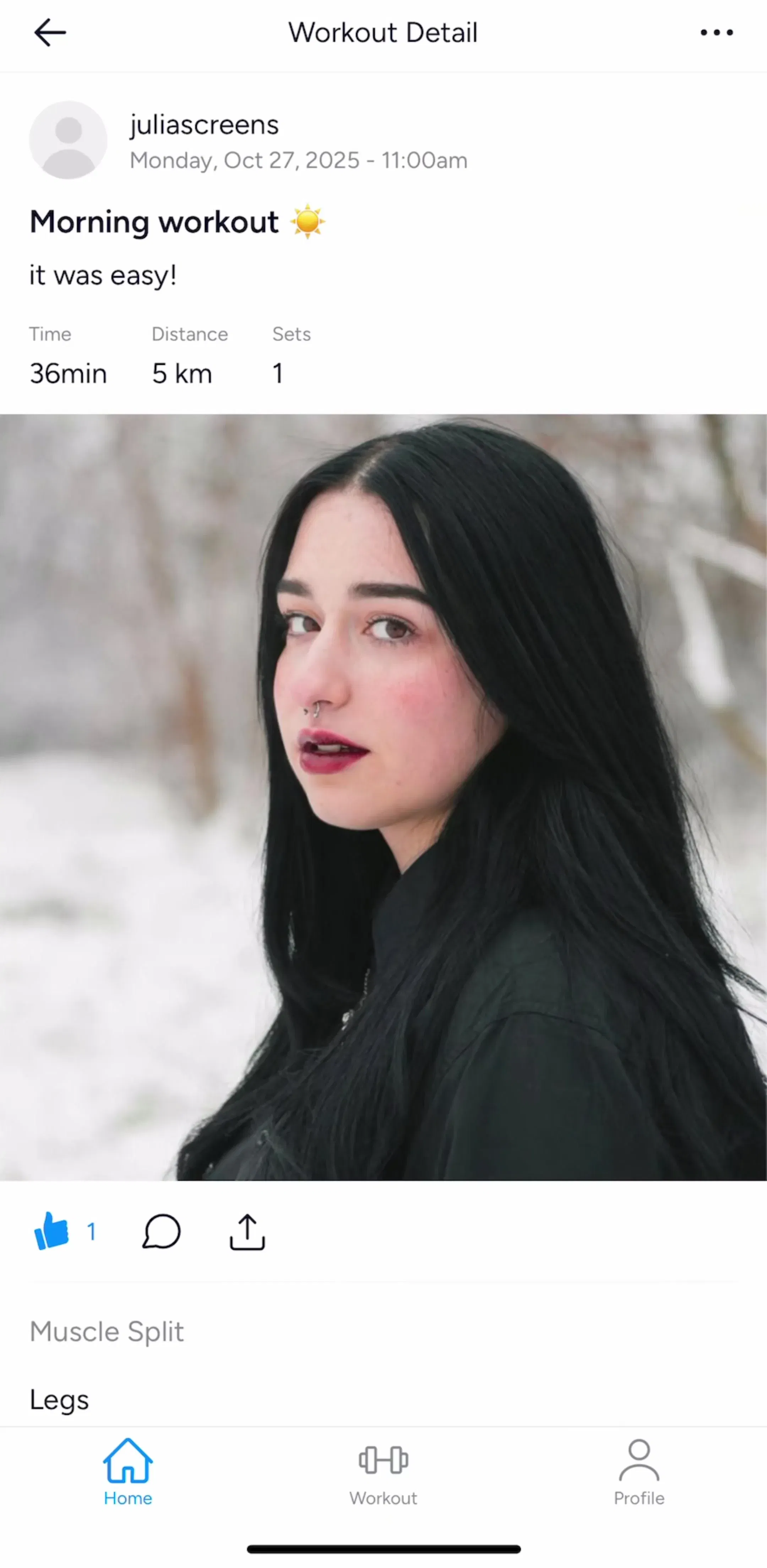
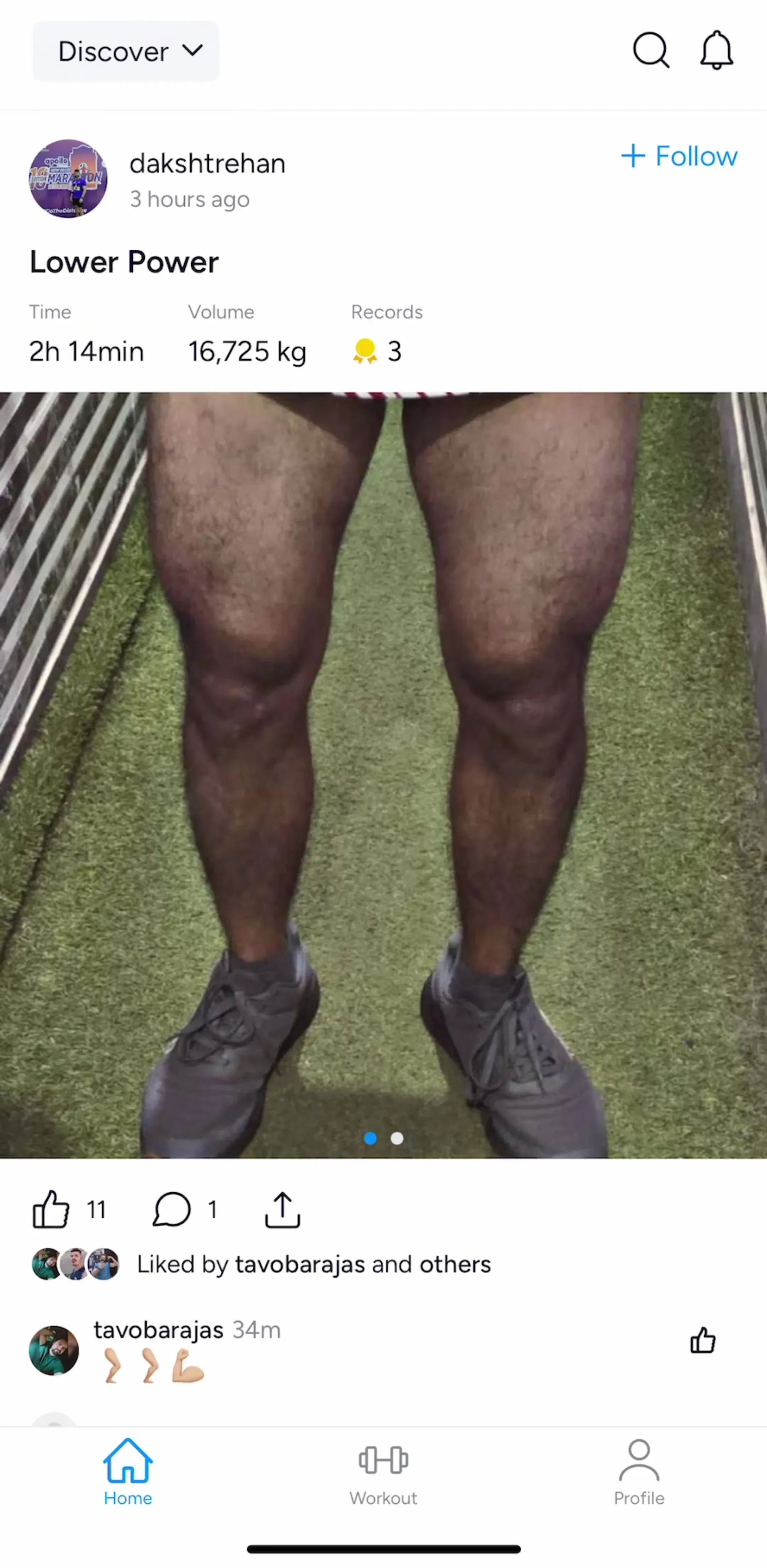
Cap the growth at a few lines and scroll inside the field after that, otherwise a long reply pushes the conversation off the top of the screen. Keep the send control attached to the field rather than to the screen, and keep it disabled rather than hidden while the field is empty, so it does not appear and shift the layout at the moment someone starts typing. The thread structure around it is in our comment UI post.
Every field declares which keyboard opens for it, and that declaration is a design choice that usually gets left at the default. The cost of the default is one extra keyboard switch per entry, forever.
Email fields should open a layout with an at sign and no autocapitalisation. Quantity fields should open a number pad rather than a full keyboard with numbers hidden behind a modifier. Prices need the decimal variant. Phone numbers need the phone pad, which is a different layout again. Verification codes should declare themselves as one-time codes so the code can be filled from the message rather than retyped, and card fields should declare themselves so the saved card can be offered. Names should capitalise words; passwords should capitalise nothing.
None of this is visible in a static mockup, which is exactly why it survives review and ships wrong. Our onboarding post covers the flows where these fields cluster most heavily.
The return key carries a label and the label is a commitment. Next means another field is coming and focus will move to it. Search means the query runs now. Send means the message leaves. Done means this entry is finished and the keyboard closes.
Two failures are common. The first is a form whose last field says Next and then goes nowhere. The second is a multi line composer whose return key says Send while also being the only way to insert a line break, which forces the user to choose between formatting and sending. On a multi line field, put send in a button and let return insert a newline.
The strip directly above the keyboard is the most valuable real estate on a focused screen, because it is the only place guaranteed to be visible and within reach of the thumb that is already typing. It is also the least used.
Good uses: the primary action, so the user never has to dismiss the keyboard to submit. Field navigation on long forms. Formatting or attachment controls for a composer. A character or word count where there is a limit. The rule is that it holds something about the current field, not a second navigation bar.
Bad uses: promotion, tips, and anything that appears once and pushes the layout up by its own height for the rest of the session. Every pixel spent here comes out of the content the user is trying to see.
This is the single most common keyboard bug in shipping apps, and it comes from a pattern that is correct everywhere else: pin the primary button to the bottom of the screen. The moment the keyboard opens, that button is behind it.
What follows is a round trip the user should never have to make. Dismiss the keyboard, find the button, press it, discover a validation error, focus the field again, fix it, dismiss again. Attaching the button to the keyboard removes every step of that. Our button post covers why the one large bottom button became standard in the first place, and this is the one screen state where it needs an exception.
The same logic applies to anything else pinned low: a bottom tab bar is usually hidden while the keyboard is up, and a sheet with a text field in it needs to resize rather than slide under the keys, which is one of the detents question covered in our bottom sheet post.
Opening the keyboard is easy. Closing it is where screens fail. Offer more than one exit and do not make the discoverable one the only one.
Dragging the content downward to dismiss is the gesture most people already have. A tap on empty space is the obvious fallback and costs nothing to add. An explicit Done, either as a return key label or in the accessory bar, is the version that works for someone who knows neither gesture. On a multi line composer, an explicit control is not optional, because the return key is doing something else.
Also decide what the back gesture does while the keyboard is up. Dismissing the keyboard and dismissing the screen are different intentions, and resolving both with one swipe loses text.
Every character the user types is a chance to make a mistake and a reason to abandon. Declaring field purposes correctly lets the operating system and the password manager do the typing: saved credentials on sign-in, a new strong password on sign-up, the verification code straight from the message, a saved address or card at checkout.
This is free conversion and it is skipped constantly, usually because a custom field component was built without the underlying attributes. It is worth checking on every form you ship, since the fix is an attribute rather than a redesign.
Draw every text screen twice, once with the keyboard down and once with it up, and treat the second drawing as the real one. Match the keyboard type to the data. Label the return key with what it actually does. Keep the focused field, its error, and the next action above the keys, which usually means attaching the primary button to the keyboard rather than to the bottom of the screen. Use the accessory bar for the current field and nothing else. Give at least two ways to dismiss. Then let autofill do as much of the typing as it will.
Every screen in the library sits next to the app’s estimated revenue and downloads, so references can be picked by outcome rather than by how the shot looks. MyFitnessPal (est. $12M/mo), SoundCloud (est. $10M/mo), NYTimes (est. $6M/mo) and Hevy (est. $0.75M/mo) are useful starting points, because each one keeps a user in a focused field long enough for the layout to matter. The search and filter flows and the content creation flows hold the largest collections of keyboard screens in the library.
A note on the numbers: revenue figures cited here are third-party monthly estimates from our library, useful for comparing magnitude, not audited financials.
Between roughly a third and a half of the visible height, depending on the device, the keyboard language, and whether predictive text and a custom accessory bar are showing. That range matters more than any single number, because the layout has to survive both ends of it. Design the screen twice, once with the keyboard down and once with it up, and treat the second one as the state the user is actually in while they are working.
The one that matches the data, not the one that matches the design. An email field should open a keyboard with an at sign, a quantity field should open a number pad, a phone field should open a phone pad, and a price field should open a decimal pad. Choosing the wrong type is one of the cheapest mistakes to fix and one of the most expensive to leave in, because it adds a keyboard switch to every single entry.
Whatever happens when it is pressed. Next when there is another field, Search when the query runs, Send when the message goes, Done when the entry is complete and the keyboard should close. The label is a promise about the next action, so a return key that says Done and then does nothing, or says Next on the final field, is worse than a plain one.
Either above the keyboard, attached to it so it rises with it, or inside the keyboard accessory bar. A button pinned to the bottom of the screen disappears the moment the keyboard opens, which means the user has to dismiss the keyboard to submit, then reopen it if anything needs fixing. Sticking the action to the keyboard removes that whole round trip.
Give at least two ways out and never rely on a single hidden one. Dragging the content down to dismiss is the gesture most users already know, a tap on empty space is the fallback, and an explicit Done is the accessible version that does not depend on knowing either. What you must avoid is a screen where the only exit is the return key on a multi line field, because on that field the return key inserts a newline.
The mobileappdesign library holds captured flows from 2,622 revenue-verified iOS apps, including 540 with an authentication section, 374 with a search and filter section and 330 with a community section. Because flows are captured in sequence, the keyboard screen appears between the empty field and the filled one, which is the pair that shows what the layout actually did when half the screen went away.
Browse captured sign-up, search and composer flows from revenue-verified iOS apps, with the empty field and the filled one in sequence.
Browse sign-up flows