Search for sleep app UI and you get concept work: Dribbble shots, Figma kits, and case studies for apps that were never shipped. The products people actually pay for look different, and they look surprisingly like each other. Our library holds 2,622 revenue-verified iOS apps, 43 of them sleep or snoring products and 562 in health and fitness overall, and the shipping sleep app has converged on a small, repeatable set of screens. Here is that set, and the reasoning behind each part of it.
Most apps can demonstrate value in the first session. A sleep app cannot. Whatever it promises happens while the user is unconscious, and the payoff arrives the next morning at the earliest. Everything odd about sleep app UI follows from that single constraint: the long questionnaire, the heavy pre-sleep screen, the emphasis on a morning score, and a paywall placed before the product has done anything.
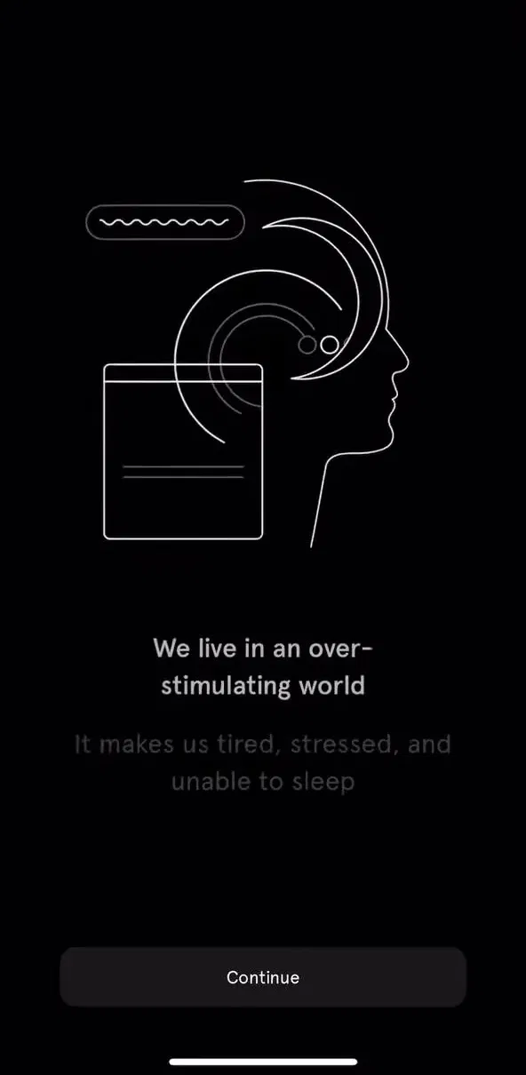
The opening flow in these apps is a run of single-question screens: what time do you go to bed, what time do you wake, what keeps you up, how would you rate your sleep now. It reads like a setup wizard, and it is, but it is also the sales argument. Each answer is a small admission that something is wrong, and the summary screen at the end reflects that back before asking for money.
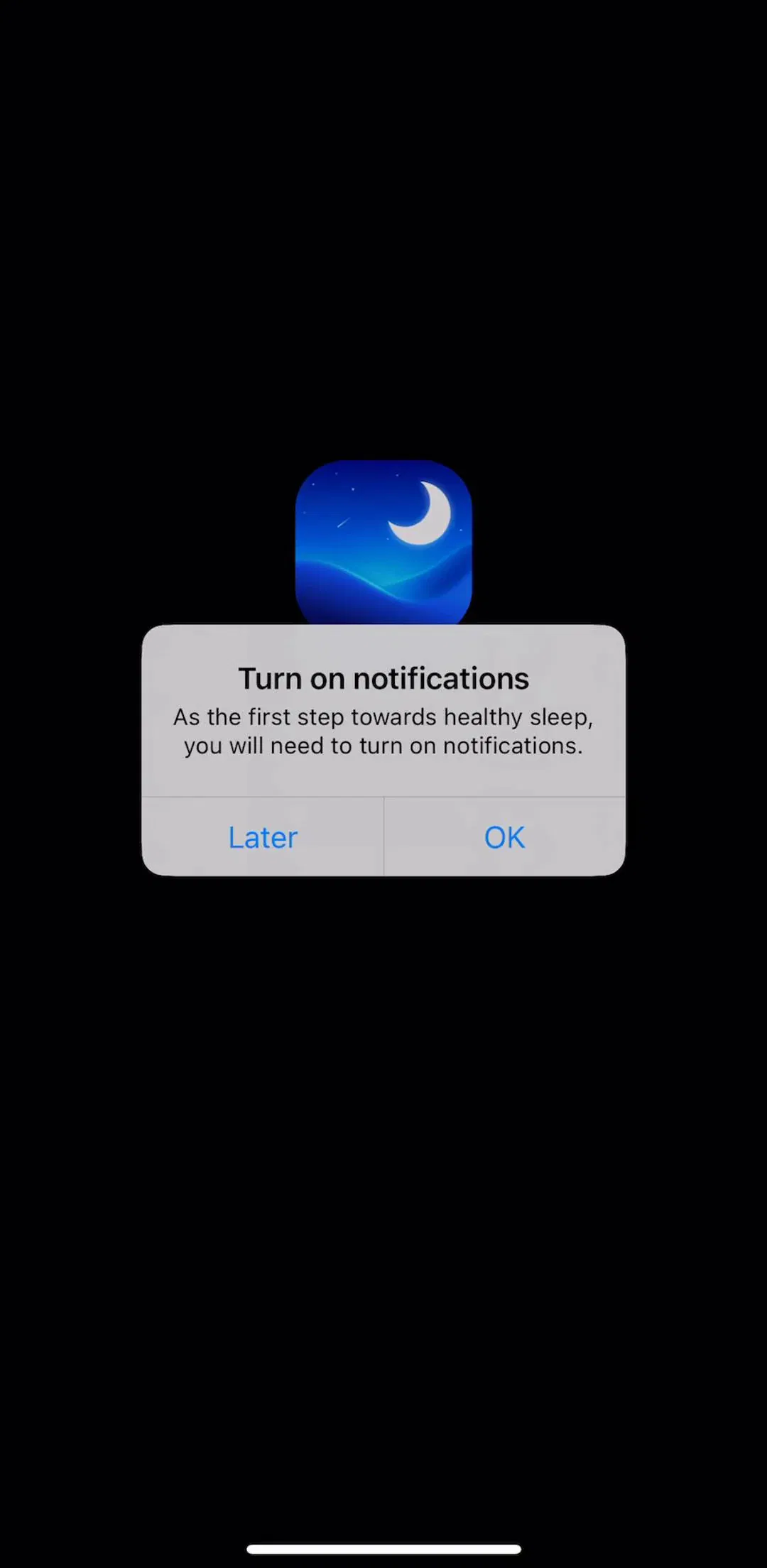
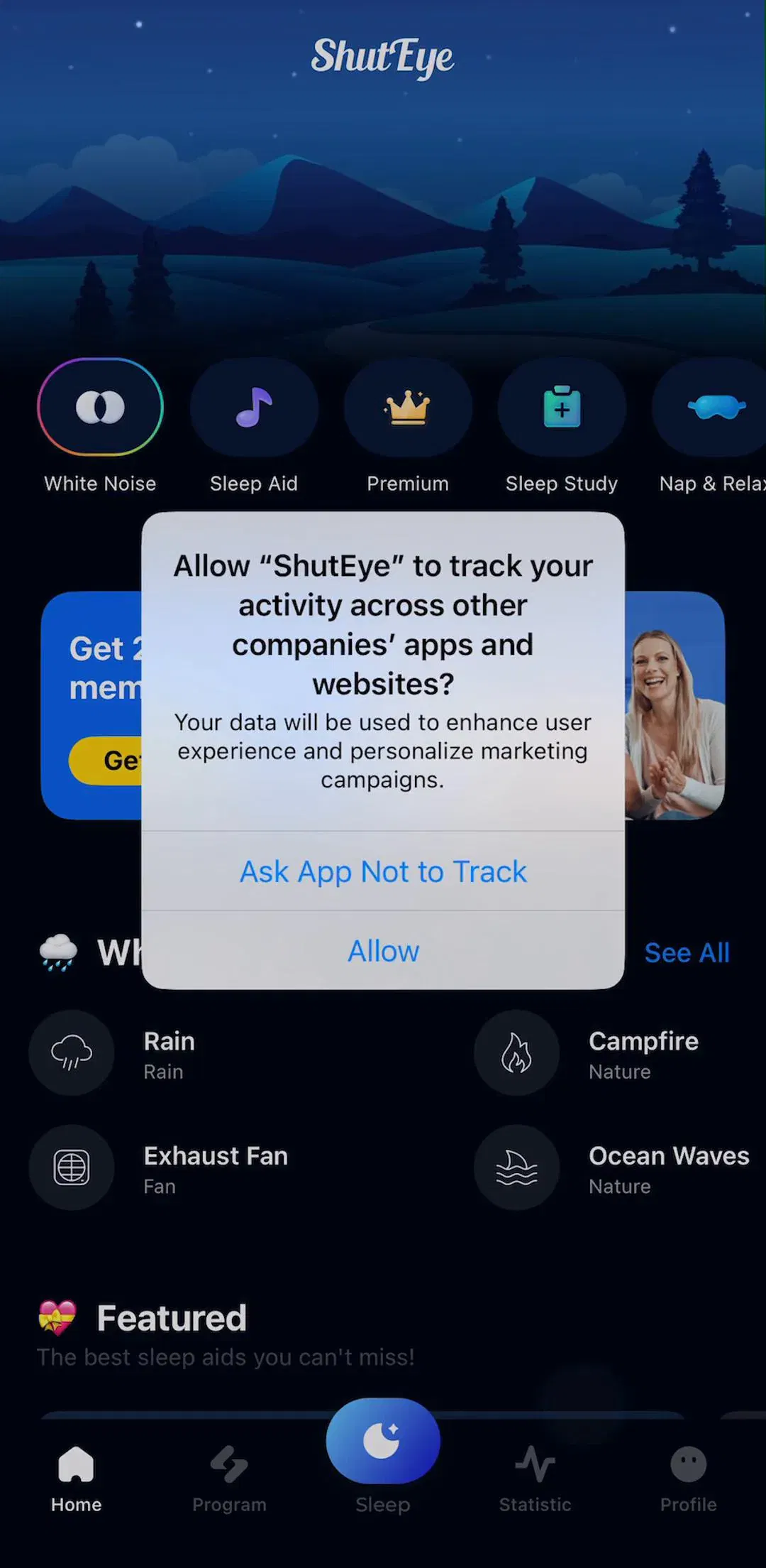
ShutEye (est. $350k/mo) runs one of the longer versions of this in our library, at 46 captured onboarding screens.
If you want the general form of this pattern rather than the sleep-specific version, the onboarding pattern breakdown covers the quiz structure across categories, and RISE (est. $300k/mo) is worth comparing against because it front-loads an explanation of its underlying model rather than only asking questions.
Almost every shipping sleep app asks for the subscription at the end of onboarding, before a single night has been tracked. That is not greed so much as timing: the moment right after someone has described their sleep problem is the highest-intent moment the app will get for weeks, and by the third morning the novelty has usually worn off. The trade is that the paywall has to carry the whole value argument on its own, which is why these screens lean on the answers just given. Our paywall pattern breakdown covers the structures used, and the paywall gallery holds the captured screens.
It is worth being precise about which one you are building, because the core surface differs completely. A tracker’s core screen is a session: start, night state, morning report. A sound app’s core screen is a library: browse, pick, play, timer. Several products ship both halves, which is where the navigation gets difficult, because the browse surface and the tracking surface both want to be the home screen.
Endel (est. $550k/mo) is a good study of the audio-first version, where the whole product is a generated soundscape and the interface exists mostly to choose and start one.
BetterSleep (est. $600k/mo) and Sleep Cycle (est. $650k/mo) sit closer to the middle, carrying both a sound library and a tracker, and SnoreLab (est. $400k/mo) is the narrow-purpose end of the category, where the recording is the entire product.
Once tracking starts, the interface has one job and it is not engagement. The screens that work show the time, the alarm, and a way to stop, at low brightness, with large targets. Tab bars usually disappear here. This is the clearest case in mobile design where the correct answer is to show less, since the screen is being read in the dark by someone who is trying to stop looking at it.
The same reasoning is why the bedtime half of these apps is dark even when the rest of the app is not. We measured how common dark interfaces are across the whole library in the dark mode breakdown, and sleep is one of the few categories where going dark is a functional requirement rather than a preference.
The score screen is what people open the app for. It has to compress a night into something legible in about three seconds, which in practice means one headline number, a hypnogram or similar chart, and two or three supporting stats. Everything else belongs on a detail screen. The common failure is giving equal visual weight to six metrics, which produces a dashboard nobody can read before coffee.
Pillow (est. $150k/mo) puts most of its design effort into this surface, and you can compare approaches across the tracking and insights gallery.
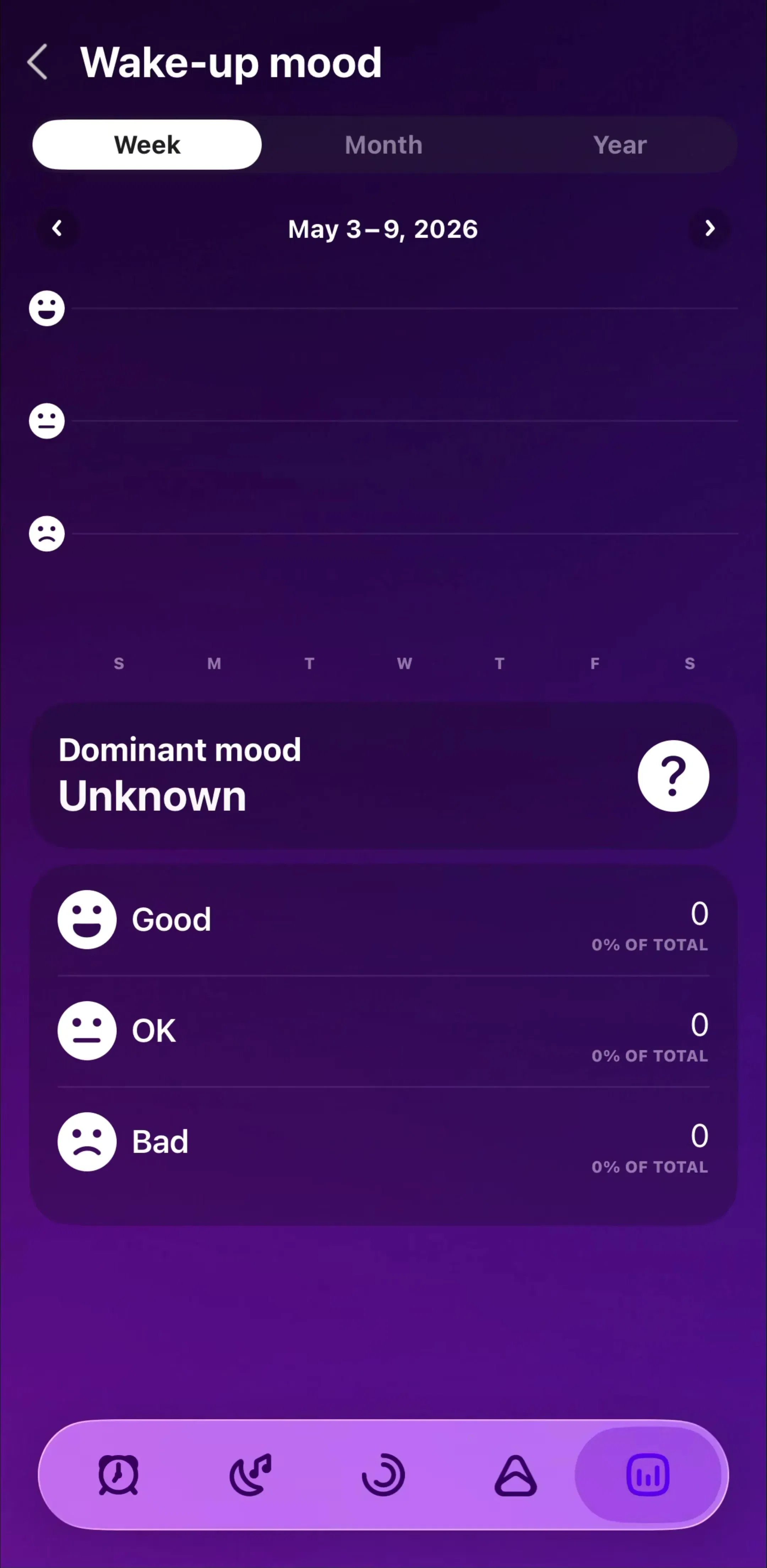
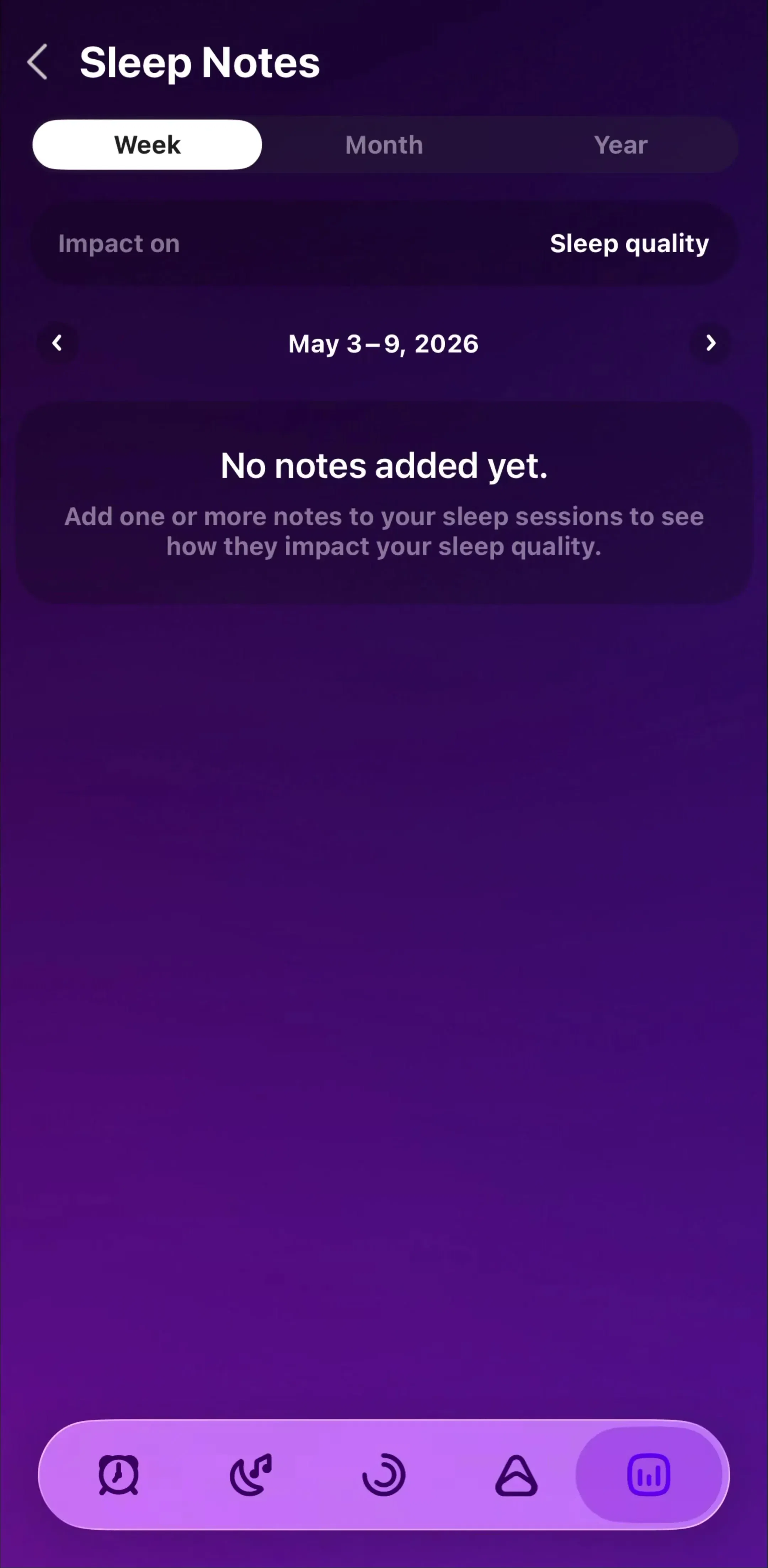
A sleep app is close to useless on day two, and the interface has to survive that. The products that handle it well design the sparse state deliberately: a chart that shows one bar and says so, a clear statement of how many nights are needed before averages mean anything, and no fake filler data. The ones that handle it badly show an empty chart frame and hope. This is a specific case of a general problem covered in the empty state breakdown.
These apps need notifications for the bedtime reminder, and often microphone access for snore detection and Health access for writing sleep data. The convention that has settled is a priming screen that explains why, followed by the system dialog, because a denied system permission is expensive to recover. Sleep is a good category to study this in because the asks are genuinely justified and the explanations are correspondingly easy to write. The captured examples live in the permissions gallery.
Three recurring problems. Onboarding questionnaires long enough that people abandon before the paywall, which trades conversion for the illusion of personalization. Morning summaries built as metric dumps rather than as one answer to one question. And bedtime reminders designed like marketing pushes, which is the fastest way to get notification permission revoked in a category that depends on it. General notification design is covered in the notification breakdown.
If you are designing in this category, the useful exercise is to open three or four shipping sleep apps in sequence and note where they agree. The agreements are conventions your users already know, and breaking them costs more than it usually returns. Every screen in the library sits next to the app’s estimated revenue and downloads, so you can choose the references by outcome rather than by how the screenshots look, and the meditation and relaxation neighbors such as Headspace (est. $2M/mo) and Calm (est. $2.75M/mo) are worth reading as the adjacent category they compete with for the same evening minute.
A note on the numbers: revenue figures cited here are third-party monthly estimates from our library, useful for comparing magnitude, not audited financials.
Across shipping sleep products the recurring set is small: an onboarding questionnaire that collects bedtime and wake time, a pre-sleep screen that starts tracking or plays audio, a low-light night state, a morning summary, and a trends view over time. Most other surfaces in these apps are variations on the audio library or the settings screen.
A sleep app cannot show anything useful until the next morning, so onboarding is the only place it can demonstrate value on first launch. The questions about bedtime, wake time, and sleep problems both configure the product and build the case for the subscription, which is why the questionnaire usually runs before the paywall rather than after it.
The screens used at bedtime and during the night should be dark, because they are looked at in an unlit room and a bright screen works against the product's own goal. That does not force the whole app dark. Several shipping apps run a dark night surface and a normal light or system-following interface for the morning summary and settings.
The night screen is the one surface where almost everything is removed: usually the time, the alarm, and a stop control, at low brightness. The design constraint is that it will be read half asleep in the dark, so hit targets are large and destructive actions such as ending a session early are given confirmation or friction.
The mobileappdesign library holds captured flows from 2,622 revenue-verified iOS apps, including 43 sleep and snoring products and 562 health and fitness apps overall. Screens are captured in sequence, so you can follow a full onboarding or a full tracking session rather than looking at isolated shots.
Browse captured onboarding flows from revenue-verified iOS apps, including sleep trackers, sound libraries, and snoring recorders.
Browse onboarding screens