
Most writing about badges UI is component documentation: the red circle, its size, its colour tokens, how it behaves over an avatar. That is useful if you are building a design system. It says little about what shipping products actually choose to mark, which is the harder decision.
So we read the screens. We took the 40 highest-grossing apps in the library whose first paywall-tagged flow has three or more free preview screens, and went through all 123 of those screens one by one. The flows cover onboarding, the paywall and whatever sits behind the permission dialogs that interrupt them, including several home screens. Every count below traces to a screen, and every app named has its full flows in the library.
Before counting, it helps to separate the shapes, because they make different promises to the user:
Across the 40 apps, labels were by far the most common, and the single most common place for one was not a tab bar or an inbox. It was a paywall plan card.
Ten of the 40 apps show a badge on a specific plan in their free paywall screens. Here is what each one says and which plan carries it.
| App | Badge text | Plan it sits on |
|---|---|---|
| CamScanner | Limited Time | Yearly, with 3-day trial |
| Picsart | 30% Off | Yearly (one-time offer) |
| Lightroom | Save 47% | Yearly |
| iScanner | SAVE 91% | Yearly |
| InShot | A seal with a thumbs-up icon, no words | Yearly |
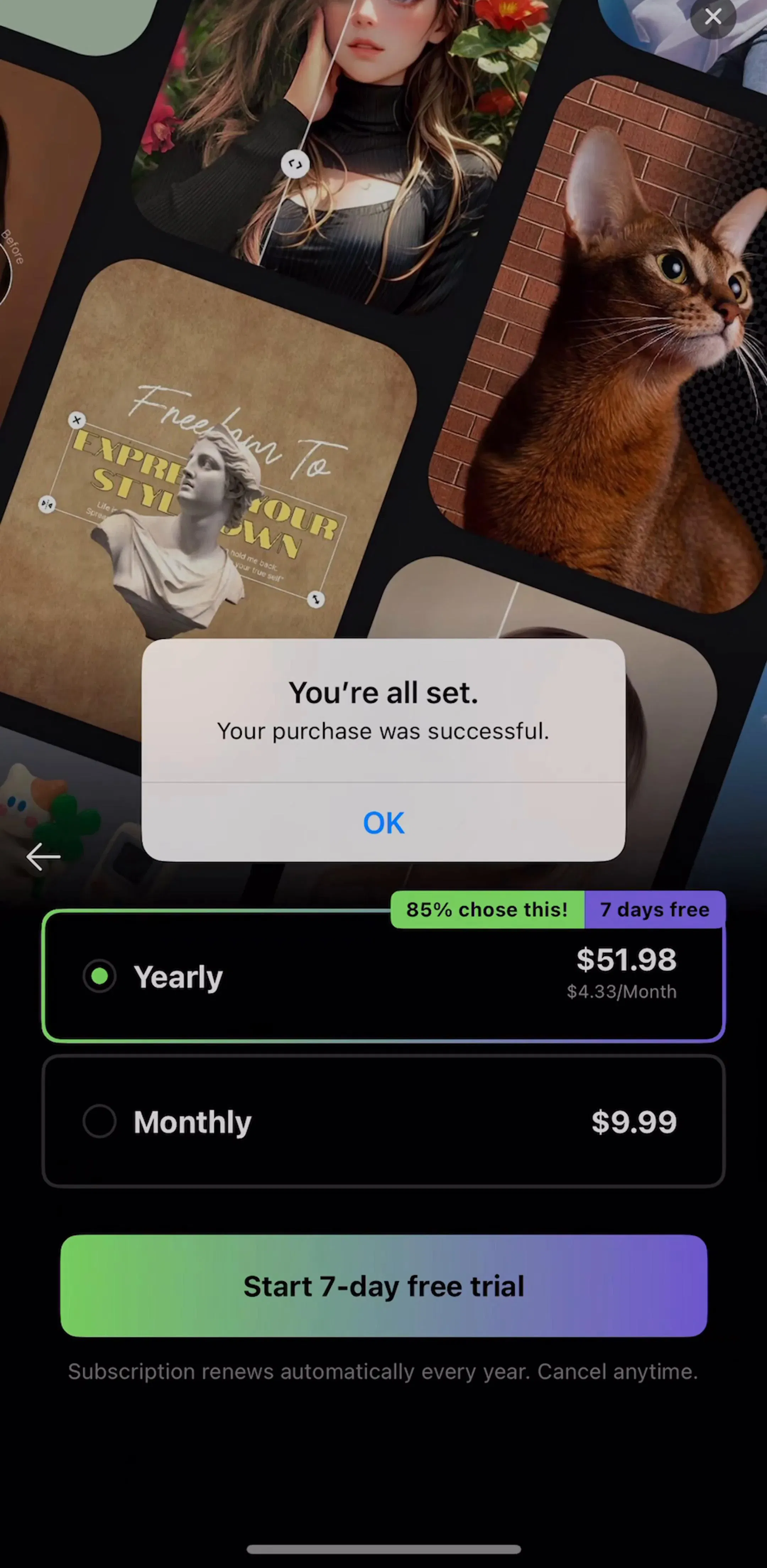
| EPIK | 85% chose this! and 7 days free | Yearly |
| YouCam Makeup | 65% OFF | 12 months |
| Waking Up | Best Value | Annual |
| ChatPrime | BEST OFFER | Yearly |
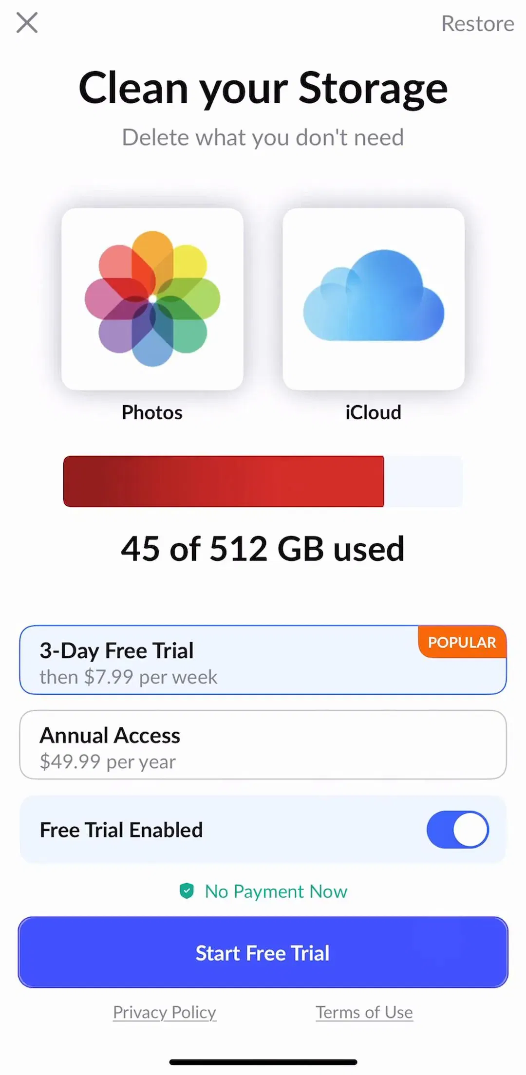
| CleanUp | POPULAR | Weekly, with 3-day trial |
The wording splits evenly. Four badges state a discount as a percentage, four use a value or urgency word (Limited Time, Popular, Best Value, Best Offer), one uses social proof and one uses no words at all. The target does not split: nine of ten point at the yearly plan, which is the plan these apps most want sold.
Lightroom (est. $4.75M/mo) is the cleanest example. Its yearly card carries a yellow “Save 47%” tab on the top edge and a full-width “7-day free trial” band underneath, so the card says three things at once: the price, the saving and the trial, while the monthly card below says only its price.

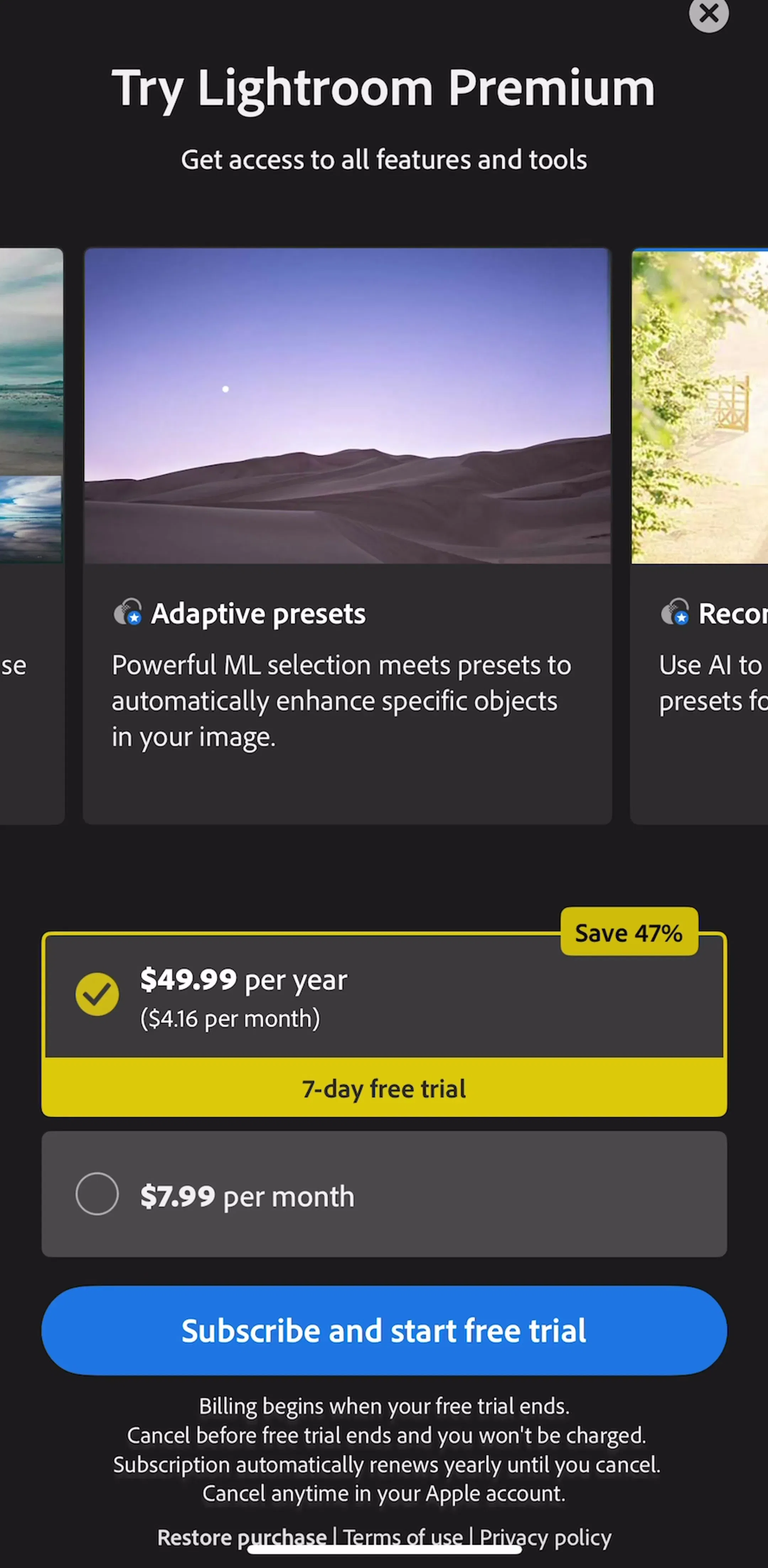
A percentage is a comparison, so it only works when the thing it is compared with is on screen. Lightroom’s monthly plan sits directly under the badge, which lets the user check the claim in one glance. The paywall design post covers why the monthly plan is often there mainly to make the yearly one look cheap.
Eight of the ten plan badges overlap the top edge or the top-right corner of their plan card: CamScanner, Lightroom, iScanner, InShot, EPIK, YouCam Makeup, CleanUp and Waking Up. The other two sit inside the row, on the right: Picsart as a separate cell, ChatPrime as a small pill beside the plan name.
The overlap is not decoration. A badge that crosses the border reads as attached to that one card rather than floating in the layout, and putting it top right keeps it clear of the price, which usually runs along the left or centre. Waking Up (est. $700K/mo) shows the quiet version: a small green “Best Value” tab on the annual card and nothing else competing with it.
EPIK (est. $850K/mo) shows the loud one: two tabs side by side on the same yearly card, a green “85% chose this!” and a purple “7 days free”. It is the only social-proof badge in the sample, and it is a claim about other users rather than about the plan, which is a different kind of promise to keep.
Two paywalls in the sample split the signal. CleanUp (est. $750K/mo) puts its orange “POPULAR” tab on the weekly plan with a three-day trial, not on the annual plan below it. That is a legitimate choice, and it is the only one of the ten that promotes the short plan, which makes the badge part of the pricing strategy rather than a convention.
ChatPrime (est. $550K/mo) does something different: its “BEST OFFER” pill sits on the yearly plan, while the weekly trial row below carries the highlighted border. The badge says one plan and the selection says another. Whatever your pricing goal, pick one plan to mark and let the badge, the default selection and the button copy all point at it.
Numeric badges are what most people picture when they hear the word, but only two apps in the sample show one inside the app. EPIK puts a red “5” on its notification bell, and Genie (est. $750K/mo) puts an orange “1” on the profile avatar in its header. Both are on home screens; in the screens we read, neither app shows a count inside onboarding or on the paywall.
A count is the most specific promise a badge can make, so it is the easiest to break. If the number does not clear when the user opens what it counts, people learn to ignore it within days, and the channel is gone. Our tab bar post makes the same point about badges on tabs: badge only what clears when opened.
One app uses counts as illustration instead. Cleaner Guru (est. $5M/mo) draws iOS app icons with red icon badges, “2.890” on a mail icon and “35” and “4” on photos and email, to show clutter the app will clear. It borrows the badge as a symbol people already read as “backlog”, which is a clever use of the pattern because it needs no explanation.
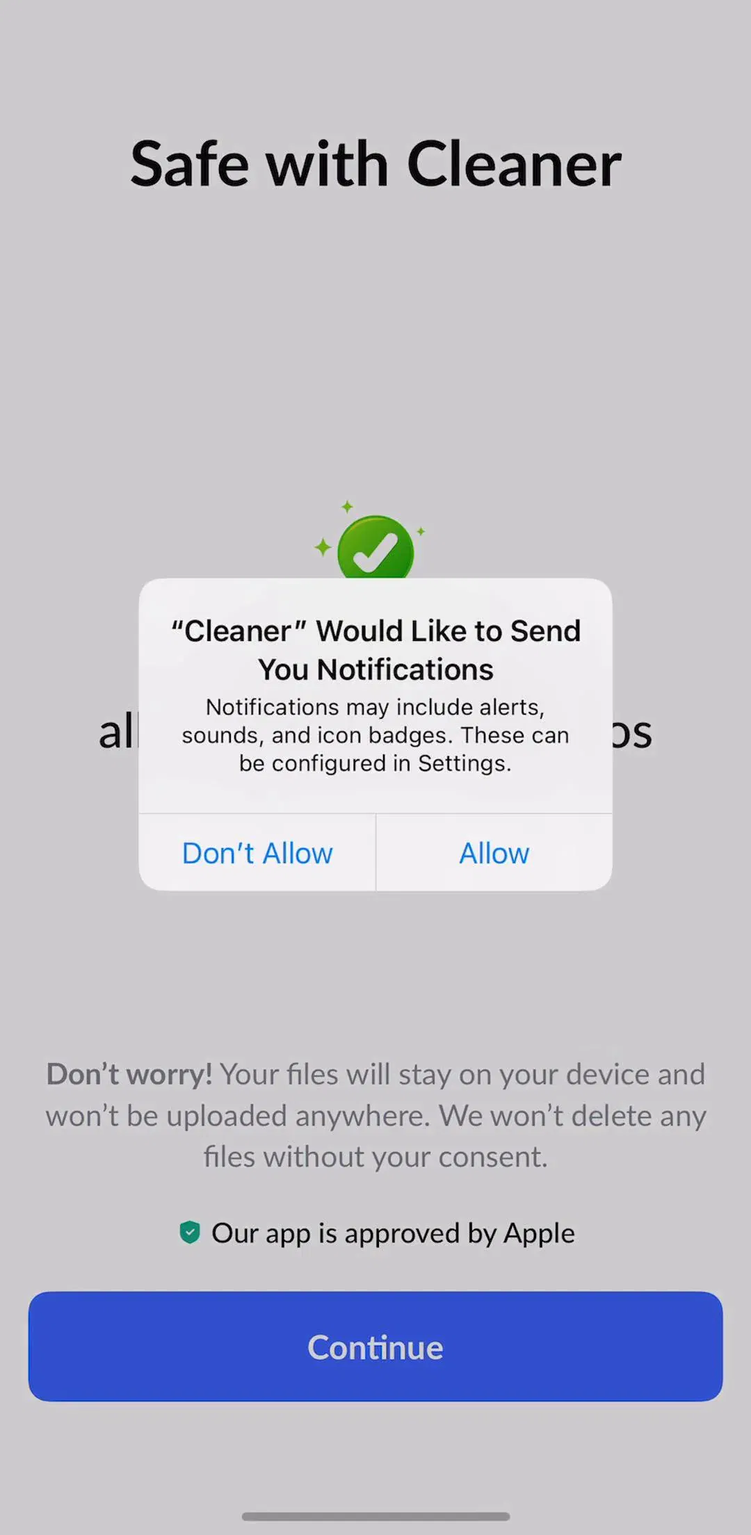
Three apps use a plain dot with no number: InShot on the settings gear in its header, EPIK over several tab bar icons, and PDF Expert (est. $1.25M/mo) as a small orange dot before a file in its recent files list. Three apps use a New label: ClassDojo above a top tab, PDF Expert on the corner of a tool tile, and EPIK as red “N” circles on two tools.
EPIK’s home screen is worth looking at as a whole, because it carries almost every kind of badge in this post at once: a gradient “+ Pro” pill, the red “5” on the bell, “N” circles on two tools, dots on three tabs and a “GIF” tag on a thumbnail.

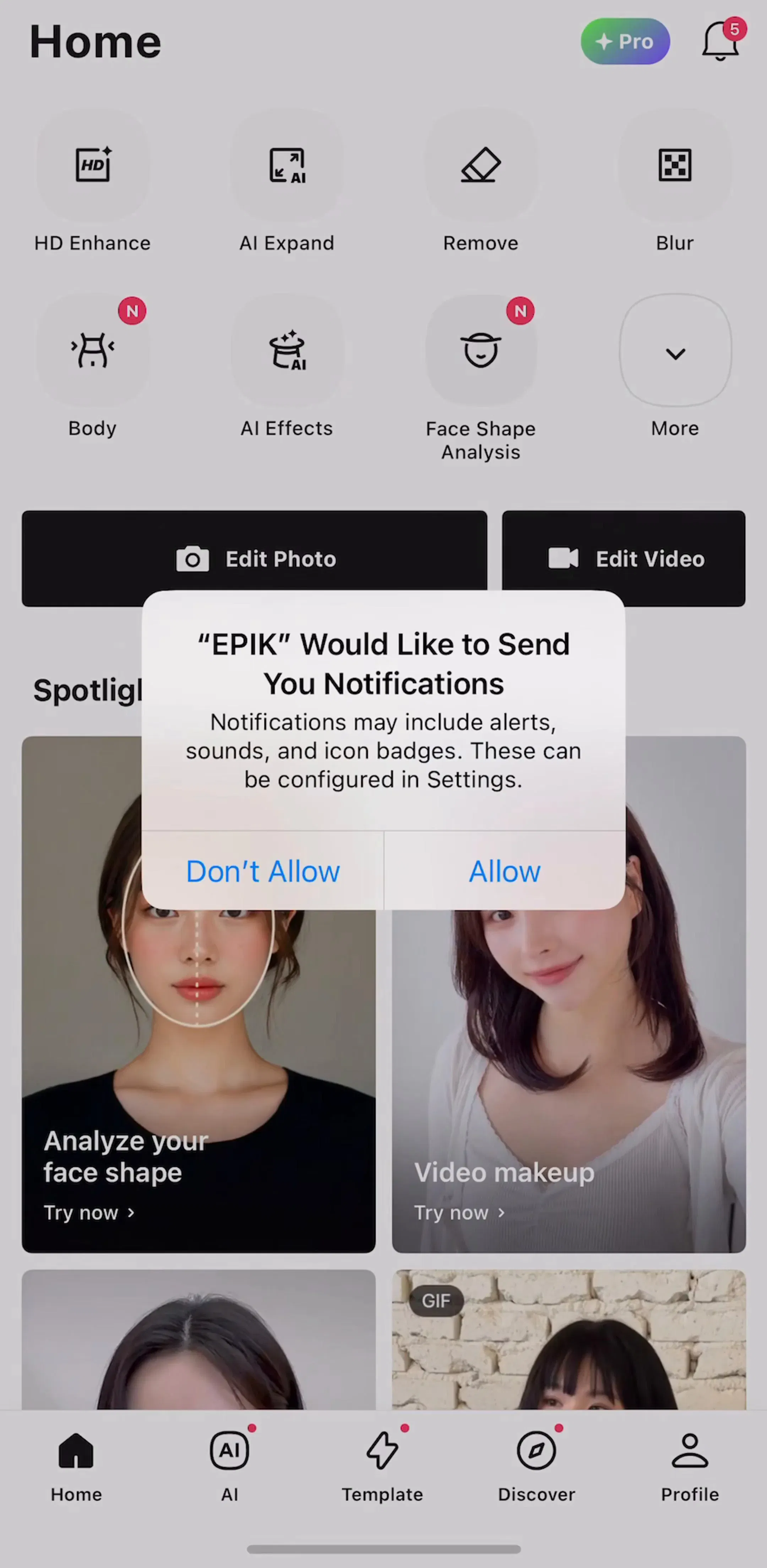
Each of those markers may be justified on its own. Together they ask the user to triage before they can do anything, and a New label that stays up for weeks stops meaning new. The practical rule is to give every dot and New label an expiry: it clears when the thing is opened, or after a fixed period, whichever comes first.
Four apps use a tier badge, and they split into two jobs. Two show status after purchase: Prequel greets a new subscriber with “Welcome to Prequel” and a gold PRO pill, and iTranslate fuses an outlined PRO badge to its wordmark on the main screen. Two use the badge as a permanent way into the paywall: EPIK’s “+ Pro” pill and YouCam Perfect’s crowned VIP mark, both in the header.
The first kind is a small reward that costs nothing, and it quietly reminds a subscriber what they are paying for. The second kind is an upsell that never leaves, so it works best when it reads as a label, not an alert: neither EPIK nor YouCam Perfect puts a count or a dot on it.
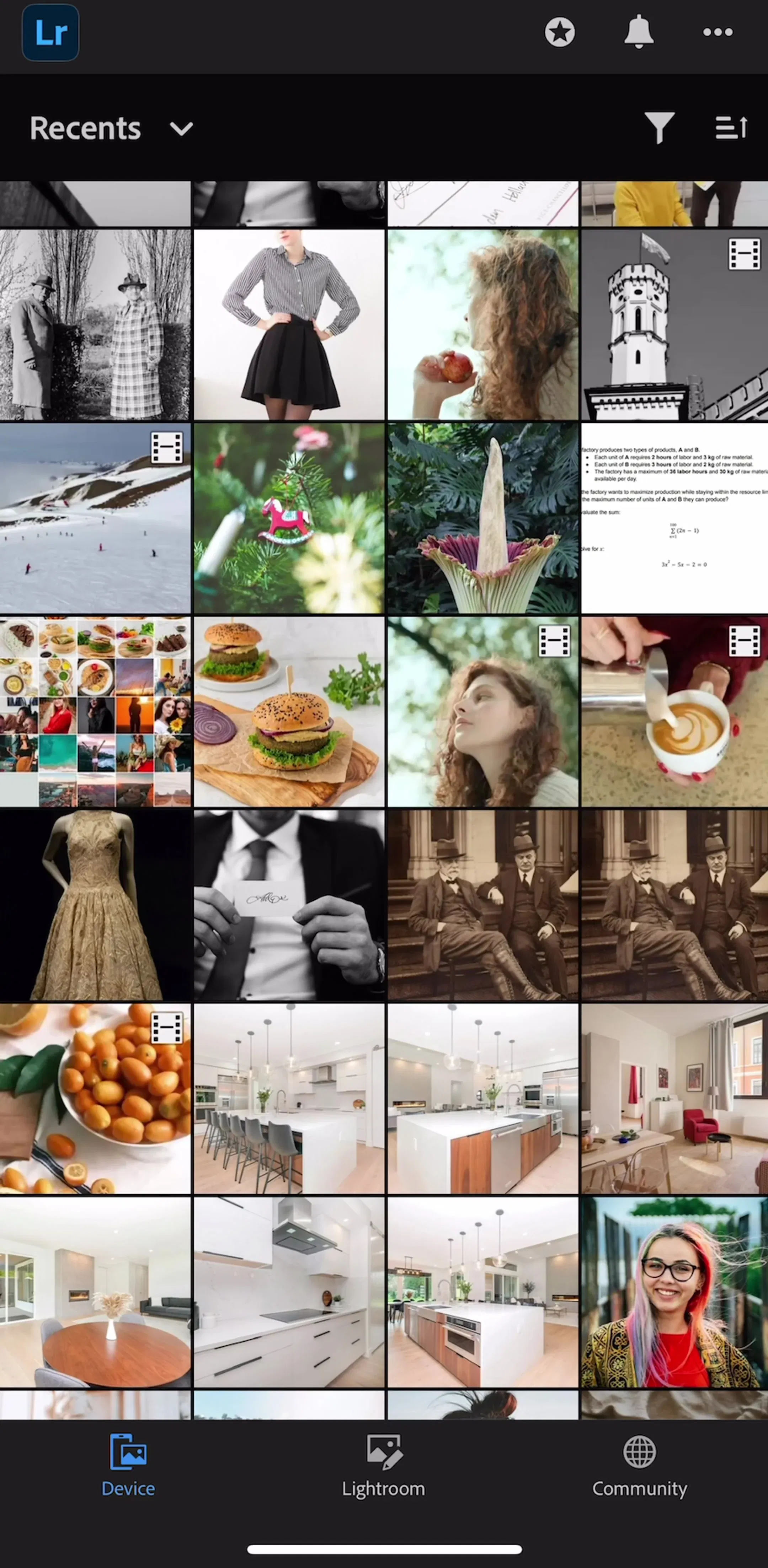
Badges on media describe the item rather than its state. BeautyPlus marks generated images with small pink “AI” corner tags and the source with “Before”. YouCam Perfect also labels a hero image “Before”. Lightroom puts a small film glyph on video thumbnails in its library grid, and EPIK tags a thumbnail “GIF”.
These are the least controversial badges in the sample, because they answer a question the user would otherwise have to open the item to answer. As AI editing spreads, the AI tag in particular is doing honest work: it tells people which picture is real.
One app uses colour as the whole badge. Yuka (est. $750K/mo) puts a green, orange or red dot beside each nutrient on a product screen. The words next to the dots (“Low impact”, “Too caloric”) carry the same meaning, which is what keeps a colour-only mark accessible.
Eight of the 40 apps show the iOS notification dialog somewhere in these flows, and every one of them carries the same system sentence: notifications may include alerts, sounds and icon badges. That dialog is where the red number on your app icon gets its permission. A user who taps Don’t Allow gets no icon badge, and a user can also turn badges off for one app in Settings while keeping its alerts.
So the icon badge is borrowed, not owned. Badges inside your own screens need no permission, which is one reason the in-app count on a bell or an avatar is more dependable than the one on the home screen. Our permission priming post counts where these asks appear, and the notification design post covers the ask itself.
On a paywall, put one badge on the plan you want chosen, make it agree with the default selection, and hang it off the card’s top edge where it cannot be mistaken for the price. If the badge is a percentage, keep the plan it is compared with on screen. Use a number only when the count helps a decision and clears when opened; use a dot or New label for change, and give it an expiry. Put Pro badges where they reward or invite without alarming. Tag media when it saves the user a tap. And treat the icon badge as something the user lent you with the notification ask.
Every example above comes from the paywall flows and the onboarding flows in the library. For the words inside badges and buttons, see our UX writing examples.
A note on the numbers: the sample is the free preview screens of the first paywall-tagged flow for the 40 highest-grossing apps that have three or more free screens there, 123 screens in all. It shows what those screens contain, not everything each app ships, so an app counted without a badge may still use one elsewhere. Revenue figures are third-party monthly estimates from our library, useful for comparing magnitude, not audited financials. Paywalls change often, so treat every badge quoted here as a dated snapshot.
A badge is a small, non-interactive marker attached to another element to add one piece of status. The common kinds are a count (a number of unread items), a dot (something is new, no number), a label (New, Pro, Best Value) and a status mark (a coloured dot that means good or bad). A badge describes the thing it sits on; it is not a button of its own.
A badge is attached to something else and carries status, like a count on a bell or Save 47% on a plan card. A chip is usually interactive: people tap it to filter, select or remove something. A tag labels content by type or category, like AI or GIF on a thumbnail. In practice the three look alike, so the test is behaviour: if tapping it does something, it is not a badge.
Use a number when the count helps the user decide what to do, such as unread messages. Use a dot when the only useful fact is that something changed, such as a new feature or an updated setting. In our sample, only 2 of 40 top-grossing apps showed a numeric count badge inside the app, while 3 used plain dots and 3 used New labels.
On the plan it describes, and on the plan you want chosen. In our sample of 40 top-grossing apps, 10 put a badge on a paywall plan, 9 of those on the yearly plan, and 8 of the 10 placed it so it overlaps the top edge or top-right corner of the plan card. The badge should also agree with the default selection: a Best Offer badge on one plan while another plan is highlighted sends two signals at once.
On iOS, a notification badge is the red number on an app icon. An app can only set it after the user grants notification permission with badges included, which is why the system notification dialog says notifications may include alerts, sounds and icon badges. Users can also turn badges off per app in Settings. Badges inside your own app, like a count on a bell icon, do not need that permission.
As few as carry real information. Each badge competes for the same small amount of attention, so a screen with a count, several New markers, dots on tabs and an upgrade pill asks the user to triage before they can act. A useful rule is one badge per decision the user might make on that screen.
Browse captured paywall and subscription flows from revenue-verified iOS apps, screen by screen, with estimated revenue next to every app.
Browse paywall flows