Most collections of UX writing examples are a scrapbook of witty error messages and friendly empty states. They are pleasant to read and hard to learn from, because nobody knows whether the charming version performed better than a plain one.
This collection takes a different sample: the screens where copy has a price attached. We read the free paywall preview of the 48 highest-grossing apps that have one, found 22 readable paywalls among them, and wrote down every button. Then we read the trial offers, the lines under the buttons, the ways out and the permission asks around them. Every example below is quoted from a shipping app whose full flows are in the library.
The button is the most expensive string in a subscription app. Here is how the 22 readable paywalls in the sample label it.
| Button strategy | Paywalls | Examples, verbatim |
|---|---|---|
| Names the free trial | 9 | Try it free (YouTube Music), Start your free trial (AllTrails), START MY 7-DAY TRIAL (VSCO), Start My 3-Day Free Trial (Cal AI), Try free for 30 days (TradingView) |
| Puts money in the button | 4 | Upgrade for $19.99 (ChatGPT), Upgrade for $64.99/year (Surfshark), Pay US$ 4.99 (AnyStories), Save $13.00 now (komoot) |
| Subscribe verb | 3 | Subscribe now (SoundCloud), START SUBSCRIPTION (NordVPN), Subscribe (PolyBuzz) |
| Names the plan | 2 | Get Max plan (Claude), Get Pro (Perplexity) |
| Neutral | 3 | Get started (Captions), Continue (Fishbrain), CONTINUE (Cronometer) |
| Game | 1 | Spin to Save (Yazio) |
Three things are worth taking from the table. First, naming the trial is the largest group, and 5 of those 9 buttons put the trial length in the label. Second, two of them switch to the first person, “Start my”, which reads as the user speaking rather than the app. Third, the apps that put a price in the button are mostly selling without a trial, and they treat the price as information rather than something to hide. ChatGPT (est. $267M/mo) is the clearest case: its button is simply the action plus the monthly price.
The general rules for button labels, length, verbs and one primary action per screen, are in our button UI post. What the paywall sample adds is that the label is where the offer lives: the trial length is on the button, not only in the small print.
The three neutral buttons are not lazy copy. Two of them sit under a switch that carries the offer instead. Captions pairs Get started with an “Enable 3-day free trial” toggle. Fishbrain pairs Continue with “Not convinced yet? Try 3 days for free”. iTranslate does the same with a plan option that reads “Not sure yet? Enable free access”.
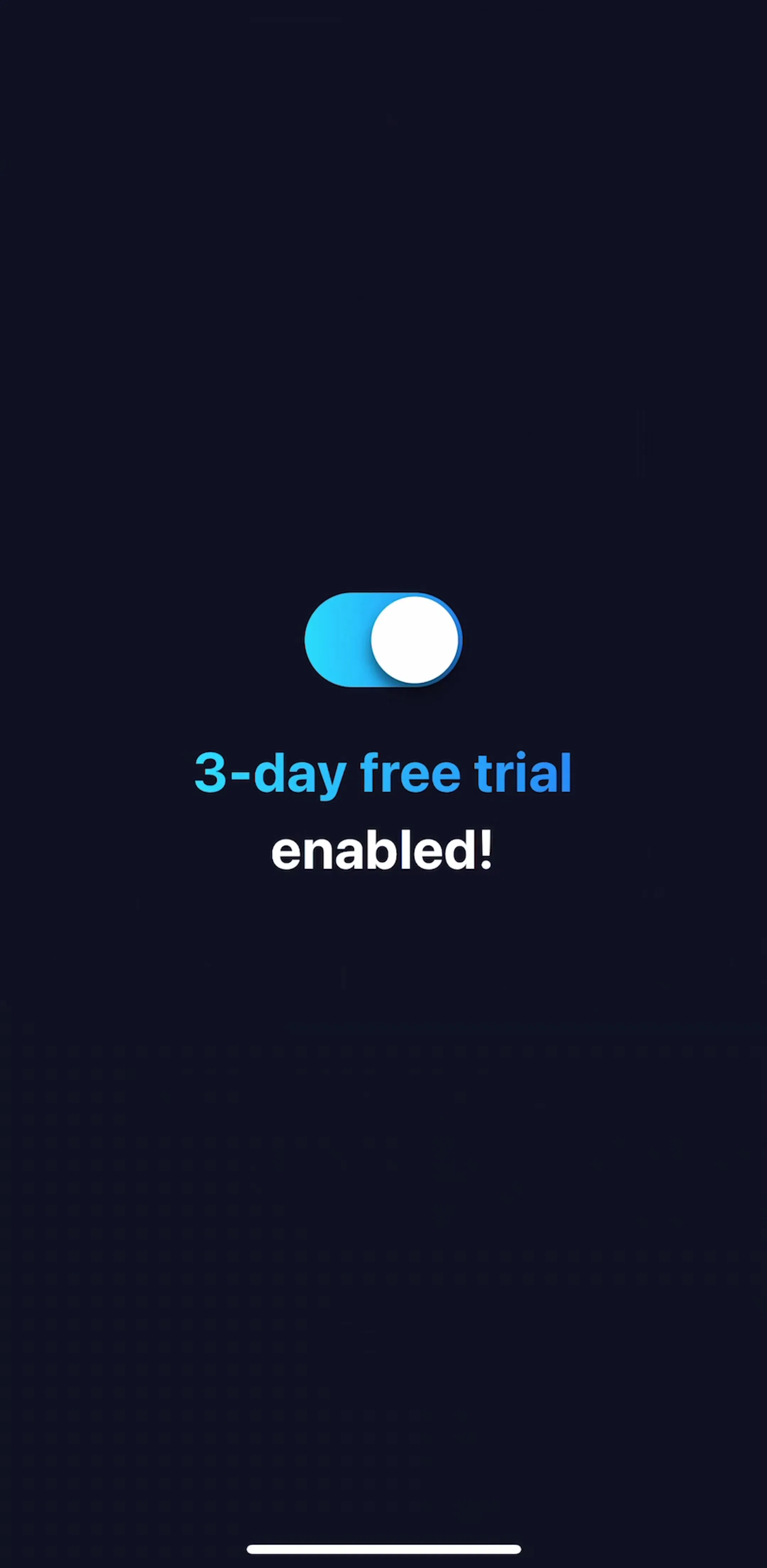
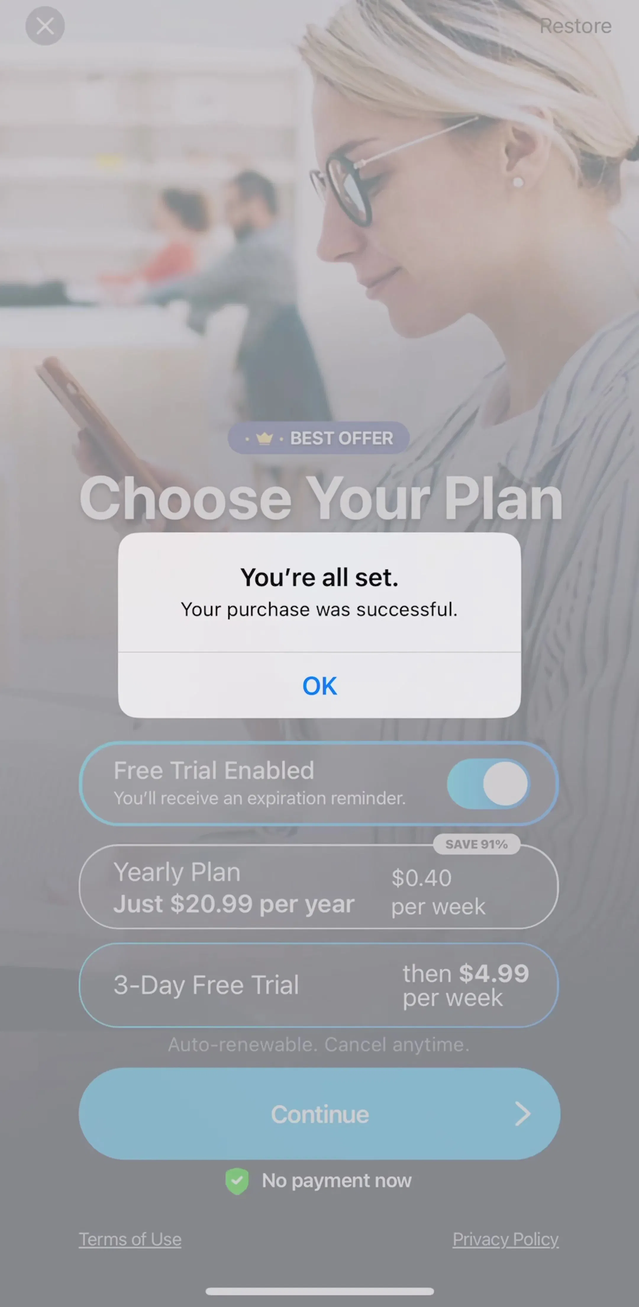
iScanner (est. $3.75M/mo) shows the pattern in full. Its plan screen has a switch labelled “Free Trial Enabled” with the line “You’ll receive an expiration reminder” beneath it, a Continue button, and “No payment now” under that. A separate screen says only “3-day free trial enabled!” next to a large switch.
The writing lesson is that a toggle turns the trial into a setting the user controls, and the copy next to it has to answer the question the toggle raises: what happens when it runs out. iScanner answers with the reminder line. That is the sentence doing the real work on this screen, not the button.
Many paywalls in the sample put a short line directly under or above the button, and they all answer the same worry: will I be charged, and can I get out.
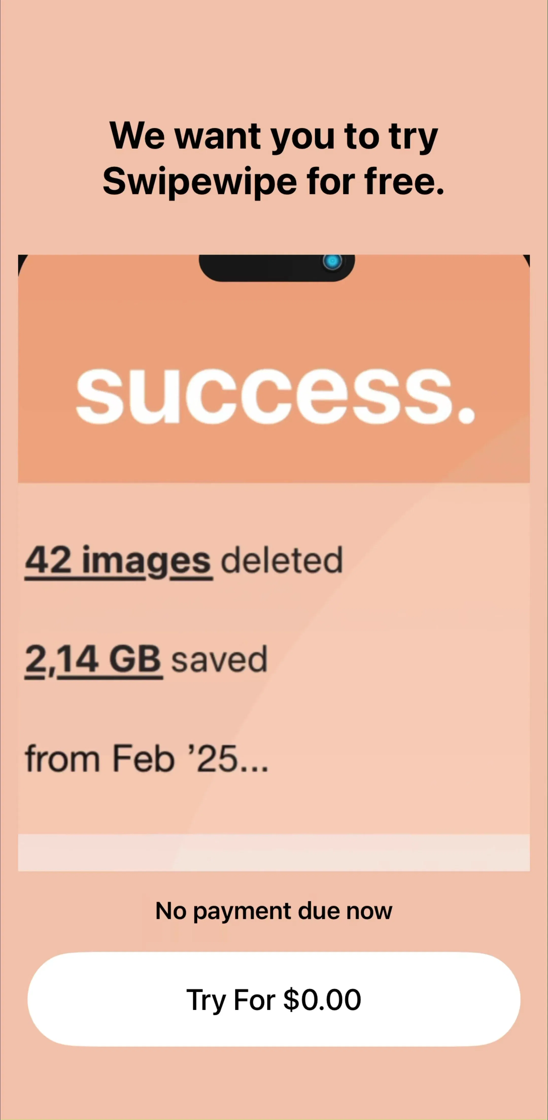
The best of these are three to six words and state a fact. They work because they are placed where the eye lands after the button, not in the terms paragraph at the bottom. Swipewipe (est. $1M/mo) builds a whole screen around this idea: a headline that says “We want you to try Swipewipe for free.”, a card showing what the app cleaned, “No payment due now”, and a button that reads “Try For $0.00”.
Two paywalls in the sample replace the renewal paragraph with a three-step timeline, and Quizlet uses a similar layout. AllTrails (est. $6M/mo) opens with “Your first week’s on us”, then lists Today: Unlock all features, Day 5: Get a trial reminder, and Day 7: You’ll be charged, with the yearly price. Cal AI (est. $1.75M/mo) uses the same three beats: Today, In 2 Days with a reminder, and In 3 Days when billing starts.
This is good UX writing because it converts legal terms into something a person can plan around. It also makes an uncomfortable fact, the charge date, impossible to miss, which is exactly why it builds trust. If your paywall has a trial, the timeline is the one pattern in this post most worth copying.
How a paywall lets people leave says as much as how it sells. The sample has a range:
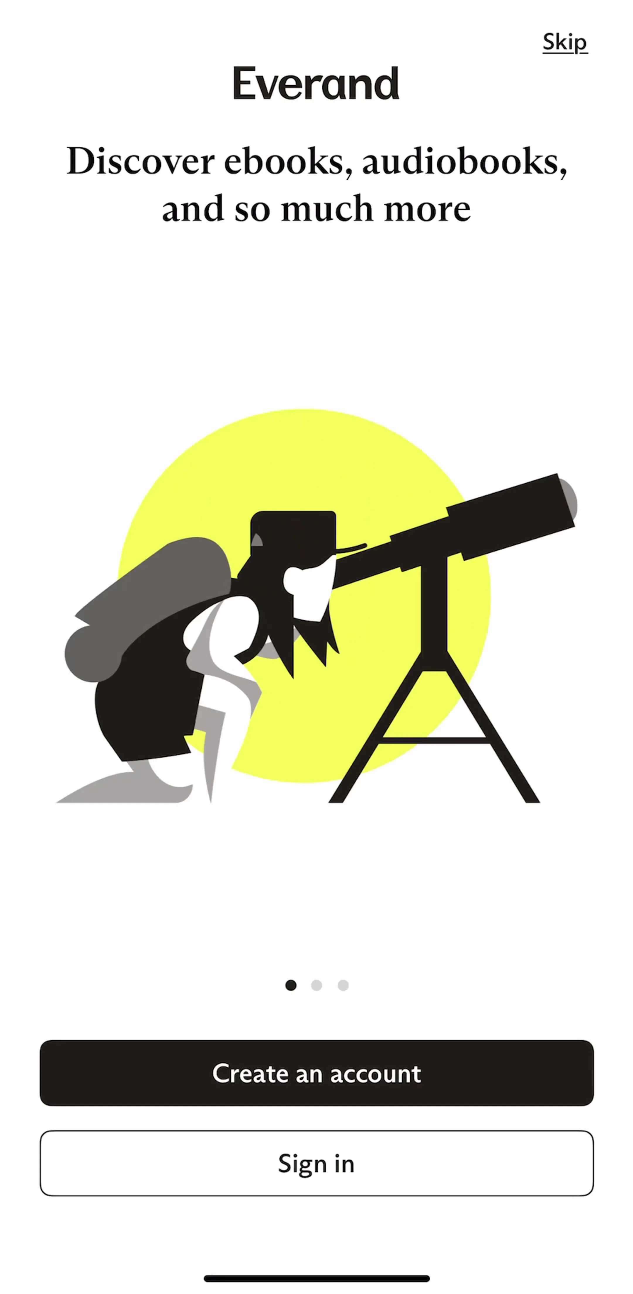
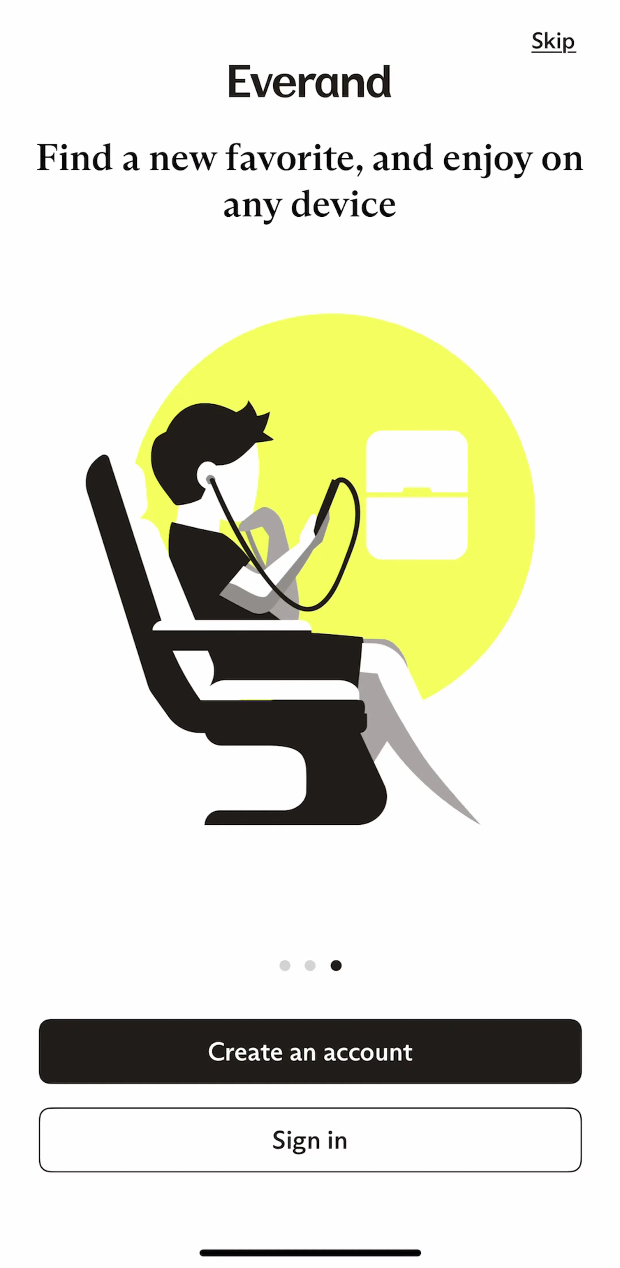
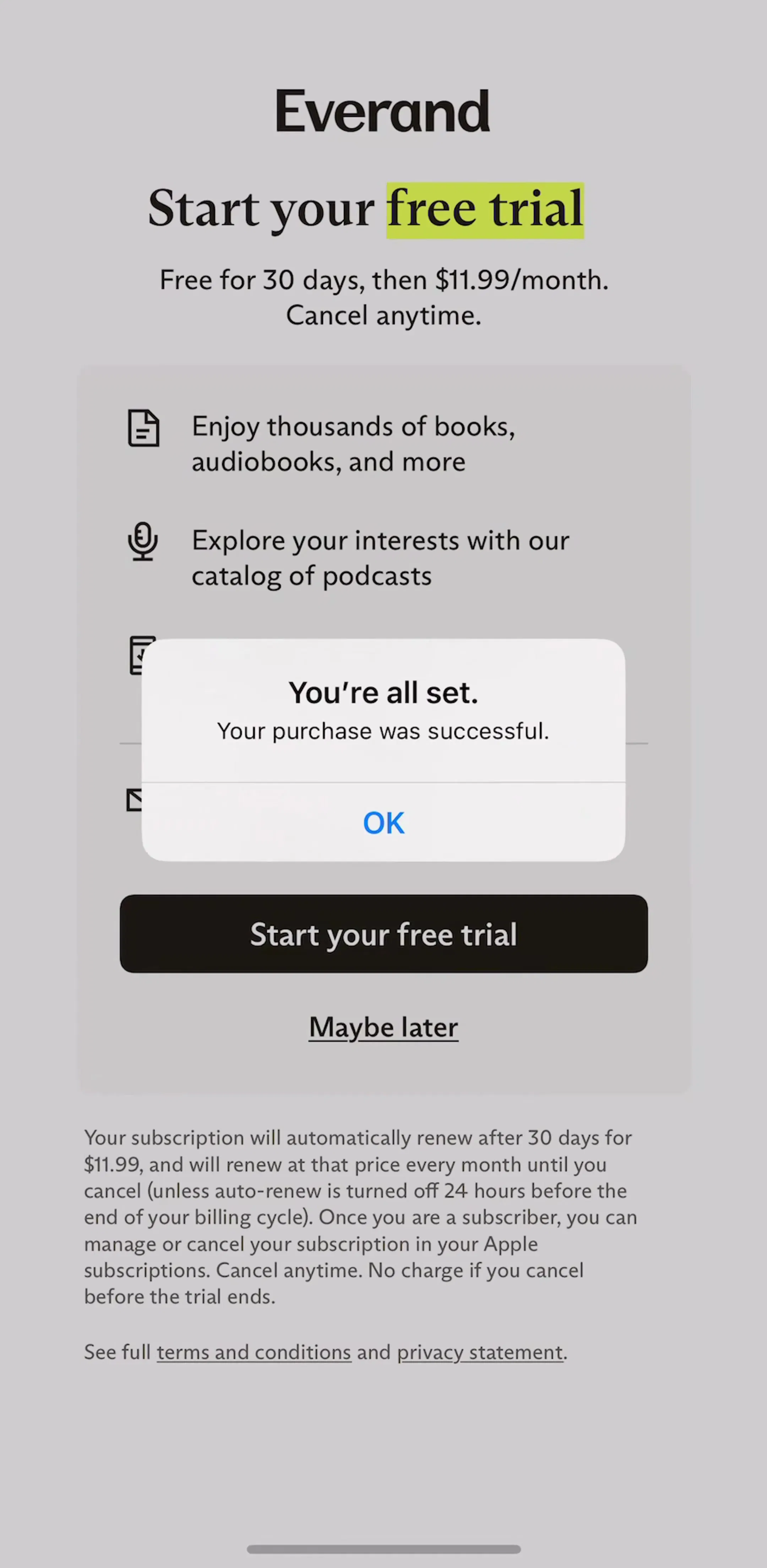
Everand (est. $1.25M/mo) is a good compact example of the whole sequence. Its onboarding carousel uses short, benefit-first headlines (“Discover ebooks, audiobooks, and so much more”), and its trial screen states the terms in one sentence, “Free for 30 days, then $11.99/month. Cancel anytime.”, before a single button and a Maybe later link.
The most repeated sentence in the whole sample was not written by any of the apps. “You’re all set. Your purchase was successful.” appears in 11 of the apps we read, from VSCO and Wink to calimoto and TV Remote. It is the system confirmation iOS shows after an in-app purchase.
That is useful to know for two reasons. You do not need to write your own alert saying the purchase worked, because the user has just read one. And the screen after it is yours to write. Adobe Scan uses it well: “Thanks for subscribing”, one sentence on what the subscription unlocks, and a Get started button.
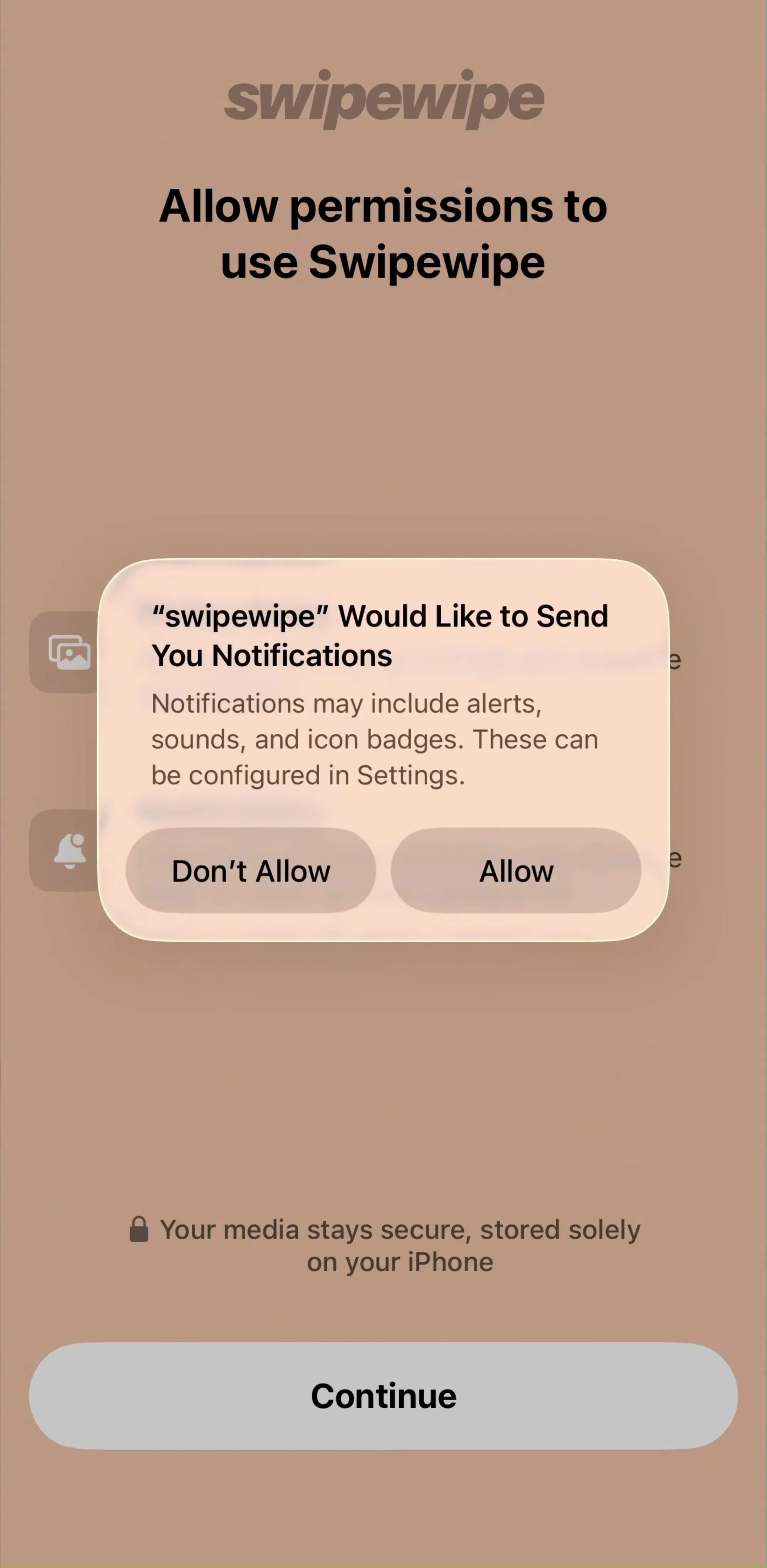
Permission asks are the other place where a sentence has a measurable cost, because iOS lets the user refuse only once. The strongest example in the sample is GuitarTuna’s microphone screen: “We’ll need to hear your instrument to help you tune and play.” It names the permission, the reason and the outcome in twelve words.
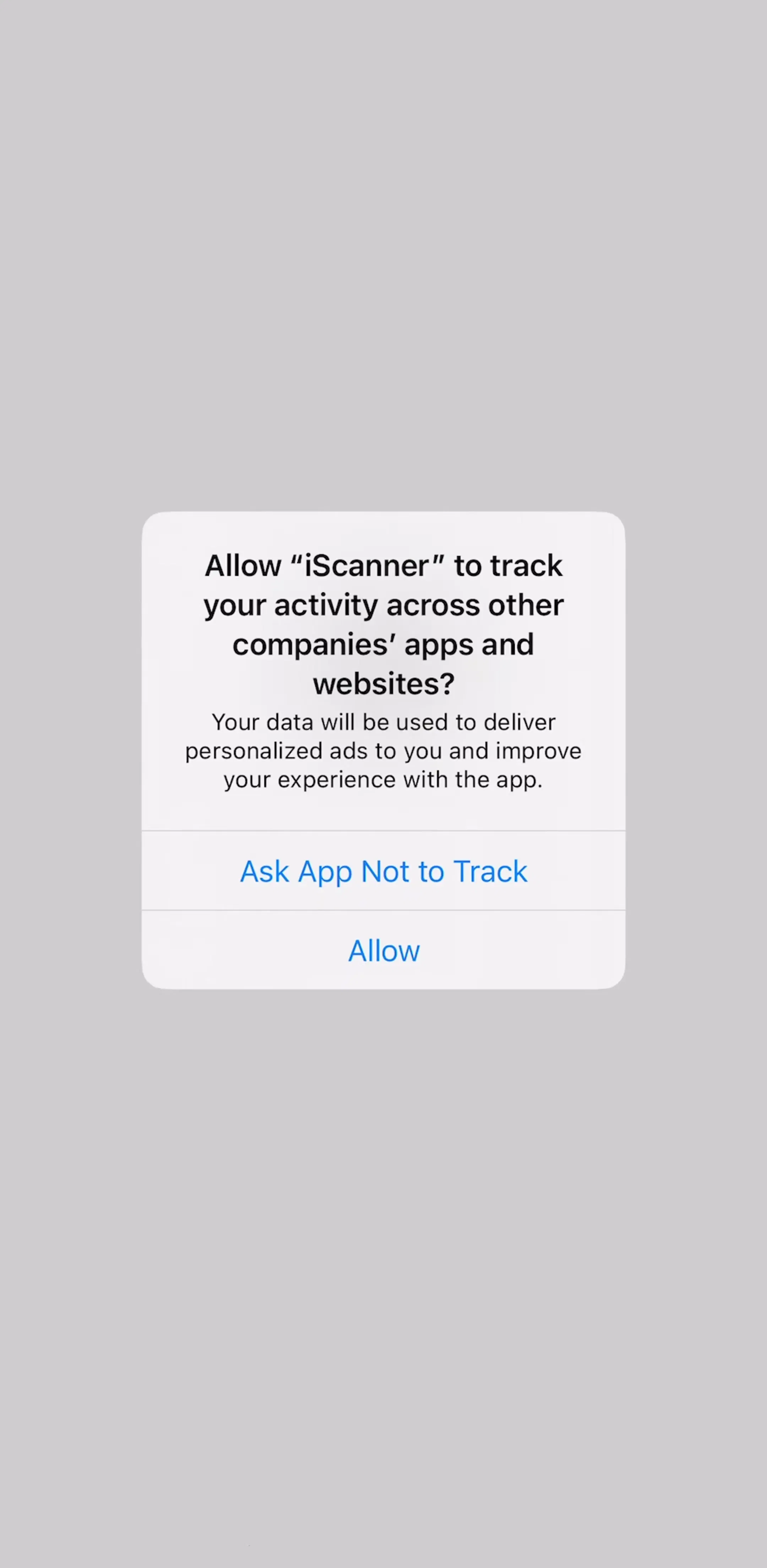
Compare two app tracking messages inside the system dialog. iScanner uses one line about personalized ads. Translate Now uses roughly ninety words about personalised journeys that the user has to scroll inside the alert. Neither gives a reason a person would repeat, and the long one costs more attention for no extra clarity. Our permission priming post counts where these asks appear and what sits behind them.
Onboarding questions are easier to answer when they say why they are asked. Impulse (est. $1M/mo) asks for an age range and adds one line under the heading: “This will allow to compare your results with peers”. The grammar is slightly off and it does not matter, because it turns a personal question into a feature. Our onboarding examples post covers the wider pattern of question-led onboarding.
The headline is where paywalls are allowed to sell, and the sample shows how differently apps use it:
The outcome headline is the one that does the most with the fewest assumptions: it tells the user what they will be able to do, not what the app wants from them. The paywall design post covers the layout around these headlines.
Put the offer on the button, including the trial length if there is one. Put a three-to-six word answer to the billing fear right next to it. If the trial has terms, write them as a timeline with the charge date on it. Give people a way out that sounds like a choice. Do not write a purchase confirmation iOS has already shown, and write the screen after it instead. Explain every permission in one sentence the user would repeat, and explain every onboarding question in one line.
All of the examples above come from the paywall flows, the onboarding flows and the permission flows in the library, where each app’s screens sit in sequence next to its estimated revenue.
A note on the numbers: revenue figures cited here are third-party monthly estimates from our library, useful for comparing magnitude, not audited financials. The paywall counts come from one free paywall-tagged preview screen per app, for the 48 highest-grossing apps that have one; 22 of those screens were readable paywalls. Paywall copy changes often, so treat every quote as a dated snapshot.
UX writing is the text inside a product that helps people use it: button labels, headings, form hints, error messages, permission explanations, empty states and confirmations. It is judged by whether people understand what will happen next and act, not by whether it sounds clever. Microcopy usually means the smallest pieces of it, such as a button label or the line under a price.
The most useful examples come from shipping products, because their copy has usually been tested against real users and real revenue. Screens where money or data changes hands, like paywalls, trial offers and permission requests, are the best place to study, because every word there has a measurable cost. The mobileappdesign library holds captured flows from 2,622 revenue-verified iOS apps, with estimated revenue next to each app.
In our sample of 22 readable paywalls from the highest-grossing apps, the most common choice was to name the free trial in the button, often with its length, such as Start your free trial or 7-Day Free Trial. Apps without a trial more often put the price or the plan in the button. Whatever you choose, the button should say what happens when it is tapped, and the line under it should answer the fear it raises, which is usually being charged.
Copywriting persuades someone to arrive or to buy. UX writing helps someone who has already arrived get something done. The two overlap on screens like paywalls, where a headline sells and a button and a terms line have to be exact, which is why paywall copy is a good place to study both.
As short as it can be while staying unambiguous. Buttons in our sample run one to five words. The lines under paywall buttons run three to fifteen. The exception is legally required renewal terms, which should still be written plainly. A long paragraph inside a system dialog is almost never read.
iOS already shows a system confirmation after an in-app purchase, so a second alert repeating it adds nothing. What is worth writing is the first screen after the purchase: what the user can now do, and the one thing to try first. Adobe Scan does this with a short thanks screen that names what the subscription unlocks and a single Get started button.
Browse captured paywall and subscription flows from revenue-verified iOS apps, in sequence, with estimated revenue next to every app.
Browse paywall flows