Every guide to permission priming says the same thing: explain the benefit before iOS shows its dialog, because the user only gets to answer that dialog once. The advice is right. What the guides do not show is how often shipping apps actually follow it.
So we looked. Across the free preview screens of 24 apps with captured permission and onboarding flows, plus the paywall screens of the 48 highest-grossing apps with a free paywall preview, we found 19 system permission dialogs in 16 apps. Only 2 sat behind a screen the app wrote to explain the ask. 6 appeared on top of the feature that needed the permission. The other 11 appeared over a launch screen, a blank screen, a home feed or a paywall, with nothing on screen connecting the ask to a reason.
iOS permission dialogs for notifications, camera, microphone, photos, location, local network and app tracking share one property: if the user taps Don’t Allow, the app cannot show that dialog again. Recovering means sending the user to Settings, and most never go. Priming is everything you do before the dialog so that the tap on Allow is a formality.
There are three ways to do it, and shipping apps use all three:
This post is about that step before the dialog, across every permission type. The alert component itself is covered in our iOS dialogs post, and the full notification ask, including what to send once you have it, is in the notification design post.
The sample is the free preview screens of apps in the library, the same screens any visitor can see. That matters for how to read it: previews are spread across an app’s flows, so we see the screen directly behind each dialog, not every screen before it. When a dialog sits over a launch screen, the finding is that nothing on screen explains the ask at that moment, not that the app never explained it anywhere.
| What sits behind the system dialog | Dialogs | Examples |
|---|---|---|
| The app’s own ask screen | 2 | GuitarTuna, Swipewipe |
| The feature that needs the permission | 6 | HeyGen, MathGPT camera, TV Remote, calimoto, PhotoSolve, Dazz Cam |
| An unrelated screen (launch, blank, home, onboarding, paywall) | 11 | EPIK, Everlook, Collage Maker, iTranslate, iScanner, Summary AI, Translate Now, Fomz |
Two patterns stand out. First, all 5 app tracking prompts in the sample fall in the last row. Tracking is the permission with the least obvious benefit to the user, and it is the one apps most often fire with no context at all. Second, notifications split across all three rows, which makes them the best place to compare approaches side by side.
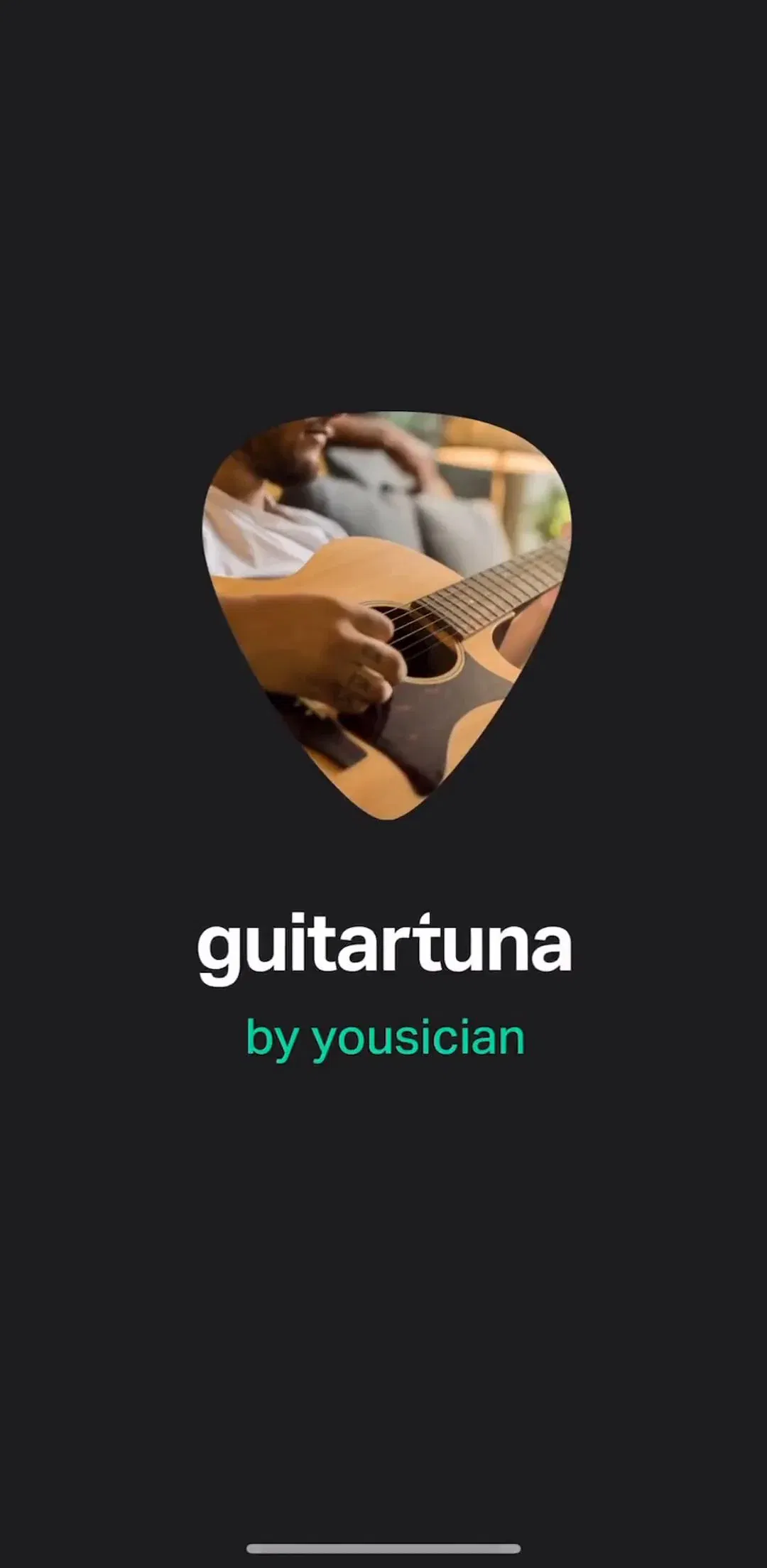
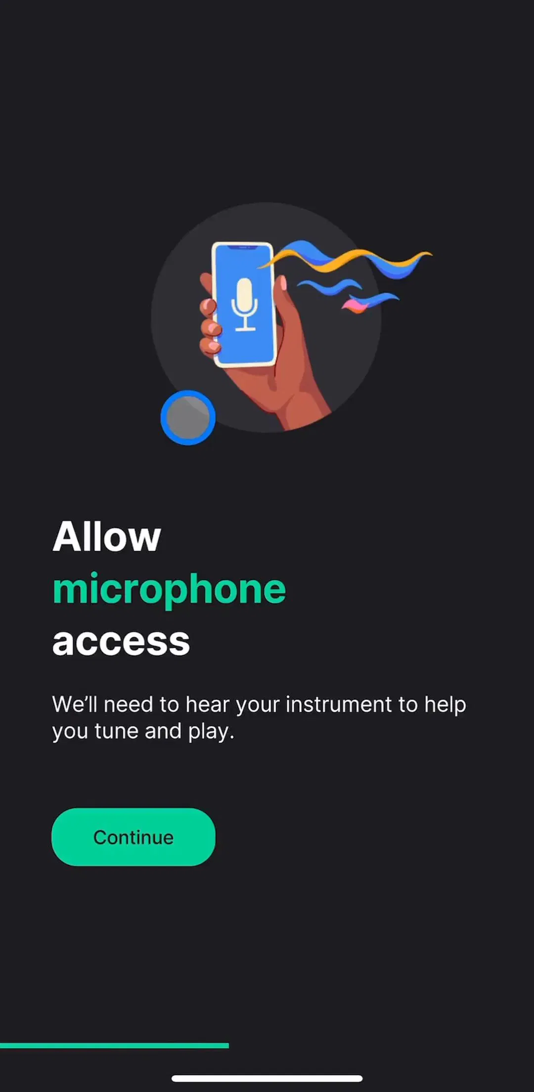
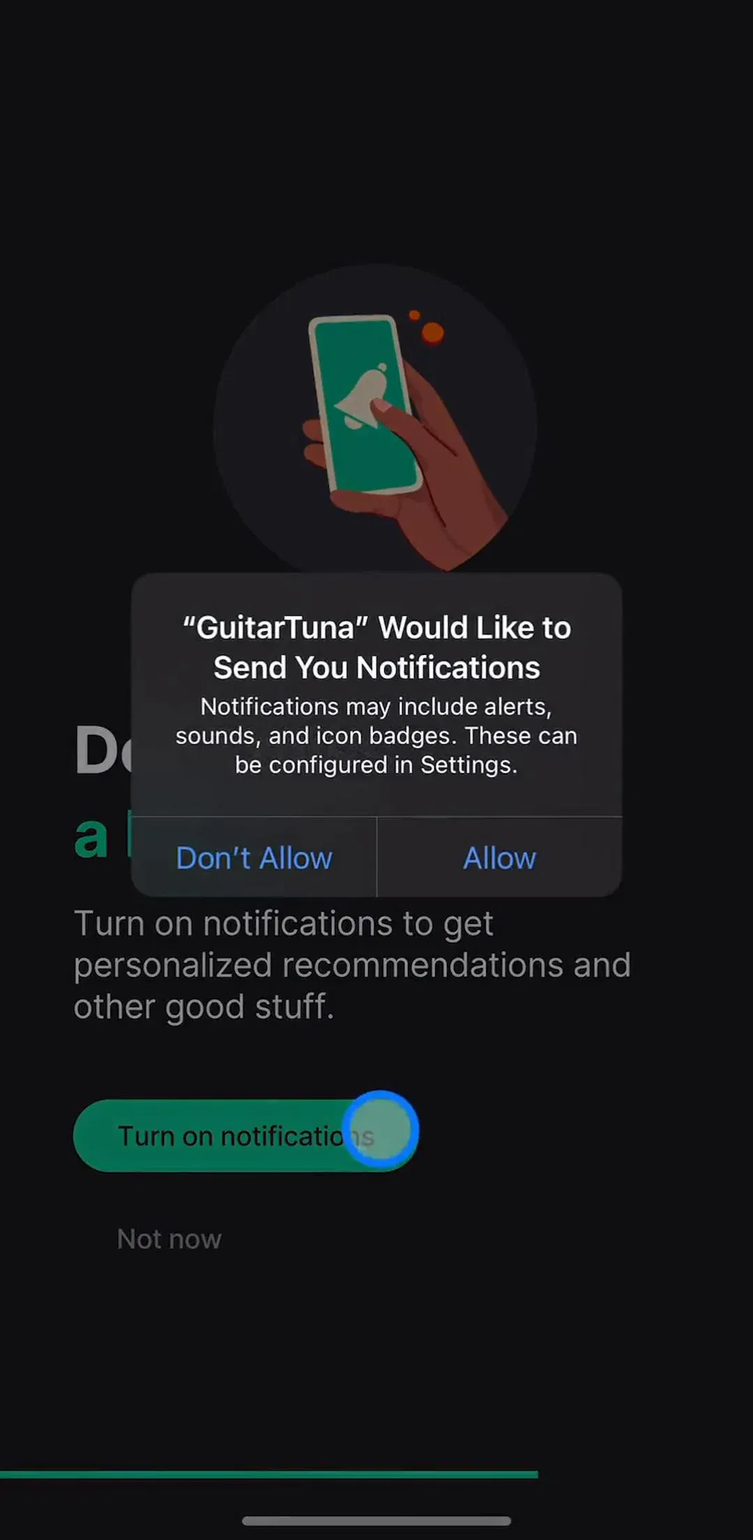
GuitarTuna (est. $1M/mo) primes two permissions inside its first session. The microphone gets a full screen: a headline that names the permission, “Allow microphone access”, and a single sentence of benefit, “We’ll need to hear your instrument to help you tune and play.” Notifications get their own screen with a Turn on notifications button and a Not now link, and the system dialog appears on top of it.
The microphone screen is close to the ideal shape because the benefit is the product. A tuner that cannot hear you does nothing, and the sentence says exactly that. The notification screen is weaker, and it is worth noticing why: “personalized recommendations and other good stuff” is a benefit to the app, not the user. The structure is right. The sentence is doing less work than the microphone one.
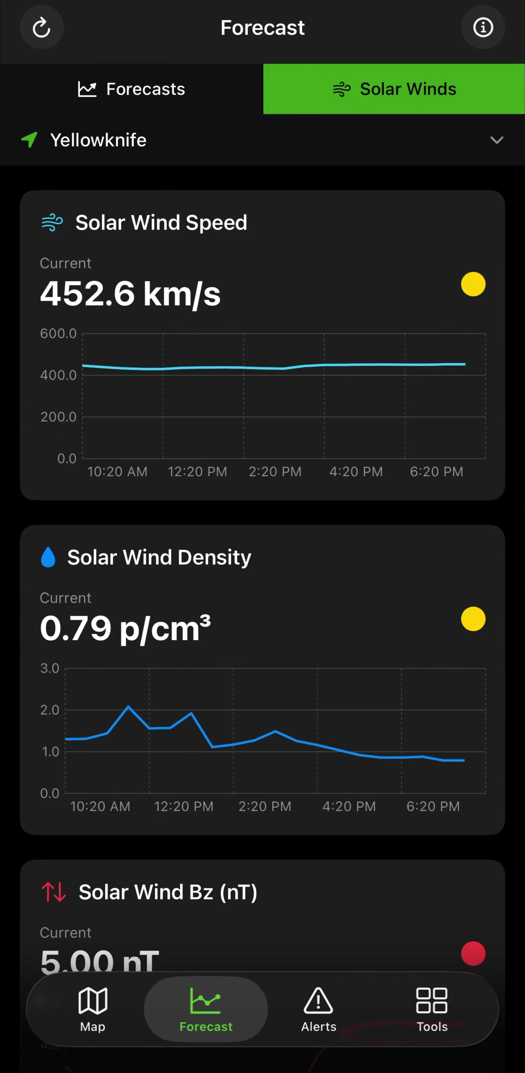
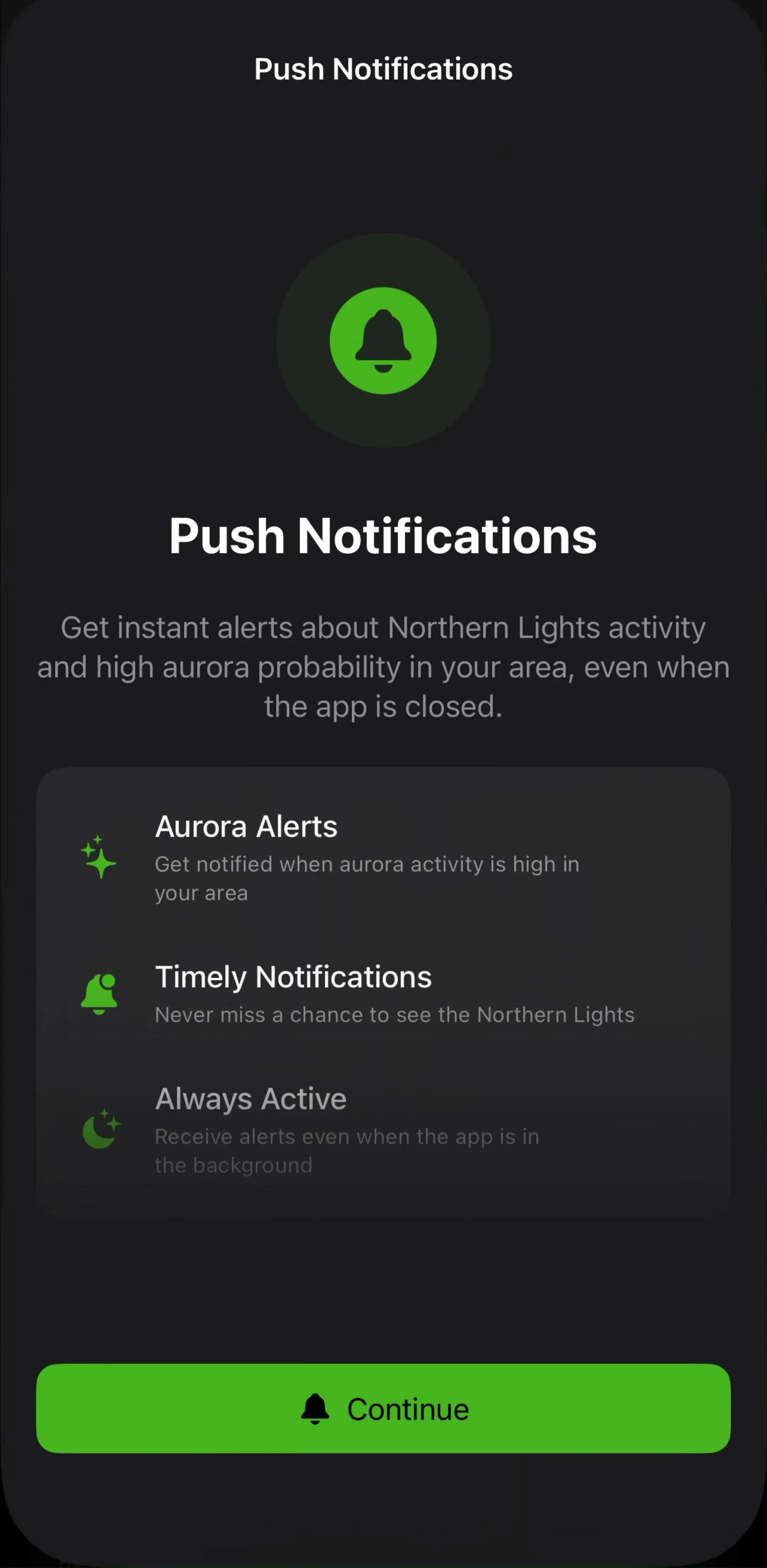
Aurora Forecast (est. $15K/mo) shows the other way to write that screen. Its notification screen leads with an outcome the user wants, alerts about Northern Lights activity in their area even when the app is closed, then backs it with three short rows before a single Continue button. For an app whose whole value is being told when to look up, that is the right permission to prime hardest.
Swipewipe (est. $1M/mo) adds the line most priming screens are missing: a reassurance about data, “Your media stays secure, stored solely on your iPhone”, placed directly above the button. For a photo cleaner, where the fear is someone else seeing your library, answering the worry is as important as naming the benefit.
The cheapest priming is timing. When a dialog appears on top of the feature that needs it, the screen behind it is the explanation, and no extra screen is required.
HeyGen (est. $0.75M/mo) shows its notification dialog on the screen where a video is rendering, above a button that reads “Notify me when ready”. The user has just started a job that takes minutes and wants to leave. The ask arrives at the one moment notifications are obviously useful, and the button text states the benefit in four words. TV Remote (est. $2.25M/mo) asks for local network access on its Select a TV Device screen, where finding the TV is the only thing the user is trying to do, and its purpose string says so plainly: select Allow to discover and connect to your TV.
calimoto (est. $0.75M/mo) does a clever hybrid. Its notification dialog sits over a screen of sample notifications in the app’s own style, such as a turn instruction for the next 90 meters, so the user sees what they are agreeing to before they agree. PhotoSolve ties its notification ask to a “Remind me before my trial ends” toggle on its paywall, which gives the permission a reason the user actually wants.
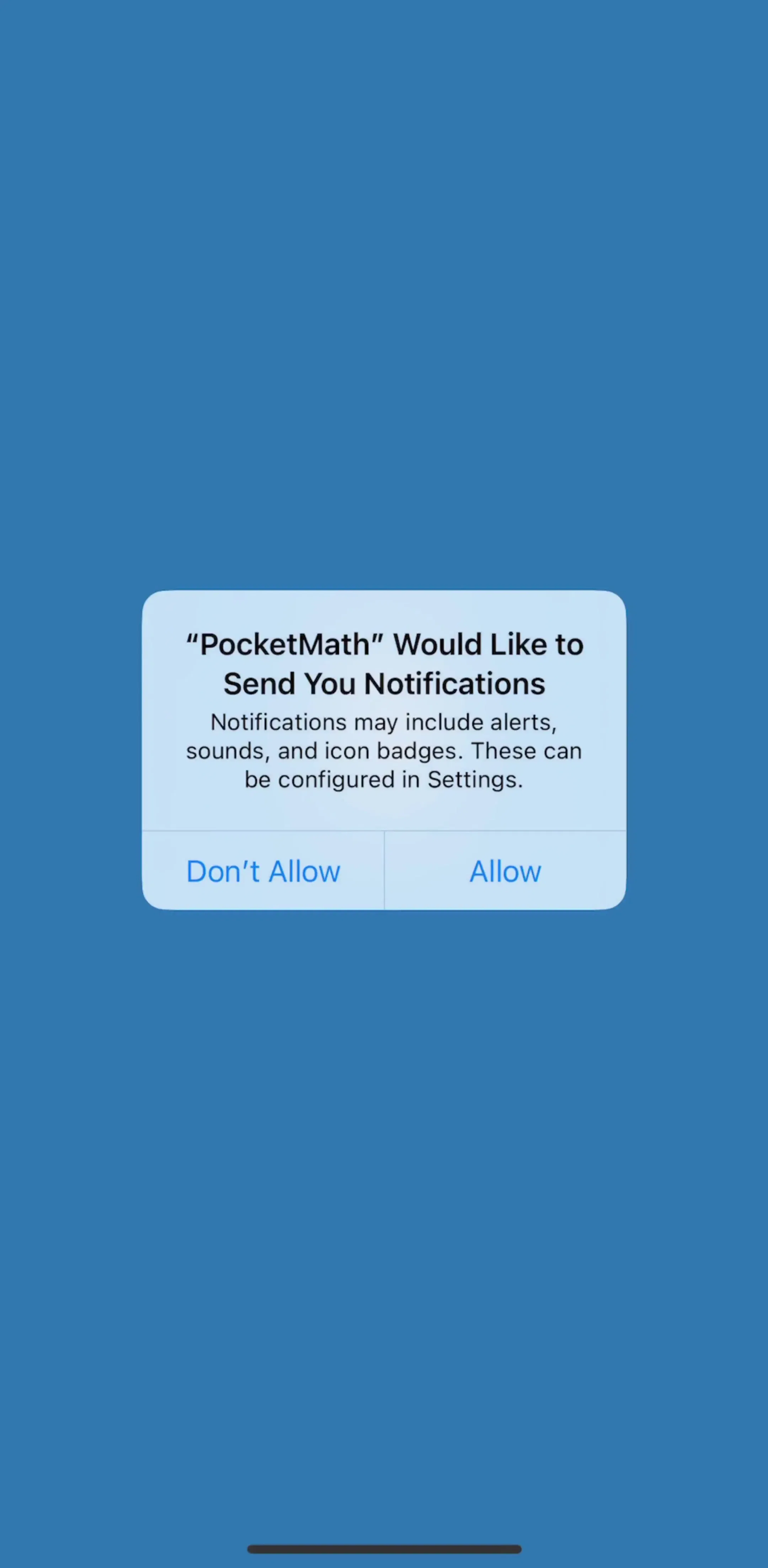
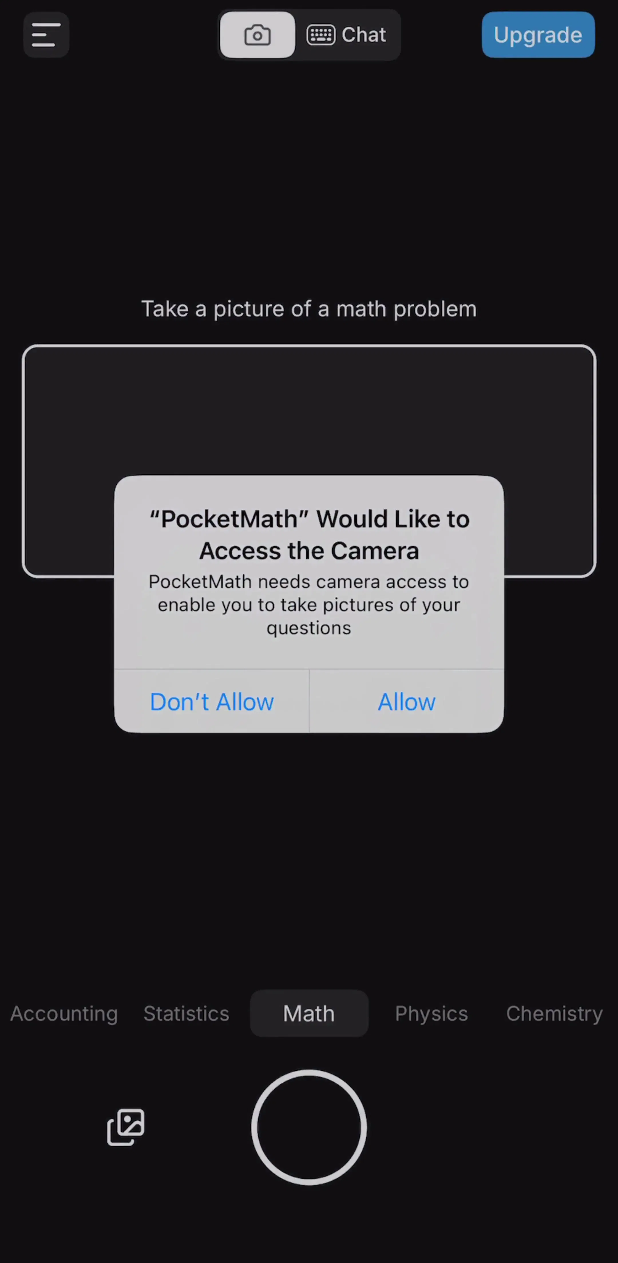
The largest group in the sample is the dialog with nothing behind it. MathGPT (its captured screens still carry its earlier name, PocketMath) shows both patterns in one short flow, which makes it a useful contrast. Its notification dialog appears over a plain launch screen with no reason on it. A moment later its camera dialog appears on the camera screen, under the words “Take a picture of a math problem”, with a purpose string that says the camera is needed to take pictures of your questions.
The camera ask will almost always be granted, because the user can see why it is needed. The notification ask is a coin toss, and a Don’t Allow on it is permanent. The same pattern repeats across the group: EPIK (est. $0.85M/mo) and Collage Maker ask for notifications over their home screens, Everlook over its photo picker, and Summary AI over an onboarding carousel about notes. None of those screens mentions notifications.
All five tracking prompts in the sample appeared with no priming screen and no related feature behind them. That is partly structural, because tracking has no feature to attach to, and it is also why the purpose string carries all the weight. The five strings range from one line to a paragraph.
iScanner (est. $3.75M/mo) uses one line about personalized ads over a blank screen. Translate Now (est. $2.75M/mo) goes the other way, with a message of roughly ninety words about personalised journeys that has to be scrolled inside the system alert. Fomz frames tracking as reducing the disturbance of advertising. None of them says what the user gets in a way a person would repeat, and the long one is harder to read than the short one without being more convincing.
If tracking matters to your revenue, it deserves the same treatment as notifications: a screen before the prompt that says plainly what changes for the user if they allow it, and a purpose string that repeats that in one sentence. If you cannot write that sentence honestly, the prompt will not convert anyway.
The sentence inside the system dialog is written by you, and it is the only app-written text the user is guaranteed to read at the moment of decision. The good ones in the sample share a shape: they name the feature and the outcome in under twenty words. Dazz Cam’s photo library string says it needs access to edit photos and videos in your library. MathGPT’s says the camera is for taking pictures of your questions. Collage Maker’s says only that it needs access to make a collage, which is accurate but gives nobody a reason to choose full access over limited access.
A useful test: read the purpose string with the rest of the screen hidden. If it would not make sense to someone who has never opened the app, rewrite it. Our UX writing examples post collects more of the sentences shipping apps put around these moments.
Many apps put every permission into onboarding so the rest of the product runs without interruptions. That is defensible for a permission the product cannot work without, like the tuner’s microphone. It is much weaker for notifications and tracking, which the user has no reason to want before they have seen the product. The onboarding flows in the library show both approaches, and our onboarding examples post covers the wider question of what belongs in a first session.
A simple rule holds up well: ask during onboarding only for permissions the core feature needs, prime those with a screen that names the benefit, and ask for everything else at the moment of use.
Permission priming is either a screen that explains the ask or a moment that makes the ask obvious. In the dialogs we read, 8 of 19 had one or the other behind them and 11 had neither. Prime with one benefit, one reassurance if data is the worry, one button and one way out. Ask in context wherever a feature can explain itself. Give tracking the priming it currently never gets. And write the purpose string as the last sentence of your pitch, not as a form field.
The permission flows in the library show these asks in sequence, with the screens before and after each dialog, next to each app’s estimated revenue.
A note on the numbers: revenue figures cited here are third-party monthly estimates from our library, useful for comparing magnitude, not audited financials. The dialog counts come from the free preview screens of the apps named above and describe what is visible behind each dialog, not every screen an app showed beforehand.
Permission priming is showing the user why you need a permission before the operating system asks for it. It can be a full screen in the app's own design, a short explanation next to the feature, or simply timing the system dialog so it appears the moment the user taps the thing that needs it. The goal is that the system dialog confirms a decision the user has already made, instead of arriving as a surprise.
Because the system dialog is effectively one shot. Once a user taps Don't Allow on notifications, camera, photos or tracking, the app cannot show that dialog again, and the only way back is a trip to Settings that few users make. A priming screen lets a hesitant user say not now to your screen, which you can ask again later, rather than no to the system, which you mostly cannot.
Yes, as long as it explains and does not mislead. Apple's guidance is that you should request permission only when it is needed and explain the benefit. What is not acceptable is a custom screen that imitates the system alert, offers only a button that leads to the dialog while pretending to be the choice itself, or blocks the app until the user grants something it does not need.
No. The strongest pattern in shipping apps is asking at the moment of need, which often needs no extra screen at all: a camera dialog shown on the camera screen explains itself. Full priming screens earn their place for permissions whose value is not obvious from the current screen, which is mostly notifications and tracking, and for asks made during onboarding before the feature has been seen.
What the user gets, in their terms, and what happens to their data if that is the worry. One short headline naming the permission, one sentence of benefit, optionally a reassurance line such as where data is stored, then one primary button and one quiet way to skip. The purpose string inside the system dialog should repeat the same benefit in one sentence, not a paragraph.
Our notification design post covers the whole notification ask end to end, including message writing and settings. The iOS dialogs post covers the alert component itself and how to write its title and buttons. This post is about the step before any system permission dialog, across every permission type, and what we measured about how often shipping apps actually take it.
Browse captured permission flows from revenue-verified iOS apps, in sequence, with the screens before and after each system dialog.
Browse permission flows