A dialog is the most expensive control on a phone. It stops the task, covers the screen, takes the focus, and refuses to go away until it is answered. Everything else in mobile design has spent fifteen years getting less interrupting. The alert has not moved, which is why it is worth being strict about when it is allowed.
The strictness is not stylistic. A dialog is the only control that assumes the user’s current intention is less important than yours. That assumption is correct roughly three times in an app: when something is about to be destroyed, when something has failed in a way the user has to handle, and when the system is asking on your behalf and you have no say in how it looks. Almost every other alert in the App Store is a design decision deferred.
Before choosing one, it helps to price it. A dialog blocks the interface, so nothing else can be read or touched. It arrives out of context, floating over the screen rather than attached to the thing it is about. It is small, so it can hold roughly a sentence. It has no memory, so it cannot be returned to. And it trains dismissal: the more of them an app shows, the faster users learn to hit the right-hand button without reading.
That last effect is the real damage, and it is cumulative across your app. Every unnecessary alert makes the necessary one less likely to be read. The delete confirmation that finally matters is competing with all the ones that did not.
Destructive or expensive confirmation. Deleting an account, discarding unsaved work, cancelling something that cannot be restarted, spending money or credits. The test is whether the action is reversible. If it is, a confirmation is usually the wrong answer and an undo is the right one.
A failure the user has to act on. Not every error: the ones where the app cannot continue and the user has a decision to make. Retry, sign in again, free up space. Errors that can be shown in place, next to the field or the row that failed, should be.
A system request you do not control. Permissions, the App Store review prompt, sign-in sheets. You do not get to restyle these. What you get to design is the moment they are triggered, which turns out to be most of the outcome.
Onboarding and feature announcements. A modal welcome is a tax on the first run. Explain in place, or use the overlay pattern covered in our coach mark post.
Validation errors. They belong under the field, where the user can read the message and fix the input at the same time.
Success. A confirmation of something the user just did, which they can already see happened, should be transient at most. Ideally the screen itself is the confirmation.
Upsells. A paywall is a screen with room to make an argument, not a box with two buttons. Our paywall post covers what actually goes on it.
Lists of actions. That is an action sheet or a menu.
Rating requests fired at random. The system review prompt is rate limited and you cannot repeat it, so spending it at a neutral moment wastes it.
Four containers, and the choice is decided by what you are asking rather than by how much content you have.
An alert asks a question with a small number of answers and expects one now. Two buttons, one sentence of context, no input fields beyond the rare single value.
An action sheet offers actions on something already selected. Cancelling is a normal, expected outcome. On recent iOS a pull-down menu attached to the control has taken over much of this job, which we covered in the pull-down menu post.
A sheet holds content rather than a question: a form, a picker, a detail view, anything the user might want to size or dismiss by dragging. Our bottom sheet post covers detents and dismissal.
A full screen is for anything with real steps, real length, or a real argument to make. If you are tempted to put a third paragraph in a dialog, you wanted a screen.
A dialog is mostly writing, and it is usually written last. Three rules recover most of the quality.
The title is the question. Delete this workout? beats Are you sure? by a wide margin, because the second one forces the user to rebuild the subject out of the buttons. If the title cannot name the object, the dialog probably fired in the wrong place.
The body is the consequence. One or two sentences, and the useful content is what cannot be undone and what else it takes with it. This will also remove the eleven entries in it is information. This action cannot be undone, on its own, is filler.
The buttons are verbs. Delete, Discard, Keep Editing, Try Again. A button labelled with a verb can be read without the title, which matters because that is how it will be read. Yes and No require the question to be held in memory, and OK confirms nothing in particular.
Two buttons is the right number for a question. One is right for an acknowledgement, which is rarer than it looks. Three is a sign that the dialog is doing a menu’s job.
On iOS the platform does something useful with the ordering: the cancelling option carries the heavier visual weight, and the destructive option is styled in red rather than as the obvious default. The safe choice is therefore the one a distracted user hits, which is the correct default for an interruption. Fighting that convention, by styling the destructive action as the prominent one to increase completion, is how an app ends up with support tickets about data people did not mean to delete. The general case for button weight and hierarchy is in our button UI post.
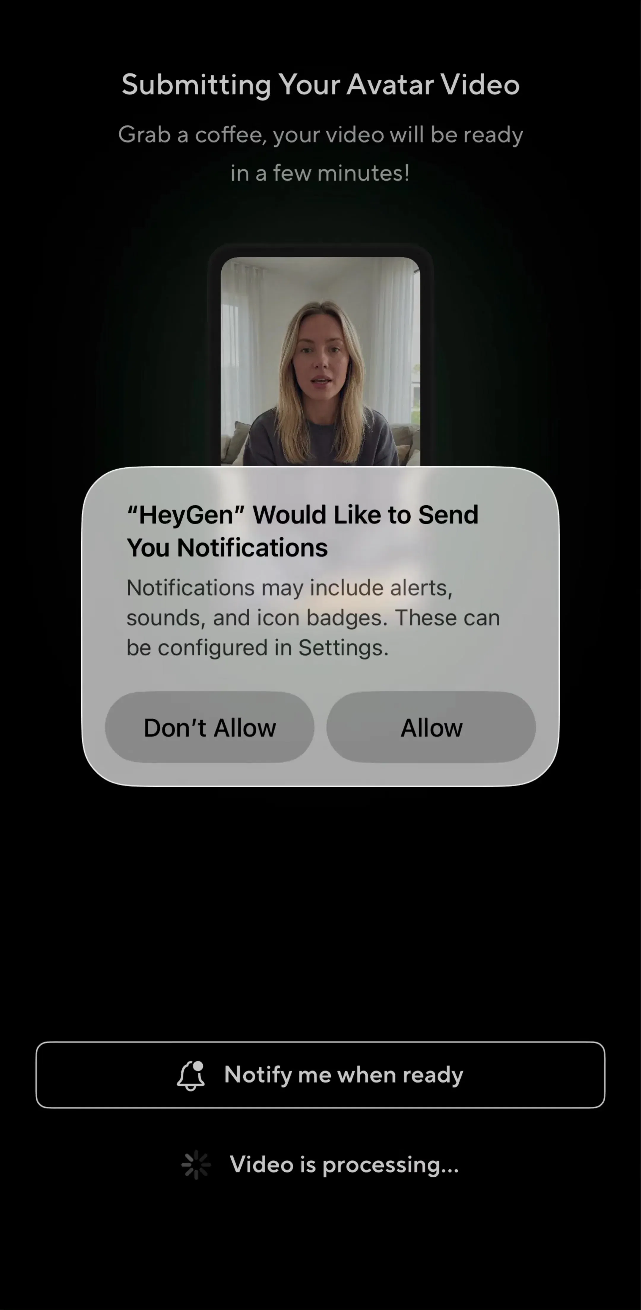
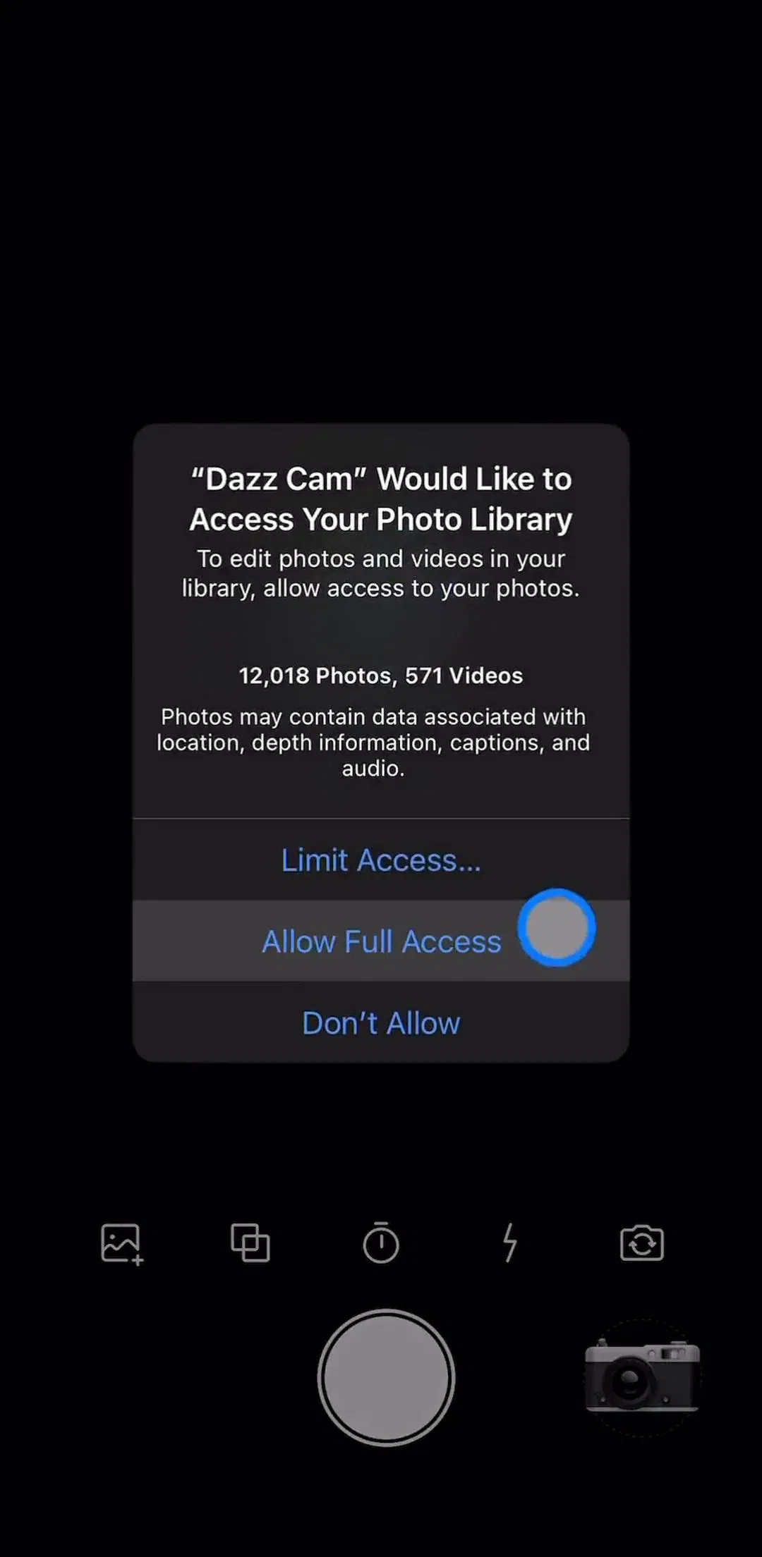
The system permission alert is the most consequential dialog in most apps and the one you have least control over. You cannot change its words, you cannot restyle it, and from inside the app a denial is effectively final: the second attempt sends the user to Settings, which almost nobody completes.
The pattern that survives this is priming. Show your own screen first, explaining what the feature does and why access is needed, in your own words and with a picture of the benefit. Let the user decline that screen, harmlessly, and ask again later in a better moment. Trigger the system dialog only after they have said yes to yours.
Dazz Cam’s permissions section is a useful reference for where this sits in a flow, because the request arrives inside onboarding rather than at a cold start.
HeyGen’s permissions section shows the same beat in an app where the permission is the feature rather than an enhancement to it.
Two details are worth naming. Ask at the moment of use, not at launch, because a request attached to a tap explains itself. And write the purpose string as though the user will read it in the system dialog, since it is the only sentence of yours that appears there. The notification case has its own timing problems, covered in our notification design post.
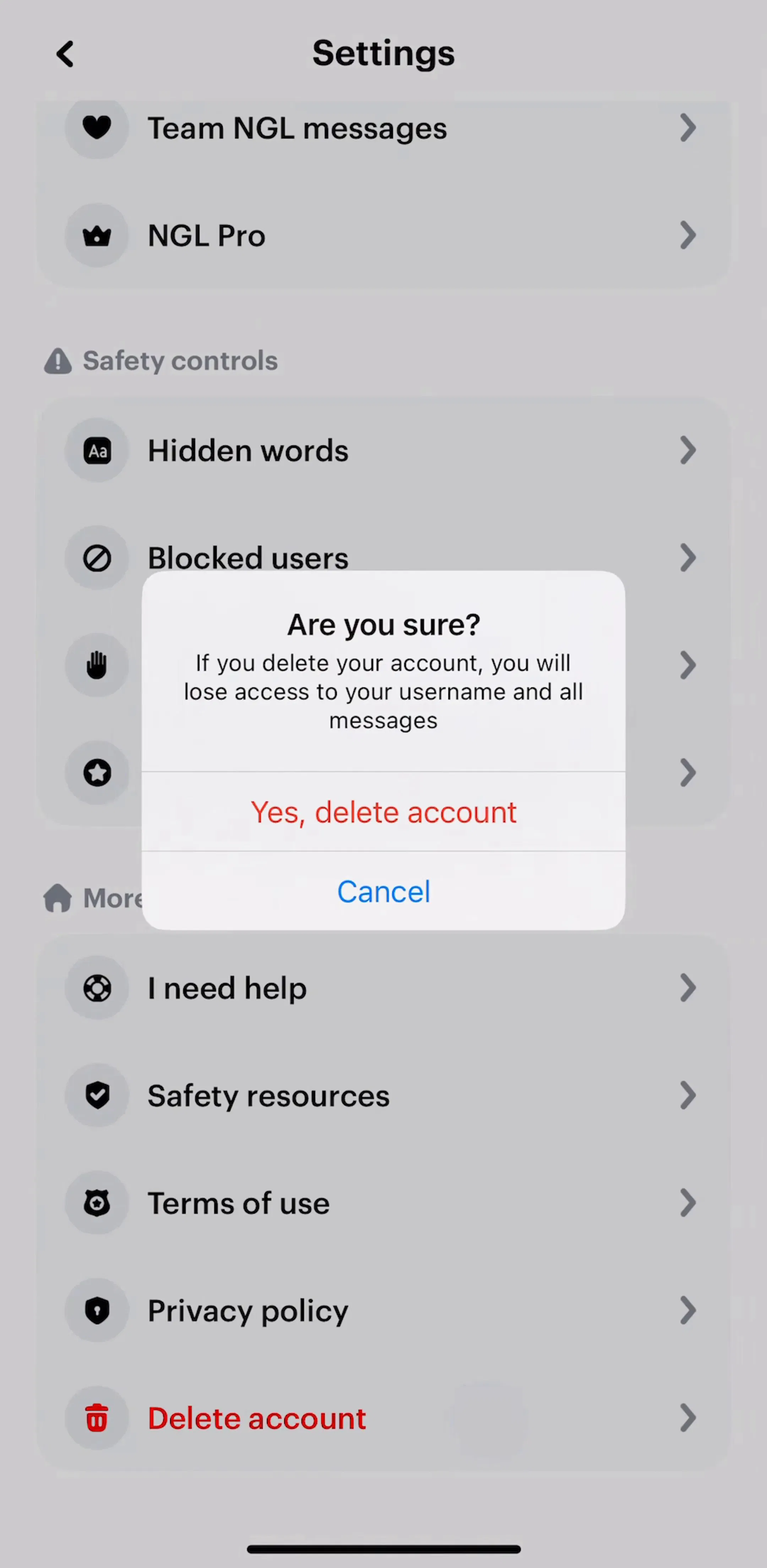
Confirmation dialogs are the default answer to destructive actions and often the weaker one. The stronger answer is undo: perform the action immediately, show a brief way to reverse it, and only interrupt when reversal is genuinely impossible.
Undo wins because it is free for the ninety-something percent of cases where the user meant it, while a confirmation taxes every single one. Reserve the dialog for actions that cross a line the app cannot walk back: deleting an account, removing something stored only on the device, spending a non-refundable credit.
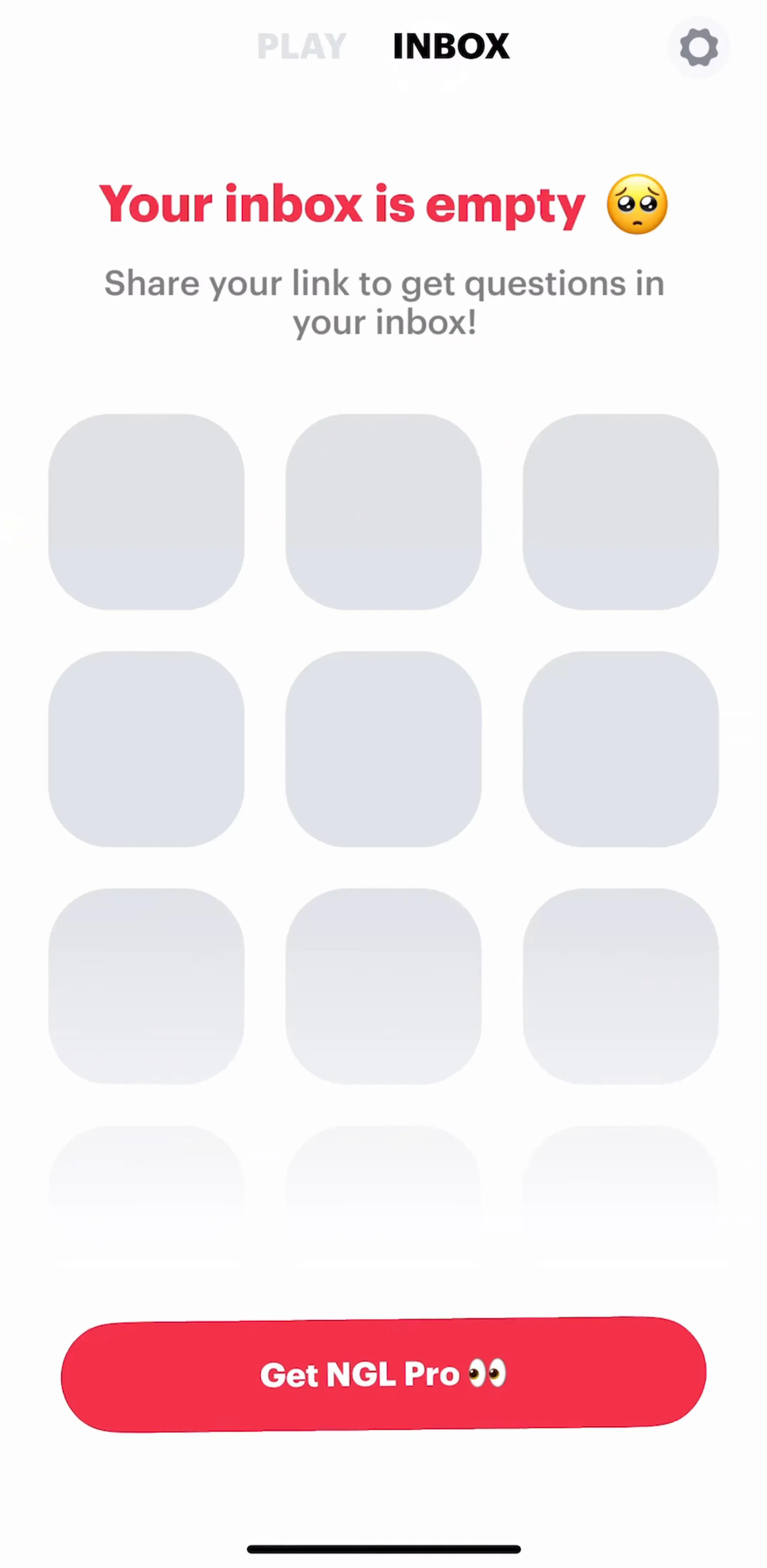
NGL’s settings section is a good place to see where these decisions cluster, since account controls, sign-out and deletion all live in the same stack of rows.
When the consequence is severe enough, raising the effort is reasonable: typing the word delete, or confirming on a dedicated screen rather than in a box. That is deliberate friction, and it is only defensible for the small set of actions that deserve it. Our settings UI post covers how those rows should be grouped and where the destructive ones belong.
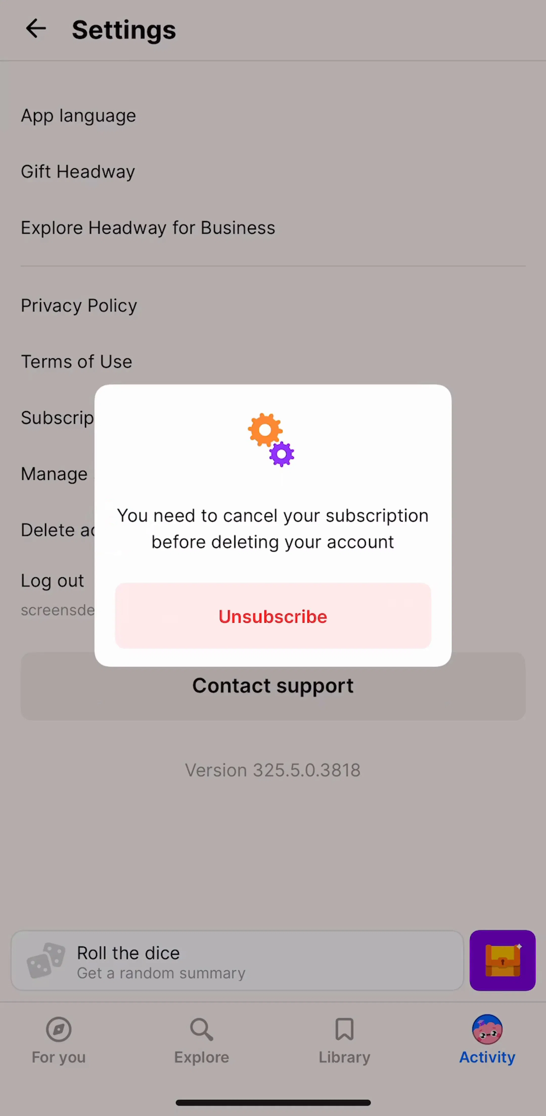
The clearest test of an app’s honesty is what its exit flows look like. Account deletion and subscription cancellation are the two places where a dialog is genuinely warranted and also the two places most likely to be used against the user.
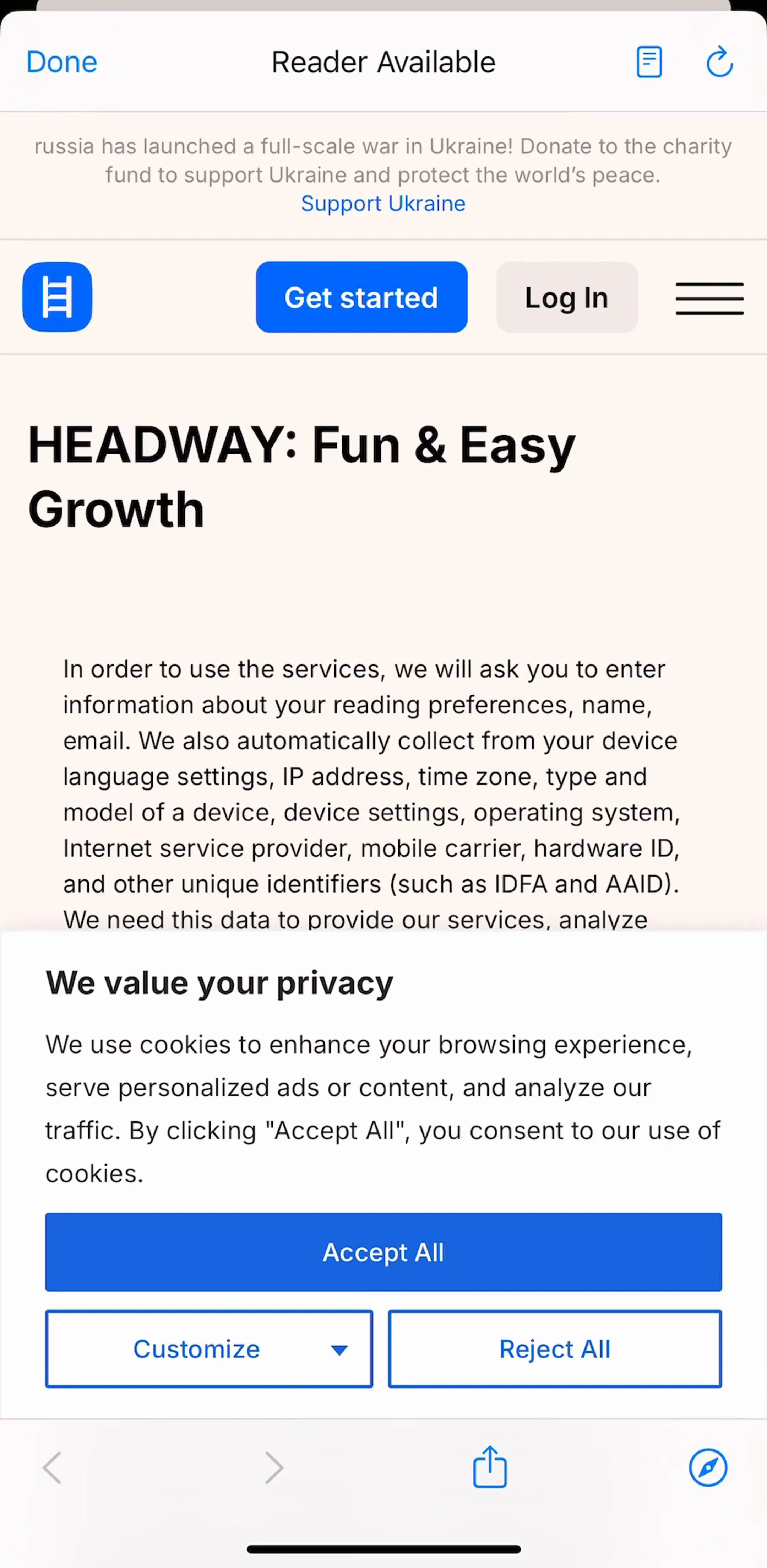
The defensible version states what will be deleted, what is kept, and what happens to anything already paid for, then lets the user proceed. The indefensible version is a chain of alerts, each offering a discount, with the exit hidden behind the least prominent button. Headway’s account management section is a reasonable reference for the shape of the surrounding screens.
One retention offer is a business decision. Three stacked dialogs is a dark pattern, and it is increasingly a compliance problem as well as a design one.
Dialogs arrive from everywhere: your code, the system, the push framework, the payment sheet. Nothing coordinates them by default, so a cold start can produce three in a row. Route them through one queue, give them priorities, and let the queue decide what is allowed to appear during onboarding at all.
Never show a dialog over a dialog. Never fire one during a transition, when the user is mid gesture, or immediately on launch before the screen has settled. And be explicit about dismissal: an alert with a required decision should not be dismissable by tapping outside, while a purely informational one should be. If tapping outside is allowed, it has to mean the same thing as the cancelling button, never the destructive one.
Spend dialogs like they are rationed. Keep them for destructive confirmations without an undo, failures the user has to act on, and the system requests you cannot restyle. Put the question in the title, the consequence in the body, and a verb on every button. Let the cancelling option keep its weight. Prime every permission with a screen of your own before the system asks, because you only get one attempt. Queue everything so two never stack. Then look at what is left and check whether an undo, an inline message, or a sheet would have done the job without stopping the app.
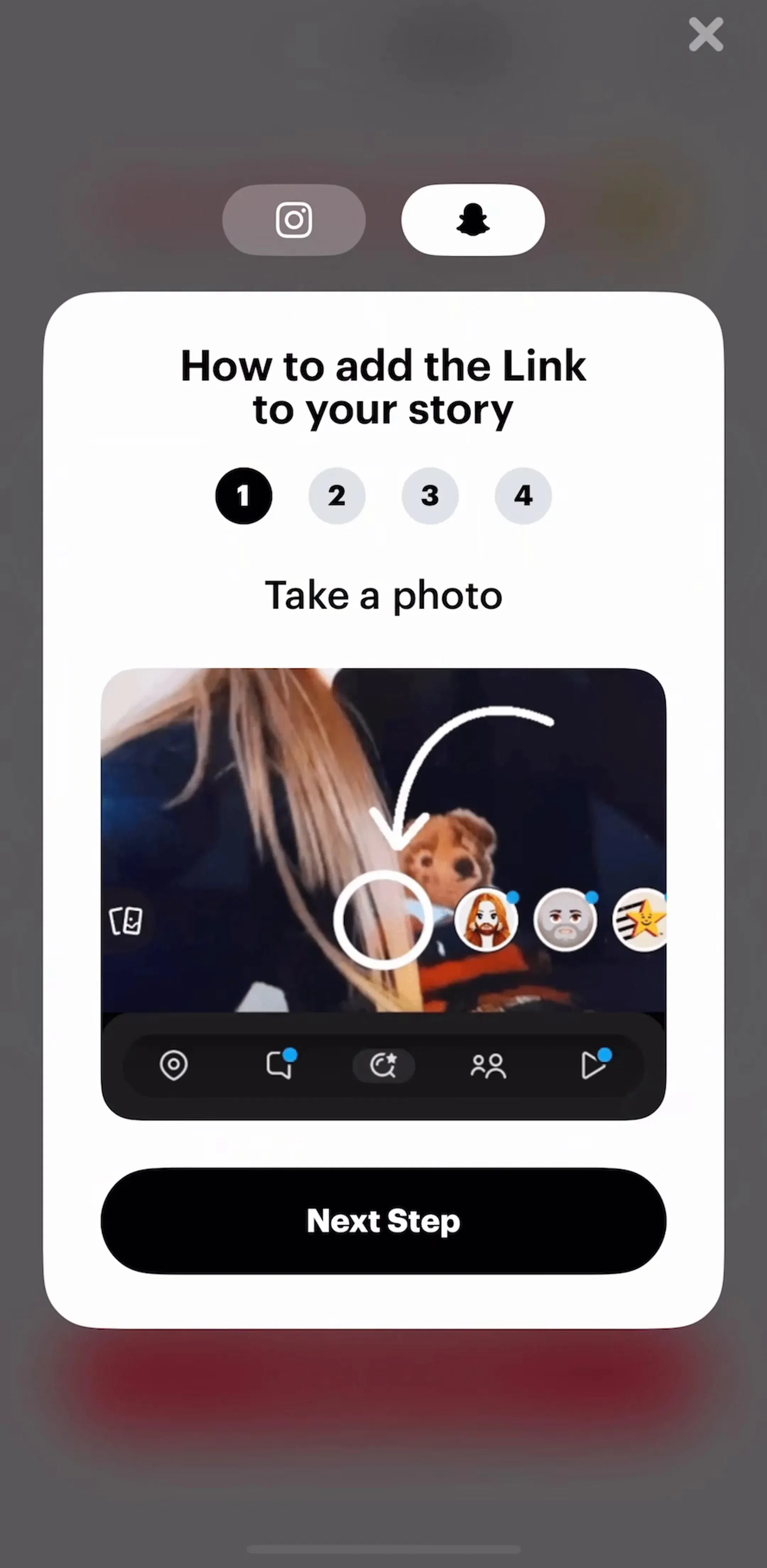
Every screen in the library sits next to the app’s estimated revenue and downloads, so references can be picked by outcome rather than by how the shot looks. Dazz Cam (est. $0.85M/mo), Headway (est. $0.85M/mo), HeyGen (est. $0.75M/mo) and NGL (est. $0.65M/mo) are useful starting points, because each one has to ask for something early and has had to design the ask. The settings flows and the account management flows hold most of the confirmations in the library.
A note on the numbers: revenue figures cited here are third-party monthly estimates from our library, useful for comparing magnitude, not audited financials.
When the user must answer before anything else can happen, and the cost of getting it wrong is high. In practice that is three cases: confirming something destructive or expensive, reporting a failure the user has to act on, and the system requests you do not control, such as permissions. If none of those apply, the content belongs in a sheet, inline on the screen, or nowhere.
An alert asks a question and expects an answer, usually a choice between two paths. An action sheet offers a list of actions on something the user already selected, and cancelling is a normal outcome rather than a failure. If you are writing a question, use an alert. If you are listing verbs, you want an action sheet or a menu, and on recent iOS a pull-down menu attached to the control is often better than either.
The question itself, in plain words, with the consequence in it. Delete this project? is a title. Are you sure? is not, because it makes the user reconstruct what they are being asked about from the button labels. Use the body text for the part that does not fit, above all what cannot be undone and what else it affects, and keep it to a sentence or two.
Label them with the verb they perform, not with Yes and No, so the button reads correctly on its own: Delete, Discard, Keep Editing, Try Again. On iOS the cancelling option carries the heavier weight and the destructive one is styled in red, which means the safe choice is the one a distracted user hits by default. Two buttons is the right number for a question; if you need more, it is not a question.
Because you only get one. The system permission alert is not yours to restyle or repeat, and a denial is effectively permanent from inside the app, so the system prompt should be the second thing the user sees, not the first. Show your own screen explaining what the feature does and why it needs access, let the user decline that one harmlessly, and only trigger the system dialog when they have opted in.
The mobileappdesign library holds captured flows from 2,622 revenue-verified iOS apps, including 61 with a dedicated permissions section, 1,520 with a settings and preferences section and 238 with an account management section. Because flows are captured in sequence, a dialog appears next to the screen that triggered it and the screen that followed, which is what shows whether the interruption was worth it.
Browse captured permission and account flows from revenue-verified iOS apps, with the screen before the dialog and the screen after it in sequence.
Browse permission flows