A coach mark is the only component that admits something went wrong upstream. Every other element on a screen is trying to be understood; a coach mark is there because one of them was not. That is not a reason to ban them, and plenty of good apps ship them, but it is the reason the pattern rewards restraint more than craft. Component documentation covers the anatomy: the spotlight, the scrim, the caption, the Got it button. What it does not cover is how many marks a real user tolerates before they start tapping through blind, or what a mark should do when it fires on a screen the user arrived at by accident. Our library holds 2,622 revenue-verified iOS apps and 2,512 of them carry an onboarding flow, which is where most first-launch overlays live.
The distinction worth holding on to is where the teaching happens. An onboarding carousel teaches before arrival: the user sees three slides about a product they have not touched, then lands on a screen they now have to map onto what they were told. A coach mark teaches after arrival, on the live screen, with the actual control under the actual finger.
That is a real advantage and it is why the pattern survives. Instruction delivered next to the thing being instructed does not require the user to hold anything in memory. It also sets the constraint that governs everything else: if the underlying screen is not visible behind the mark, you have built a modal with a spotlight drawn on it and lost the only reason to prefer a coach mark in the first place.
Coach marks, tooltips, and instructional overlays get used as synonyms and they behave differently in production.
A tooltip is requested. The user taps a question-mark icon or long-presses a control. Because they asked, the tooltip owes them nothing beyond an answer, and it can be as small as it likes.
A coach mark is imposed. It fires on first launch, or the first time a user opens a screen after a feature shipped. Nobody asked. That single fact generates the rest of the rules: it needs a visible dismiss, it needs to be brief, and it needs to fire at most once.
A full-screen instructional overlay, the kind with arrows scrawled at three controls at once, is a third thing and mostly a worse one. It asks the user to learn four things simultaneously and gives them one chance to do it, which is how apps end up teaching nothing at all.
A coach mark is really two components: a highlighted region and a dimmed everything-else. The dim is what makes it a coach mark rather than a floating label. When teams get nervous and set the scrim at 20 percent, the result is a screen that looks slightly broken and directs attention nowhere.
The treatments that hold up on a device commit to the contrast, keep the spotlight tight around the target rather than around a generous bounding box, and never let the caption cover the element it is describing. That last failure is common and self-defeating: the user reads about a button they cannot see.
There is a dark-theme trap here too. A scrim tuned against a light interface disappears against a dark one, since dimming an already-dark screen produces almost no separation. Apps that ship both themes need two scrim values, and most ship one. We measured how shipping apps handle the wider version of that problem in the dark mode UI study.
The user downloaded the app to do something. Every coach mark is a wall between them and that thing. Three is a defensible ceiling for a first-launch tour, and the honest version of most tours is one mark on the single control nobody finds.
Whatever the count, the skip has to be visible from the first mark rather than appearing on the last one. A tour that only offers Next until step four has decided the user must be taught, and users respond by tapping Next four times without reading, which produces the same completion metric and none of the learning. If you are chaining marks, the same counting limits apply as anywhere else a sequence is drawn on screen, which we covered in the page indicator breakdown.
Coach marks earn their place where a screen carries many controls that cannot be labelled without clutter. Photo and video editors are the clearest case: a toolbar of ten icons has no room for words, and the icons are not self-evident.
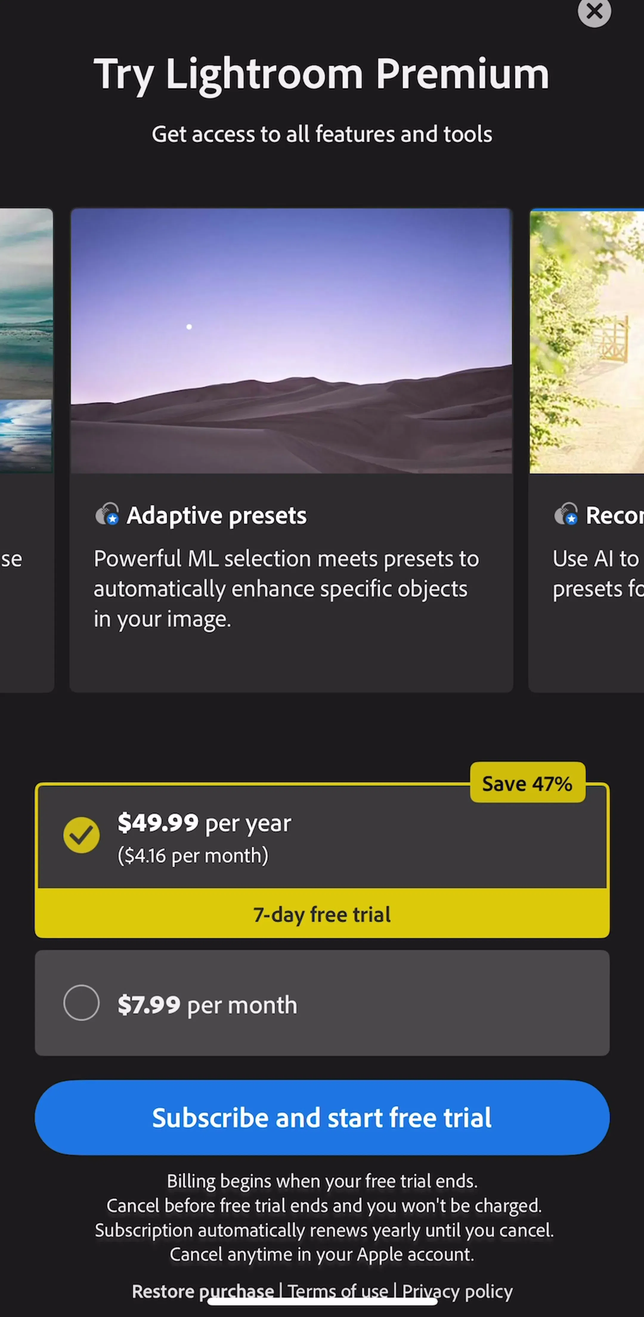
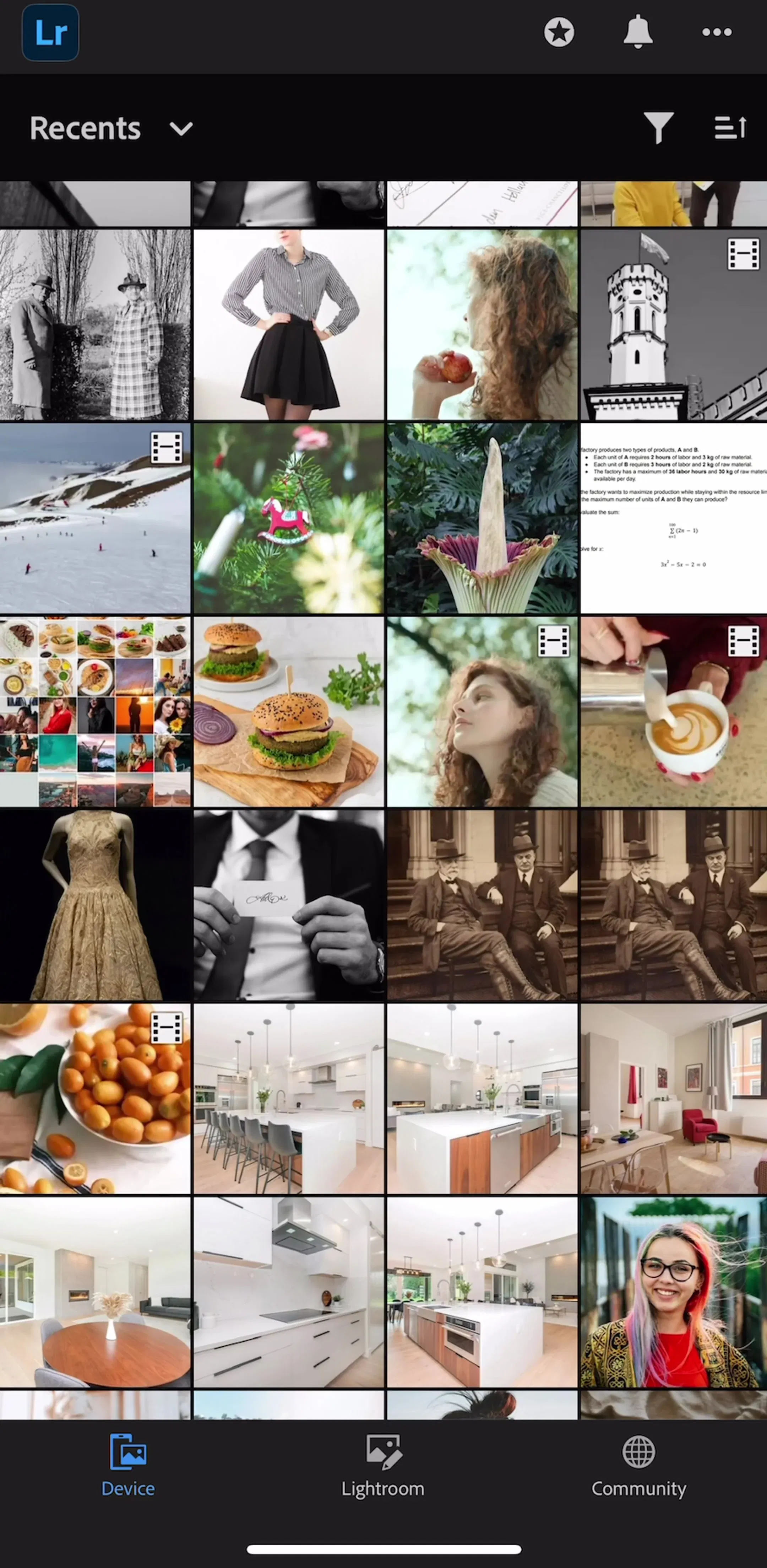
Lightroom (est. $4.75M/mo) is worth studying for exactly that reason. The product has to hand a dense editing surface to someone who has opened it for the first time, which is the canonical situation the pattern exists for.
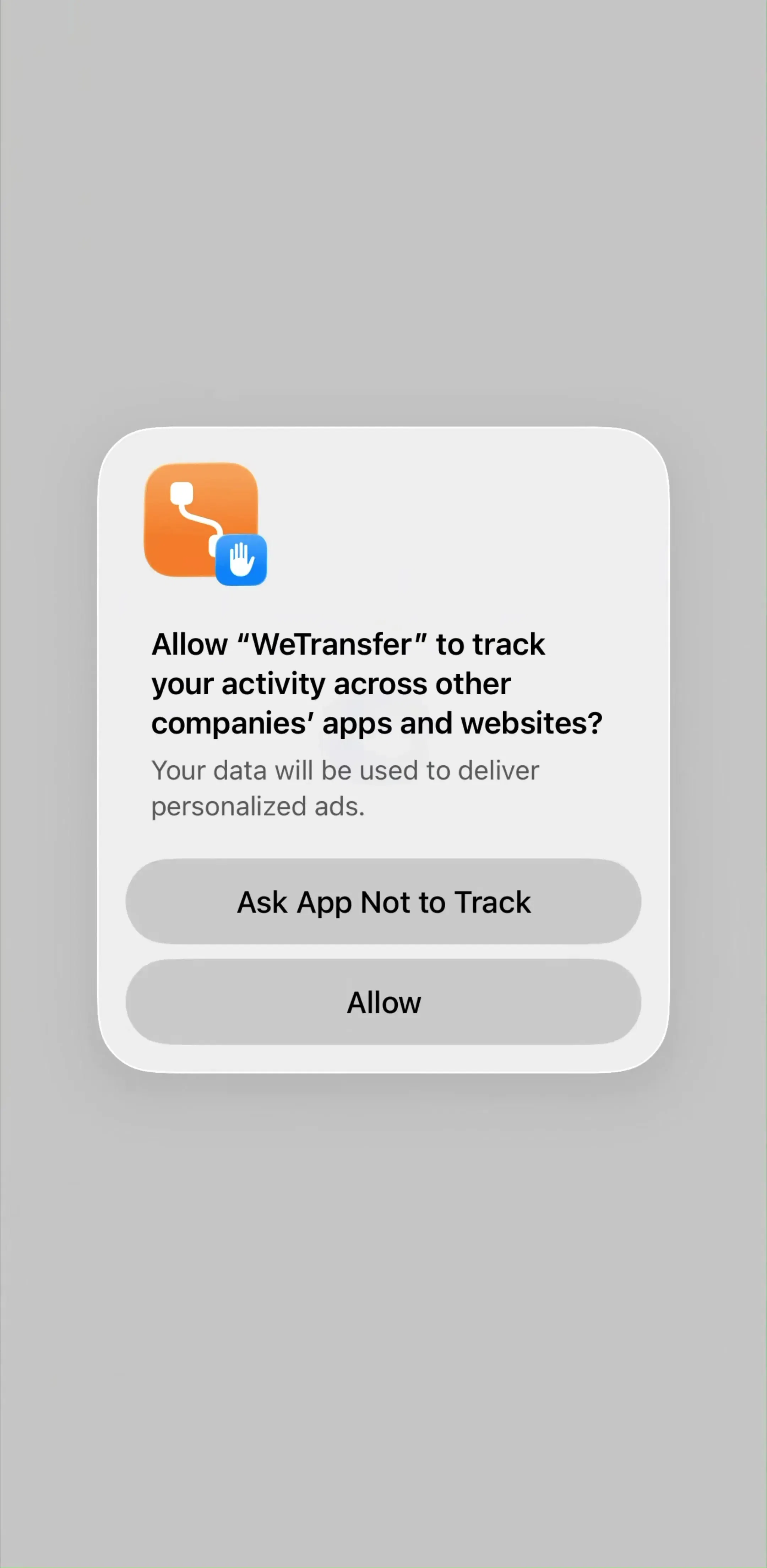
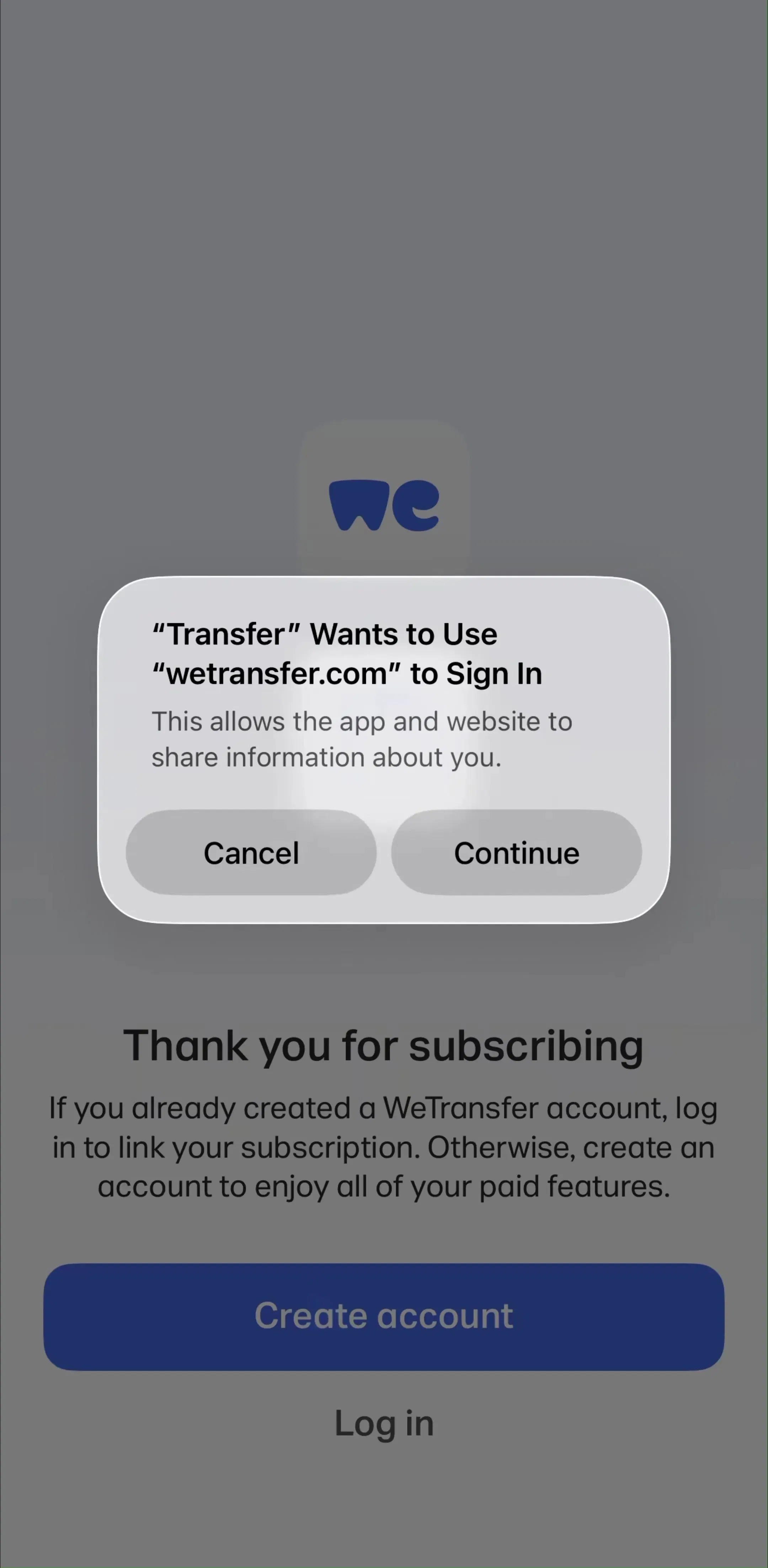
WeTransfer (est. $5M/mo) sits at the other end of the range. A product with one obvious job has less to explain, and its first run is a useful control case for how little instruction a focused app actually needs.
The other place coach marks appear is after a release, pointing at something new. This is harder than first launch because the user is not in a learning posture. They opened the app to do the thing they always do, and an overlay is now standing in front of it.
Two rules keep this bearable. Fire it on the screen where the feature lives, not on the home screen where it does not, so the mark is adjacent to the thing it announces. And do not fire it during a task; a user halfway through a flow will dismiss anything without reading it in order to get back to what they were doing.
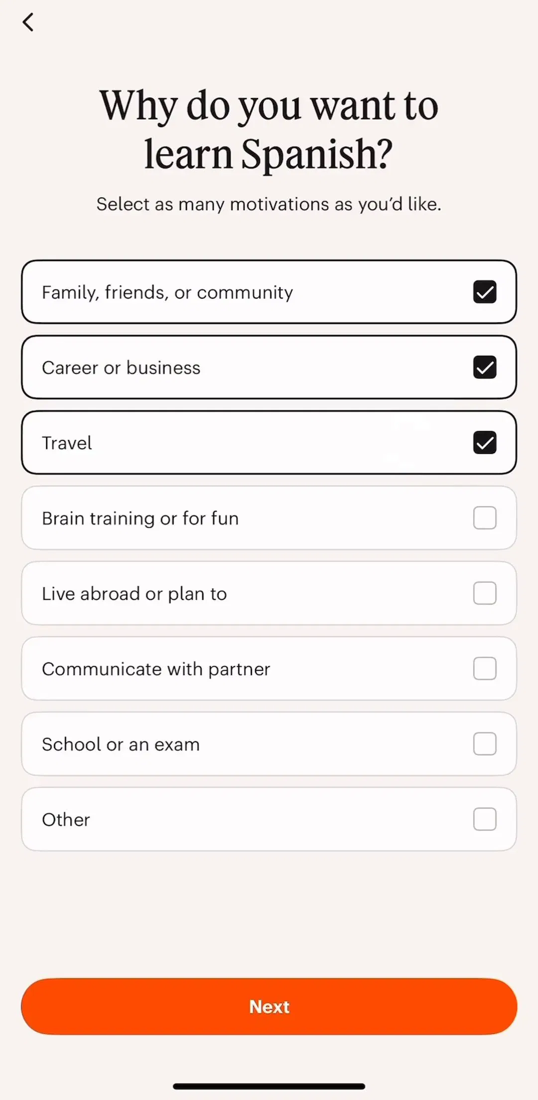
Learning apps handle a version of this continually, since they introduce new mechanics throughout a course rather than only at the start. Babbel (est. $3M/mo) is a reasonable reference for how a product paces explanation across a long relationship rather than front-loading it.
A coach mark that reappears is a bug the user experiences as contempt. The usual causes are mundane: the dismissal flag is stored in memory rather than persisted, or it is keyed to a session rather than to the install, or a logout clears it.
The related question is what happens to the information afterwards. Coach marks are shown once and then gone, so anything a user might want on their second visit needs a permanent home, usually a help entry in settings. Treating the tour as the only documentation means the app has explained itself exactly once, to a person who was not yet in a position to care. Where that permanent home goes is a settings-architecture question, which we took apart in the settings UI study.
Five recurring failures. A caption that covers the element it describes. A scrim too weak to direct attention. A tour longer than three steps with no skip on the first one. Marks that fire mid-task rather than at a rest point. And a mark whose target moves or scrolls away while the overlay is up, leaving the spotlight sitting on empty background.
The largest one is not a defect at all: a coach mark used to paper over a control that should have been labelled. If the mark is genuinely necessary for a user to operate the screen, the screen is the problem, and no overlay makes an unlabelled icon self-explanatory on the tenth visit.
Open your own first launch on a device and count the taps between the app opening and the user being able to do the thing they downloaded it for. Coach marks are part of that count. Then check whether each mark survives the deletion test: remove it, and if the screen is still operable, the mark was decoration. What remains after that test is your real tour, and it is usually one step.
After that, compare against shipping apps rather than concept shots. Every screen in the library sits next to the app’s estimated revenue and downloads, so references can be picked by outcome rather than by how the shot looks. The screens leading into a first launch matter as much as the overlay itself, and we broke those down in the app onboarding breakdown.
A note on the numbers: revenue figures cited here are third-party monthly estimates from our library, useful for comparing magnitude, not audited financials.
A coach mark is a temporary overlay that points at one element on a screen the user is already looking at, dims everything else, and explains what that element does. Several chained together make a product tour. The defining trait is that the underlying screen stays visible: unlike an onboarding carousel, a coach mark teaches in place rather than before arrival.
A tooltip is requested. The user taps an info icon or long-presses a control and a small label appears. A coach mark is imposed: it fires on first launch or after a feature ships, without the user asking. That difference decides the design. Because a coach mark interrupts, it owes the user a visible way out, and because a tooltip was requested, it does not.
Three is a working ceiling for a first-launch tour, and one is often better. Every mark is a screen the user has to dismiss before they can touch the product they just downloaded, and dismissal rates fall off sharply after the first two. If you need five marks to make a screen usable, the marks are not the fix. Long sequences also collide with the same counting problem a page indicator has.
When the mark explains a control that could have been labelled instead. Coach marks are shown once and then gone forever, so any instruction a user might need on their second visit is in the wrong container. They are also the wrong tool for explaining value, which belongs in onboarding, and for anything the user can discover by tapping.
The mobileappdesign library holds captured flows from 2,622 revenue-verified iOS apps, and 2,512 of them carry an onboarding flow, which is where first-launch overlays sit. Because screens are captured in sequence rather than as isolated shots, you can see what the app showed immediately before and after an overlay, which is the part a single screenshot never tells you.
Browse captured onboarding sequences from revenue-verified apps, in the order a real user walks them.
Browse onboarding screens