
The pull down menu is the least discussed control on iOS and quietly one of the most used. It is the thing that drops out of the three-dot button in a navigation bar, or off the corner of a row in a library, holding rename, duplicate, share, delete. For most of iOS history those actions lived in an action sheet that slid up from the bottom and dimmed the app, and a large share of them have since moved into a menu anchored to the control that opened it. Our library holds 2,622 revenue-verified iOS apps, 138 of them with a content management flow, 226 with a collections and library flow, and 125 with a favorites and saved flow, which is where this pattern lives. This is where the menu belongs, what it can carry, and when it is the wrong container.
Before choosing anything, the four options need separating, because designers use the names loosely and then ship the wrong weight.
A pull down menu is anchored to a visible control you tap. It lists actions, leaves the rest of the screen readable, and is meant for things done routinely. A context menu is the same visual object reached by long pressing the content itself, usually with a preview of that content above it, and it is discoverable only by people who already know to press and hold. An action sheet slides up from the bottom, dims everything, and asks for a decision. And swipe actions are the shortcut on a row, covered in the list UI design piece.
The useful rule is weight. Routine and reversible goes in a menu. Consequential goes in a sheet. The full argument for when a sheet earns the interruption, and when it should have been something lighter, is in the bottom sheet piece.
A context menu reached by long press is invisible. Nothing on the screen says it exists, and a meaningful share of users will never discover it, which is the single strongest argument for the pull down variant: it has a visible trigger.
Even then, the menu should be a shortcut rather than the only door. Anything a user genuinely needs should also be reachable from the detail screen for that object. Menus are for speed, not for hiding functionality, and an app whose only delete lives behind a long press has effectively shipped an app without a delete.
The trigger itself deserves the standard treatment: a 44-point target even though the three-dot glyph is small, and enough separation from the row’s main tap target that reaching for the menu does not open the item. That sizing argument is the same one in the button UI piece.
Wikiloc (est. $0.5M/mo) is a navigation app whose users accumulate saved routes over years, which is exactly the shape that forces a management surface to exist.
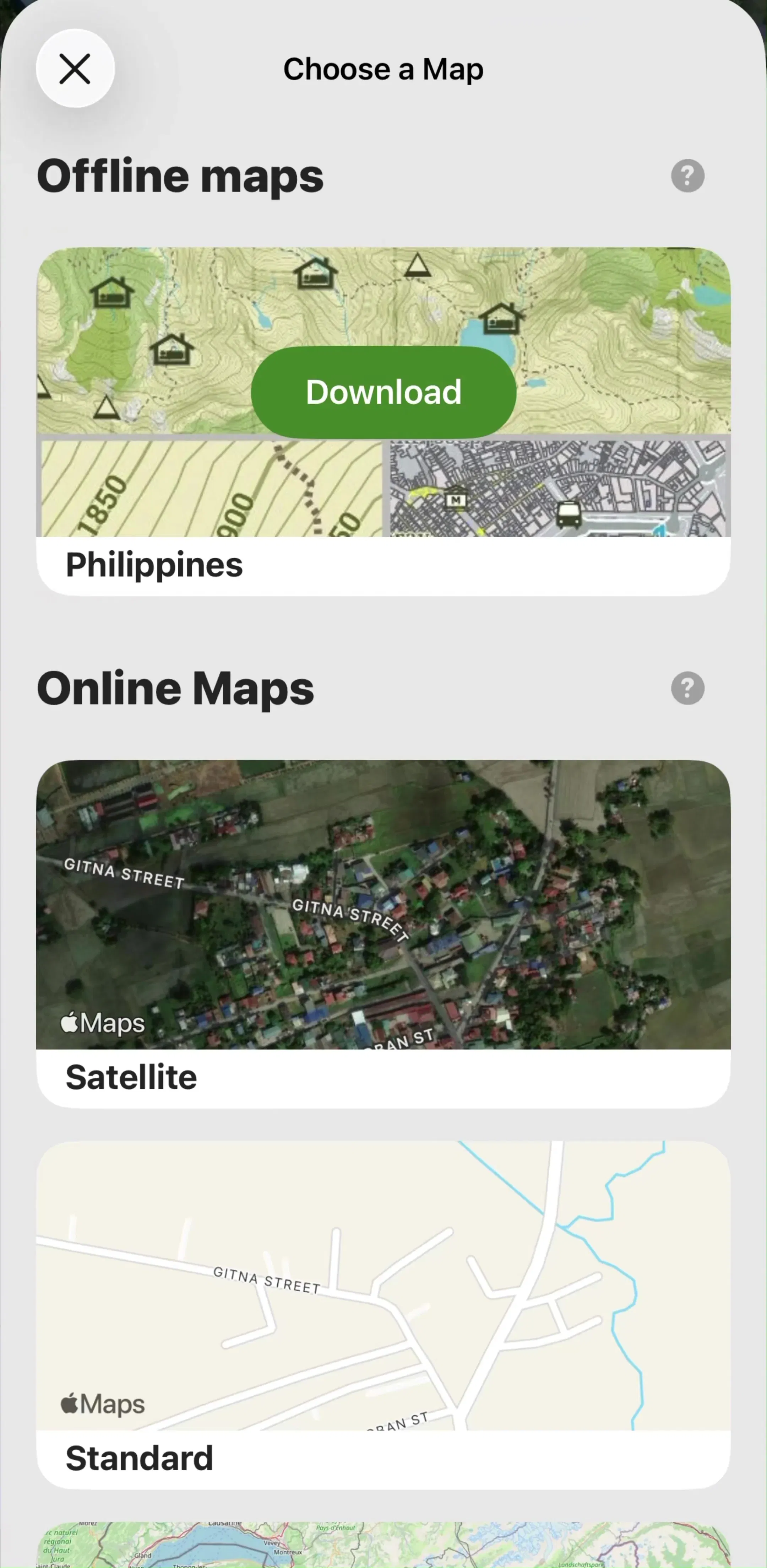
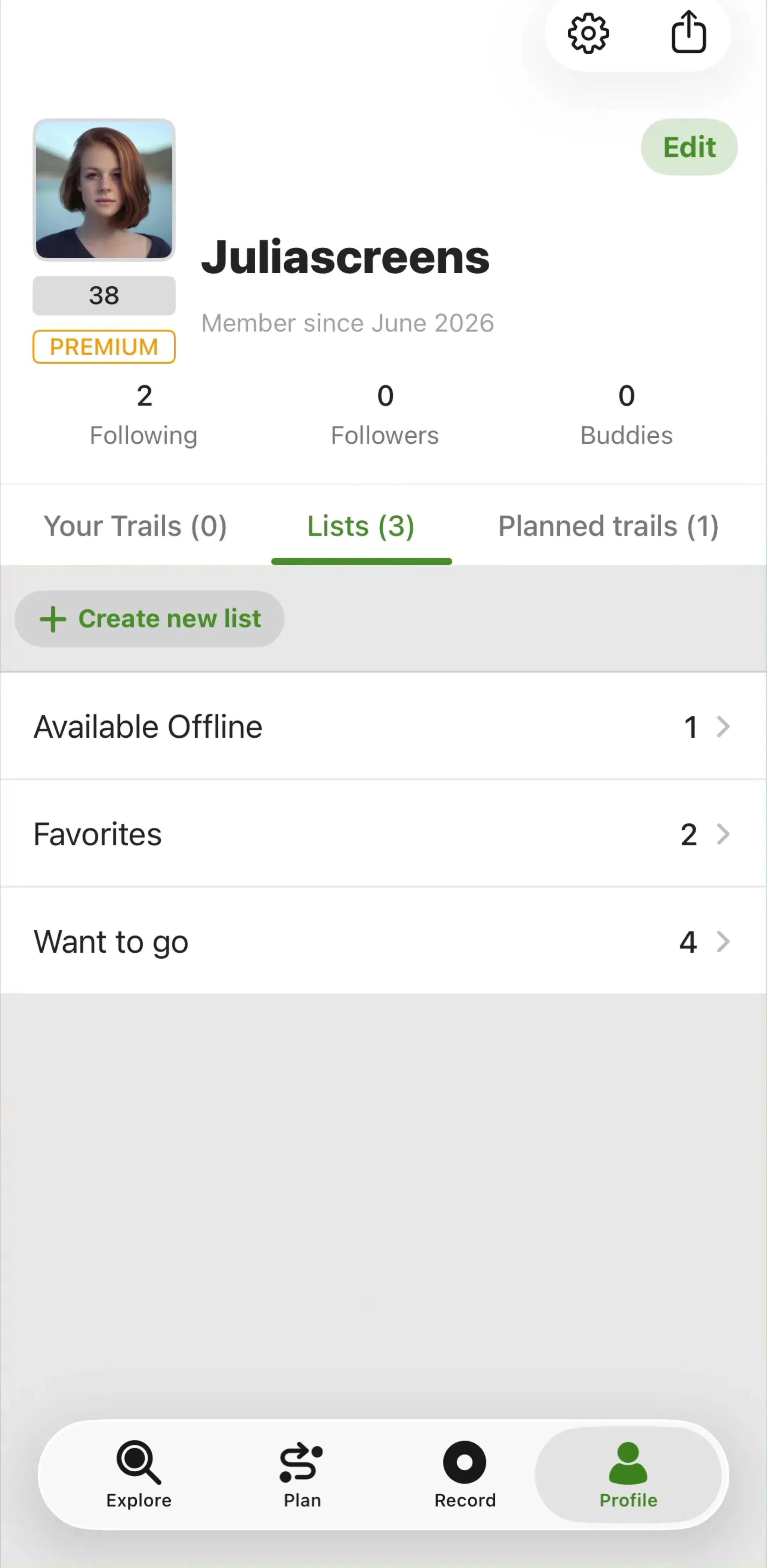
In practice the trigger sits in one of two places, and they mean different things.
In the navigation bar, the menu belongs to the whole screen. Sort order, view switching, select mode, screen-level settings, export. This is the right home for anything that changes how the current screen behaves rather than acting on one item, and it keeps a toolbar from accumulating five icons nobody can identify.
On a row, the menu belongs to that item. Rename, duplicate, move, share, delete. The tradeoff is that the trigger repeats on every row, so it has to be visually quiet enough to disappear when unused, which usually means a low-contrast glyph aligned to the trailing edge rather than an outlined button.
The mistake is mixing them: a row menu carrying a sort option, or a navigation bar menu carrying delete with no indication of what would be deleted. If an item in the menu cannot state its object from the anchor alone, it is in the wrong menu.
Menus have no structure beyond order and separators, which puts a hard ceiling on how much they can carry. Around five to seven items, split into two or three sections, is where they stop being scannable.
Grouping does most of the work. Put the frequent, safe actions first, organisational actions second, and destructive actions last in their own section. Order should follow expected frequency rather than importance, because the top item is the one reachable without moving the thumb and the bottom of a long menu is a stretch.
If the item count keeps climbing, the answer is not a taller menu. It is a settings screen for preferences, a sheet for anything needing explanation, or a select mode for bulk operations. A menu that scrolls has already failed.
Calm (est. $2.75M/mo) is a large library product where the user accumulates saved sessions and collections, and the management surface has to stay out of the way of the content.
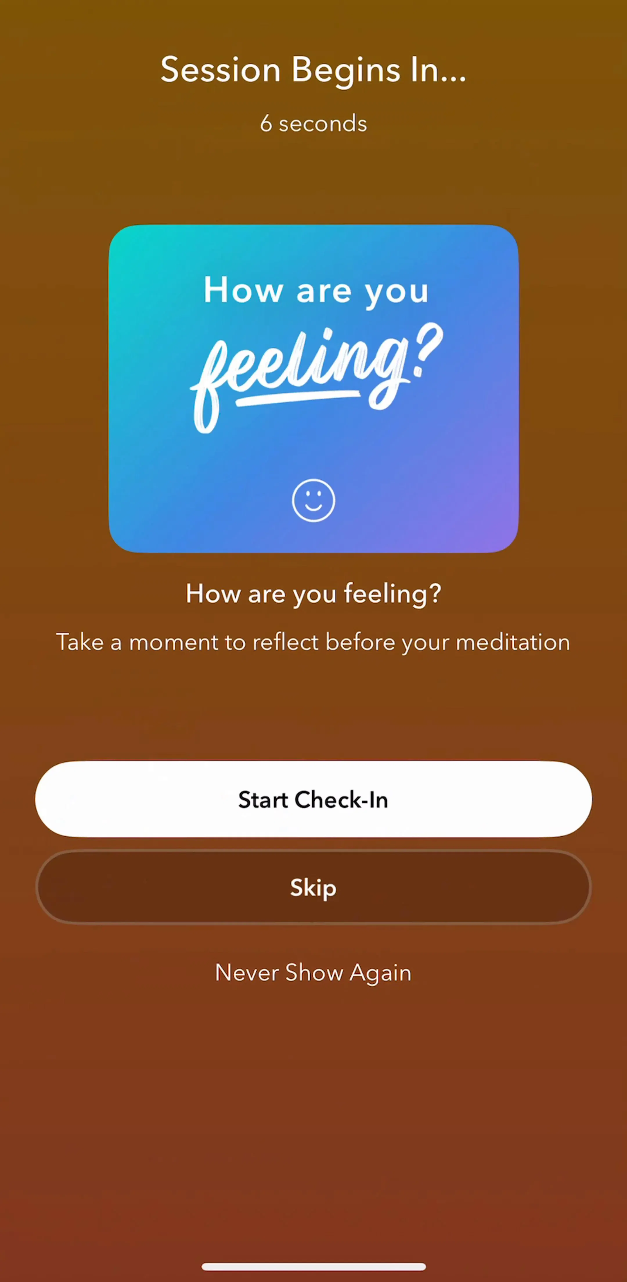

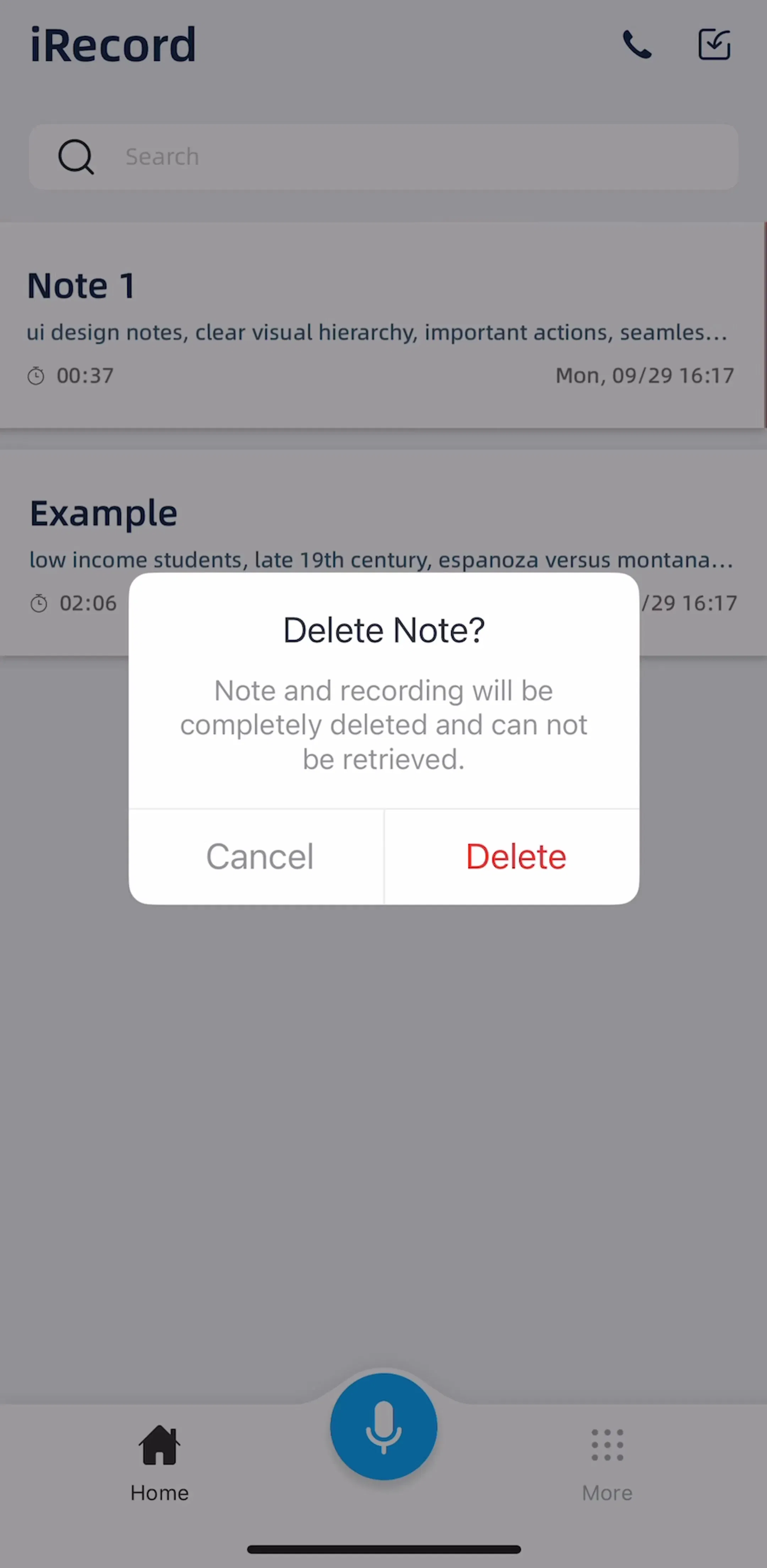
Delete belongs at the bottom of the menu, in its own section, in the destructive style. That is not decoration: the separator is what prevents a mis-tap from the item above it, and the bottom position is the furthest point from where a thumb lands when the menu opens.
Whether it then needs a confirmation depends entirely on reversibility. If the app has undo, or the item goes to a recently deleted collection, tapping delete should just delete, and a brief undo affordance is better than a modal. If the deletion is permanent, the menu item should open a confirmation, which is the one case where a menu correctly hands off to an action sheet.
Two smaller rules. Never put a destructive item adjacent to a frequent one, because the neighbour is what people mis-tap. And label the object, so the item reads delete recording rather than delete, since a menu can be opened from the wrong row and the label is the last chance to notice.
iRecord (est. $0.15M/mo) is a recorder where every item is something the user made and cannot recreate, which raises the cost of a mis-tap considerably.

A menu with icons on four items and none on the other two reads as an alignment bug. Pick one treatment for the whole menu.
Icons earn their place when the actions are common and have settled glyphs: share, delete, rename, duplicate, favourite. They stop helping the moment an action is abstract, because the invented glyph adds a symbol the user has to decode alongside the label they were going to read anyway. A menu of abstract options is cleaner as plain text.
Labels do more work than icons here regardless. Menu items should be verb-first and specific, so a user scanning without reading closely still lands correctly.
The variant worth knowing is the pop up menu: same object, but it shows a current selection with a checkmark and changes it. This is the right control for sort order, filter scope, quality level, or any small set of mutually exclusive options.
It beats a picker sheet for anything under about six options, because the current value stays visible on the trigger and changing it costs two taps without covering the screen. Above six options, or when the options need description, it should become a sheet. And when there are exactly two or three, always visible and frequently switched, a segmented control is the better answer, because it shows all options without a tap.
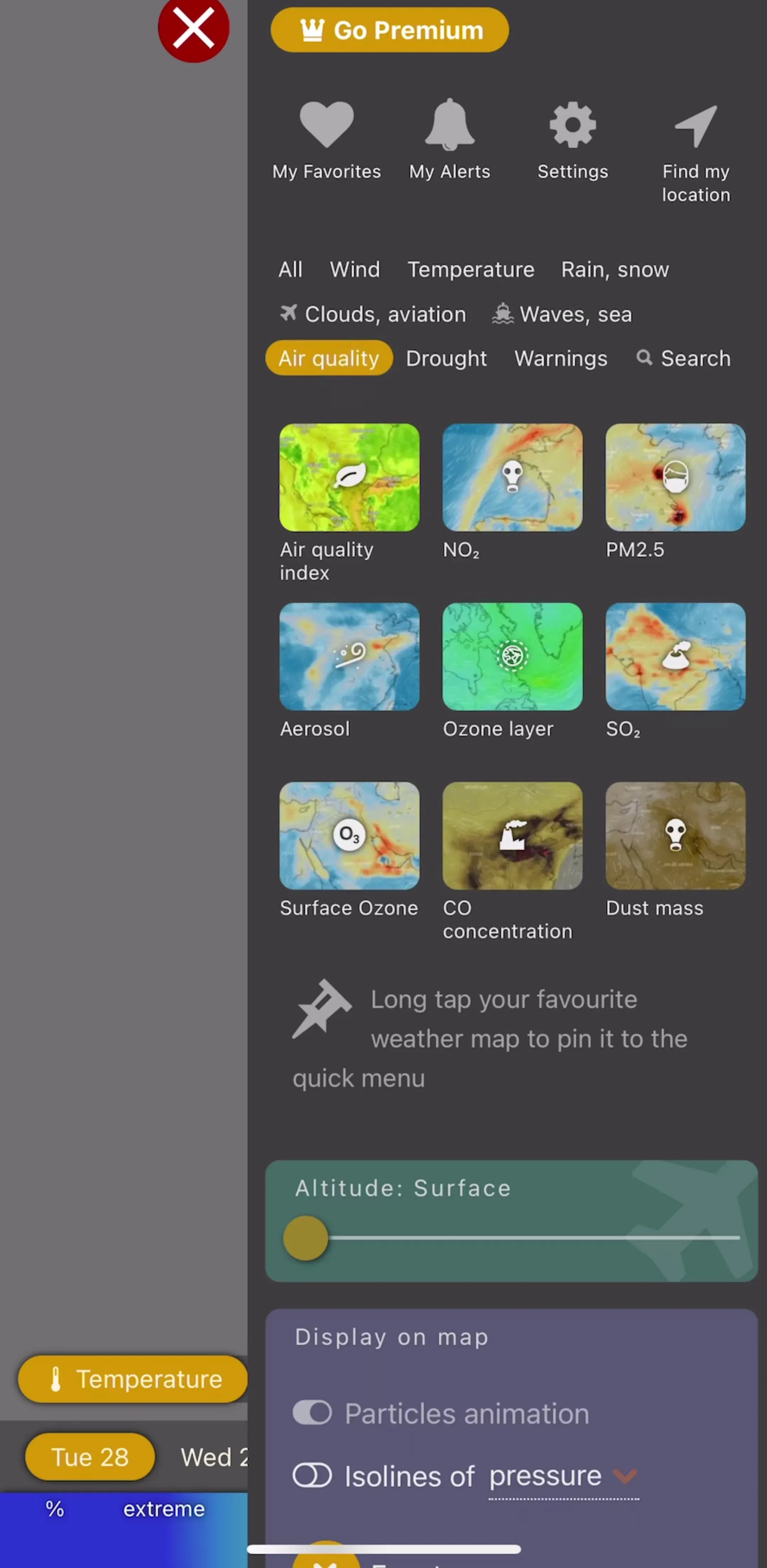
Windy.com (est. $0.75M/mo) leans on selection controls heavily, since its users are choosing among saved places and alert settings constantly.
Five recurring failures. Making a long press the only route to an action, so most users never find it. A menu of eleven items that should have been a screen. Delete sitting directly under a frequently used item with no separator. Icons on some items and not others. And a row trigger with a tap target small enough that reaching for it opens the row instead.
A sixth is using a menu where an action sheet was right. Menus are quiet by design, which is exactly wrong for an action a user should pause over. Signing out, cancelling a subscription and deleting an account do not belong in a dropdown next to rename.
Audit your menus by asking two questions of every item. Can a user reach this action any other way, and if not, does it belong somewhere visible? And is this item routine enough to deserve the quiet container, or consequential enough to need a sheet? Those two questions usually empty a third of a bloated menu and move two items into the detail screen where they should have been.
After that, compare against shipping apps rather than component libraries. Every screen in the library sits next to the app’s estimated revenue and downloads, so references can be chosen by outcome rather than by how the shot looks. Start with the favorites and saved flows, where management menus appear most often.
A note on the numbers: revenue figures cited here are third-party monthly estimates from our library, useful for comparing magnitude, not audited financials.
A menu that drops from a control you tap, most often an overflow button in a navigation bar or on a row. It appears anchored to that control rather than sliding up from the bottom of the screen, it does not dim the whole interface, and it holds actions relating to whatever the control belongs to. Apple's own naming separates a pull down menu, which lists actions, from a pop up menu, which shows a current selection and changes it.
Weight and origin. A pull down menu is anchored to the control that opened it, leaves the screen visible, and is meant for routine actions. An action sheet slides up from the bottom, dims everything behind it, and demands a decision. Anything a user does several times a session should be a menu; anything with consequences that deserve a pause is a sheet.
Around five to seven, grouped into two or three sections. Past that the menu becomes a list rendered in the wrong container, since it cannot scroll comfortably and gives no scanning structure. If the item count keeps growing, the honest fix is a settings screen or a sheet rather than a longer menu.
All of them or none of them. A menu where four items carry an icon and two do not reads as broken alignment rather than as emphasis. Icons help when the actions are genuinely common and recognisable, such as share, delete, rename and duplicate, and hurt when they are invented glyphs for abstract options that nobody can identify.
The mobileappdesign library holds captured flows from 2,622 revenue-verified iOS apps, including 138 with a content management flow, 226 with a collections and library flow, and 125 with a favorites and saved flow. Screens are captured in sequence, so a management screen appears next to the library screen that led into it.
Browse captured content management flows from revenue-verified apps, in the order a real user walks them.
Browse management screens