Most writing about iOS app design describes what designers admire. This is about what the apps making money actually ship. We looked across revenue-verified apps in the library, from $50K a month to hundreds of millions, and the same structural decisions repeat far more than the visual trends do. Here are the ones worth copying, and the ones worth skipping.
The single most consistent pattern at the top of the grossing charts is onboarding built as a long personalization quiz. Yazio (est. $5M/mo) carries one of the longest onboarding sections in our library, Flo (est. $9M/mo) is in the same territory, and Cal AI (est. $1.75M/mo) shows the shorter version of the same idea. The length is not sloppiness. Each screen asks one small question, the answers visibly change the output, and by the end the user has built something they do not want to abandon. We broke the mechanics down in the onboarding patterns post.
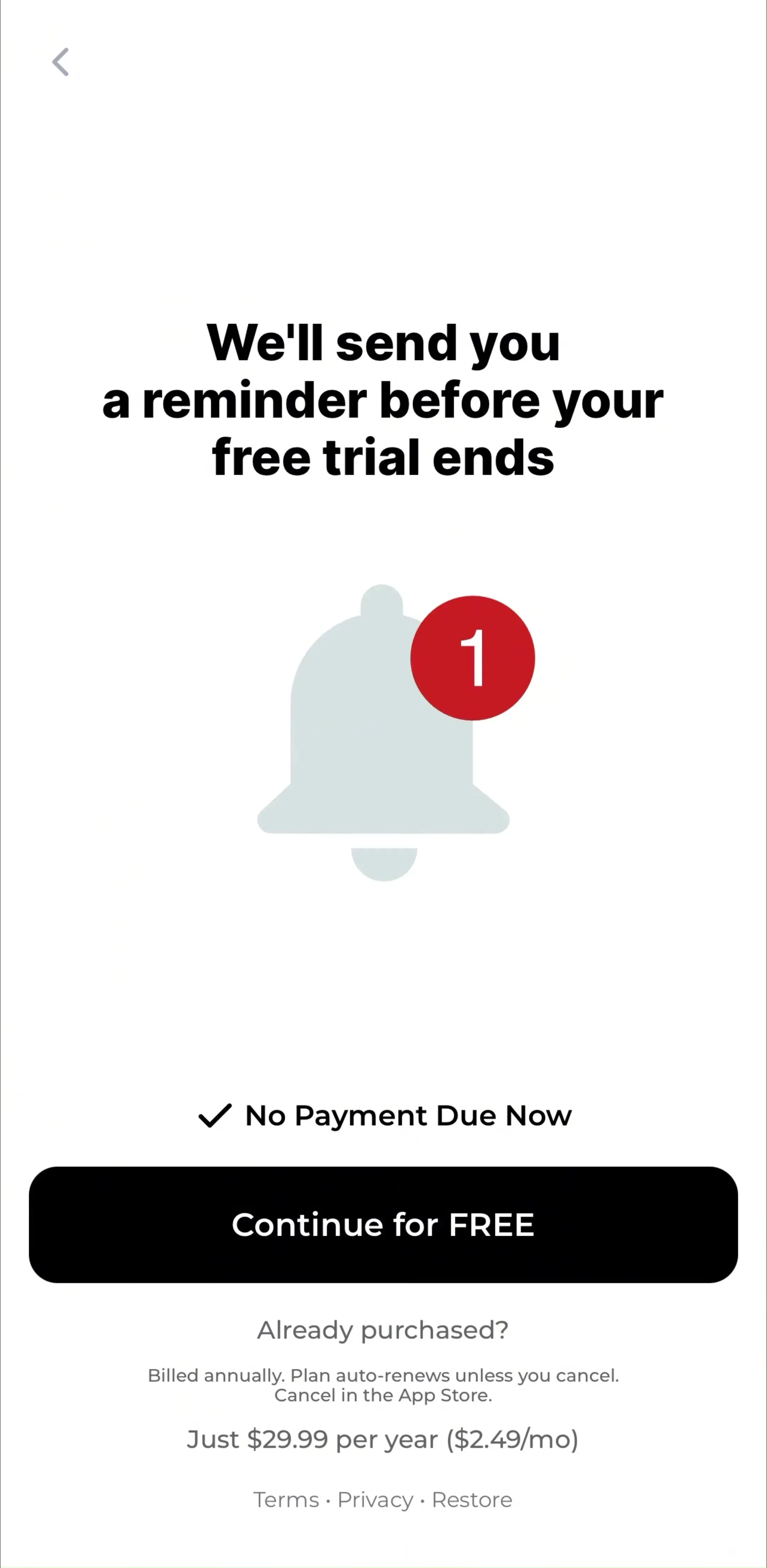
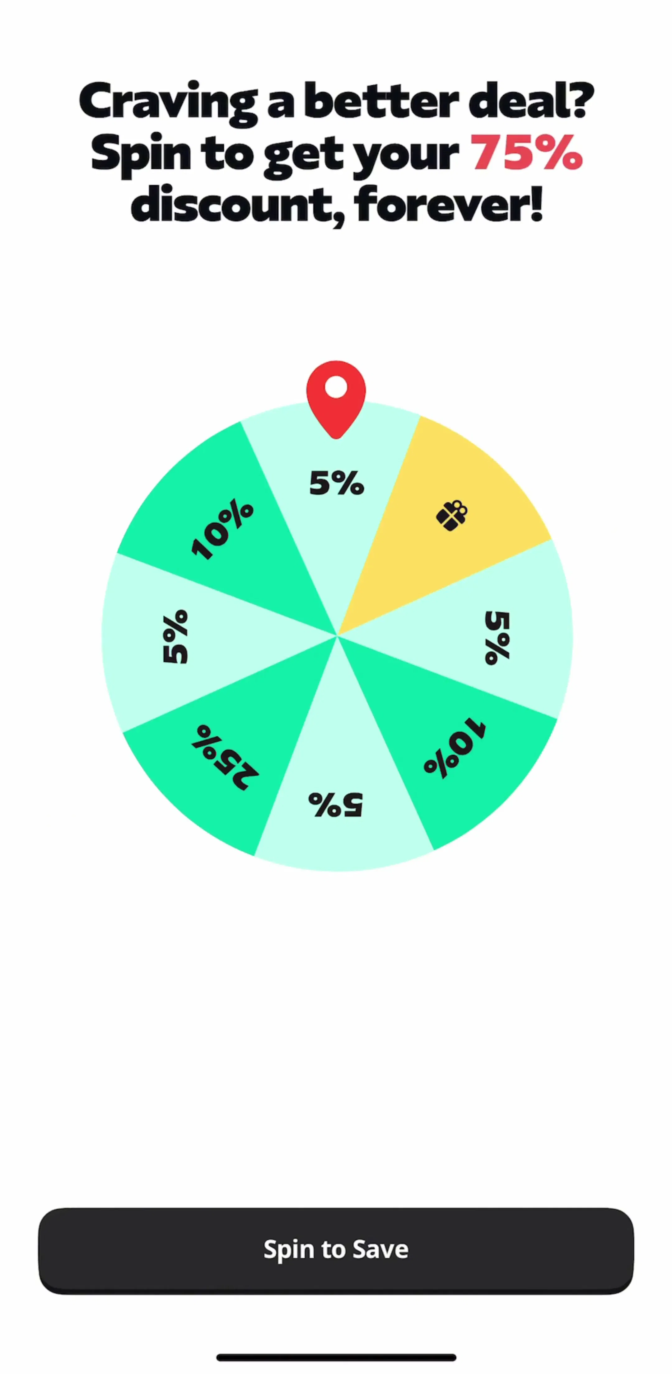
In the apps that earn, the paywall is a designed screen with a job, placed at the peak of the onboarding narrative rather than behind a settings menu. Plan cards, a highlighted annual option, a trial timeline, and a single primary button are close to standard now. The paywall gallery shows the variations, and our paywall patterns breakdown covers which ones hold up.
The apps that ship fast and still feel good use system components for the frame, tab bars, sheets, navigation bars, system type, and spend their design budget on the content area that makes the product itself. The reverse, a custom navigation stack wrapped around a generic feed, costs more to build and feels worse to use. If you want the rules for the frame, start with our tab bar design breakdown.
Detented bottom sheets have quietly become the default container for anything secondary: filters, quick actions, pickers, confirmations, even short flows. They preserve context, they are dismissible with a gesture users already know, and they cost less navigation plumbing than a pushed screen. The main risk is stacking them, a sheet on a sheet on a sheet, which leaves people unsure how to get back.
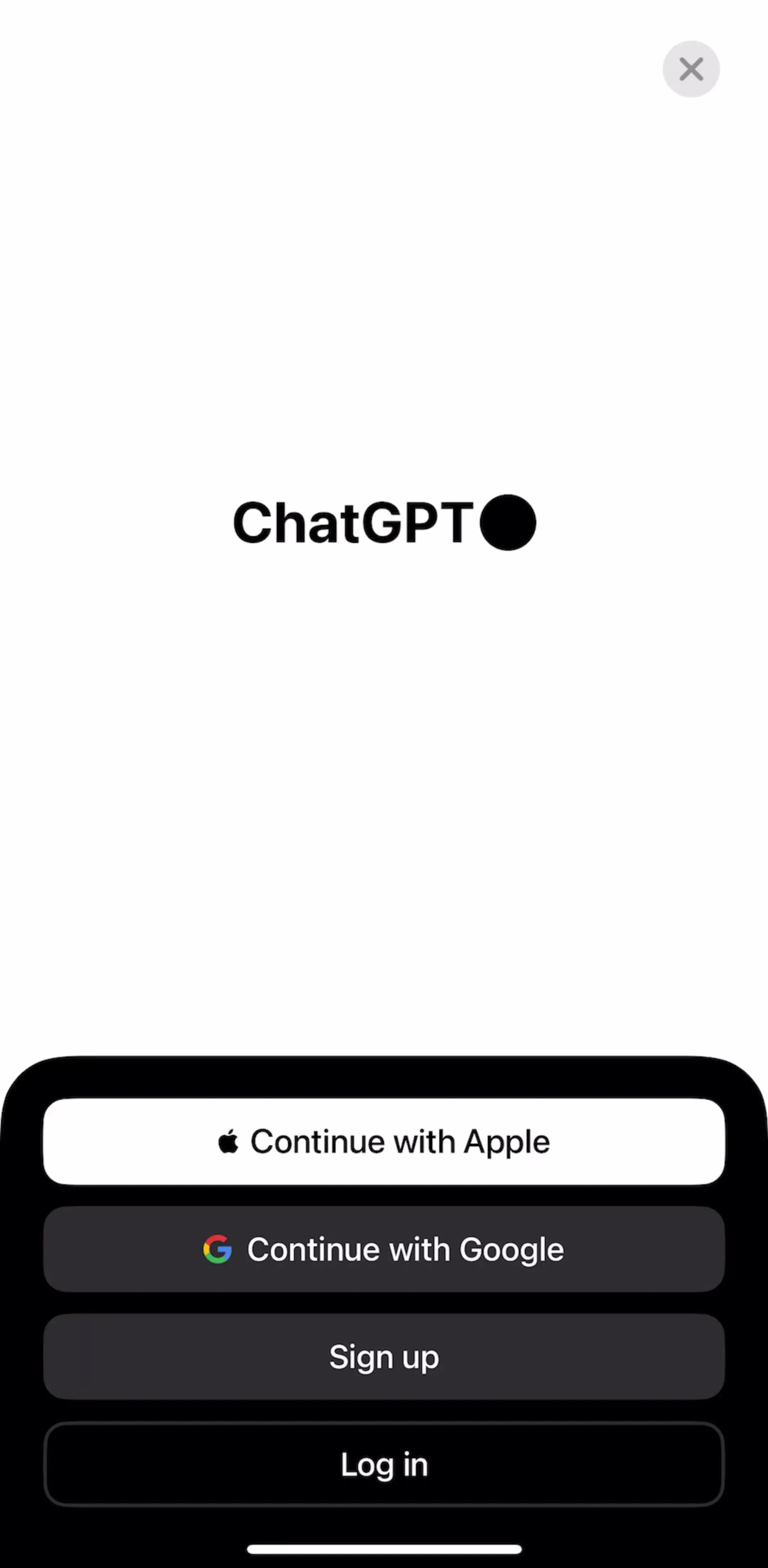
Across the library, the apps that added AI in the last two years converged on one pattern: a single unmistakable button, often center or top right, that opens a conversational or generative surface, rather than sprinkling small AI affordances everywhere. ChatGPT (est. $267M/mo) set the interaction vocabulary for this and the rest of the App Store borrowed it, including apps whose AI is a thin layer over existing features.
Dark mode has moved from a feature to an expectation, and the apps that do it well design a real surface hierarchy rather than inverting light mode. Elevation comes from slightly lighter surfaces rather than shadow, accent colors get retuned for contrast on dark, and imagery gets its own treatment. Doing this after the fact is where the cost lands, which is why more teams now design dark first.
Streaks, progress rings, and badges are everywhere in education and health because those products need a daily return. Duolingo (est. $48M/mo) remains the reference. In apps with a weekly or occasional loop, the same mechanics read as noise and quietly train users to ignore your notifications. Match the reward cadence to the real usage cadence, not to the app you admire.
Three things show up mostly in older screens now: the three-panel feature carousel before anything useful happens, hamburger menus as primary navigation on iPhone, and dense settings screens as the answer to product complexity. All three are still shippable, and all three are a signal that the flow was designed around the org chart rather than the user.
Trends are only useful with the numbers attached. Pick five apps in your category at the revenue level you are aiming for, walk their flows screen by screen, and note what they all do rather than what one does beautifully. That is the method behind our best app designs roundup, and it is why every screen in the library sits next to its app’s estimated revenue and downloads.
A note on the numbers: revenue figures cited here are third-party monthly estimates from our library, useful for comparing magnitude, not audited financials.
Three things dominate the top of the App Store: onboarding that runs as a long personalization quiz, monetization designed as part of that flow rather than bolted on, and a native-feeling shell of sheets, tab bars, and system typography around whatever the app actually does.
Follow them for structure and behavior, navigation, controls, typography scale, and accessibility, and spend your originality on the content areas. The apps that earn the most look native at the edges and distinctive in the middle, which is also the cheapest way to ship fast.
Yes, and it is now table stakes rather than a differentiator. The work is in choosing surfaces and elevation rather than inverting colors, and in checking contrast on the accent color you picked for light mode.
Longer than most designers expect. Health, fitness, and education apps at the top of the grossing charts routinely run 20 or more screens, because each answer visibly personalizes the result. Utilities that deliver value in the first session stay at three to five.
The mobileappdesign library has screens from thousands of revenue-verified iOS apps, sortable by revenue and category, so you can study what apps at a given scale ship rather than what concept work suggests.
Browse screens from thousands of revenue-verified iOS apps, with revenue and download estimates next to every app.
Browse the library