Chat UI looks like the easiest screen in mobile design and is one of the hardest to get right. Two bubbles and a text field take an afternoon; the states around them, empty, streaming, failed, interrupted, out of quota, are what the work actually is. Of the 2,622 revenue-verified iOS apps in our library, 591 ship an AI tools flow and 214 ship a messaging flow, which is a large enough sample to see which decisions are settled conventions and which are still up for grabs.
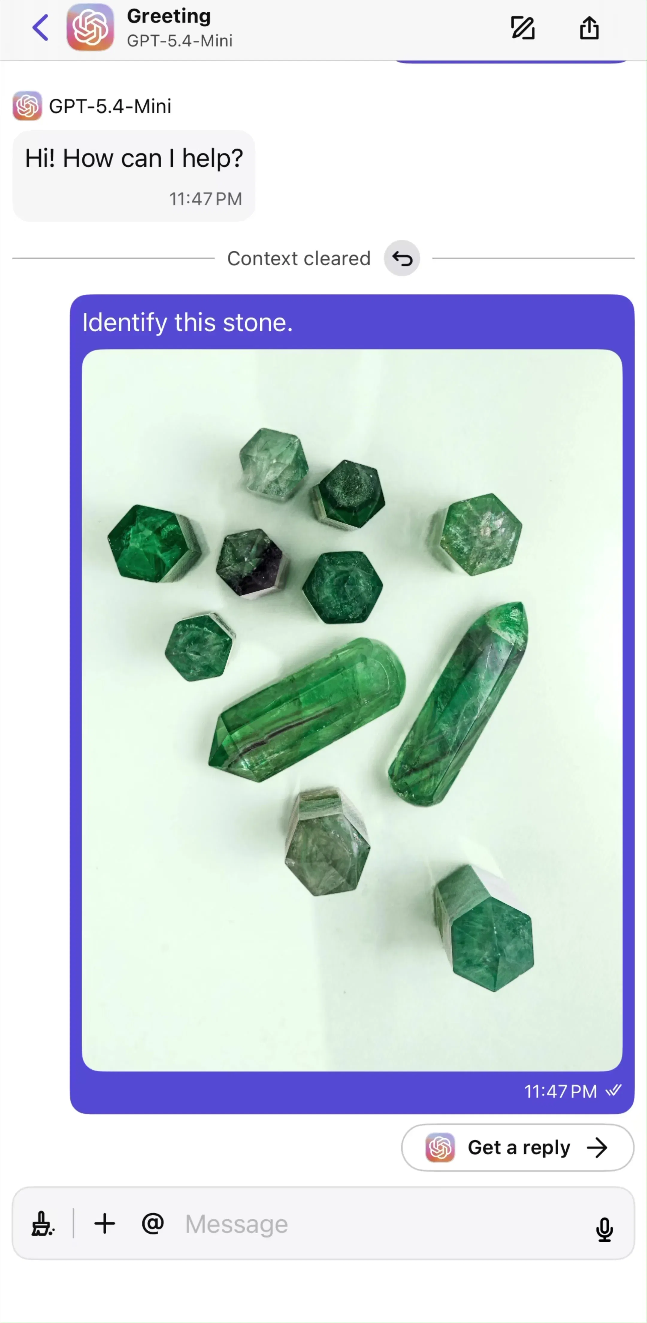
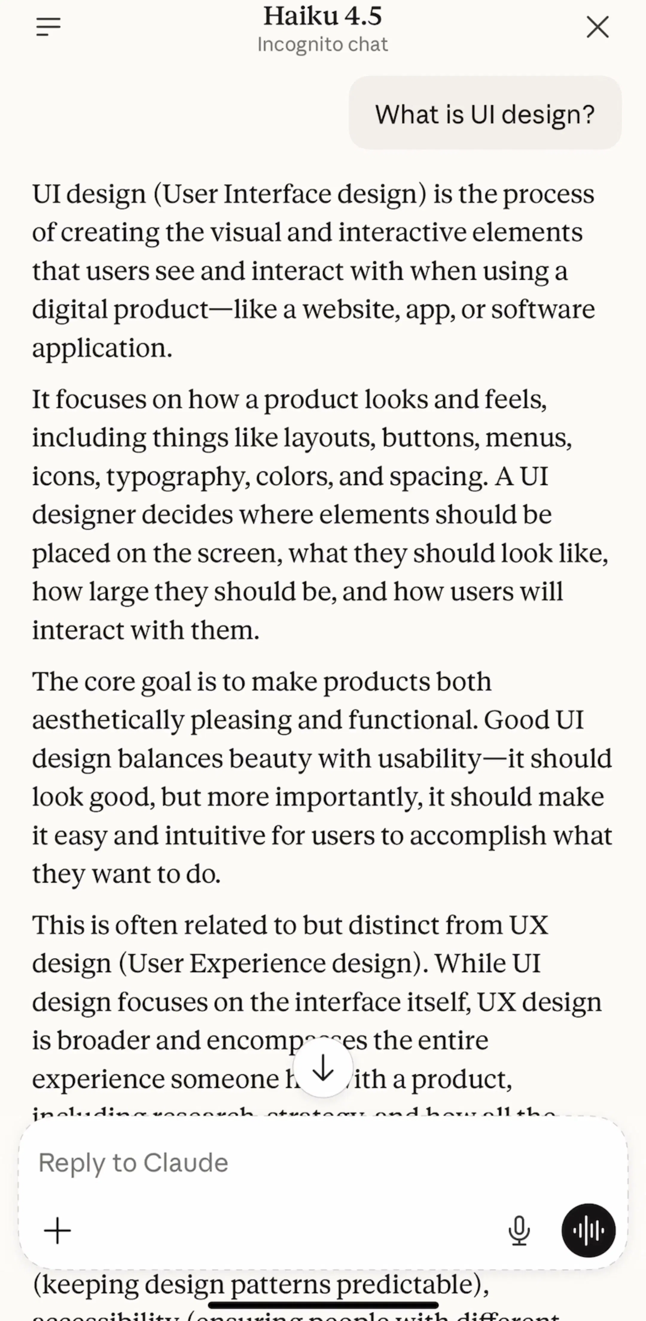
Message bubbles are close to solved. User messages sit right, aligned and tinted; assistant or contact messages sit left or full bleed with no bubble at all. The variation that matters is whether the assistant gets a container. Apps that expect long structured answers, code, lists, tables, tend to drop the bubble entirely and let the response run the full content width, because a rounded container around 600 words of markdown wastes horizontal space and fights every code block inside it. ChatGPT (est. $267M/mo) and Claude (est. $59M/mo) are the two references most users are unconsciously comparing your app against, so it is worth studying how they spend that width.
It is the only control on screen at all times, so everything wants to live there: send, voice, camera, attachments, model picker, web toggle, mode switches. The pattern that has settled in high-traffic apps is a single rounded field with one primary affordance on the right (send, which becomes stop while a response streams) and everything else collapsed behind a plus or a small row of chips above the field. If your composer has five icons in a row, you have shipped a toolbar, not a composer.
Two details separate careful builds from quick ones: the field must grow with the message to a capped height and then scroll internally, and the send affordance must stay disabled until there is something to send. Both are invisible when correct and obvious when wrong.
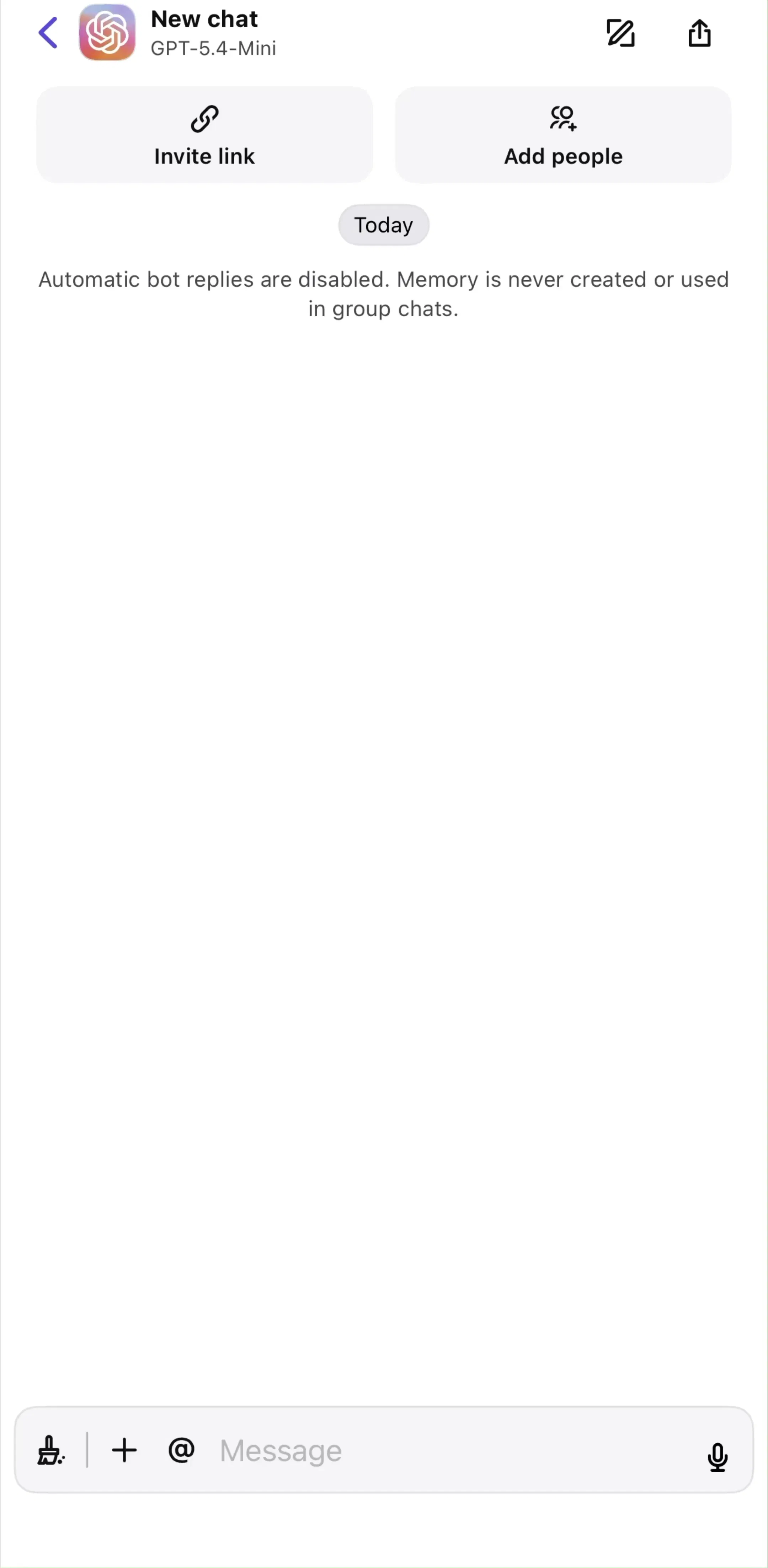
A blank transcript asks the user to invent a use case on the spot, and most will not. Nearly every shipped AI chat app fills the first screen with a greeting plus a small set of tappable example prompts, which do double duty: they demonstrate capability and they remove the blank-page problem in one tap. This is the same activation logic we broke down in our empty state post, applied to the one screen where it pays the most.
The common mistake is writing example prompts that flatter the model instead of describing the job. Prompts that name a concrete task the user already has are the ones that get tapped.
Once an app has more than one model, tier, or persona, the selector lands in the navigation bar as a tappable title, usually opening a sheet. Putting it in settings hides it from the people paying for it; putting it in the composer crowds the one control that cannot afford crowding. The header title doubles as a state indicator, which is the whole point: you can see what you are talking to without opening anything. Google Gemini (est. $850k/mo) and Poe (est. $500k/mo) both take this route, and Poe is a useful study because multi-model switching is its core proposition rather than a secondary feature.
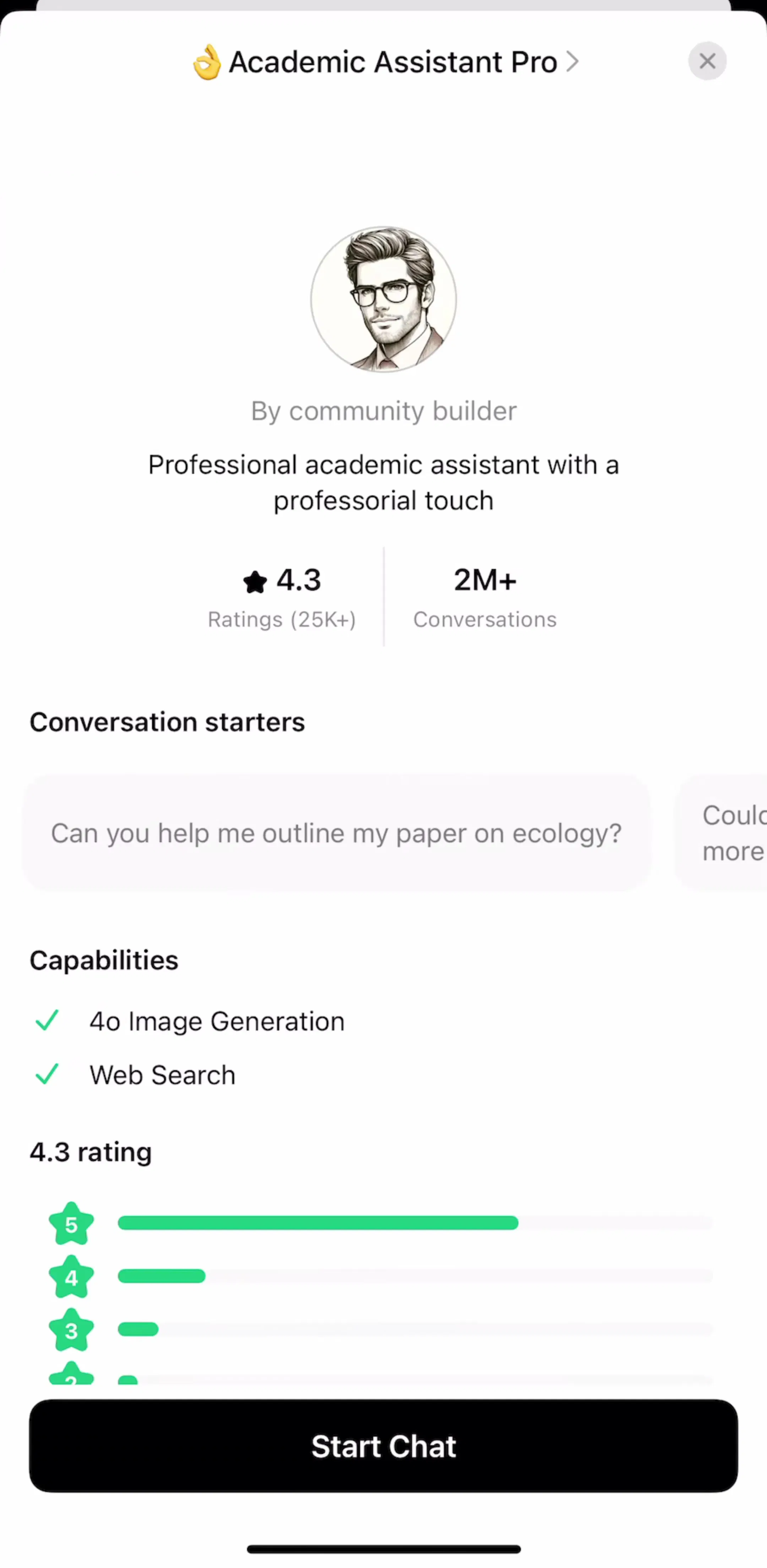
The related problem is discovery. Once an app carries personas, assistants, or saved modes, it needs a browsing surface for them, which is a different screen from the picker itself. ChatGPT splits the two, and the split is worth copying: the header picker is for switching quickly between things you already use, the catalog is for finding new ones.
A chat screen has at least six states worth designing: idle, typing, sending, streaming, complete, and failed. Streaming is the one that gets skipped in design files and then improvised in code. The decisions to make deliberately are whether the send button becomes a stop button (it should), whether the transcript auto-scrolls while text arrives and what happens when the user scrolls up mid-stream (it should stop following), and what a partial response looks like when the user interrupts it.
Failure needs the same care. A network error that erases the user’s typed message is the fastest way to lose a session; keeping the text in the composer and offering a retry on the failed message is the shipped standard.
Copy, retry, edit, share, and feedback add up to more affordances than a message can carry inline. The dominant pattern is a long press or tap that reveals a compact action row or sheet scoped to that message, with at most one or two actions persistently visible on the latest assistant response. Persistent per-message icon rows read as clutter within about three exchanges.
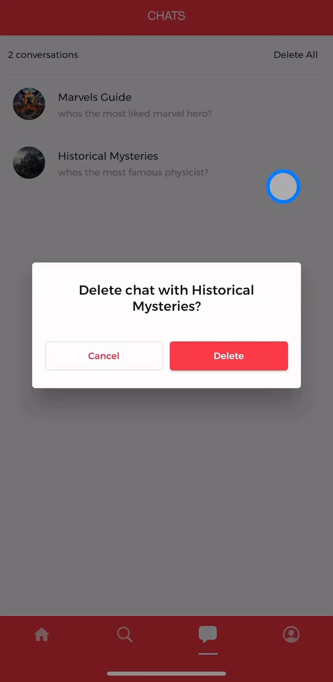
Conversation history almost always opens from the left as a drawer or a sheet rather than claiming a slot in the tab bar. The reason is structural: the tab bar is for parallel sections of an app, and history is a sibling of the current conversation, not a different destination. Apps that do run a bottom bar in a chat product typically use it for genuinely separate modes, such as discovery or a library of characters, which is how CHAI (est. $2.75M/mo) organizes a catalog of conversations rather than a single thread.
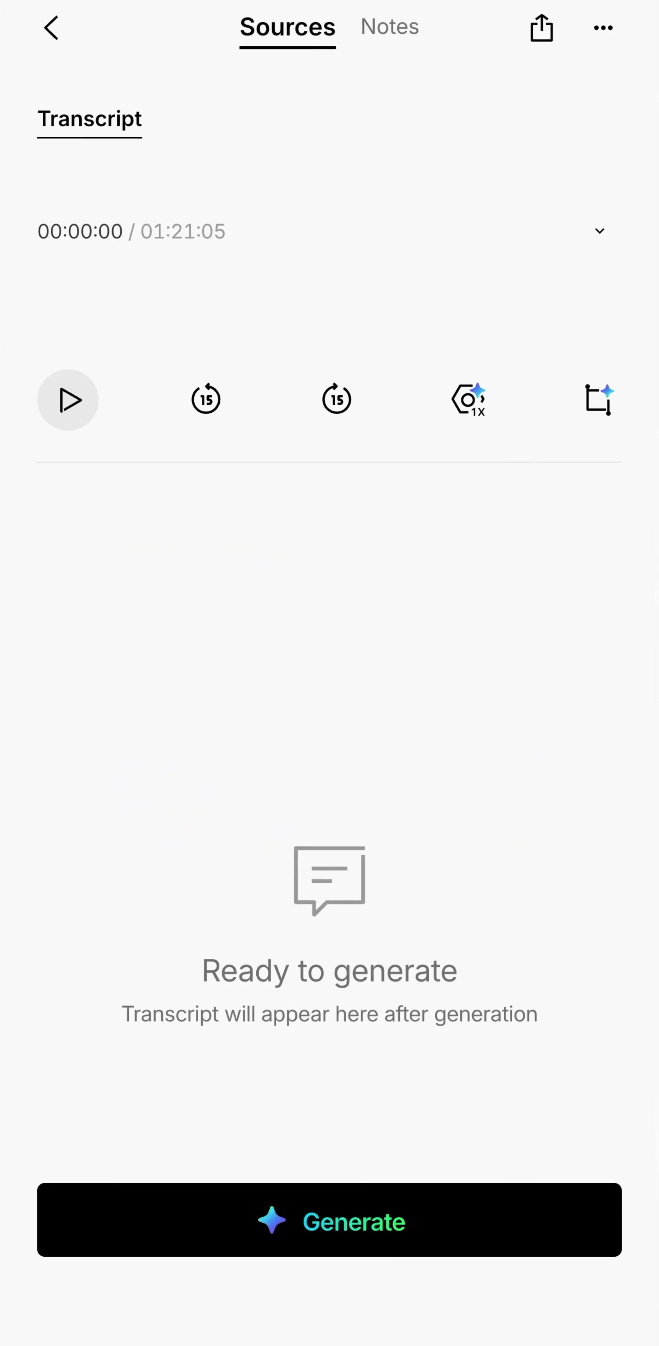
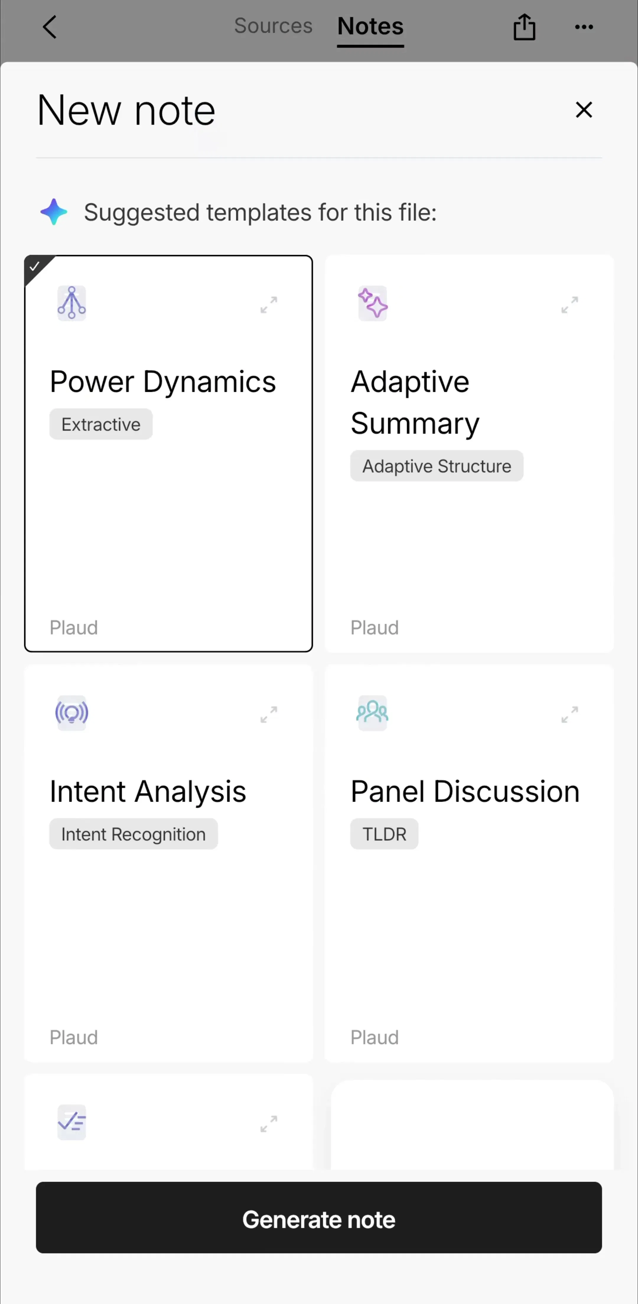
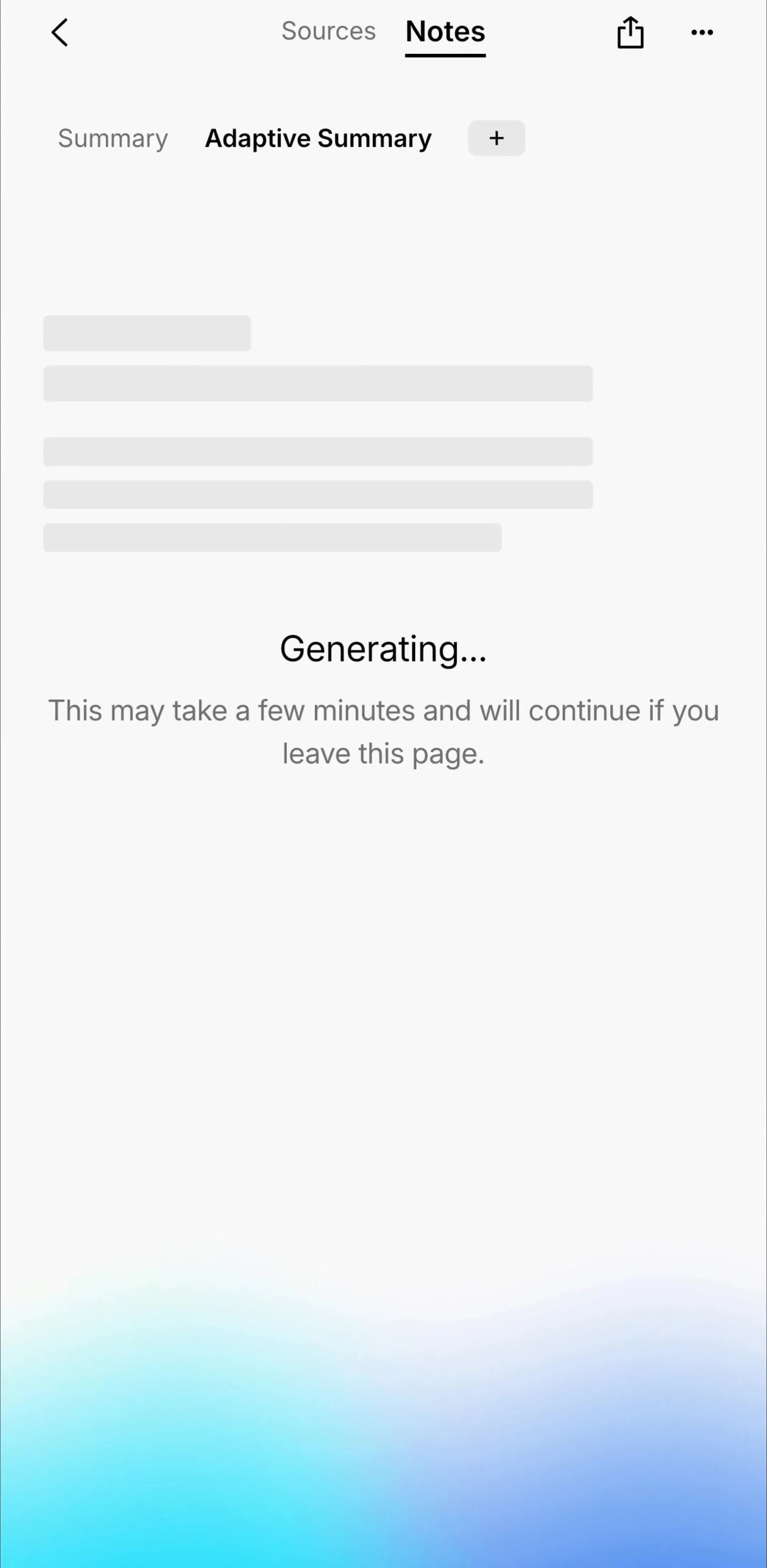
Voice input has largely split into two distinct things: dictation, which fills the composer and stays inside the text flow, and a full-screen conversational mode, which replaces the chat screen entirely with its own visual language and its own exit. Treating them as one microphone icon is where voice features get confusing. Apps built on transcription, like Plaud (est. $4.25M/mo), are worth studying here because the recording surface and the resulting chat over that content are designed as separate rooms.
In subscription AI apps the limit is usually a message count or a model tier, which means the upgrade prompt arrives inside the transcript rather than as a separate screen. Designing it as a message-shaped block keeps the flow intact and preserves the context the user was in. The alternative, a full-screen takeover fired at the moment of highest intent, converts too but costs the thread. Both approaches show up across our paywall gallery, and the tradeoff is covered in the paywall breakdown.
Chat UI has a low floor and a high ceiling. The floor is two bubbles and a field, which everyone clears. The ceiling is the state machine: what happens on interrupt, on failure, on quota, on scroll-up mid-stream, on a message the user wants to edit three turns later. The quickest way to raise your ceiling is to look at complete captured flows rather than single screens, because the interesting decisions only show up in sequence.
A note on the numbers: revenue figures cited here are third-party monthly estimates from our library, useful for comparing magnitude, not audited financials.
A chat UI is the screen where a conversation happens: a scrolling transcript of messages attributed to a sender, plus a composer for writing the next one. On mobile it also has to carry model or contact switching, history, message actions, and error states, which is where most chat UI design work actually goes.
Shipped AI apps almost never show a blank transcript. The empty chat is used to teach: a short greeting, a few tappable example prompts, and sometimes a capability list. It is the highest-leverage screen in the app because it is the only place you can tell a user what to type.
Pinned to the bottom, above the keyboard, growing upward as the message gets longer. The composer is the only permanently visible control in most chat apps, so attachment, voice, and send all compete for space there, and the ones that lose get moved behind a plus button.
The mobileappdesign library holds captured flows from 2,622 revenue-verified iOS apps, including 591 with an AI tools flow and 214 with a messaging flow, so you can see complete conversation screens in context rather than isolated concept shots.
Browse captured AI and chat flows from revenue-verified iOS apps, with revenue and download estimates next to every screen.
Browse AI tool screens