Most UX competitive analyses end in one of two places: a feature matrix with ticks in it, or a Figma page of screenshots arranged by colour. Both feel thorough. Neither answers the question the design team actually has, which is what the competitors decided, in what order, and whether any of those decisions are still open.
This post is the method we would use, run for real on one category rather than described in the abstract. The subject is calorie counters, because the category is crowded, well funded and split between long-standing incumbents and newer AI-first entrants. Twelve apps, one flow, and a grid of decisions at the end.
A competitive analysis is a research tool for a decision, so start by writing the decision down. Should account creation come before or after the first value moment? Where should the paywall sit? How long can onboarding run before people quit? If you cannot name the decision, the analysis will turn into a mood board, which is a different and cheaper activity.
The output should be short: a grid of how each competitor handled the decision, a note of where they agree and where they split, and two or three bets your team is willing to make. Everything else is supporting evidence.
The apps a team already uses are the worst possible sample. They skew toward products the team likes, which is not the same as products that work. Start from a ranked list instead, include the category leader, the fastest-growing challengers, and one or two adjacent products that solve the same job from a different angle.
For this example we took every app in the library with calorie in its name and kept the twelve with the highest estimated monthly revenue, from MyFitnessPal at an estimated $12M/mo down to Calo at an estimated $0.55M/mo. The set mixes long-standing incumbents with AI-first entrants such as Cal AI and BitePal, which is exactly the tension a new entrant would want to understand.
Benchmarking a whole app produces a document nobody finishes. Pick the flow where the decision lives and phrase a question that has a measurable answer. Ours: what happens between install and the end of onboarding, and where do the account and paywall moments fall?
Onboarding is a good first flow for almost any subscription category, because it is where the biggest structural decisions are made and where apps differ most. If you are new to the patterns themselves, our onboarding examples post covers the recurring screen types before you start counting them.
The most common mistake is jumping straight to screenshots. Map the sequence first: which sections each app runs, in what order, and how many screens each takes. Pixels come later, once you know which screens are worth staring at.
Here is the map for the twelve apps, built from the captured flows in the library. Revenue is a third-party monthly estimate. Screen counts are what was captured for that section, which includes intermediate states such as a keyboard opening, so read them as relative sizes rather than exact step counts.
| App | Est. revenue | Onboarding screens | Next captured section |
|---|---|---|---|
| MyFitnessPal | $12M/mo | 23 | Setting up a meal plan |
| Yazio | $5M/mo | 76 | Paywall |
| Cal AI | $1.75M/mo | 28 | Paywall |
| MyNetDiary | $1.25M/mo | 35 | Paywall |
| Calorie Counter + | $1.25M/mo | 15 | Logging a meal |
| Cronometer | $1.25M/mo | 16, with account creation | Logging daily entries |
| Numify | $1M/mo | 82 | Paywall |
| Foodvisor | $1M/mo | 90, with account creation | Logging a meal via search |
| Lose It! | $1M/mo | 88 | Logging a meal |
| Lifesum | $0.85M/mo | 14 | Logging the first meal |
| BitePal | $0.75M/mo | 59, with account setup | Logging a meal via photo scan |
| Calo | $0.55M/mo | 37 | Paywall |
A table like this takes an afternoon and already answers more than a screenshot wall would. It also tells you which three or four apps deserve a close look, which is the point.
Onboarding length is wildly split. The captured onboarding sections run from 14 screens (Lifesum) to 90 (Foodvisor). Five apps sit under 30, five sit over 50, and the median lands in the mid thirties. That is not a category with a settled answer.
Length does not track revenue in this set. The highest earner, MyFitnessPal, has one of the shorter captured onboardings at 23 screens. Yazio, second by revenue, runs 76. Lose It! and Foodvisor both run close to 90 at an estimated $1M/mo, right next to Cronometer at an estimated $1.25M/mo with 16. If your team is debating whether a long quiz onboarding is worth it, the honest reading of the competition is that both ends of the range are commercially viable, so the question has to be settled by your own test, not by copying.
This is the step most analyses skip. A pattern being common, or being used by a successful app, is evidence that it is survivable. It is not evidence that it caused the success.
Once the map exists, look for the moments where apps ask for something: an account, a permission, money. Their position in the sequence is the decision.
Paywall placement. Five of the twelve (Yazio, Cal AI, MyNetDiary, Numify and Calo) have a dedicated paywall section as the next captured section after onboarding, ahead of any logging. The other seven move into the product next in our captures, which means any paywall is either folded into the onboarding sequence itself or arrives later. That is a genuine split, and it does not follow the obvious line: AI-first apps and long-standing incumbents appear on both sides of it. Our paywall design post covers what the screen itself should contain once you have chosen where it goes.
Account creation.Cronometer, Foodvisor and BitePal fold account creation or setup into the onboarding section rather than treating it as a separate step, while MyNetDiary’s captured account creation section arrives much later in its sequence. Whether sign-up blocks the first value moment is one of the most consequential decisions in the flow, and the login screen design post goes through the options.
Permissions. This one only shows up when you look at the screens, which is why the map comes first and the pixels second.
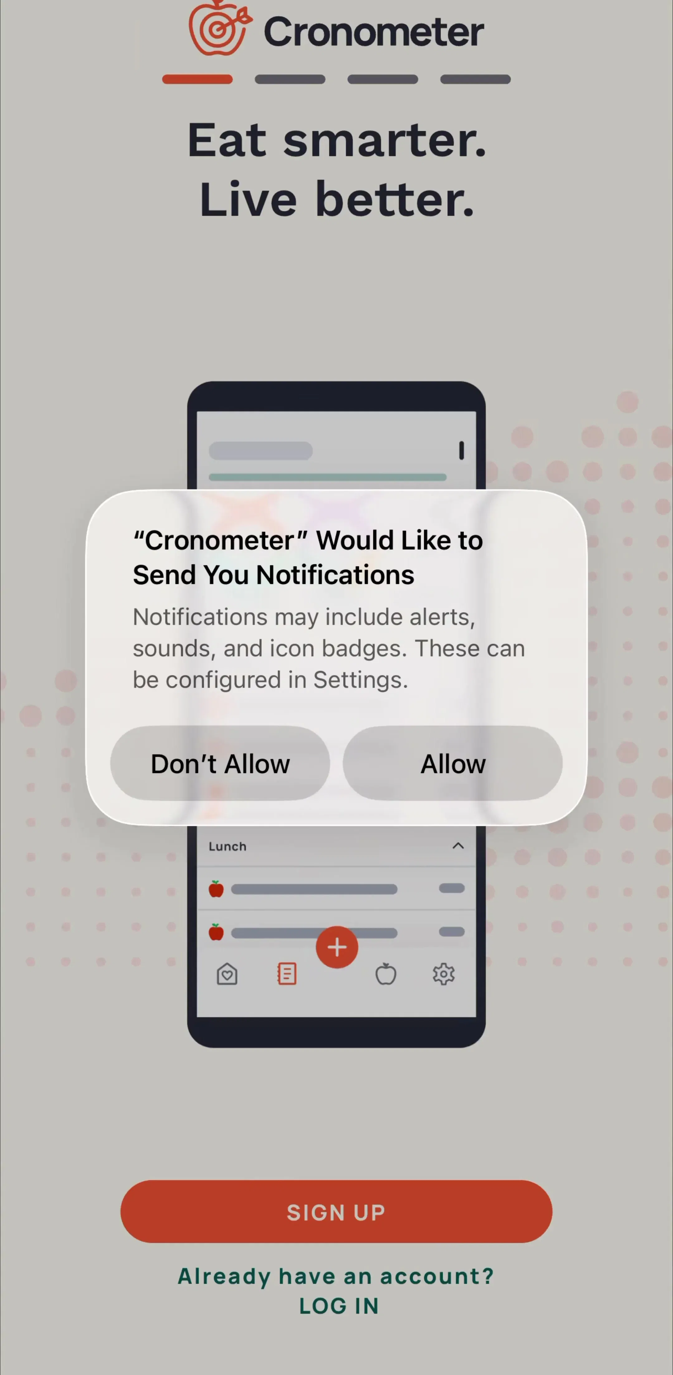
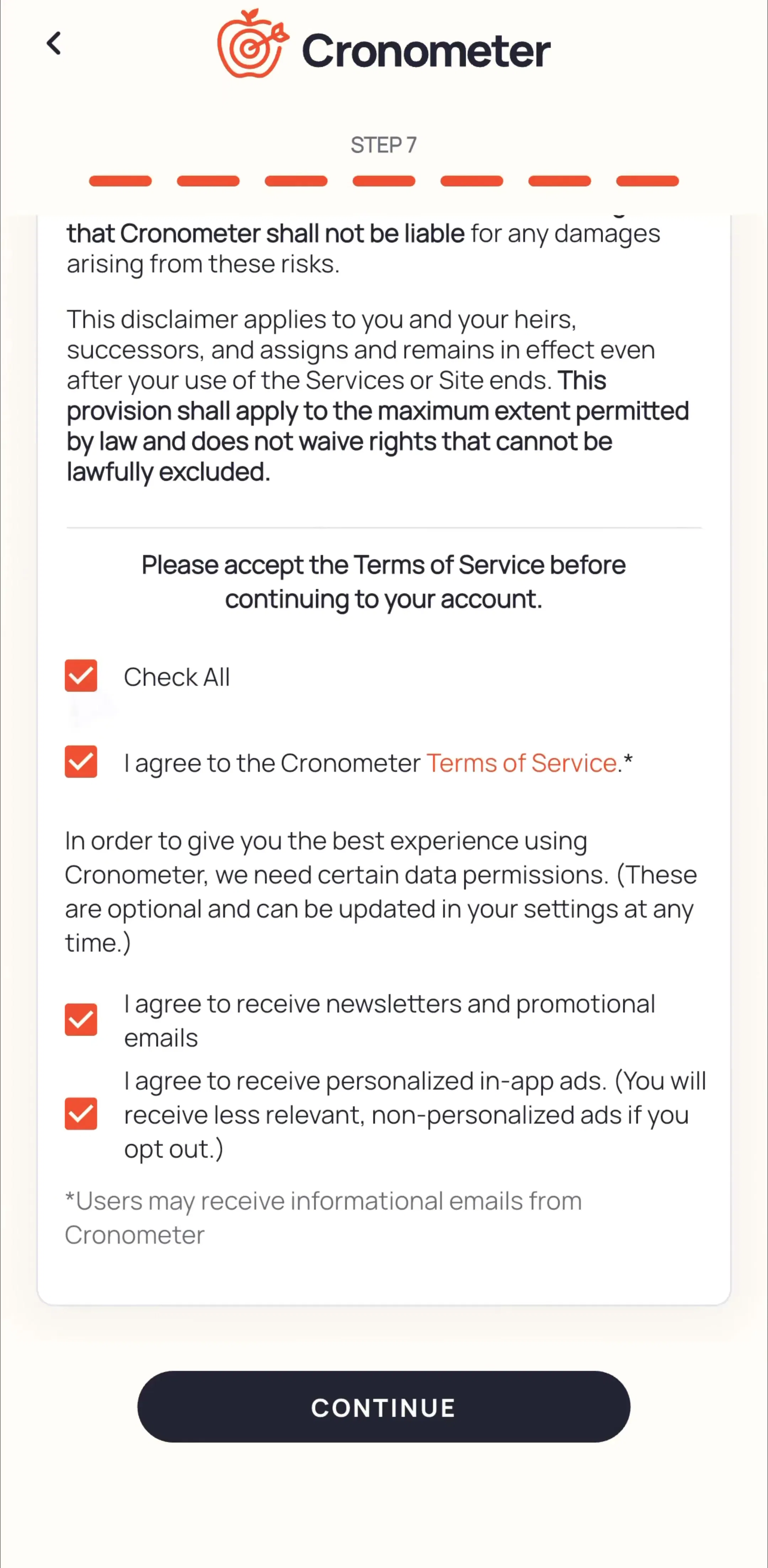
With the question narrowed, the screens become evidence rather than inspiration. Cronometer’s onboarding opens on a splash, then shows the system notification request over its sign-up screen, and later reaches a numbered consent step covering terms, marketing emails and personalised ads, with a single option to check everything.
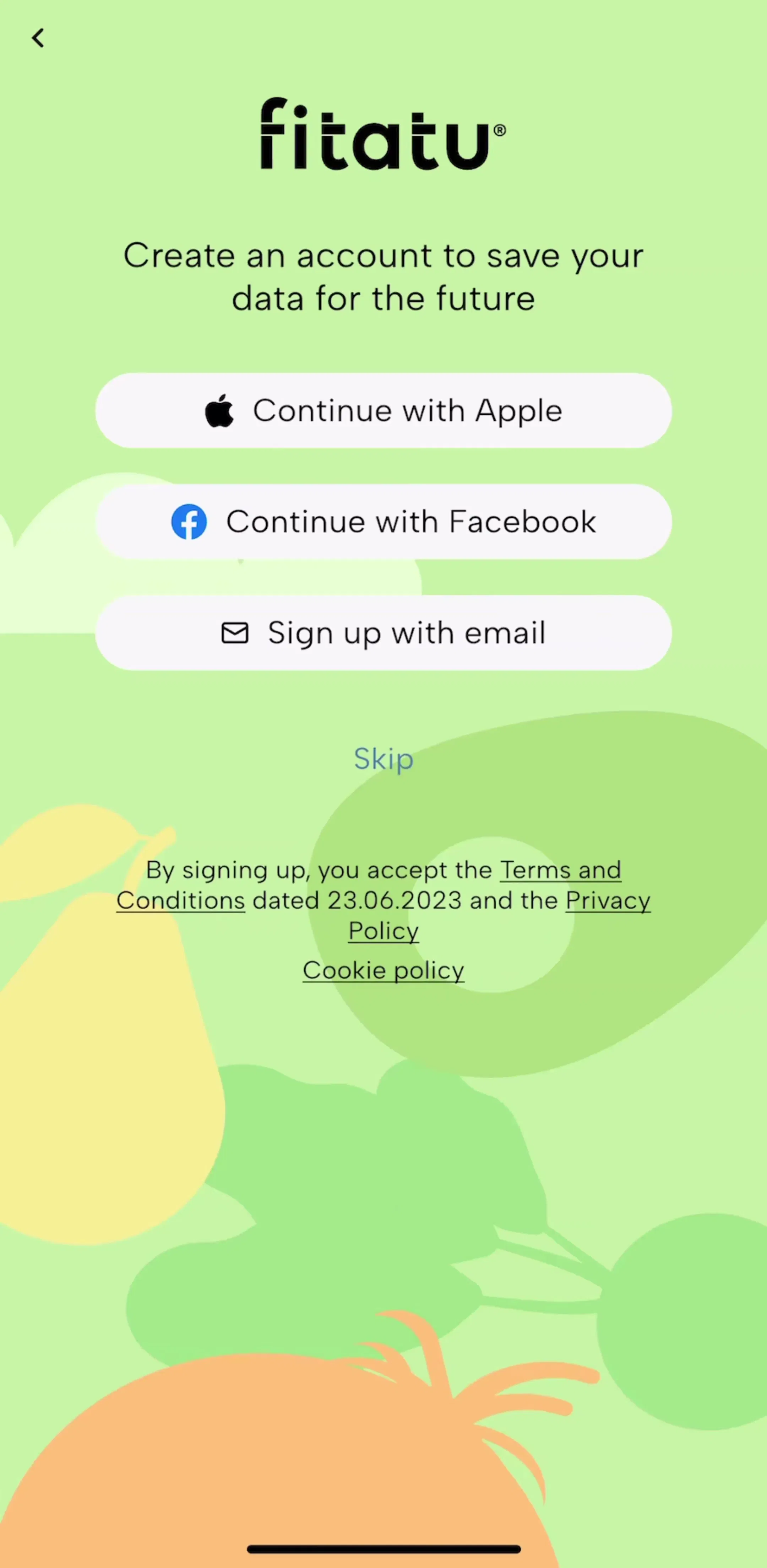
Fitatu (est. $0.2M/mo) makes the same call on notifications even earlier: the system request appears over its splash screen, before account creation, which then offers Apple, Facebook and email with a visible Skip.
Two apps, one shared decision: ask for notifications before the user has logged a single meal. That is a finding worth writing down, because it runs against the usual advice to prime a permission with your own screen and ask at the moment of use, which our iOS dialogs post argues for. It does not prove the early ask is wrong for this category. It does tell you that asking later would be a differentiated choice, and a testable one.
The final document should be readable in five minutes. One row per decision works well:
Repeat for account creation, permission timing and onboarding length. Four rows, each backed by a map and a handful of screens, is a better analysis than forty pages of screenshots.
Benchmarking marketing instead of product. App Store screenshots are advertising. They show the best frame of each feature, not the flow a new user walks through.
Comparing favourites instead of earners. A sample chosen by taste will confirm the taste.
Confusing frequency with effectiveness. Apps copy each other, so a pattern can be everywhere because it spread, not because it won.
Forgetting the date. Onboarding and paywalls are the most frequently tested screens in any subscription app. Note when each capture was made, and assume anything older than a few months has been changed.
Stopping at the grid. A matrix without bets is a report, not an analysis. The value is in the two or three decisions it lets the team make with more confidence.
Name the decision. Rank competitors by outcome and keep six to twelve. Choose one flow and a question with a measurable answer. Map the sections before you open a single screenshot, then measure and check each measurement against revenue before believing it. Find the moments where apps ask for an account, a permission or money, and note where they split. Only then look at the screens, and write the result up as decisions, evidence and bets. In the calorie counter category that process surfaces three open questions in an afternoon: how long onboarding should run, whether the paywall comes before the product, and when to ask for notifications.
Every app in the library sits next to its estimated revenue and downloads, so a competitor set can be ranked by outcome before the first screen is opened. The onboarding flows, the paywall flows and the sign up and login flows hold most of the decisions covered here. For a single app studied end to end, see our product teardown guide.
A note on the numbers: revenue figures cited here are third-party monthly estimates from our library, useful for comparing magnitude, not audited financials. Section lengths reflect the captured flows and include intermediate screen states.
It is a structured comparison of how competing products handle the same user task, done to inform a specific design decision. The useful version compares decisions (what each product asks, shows and charges for, and in what order) rather than features or visual style, and it ends with a short list of choices your team will make differently or deliberately copy.
Enough to see a spread, few enough to read every screen. For one flow, 6 to 12 apps works well: the category leader, the fastest-growing challengers, and one or two adjacent products that solve the same job differently. Rank candidates by an outcome such as estimated revenue rather than by which apps the team already uses, or the analysis only confirms existing taste.
Pick one flow and one question, such as what happens between install and the first meaningful action. Then compare the sequence of steps, how many screens each step takes, where the account, permission and paywall moments fall, and what the user has done or seen before each of those asks. Visual polish is the least useful column.
A teardown goes deep on one product, end to end, to understand how it works as a system. A competitive analysis goes across several products on one flow, to see where they agree, where they split, and which decisions are still open. Teams usually need both: teardowns of the two or three most important competitors, and a cross-product grid for the flow being redesigned.
No. Frequency tells you a pattern is survivable, not that it is optimal, and apps copy each other constantly. Treat what most competitors do as the default to beat and the split decisions as the real opportunities, then validate your choice with your own experiment rather than with the count.
The mobileappdesign library holds captured flows from 2,622 revenue-verified iOS apps, grouped into sections such as onboarding, sign up, permissions and paywall, and every app sits next to its estimated revenue and downloads. Because each flow is captured in sequence, you can build the section map for a competitor without installing it or paying for it.
Browse captured onboarding sequences from revenue-verified iOS apps, section by section, with estimated revenue next to every app.
Browse onboarding flows