Most product teardowns are reviews wearing a lab coat. They list what the author liked, what felt clunky, and how they would redesign the home screen. That can be fun to read, but it tells you about the author, not about the product.
A useful teardown works in the other direction. It starts from what the product actually does, in the order it does it, and tries to reconstruct the decisions a team made to get there: what they ask for, when they charge, and what they chose to build a lot of. This post is that method step by step, run on CamScanner, a document scanner with an estimated $7M/mo in revenue.
Before opening a single screen, write two sentences. What job does the product do for the user, and how does it make money? Every later observation gets interpreted against those two lines, and a surprising number of teardowns never write them down.
For CamScanner: the job is turning paper into clean, shareable digital documents from a phone camera. The model is a subscription. That already predicts what to look for. A subscription utility has to convert people early, while the need that brought them to the App Store is still urgent, so the first session is where the important decisions will be.
The next step is a map, and it should be coarse. List the main flows, in order, with a rough size for each. Resist annotating individual screens at this stage, because you do not yet know which ones matter.
Here is CamScanner as captured in the library. Screen counts are what was captured per section, including intermediate states, so treat them as relative sizes.
| Captured section | Screens |
|---|---|
| Onboarding and subscribing | 5 |
| Scanning and editing a document | 10 |
| Converting PDF to Word | 4 |
| Scanning an ID card | 4 |
| Solving a math problem with AI | 9 |
| Managing files and folders | 8 |
| Configuring settings | 27 |
Two things jump out before any pixel has been examined. Onboarding and the subscription offer are one section, not two. And the product has spread well beyond scanning: file conversion, ID cards and an AI math solver sit alongside the core job.
Now go screen by screen through the first session, and count how many screens pass before the user gets the thing they came for. In a scanner that moment is a first finished scan.


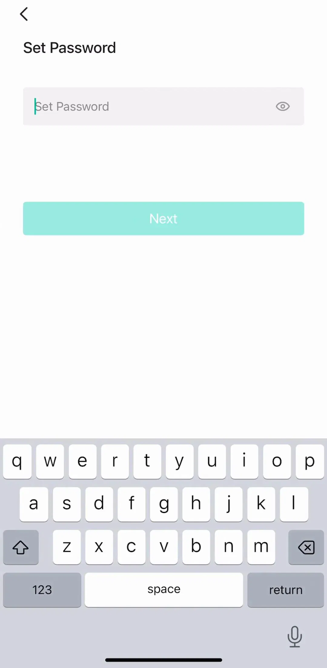
CamScanner’s captured onboarding opens on a welcome screen, reaches a subscription offer, and includes an account step that asks the user to set a password. All of that sits inside a five-screen section that comes before the first scanning section in the capture. In other words, the paywall is shown before the value moment, not after it.
That is a legitimate choice for an urgent-need utility, and it is common. Our onboarding examples post and the paywall design post both cover the trade-off. The teardown’s job is not to judge it but to name it precisely: paywall before first value, inside a short onboarding.
The paywall deserves its own pass, because it is where the business model becomes a screen. Look at four things: placement, what is being sold, how the price is framed, and how the user gets out.
What is being sold. The captured paywall doubles as a feature tour. A carousel with page dots sits above the plan picker, and the visible slide sells a specific capability, scanning an ID, rather than a generic Premium badge.
Price framing. The captured screen leads with a free trial (three days, then an annual price) and places a discounted first-year option next to it, with a limited-time label on the trial choice. Prices change often, so record them with a date and treat them as a snapshot. What stays useful is the structure: trial first, an intro offer as the alternative, annual as the reference price.
The exit. A close control sits in the corner. Whether a paywall can be dismissed is one of the most consequential facts in any teardown, so note it explicitly rather than assuming.
Go back through the first session and write down every ask, in order: accounts, passwords, permissions, consent, money. The sequence of asks is often more revealing than any single screen.
It helps to compare one ask against another product to see what a different choice looks like. FaceApp (est. $14M/mo) has the same combined onboarding and subscribing section, but its captured sequence includes a consent dialog explaining that selected photos are processed on cloud servers, shown over the photo selection screen before any photo has been edited.
That is an ask attached to the action that needs it, which is the pattern our iOS dialogs post recommends for permissions. In a teardown, placing the two sequences side by side is how you notice that CamScanner’s password step and FaceApp’s consent step are answering different questions at different moments.
Where a team spends screens is a rough record of where it spent effort. In CamScanner’s capture the largest section by far is settings, at 27 screens, more than the scanning and editing flow at 10. That is common in mature utilities that accumulate export formats, cloud sync and document options, and it is worth checking against our settings UI post for how that depth is usually organised.
The other signal is breadth. An AI math solver inside a document scanner is not an obvious extension of the job. The observation is that it exists and gets its own flow. The inference, which should be labelled as one, is that the team is using the camera as the entry point for more than documents, and pricing the subscription against a wider set of uses.
This is the step that turns a teardown from opinion into research. Write every finding in three columns:
You cannot see a competitor’s data, so every why in a teardown is a hypothesis. Saying so is not a weakness in the write-up. It is what makes the write-up usable by a team that can run the test.
One product in isolation will make every decision look deliberate. Before concluding, check the one or two findings you care about against close competitors. In the scanner category, iScanner (est. $3.75M/mo) and Adobe Scan (est. $2.25M/mo) also have a combined onboarding and subscribing section in our captures, which suggests that putting the paywall inside onboarding is a category convention rather than a CamScanner quirk. That changes the conclusion from a bold choice to the default, and makes a product-first first session the differentiated option. When that comparison grows past two or three apps, it has become a UX competitive analysis, which has its own method.
Reviewing instead of reconstructing. Whether you like the typeface is not a finding.
Redesigning too early. A redesign proposal before the decisions are understood usually reintroduces a problem the original team already solved.
Ignoring the business model. Most of the choices that look odd in a subscription app make sense once you ask when it needs to convert.
Treating one session as the product. Apps test onboarding and paywalls constantly, so a single run shows one variant. Date every capture.
Presenting guesses as facts. If the evidence is a screen, say what the screen shows. If the evidence is your reasoning, say that.
Write down the job and the business model. Map the product as sections with rough sizes. Walk the first session and count screens to value. Take the paywall apart for placement, offer, price framing and exit. List every ask in order. Read section sizes as a record of priorities. Then write each finding as what you saw, what you think it is for and how you would test it, and check the important ones against two neighbours before calling anything a strategy. For CamScanner that process produces a one-line summary: a subscription utility that sells, through a feature tour, before the first scan, and has grown its camera into several products.
Every screen in the library sits next to the app’s estimated revenue and downloads, so a teardown can start from products that demonstrably earn. The paywall flows, the onboarding flows and the capture and scan flows hold most of what a utility teardown needs.
A note on the numbers: revenue figures cited here are third-party monthly estimates from our library, useful for comparing magnitude, not audited financials. Section sizes reflect the captured flows and include intermediate screen states.
A product teardown is a structured study of one product, end to end, that works out what the team behind it decided and why. It maps how the product is organised, walks the key flows screen by screen, and ties what you see back to the business model. It is not a review of whether you like the design, and it is not a redesign proposal.
At minimum: the job the product does and how it makes money, a map of its main flows, a screen-by-screen walk through the first session, a close look at the monetization moment, a list of everything the product asks the user for, and a write-up that separates what you observed from what you infer. A short section on how you would test each inference makes it far more useful.
Long enough to show the evidence, short enough to read in ten minutes. A one-page summary of the five or six decisions that matter, backed by a section map and a handful of annotated screens, beats a forty-slide walk through every settings row.
A case study usually tells the story of work you did, including your process and results. A teardown studies somebody else's product from the outside, so it cannot see their data and has to be explicit about which conclusions are observations and which are guesses.
A teardown goes deep on one product. A competitive analysis goes across several products on one flow, to see where they agree and where they split. Most teams use both: teardowns of the two or three competitors that matter most, then a cross-product grid for the flow being redesigned.
Partly. You can map the free experience yourself, but the paid side, the cancellation flow and the screens behind a trial are hard to reach without subscribing. The mobileappdesign library holds captured flows from 2,622 revenue-verified iOS apps, including onboarding, paywall and settings sections, which covers much of what a teardown needs without installing anything.
Browse captured paywall and subscription flows from revenue-verified iOS apps, in sequence, with estimated revenue next to every app.
Browse paywall flows