The pill button question usually gets argued on taste: pills feel friendly, rounded rectangles feel serious, and design forums go back and forth on which one is more modern. What rarely shows up in that argument is a count of what shipping products actually use on the screen where a button matters most.
So we counted. We took the 60 highest-grossing apps in the library that have at least one free preview screen tagged as a paywall, and read all 97 of those screens. 32 of them show a full-screen or modal paywall, and 31 of those have the main button in view. Every number below traces to one of those screens, and every app named has its full flows in the library.
A pill button has a corner radius of half its height, so both ends are full semicircles. A rounded rectangle has a smaller radius and keeps short straight edges at each end. On a 50 point tall button the gap between the two might be a radius of 25 against 12, which sounds trivial and is not: at the bottom of a phone screen, the pill reads as one soft object and the rounded rectangle reads as a slot in a grid.
For this count, a button is a pill when its ends are full semicircles. Three buttons used a radius large enough to look almost round but still kept visible straight sides, and we counted those as rounded rectangles.
Of the 31 paywalls with a visible main button, 17 used a pill and 14 a rounded rectangle. That is close to an even split, so the honest headline is not that one shape has won. It is that the choice tracks the kind of product more than the size of the business.
| Shape | Apps in the sample |
|---|---|
| Pill (17) | Claude, YouTube Music, PictureThis, CamScanner, AllTrails, Lightroom, Speak, BeautyPlus, VSCO, Wink, MyNetDiary, BetterMe, InShot, LazyFit, Swipewipe, Photoshop Express, SNOW |
| Rounded rectangle (14) | Dropbox, Meitu, NordVPN, Perplexity, Yazio, Translate Now, TV Remote, Captions, Fishbrain, Cal AI, PDF Expert, AI Chat, Cleaner Kit, Home AI |
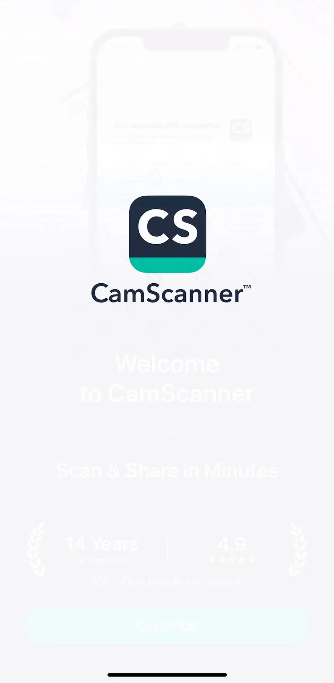
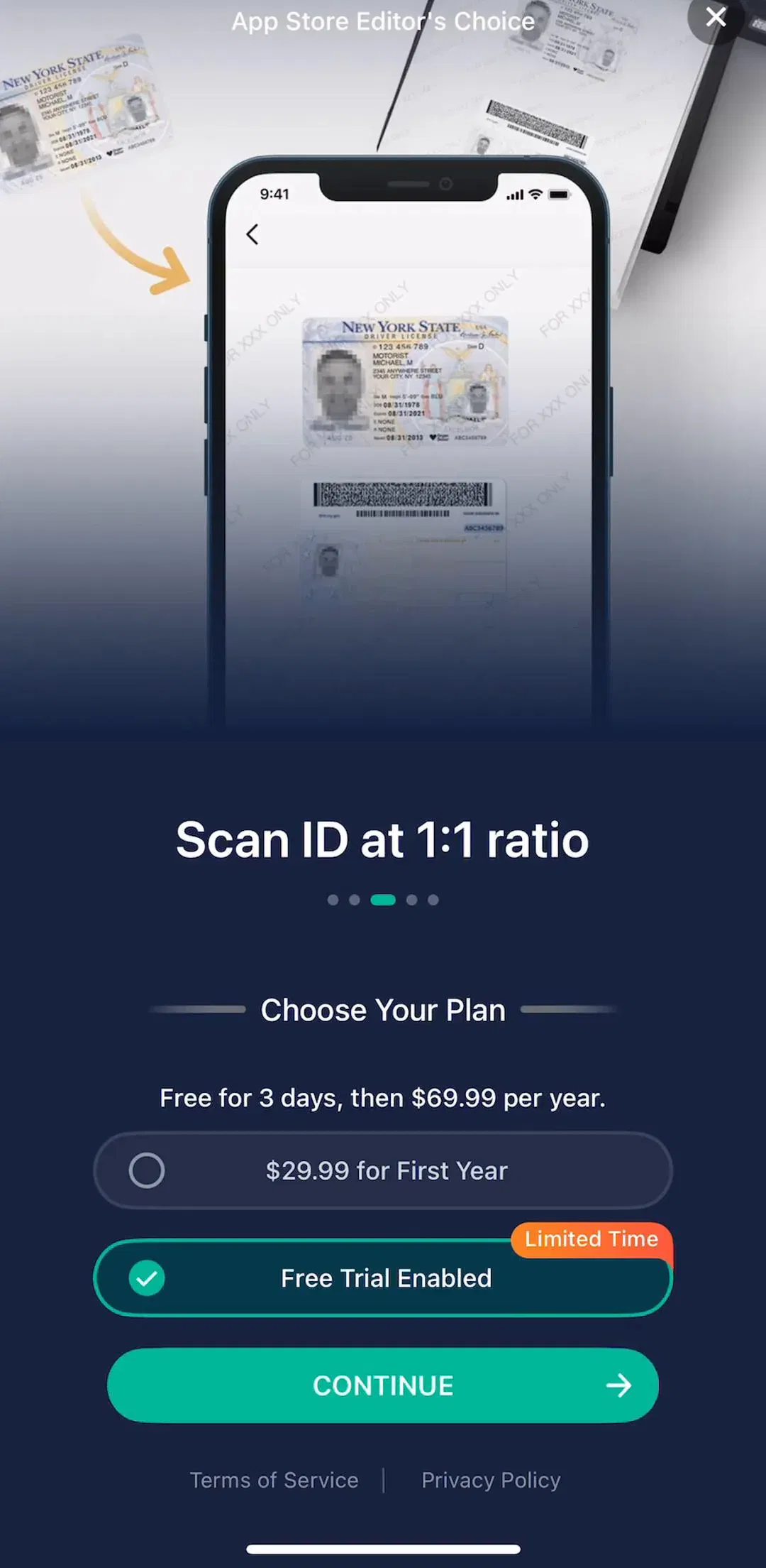
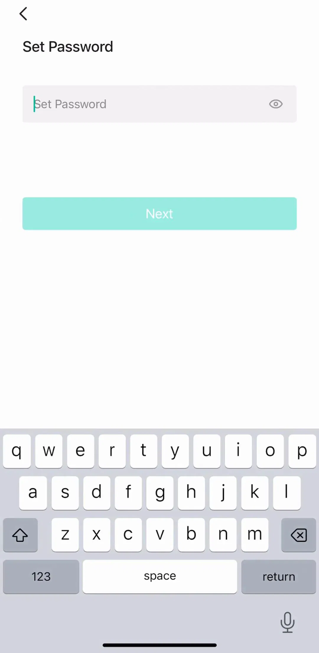
CamScanner (est. $7M/mo) is a good example of the pill done plainly: a full-width Continue at the bottom of the plan picker, with the trial plan marked above it. The strip below runs from its launch screen to the paywall to the set password step that comes next in the flow, where the Next button switches to a rounded rectangle.
Split by category, the pattern is clearer than the total. Among photo and video editors, 7 used a pill (Lightroom, VSCO, BeautyPlus, Wink, Photoshop Express, SNOW, InShot) and 2 a rounded rectangle (Meitu, Captions). Among utilities and productivity tools, which here means storage, VPN, PDF, translation, remote control and phone cleaning apps, the split ran the other way: 6 rounded rectangles (Dropbox, NordVPN, PDF Expert, Translate Now, TV Remote, Cleaner Kit) against 2 pills (CamScanner, Swipewipe). Health and fitness apps leaned pill, 4 to 2.
These are small numbers, so read them as a tendency, not a rule. The tendency makes sense, though. Creative apps sell a mood and tend to round everything, from sliders to plan cards. Tools sell reliability and tend to inherit the stricter grid of the rest of their interface, where fields, lists and cards are all rounded rectangles too. In both camps the paywall button matches the app around it, which is the real rule worth copying.
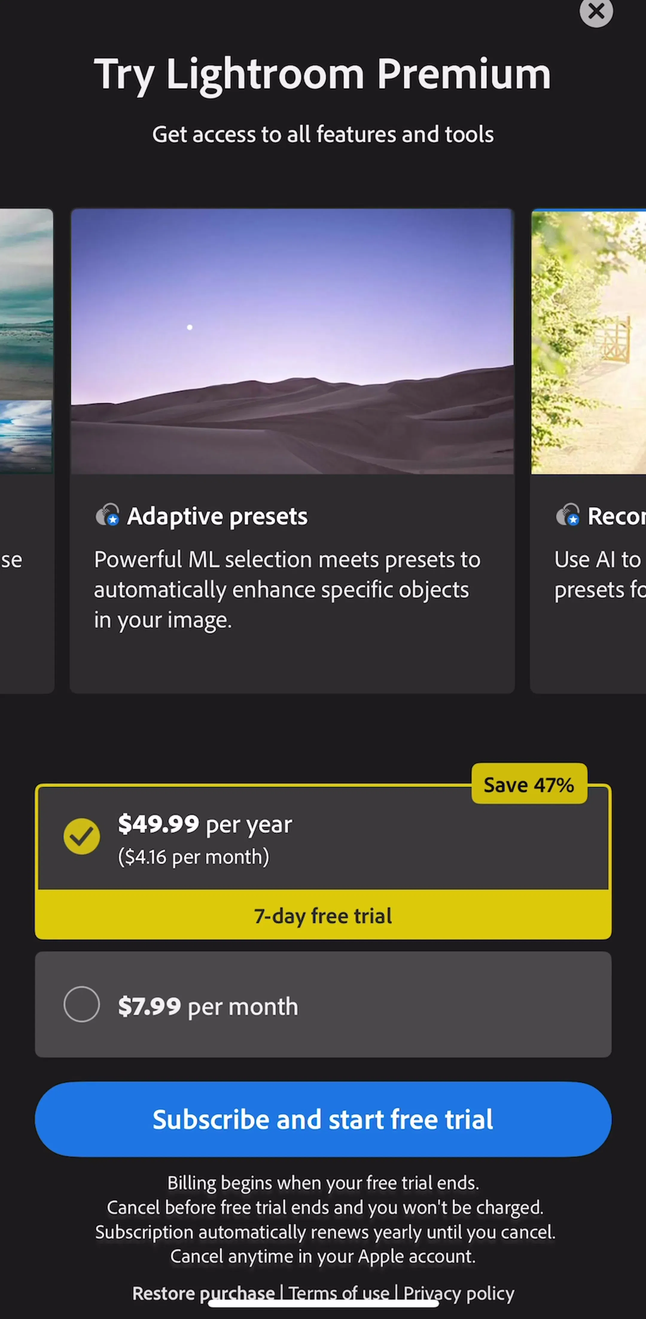
Lightroom (est. $4.75M/mo) fits the creative camp: a blue pill reading Subscribe and start free trial under two plan options, on a dark screen led by a carousel of feature cards.
Most pills in the sample ran nearly edge to edge with a standard side margin, the same full-width bottom button our button UI design post argues for. Three were narrow and centred instead: YouTube Music (est. $38M/mo) with a small Try it free pill beside a Not now link, BeautyPlus (est. $2.25M/mo) with a pink 7-day free trial pill, and SNOW (est. $950K/mo) with a yellow one under a 64% off price.
A narrow pill reads as lighter, closer to a suggestion than a commitment. That suits YouTube Music, which shows the offer as a light interruption with a quiet Not now beside the button. It suits a dedicated paywall less well, because the button is the only thing on the screen the business needs you to find, and shrinking it costs target size for no gain.
The one real failure mode we saw is a pill button sitting among other pills. Several paywalls draw their plan options as pill-shaped rows too, so the plan you can select and the button that buys it share a silhouette. CamScanner separates them by fill: the plan rows are outlined, the Continue button is solid green. Remini draws pill-shaped plan rows as well, in a sheet where the main button falls below the captured frame, so the rows carry the whole visual rhythm of the screen.
The fix is not to abandon the pill. It is to make the action different from the options in at least two ways at once: a solid fill against outlines, a heavier label, a full-width span against inset rows. If the only difference between a plan row and the buy button is the colour, people on a small screen will occasionally tap the wrong one. Our badges UI post covers the other pill on these screens, the little Save 47% label hanging off the plan card.
Pills also turn up outside the paywall proper, as upgrade prompts inside the product: ClassDojo puts a Start my free week pill inside a tab, BandLab a small Get Membership pill inside a card in its studio settings. Inline, the pill does a useful job: it signals an action without pretending to be part of the content around it.
A main button is only half of a paywall's button hierarchy. The other half is the way out, and the same 32 full-screen paywalls are a useful sample for that too.
Two caveats. Each screen is a single captured frame, and some apps reveal the close button after a delay, so “no visible way out” means at that moment, not forever. And placement matters less than contrast: 8 of the 22 X buttons were faint grey on a busy background. Fishbrain (est. $2M/mo) is the clearest counterexample, a dark filled circle in the top-right that nobody will miss. MyNetDiary (est. $1.25M/mo) does something else worth noting: an I Don't Want It text link directly under its green pill, which keeps the exit in the same thumb zone as the purchase.
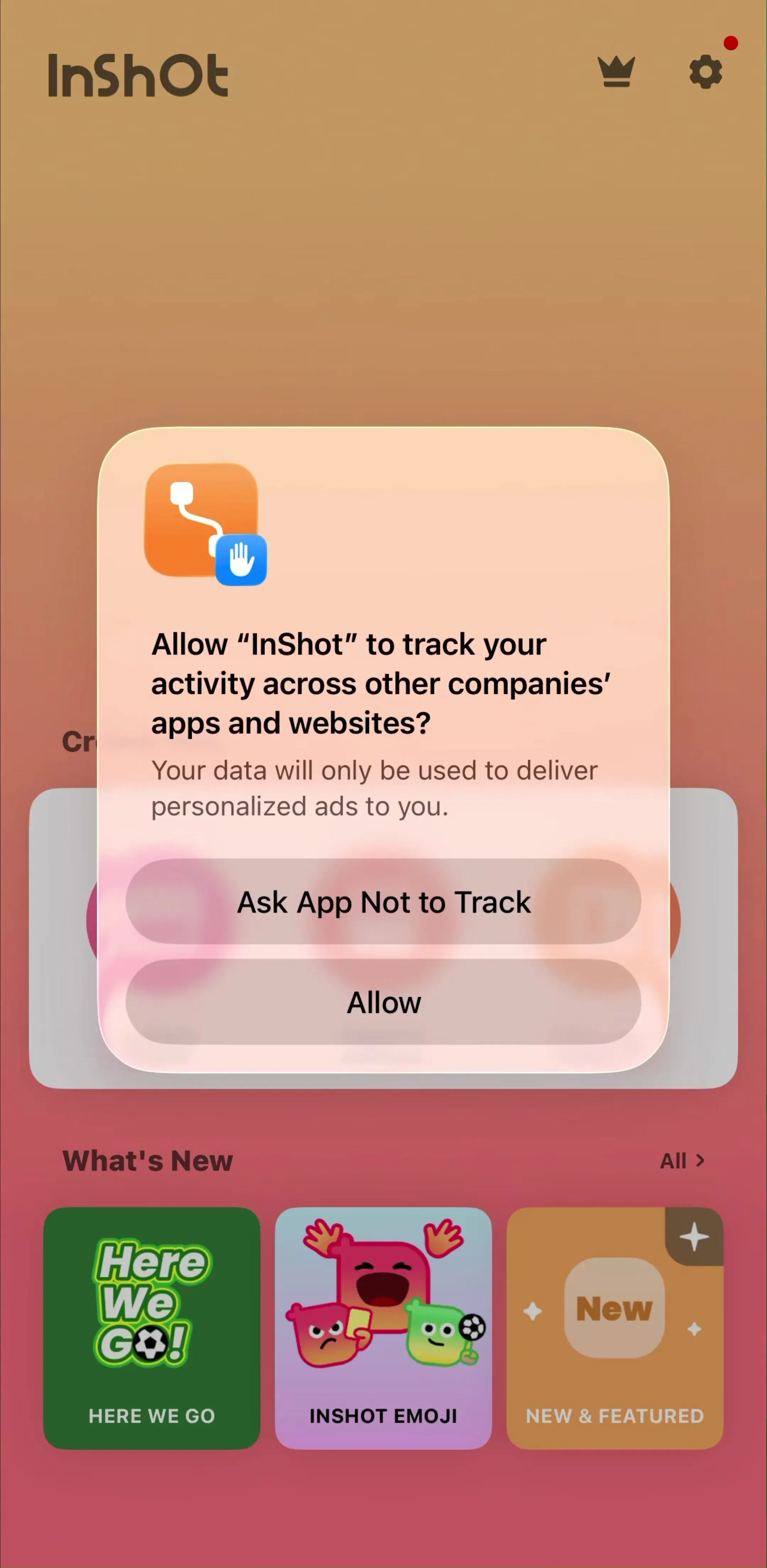
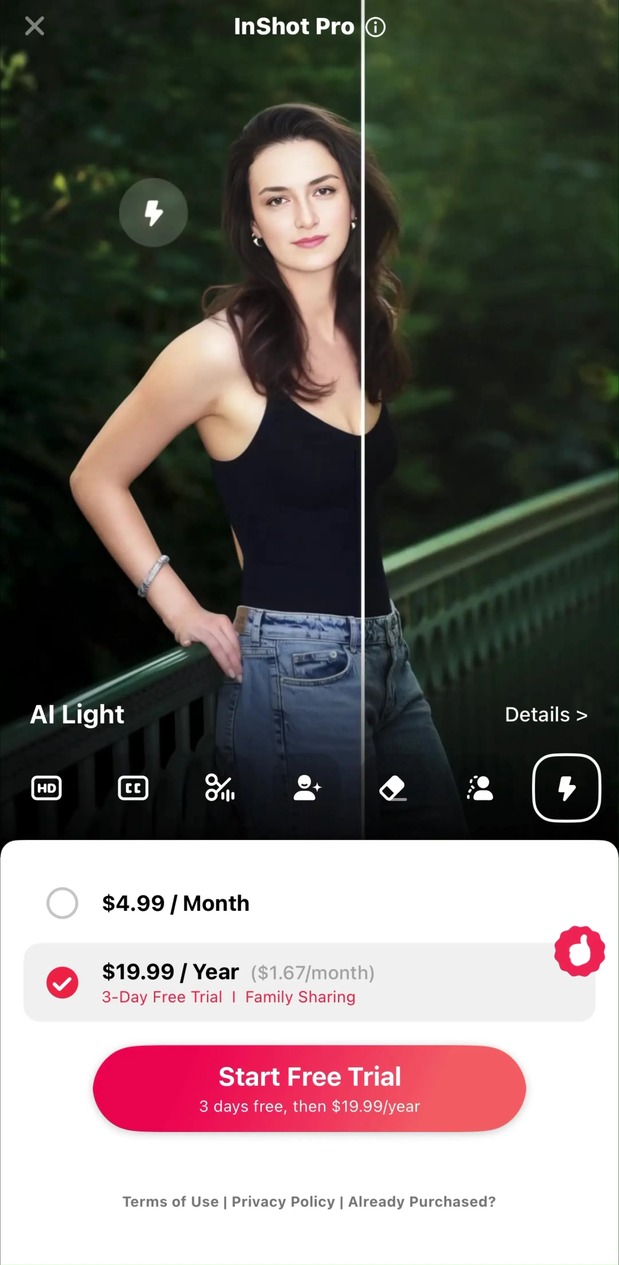
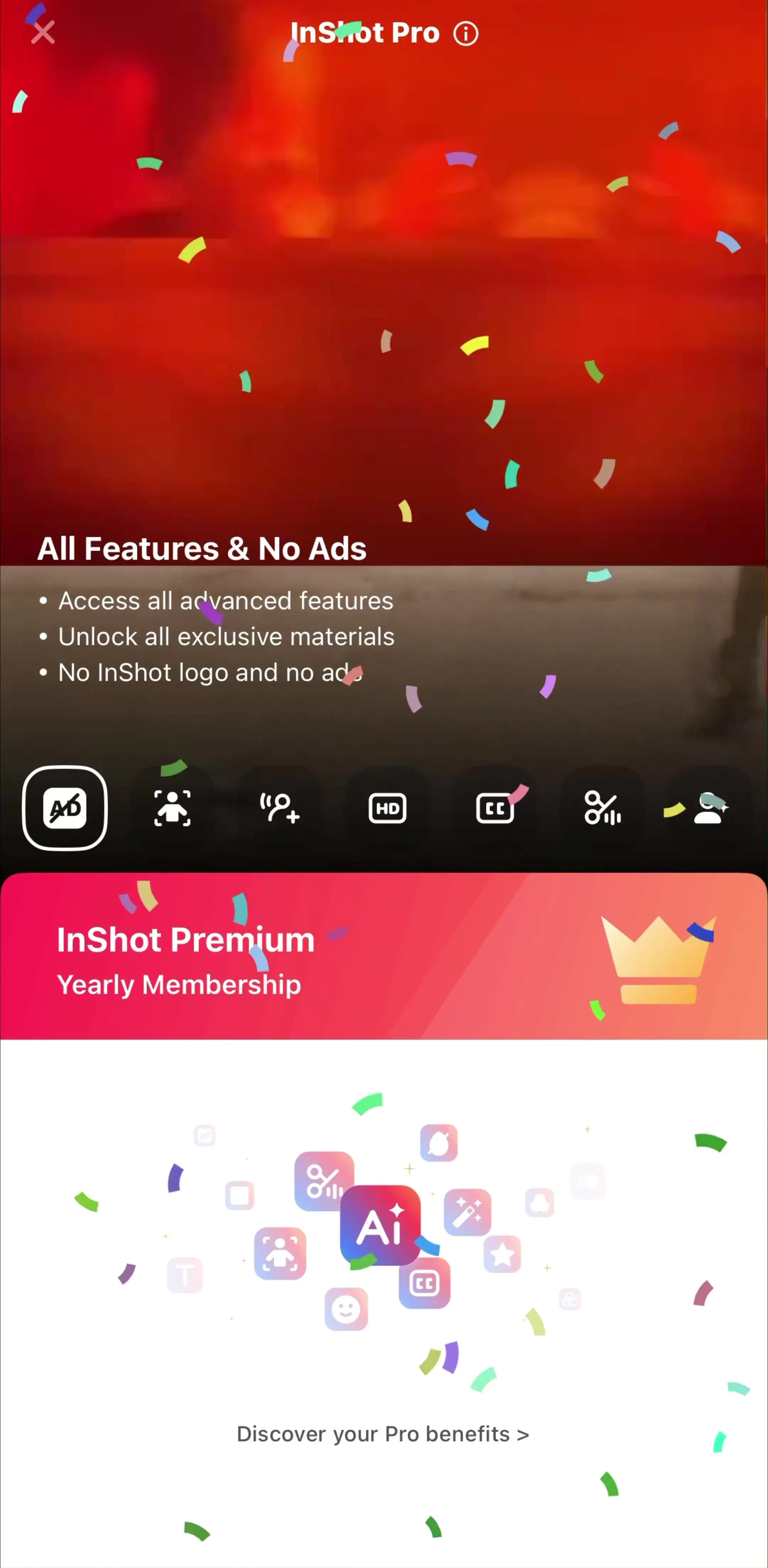
InShot (est. $1M/mo) shows the common middle case: a red Start Free Trial pill at the bottom and a faint X in the top-left corner, the furthest point on the screen from the thumb. The strip shows the tracking prompt that precedes it, the paywall, and the confirmation after purchase.
Every example above comes from the paywall flows and the onboarding flows in the library. For layout and plan structure, see our paywall design examples, and for the words on these buttons, our UX writing examples.
A note on the numbers: the sample is the free preview screens tagged as paywall for the 60 highest-grossing apps that have one, up to two screens each, 97 screens in all. 32 show a full-screen or modal paywall; the rest are launch screens, dialogs, confirmations and onboarding steps. Inline upgrade cards and in-tab stores were left out of the counts. The sample shows what those screens contain, not everything each app ships, and paywalls change often, so treat every button described here as a dated snapshot. Revenue figures are third-party monthly estimates from our library, useful for comparing magnitude, not audited financials.
A pill button is a button whose corner radius is half its height, so the short ends are full semicircles and the shape looks like a capsule. A rounded rectangle has a smaller radius, so it keeps visible straight sides at the ends. The difference is one number in the design file, but at phone size it changes how soft or how formal the button reads.
Neither wins on usability by shape alone; size, contrast, position and label matter far more. In our sample of 31 top-grossing paywalls with a visible main button, 17 used a pill and 14 a rounded rectangle, so both are mainstream. Pick the one that matches the rest of your interface. If your cards, fields and plan rows are rounded rectangles, a rounded rectangle button belongs to the same family. If they are already pills, make the button different by fill and weight, not by shape alone.
Set the corner radius to half the button's height or larger. In CSS a common shortcut is border-radius: 9999px, which always produces full semicircle ends whatever the height. In Figma, a radius equal to or larger than half the height does the same. If the button can grow taller, for example when a label wraps to two lines, check that it still reads as a pill rather than a lozenge.
Usually, for the one main action on a screen. In our sample most paywall pills ran nearly edge to edge with a standard margin. Three were narrow and centred (YouTube Music, BeautyPlus and SNOW), which reads more like a tag than a commitment and gives the thumb a smaller target. A narrow pill works best for a light offer with a quiet second option beside it, as YouTube Music does with its Not now link.
The shape itself is fine. The usual risks are elsewhere: low contrast between the label and a bright gradient fill, labels that are too long for the rounded ends and get clipped, and pills that are visually identical to non-interactive chips or plan rows. Keep at least Apple's 44 by 44 point touch target, keep text contrast high, and make sure a pill that does something looks different from a pill that only labels something.
Somewhere people can find it. In our sample of 32 full-screen paywalls, 12 put an X in the top-right corner and 10 in the top-left, so there is no single convention, though top-right matches most iOS sheets. The bigger finding is visibility: 8 of the 22 X buttons were faint or low-contrast, and 5 paywalls showed no visible way out in the captured frame at all.
Browse captured paywall and subscription flows from revenue-verified iOS apps, screen by screen, with estimated revenue next to every app.
Browse paywall flows